


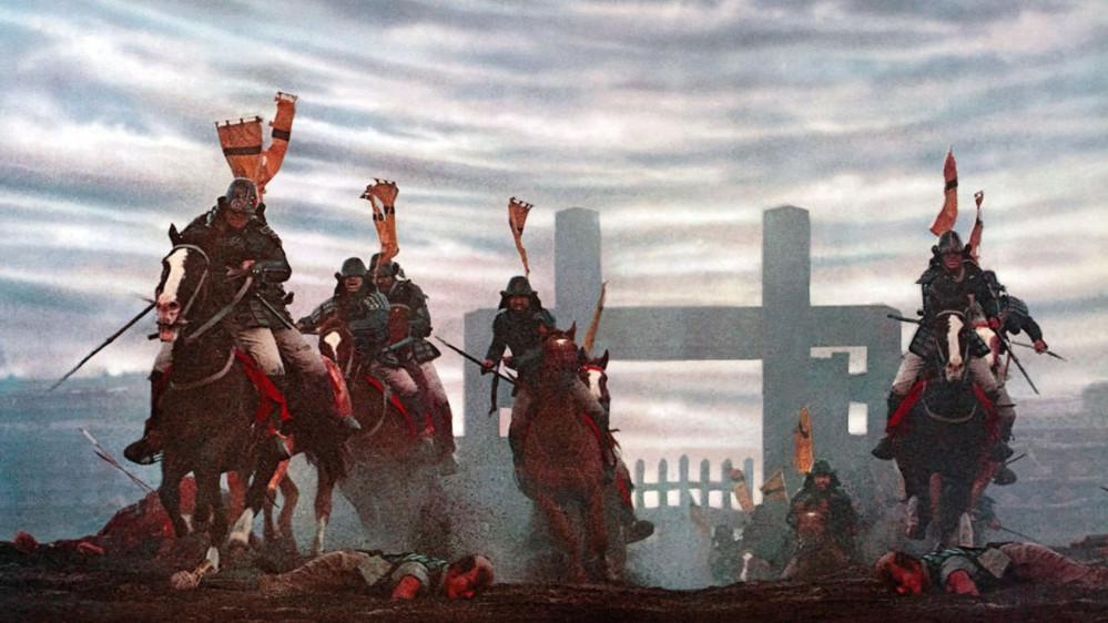
Kurosawa in Color


Recommendations: 22
About the Project
My second entry in the UKGE painting contest will be in the board games category. Senjutso: Battle for Japan has some cool samurai miniatures, and the game's self-contained nature means I can try out a different look for the models without worrying about whether they'll line up with other models I've painted for the likes of Test of Honour.
Related Genre: Historical
Related Contest: UK Games Expo Painting Competition 2025
This Project is Completed
Glorious black and white
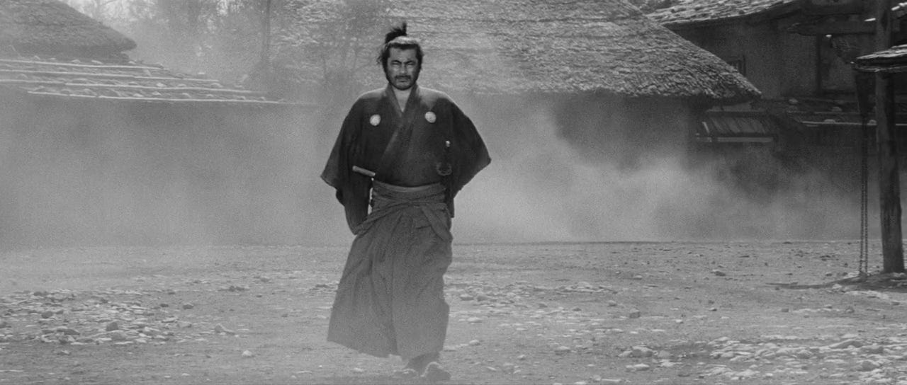
When we think of the samurai epics of Akira Kurosawa, most of us immediately think of his black and white masterpieces like Seven Samurai or Yojimbo. I’ve always wanted to paint a group of samurai to match this aesthetic, but I’ve stopped short of doing it, reasoning that black and white models would look a little weird next to the fairly large number of full color models I’ve painted for use with Ronin and Test of Honour.
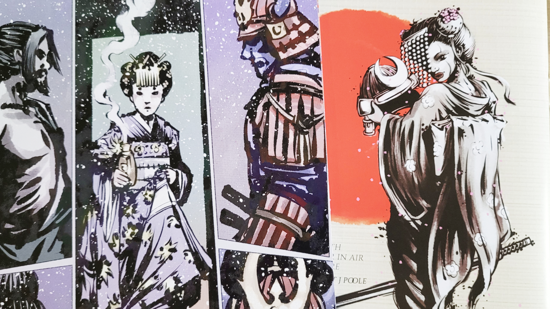
I recently picked up a copy of Senjutsu: Battle for Japan, a fairly interesting card-driven dueling game that comes with some pretty good looking samurai miniatures and small terrain pieces like carts and clusters of bamboo. It uses a small, hex-based board and is definitely packaged and sold as a self-contained board game, although they do have a few expansion packs available with additional characters. More importantly, Senjutsu’s models are all on fairly large hex bases, so it’s unlikely that I’ll ever need them to stand next to any of my other samurai models. Perfect for the black and white color scheme I had in mind.
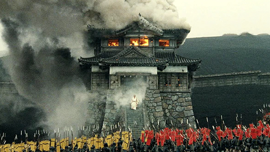
It then occurred to me that while a black and white color scheme might look cool, it might also make it difficult to tell the miniatures apart on the board. The cards are fairly colorful, and my thinking when painting board game pieces is to always try to stick as closely to the game’s artwork as possible. I started thinking about Kurosawa’s later films, especially Ran from 1985, and the way he tended to stick to a fairly grey color palette, with splashes of bright color here and there. I was also looking at one of the game’s terrain pieces, a flaming cart, and thinking that the cart could be grey but the flames really needed to be orange.
I thought that a great compromise might be to do each model in shades of grey, with one spot color pulled from the card artwork — it would make it easy to tell which model was which, and it would probably be pretty eye catching too.
Scenery first
The terrain bits seemed like they would be easier so I decided to tackle them first — the flaming cart would also be my proof of concept for the look I was going for.
Painting in greyscale is pretty interesting — you have to think about what tone (light or dark) each part of the model is, rather than what color. I sat down with Army Painter’s Black & Greys flexible triad and worked from dark to light. I started with black primer, then drybrushed in Deep Grey, then painted in everything that would be dark but not black with Deep Grey, then drybrushed in the next shade up (Uniform Grey in this case), then painted in the next lightest elements, and so on.
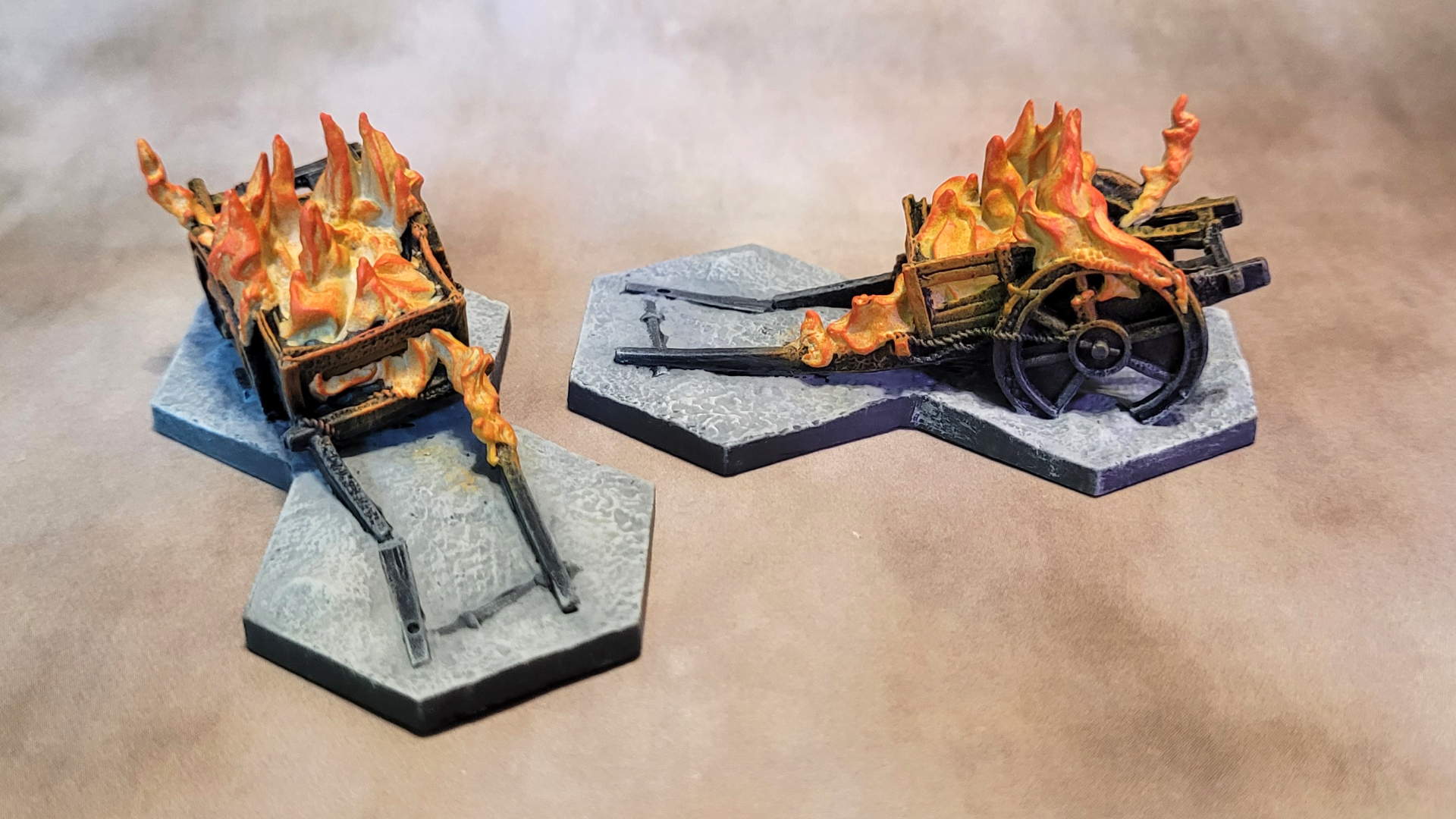
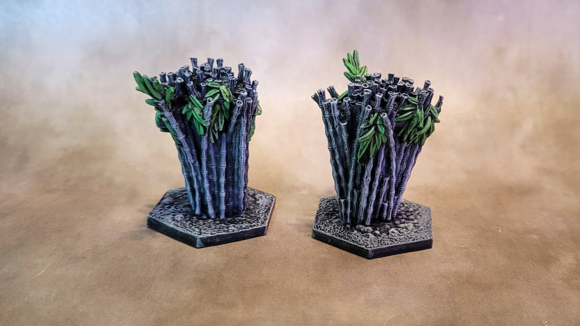
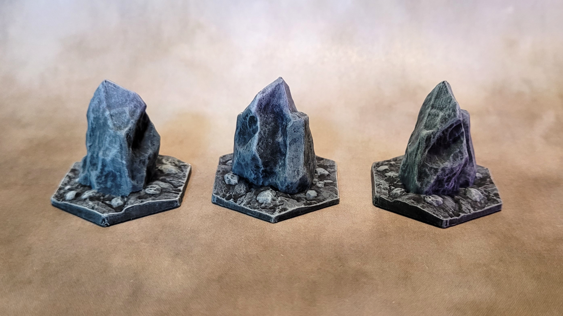
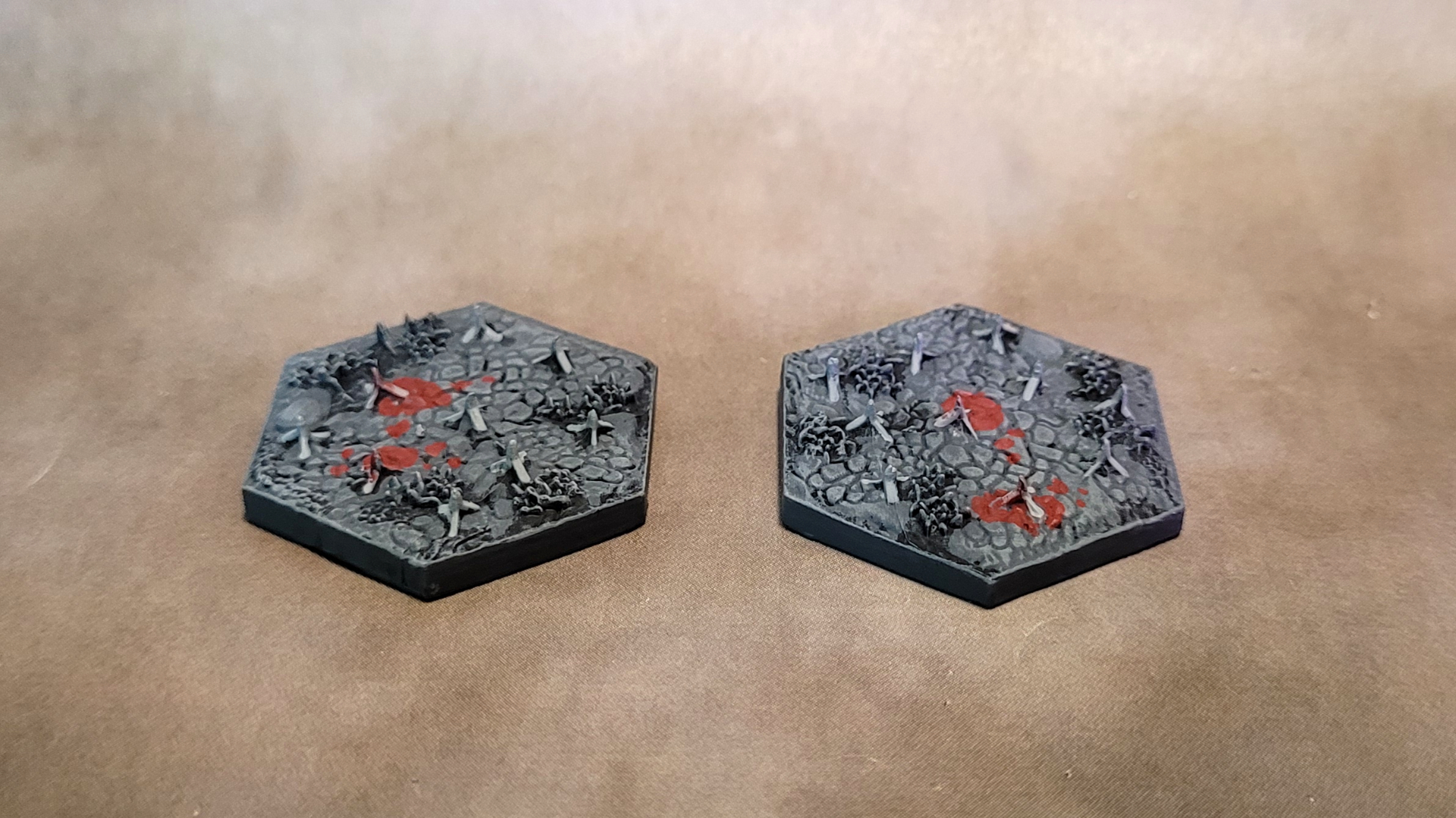
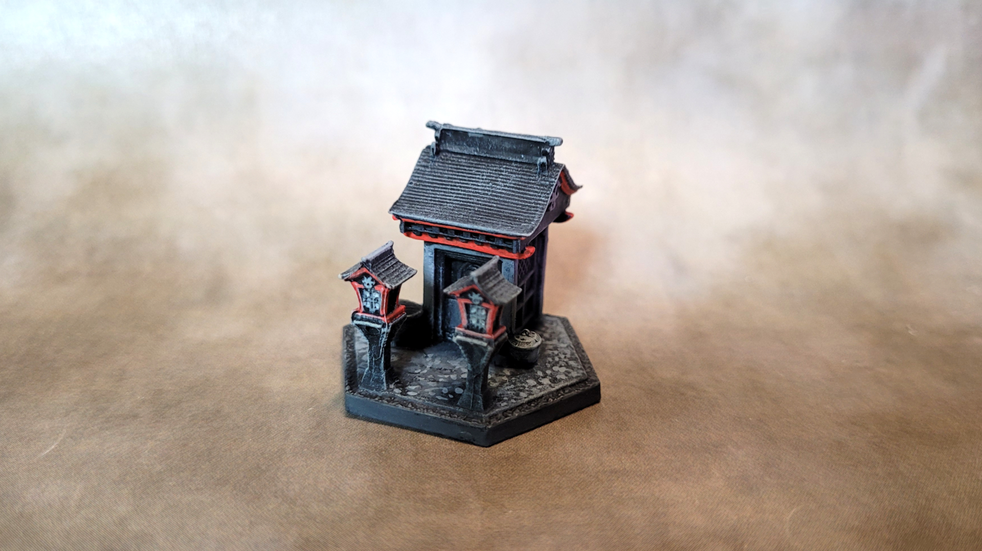
The fun part was deciding what spot color to use. For the flaming carts it was obvious, and green seemed like the only choice for the bamboo plants. I didn’t do a color at all for the rocks, because, well, they’re rocks. The caltrop bases have plants on them, and that was my first thought, but then I thought some puddles of blood in bright red would be more dramatic and interesting. It was a little tough deciding how much of the shrine to paint in red, but I decided on just a few details around the roof.
On to the fighters
The game comes with four playable character models, and two bystanders that are used in a few of the campaign scenarios (players have to make their attacks and avoid hitting the innocent bystanders, not as easy as it sounds). For these I would have to make some interesting choices, the first of which being what spot color to use for each model.
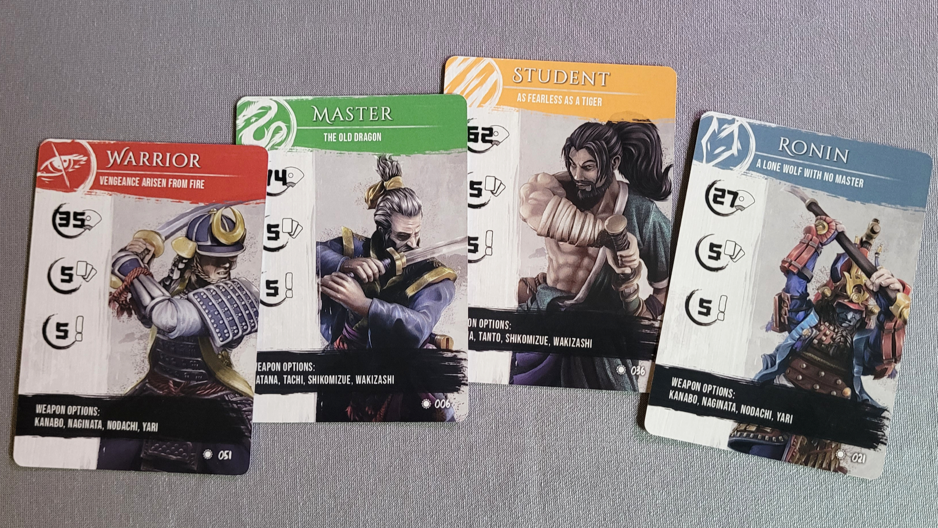
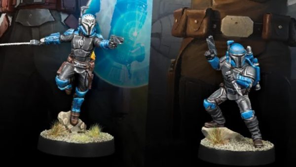
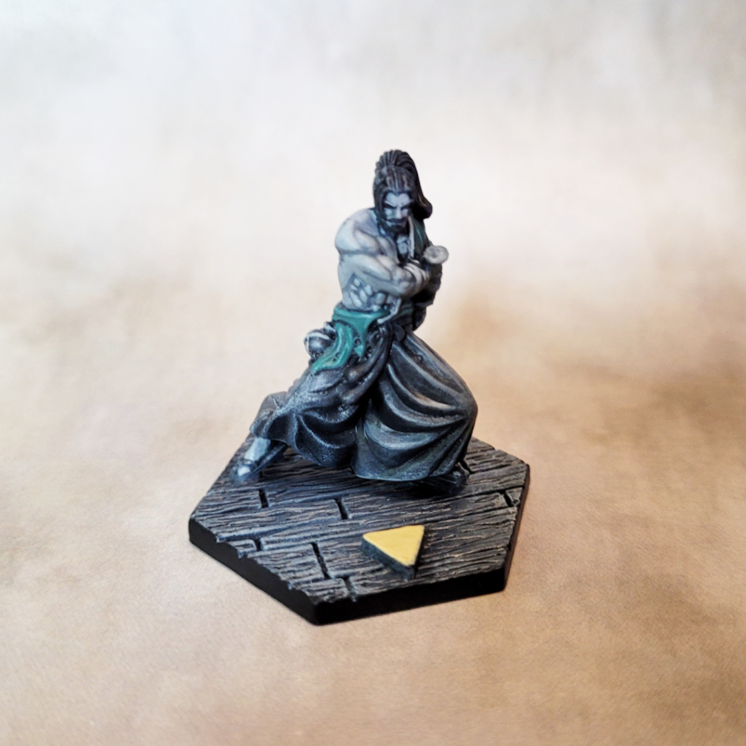
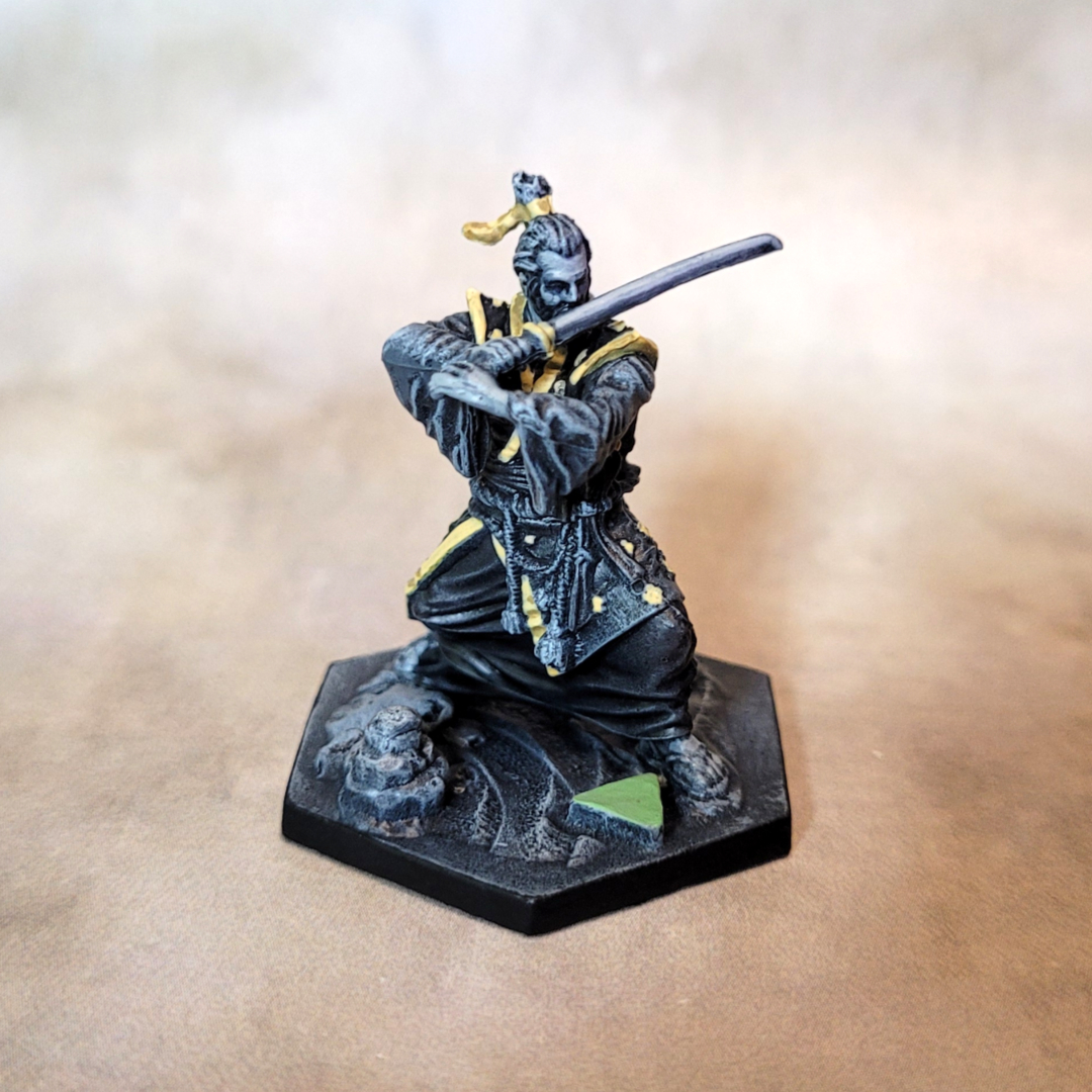
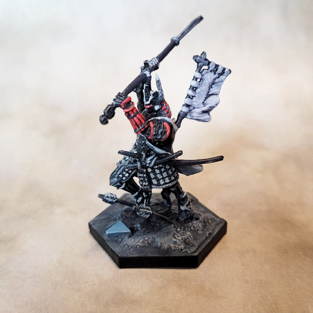
The Student and Master characters were pretty easy, the artwork on both cards is fairly in line with what I’m doing. For the Student I did the top of his kimono in a bluish green, and for the Master I picked out the gold details on his shoulders and hair tie. Similarly, the Ronin is the only character with a lot of red, and picking out those details in his gauntlets and helmet worked out well.
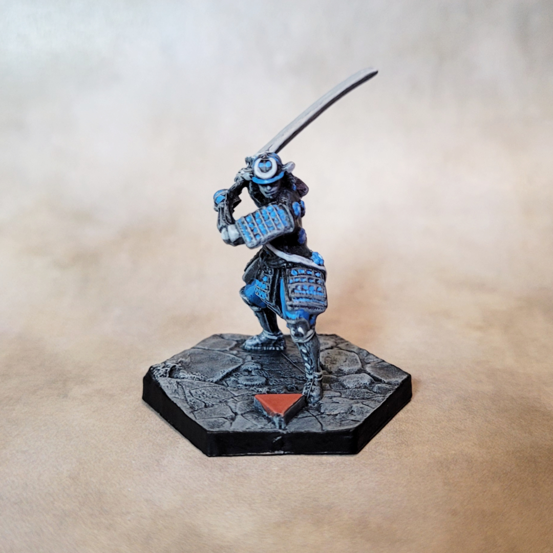
The Warrior was more problematic. Looking at the card artwork, the Warrior’s color scheme is almost identical to the Master’s — washed out blue with gold trim. Based purely on the artwork, gold would have been the best choice, but since I already used in I went for a light blue on the helmet, armor, and the flower pattern on the back of the jacket.
My color decisions were based on the card artwork, reasoning that a player would identify their miniature on the board based on the artwork colors. However, it occurred to me that each character also has a player color, represented on the cards by a splash of color at the top of the card, behind the character’s name. Each character is a different color, and naturally this color appears nowhere in the actual artwork for the character. What’s more, there are a few other tokens in the game that match these colors.
My solution was to paint the facing arrows on the base of each model in the color shown on the card for each character. This way, a player can find their miniature on the board either by the card artwork, or their player color. I think this covers all my bases.
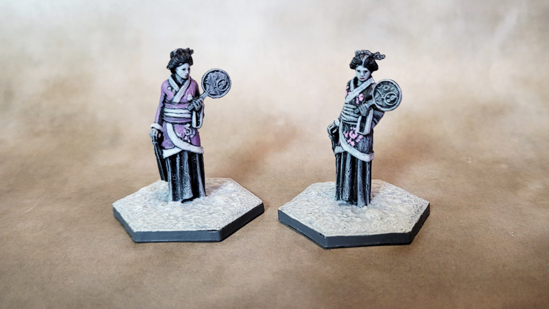
Finally, the bystanders
The two bystander figures are the same model, but I didn’t want to paint them both the same way. Inspiration came from some of the artwork in the game’s rule book and campaign book. One showed a geisha in greyscale with just a few spots of hot pink, which I found really striking (and it was partly what gave me the idea to paint the game this way in the first place). For the other I followed the artwork from the campaign book, which also uses washed out color, depicting the geisha in pale purple.
And that’s this project done! There are a few expansions for the game that add additional character miniatures, but for the purposes of the UKGE contest I’ve decided to stick to just the core game. This project went very quickly, so much so that I was finished before I had time to post anything here.
As with my other UKGE contest entry, I’m not sure if this is competition-level painting, but I was determined not to second-guess myself and try to figure out what the contest judges might want. I painted to the standard I always try to paint to, the way I always paint, but doing it for a contest was helpful in that it gave me a deadline to get it done. Who knows how long this might have languished in my “I’ll get to that some day” pile.
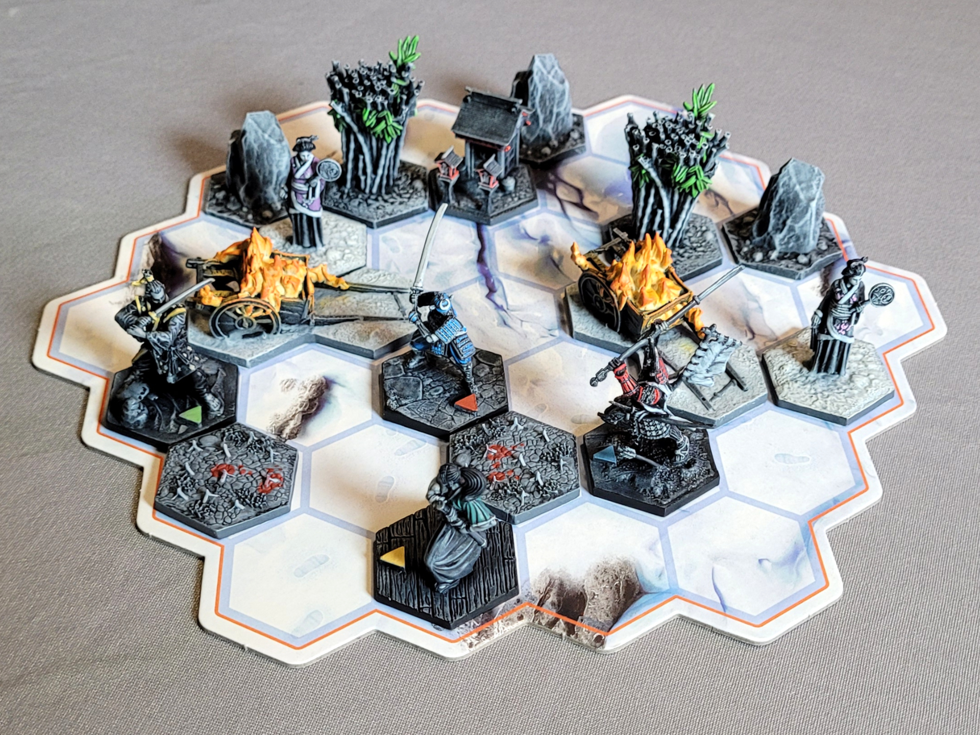 I haven't decided for sure how I'll display these for the contest, but I'm thinking I'll probably just use the game's board.
The final battle
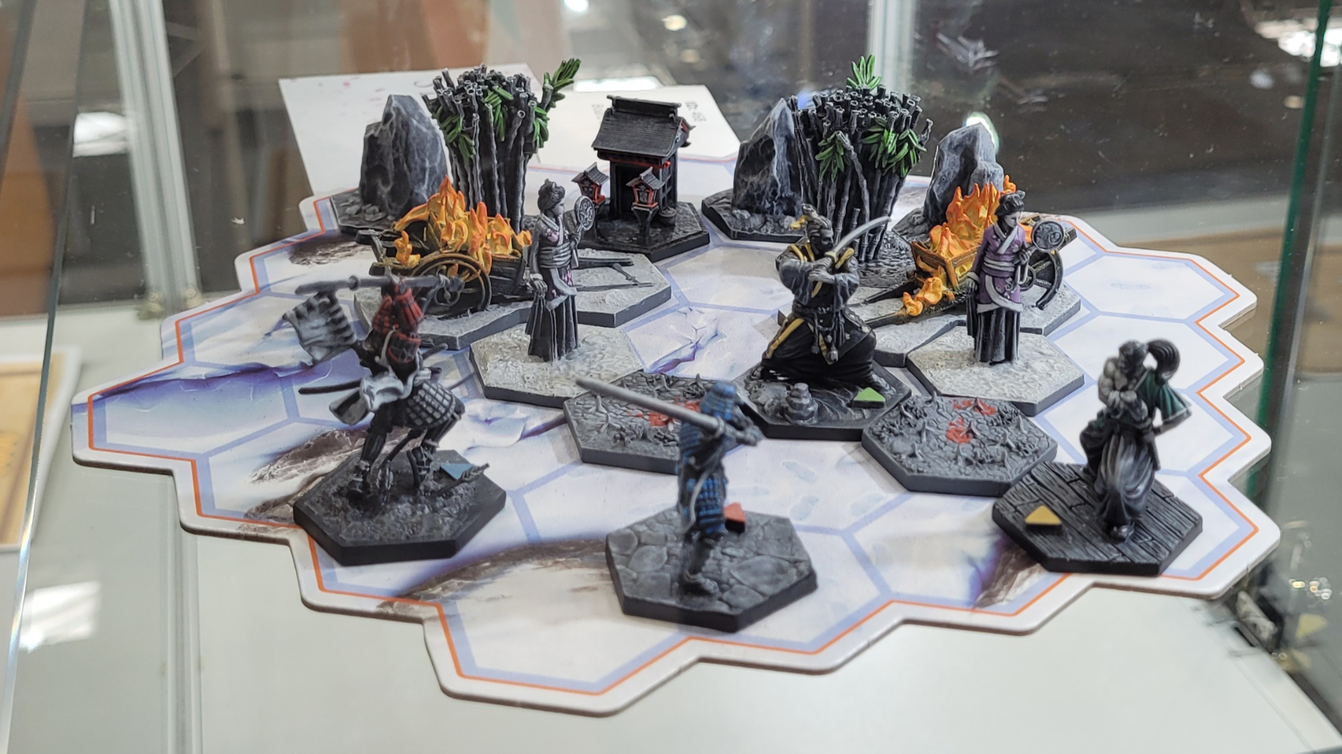
Here’s the board and miniatures as seen in the display case at UKGE. There were a lot of great entries in the board game category, including another set of models from this same game (the other painter opted for a full color approach).
I had a great time painting these and participating in the contest. I especially want to give a shout-out to the fellows who were taking in the contest entries on the day — they were extremely friendly and helpful. All in all it was a wonderful experience, and I would probably do it again given the chance.