

![1918 Spring Offensive Wargame | Full Rules Overview with John & Gerry (WW1 Tabletop Game) [7 Days Early Access]](https://images.beastsofwar.com/2026/03/unboxing-warfulcrum-games-1918-spring-offensive-review-coverimage1-225-127.jpeg)


Supported by (Turn Off)

-

0
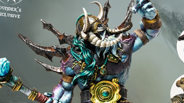
Winter’s End! Stunning New Founder’s Exclusive Set For Conquest
-
3
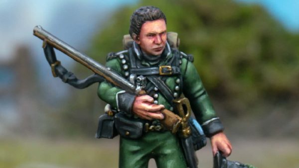
Rifleman Harper Miniature Coming Soon For Sharpe Fans!
-
0
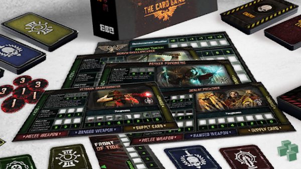
Battle Chaos Fiends In Cubicle 7’s Darktide: The Card Game
-
8
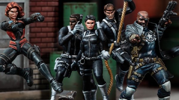
S.H.I.E.L.D Goes Up Against Sentinels! New Marvel: Crisis Protocol Sets
-
5
Pre-Order Baylan Skoll & Morgan Elsbeth For Star Wars: Shatterpoint
-
4
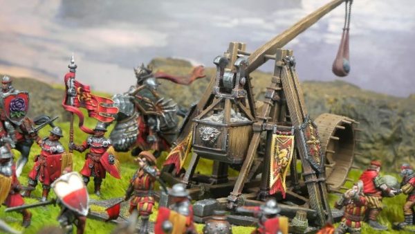
Smash Defences With Conquest’s Hundred Kingdoms Trebuchet
-
7
Wargames Atlantic Marcher: Empires At War US Plastic Kits Available!
-
6
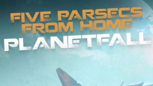
Begin Planetfall With New Five Parsecs From Home Rules
-
1
Play Out Campaigns With Chronicles Of Midgard Rules
-
4
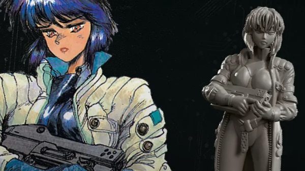
Pick Up Major Motoko Kusanagi Miniature From Mantic Games!
-
11
More Details Drop For Atomic Mass’ Marvel: Crisis Protocol Alliances
-
2
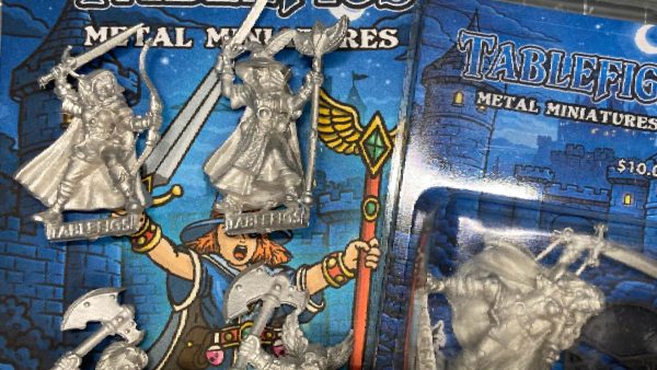
New Dungeon Delving Heroes Available From Tablefigs Range
-
4
More Beowulf Teasers For Ragnarok Miniatures’ Next Kickstarter
-
3
Build A Fantasy Hamlet With Micro Art’s New Collection
-
1
Senshi, The Undying Ronin Joins TTCombat’s Carnevale
-
8
Commissar Yarrick Returns To Warhammer 40,000 + More!
-
0
Smooth & Rifled! New Blackpowder Wargaming Rules Available
-
1
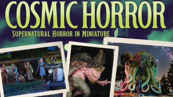
Face Down Cosmic Horrors With Spectre Miniatures’ New Game!
-

1
Mantic Games’ DreadBall All Stars Lands A Strike On Kickstarter
-
4
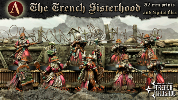
Axia Launching Grimdark Trench Sisterhood On Kickstarter Soon
-
![StarCraft Tabletop Miniatures Game Pre-Orders Live Now [Updated]](https://images.beastsofwar.com/2026/03/starcraft-tmg-news-cover-600-338.jpg)
15
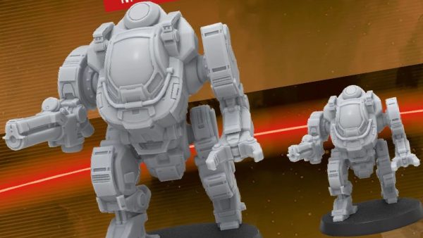
StarCraft Tabletop Miniatures Game Pre-Orders Live Now [Updated]
-
0
Imperial Banner Reinforcements Come To Eldfall Chronicles
-
5
Battle Pigs Charge Into RelicBlade! New Plastic Box Set & Rules Update
-
1
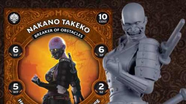
Nakano Takeko Prize Model Revealed For Malifaux 4th Edition
-
15
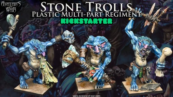
Legendary Stone Trolls Plastic Regiment By Avatars of War!
-
7
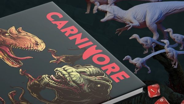
Dinosaur Vs Dinosaur Combat! Carnivore By Buer Games
-
4
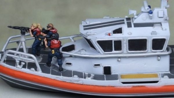
Post-Apocalyptic Coast Guard Rescue Boat Released by Khurasan Miniatures
-
7
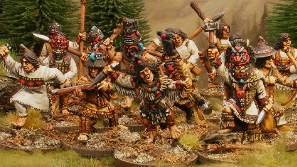
Eureka Miniatures Release New Tlingit Warriors For Tribal Battles
-
2
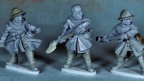
Antediluvian’s Wars Of The Bruce’s Medieval Range Expands
-
4
Modiphius Release New Wave Of Mass Effect Miniatures
Cracking stuff! 😀
BoW Andy
Thanks, I painted before the tron craze but since that movie people have been going nuts for my jacks.
This is so nice. Great work
They say imitation is the greatest form of flatery. Im going to use your style as a foundation for my warjacks. Any tips will be great.
I will try to describe my heat effect as well as i can and at least list the paints i used. I started with a black primed model and made a wash of p3 morrow white to wash all the areas that would be hot. I took normal painting constancy morrow white and got into the inner shoulders as much as humanly possible, a little black in a shadow can kill the effect. it looked very messy afterward.
Next i used a heavy glaze of reaper phoenix red, this is actually a reddish orange. i glazed twice so no white showed in the deepest parts.
At this point i took a mix of reaper clear red and some darker gw red, i think scab red. the original color was nearly neon so i got it down to a ruby red color, i will refer to this as ‘red’ from now on. i used a 2/1 mix of this and matte medium and thinned it to normal painting consistency and painted next to the orange try hard to get a good blend.
i blended some p3 sanguine base over the red in the same way and tried to blend into the black basecoat. next i took some pure black and a touch of some oop gw midnight blue to recover my black. i dont know what it is about midnight blue but it is not just blue+black like most dark blues, it has some high pigment concentration or dye added or something. The added blue helps contrast the black from the orange and that particular blue makes black look even darker. I took my black mix and just painted over the large open areas then after it all dried added matte medium to glaze over the edge of the dark red and help blend it.
The brightest oranges are based on reaper orange highlight and p3 menoth white highlight. I first just painted the pure orange on then made a wash of the two and went into the deepest cervices where i wanted it to pop or where it would be the hottest.
After that i just went back to tidy things up with glazes. I made it a point to never add yellow to keep the effect looking hot, but not on fire.
Lovely ! Your colors are wonderful…
To answer your question, partly, the midnight blue is a very cold blue that tends towards purple… One must realise that shadows are never black, in reality.
The color blue is perceived by the human eye as “cold”, and it’s the color of faraway objects (mountains, the sky, the sea…) because of earth’s atmosphere. It is perceived as “deep”. Generally, a cold blue or green is used by painters as a shadow for flesh, or for warm reddish tones… A cold shadow sets off a warm highlight, just like a warm shadow sets off a cold blue or white lighting on a miniature.
Hope this helps… I know I paint better miniatures since I apply proper color theory.
@elromanozo thank you. I have noticed some of your work here and I am very impressed.
I try to keep color theory in mind when I paint but sometimes it can be difficult to process what a color looks like to the eye vs. what it is. Black iron for instance seems dead black(technically dark gray but hey, I have to make that glow look lit up) but with the blue sky overhead it dose take that cool blue hue just a bit.