


Death Korps of Krieg the Speedy Way


Recommendations: 16
About the Project
I got a Krieg army box for Christmas and the Combat Patrol for my birthday so I guess I'm adding a Krieg Korps to my Bauhaus Imperial Guard army. Lots of miniatures so a speedy way through this will be essential.
Related Game: Warhammer 40,000
Related Company: Games Workshop
Related Genre: Science Fiction
This Project is Active
Test paints finished with a Forgeworld Commissar
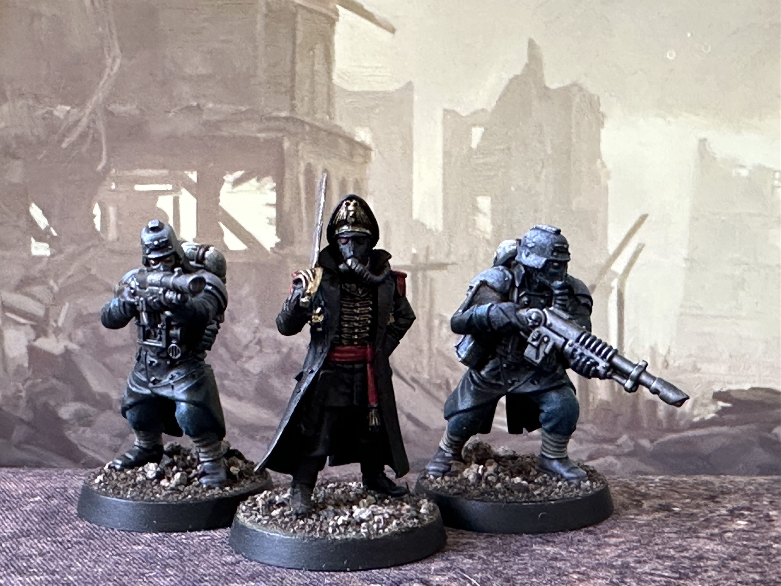
Varnish on. I’m happy with the test paints and will now finish off the rest of the squad.
Sorting a colour scheme
I’m not sure exactly how I want to paint these. I’d like to nod towards the colours in the rest of the Imperial Guard collection so I’ll probably need to use some blue/grey somewhere. Other than that I’m not decided.
I assembled a squad of basic troopers. I was happy with the instructions and although I’m no fan of the modern way of cutting up miniatures to fit them onto a sprue I managed to get a squad assembled with the options I wanted. I don’t have the current Codex and don’t play 40k so I’m not bothered if this combintaion isn’t allowed.
Models will be mostly Speedpainted so a zenithed undercoat will be used, white over grey so the Speedpaint has a chance to show up better – you often can’t see any colour in the shaded areas if you use a black base coat.
Choosing a paint scheme
Approach: The basic technique is to paint the biggest remaining area of the model with each successive paint. This means you can build the paint scheme as you go balancing dark and light, deeper and brighter tones across the model. If you cover the largest remaining area each time you won’t get caught out by suddenly painting a large area and finding your choice of colour disturbs the balance or look you are going for.
This approach is probably not how you will paint the rest of the models once you’ve picked the scheme. When I paint I usually do key features first. Faces and bases are the focus of most Sci-Fi models so I would usually start with fleshtones and then go on to the clothing, painting from the inside out. Weapons and boots are therefore usually last.
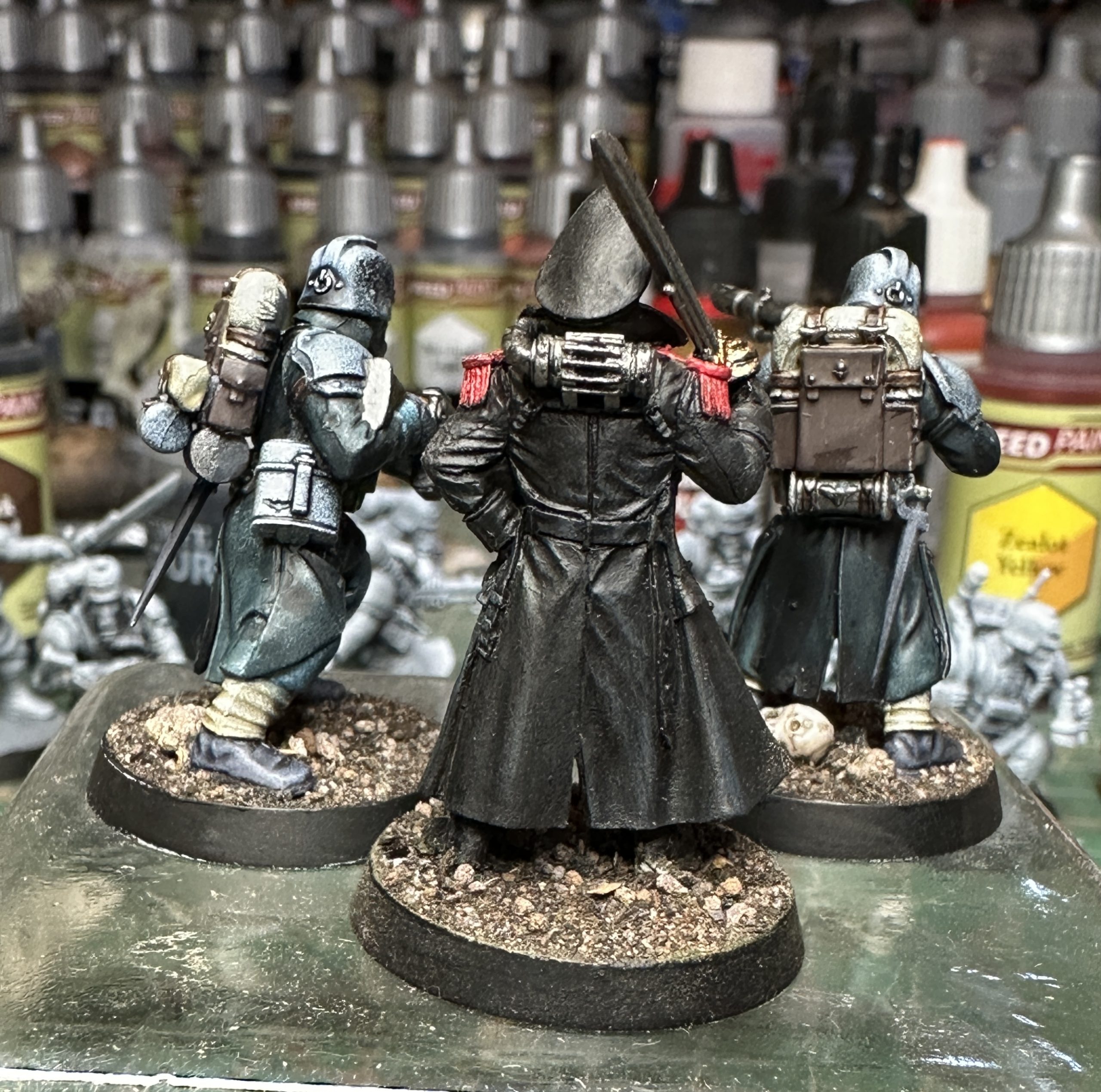
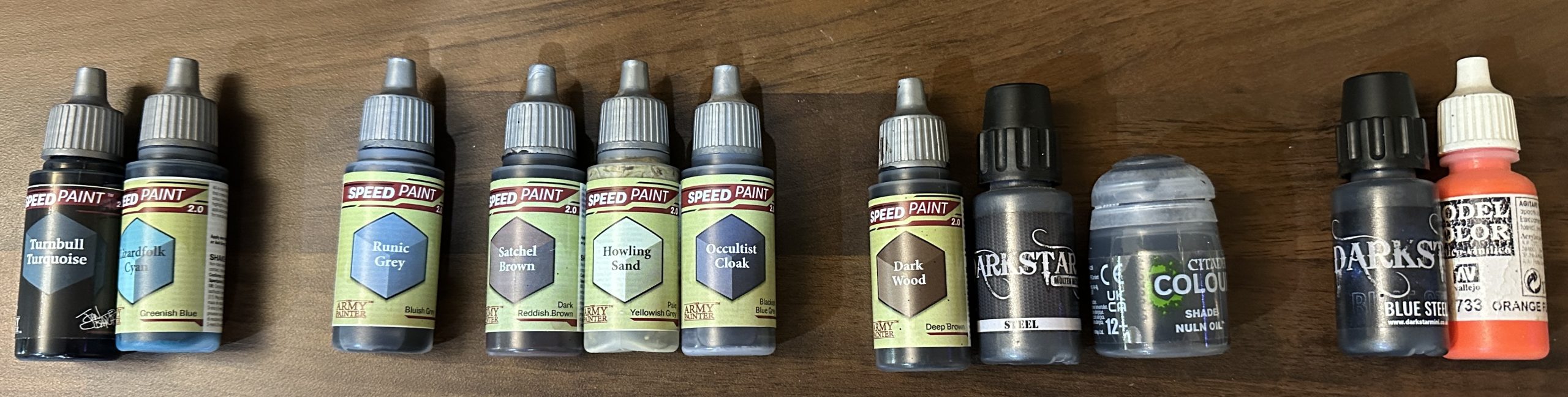
Primary Colour: The greatcoats are the biggest surface area on the model so the colour chosen for these will determine where we go with the other choices. I recently opened my first two Blanche Masterclass paint set boxes. In one of them was a very dark teal coloured Speedpaint called Turnbull Turquoise. This looks great and I’m very keen to try it on a miniature.
Main Complementary Colour: To complement this I’m going to use another teal Speedpaint – this one a bit brighter and with more green than blue in the mix; Lizardfolk Cyan. Picking something close to the main colour on the colour wheel makes the miniature look less bright. This means it looks a bit more “realistic”. For a scheme to work it needs to be appropriate to the context. Here the context is that of a hard Sci-Fi wargame with an edge of grim realism. Therefore I’m thinking more about WWII and modern army uniforms as inspiration. The Korps are clearly modeled after WWI/WWII Germans so something reminiscent of feldgrau is good, hence the grey/green tones I’ve picked, but it is Sci-Fi so we’ve just tweaked it into a grim version for the greatcoat and a brighter more fantasy one for the uniform.
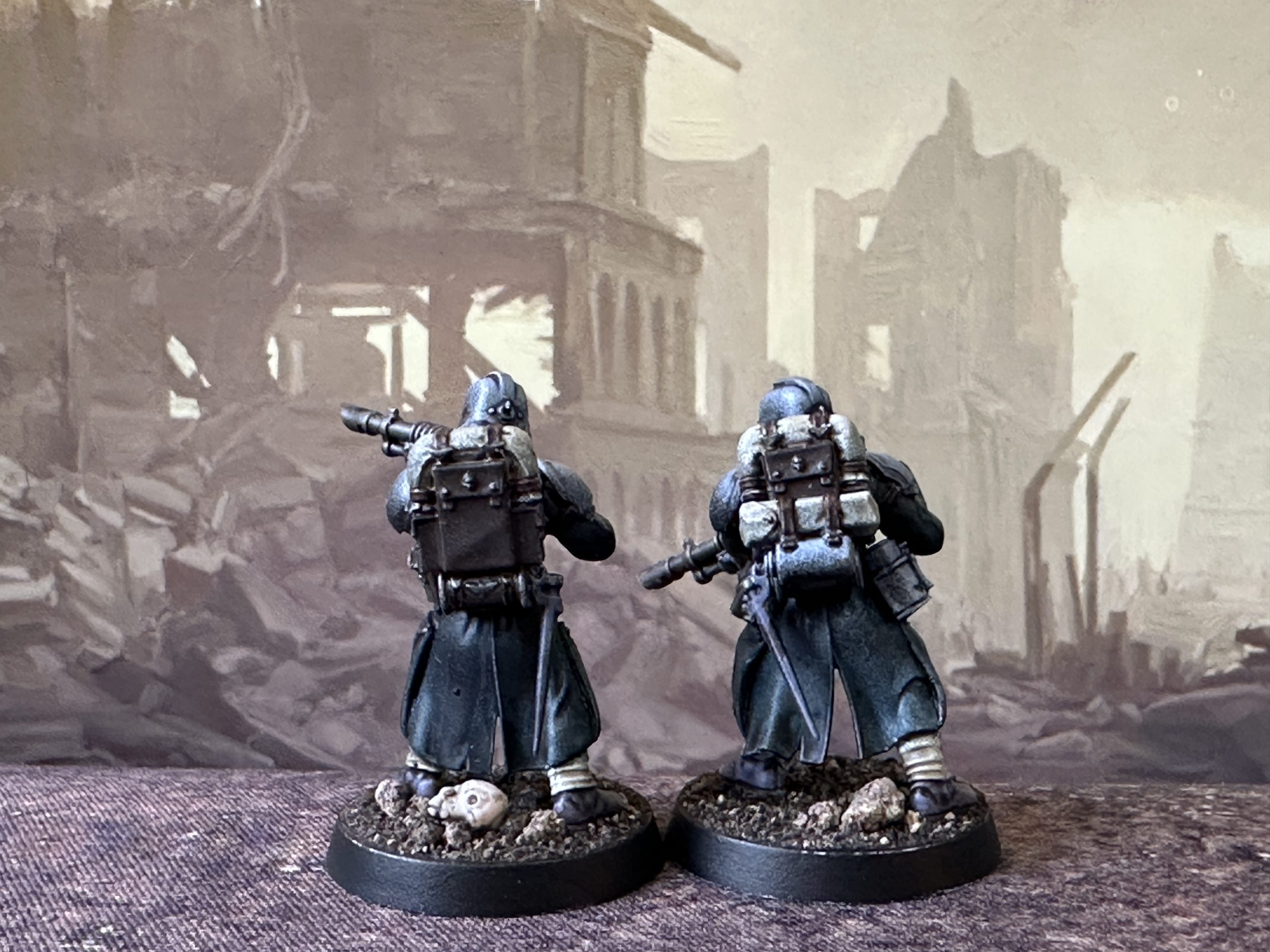
With those two chosen I go straight to testing on the models. Rather than do the whole squad I do one or two test models. In this case I’ve chosen two, both with rifles and different backpacks for a broader range of bits to paint.
Happy with the first two colours I moved on to the next biggest surface area item – the armour. I decided this would be the blue/grey that matches it to the rest of the Bauhaus force. I used Runic Grey Speedpaint and laid it on heavily as these bits are some of the brightest on the model and the Runic Grey can be a bit weak in colour tone if left as a thin coat. This was allowed to dry as the colour strengthens during drying so I can’t get a proper look at where we are with the colours until it is dry. I really like that the unevenness of the rattle can undercoat shows through this on helment and shoulder guards. The speckley effect from overlaying the white zenith would usually not be seen as even Speedpaint has enough pigment to cover it up but this one is very translucent.
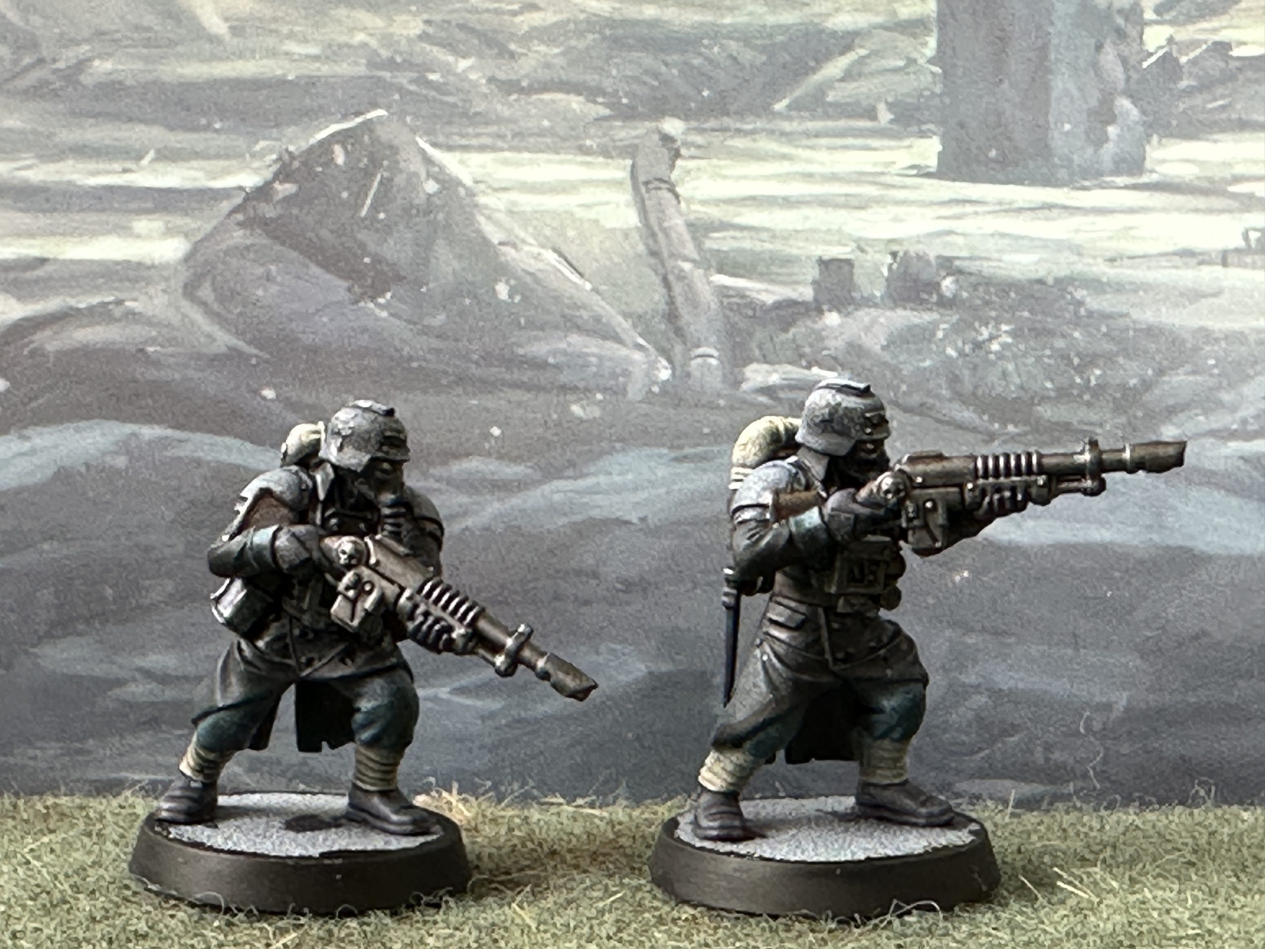
Still happy the next stage is to start working on the backpacks. I painted one using German Camoflage Brown and one with Satchel Brown Speedpaint. No real difference here so we’ll go with the Speedpaint. Then on to the khaki puttees and blanket roll using Howling Sand. The blanket rolls on the Bauhaus are sky blue but I felt this would unbalance the model as too much more blue will clash with the green and grey tones we have used already and wash out the very subtle blue tint we’ve got on the armour.
I moved on to the metal bits, now the largest area of the model with no paint on. Dark Star Steel was used and a Nuln Oil wash applied. I may swap over to a Speedpaint but I was worried the highlights you get from Broadsword Silver would be too bright. Dark Wood on the rifle stock.
Finally we have the leather/rubber areas, gloves, boots, bayonet sheath, facemask and rebreather tube. Black would be the obvious choice here but there were plenty of reasons to pick something else for this scheme. I had in mind that the model would be based with Krautcover’s Tale of Grimdark which is a very dark brown. However, black boots would be lost against this and the miniature would look like it was disappearing into the base. For it to look like it is standing on the ground, not in it, I needed a lighter colour on the boots. I went for a dark grey/blue here, Occultist Cloak , trying to strike a midpoint between the lighter armour and the darker elements around the model.
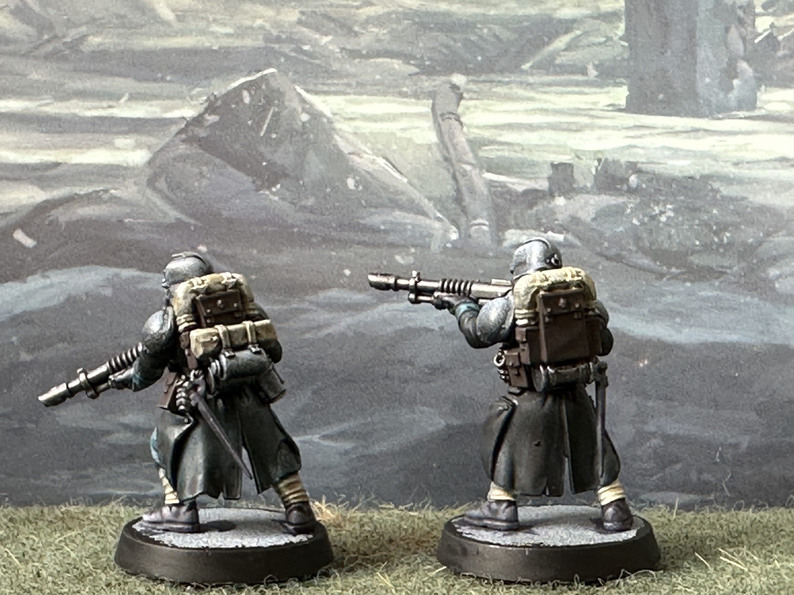
I use photos to review the scheme. Looking at a photo is not the same as looking at the model in your hand. For some reason our brains process these images differently and the difference allows the careful observer a chance to spot errors or inconsistencies. As a final step I rimmed the bases in black. This cuts down the amount of white showing and gives a better basis for evaluating the overall blend of tones.
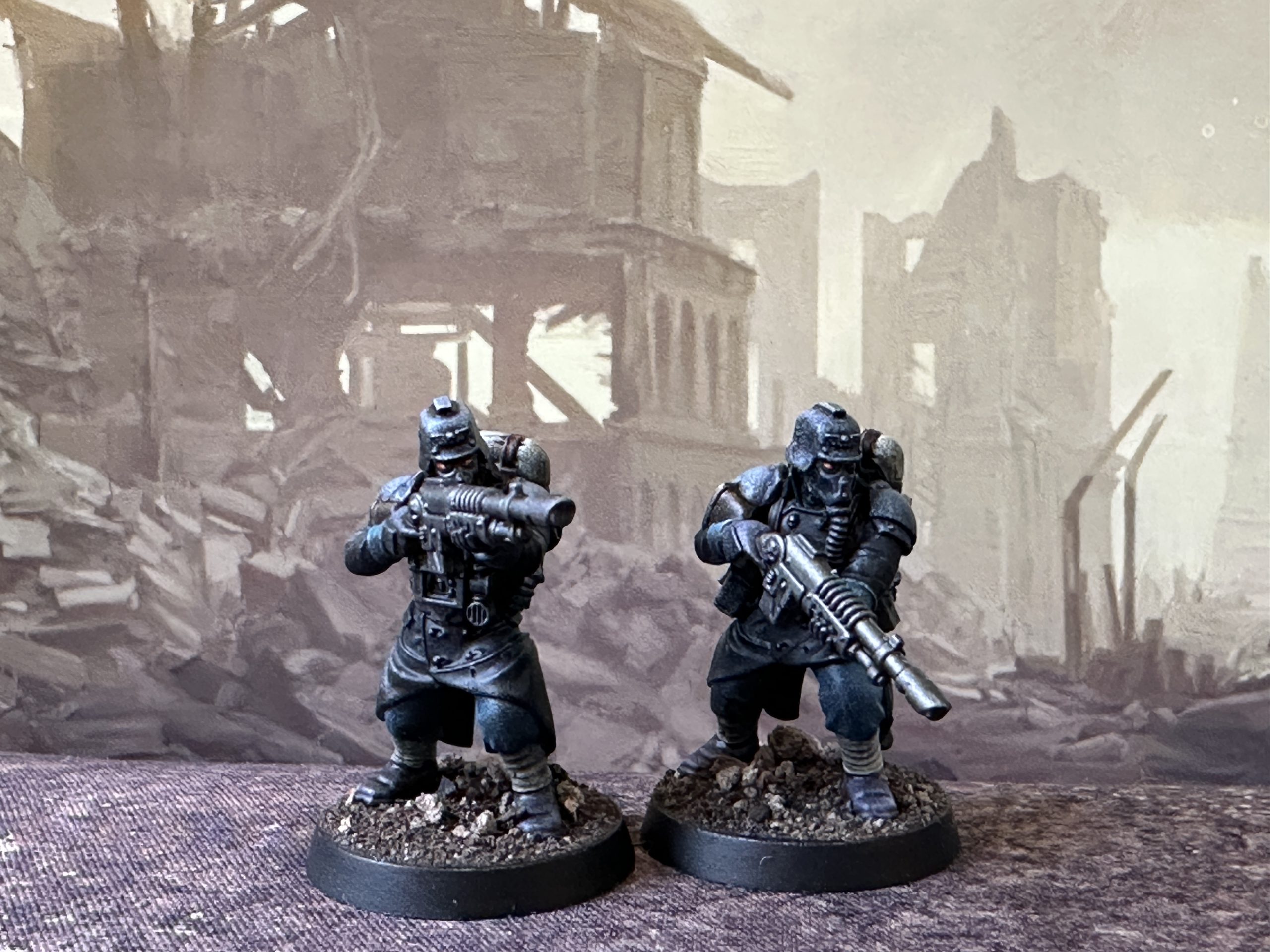
This is where we have got to:
I’m broadly happy so now on to final detailing. Mostly just adding straps using Satchel Brown and metal details like buttons, belt aquila, skull detail on the rifle and the hanging loop on the back of the helmet using Dark Star Blue Steel. Finally lenses were added, initially with an orange Sppedpaint over white but this wasn’t showing well enough so I went over it with Orange Fluro which gives a very tiny pop from the opposite side of the colour wheel to the dark teal we have as the main colour.
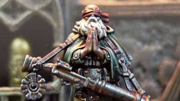
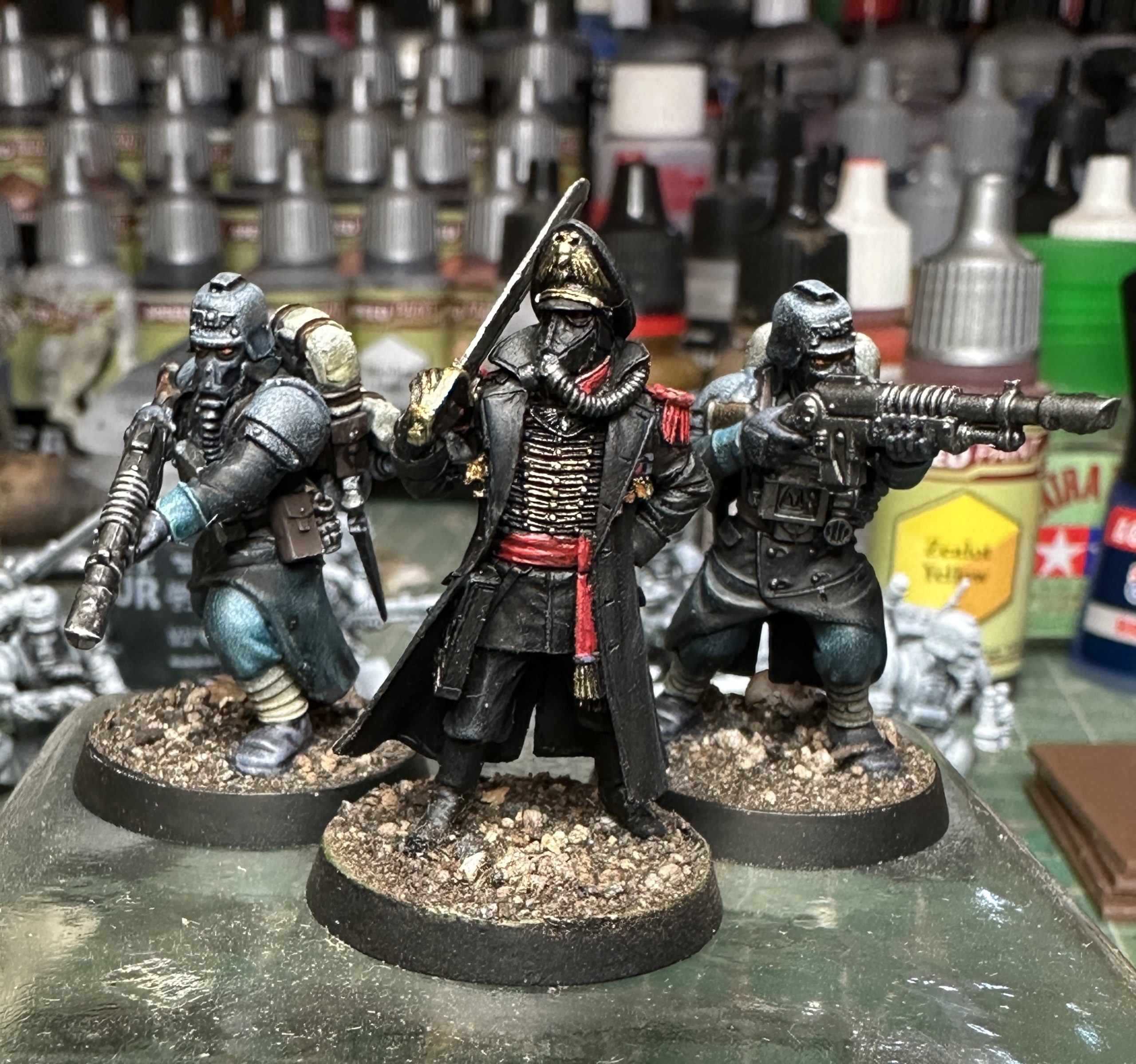
I decided to touch up the Forgeworld Commissar I have. I redid the metal in my current favoured approach and gave the black a subtle highlight with another paint from the Blanche sets – The Darkness, which is a very dark blue/grey colour and my new favourite for highlighting black.
Basing added and this is what we have:
A final squirt of Matt varnish in the morning will help even out the colour contrast by taking the bit of shine off the Speedpaints. A quick final check and these should be finished 🙂
Here are all of the paints. Mostly as a reminder for me if I need to come back to this paint scheme again at some point.
Getting started
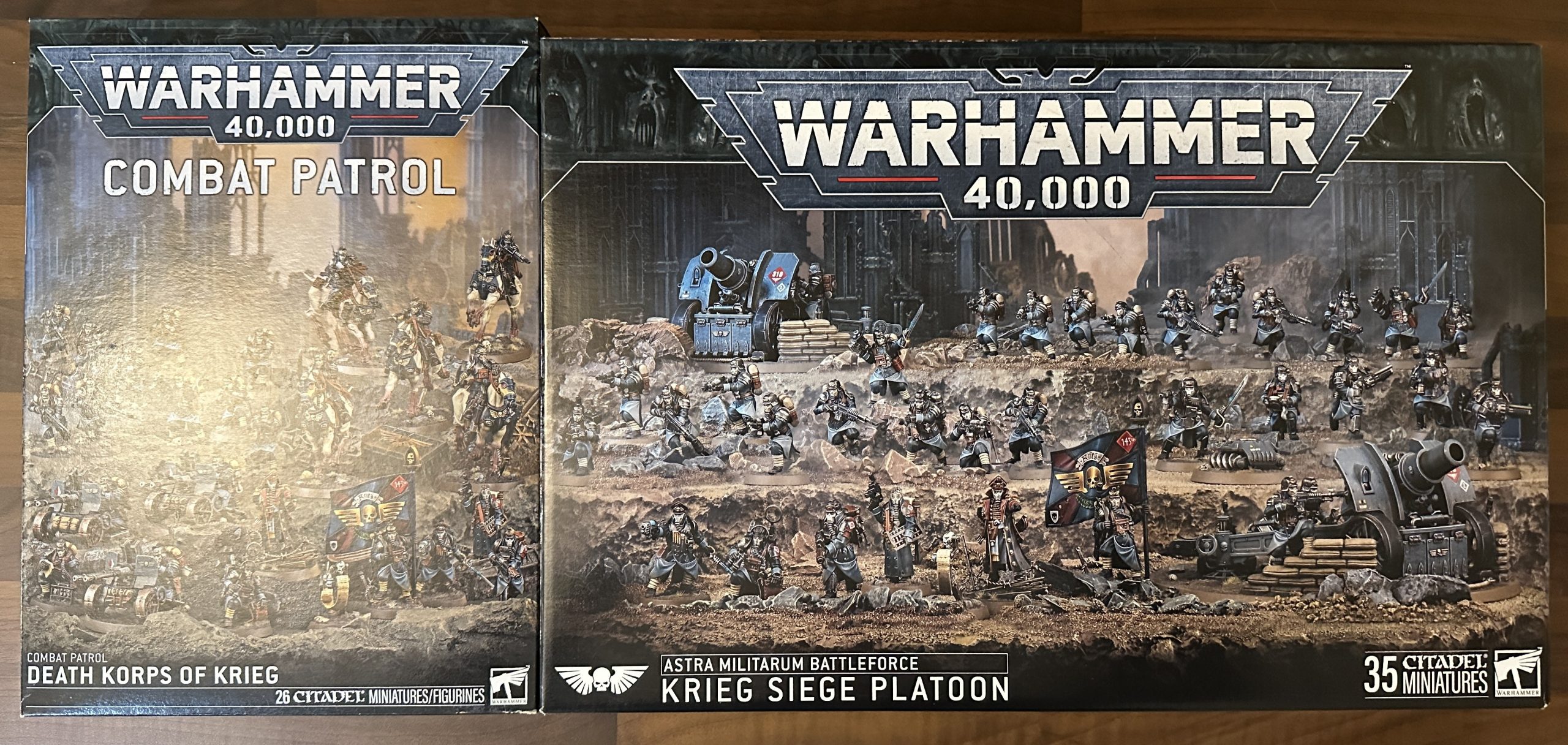
Christmas and birthday have brought a lovely pair of Krieg boxes. I love the design of these, so much better than Cadians. They will fit in well with the rest of my Imperial Guard (Astra whatsay?!?) who are based around a collection of Bauhaus Warzone Second Edition models with some Mordian Iron Guard thrown in. A few were finished a couple of years ago in the Spring Clean Challenge. The rest are still in The Pile.
Specifically in these boxes you get:
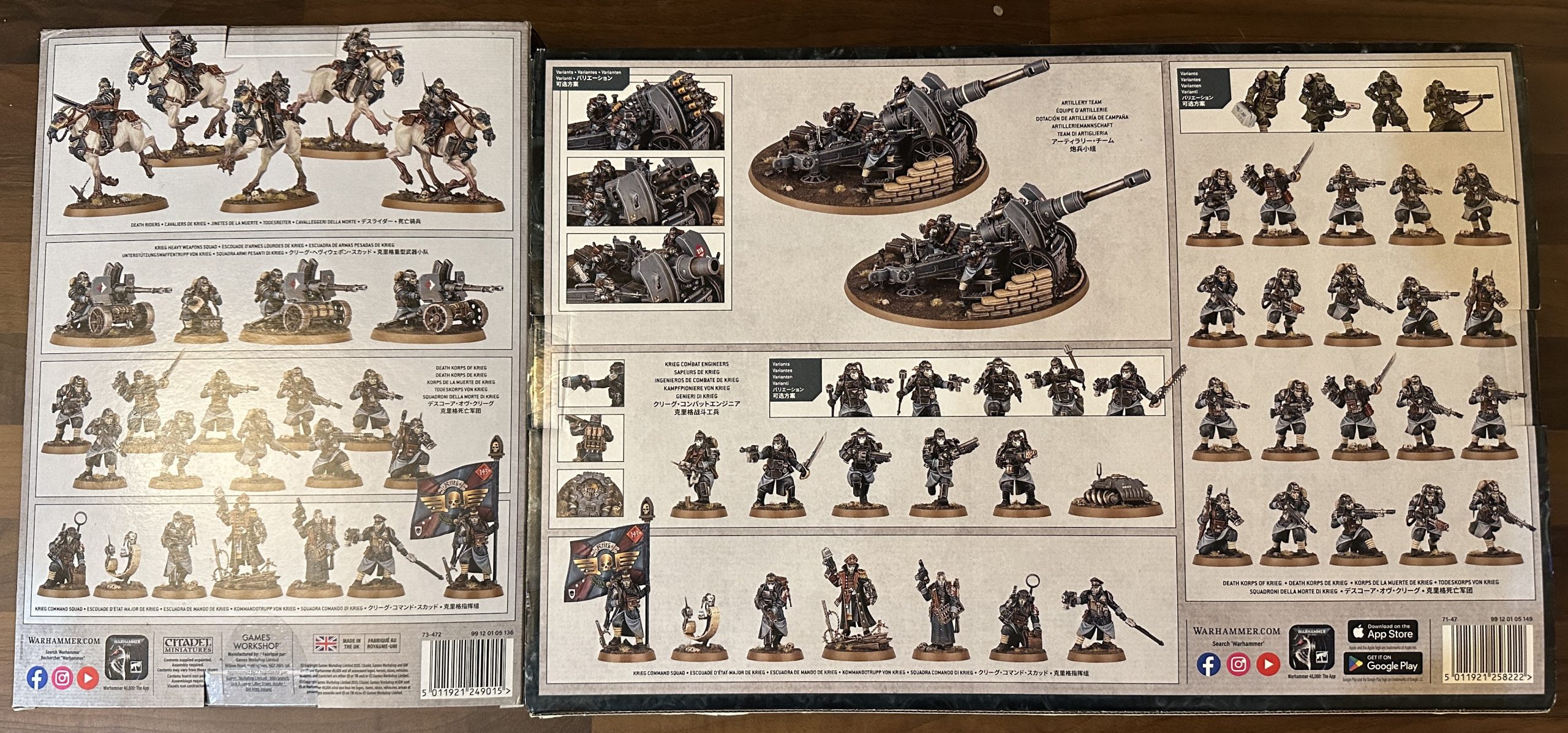
So thats; 3x 10 man troop squads, 1x heavy engineer squad, 2x command squads, 5x cavalry, a squad of 3 heavy weapons and 2 artillery pieces.
In addition I have the mounted character model and a Forgeworld Commissar on foot (not pictured).