

![NO Weekender Or Cult Of Games XLBS This Weekend [Updated]](https://images.beastsofwar.com/2026/03/No_Weekender_and_XLBS_this_Weekend-225-127.jpg)


Terrain Challenge: Summoning Portal

Recommendations: 151
About the Project
The End Is Nigh Terrain challenge - Summoning Portal.
Related Game: Frostgrave
Related Genre: Fantasy
This Project is Completed
Part 1 - Half a Plan...
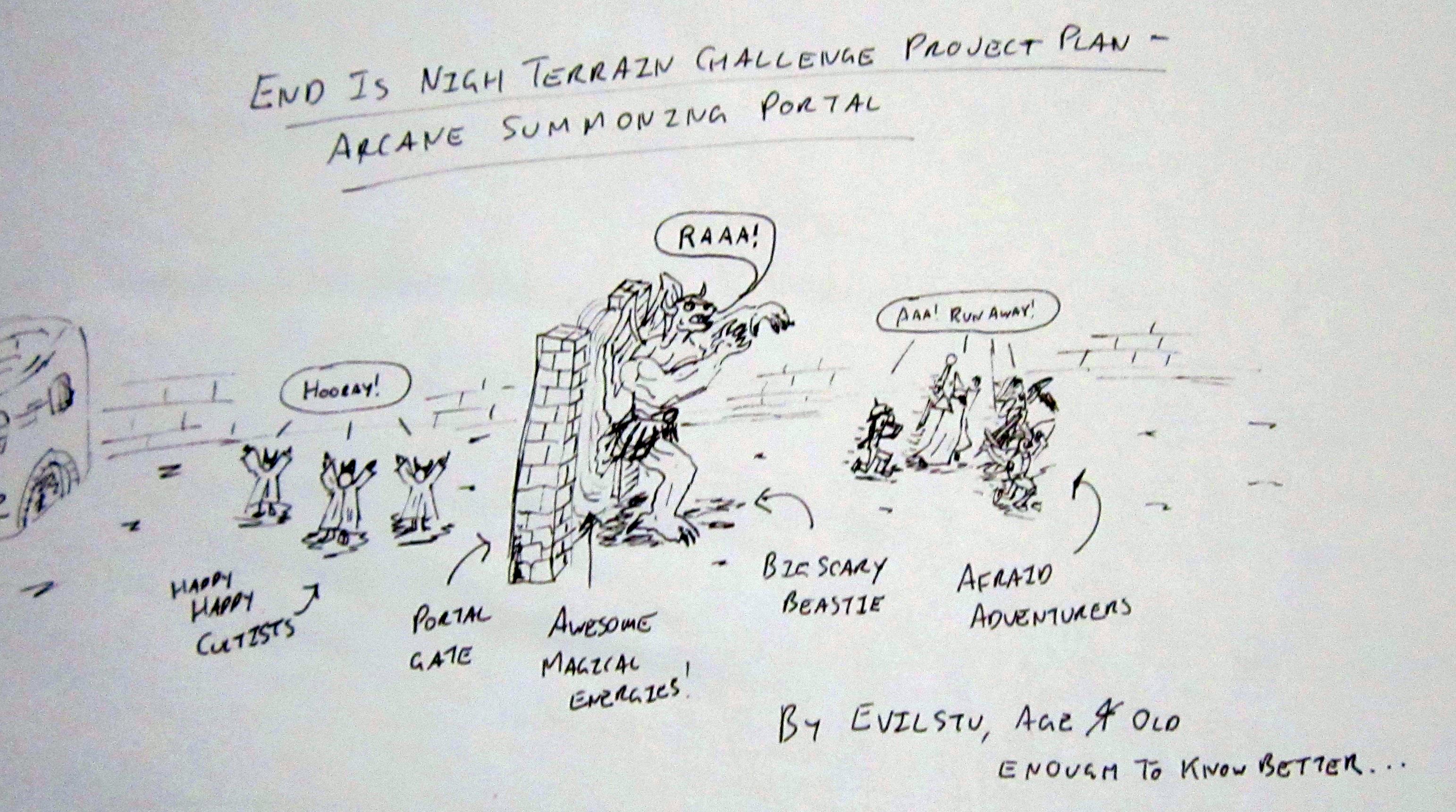 Sorry, couldn't find my crayons...
Due to an unanticipated gap in my schedule opening up, turns out I will have a small window to put something together for the current terrain challenge. Which works out well as I have had an idea floating about on my to do list for a year or so which fits the theme of the challenge. A summoning portal. or more specifically, two near-identical summoning portals, one with a monster partway through the portal, as though pushing itself through into the reality of the gaming world.
Please do excuse the terrible cartoon above, Just threw it together as a placeholder for the project until such time as I had a completed shot to replace it with. I promise I am taking the project semi-seriously 😛
Due to time constraints I will be cutting more than a few corners, and working on several elements concurrently, so apologies if some of the posts appear out of sync… Broadly, elements of the project will consist of the following:
- Two (as near to as I can manage) identical frames for the summoning portal. Essentially a base and a pair of upright columns, with whatever detail added that available time permits;
- The portal itself – using 2mm A6 size clear perspex for rigidity (I will need to affix chopped down pieces of a mini to it so it will need to be strong enough to support some weight);
- A big gribbly monster to be summoned through the portal. One to be chopped up and glued halfway through the model mid-summoning, one fully painted for once they are loose on the tabletop; and
- A bunch of cultists to summon the gribbly through the portal.
So, let’s see how far along I can get 🙂
Part 2 - The Portal Frame
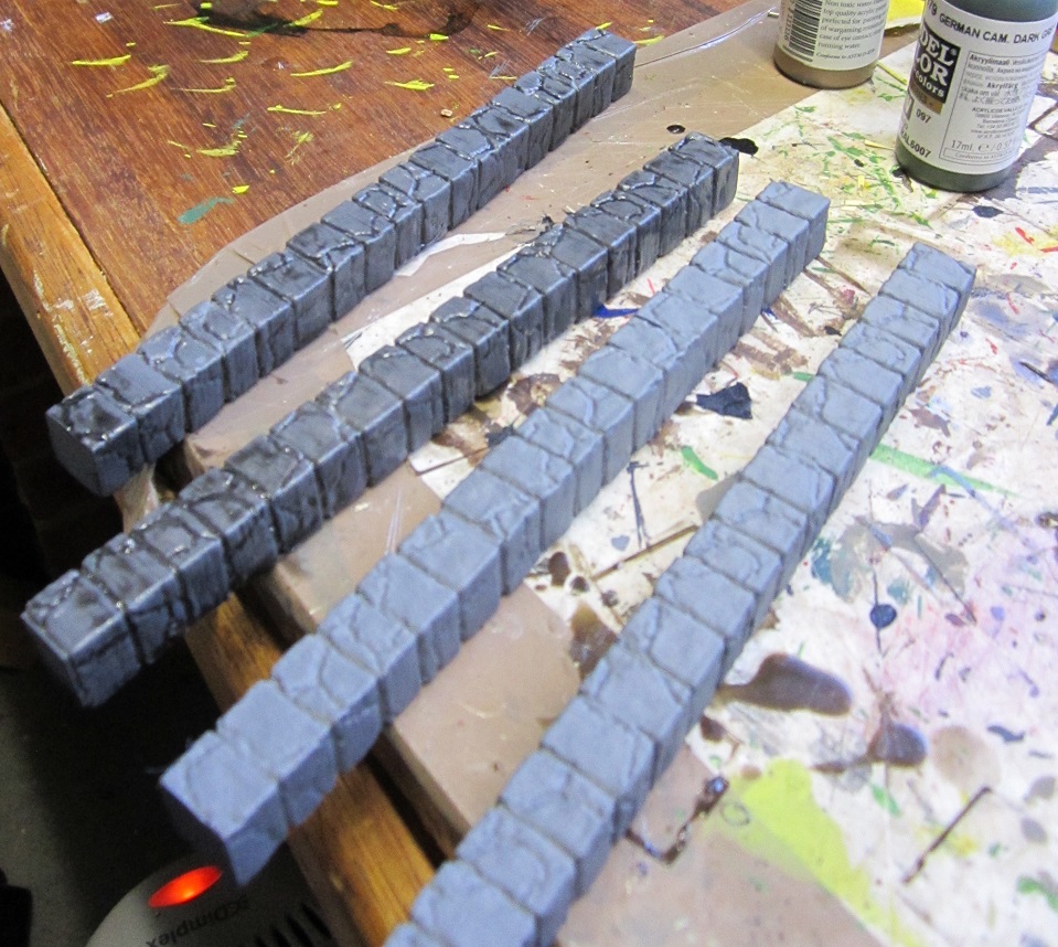
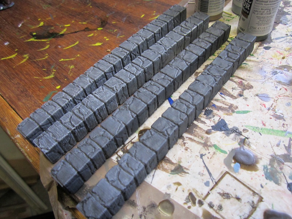
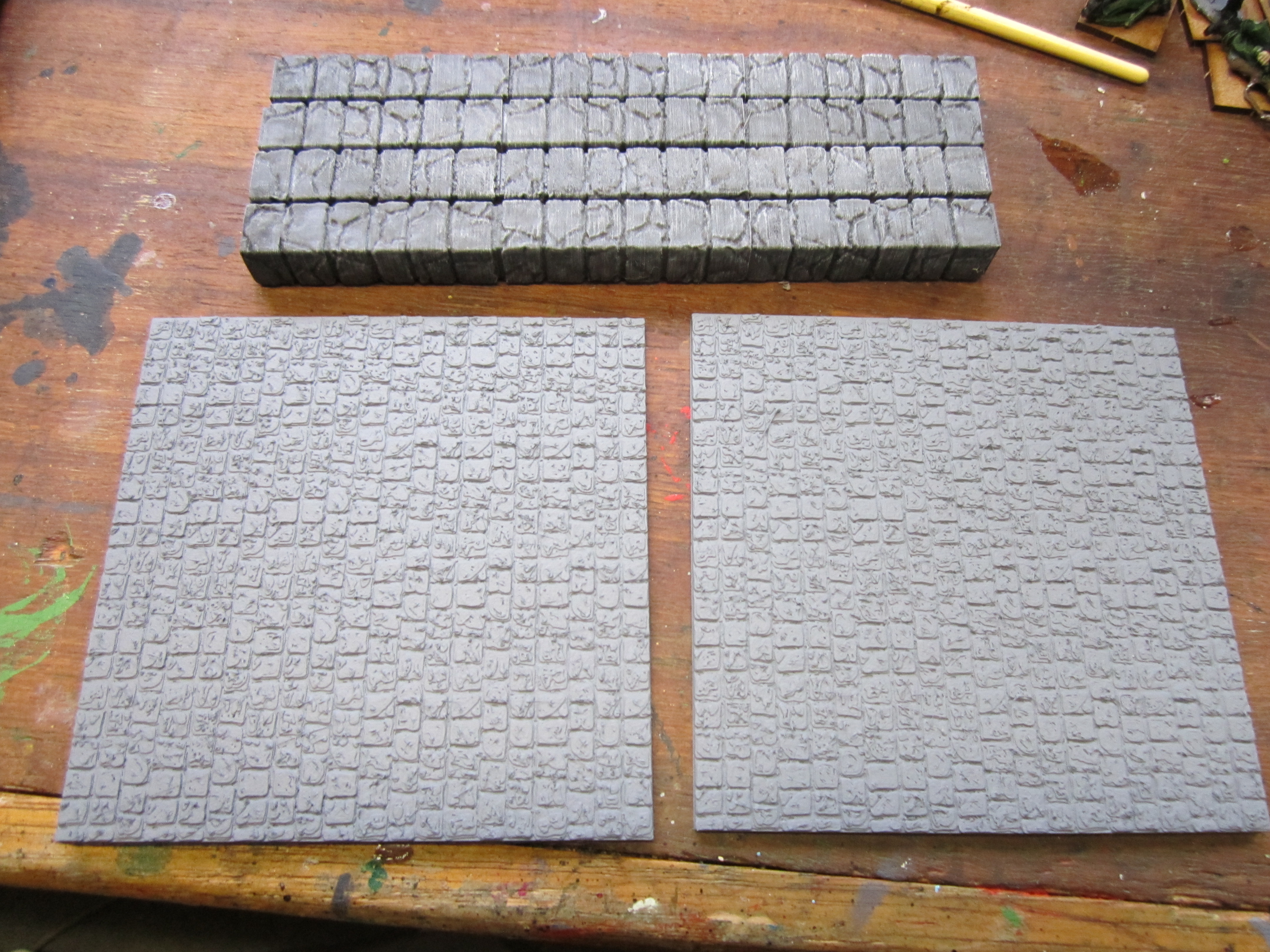
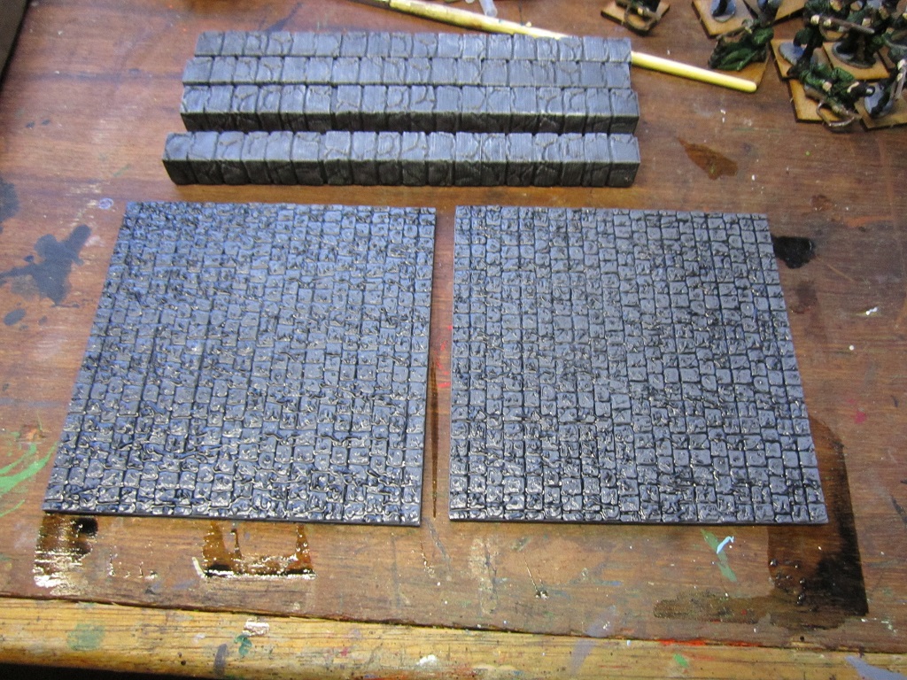
Had considered and eliminated several possibilities for how to construct the frame that would house the summoning portal. The main factors guiding consideration were that the portal frames had to appear close to identical, and the time constraints I would have for the project. In the end while I would have preferred to scratch build something, I opted to 3D print instead. This would mean the parts would be identical (at least until I started work on them) and while they were printing I would have capacity to get on with other elements of the project. So away I went. Printed 2 jobs of six column parts, superglued the sections together in groups of three to leave me with two pairs of identical columns. These were then primed with Army Painter Uniform grey, given a wash with a mix of airbrush flow improver and Army painter Dark Tone Ink, and when dry, given a drybrush of Army Painter Productname (Skull?…) White.
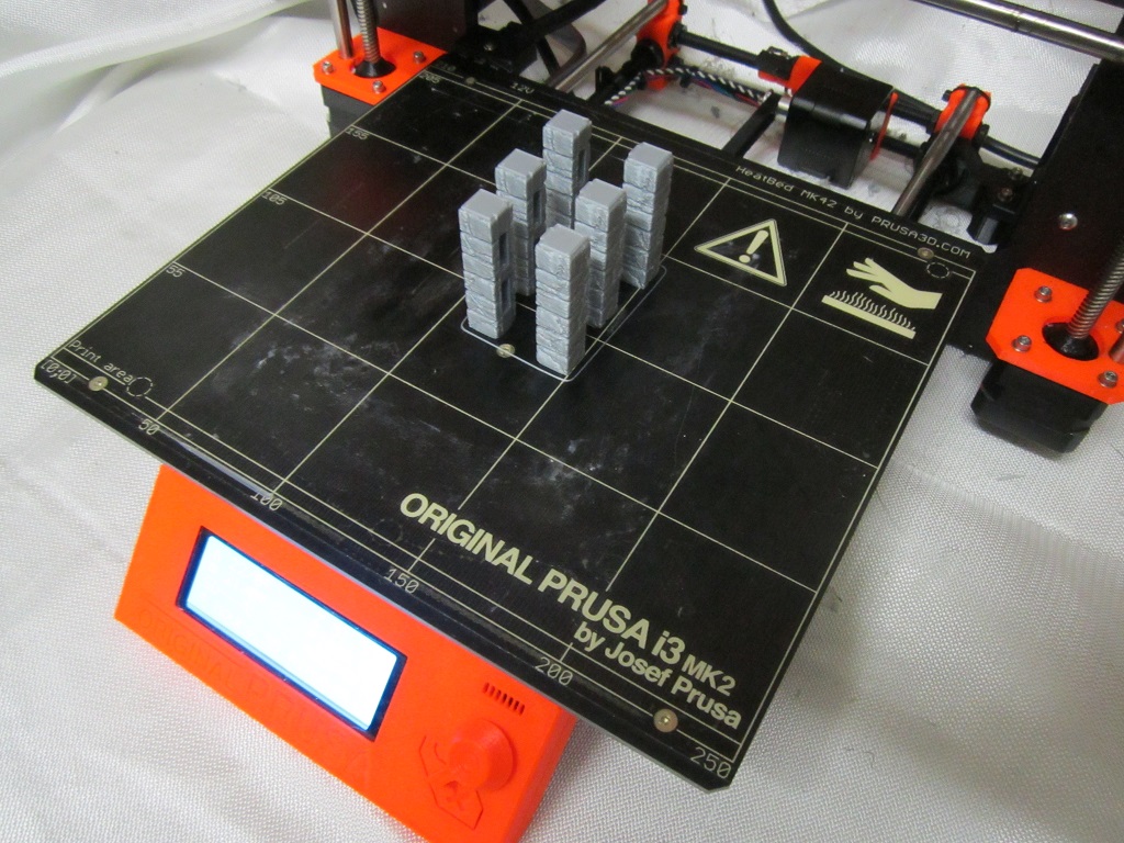

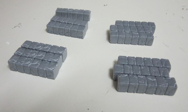
For the base I once again went for the 3D printer option. Again, printed 2 identical bases (cobblestone road sections in this case), primed in AP Uniform Grey and gabe a wash of flow improver and AP dark tone ink. Once this is dry I’ll give it an overbrush in grey and a highlight in white, and maybe stipple on some brown and add a tuft or 2 of foliage to break things up a little.
Part 3 - Testing for the Portal
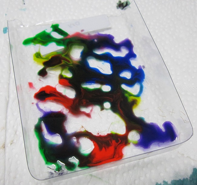
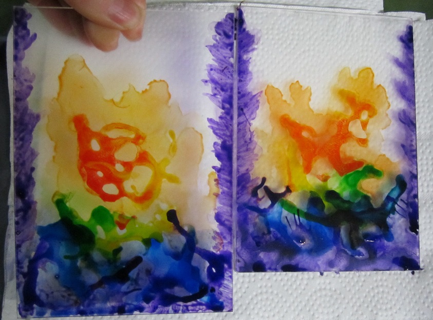
For the portal I wanted to use ink washes on the clear perspex but wasn’t really sure how it would end up looking. As I didn’t have any spares of the perspex and was unsure how well it would clean if I needed to redo elements I decided to try a few test pieces on plastic packaging – casings for grass tufts in this instance.
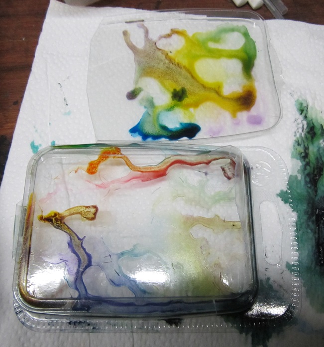
The example at the top of the above photo was the result of mixing Army painter inks with flow improver and brushing on. The one at the bottom of the above pic was done by brushing flow improver in a thin coat all over the plastic sheet, then dropping on pure AP inks and tipping the plastic to allow them to move and swirl about a little. Regrettably most of the colour leaked out of the plastic package as it was drying so most of the effect was lost. While the effect was interesting, it was a little too subtle for what I was aiming for. Would keep this technique up my sleeve though and incorporate it into the finished product later on.
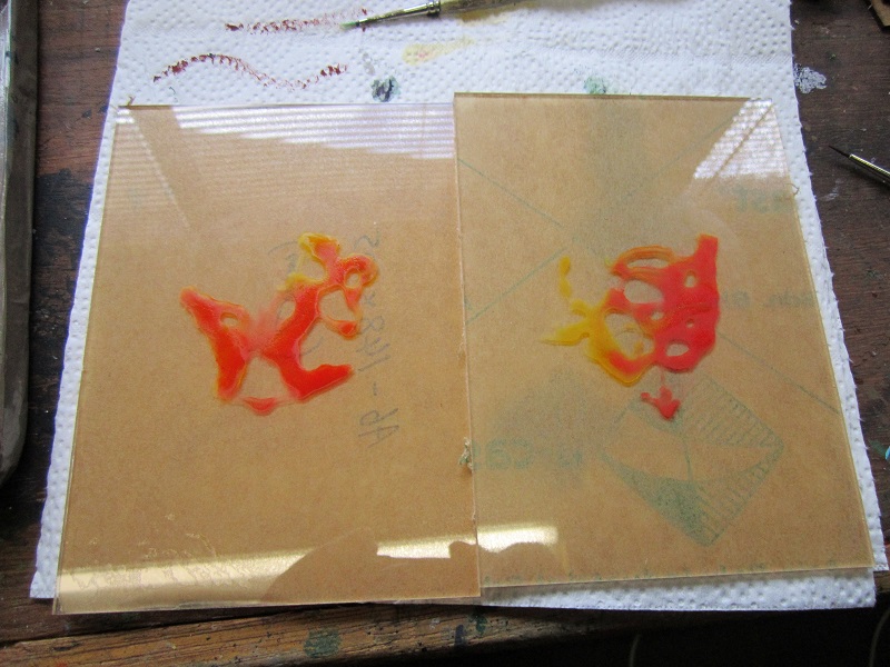
With the first couple of tests completed I could see that I would need something with more pigment. For test 3 I brushed on a much thinner backing of flow improver and switched to Vallejo inks, which seem to have much more pigment. I probably went a bit far with the number of drops of ink on the third test…
Once the plastic was loaded up, tilted it again to get the ink to move around and swirl and mix a little.
Left it to dry overnight and in the morning found this was the result (when viewed through the other side of the plastic packaging):

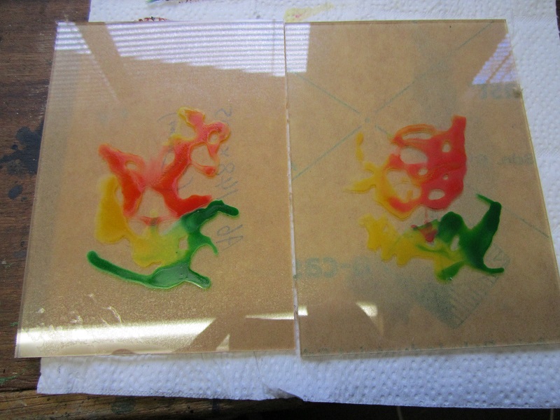
So closer to what I was aiming for. I did still want something a little more controlled (although this would work great for fires of Tzeentch or similar) but now had a much better idea for how to plan for the ‘production’ portal pieces.
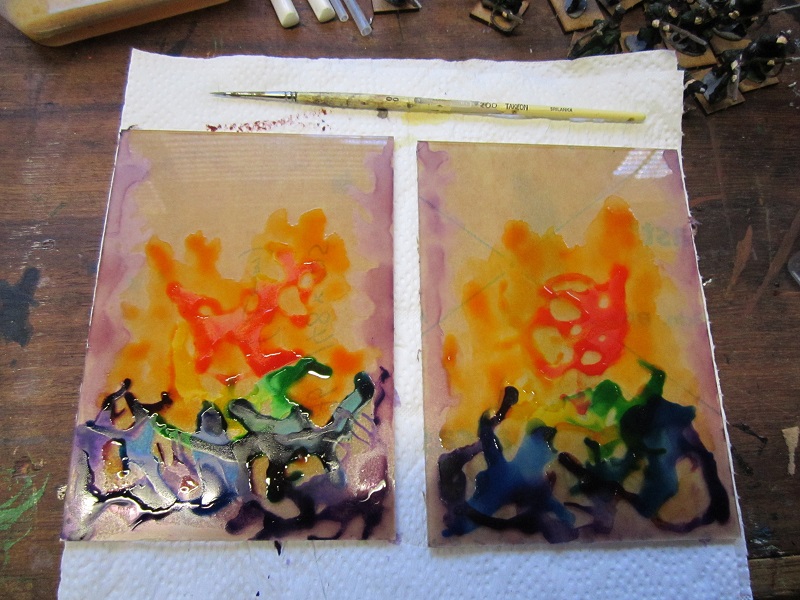
Part 4 - Adding Colour to the Portal
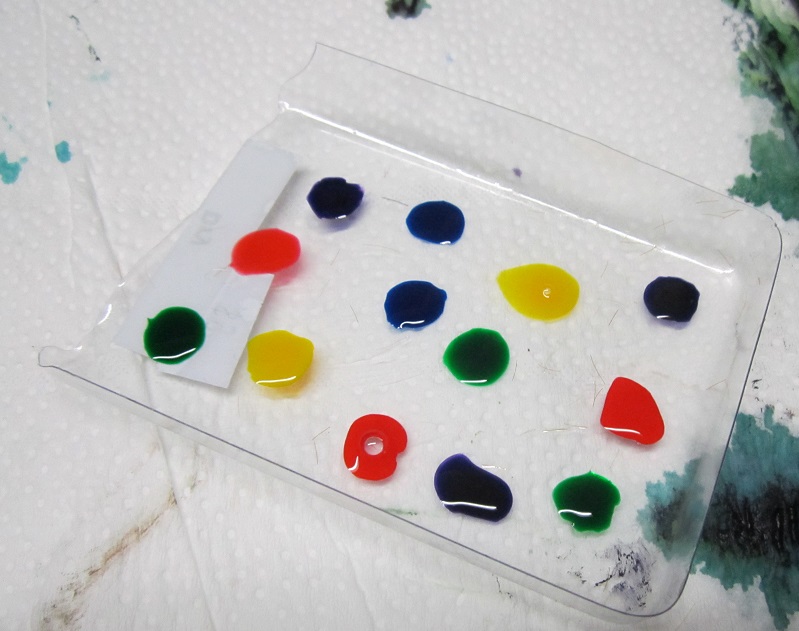
With a little practice under my belt with regard to adding ink washes directly to the plastic sheeting I decided to get stuck in to the perspex sheets for the portal itself. I began by adding a thin coating of flow improver to the centre of each sheet of perspex and then dropping of a couple of drops of yellow and red inks and moving them about a little. Idea was to get the colours to approximately line up in the same areas but with different patterns, as though the arcane energies were swirling around a little. Once this was dry I noticed that the flow improver covered areas were clearly visible where the ink had not travelled, so resolved not to use flow improver for the remaining steps.
For the next part I added drops of yellow and green to approximately similar locations on both sheets and repeated the process. The absence of flow improver meant that the inks did not mix as well, leaving more defined areas of colour.
Following this was green and blue (you can probably see what’s going on here…). Again, the absence of flow improver left things with clear lines of delineation rather than blended areas. It probably didn’t help that I was letting each colouring dry completely before adding the next layer, but I was seeking to avoid all the colours running into one mess.

Final one was straight purple around the bottom of the perspex to try and fill in the area near the base of the portal frame.

From here I mixed some purple ink with flow improver and brushed it along what would be the vertical edges of each sheet of perspex. This is where the support columns would link up to the perspex so I wanted it to look like there was some magical energy flickering off of them.
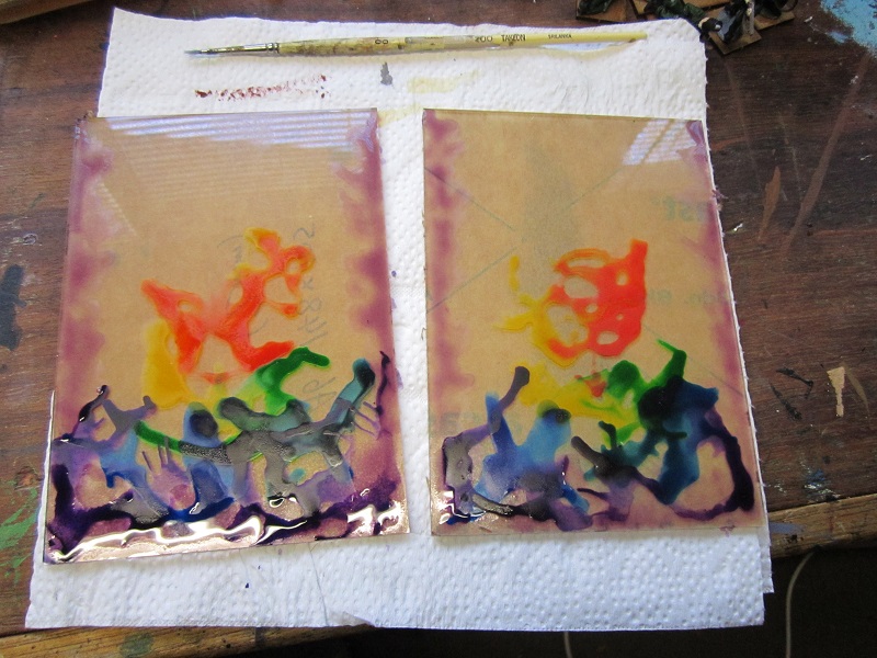
From here mixed some flow improver with red and yellow inks and brushed over the centre of the model to try and provide more coverage and hide the coat of flow improver from the initial colouring.
Part 5 - Adding Colour to the Portal - Learning Points
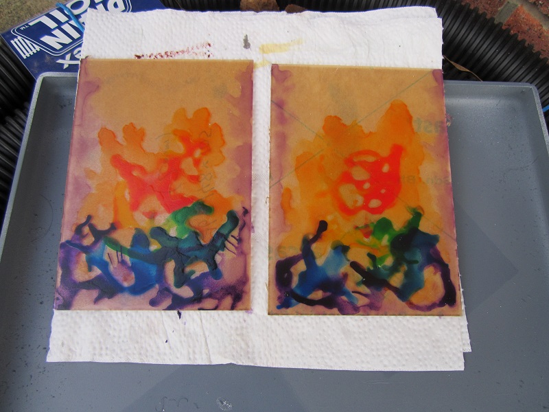
The above is a picture of the portal after a coat of gloss varnish to protect the back. The gloss varnish was going to be a necessity as the perspex was not really going to bond with the ink particularly well and I suspect it would otherwise have rubbed off quite easily. The varnish left slight frosting, meaning I needn’t have been so concerned with the discolouration form the flow improver initially.
Will put up a shot once I remove the protective tape form the ‘working’ side – from the test pieces I do expect it to look quite different to the back (underlying/earlier layers should be more visible) so looking forward to the surprinse of the end result.
Learning points:
- The perspex was never going to stay completely clear – I needn’t have worried about putting down a base of flow improver.
- It may have been better to mix small quantities of flow improver with ink on a palette and dab them on with a brush rather than using pure ink. Result would have been more subtle.
- Colour gradient could have been enhanced form additional steps between colours – ie, red, then a red/yellow mix, then yellow etc.
- Going with a restricted palette may have enhanced the end effect – ie, reds, oranges and yellows for an infernal type portal, reds and purples for something interdimensional, greens and blues for drawing on the power of nature or the elements etc.
- Something I had not considered until I started to do this write up was just covering the whole sheet of perspex with a mix of one colour of ink with silver pigment mixed through to give a shimmering and reflective effect. Hrm… I may need to start ordering some more perspex and give some of these ideas a go…
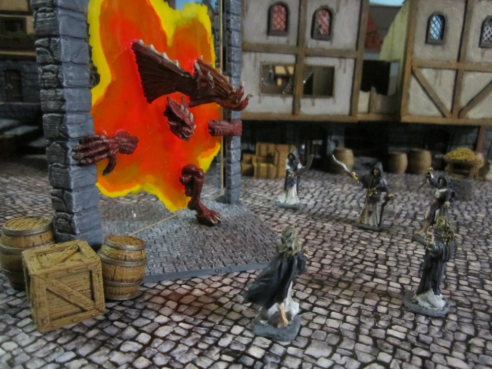
Part 6 - Finished Portal and a Redo...
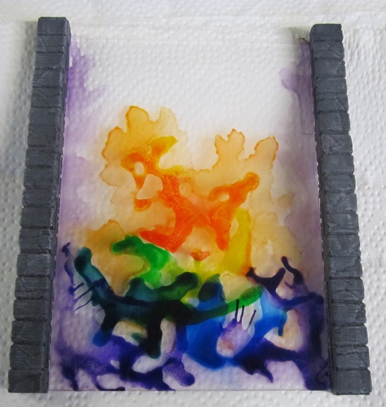
With everything now properly dried I removed the tape backing and got to have a look at the underside of the portals.
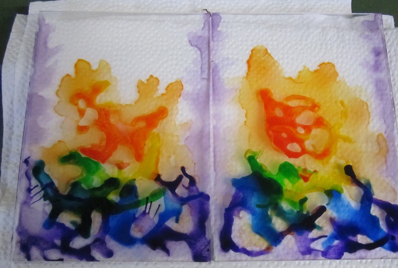
Placed one of the portals next to two of the uprights. Scale looked good, flames to the side were in the right place but the overall effect was not what I was looking for for this project. So have ordered some more sheets of perspex and will make a few extra portals. I’m sure they will come in handy for random game scenarios soewhere down the line.
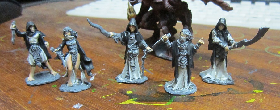
Part 7 - Minis
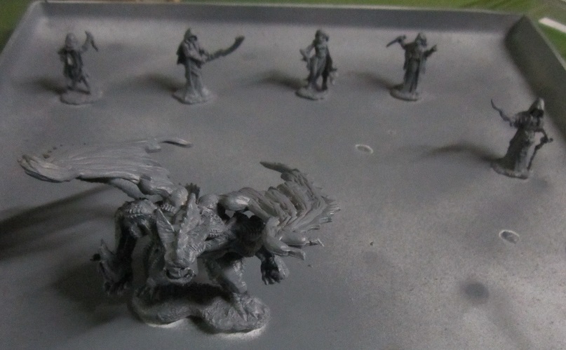

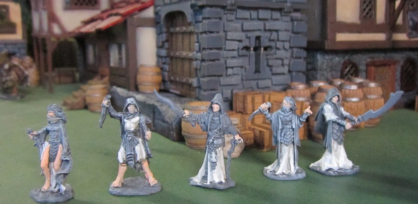
Minis for this project would be Reaper Bones for three important reasons:
- I had them on hand
- The demon had to be light enough to glue to the portal without unbalancing it significantly (My Keeper of Secrets lives another day….)
- It had to be cost effective enough for me to chop up a second version of the model for stepping through the portal. The alternative is me using green stuff to try and sculpt, and I’m no way near practiced enough at this stage to pull such a feat off.
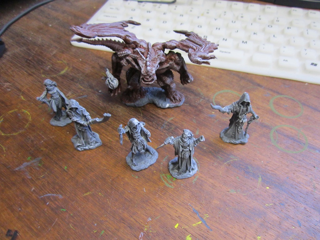
All the mins got primed in Army painter Uniform Grey. The demon got a basecoat of Vallejo Mahogany (because I like the colour) and a white dry brush on the raised surface areas to help me with highlighting when I work out a colour scheme to use. Am thinking of starting with the artwork for the Balor from the D&D 3.5 Monster Manual and working from there as far as inspiration goes.
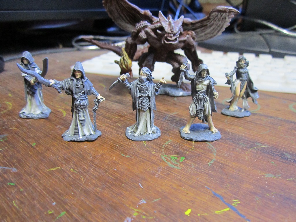
For the 5 cultists I gave everyone a black wash to help me identify details, and a white dry brush for helping with highlighting. Have opted to go for a black, white and purple scheme on the cultists. Started off with the white, and using the fantastic Vallejo ‘Black and White’ paint set took some liberties with the suggested methodology and proceeded as follows:
- Basecoat in Deck Tan
- Shaded with German Cam Beige
- Second shade with a 2:1 mix of German Cam beige and Neutral Grey
- First highlight with Ivory
- Second highlight with a 1:1 mix of Ivory and White.
- At that point the transition still looked a little stark, so I glazed all the white areas with a very thinned down coat of Ivory.
Will probably leave well enough alone at this stage and see how it looks with the other colours on. If all else fails I still have recourse to dipping them 😉
And yeah, somewhere along the lines the cultists got some basic skintone applied to their flesh and the demon picked up some ink washes on his summoned fireball..
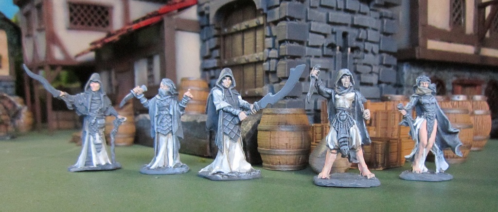
Part 8 - Minor Progress
Minor progress. Have printed extra columns for when the new perspex sheets arrive. Currently working on printing the additional bases needed. Also got the black basecoat on the cultists – a 1:1 mix of Vallejo Dark Grey and Black. Finally since I had nothing to lose I added further ink to the portals to see if I could improve the look a little – will keep at it and see where I land…