
![Perfect Call Of Duty-Style Miniatures? Wargames Atlantic’s Operators Review [7 Days Early Access]](https://images.beastsofwar.com/2026/02/unboxing-wargames-atlantic-operators-coverimage-225-127.jpg)


Crazyredcoat’s Crazy Compendium of Collected Creativity

Recommendations: 1479
About the Project
Come one, come all! See the most vaguely inconsistent extravaganza that no one really thinks about but if they did they'd be mildly misanthropic about it! Slow off the heels of my last adventure comes a tale so confusing that it's not even remotely tail-like. Here I will avail you all of the many experiments and miniatures I manage to paint over the coming times, or at least some of them. Time is funny like that... Either way, stay tuned for various projects that don't fit into any one larger project like my last foray into this sort of thing. Oh, and watch out for Spiny Norman.
Related Game: Warhammer Age of Sigmar
Related Genre: General
Related Contest: Spring Clean Hobby Challenge (Old)
This Project is Completed
"He weaves in and out of my vision – I see one who is many, I see they who will test the Unforgiven. In one hand he carries hope, in the other despair. I speak of Cypher. He is coming closer all the time."
Realistically, Cypher is now done. He’s not on a base, yet, but I’m thinking of adding him to a 40mm base to match my other Marine characters rather than the 32mm he came on, but the main painting is done! I was most sruprised just how ‘finished’ he looked the moment I put the basecoat for the robes on, but that’s just one of those things all minis have. Carrying on from where we left off, let’s get on with it!
(The lighting is also a little better this time round…though the pictures are still in portrait…I promise the final with base attached will be in landscape…)
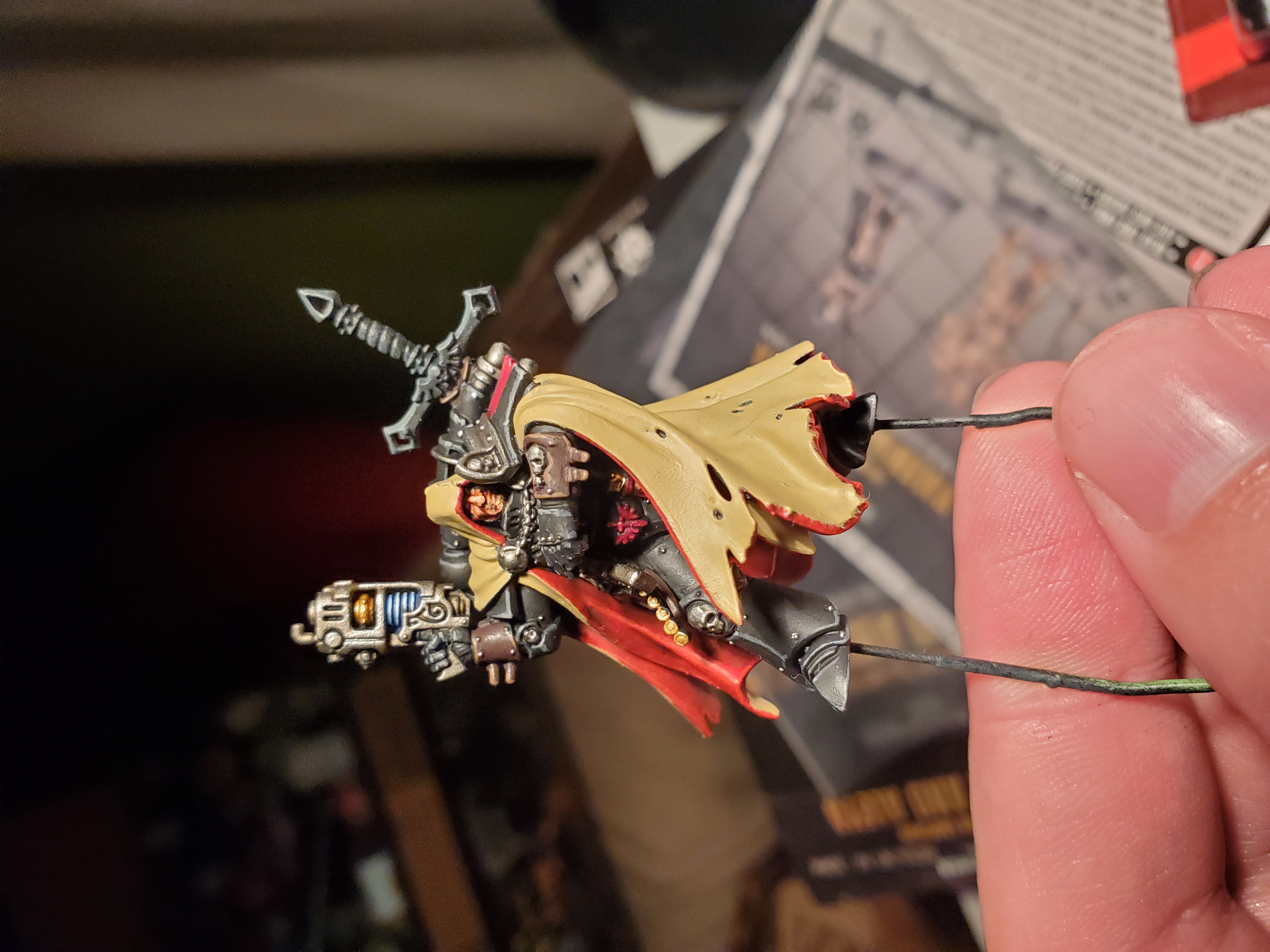


The basecoat here was Zandri Dust, followed by a shade of Agrax Earthshade. Rather than ‘brighten up’ with the Zandri Dust, I instead went for layers of thinned Ushabti Bone to give it a nice bright finish to contrast better to the darker armour. This did take time, and I was not happy with how it looked for the first few layers of paint, but nice thin coats allows a few mistakes to be made that can be easily tidied up. You may notice a blob of this colour on the red of the lining that I could tidy up with a small coat of Mephiston Red, for example. We all make mistakes, after all, and the robes on this chap are quite difficult to work around (hence the improvised holder and no attached base). After the layering, I highlighted up with some Screaming Skull along the edges and tears in the fabric. If you wanted to you could push to Pallid Wych Flesh on the real sharp corners for that final spark, but I decided that I liked the look I had. After that I added some thinned Dryad Bark to the few stiches holding part of the robes together. I used thinned stuff here to allow some of the base to show through so I wouldn’t have to worry about highlighting, but you could highlight with a touch of Gorthor Brown.
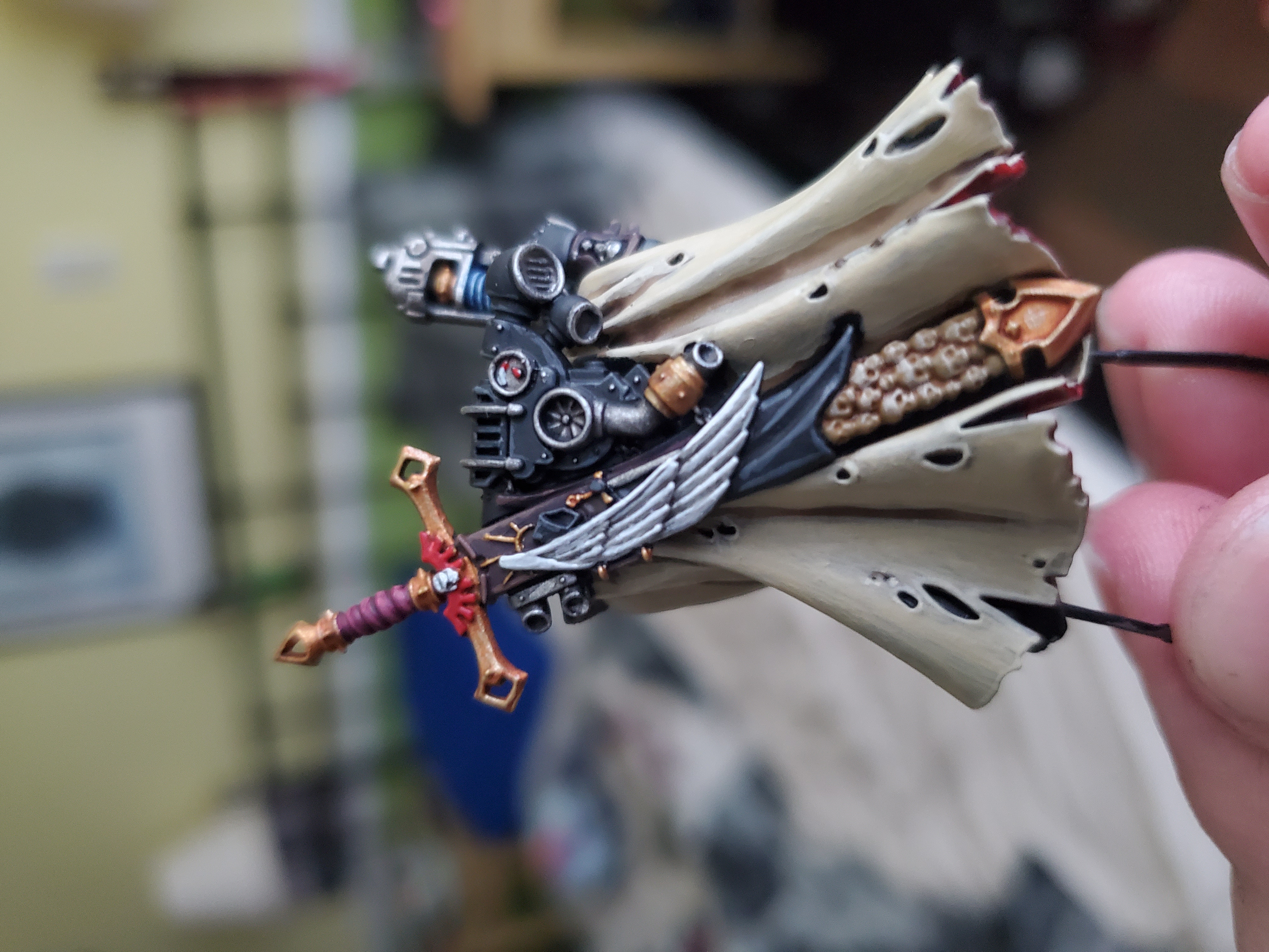 And then the sword on his back...
I didn’t do a step-by-step for the sword, simply because the details are small and it would be painful to watch each stripe be painted… The big problem I had here was the skulls, not because of the painting, but because of colour. My typical colours for skulls very closely match what I did for the robes, and I needed a bit of contrast, so I did two things. First I changed the shade I used (Serephim Sepia in this case) and secondly I overbrushed the details rather than layered them. This gives a different tone and finish that I’m quite happy with that don’t blend in to the robe colour all around them. Other than that, it was mainly just base/shade/layer/highlight, but with different colours, most of which have been done in earlier posts here, or in the previous posts about Cypher himself.
Hopefully I can get a proper picture of him on his base and ready for combat, but that’s for a future post!
"I know not why, but I believe Cypher is testing us, seeking always to take our measure, to push us beyond our boundaries. Those found wanting do not live long."
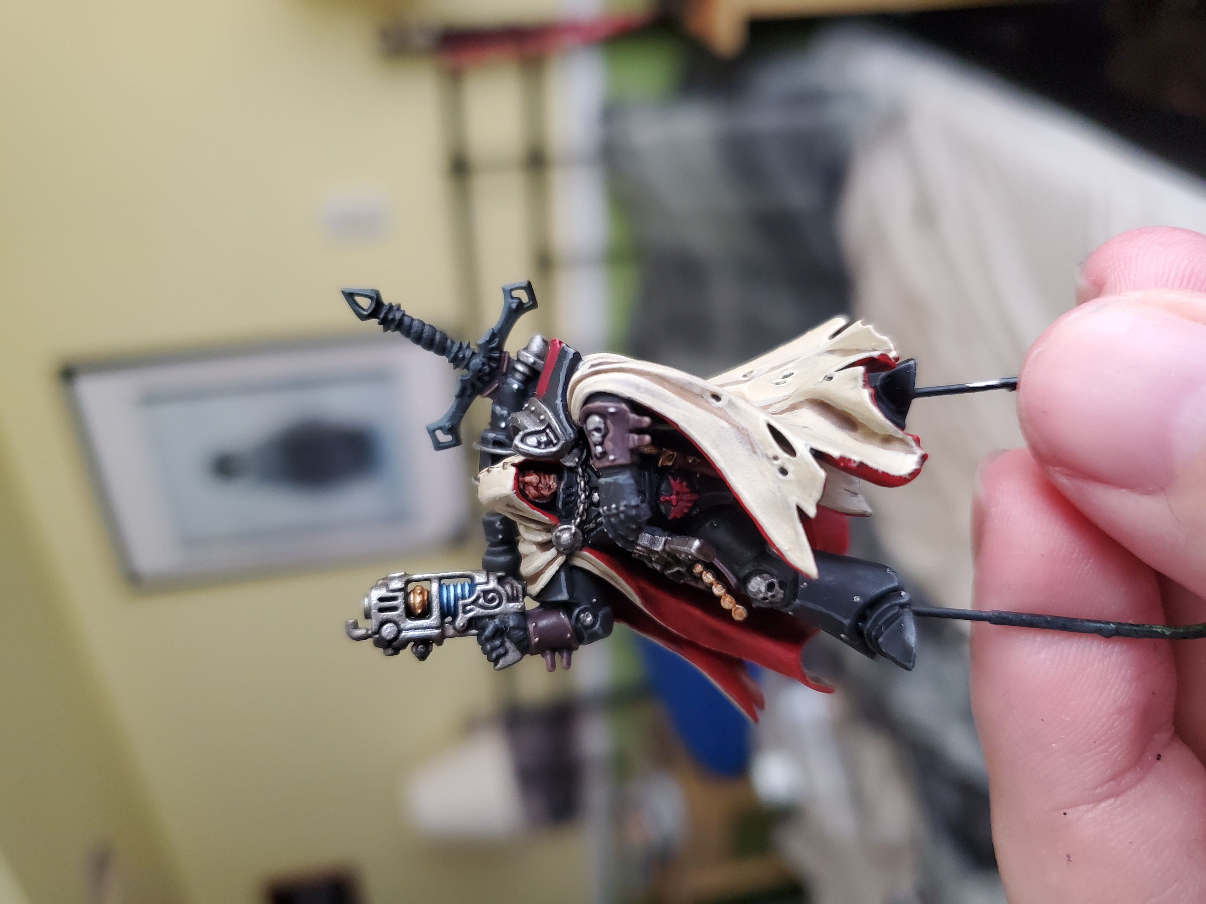
Cypher, now with 100% more base! Honestly, I covered all the steps up to this point before, so it’s just a ‘finished piece’ post today. I did put him on a 40mm base, as I mentioned before, and I really like how he looks on it. Fits the model nicely, and he’ll fit in with my other Marine characters quite nicely now.
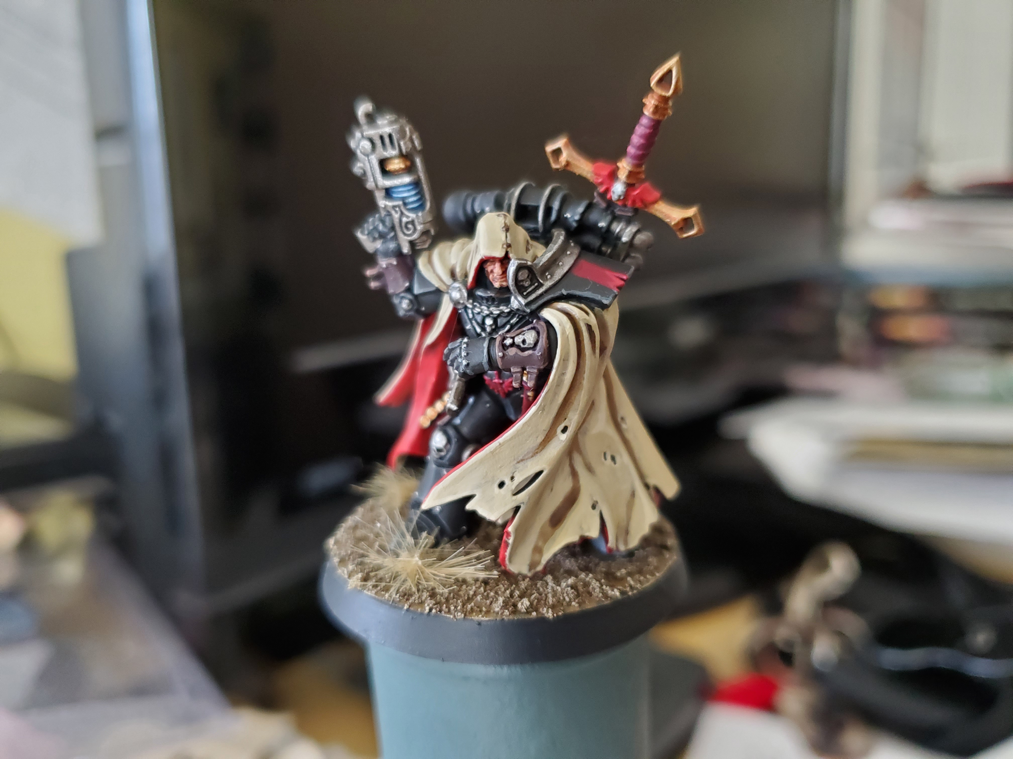 I went for the same basing as my Ultras as I'm attaching all my smaller forces obliquely to them it makes sense to match bases.
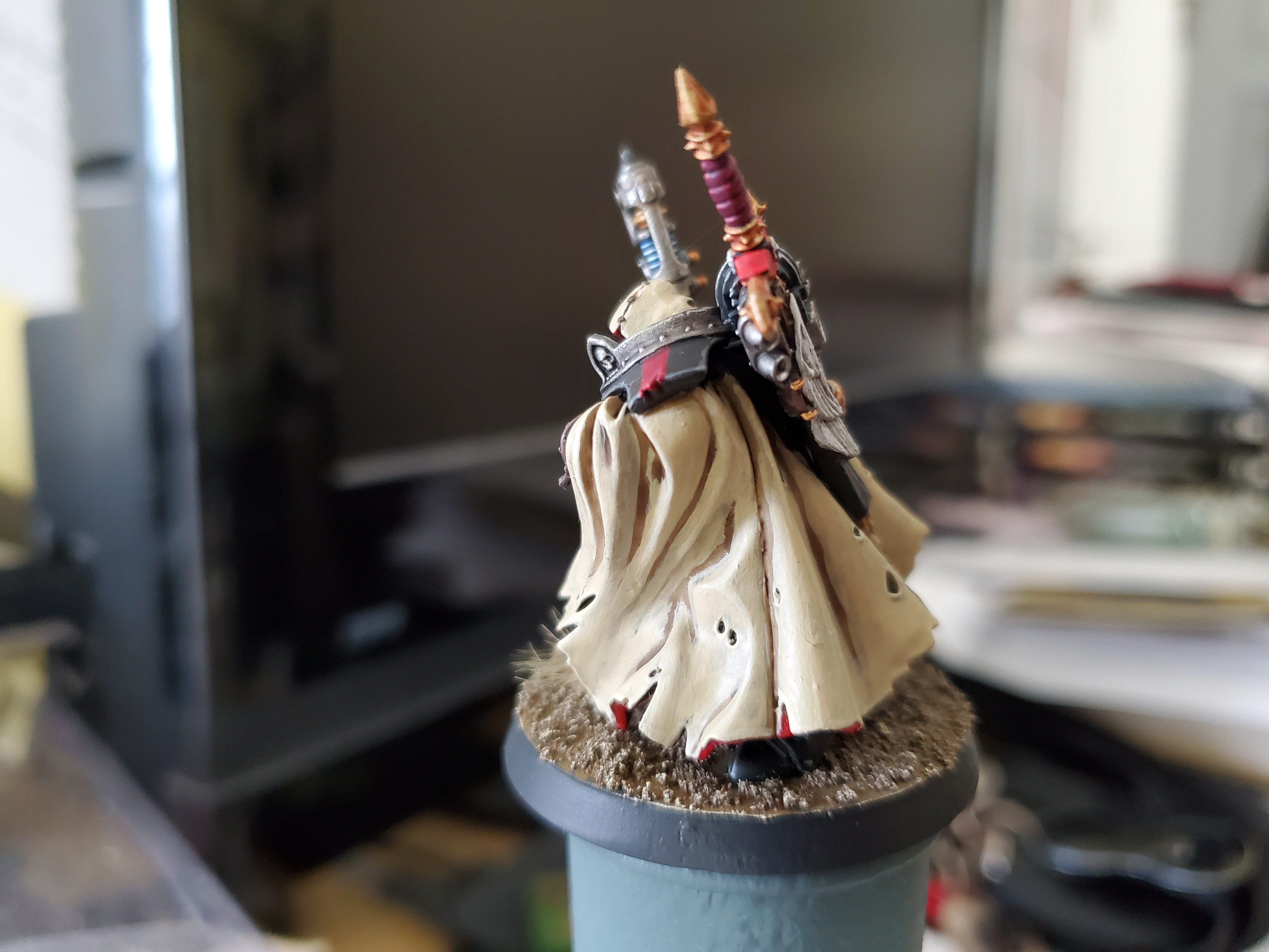 Robes. Just a whole picture full of robes!
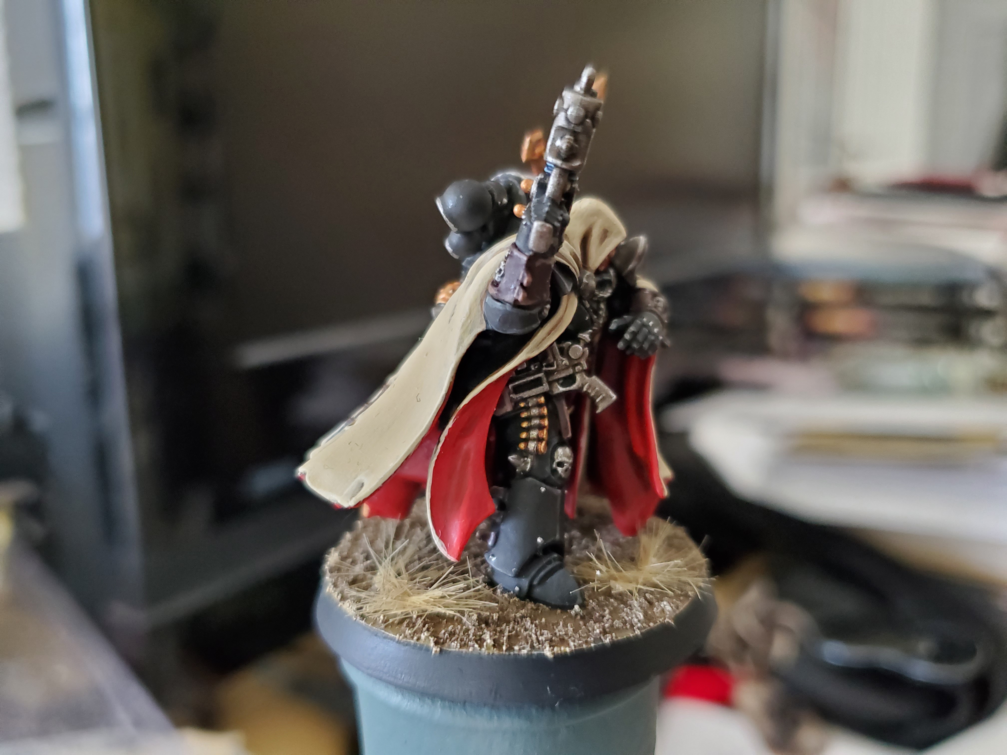 More fun bits...like boom sticks!
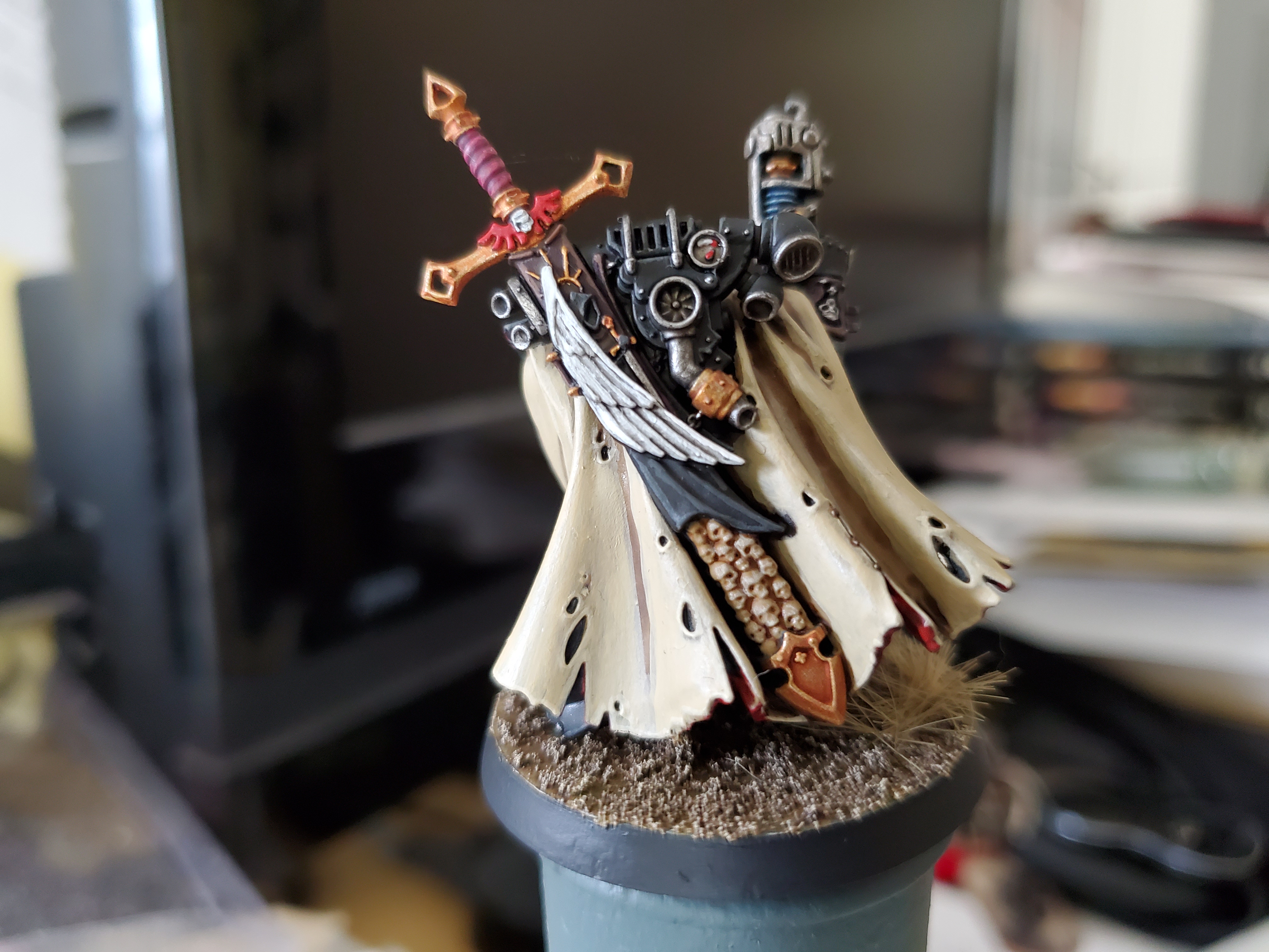 And then Lloyd shot.
Nothing really new here, though the pictures are landscape this time round and a little better for lighting and such…I hope.
No fixed plans for the next project, but POSSIBLY a Lannister Guard Captain or maybe even Lannister Bannerman…we’ll have to wait and see.
"Hear Me Roar!"
Another mini done (sort of)! This time round we’re back to Westeros with a Lannister Guardsmen. Long story short, my time for painting minis is a little les right now, so painting individual minis works best for me. Also means I can get through some of the massive backlog of characters and one-offs that I’ve acquired over the years. Now this chap isn’t complete, but the banner is something I plan to do as a separate step-by-stpe video, whereas the main chap was painted using Duncan Rhodes’ guide for Lannisters that I’ll link at the end. There’s only a few differences I used from his method but it was mostly the same (though I used only Citadel paints).
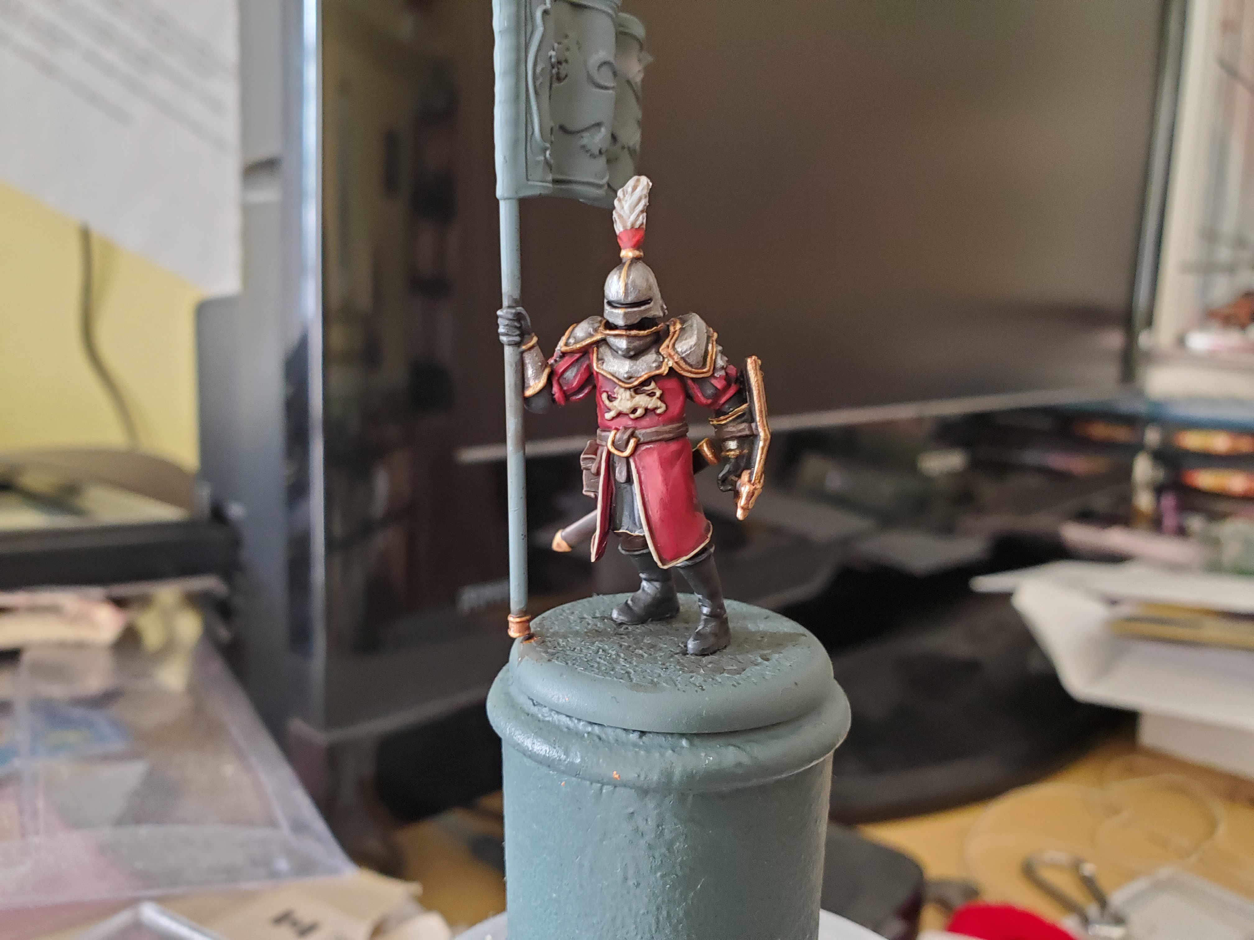 And here he is! The shadows around the helmet are maybe a bit too deep, but it doesn't bother me enough to worry about it. This shows one of the deviations from the guide I used, however, with the plume on the helmet. I went for something from British Napoleonic Line Battalions here with the idea of using the Green of Light Companies for my Crossbowmen (when I get some) and any plumes on my Halberdiers will be the white of Grenadier Companies.
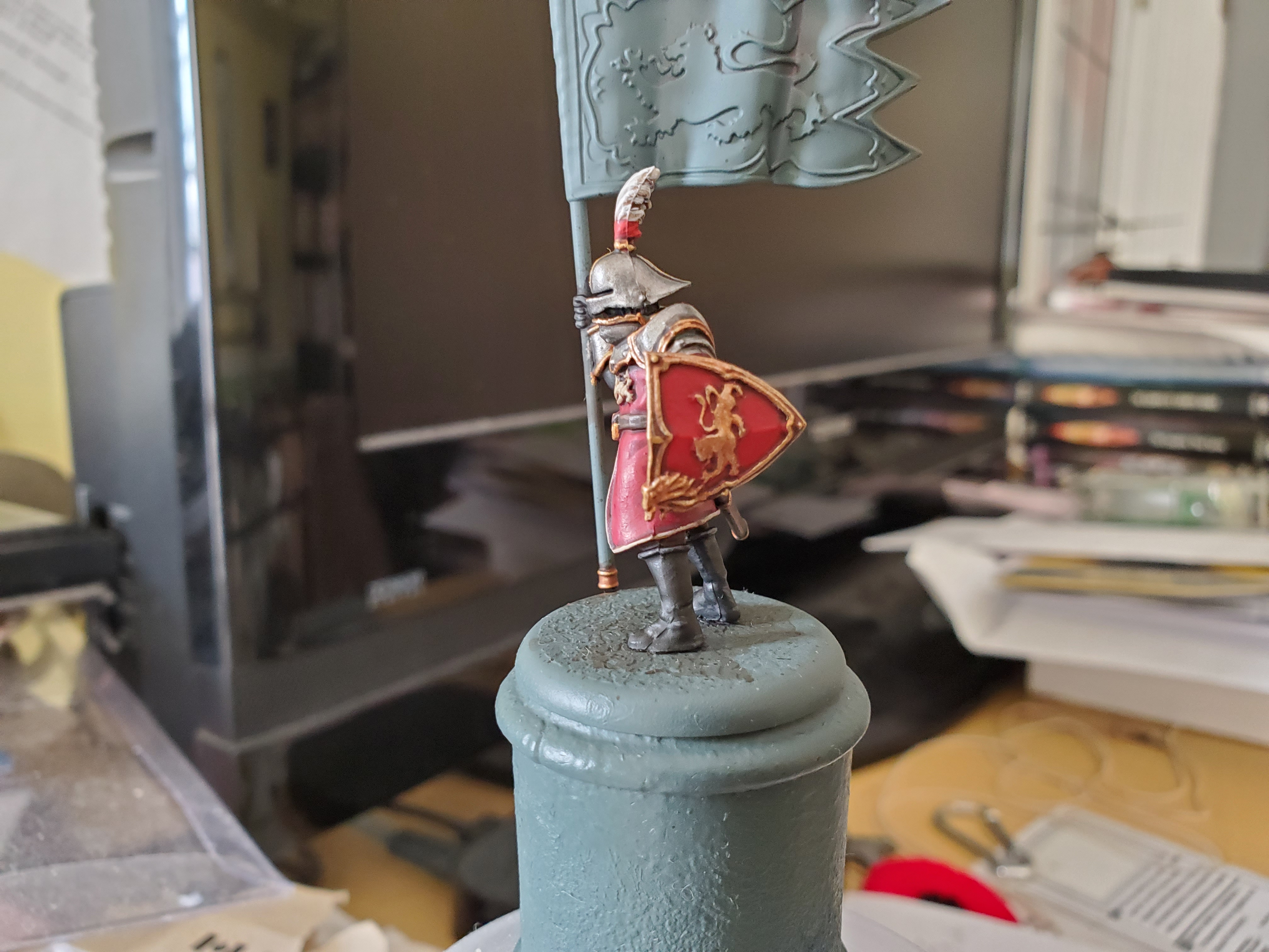 Really do like how the shield turned out here. There's also another difference with this shield, and that is material. The Lannisters are rich enugh to afford metal shields, and so rather than a wodden backing, like Duncan went for, I instead stuck with metal, though I let it stay dulled down in colour.
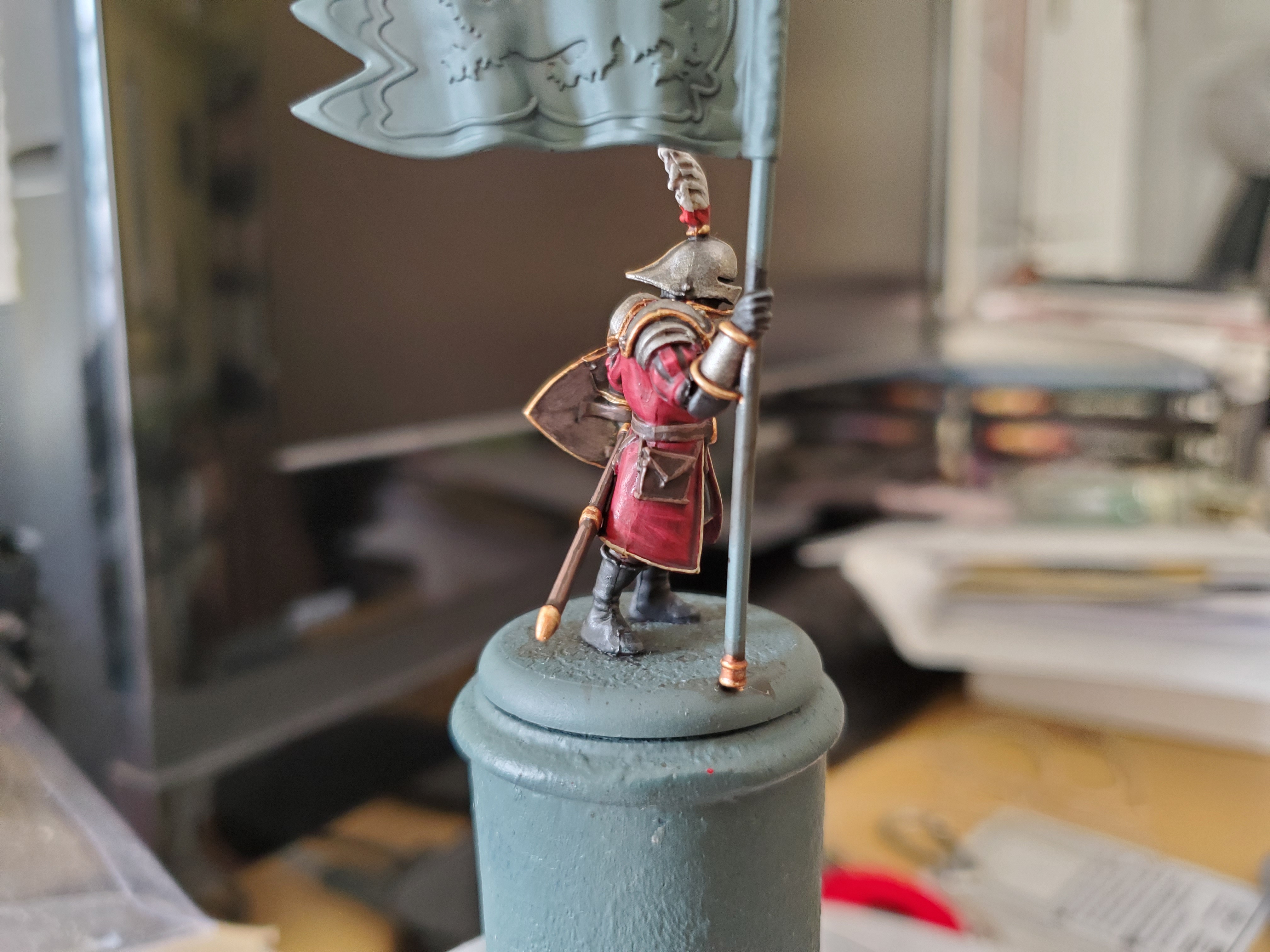 Not as impressive from this angle without the banner finished, but this is my favourite red now...even if my Khorne Red has decided to dry up... GW NEEDS to fix their paint bottle situation; they are constantly drying out for me...
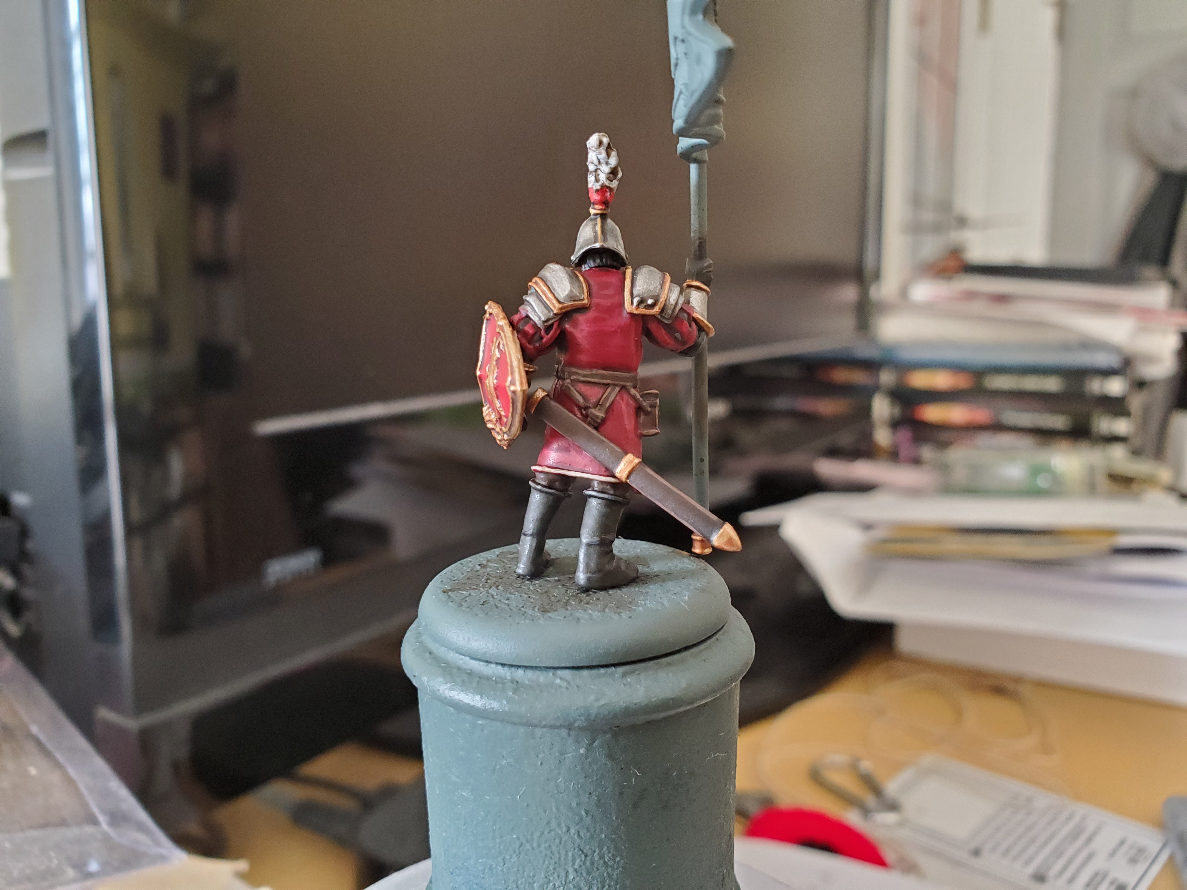 And the traditional Lloyd Shot!
Might be a while before the next update, but Reading Week looms, so anything is possible! Here’s Duncan’s video that I used for the stages; it’s a good one.
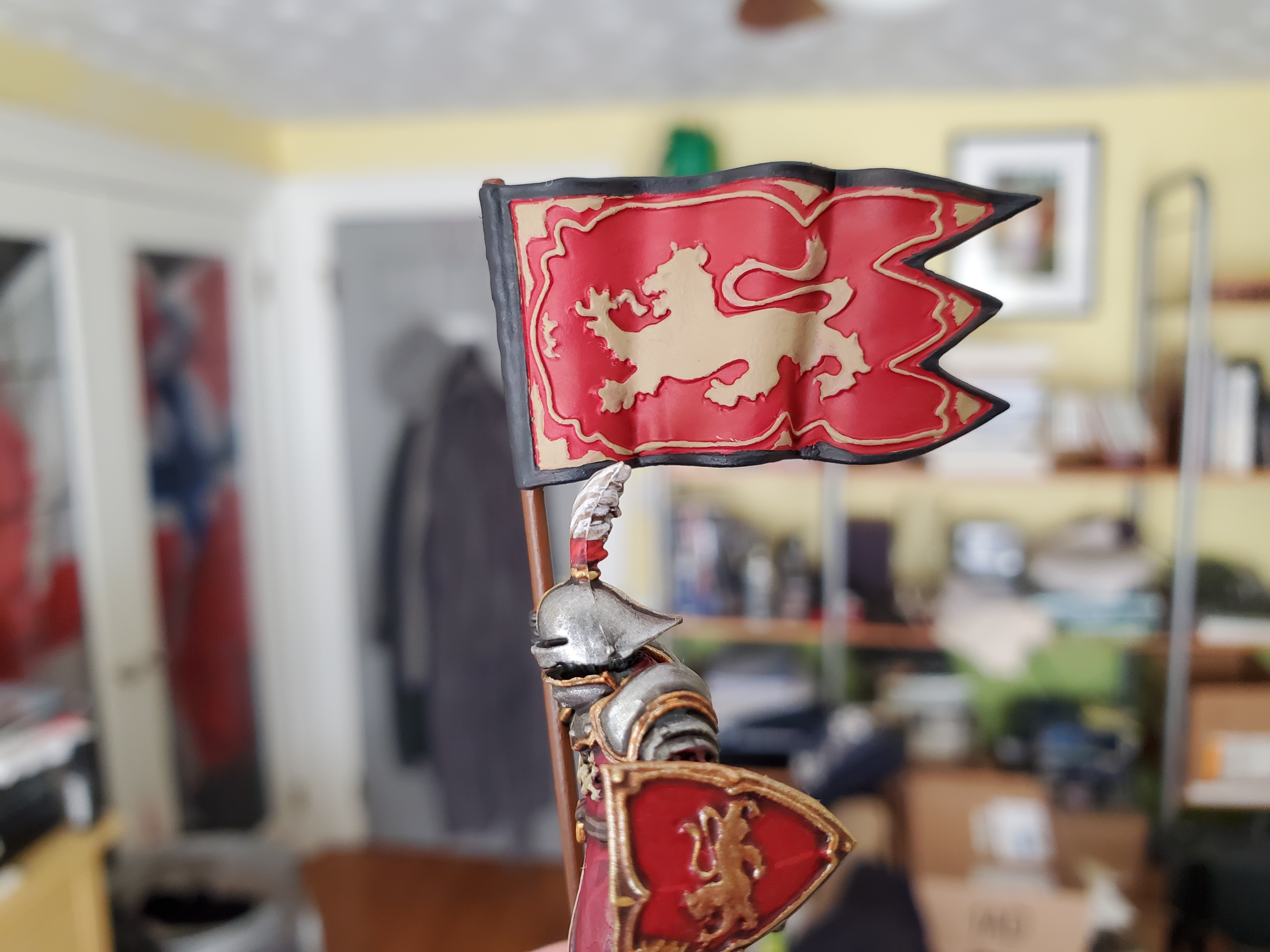
"The Lannisters are proud. You'd think the royal sigil would be sufficient, but no. He makes his mother's House equal in honor to the king's."
And lo, the banner was done! Sculpted banners are great for making it clear where the shadows should be, but smooth folds in the cloth can be a pain to highlight. Anyway, I have plenty of step-by-steps this time though the method I used did follow a similar pattern to Duncan’s guide and could easily be simply added to the various stages. All of the colours I used were used across the rest of the Guardsman so no extra fancy colours to worry about! Let’s get on with it, shall we?
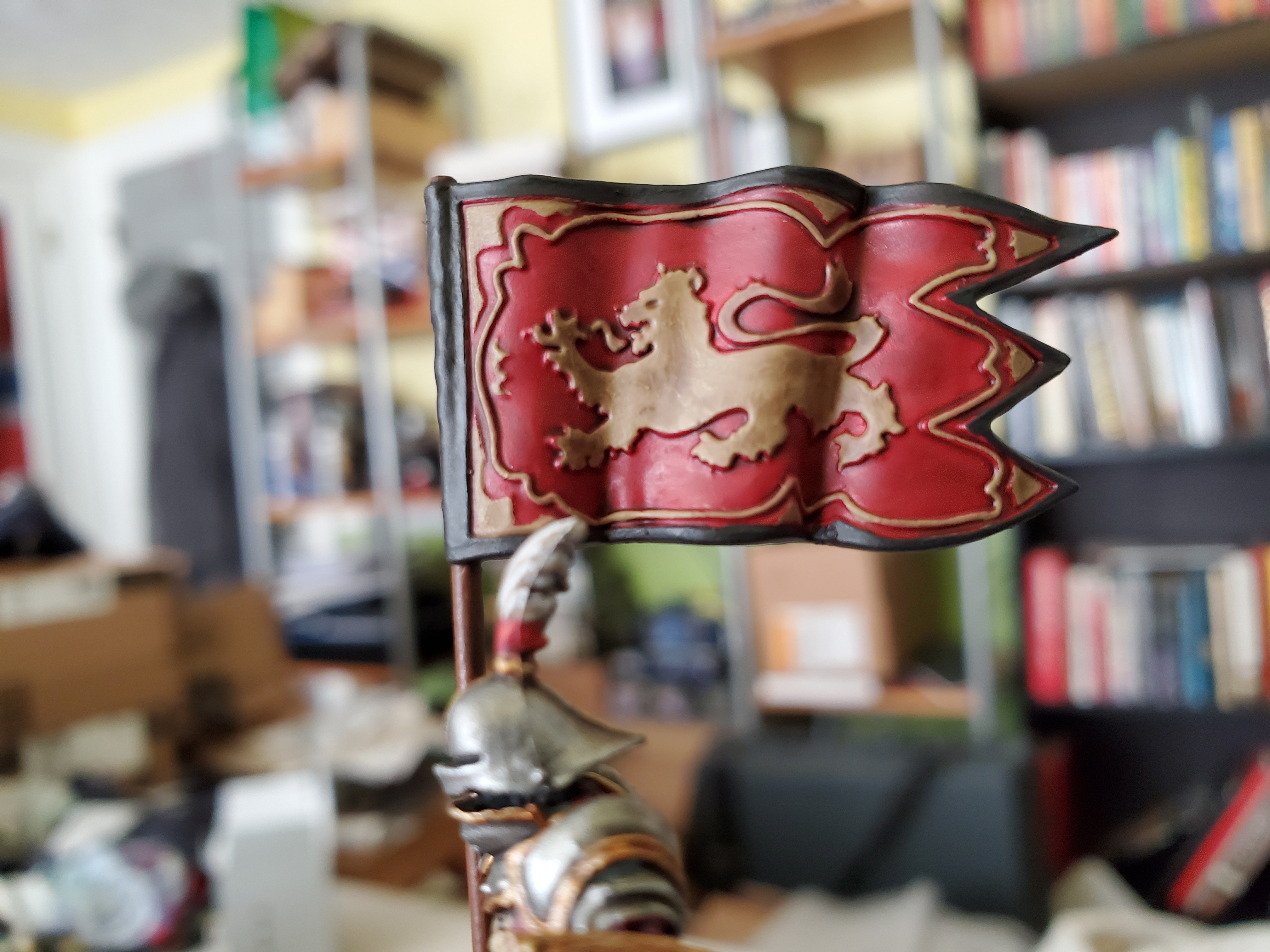
Basecoats and shades to begin with! I chose a brighter red field for the banner and went with Mephiston Red. I would advise doing this part first, so then you can be messy and not worry about it. A nice solid basecoat is what’s needed here. Then Zandri Dust to pick out the details across the flag. Be careful around the edges, but the Mephiston covers quite nicely if you need to tidy up (I had a lot of boo-boos with the thin trim details in places). After that, I went with Corvus Black for the edge to really make the banner stand out. I chose Mournfang Brown for the wooden pole, but if you chose to use Duncan’s wooden shield idea then you could use Zandri Dust here for a lighter wood.
After all that, we covered with Agrax Earthshade! Try not to let it pool as tidying up around the smaller details is tricky when everything is applied, but if you’re using thin coats you have some leeway, and we’re going to brighten up in later steps and we can fix mistakes then.
When applying all these paints, I thinned them down quite a bit to help with the smooth transition across the cloth. This is something of a tricky thing to highlight, but by using thinned paint, I could mask small errors nice and easily. Another thing to remember if ‘gaming distance’. With these close-ups you can see some of my brushstrokes and mistakes, but at a normal distance they will hardly be visible, which is nice.
First colour was a return to Mephiston Red for a layer. Leaving the deeper recesses shaded. I did this in two thinner coats to help keep the transition smooth, but with this colour the paint in more forgiving with the tones. After that I went with Evil Suns Scarlet and layered within my Mephiston Red layers. Here the thinner paint really does help. Originally I focused a lot more on the upper folds, but decided to add the extra highlight to try and make it look a bit more silky (not sure I managed the silk look, though). With every thin layer I added I reduced the area I was covering and I think ended at 3 layers. After that was the tricky one; Wild Rider Red. This is tricky because if you over-do this colour you will shift the colour from red to orange. I focuses just on the upper most folds and only added some in very light and narrow brushstrokes. If you do make it a little to orange, you could cover back over it with the Evil Suns Scarlet fairly easily, though.
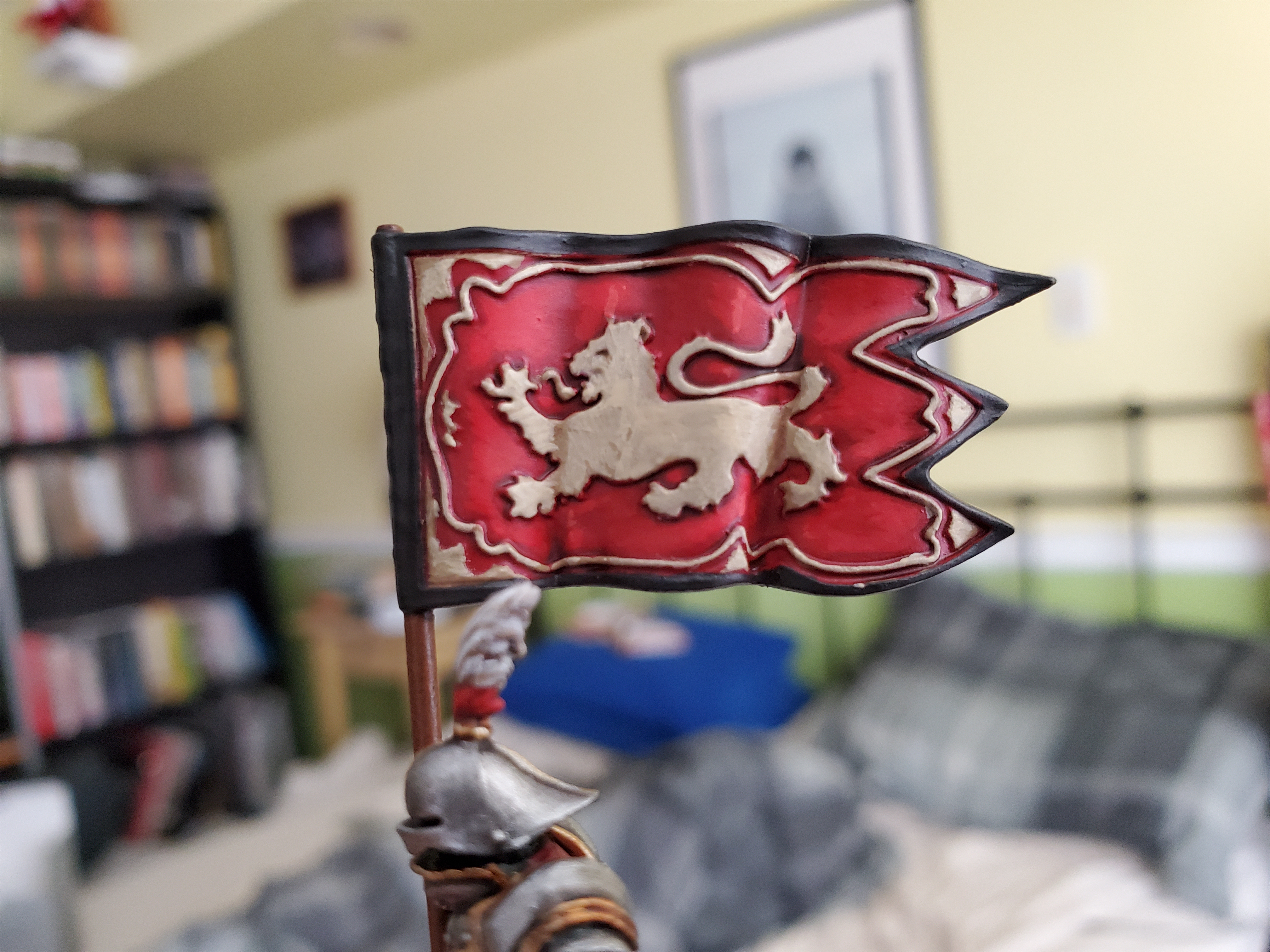 Having issues posting groups of images...so this will have to do for now. Much the same process on the lion and trim of the banner. For brightness I layered up with Ushabti Bone......
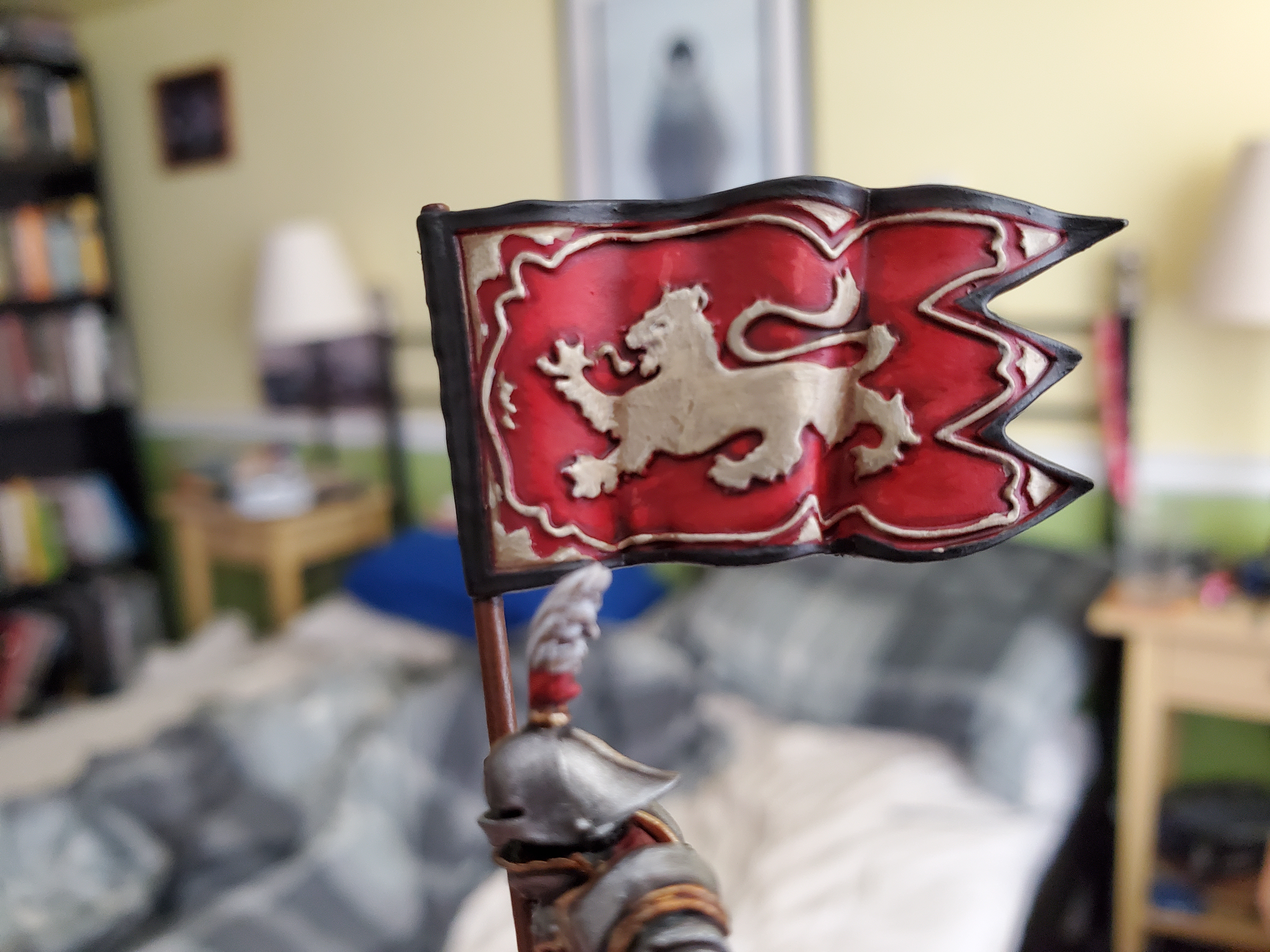 ...then apply some Screaming Skull along the upper folds again and some edged details. Thinned paints as with the reds.
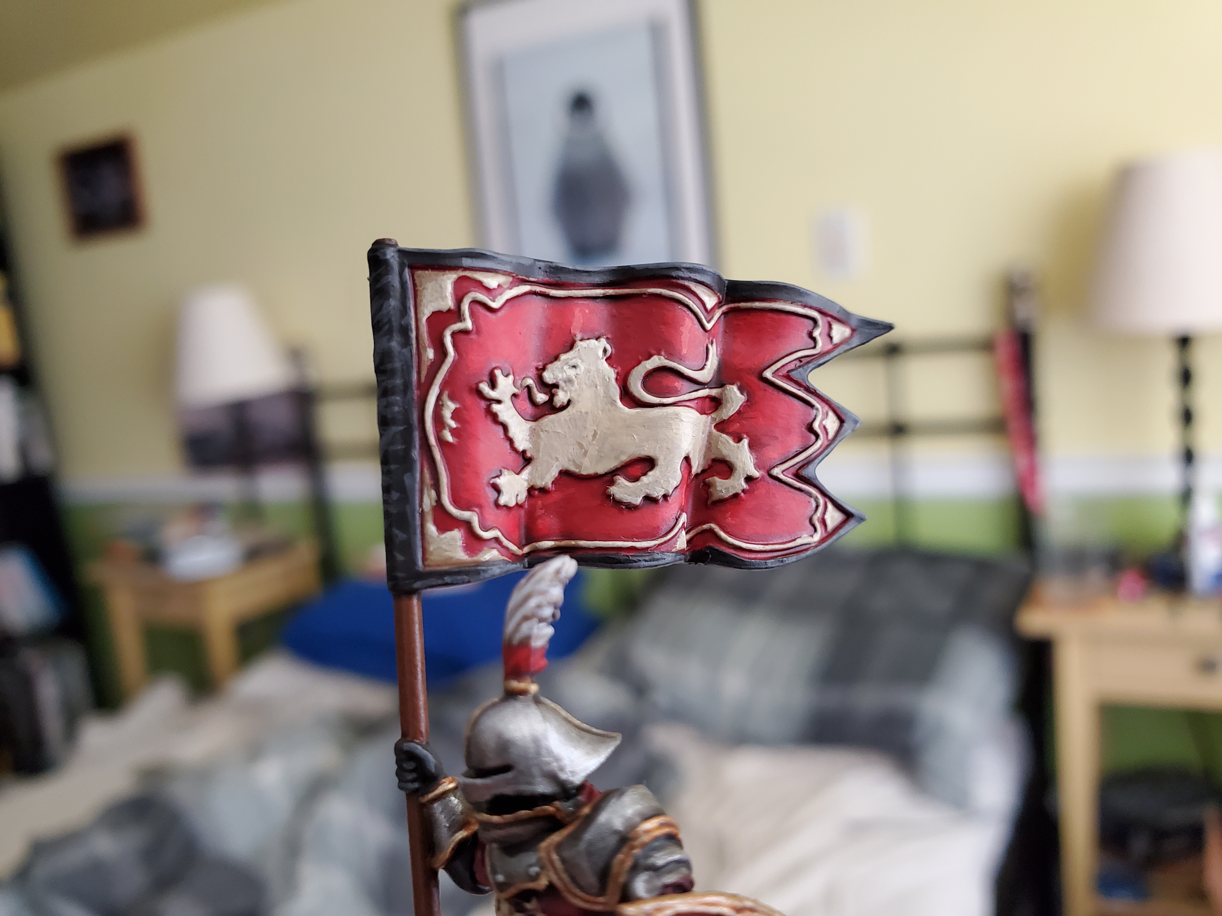 Then some highlight on the edges of the black with Mechanicus Standard Grey.
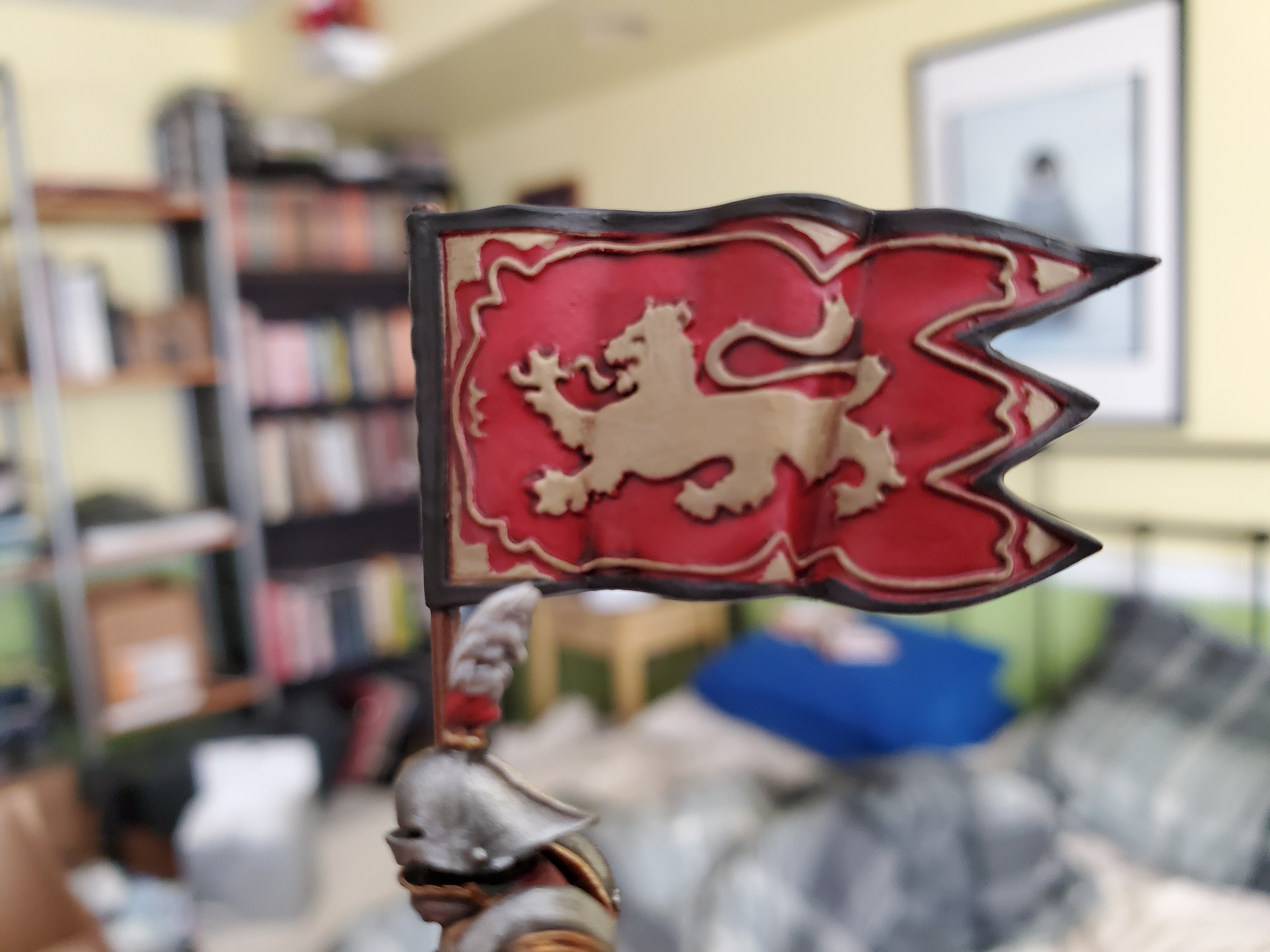
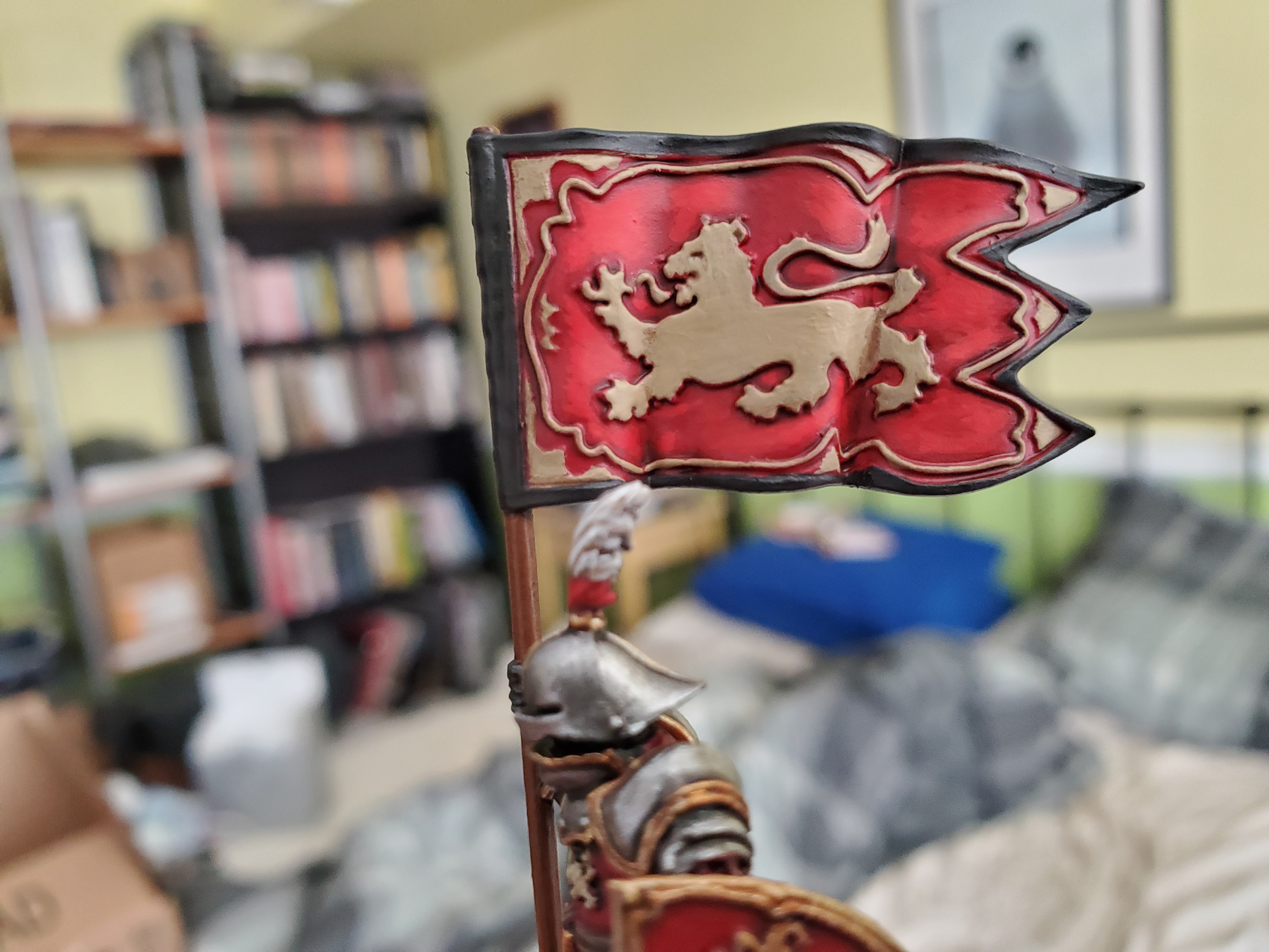
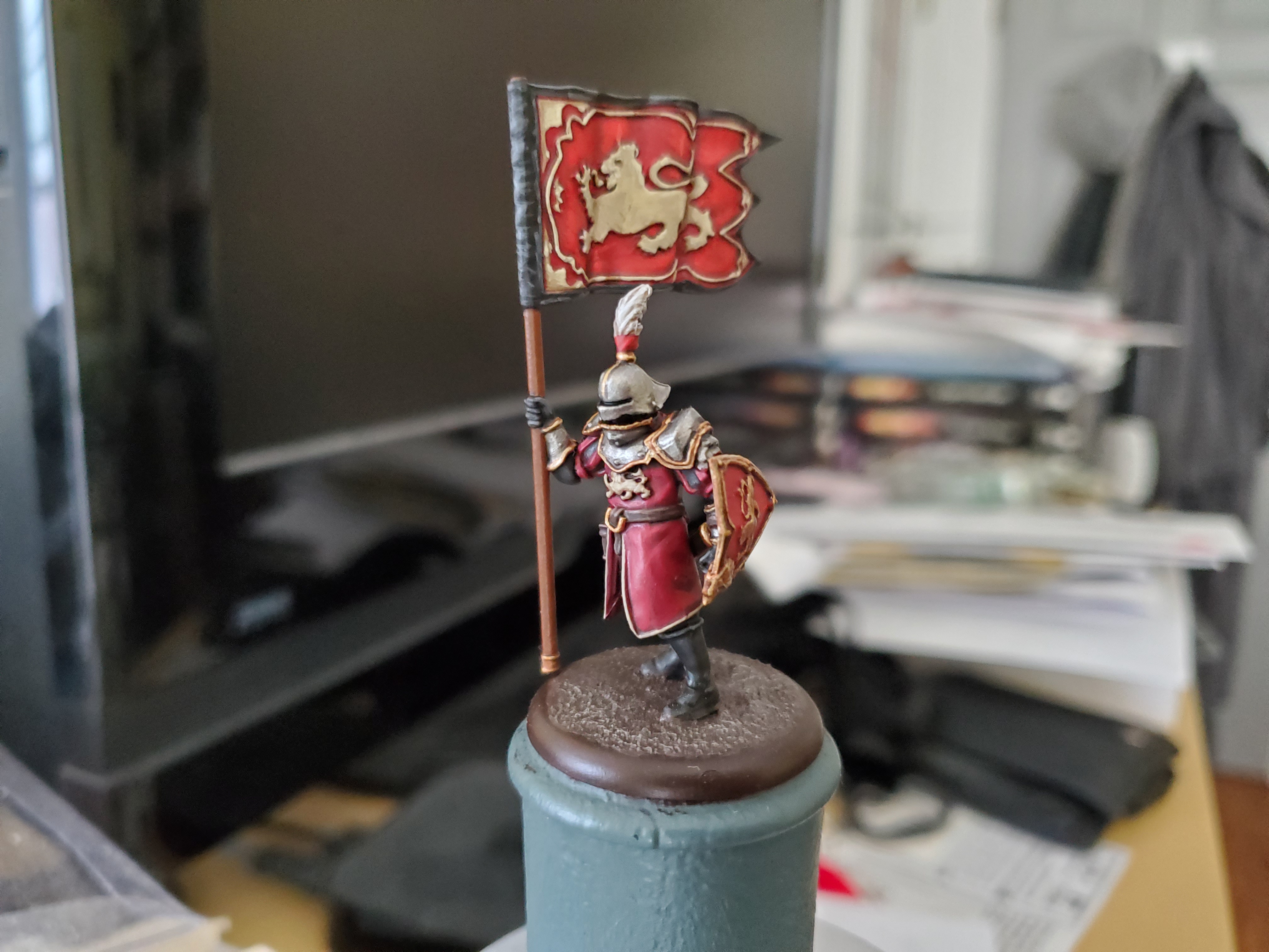 Minus grass (I ran out of tufts), here is the finished Lannister from the front...
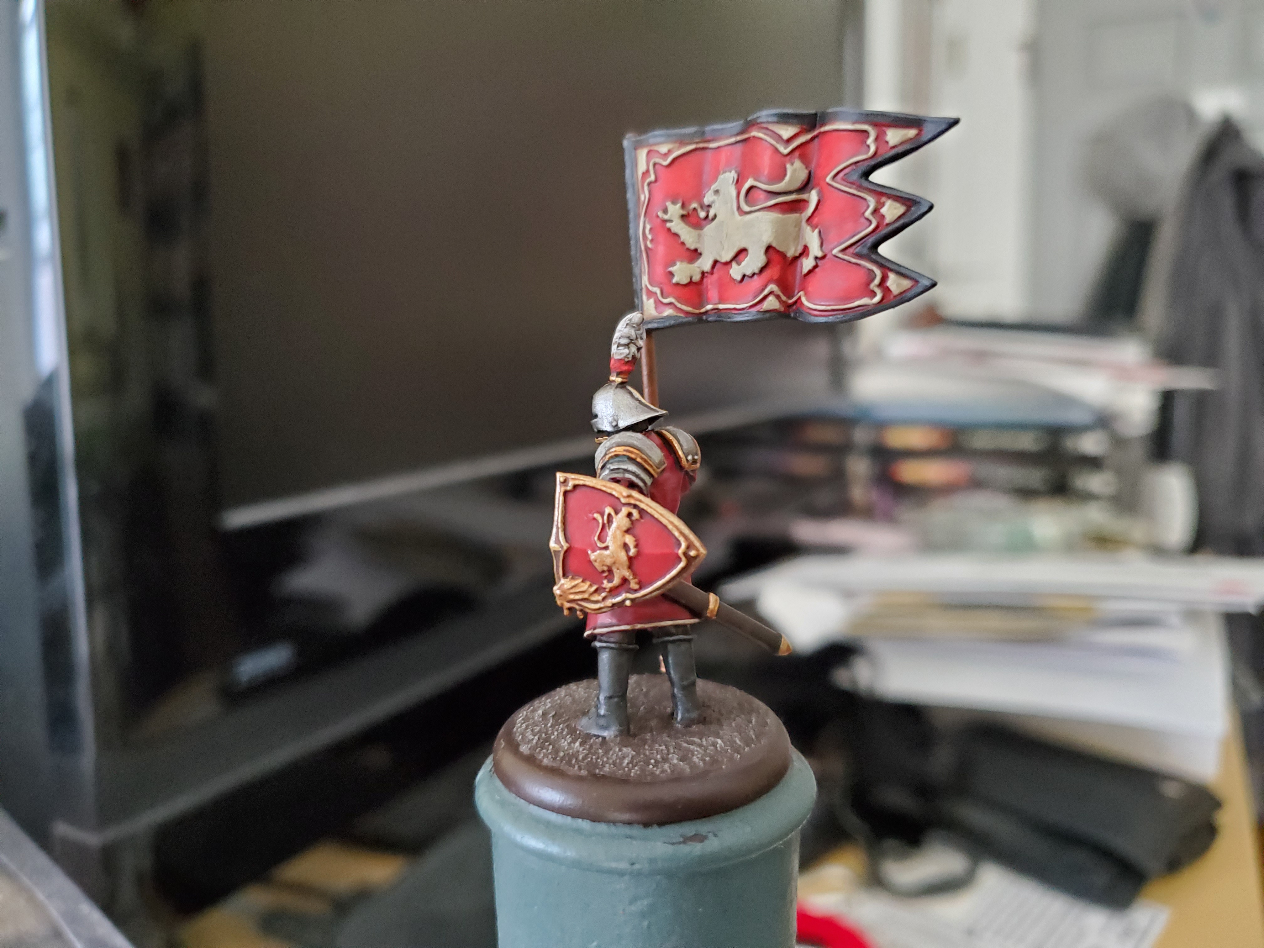 ...his left...
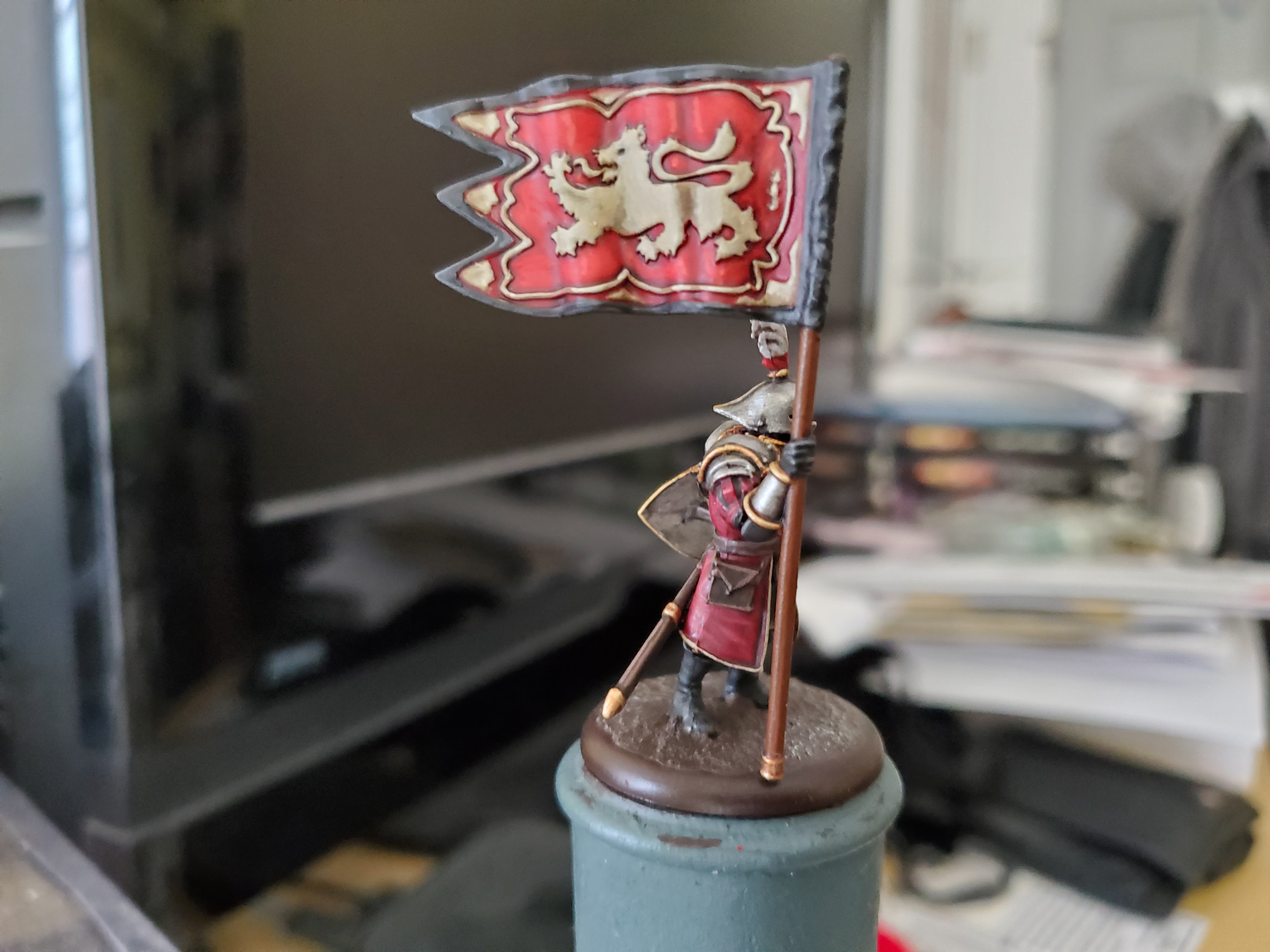 ...his right (the banner looks really nice at this angle I think)...
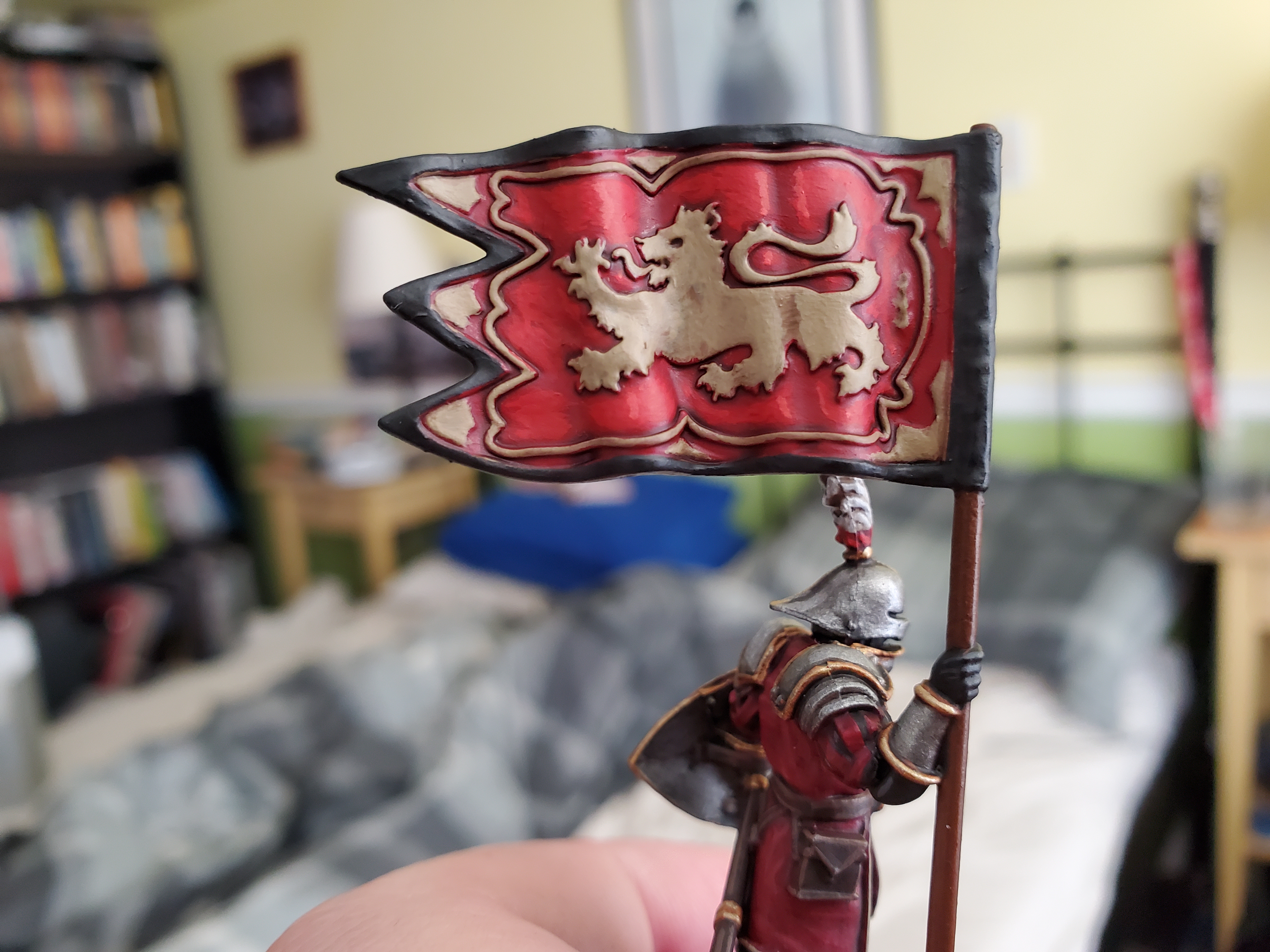
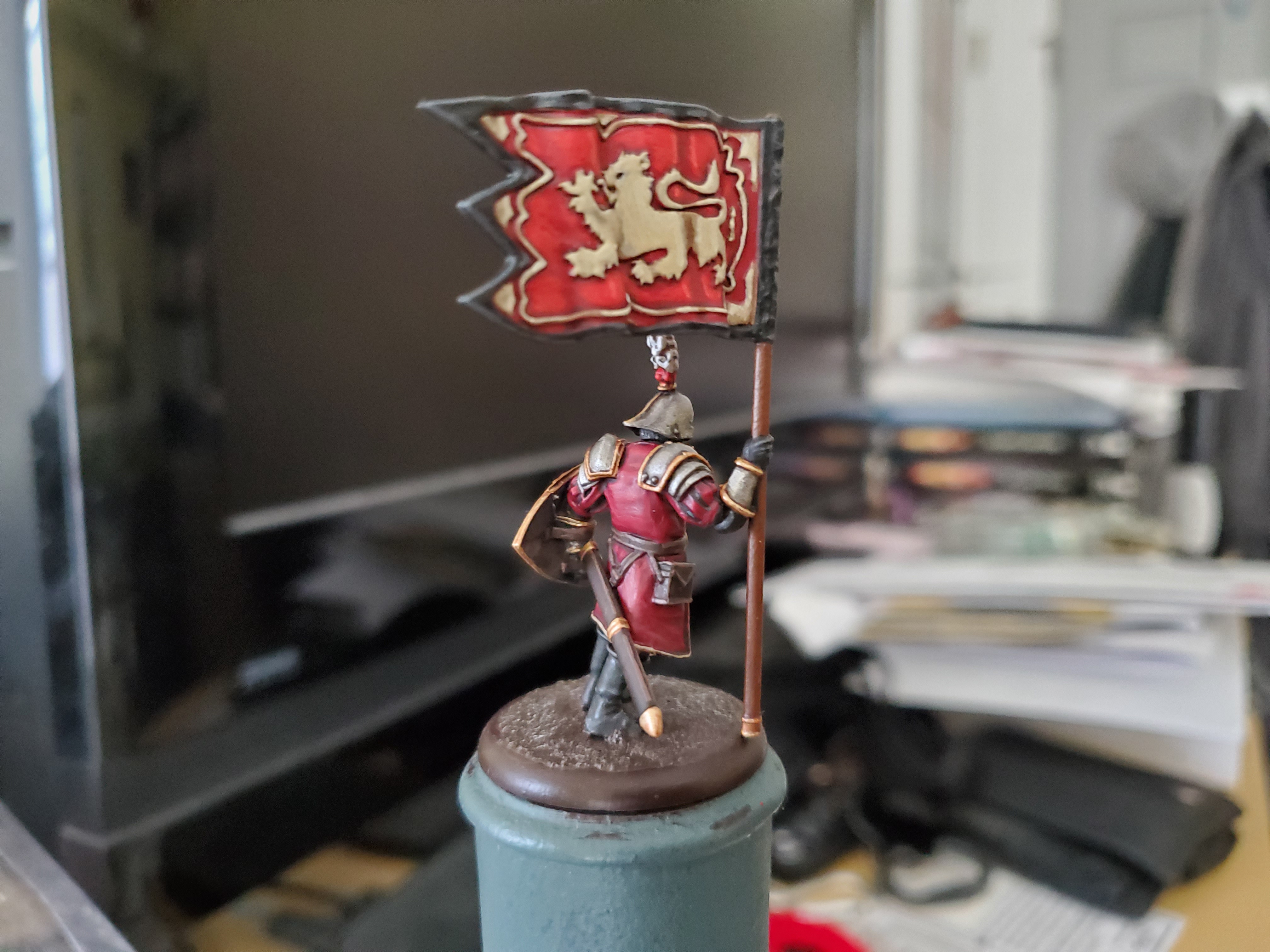 ...and his Lloyd. Just enough space to fit this in one post! Yay!
In arduis fidelis
Been a while thanks to midterm madness, but here is my finished WW2 NW Europe British Army medic! Went with a big white helmet and cross for markings on this chap because I didn’t want to screw up getting the arm band to look right on a scrunched up upper arm. Sort of the same reason I didn’t add division badges like I usually do (they were supposed to take them off, after all).
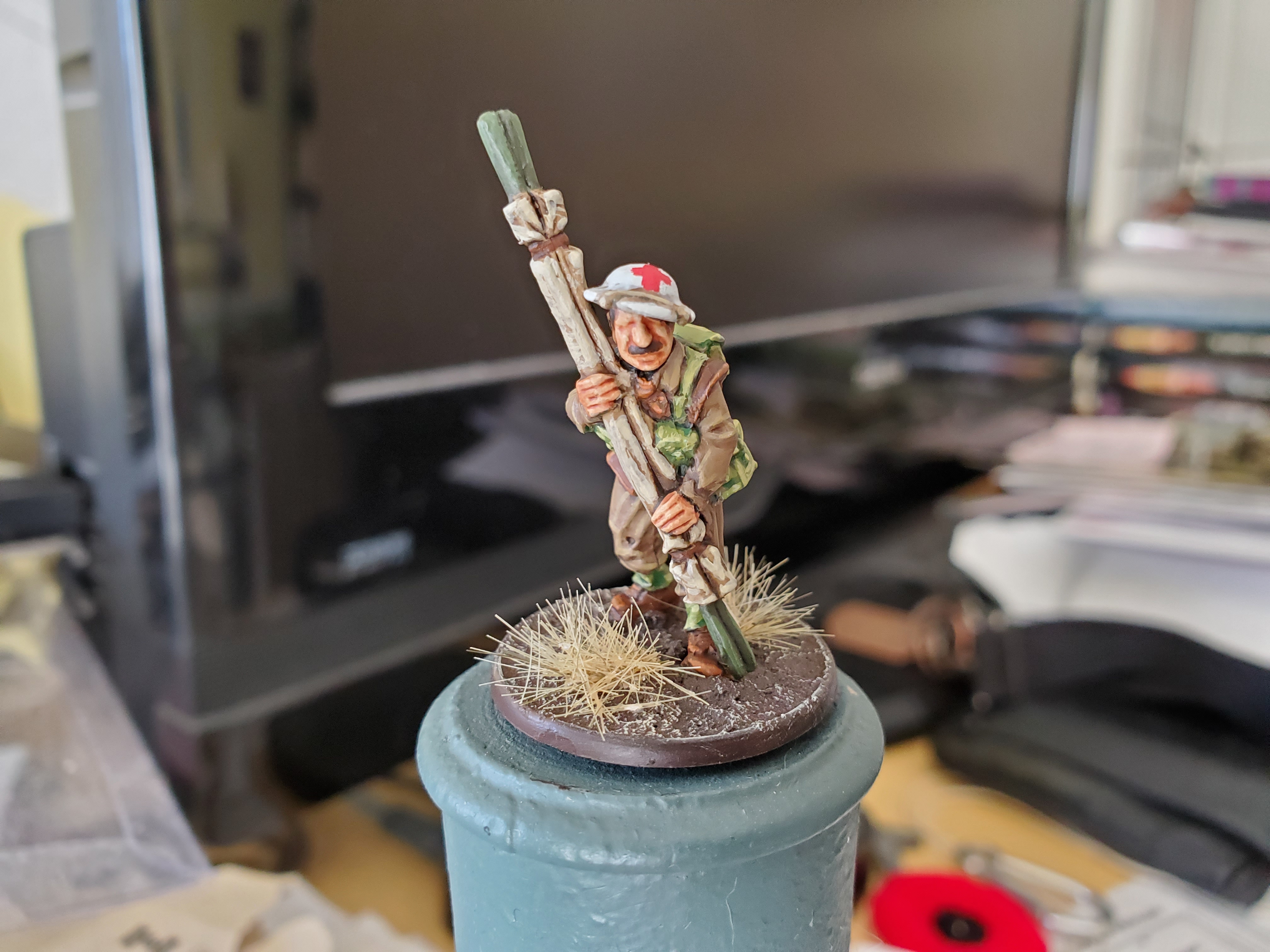 Colours are my GW equivalents that I'll list below, and they are a bit rough in approximation, but they look good enough for the scale we're working at.
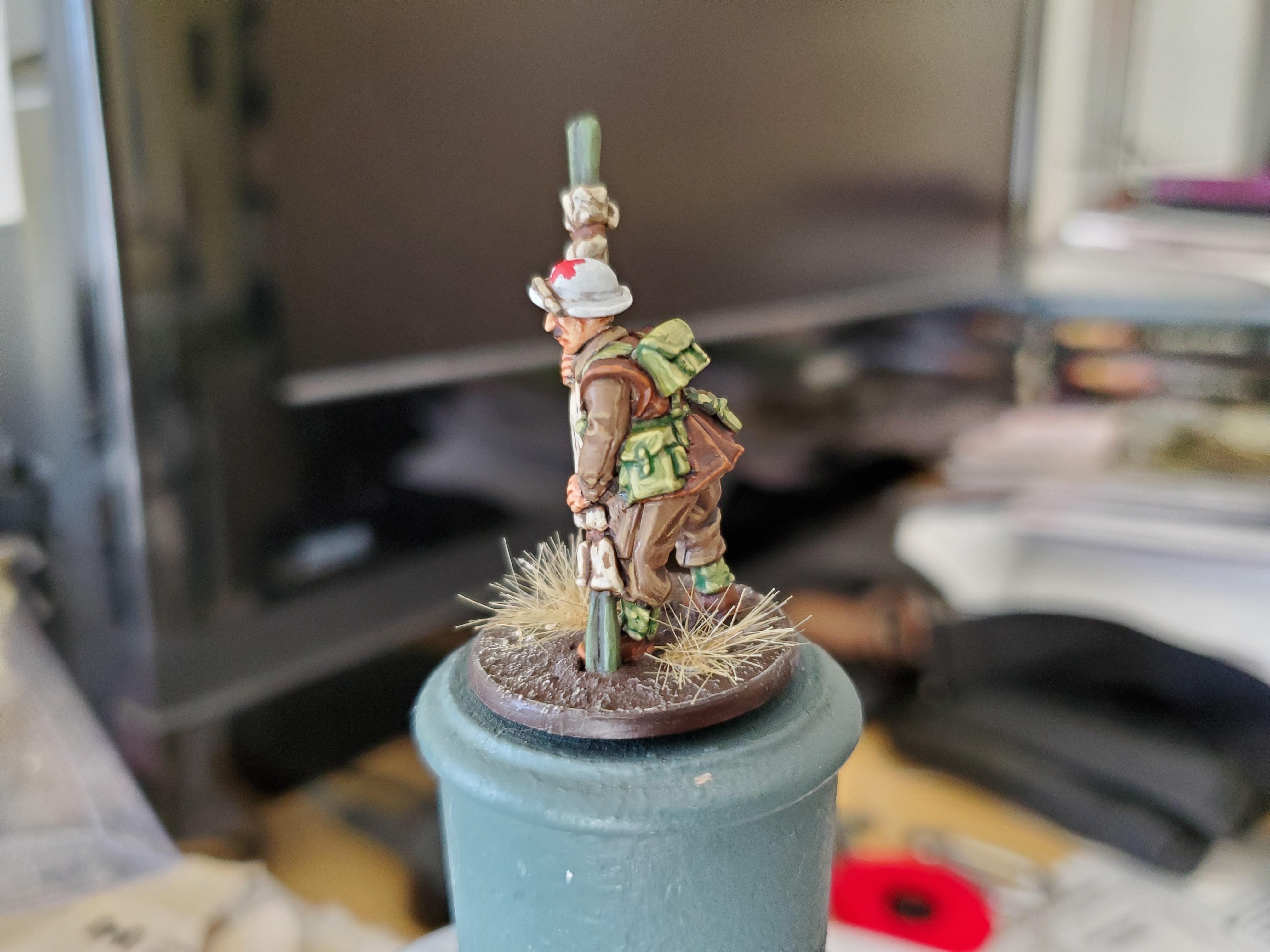 I decided to pick some similar, but more contrasting, colours for the stretcher to help it stand out. Bearing in mind the Geneva Convention is suuposed to protect this chap, it doesn't matter if some bit 'stand out' on his kit.
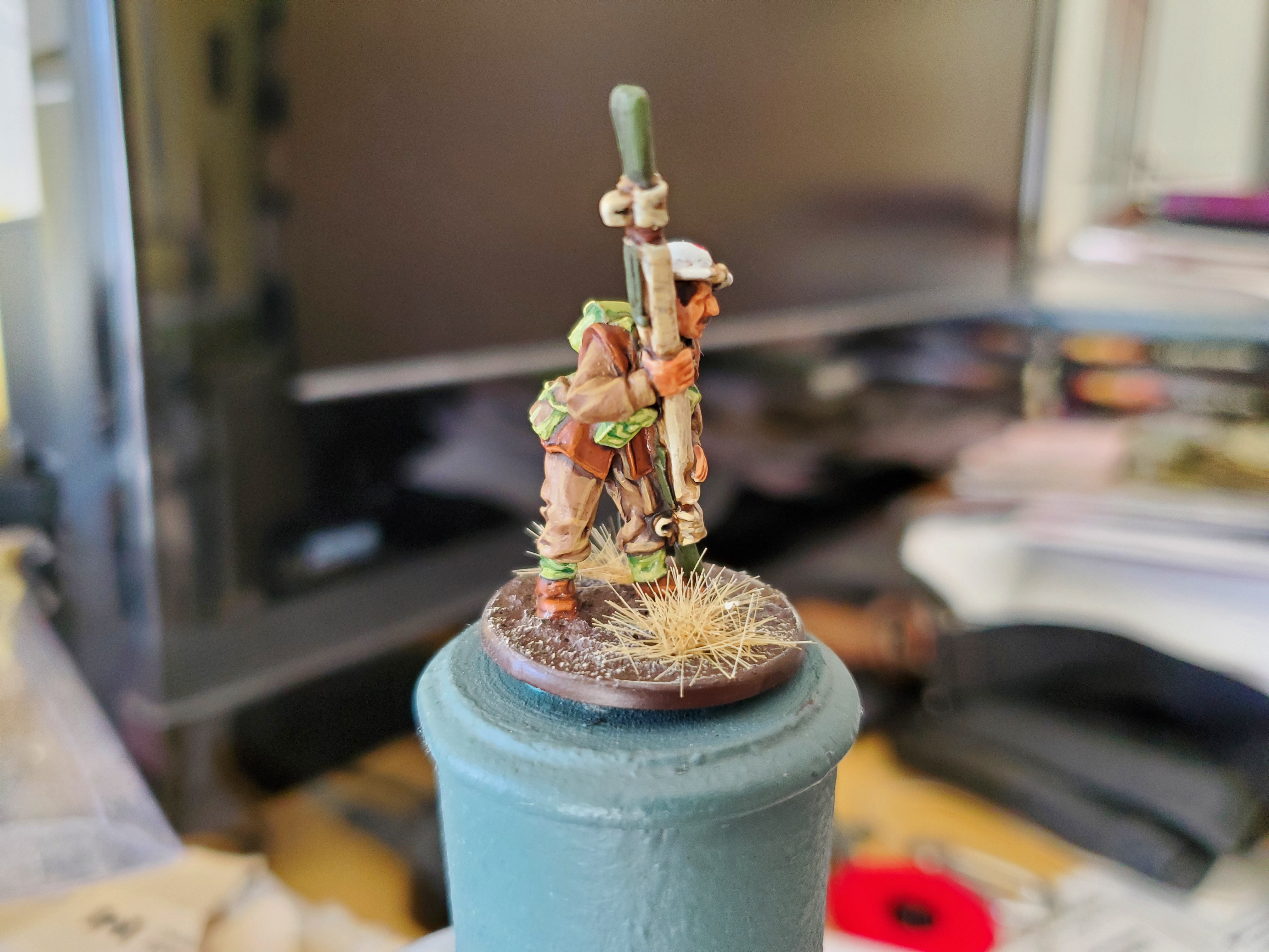 The leather jerkin might have been better if it was a slightly darker leather, but well worn leather can always change colour here and there, so I'm not too worried about the overall look. It's not that common on Warlord's British minis, so if I chose a different tone next time it won't look too out of place.
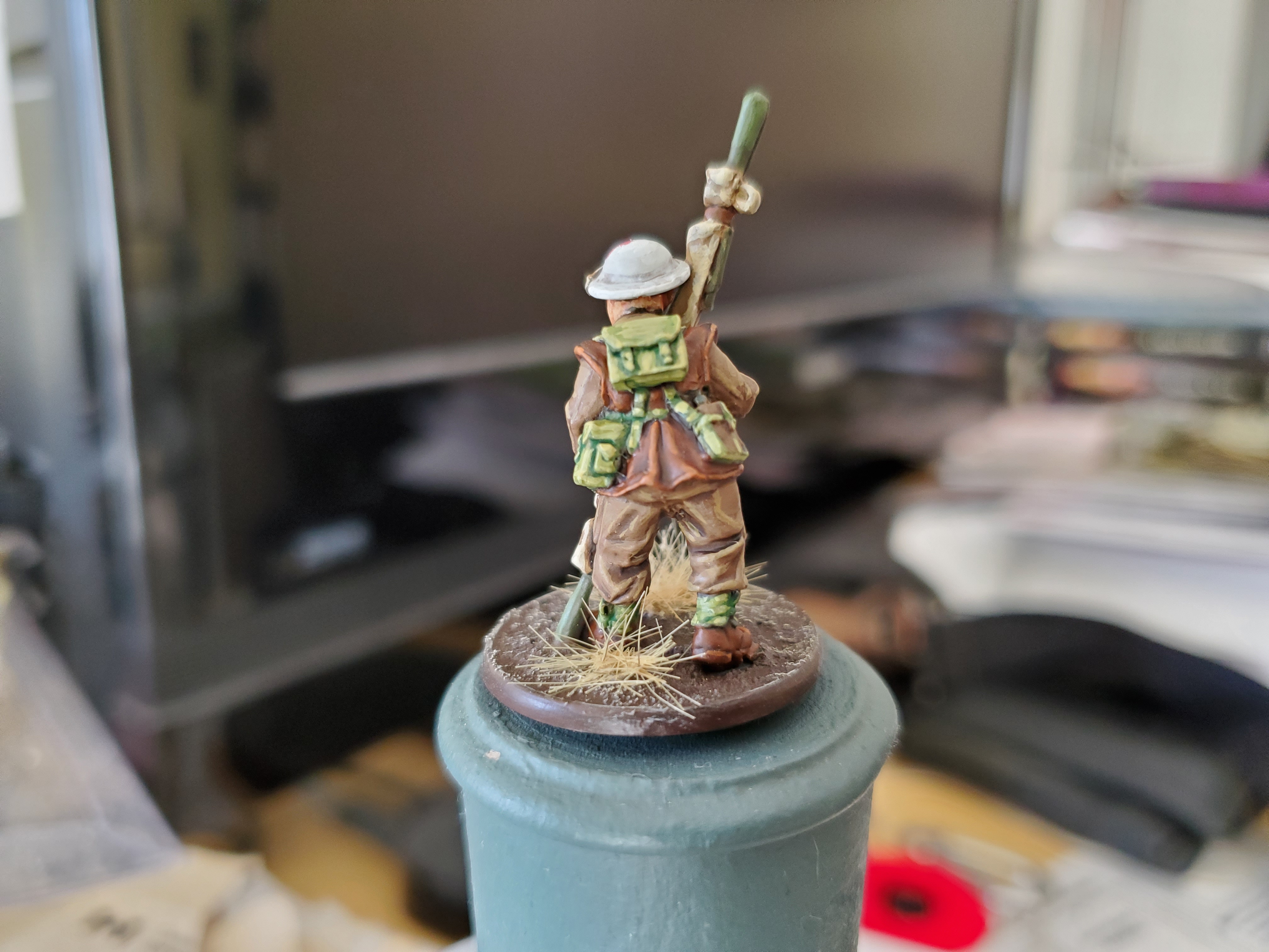 And the Lloyd shot!
As promised, my uniform approximations using GW paints!
Battledress:
Basecoat Steel Legion Drab
Shade Agrax Earthshade
Layer Steel Legion Drab
Highlight Tallarn Sand
Webbing:
Basecoat Death World Forest (can use Loren Forest)
Shade Biel-Tan Green
Layer Loren Forest
Highlight Ogryn Camo
Achtung! Panzer!
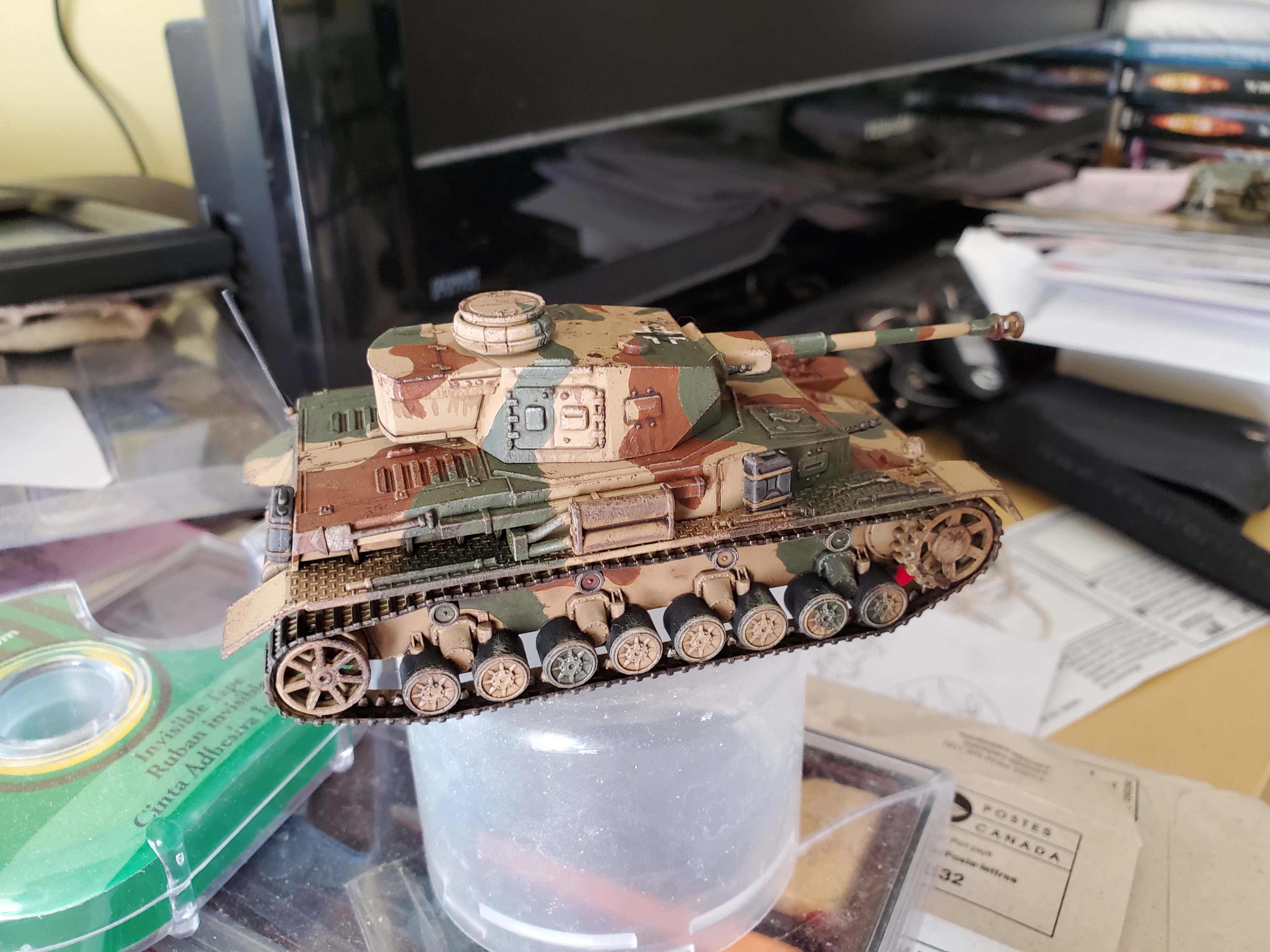
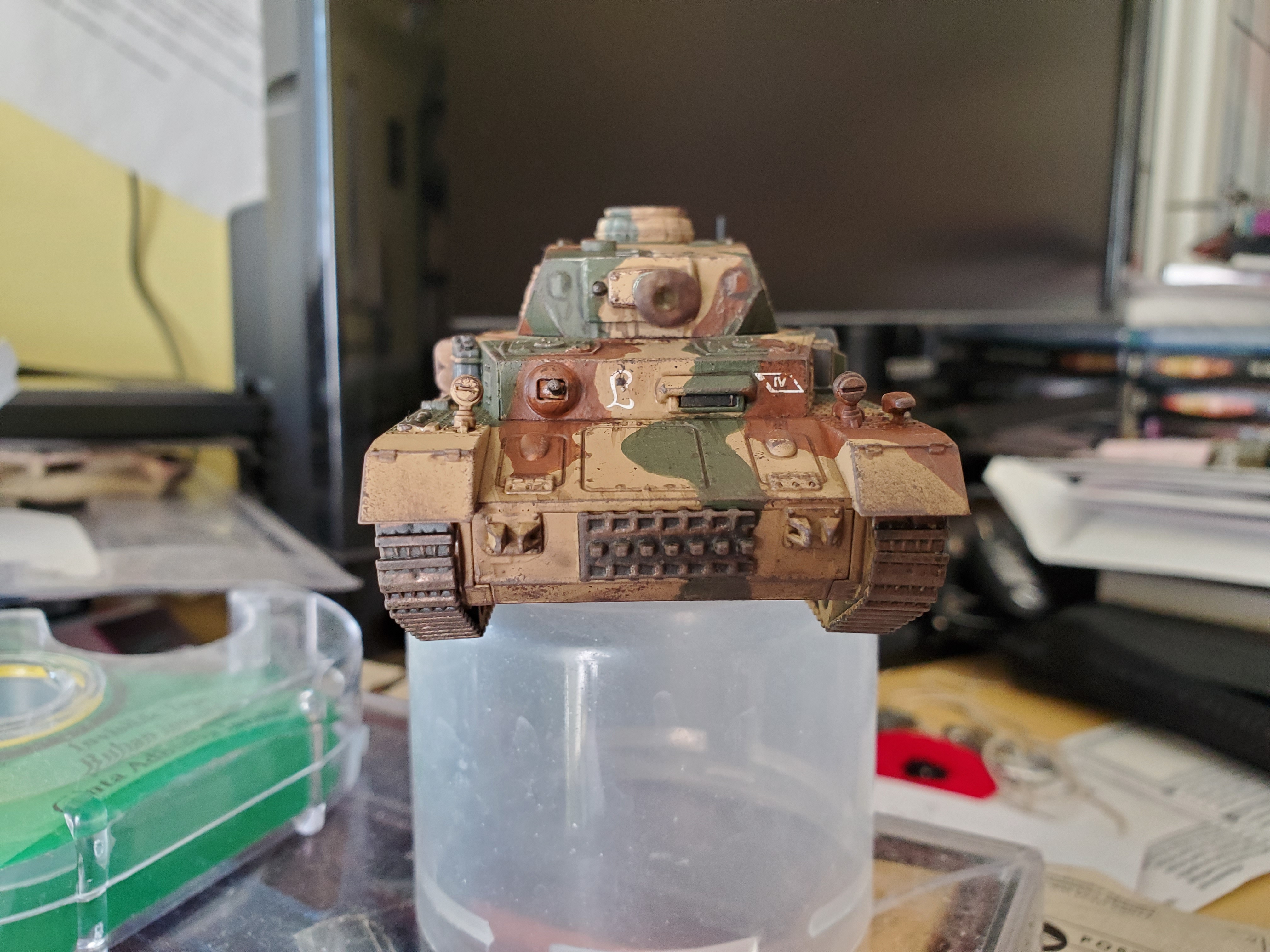
Hopefully I spelled that right…my German is rudimentary, at best. 😛 Anyway, I’ve been working on this on the side of some school projects for this PzKpW IV ausf H(?)…I think it’s an H. I lost track of what I built it as as it was so long ago… So long that you may notice a bit of an odd kink in the aerial because I have to fix it up before priming…even then it’s been sitting primed for some time. I’m really bad at painting things on time…
Anyway, the camo pattern was based upon a few images I found on the interwebs as thanks to a bunch of chaps over at the Sitrep Podcast Discord I got some nice confirmation of patterns. Thank the gods for the German Army in 1944 being such a poor state of supply, right? So thanks to Oriskany, Damon, and the other chaps who lent their advice. Much appreciated mates!
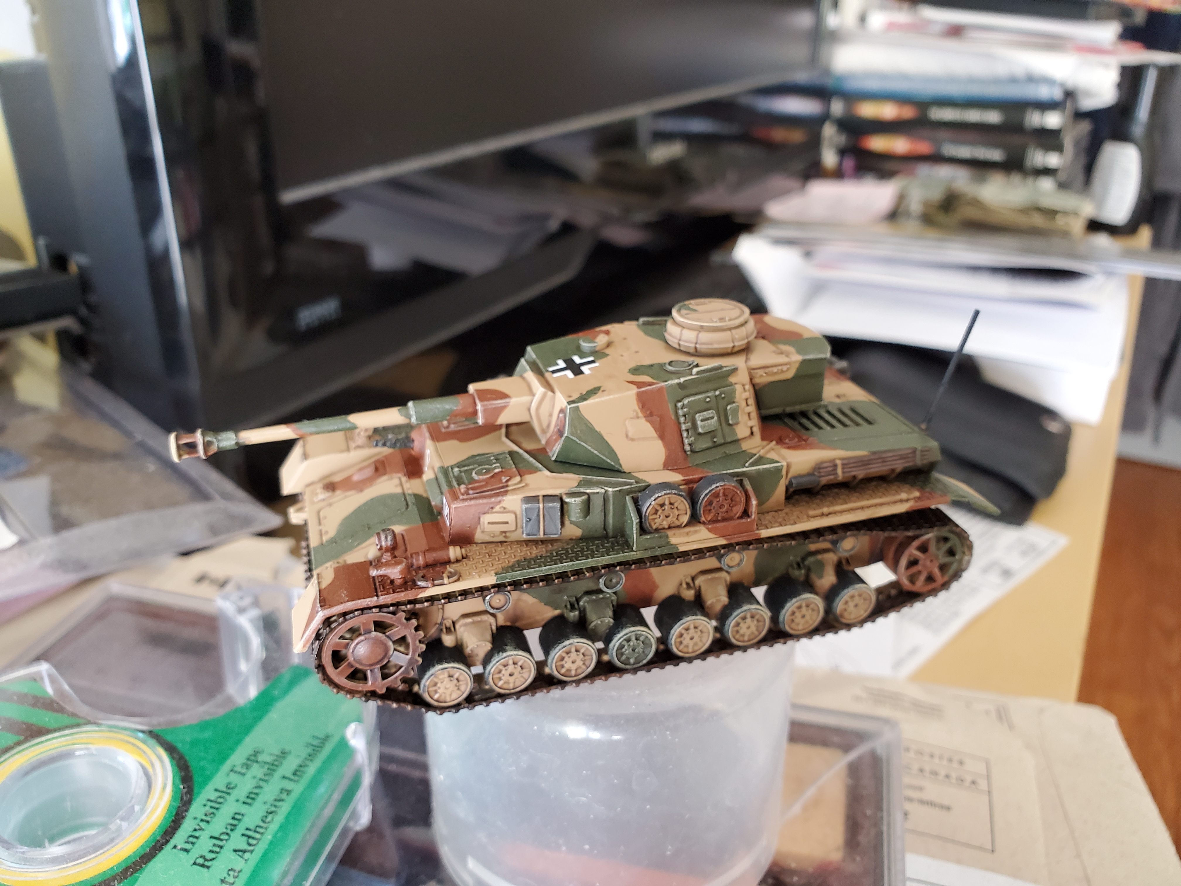 The pattern is a 3 colour pattern that is more typical for the Eastern Front in late '43 into '44, which is great for me as I went for NW Europe with this tank, but if my brother gets into Bolt Action it's likely to be a Russian army for him, so the pattern works for both even if the markings don't.
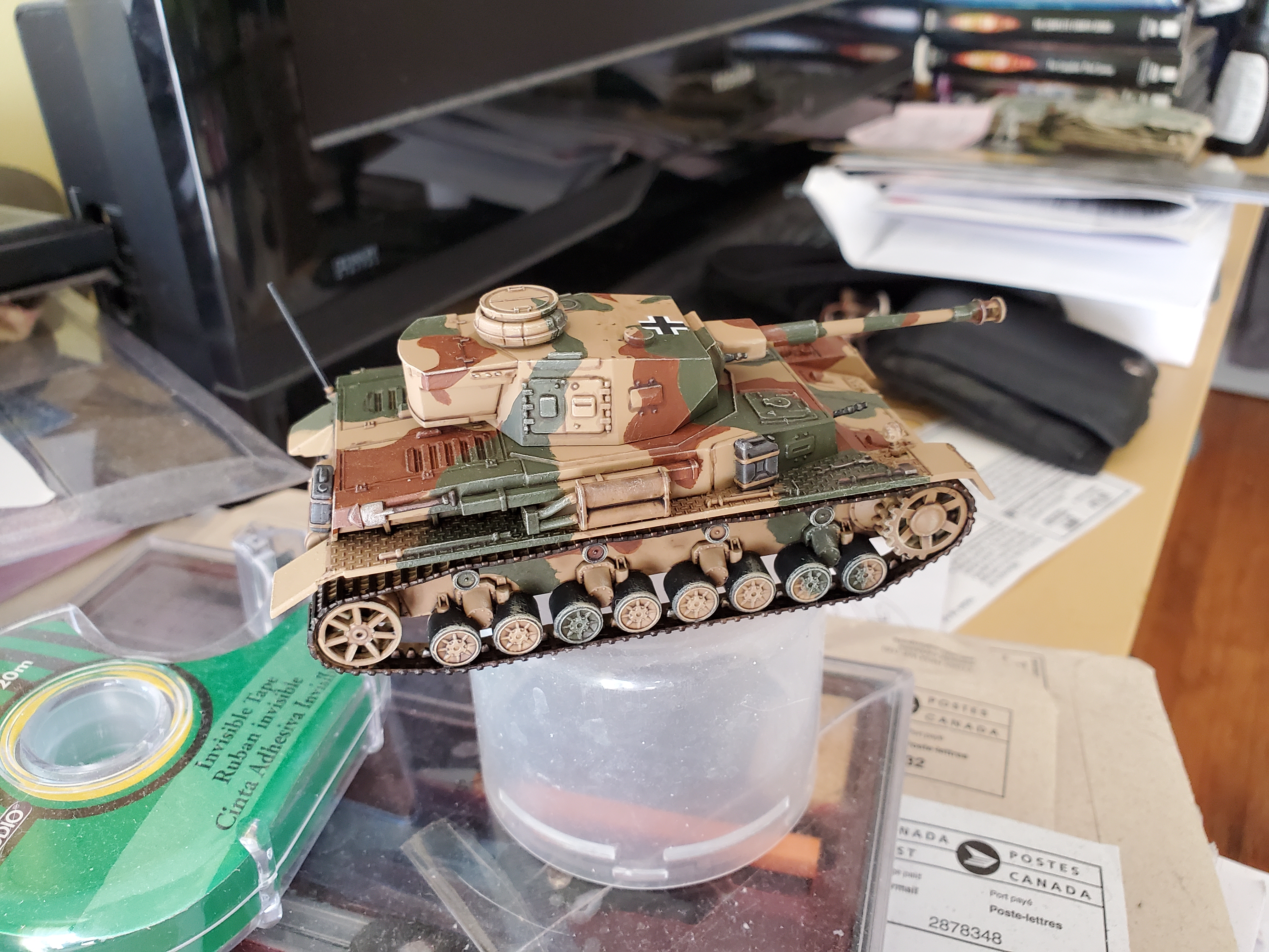 I used all GW paints here, so I'll go over some of the colours I used and they are a pretty good approximation for the colours in use at the time. The beige is Zandri Dust (I used this as a spray basecoat), the brown is Mournfang Brown, and the green is Castellan Green. They work quite nicely and also shade nicely with Agrax Earthshade, which is what I used to do all colours at the same time. After that I drybrushed the edges (really try and focus on the edges here) with Ushabti Bone. It is a little stark, but stands out well at this scale.
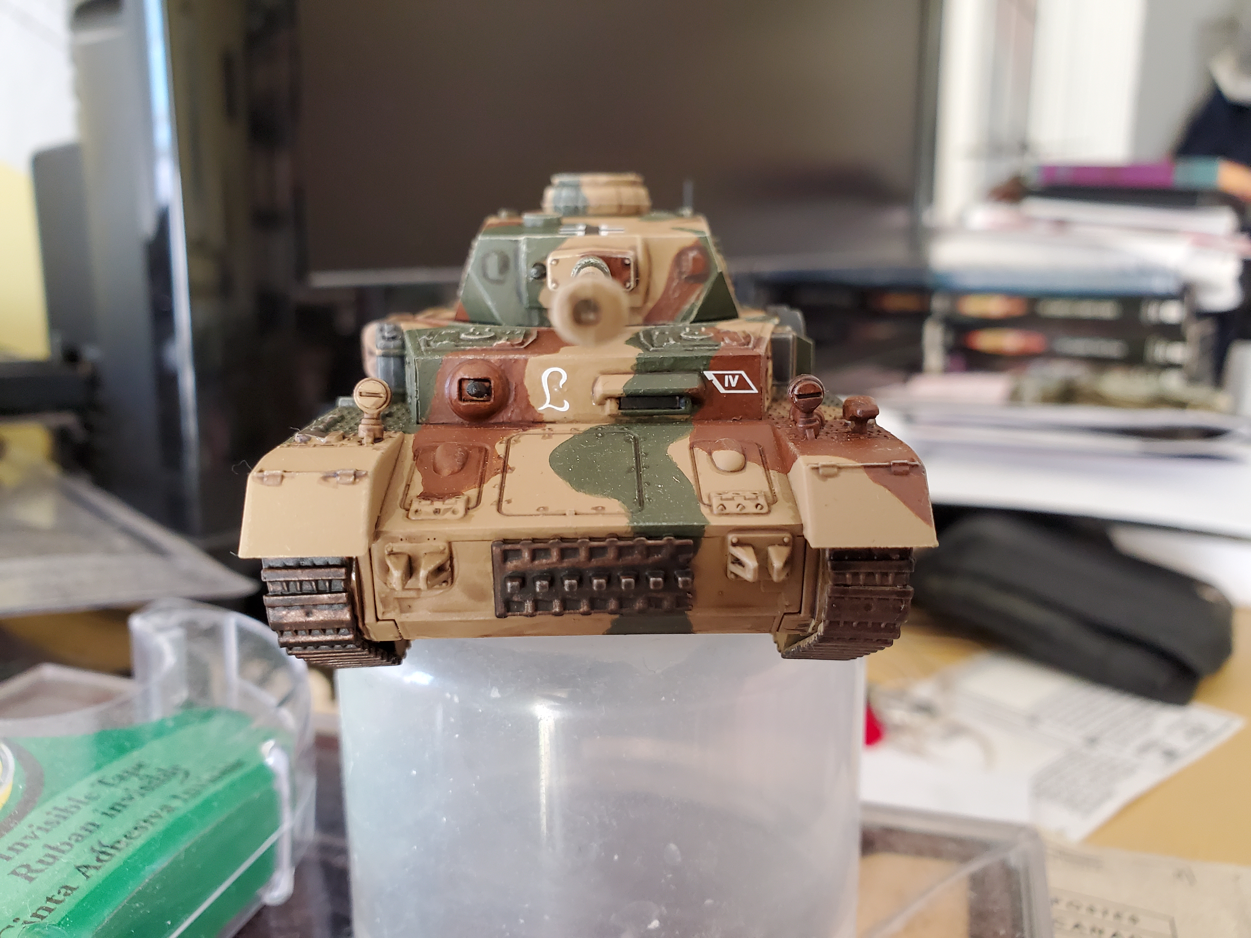 The markings are all decals available with the Warlord kit (which this is) and I went with markings for the Panzer Lehr Division. Not sure how accurate the placement of the markings is as the Germans don't seem to have been as strict with marking placements as the British were, but it works out alright for an overall look. I also went with a Balkenkreuz for the aerial identification symbol just because I'm more comfortable with it as a symbol, though it is not as accurate as a Nazi flag, historically.
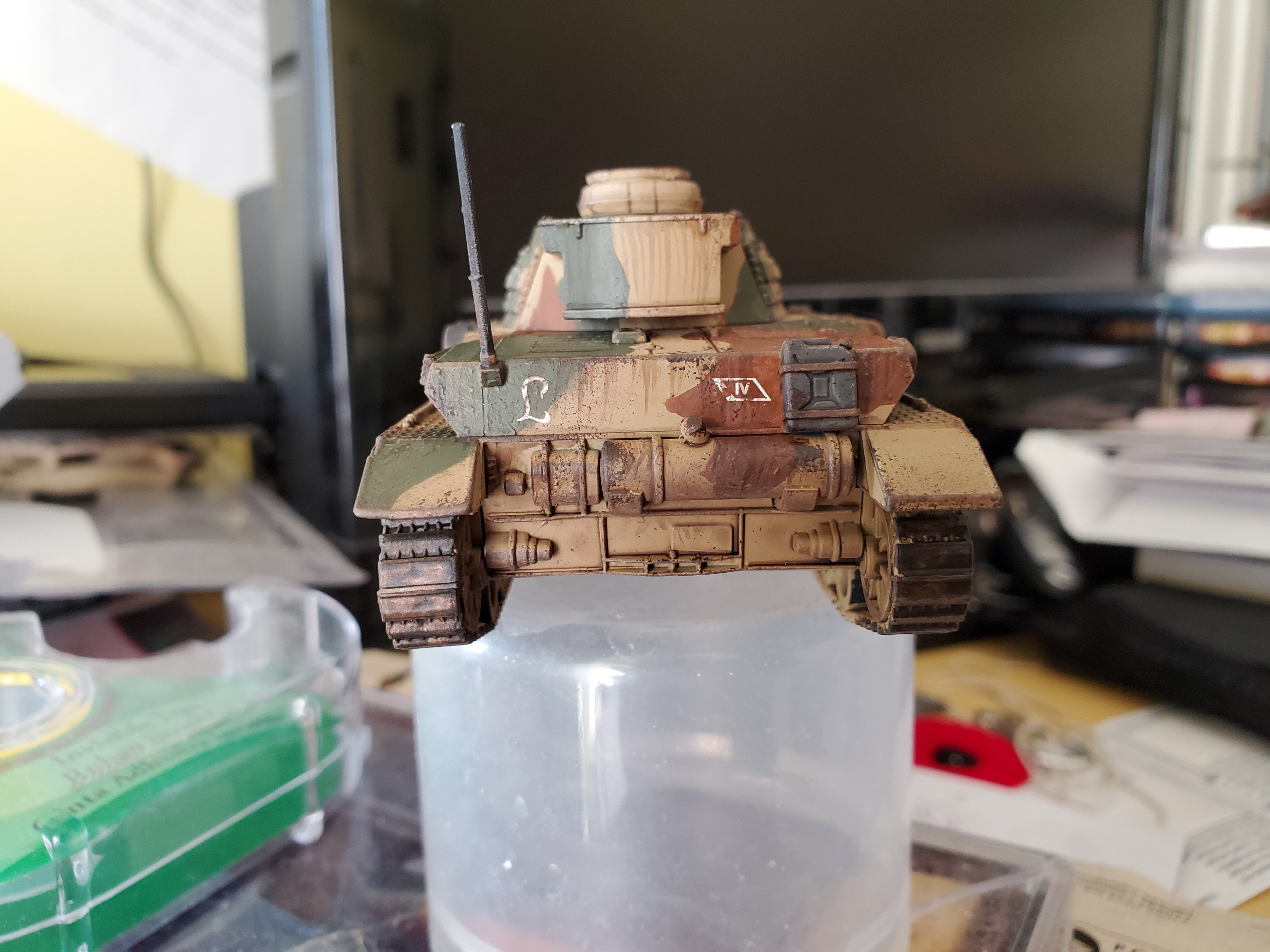
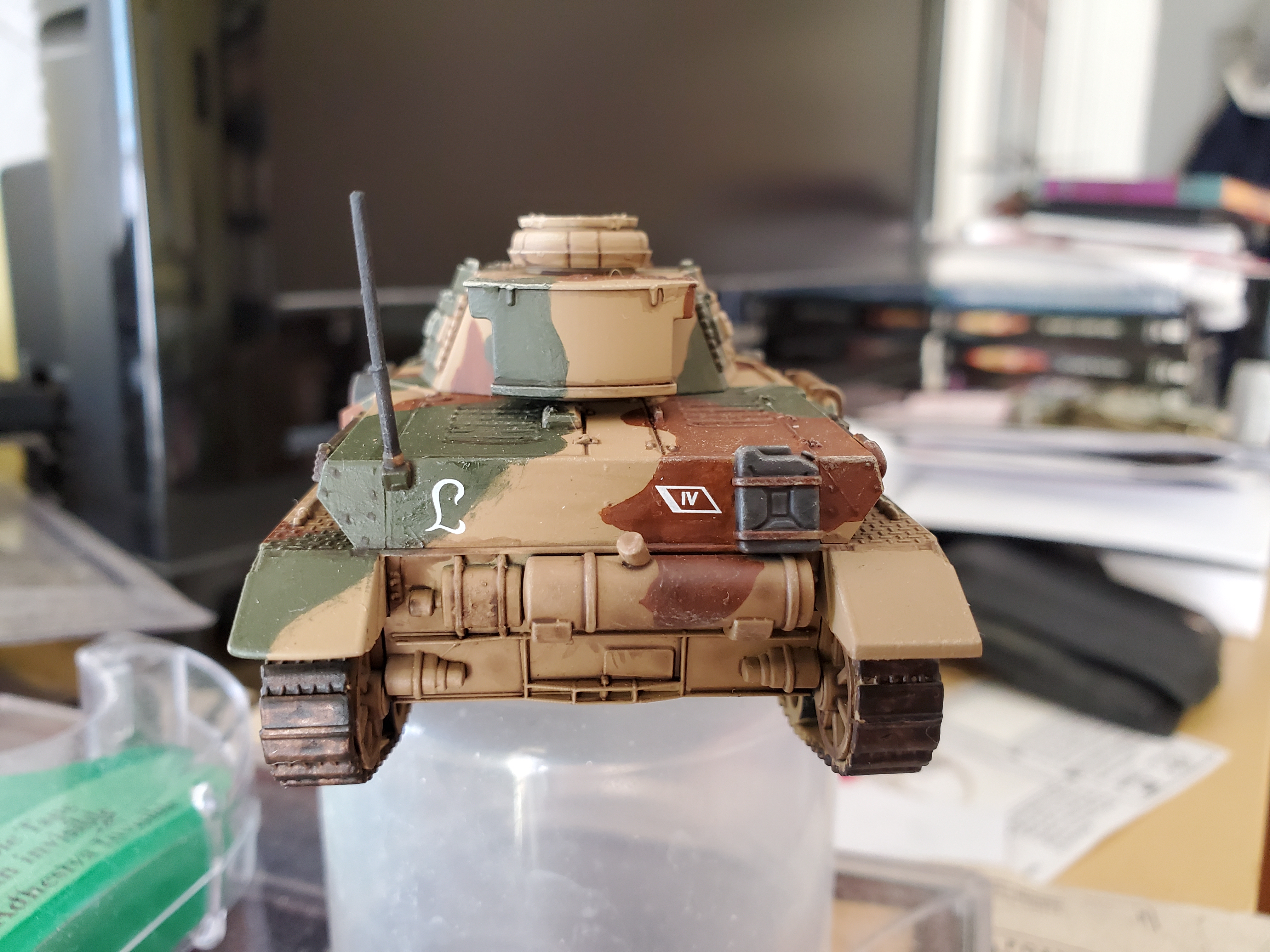 And the Lloyd shot! Do we still do Lloyd shots on tanks? We do now! This is actually the area that shows the only real dissapointment I have with this set. It sort of shows just how much this was designed as a 'gaming' kit, but the lack of detail around the back of the road wheels is pretty visible here. The lower detail on the outside will be covered by the schurtzen, but this is just a bit yucj to look at. This is probs because this was one of the first plastic kits they did as I think my StuG III has more detail there. But still.
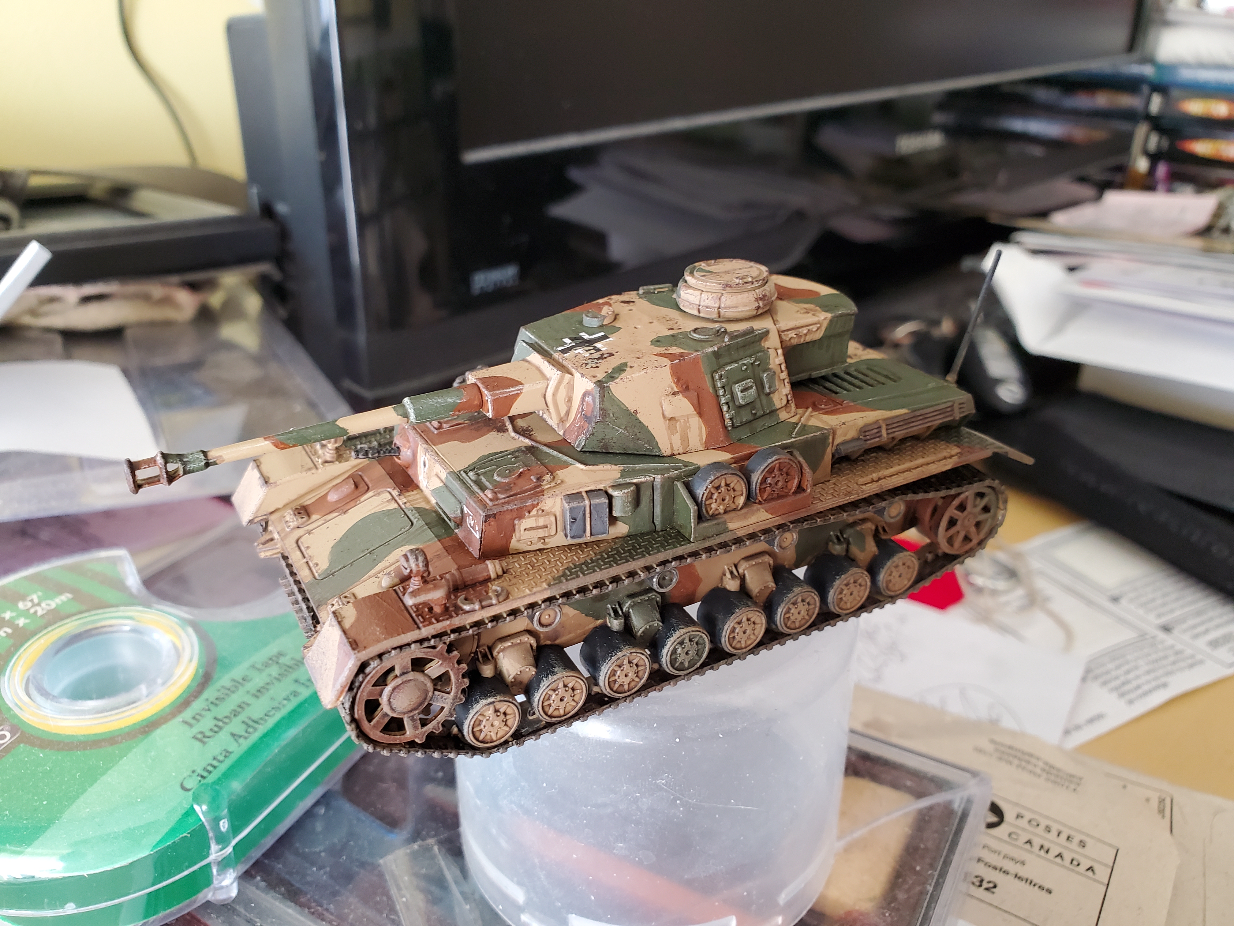
That’s the basic paintjob, but she looks far to ‘clean’ for combat, so here comes the weathering. Sponge stippling of Rhinox Hide was the start. Focus to edges, but also best to try and run across some decals (I ended up ‘scratching’ some of mine with the basecoat colours in places). It looked quite nice, but I decided to test something. I took some Wyldwood Contrast paint and heavily watered it down. Not with medium, with water. With this thin mix I added it in places water may drip down and dragged downwards. It works really nicely for this purpose. Another handy dandy use for Contrast paints! Anyway, here’s the dirty version!
I still have the schurtzen to prime and add, so she may make a reappearance later on, but I haven’t decided on a next project, yet. Schoolwork is ramping up for the end of the year, so time may be less to play with things, but we’ll see.
On the subject of Contrast, I also forgot to mention that is how I did the MG34’s and the tracks, too. Basecoat with Leadbelcher, then cover the guns in Black Templar (maybe thin this a bit with Contrast, though) and Wyldwood for the tracks.
Just imagine I made an amazing snake-based pun here...
The penultimate member of the team is finished! The snek ladies are usually my least favourite model in the range for Daughters of Khaine (I’m just ignoring the Doomfire Warlocks), but they have grown on me a bit. That being said, a mammalian reptile is a questionable notion but this is fantasy and minus the push-fit leaving a few obvious gaps here and there is not a bad mini.
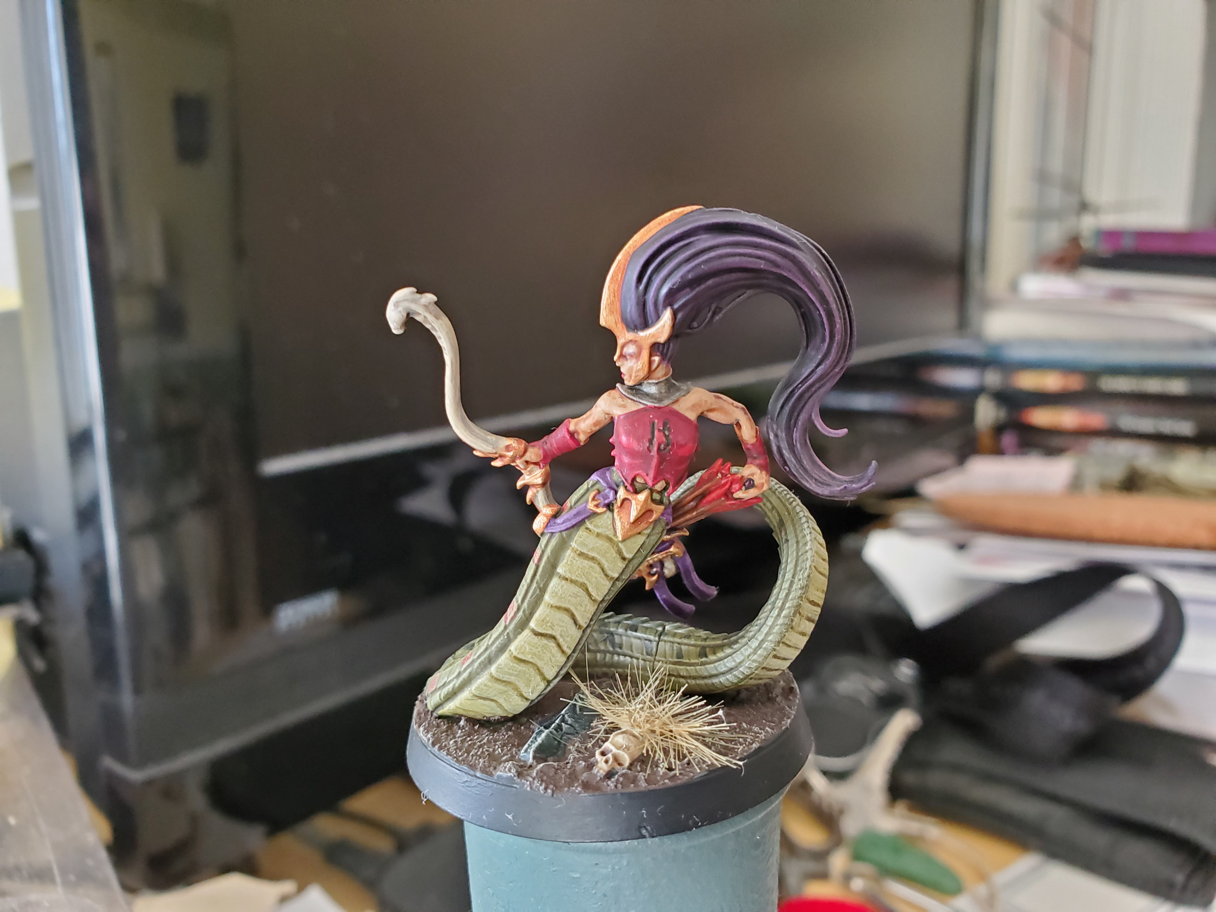 Just went with a simple pattern on the snake part. I'm not planning on having too many of these units in a larger army, so I will probably make the patterns on later minis different and unique and probably go a bit beyond this first mini. Might even change up the main body colour of the snake bits.
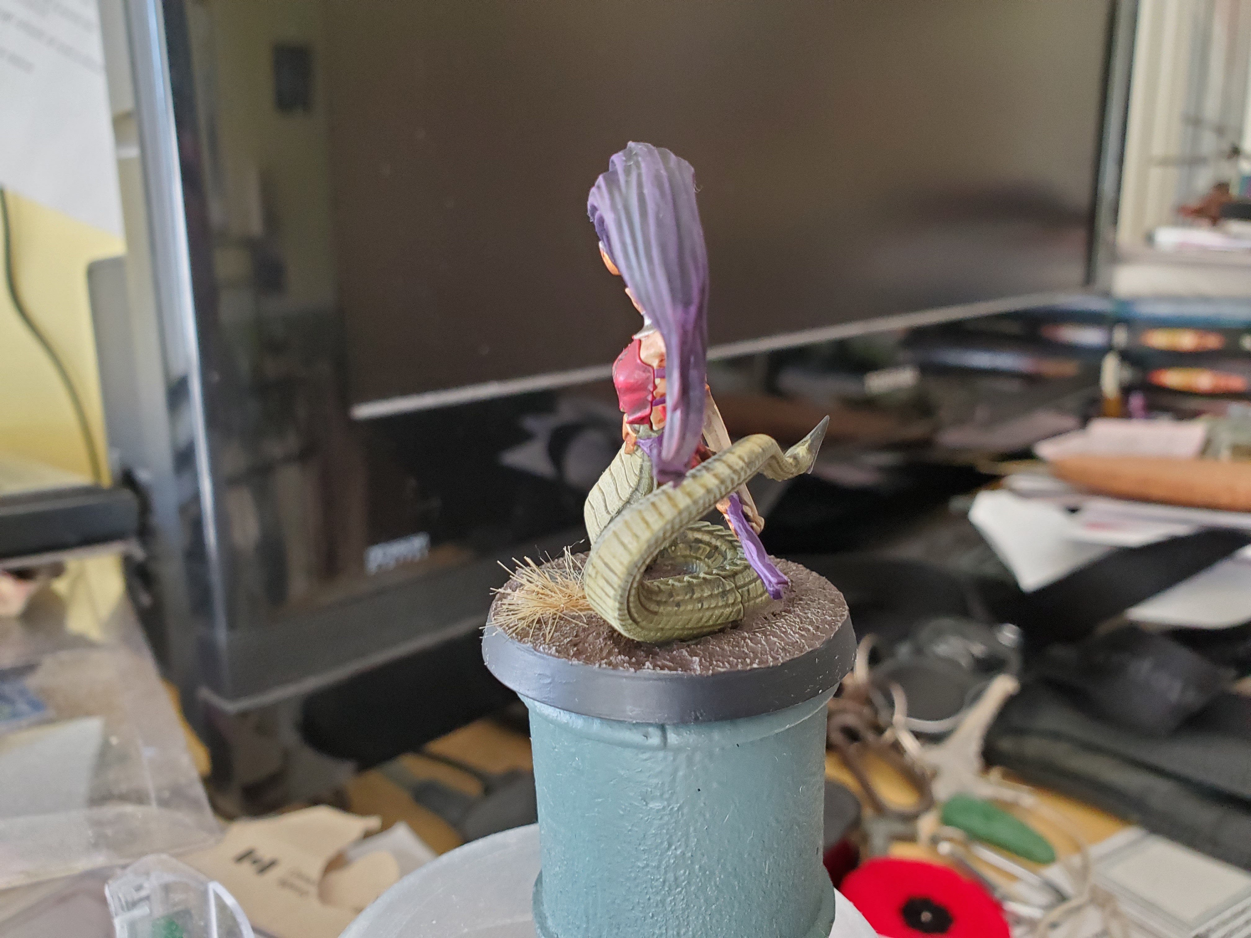 I went with a less natural purple hair colour here, just to switch things up a bit and because the snake 'legs' aren't exactly natural. Or is it leg? Not really a tail at this point...seeing as snakes actually have quite short tails...let's stop thinking about that problem...
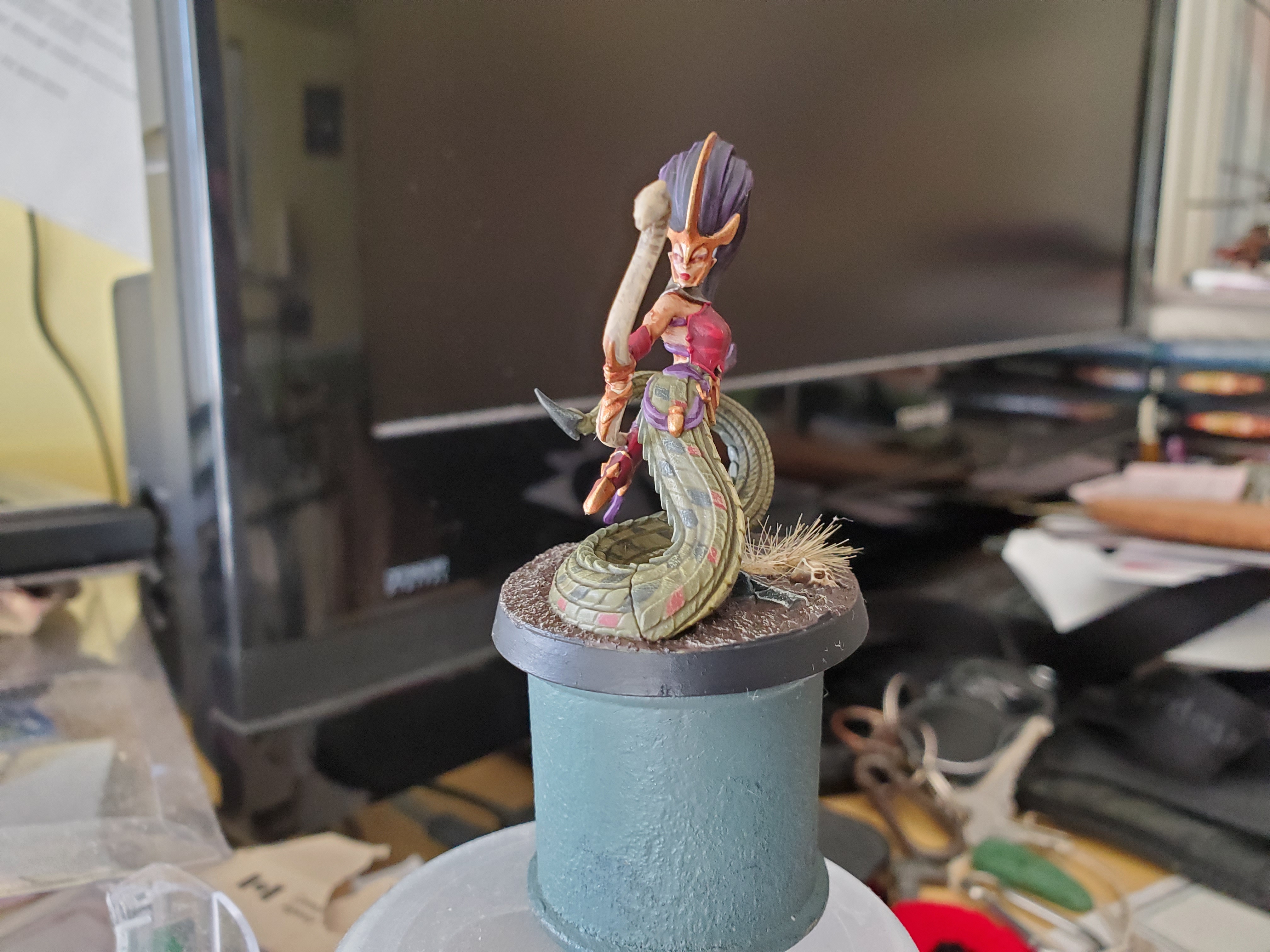 Tip for anyone who overdoes the starkness of highlights; glazes are your friend. Originally I had some VERY sharp lines between my shaded base colour and my highlight on the bow, but a nice glaze of my highlight colour smoothed it all out nicely. Also shades work quite nicely for eyeliner, if anyone is wondering.
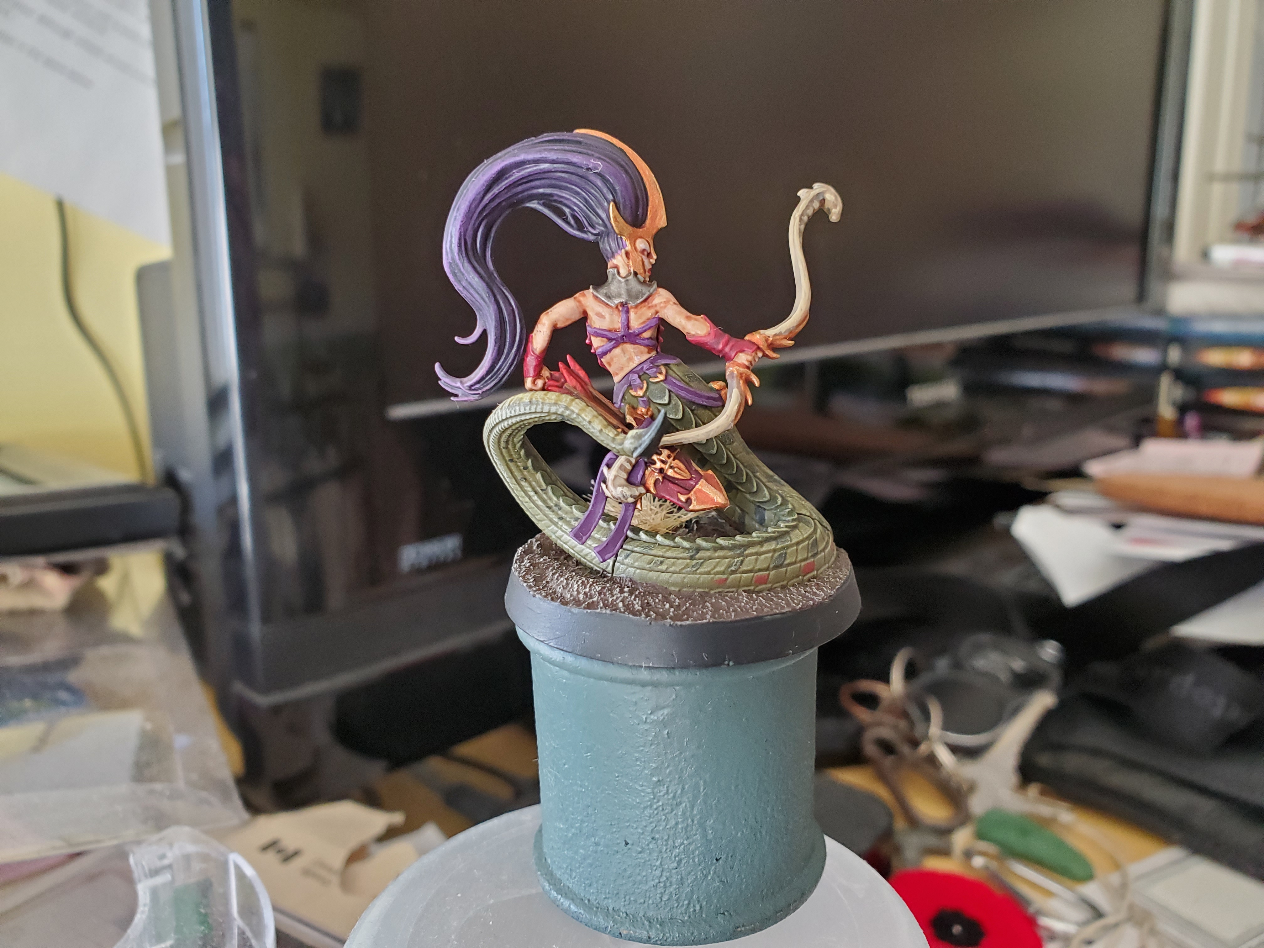 And the traditional Lloyd shot. My Khorne Red paint is sort of drying out right now, so I just decided to do the fletching with Mephiston Red to save what little is still usable...but also to give a different tone to it. Could have picked a brighter colour to contrast better, but I like the idea of the Murder Girls having blood coloured fletching. I'm wierd.
Might be a bit of a dry spot for update on this project…and I think it might actually be getting too full as well…so maybe it’s time to start a part 2? Who knows… This project does a lot of strange things for me. The ‘Previous Page’ tab never even appears at the bottom of the page for me… We’ll see what the future brings, but that’s all for now!


![Zenit Miniatures’ Samurai Warlords Now Live On Kickstarter [Updated]](https://images.beastsofwar.com/2026/02/samurai-warlords-launch-main-600-338.jpg)