
![Alternative Trench Crusade Miniatures? Trench Missionaries Review | Wargames Atlantic [7 Days Early Access]](https://images.beastsofwar.com/2026/03/unboxing-wargames-atlantic-trench-missionaries-coverimage-225-127.jpg)

Spring Cleaning Military Orders


Recommendations: 681
About the Project
Spring cleaning Military Orders models for infinity the game. Hard decisions, rebasing, paint and scenery making ahead.
Related Game: Infinity
Related Company: Corvus Belli
Related Genre: Science Fiction
Related Contest: Spring Clean Hobby Challenge (Old)
This Project is Completed
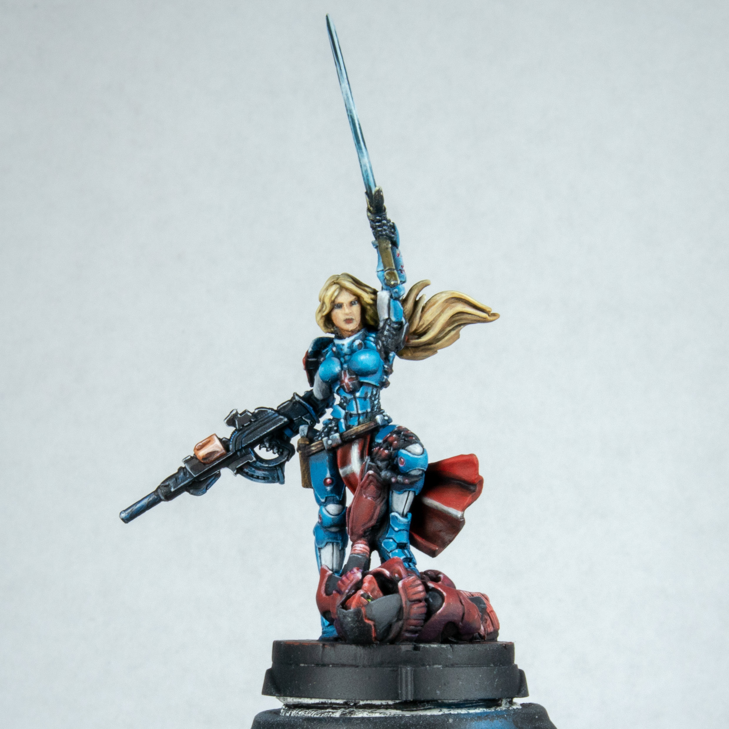
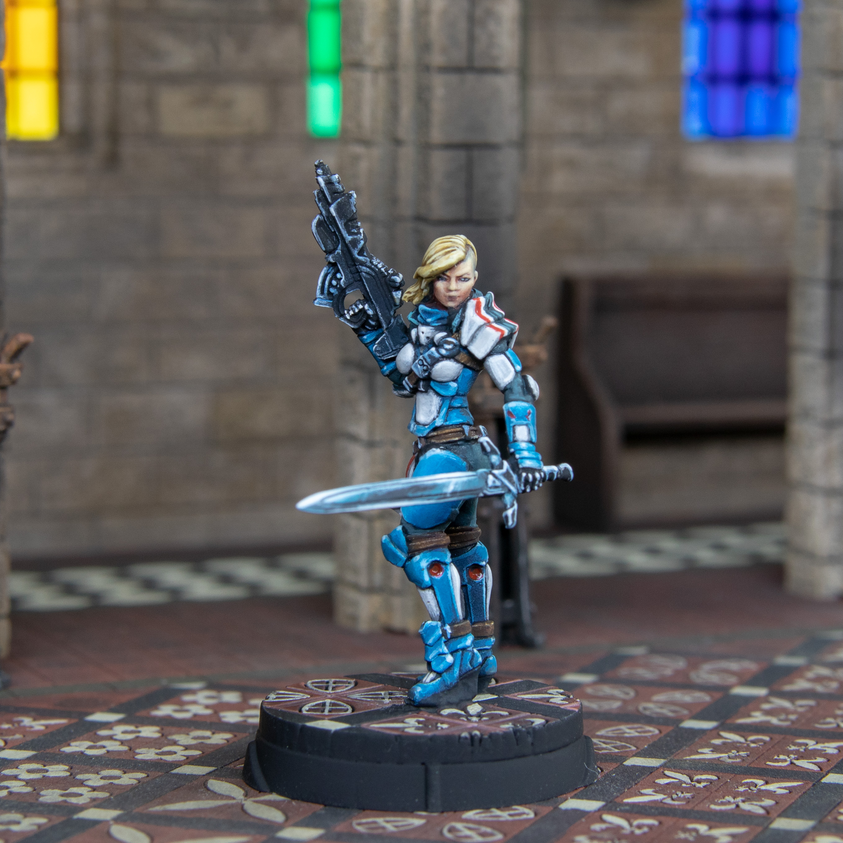
Joan of Ark 2.0 - Part Two.
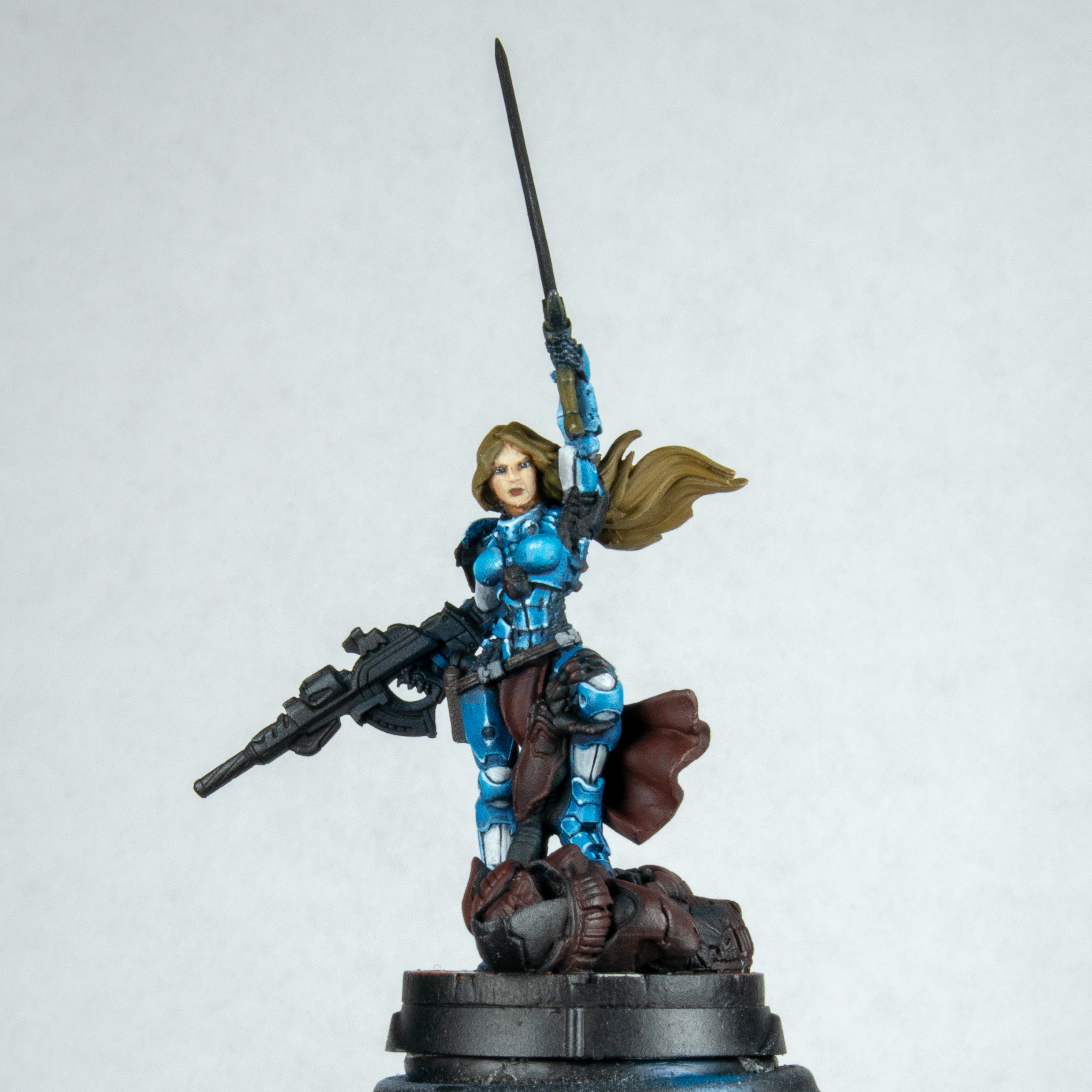 Next up is the face. I always want to do it at this stage, sometimes I leave it right to the end. But I decided to face my fear, pun intended. I will be here forever if I do a step by step on this. I took sunny skin tone as my base and slowly worked in glazes, lots of glazes of warm brown and dull red. I tried not to be hard with it like in most of my faces they always end up looking like men. This looks quite flat from this angle but you have to remember if you have two lights pointing at either side of your face there is not much shadows that are cast. From any other angle you can see more of the work. Sadly due to this point of view you will need to wait to the end. Faces in general are still very much a work in progress for me but I seem to have improved over the years. This is something that I may need to do some focused practice on. Clearly just watching Youtube has not worked need to do about 40 heads in a row. I also think there is one mould line on the model. That happens to be running to the right on the nose I cant be certain, that or I just painted by first broken nose.
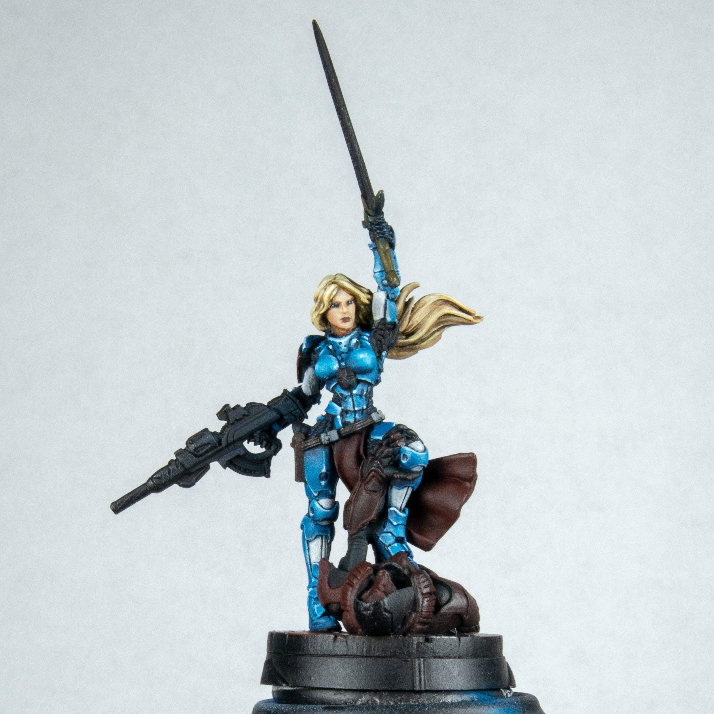 I love the hair on this model I had to paint it. Normally I would have left the gun hair and sword until the end. The main reason for this is that I have a tenancy to rest my hand on the model and can rub paint off or add hand oils. However her hair seems to be about 1/3 of the model and I wanted this very blond.. I started with English uniform flat colour. I then added some gold brown. When applying this I do small strokes almost little lines in the direction of the flow of hair to build up the texture. As I took this so light most of it was lost but it pleasures me to know it's under other small lines. At the stage of the gold brown I then washed with sepia ink in places and adding a little black in as well. I then re applied the gold brown and then added ice yellow to consecutive layers ending with ice yellow and white for the last very top highlights
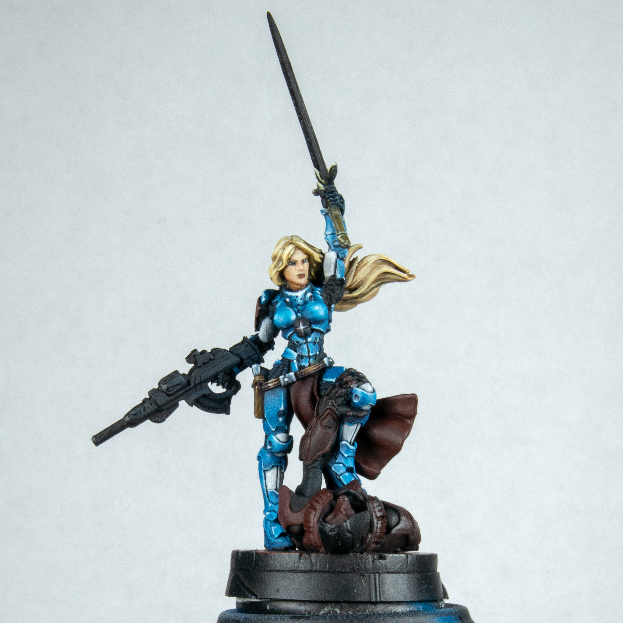 As I had the colours out I done the hilt of the sword to do a very dull gold. This is mostly black with English uniform a little gold brown ending in ice yellow. This was all done rule of cool. I didn't even think of my lights though this is not far off now that I look at it. I also done the holster and buckles. This was done with a stipple of dark brown, earth brown and sand colour then washed with sepia ink and then done it all over again. When done I used violet ink for the creases. I also picked out the buckles to do a silver metal look. Mixing dark Prussian blue and white I thought this looked a little dull.
 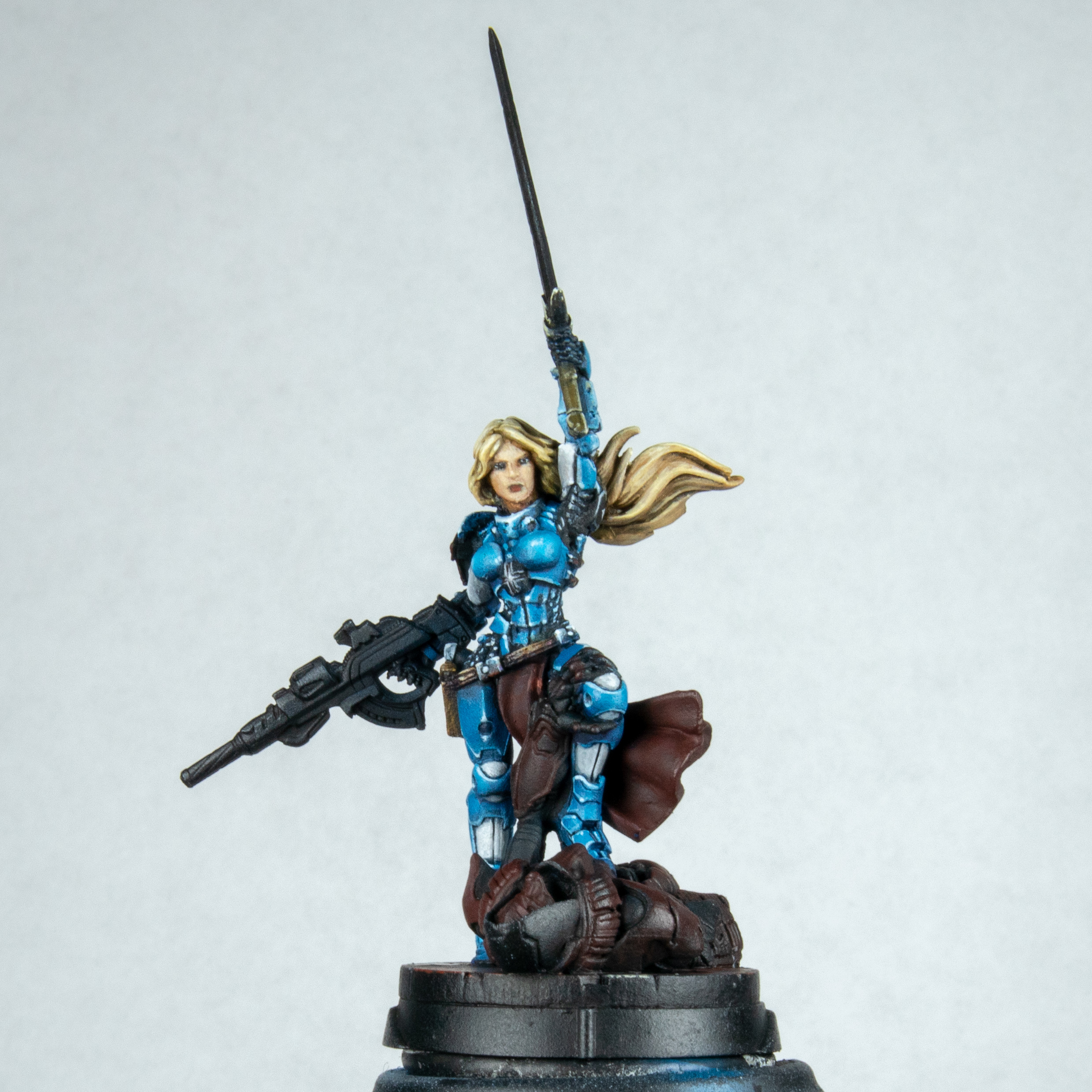 I then went ahead and fixed the belt. It was supposed to be silver but it was black at the bottom. I used red or blue for the reflections from the bottom depending on what was under each one. I also went ahead and added points of light on each of the mail sections done this in a pastel blue then picked out highlights by adding white to the mix. I did have issued under her armpit. This looked very strange done in this fashion. I couldn't shake this so I painted it over in back and tried to fade in a blue. This was rule of cool. I didn't want the viewers attention to be on her armpit. So it's not correct but to me it is right. I also highlighted the black on the cross section of the armour. I wanted to get an idea for my reflections on the belt buckles. Lol you have got no idea how pleased someone can be over buckles. Best part of the model even after I finished it.
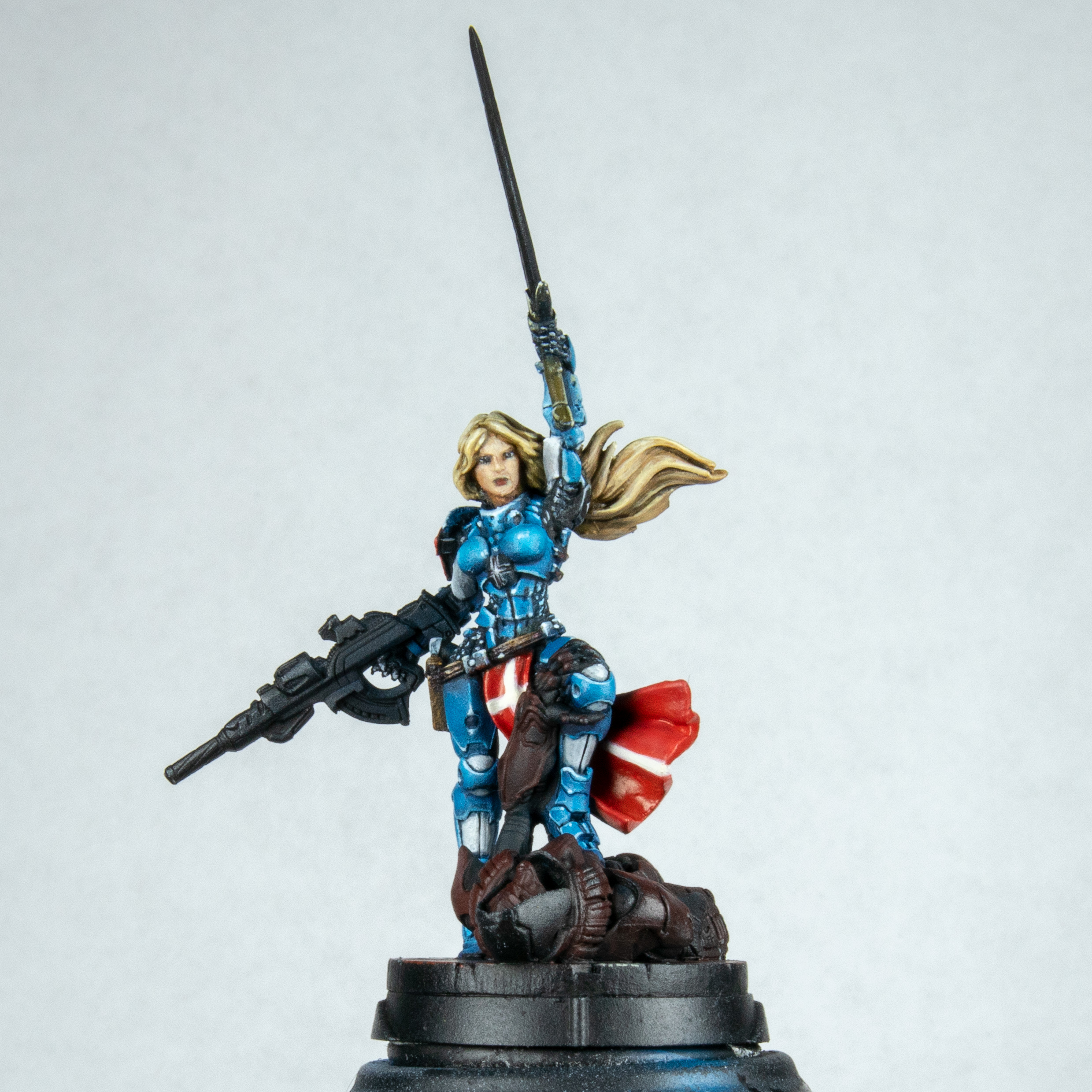 Next up I painted the tabard and shoulder in red and freehanded the white cross on it. This took 3 attempts. I should have just waited for the morning it was 2am when doing it. I painted this a dull pink before going in with Scarlett blood. A very glossy but very red paint. I then added a touch of skin tone to make a rich pink for the highlight. I was fearless though and just powered through I am trying not to overthink freehand from now. I also painted the red cross on her left shoulder pad.
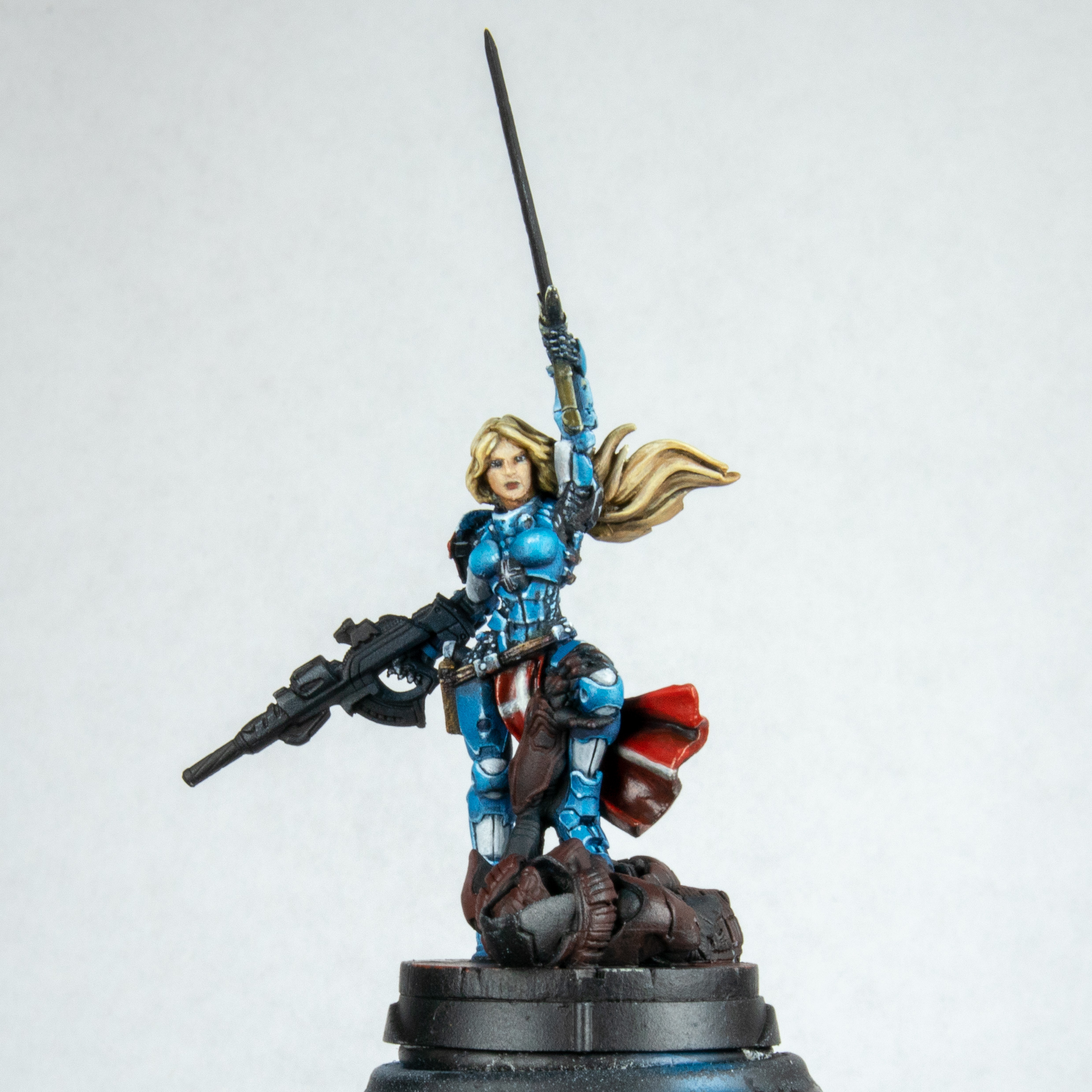 I remembered doing this before on the first one and went in with glazes and washes of black on the red but going back in and blending out errors with more red. I like the effect it gives but I wouldn't chose to use it mostly as it looks a little messy. It does keep the bright red in place though and doesn't desaturate it. You cant see much due to the gloss and I do correct this a little until the end due to this.
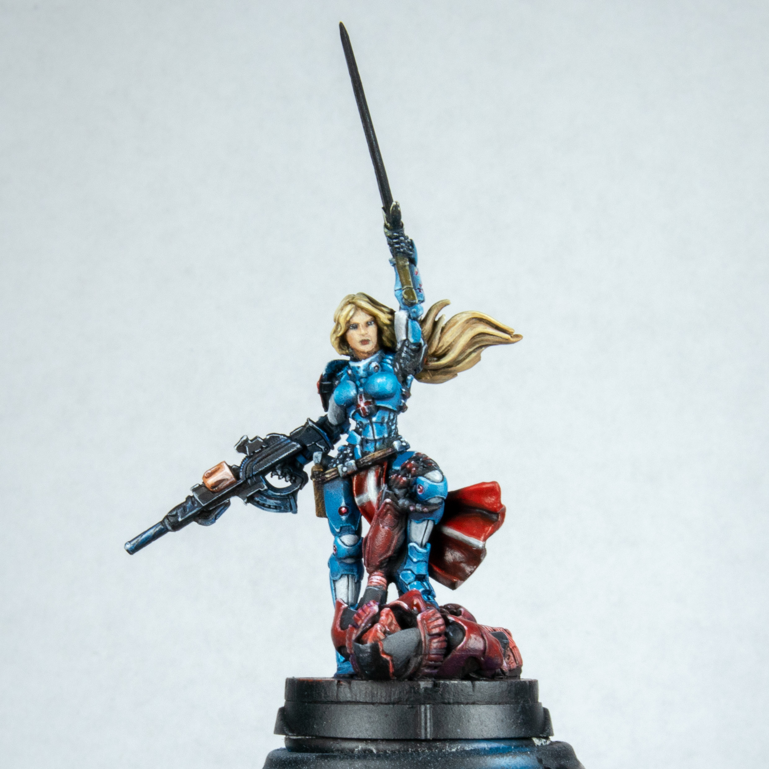 I then painted the Umbra on the base. I wont go into it but it was like painting another model. This did piss me off a little. What is the colour of the base? Red. The colour of the Umbra? Red. It clashes. If I didn't have the army and some of them to paint I would have done this in Necron style green. This also ended up shiny due to the use of the same red in glazes. I then picked out the red components on the armour trying to make a lens effect out of them. finished the gun by adding orange brown and red for my pallet along with white and some washes I used before for the cartridge. I lined the run out in white and added spots of dark Prussian blue washes to areas to give visual interest but not draw the eye to much. I don't like the out hanging gun on the pose but wanted to use that as a line to bring the viewer into the model.
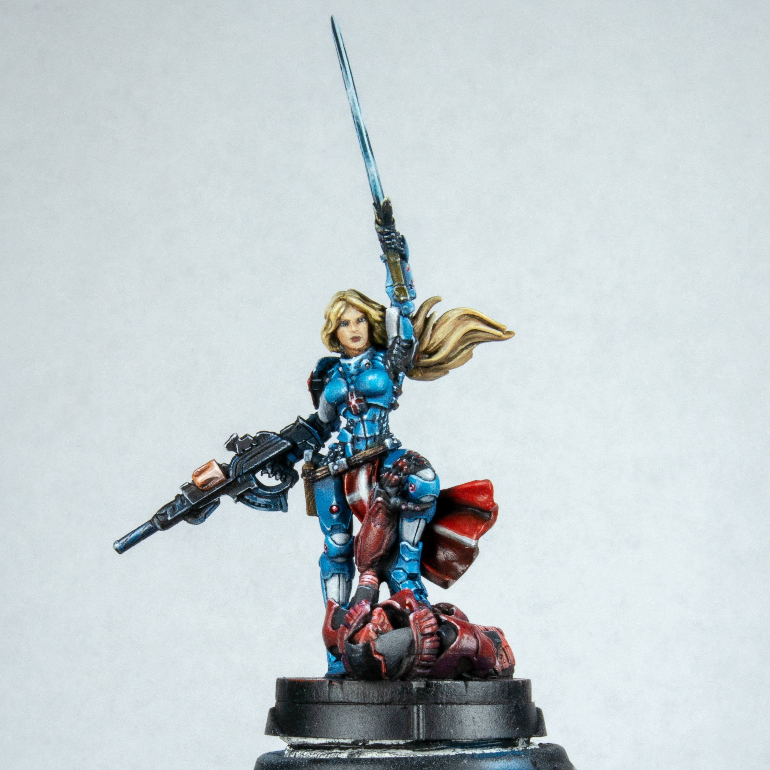 I went ahead and got my turquoise out. I was thinking of going more green on the sword but it didn't look right so painted it again is just turquoise with white and black added and then put in the sword with the side of the brush. You cant see much here. The only thing I did do was create a very almost water consistency of glaze before the final highlight and picked out areas of blue yellow and red depending on what would be reflecting. This is extremely subtle in real life but is lost completely in the pictures I think.
 At this point I am finished apart from the varnish. I took the time to look at the model and compare this to my first (technically second) Joan of ark. The two base models are pretty much the same. I have changed the way I have done things at points all over, I think the only thing that was done the same was the tabard. The mail before I think was over brushed. I highlighted the pano blue so much with white it is a desaturated dull grey blue. I think this took me a week to paint on and off. The other model I painted in a day and a half which is about double what I normally spend. This could have been photography time and thought rather than time with brush on model. I am still pleased with both for different reasons. I have painted a new benchmark in my painting journey and have two reference points I can look at when being too self critical, to ground myself. I still have loads to learn in painting models. I need to do more focused practice but that's hard when I have so many models I want to paint.
Joan of Ark 2.0 - Part Three.
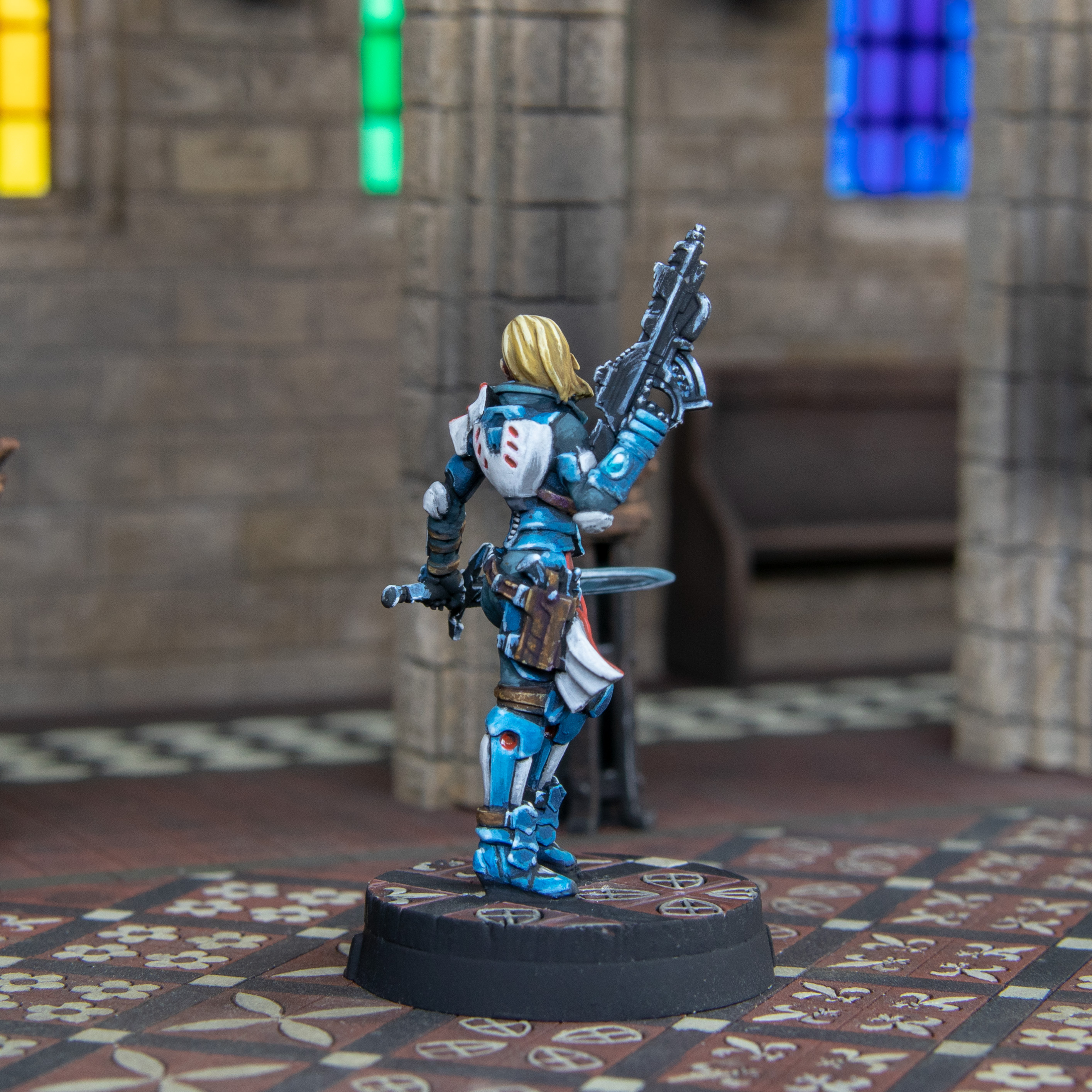
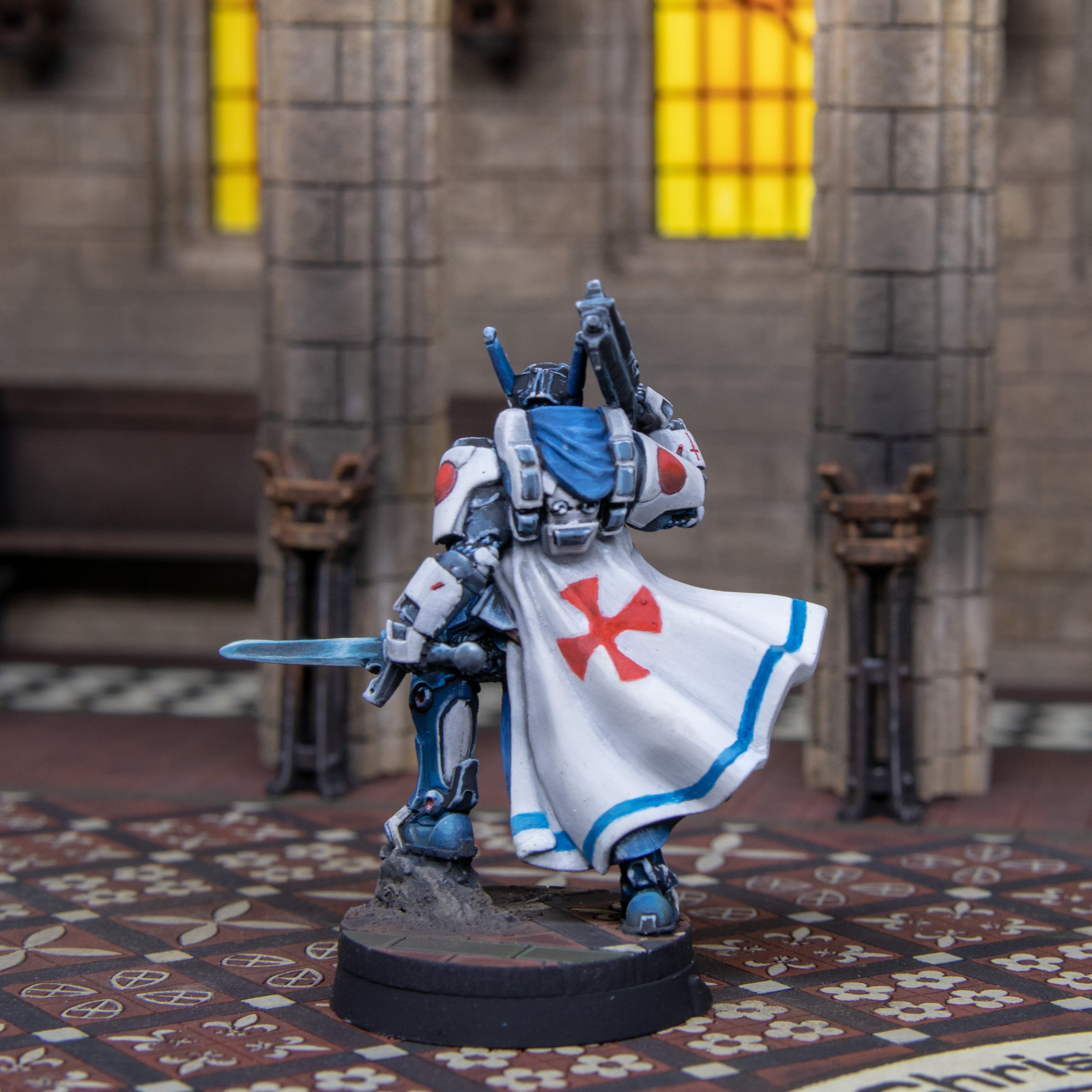
 After my pause for reflection (it went on longer than above) I gloss varnished the model then matt varnished it after it was dry. Before I don't that you will see I pushed the white tack it's on away from the edge of the model so I didn't paint this on. I also had to do some blood effects on the stumps of the poor Umbra. This was done with blood for the blood god and a messed up brush dragged in from the edge of the base. Not that you can see most of it as it's red on red... not that I am bitter.
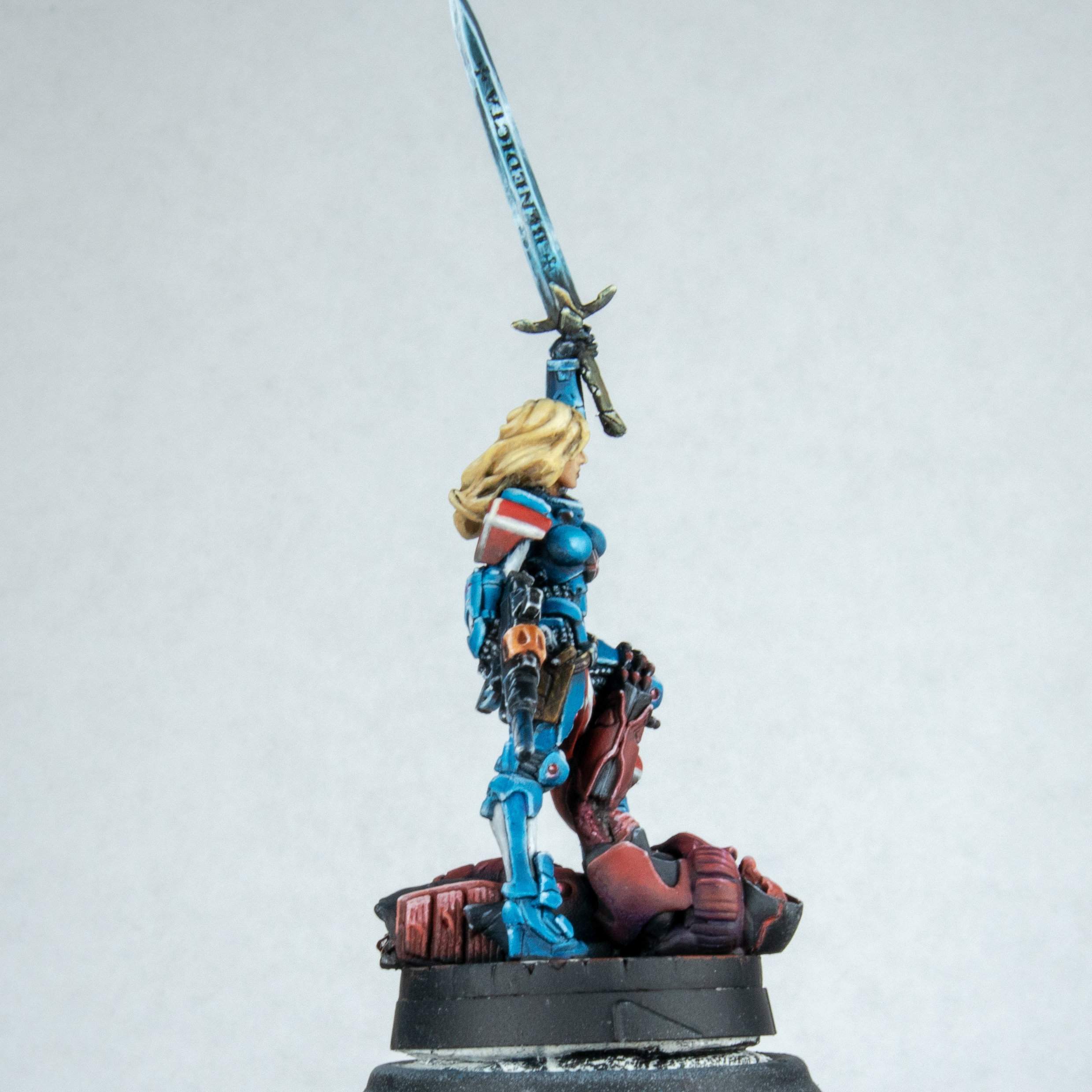 Yes I didn't just paint the front of the model. Though looking at all the pictures I wouldn't blame you for thinking so.
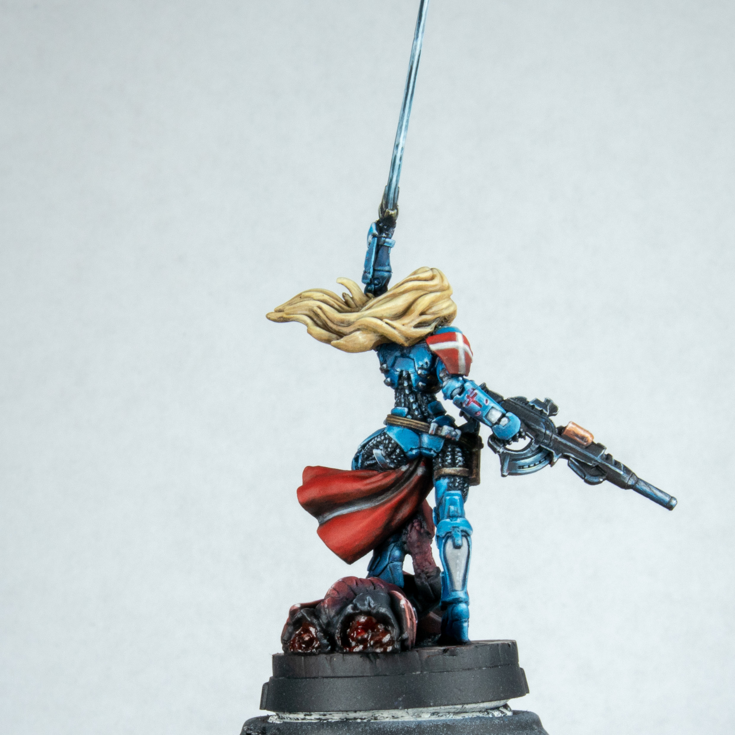 Bum bum bum. My favourite part of the back is on the left thigh. A little metal part. If there was an award for painting belt buckles I would enter it.
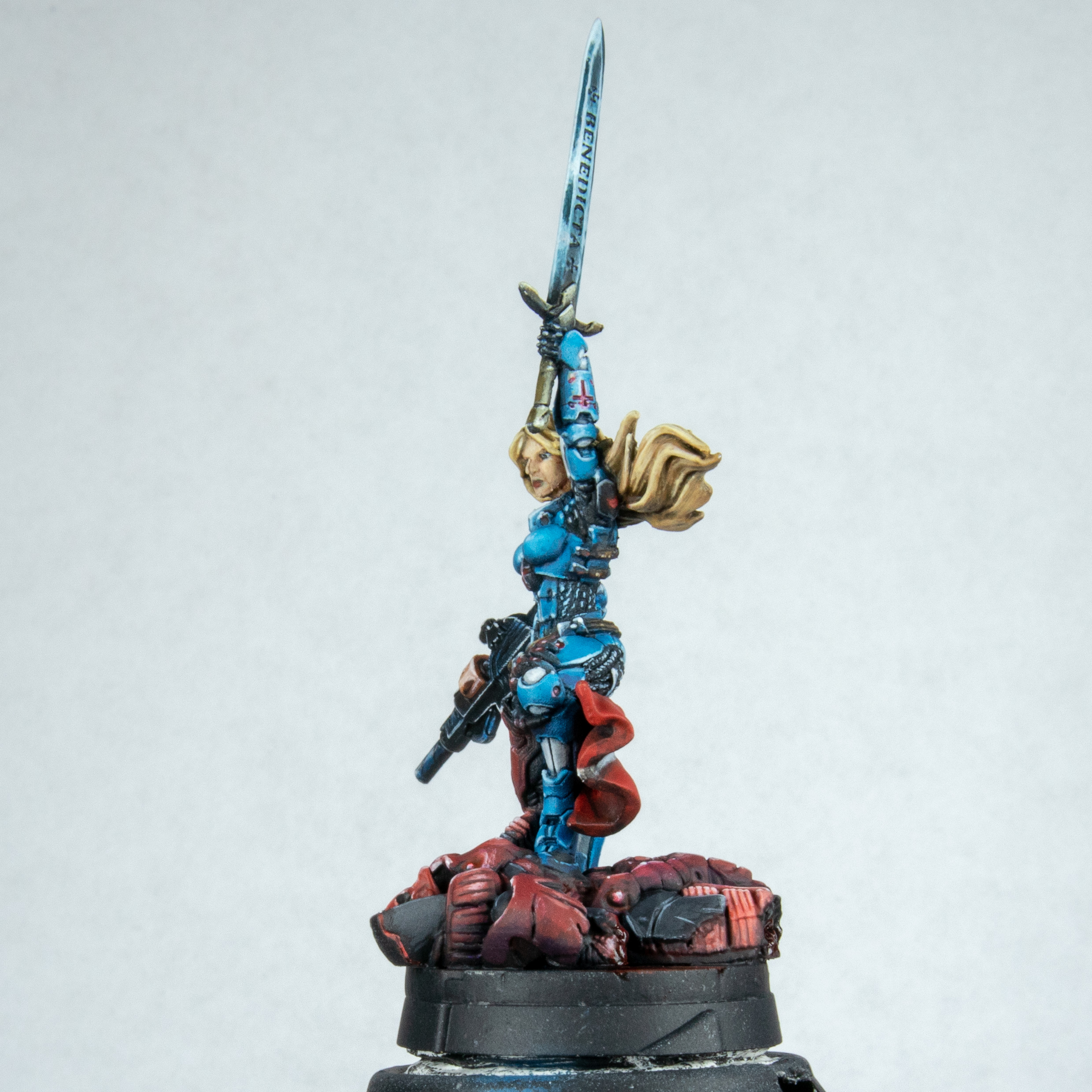 Oddly she does look quite manly from this angle though.
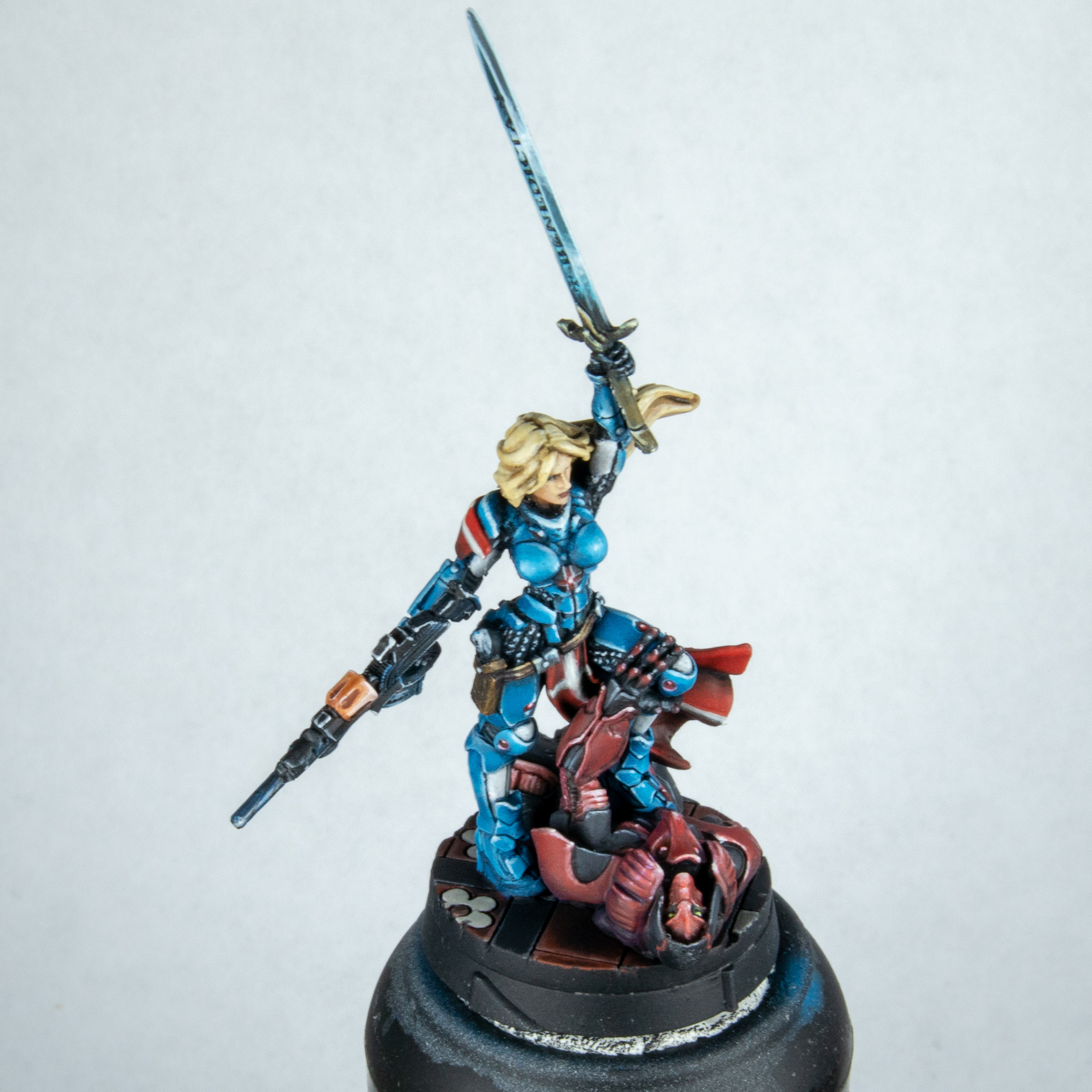 Shot from above so you can see the base. There will still be more pictures of this on the base when I decide on weathering and have it on the set. I am going to live with the model for a while before taking it off and possibly rework some things. I mostly want to repaint the face now. However not sure I could do much better. I also want to finish writing this up so I can look at Angels book to see how it's done properly.
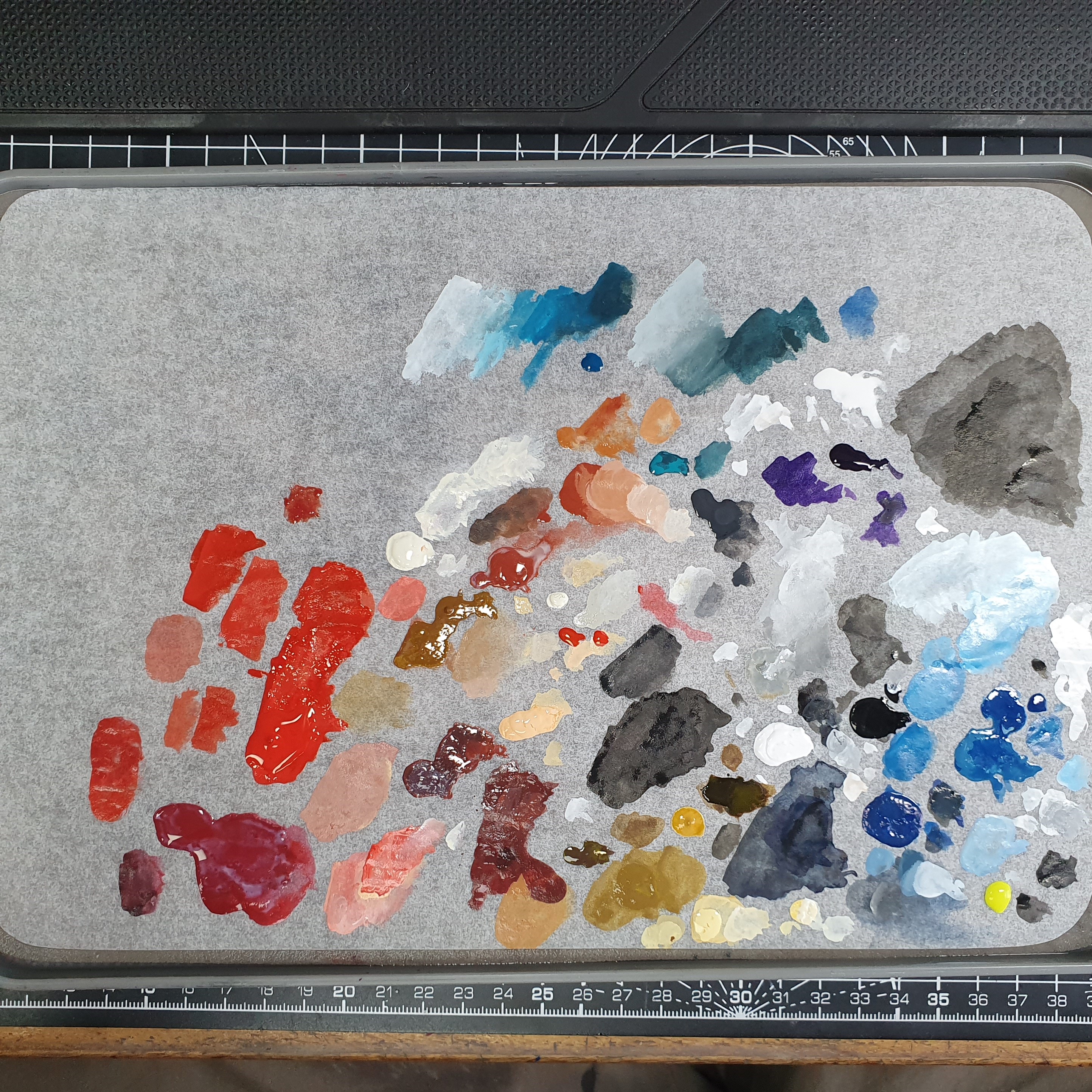 Also took a picture of my pallet. I normally can learn a lot from watching someone paint and then seeing the pallet when done but I know for a fact I don't use a pallet correctly. So much to learn so little time before we die.
So that’s the end of this section. Sorry if it’s TLDR (3200 words of TLDR). I actually write these for me and not you. Hobby therapy, this has actually helped. I normally finish a model and hate it within the next 5 minutes and then try and post about it online and not be negative. This has helped reach a milestone and slow everything down with contemplative thought. It was a bit indulgent doing a step by step and will not be doing another one for a while.. Maybe when they release a new Joan or I can get the mobility armour one. I am back at work tomorrow so this will also slow down as well for a while.
Next I will be repairing the models after moving them to other bases. Spoilers it already been done however I have not touched them with paint yet. I will then need to make some decisions about weathering on the bases and set. Whatever I will do it will be light. I just need to see a few models on it first. Then it’s waiting for the postman.
More to come. With less words.
[EDIT] Please criticise the hell out of this (model). Especially if you have read all the words and even if you have not. Call this the fee for the work I just put in to share it 😀 . This is something that I am missing a lot of in my process. Self criticism only gets you so far and constructive criticism is always welcome. This is a great point for it. I wish the project system had a better way of doing it but feel free to point me to reference photo’s or videos. I will consider each point and you will be helping me a lot.
Getting Bitty.
This week has been rough, nothing major just buy at work and a culture shock of having to work again. The project is still moving along but I am finding myself drawn in many directions for much shorter lengths of time. I am at the point I just want to sit and paint. Even when it comes to painting, I just want to paint a fresh model and not add to an old ones. I think this is phycological as I am generally happy with the models now and this makes a good enough mentality. But I have freehand to do, and I want to push the models a little. My heart is saying they are done, and my head is saying push on. I know who will win this.
 I base painted the bases and I took the two models off their bases. I cut around the outside of the base until it was just the plastic and the tab under the feet. I done this in lots of small cuts and not just chop them off. This worked but I did chip a little paint which was too be expected. I didn’t used to pin everything. I used the tabs. After they were free, I filed the base of the contact point down and drilled for a pin. I used to use paperclips, but they got dangerous, I now just use aluminium wire which is about the same per volume 1 roll and you will never run out. These are just superglued in.
 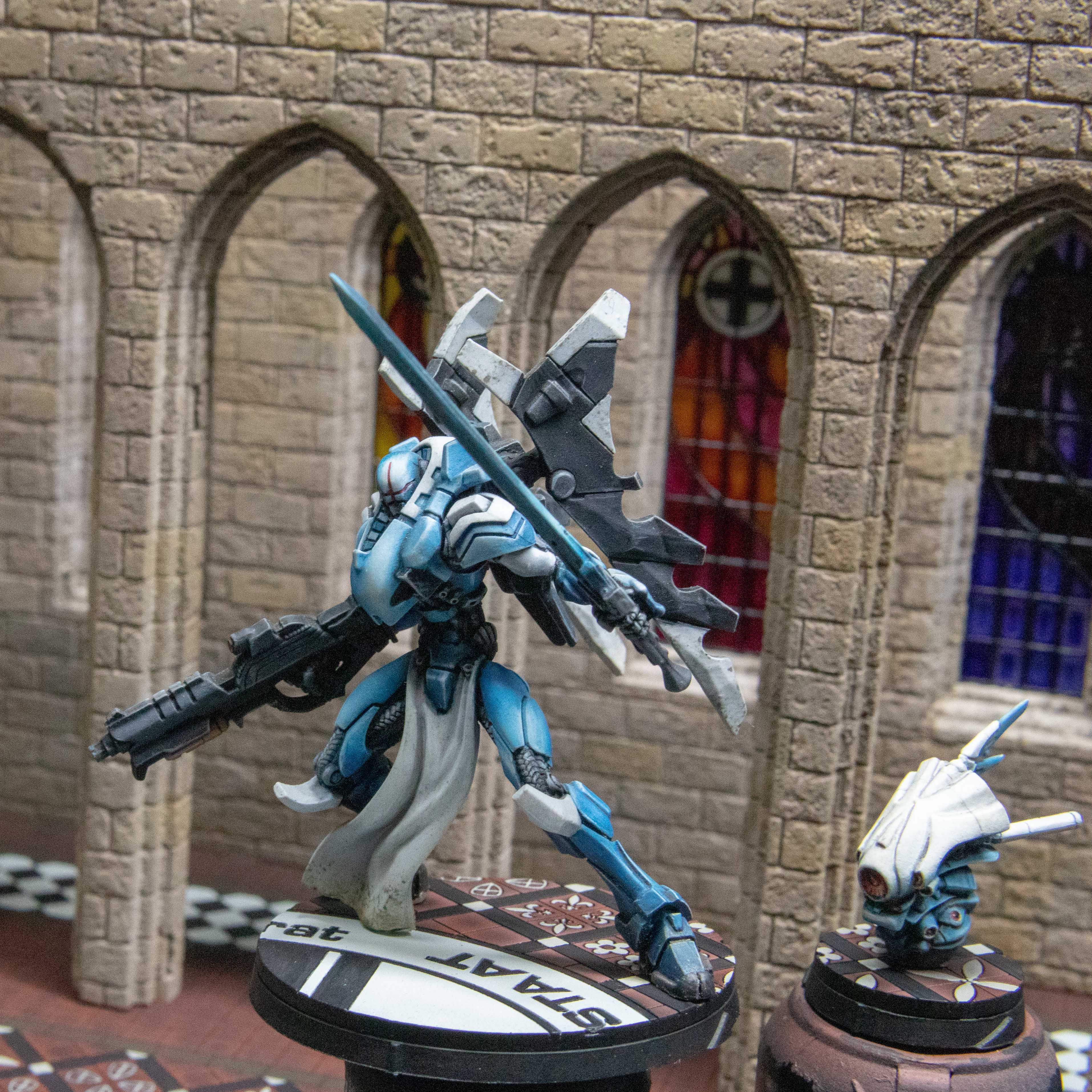 I apply paint globs to the underside of the pin and press this onto the base to make a mark to drill these. Making sure when I marked the front of the model is lined up with the front arc of the base. I then superglue these in place. Later on, I went onto use model putty to hide some of the gaps to the base. I went onto paint Joan after this but also got distracted after painting Joan. But these were ready for painting. I have redone the white on so far but will come back to this later when I freehand on stuff.
 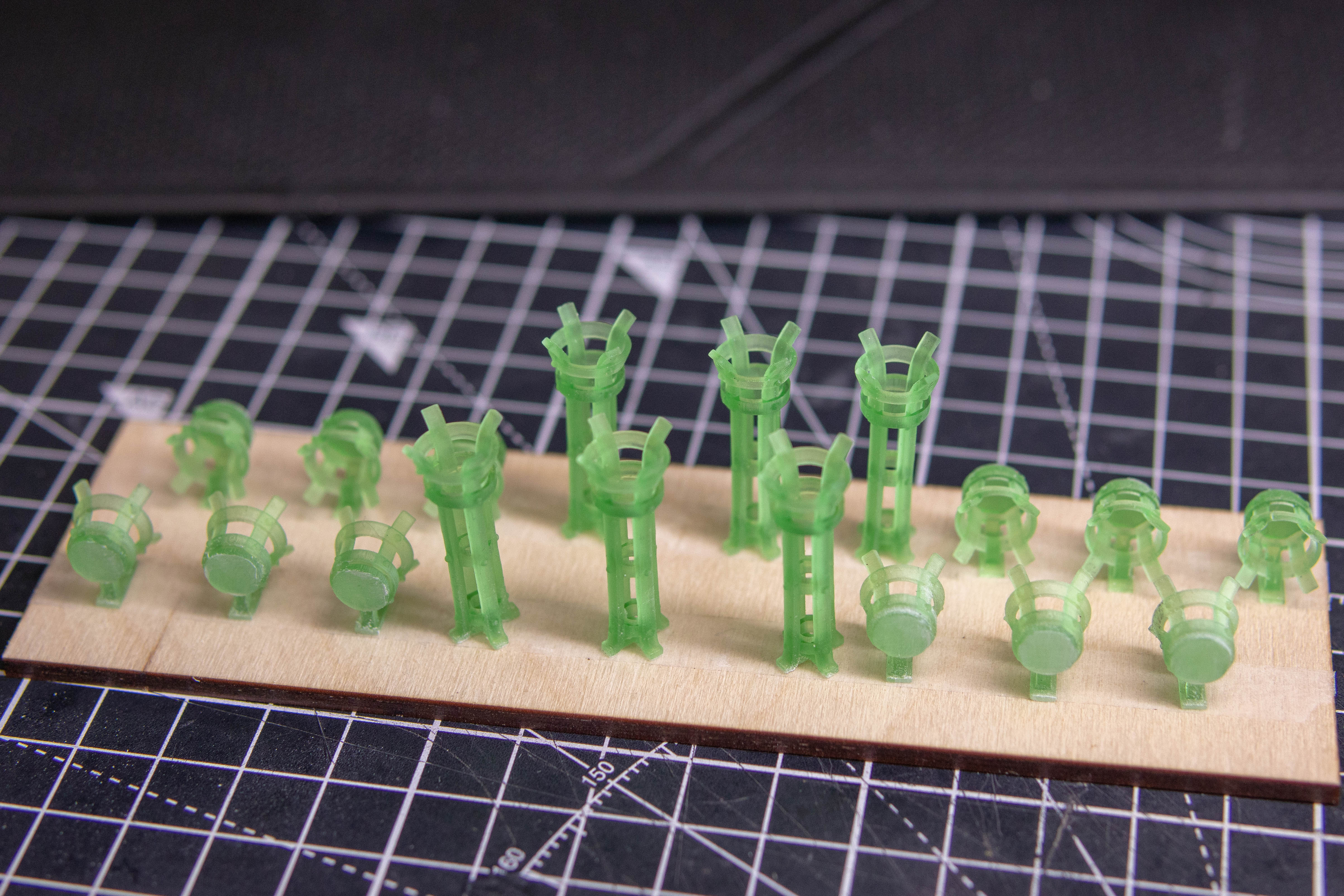 I was originally going to make chandeliers for the back hall and floor standing candlestick holders from the midground. I designed the candlestick holders, but it was taking far longer than I liked and it wasn’t going to add much. So, I went on Thingiverse and some great guy uploaded small base parts including some braziers. I thought about painting the flame but no this would require me to do OSL to make it look right. I thought about adding LEDs and no, under my bright lights the LEDs would need to be as powerful as the sun. luckily enough he has some empty ones. I printed them and they were too mall for me. I enlarged them to 150% and they seem about right now. I also changed these as they came with multiple options on them to just be three of the same using mesh mixer. I went ahead and made multiple copies.
 I googled “used firepits” to get an idea for colours. These seemed way brighter than I wanted but it did give me an idea for a quick paint. I primed then used rust texture paint to take away any sign of layer lines. Then stippled (not dry brushed) heavier layers of the darker colours softening to the lighter ones. I then dropped the pile of larger braziers but not to worry the wheel of my chair found it. Lucky I always do spares when I can.
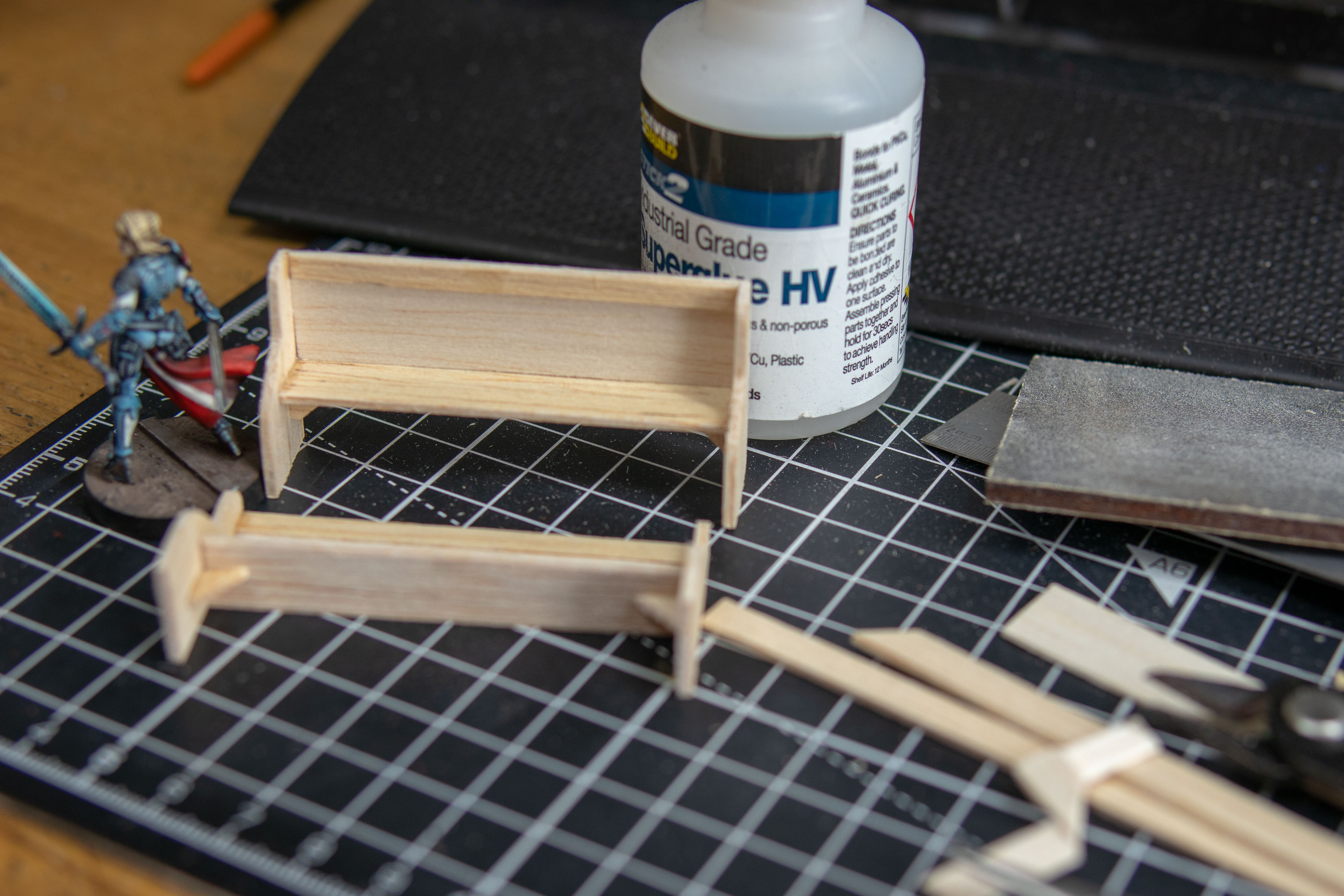 I also wanted to break up the walls in the background. I thought about reliquary’s or something high tech but decided to keep it old looking e.g., modern for today or back to medieval. I googled “medieval church pew”. It seems like these used to be very simple. I remember these as a kid, torture chairs. They are not designed for sitting. Evil as a kid they were too narrow. The ones in my church had a gap where the kid behind they could pinch your arse or put stuff down your trousers. Also, apparently that doesn’t matter, and you should not break other kids nose in a house of god… I didn’t need the hymn book stand on the back and copied the general design making this out of 1.5 and 1mm balsa wood. I didn’t have or plan for them I just measured to the knee of old Joan that set the hight of the seat and to the armpit for the hight on the bench. I corrected the childhood design flaw. And assembled using superglue. I just used clippers to make a small angle jog then cut the sides to make them the same and rounded them with sandpaper.
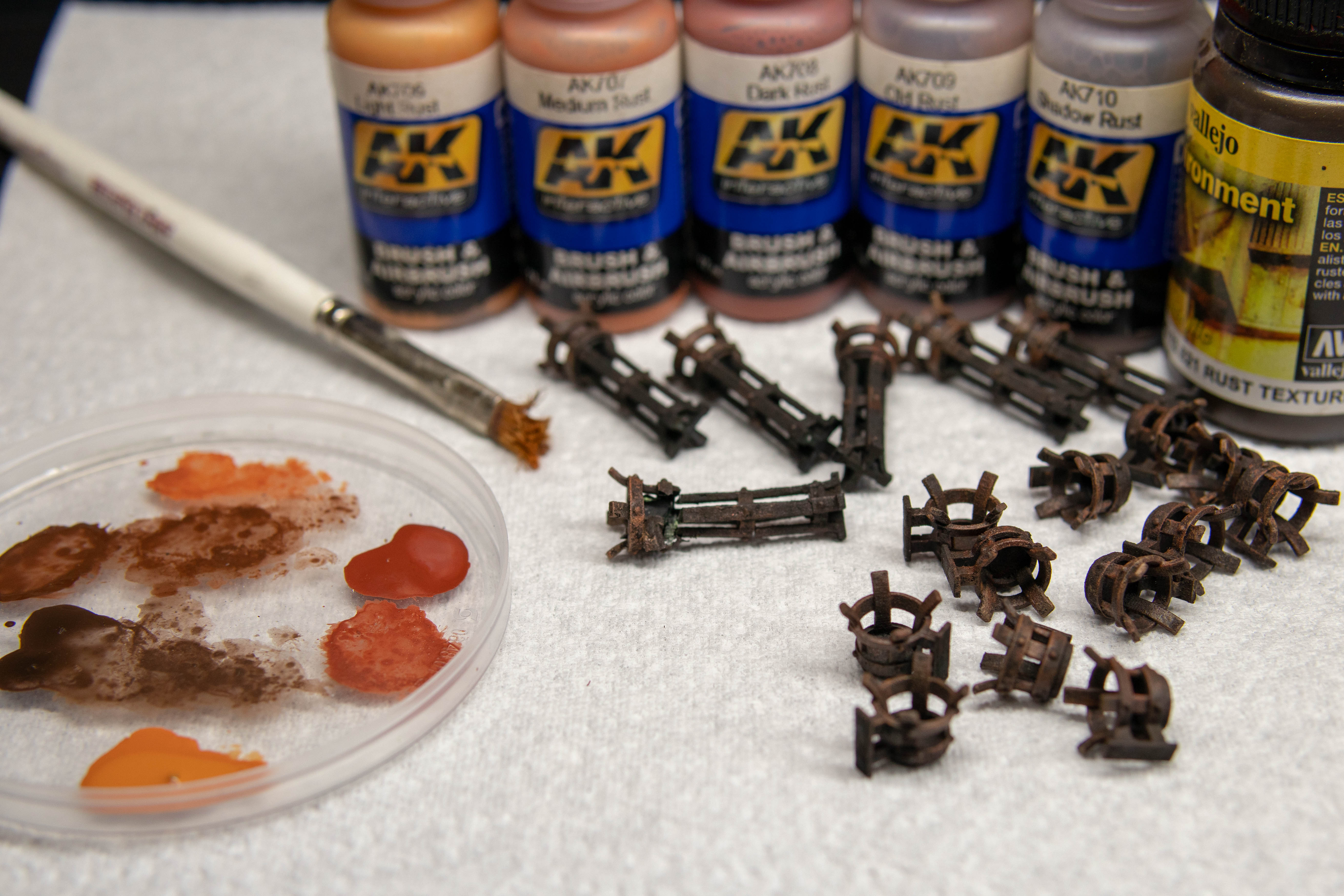 I painted these. Very quickly and simply going from darker brown to lighter by adding red and orange and then finally a little grey. Dry brushing all the way. I then gloss varnished and then to test it out used AK Ultra Matte for the first time. I normally use Vallejo premium matt varnish. But seen this on the Gerry Can. Wasn’t quite convinced but I am now 100% converted. Not as instant matt like my usual but when it dries it’s the most matt varnish I have ever seen.
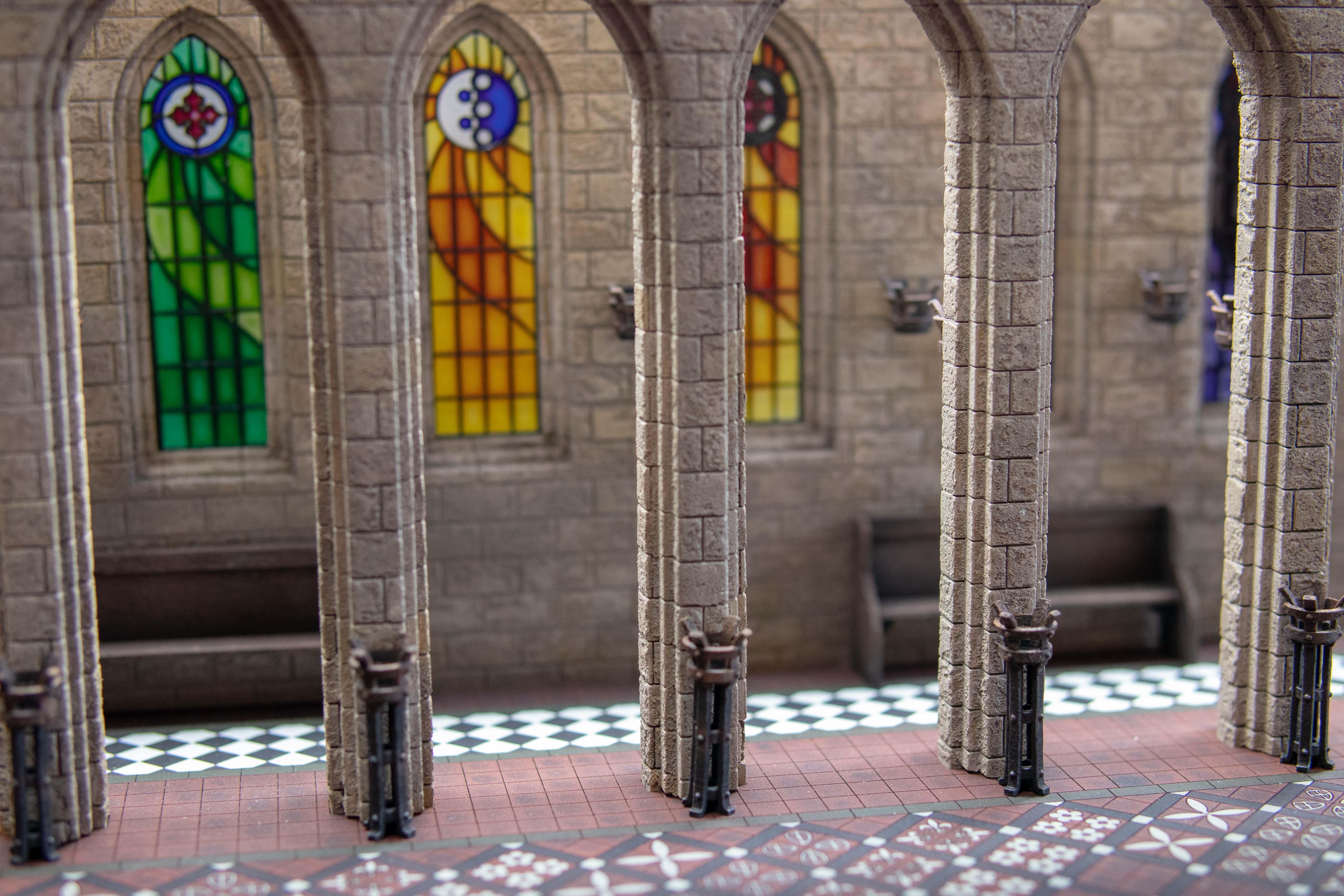 I then went onto assembly I superglued the floor braziers in place and then wall braziers making sure it was on the correct brick row. I love these details it makes you want to peak around the corner and makes it feel alive. However, there was nothing to tie them into the set. I got my airbrush and used blackwash as soot. I done behind where the flame would be and faded this out as it went higher. I also matted in between the window pains to reduce any chance of glare. Sadly, no photo’s but I also lightly weathered the base with oil washes of streaking grime, sand deposits and dark brown panel liner all stippled on then taken off with a damp brush. The effect is slight, but it does bring it together a bit.
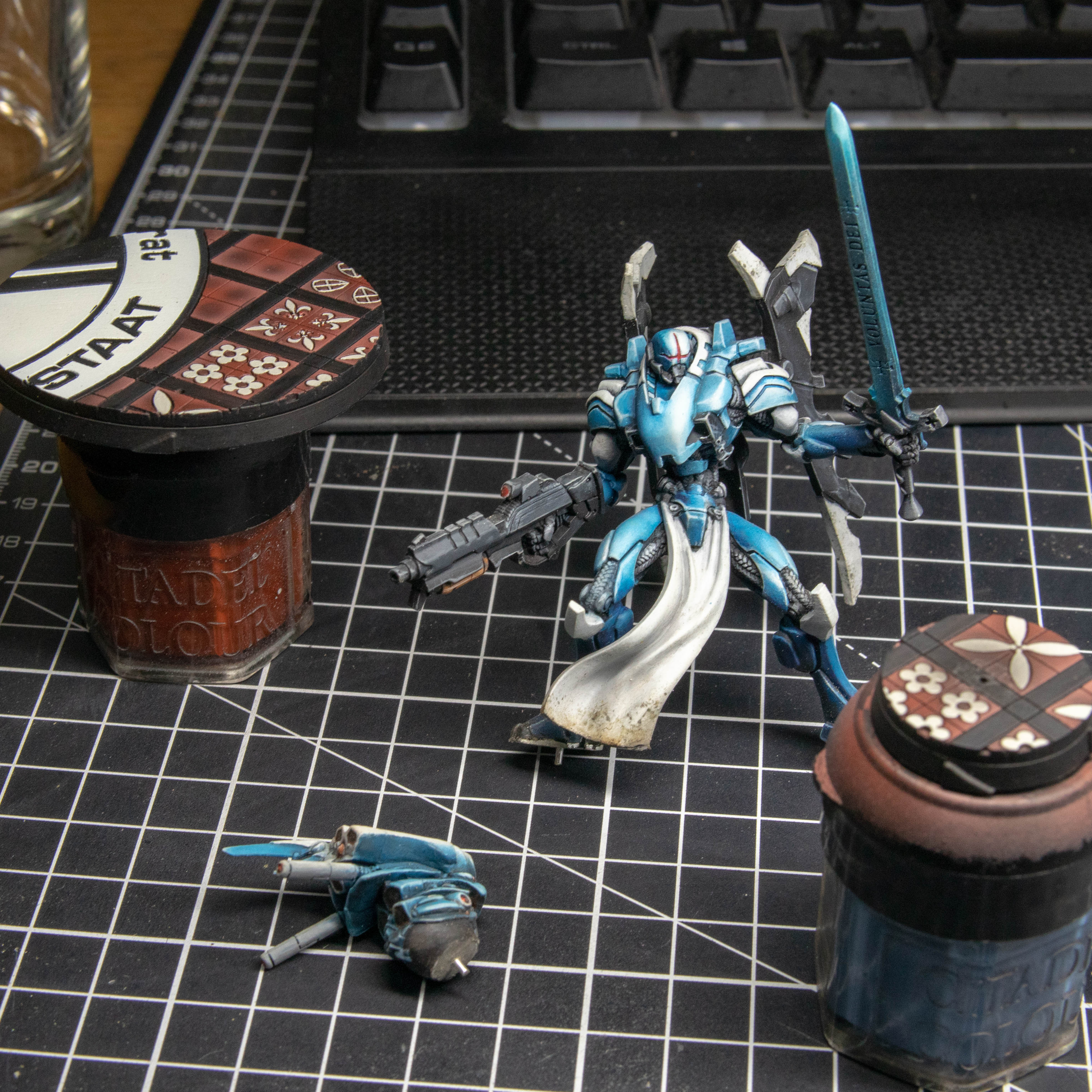
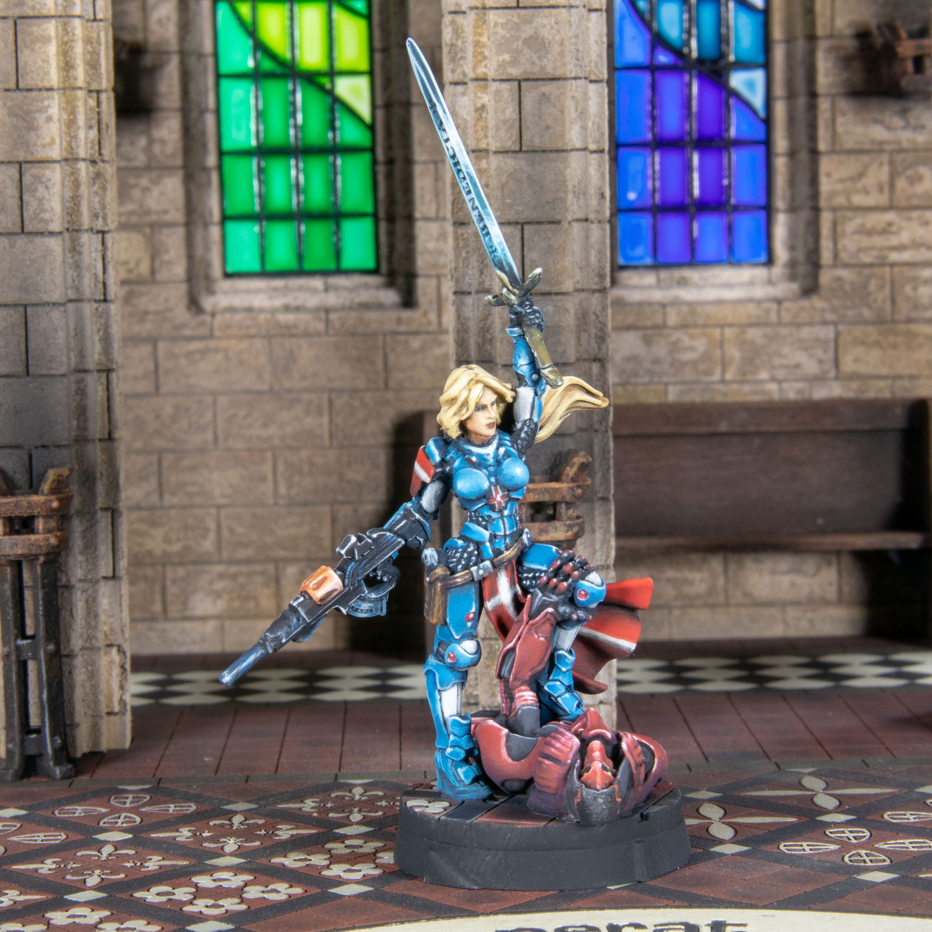 I took on the feedback about Joan’s left side armour boob. And corrected this. Then setup my lights in the usual way. NE and NW from the model’s point of view and put a light on the back to light up the glass and this was the horrible result. It looks 1. Photoshopped (it wasn’t), 2 like there was a overpowered flash used (there wasn’t) 3. Horrible due to the glare off the windows. 4. The shadows in the back were just plain odd. This was supposed to be a great moment. I was a little gutted. Though I am sure I have seen wedding pictures with this exact same issue so realistic?
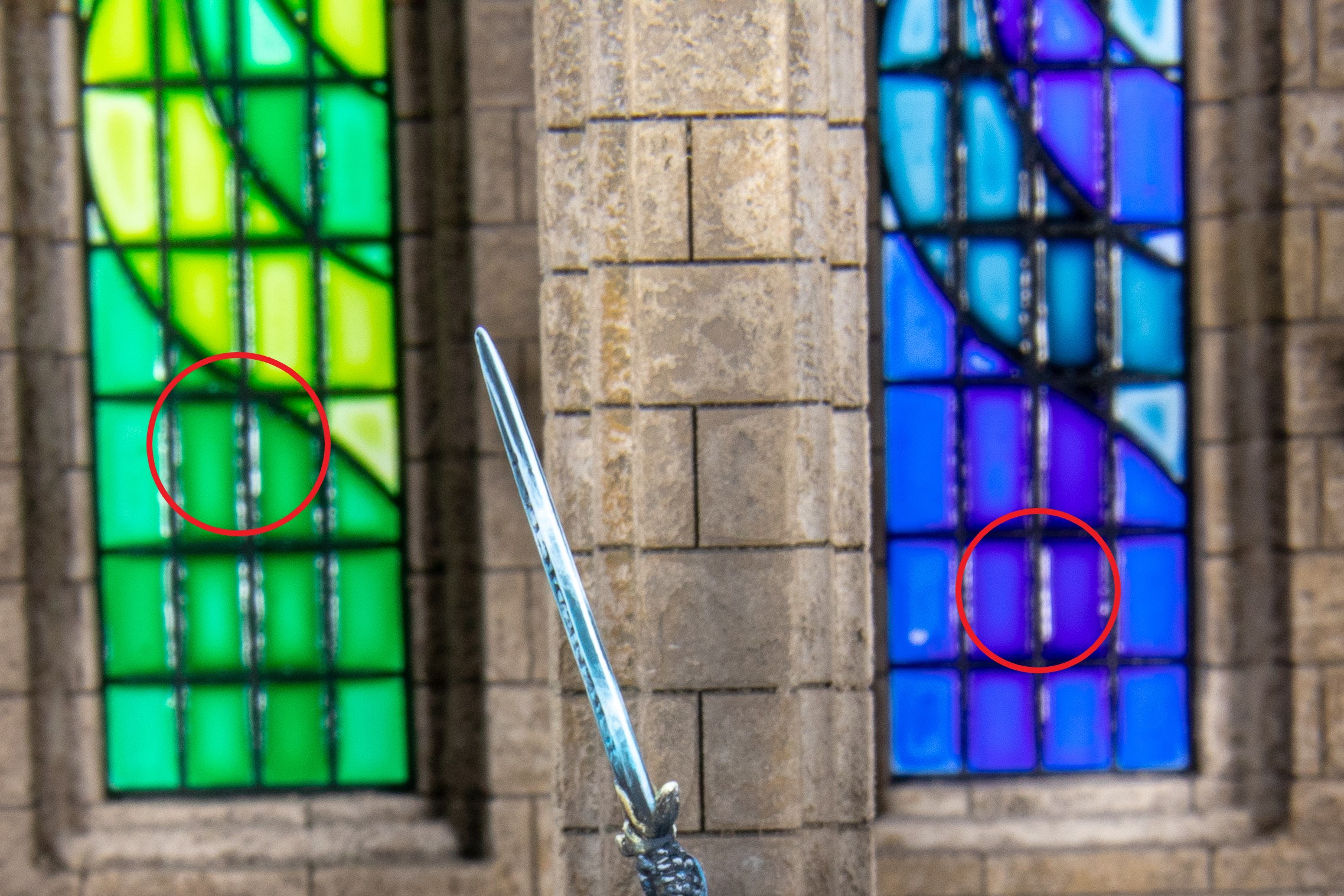 This is one of the main things I hated. I was getting away with it before due to the angle of the lights. To be fair I knew this may happen. But I thought I may get away with it due to the pillars and I can angle my lights in just the right way… I’m not that clever.
 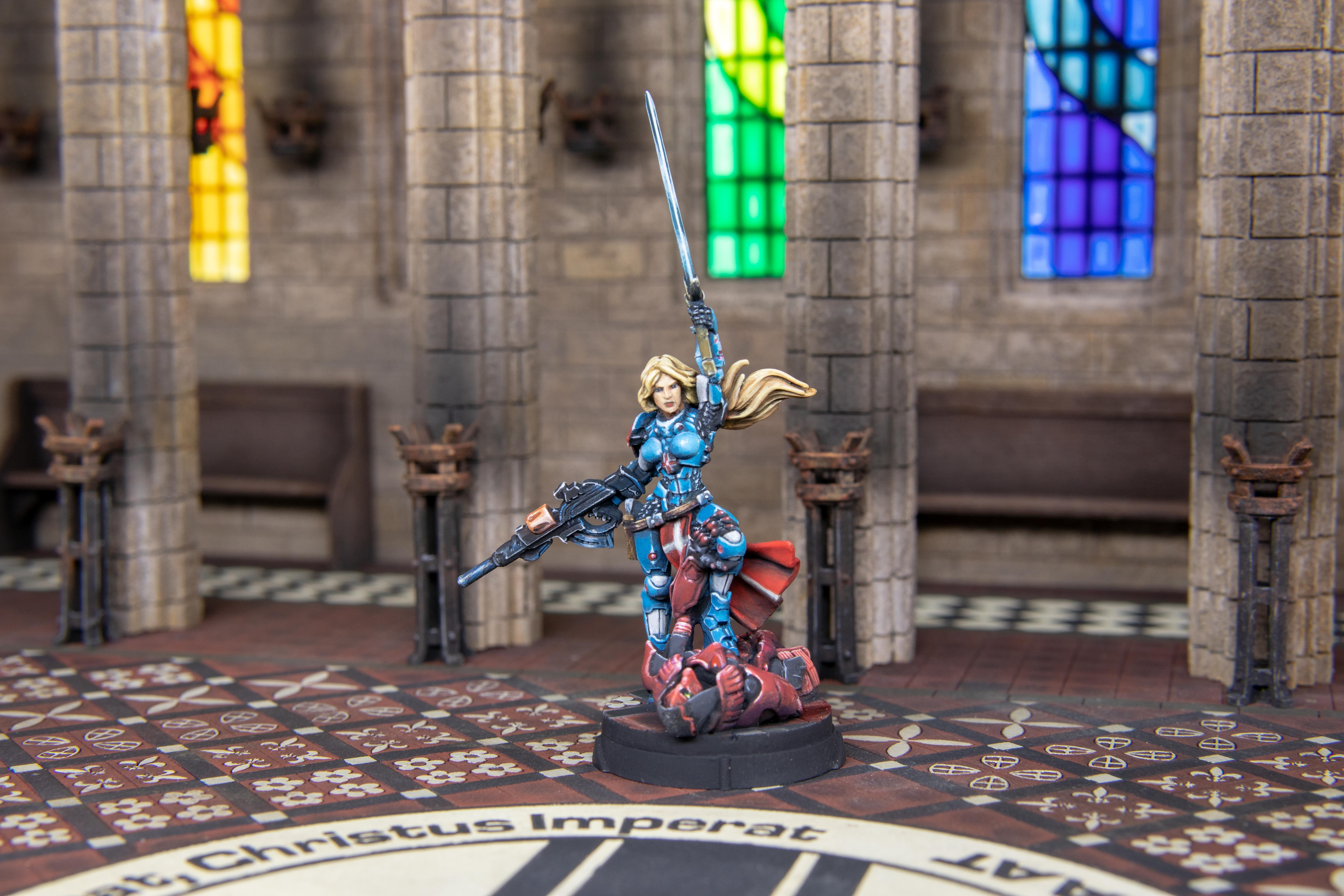 I used my new best friend Ultra Matte on my test piece to ensure it didn’t react and it didn’t and made sure the light was a similar quality coming through which it was. So, I coated all the windows. I changed my lights to use my wide painting light on the front and one light from the back. This sorted out the shadows, the flash look and the Photoshopped look.
 Overall, I am becoming happier with this. I am getting what I want but I really should be painting and not updating my project.
More to come sooner than you may think, lol.
Photography
The previous steps were all around lighting and the set. The next decision I wanted to take was photography. This is a hobby and profession of its own like casting or 3D printing. I used to take photo’s using manual mode on my mobile phone but a couple of years ago got a DSLR camera. This advice goes for both mobiles and DSLR. It would be great if mobiles and camera’s have a miniature mode they don’t. The closest you can get is Macro mode, which is horrible for models as it magnifies it, but it has it’s uses and can be used for models. This is what I would recommend doing as a beginner. Taking a photo on auto mode and being angry because it didn’t come out great is frustrating, but all equipment has limitations. Some cameras have a small slow lens, some have large fast lens or can change out the lens. Some can take a picture over days and some you can’t select the shutter speed. Some are great in low light, have great ISO options without introducing grain and others take every photo even outside like a pissed morning in a nightclub. All can take a great picture (mostly e.g. Gameboy camera)
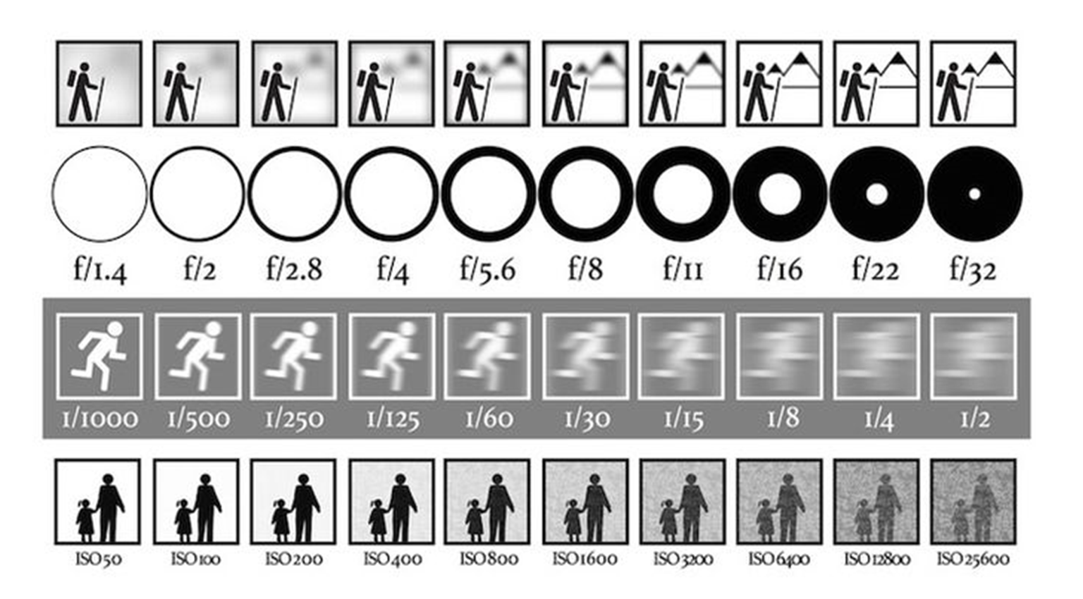 You have probably seen this picture a lot. It’s true on the left there is lighter and on the right it’s darker. You can manipulate these settings to correctly expose a model. But there are downsides. Larger aperture means more light but also a shallower depth of field. Meaning what’s in focus on and around the subject. The slower the shutter speed the lighter but if there is any movement in the camera it will blur the photo. And the higher the ISO the more sensitive you make the camera to auto correct the light but the more grain or noise this introduces. The choices you make with these are all stylistic when taking regular photo’s but not so much (in my opinion when it comes to models.
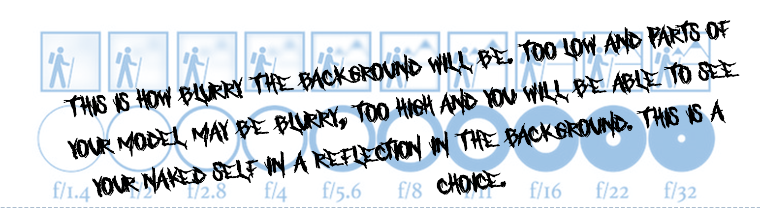 Aperture for me if the main choice when it comes to taking pictures of models. Changes this changes the depth of field. On taking photos with a plain background, you may wish to blur the background, so it looks like one colour. You can do this using aperture selecting one that makes your model sharp but everything around it fuzzy. You may also want the focus of the viewer to be on the model and not everything around it. You could also be taking a picture of a game in progress and want everything in focus. So, you would use a small aperture. Mobile phone cameras have this option, however most of it is done digitally and not through the lens. It still gives you the effect
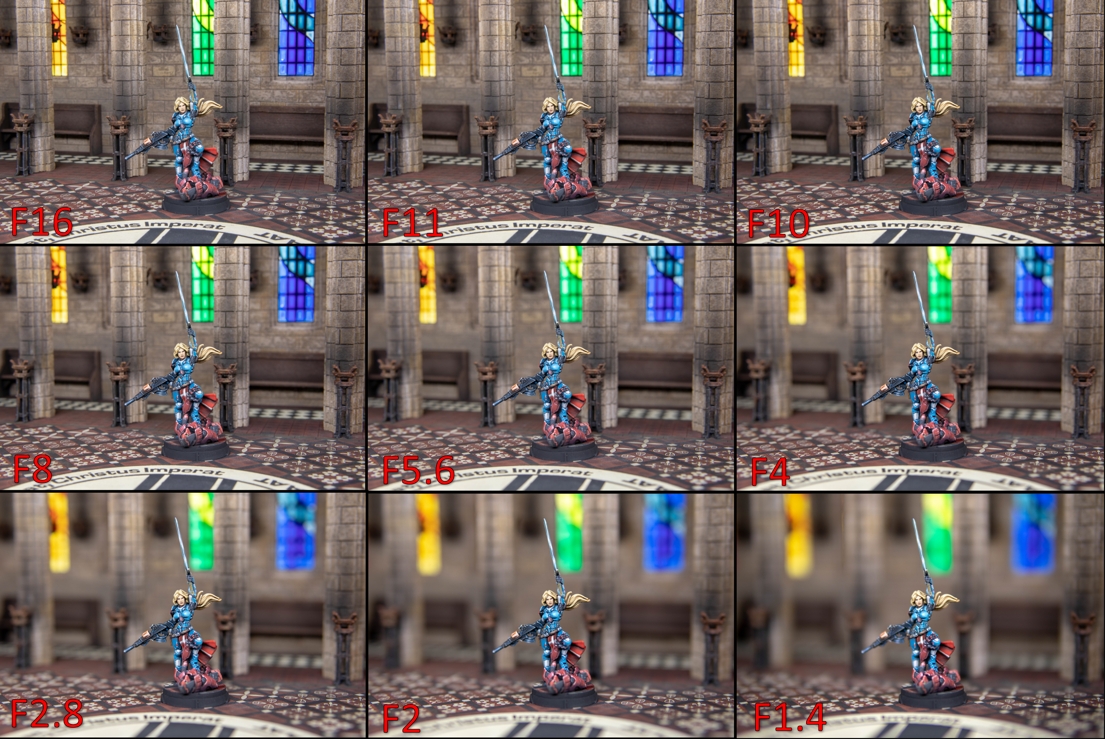 Aperture is described in F numbers and in lenses the lower the aperture the lens can be described as faster. A fast lens is one with a low aperture number and the speed of the lens dictates how low you can go. The distance from the subject and how far away they are from the background dictates what’s blurred. But in photography terms everything we do is so small. Any changes at the distances we shoot at are quite noticeable on the final photo. This is the same photo taken with different settings. I changed the aperture and corrected the exposure with the shutter speed which I will come onto next. You can see the effect of each main F setting (or stop) on my camera. for this picture I like F8 but it’s subjective.
 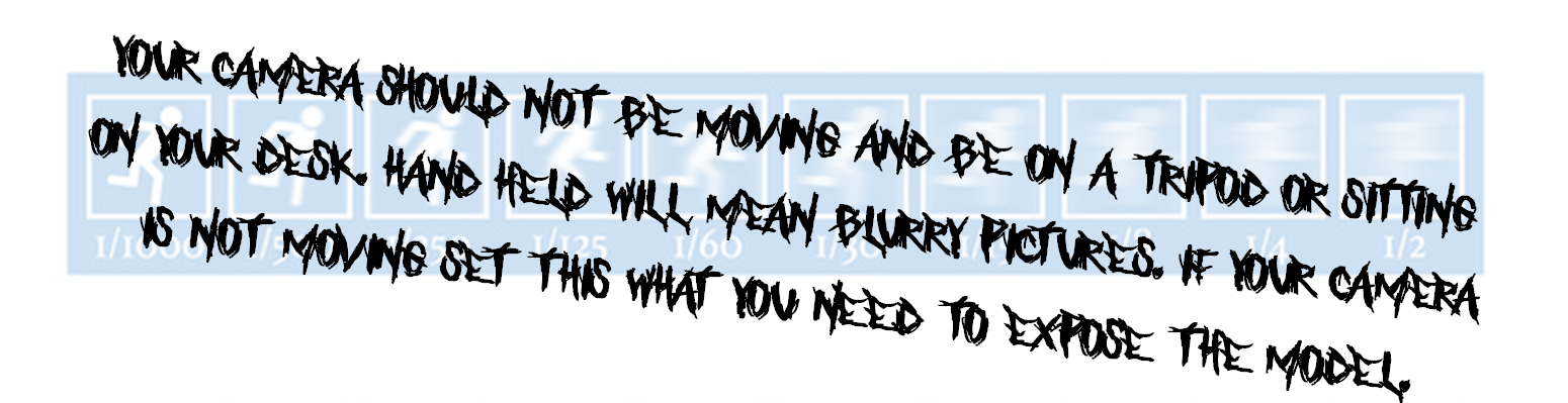 Shutter speed matters in terms of how sharp you want the photo to be. You need a lot of light for the fastest shutter speed. If you turn this right up in most cases your picture would be very dark. This doesn’t really affect most of my photo’s as I take them using a tripod (you can also get mobile phone mounting options). This means that the camera doesn’t move when taking longer exposure pictures. However, as you will see earlier in the project this hurt a lot taking pictures at night, even on auto my camera couldn’t make up the difference within the limits I set meaning it took blurry photos. I would also say just use auto for work in progress or quick snaps or just use a priority mode, so you only have to think about one thing I would strongly recommend aperture priority mode if you have it.
 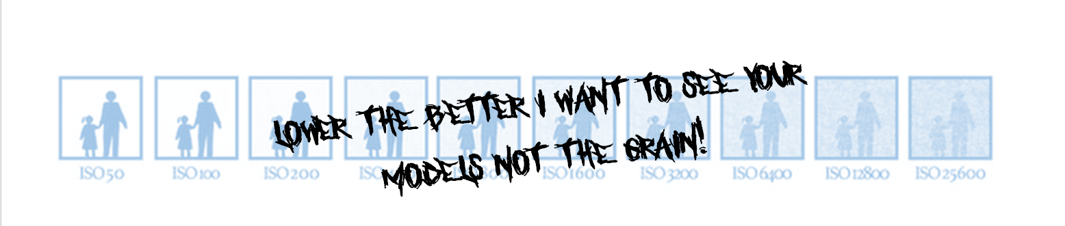 ISO is tough. It’s there to be used and can make it possible to take photos in what other circumstances would make it impossible to take a photo. In old film camera’s this used to be the sensitivity of the film to light. In digital camera’s it turns the sensitivity of the sensor up. Turning this up makes grain. Though this has a nostalgic feel on older photos and can in digital as well. I am firmly against this personally for taking photos of painted models as it introduces texture that you didn’t put on the model. Keeping this on the lowest setting is the best option however if it’s a choice between taking a useable photo of a model and turning up the ISO to get the correct exposure. Just turn up the ISO.
 There are loads more things to do with photography and model photography in general you can go through. But the main rules are put as much diffused light on the model as possible more lumens more choice. It will help you use the settings you want without messing around too much. Use daylight temperature bulbs / lights and try and light evenly. Select your settings for the result you want. Take a picture and look at it. We are not taking pictures of wildlife that moves you can look on all digital cameras to see if you are happy. Don’t be afraid to break any of the rules. Coloured lights, different metering modes, different temperatures of light, smoke effects, angles. light sources the world is your oyster. Be creative, a finished photo should be a celebration of your hard work.
Blame the projects system for the amount of words in this project. It’s certainly not my fault. As I am typing on Word, apparently I cant be cogent and concise and want to fill the paper. Sadly it’s endless, so you see my problem?
More to come, just more waffling or actual pictures of work? Who knows.
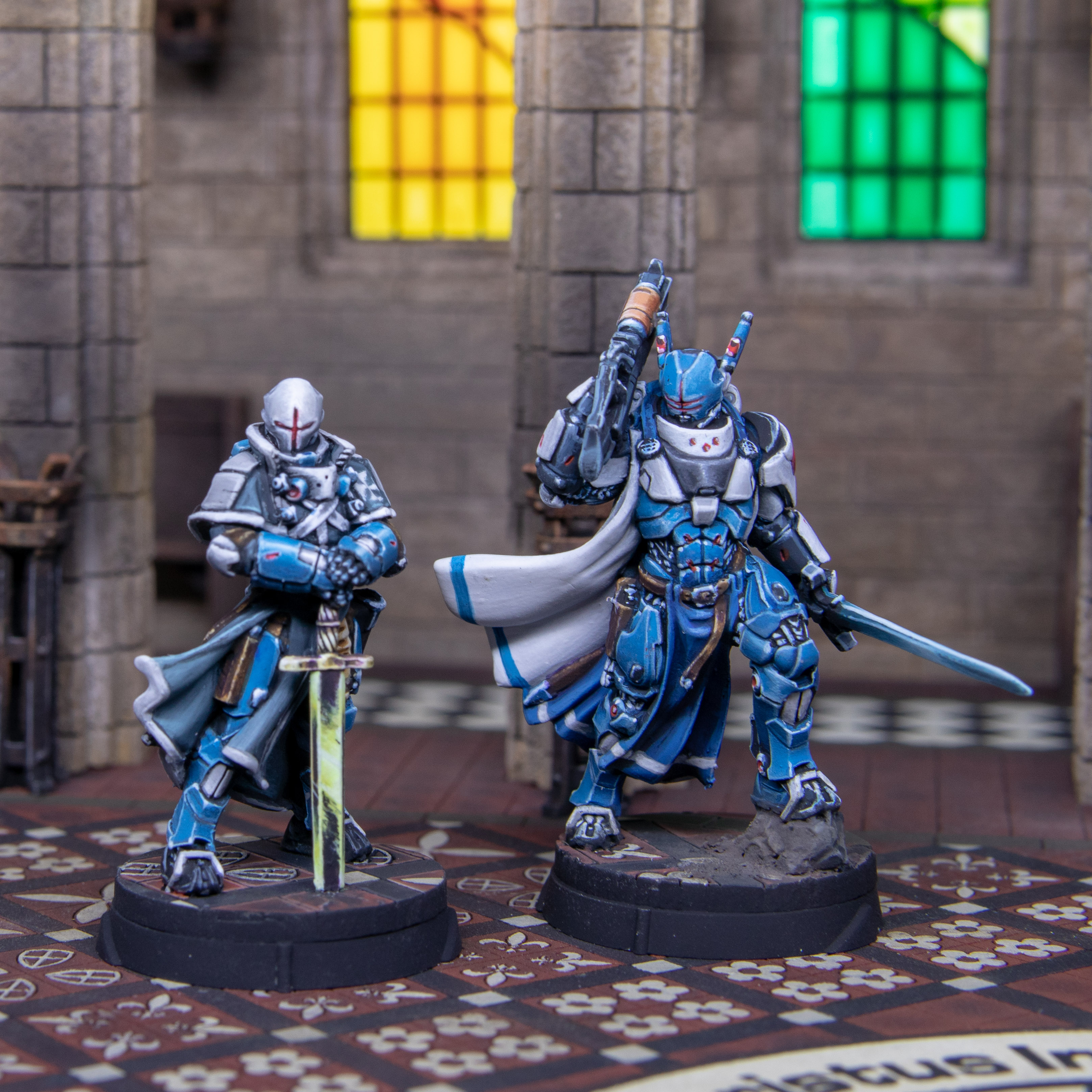
Operation Midpoint.
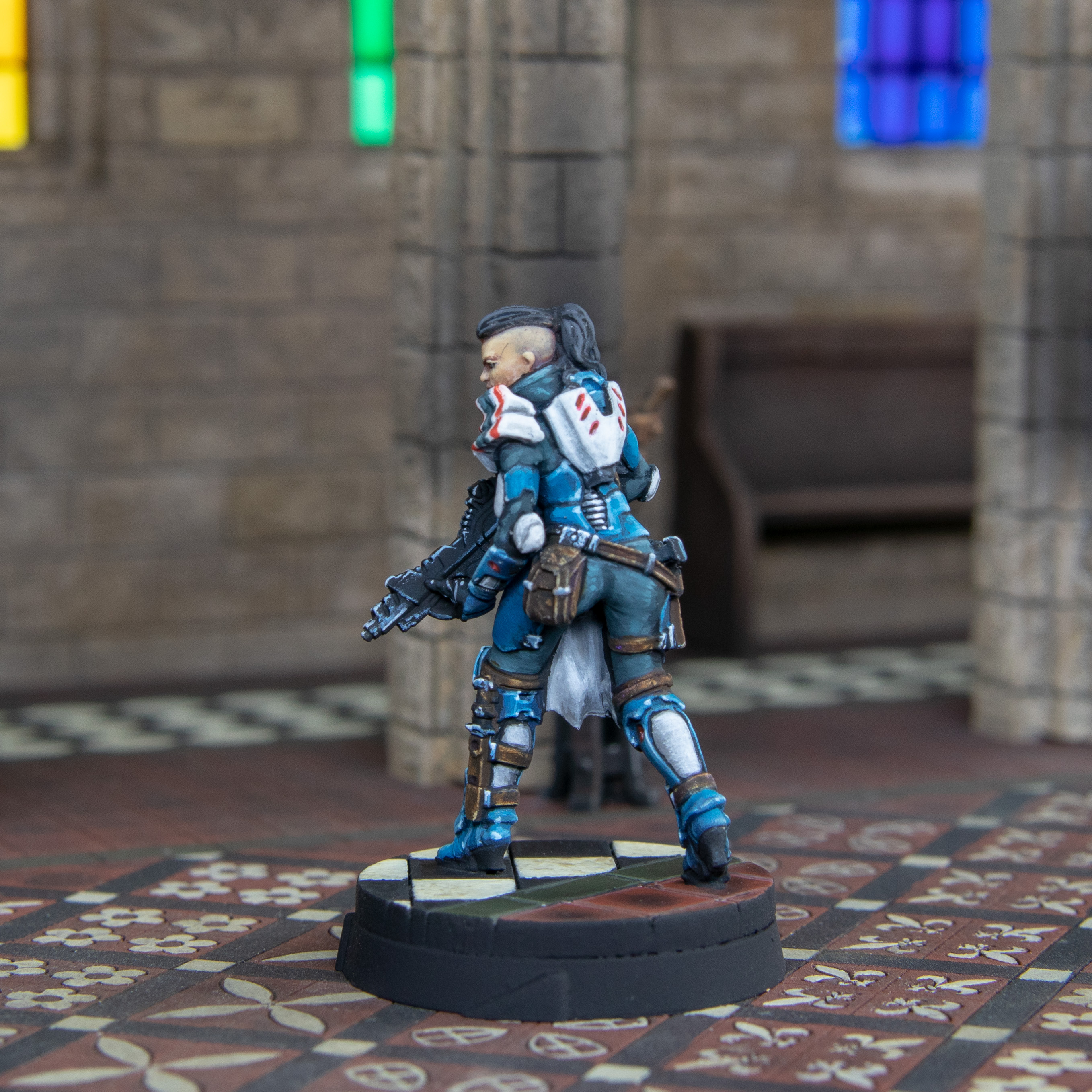
So this week has been difficult. I actually realised I have never “tarted up” a model. Sure, I have done tweaks and repairs but never a full make over. This was difficult in two ways. I didn’t think the model looked “bad” so it wasn’t clear on what I should be changing. Sure, there were glairing mistakes, but nothing that spoiled the model especially from photos.
I started on the white of the Seraphs. It wasn’t white on the model before it was a very light yellow, almost white but not quite. I think when I started to paint this originally, I started to paint this a white yellow and brown tabard and then changed to greys. This was pointless as soon as I finished making everything white, I then done freehand over the top. This is still my weakness and so I made a massive mess then needed to repaint it a 3rd time after the freehand was in place and looking passible.
I corrected some of the blues. I even went to looked at Angel’s one. I don’t like the amount of brightness on the chest. I calmed this down with glazes of blue. I completely blacked out all the black parts of the model. For some reason I had done grey over everything it actually looked like I glazed grey on from afar this looked ok but I took another shot at it and painted each twist in the mail which gives it a lot more contrast.
At the end of this process, I feel like I should have just stripped the model. I probably spent the same amount of time on it now, as I did back then, and I could paint this faster and better from scratch. The lighting is a bit off, but it really does look great from some angles none of which are good for a photo. Is it “bad?” Hell no (in my opinion). Is it great? Hell no. Now for the important question… Is it better than before? That’s subjective but in my opinion, no. Will I be more likely to field it with the new models that will hopefully arrive next week? Yes. And that’s the point of this. It’s to give it an Army to fit into. I may have chosen to play Joan in a game with standard Pano but I don’t think I would have chosen to play the Seraphs. I am always a style over substance player and it wouldn’t have made it onto the table for the basing alone.
So all I wanted to do all week was crack open Defiance. Problem is that means I have another whole project waiting or delayed. That cant happen. Doing something you don’t “want” to do is never a good idea. I put on the Top Gun soundtrack and pressed ahead.
 This is the result. Looks underdone in some places overdone in others. Not 100% happy but it’s finished. One thing I am somewhat happy with is the freehand. And the correction of the white.
  This shows off the freehand better. This is the main point why I wanted to repaint the model to add this. I wish I started to do freehand as a Kid. The losest I got was flames on the trim of my Redemptionist’s then I don’t think I done any for 20+ years. I would even prefer to sculpt detail on and paint that than freehand. Imagine how good I could have been if I painted like a 2-year-old on my models and gotten better over the years.
  I changed the way I highlighted the black. It’s just more contrast. I normally use these exact same colours. I decided to put a mid-tone in blue in. I like the effect more in person than in the pictures.
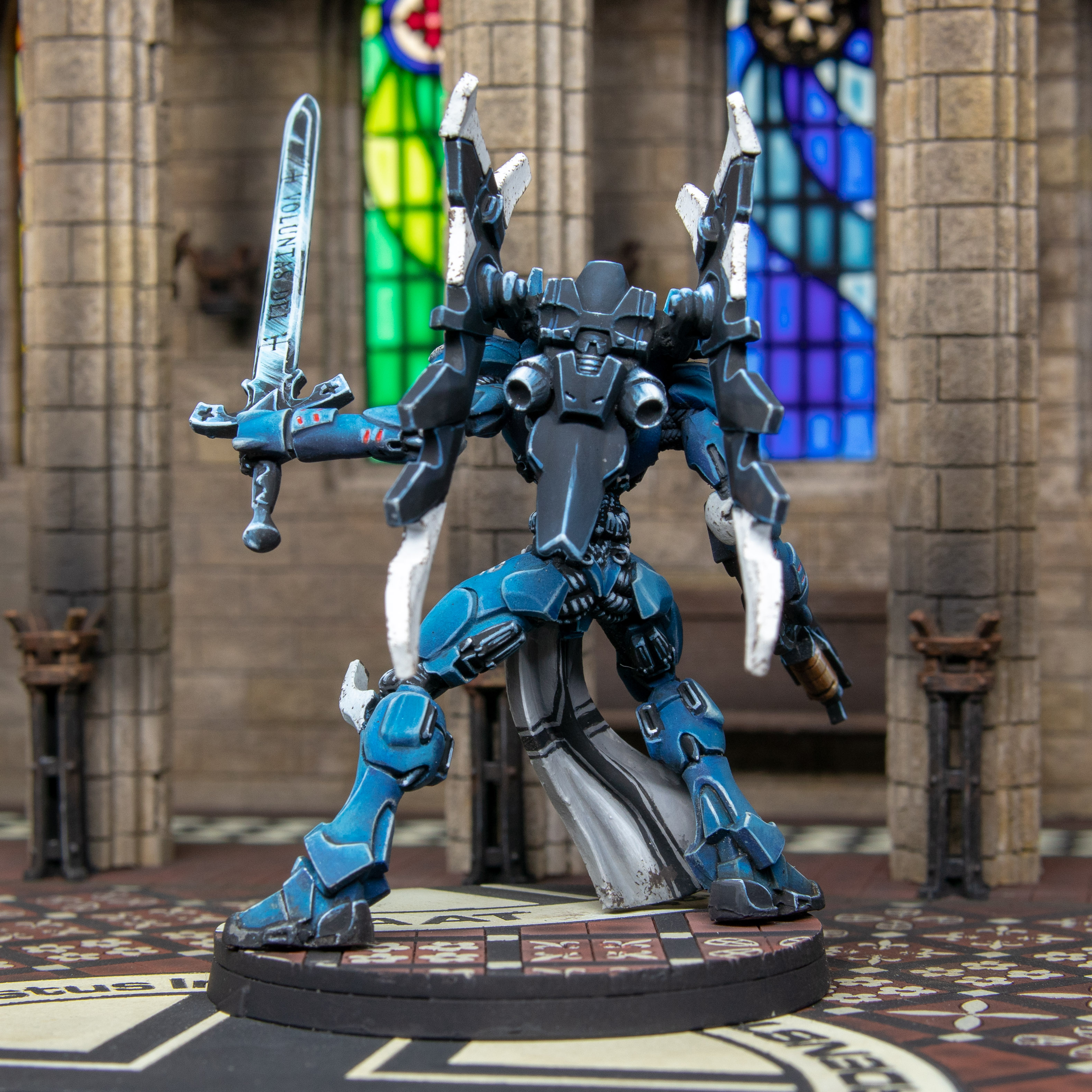 I do like this from the back. Best view is the arse of an Angel. Glad this will be the way I will be viewing the model for the most part. Here you can see the highlighting of the black at it’s best.
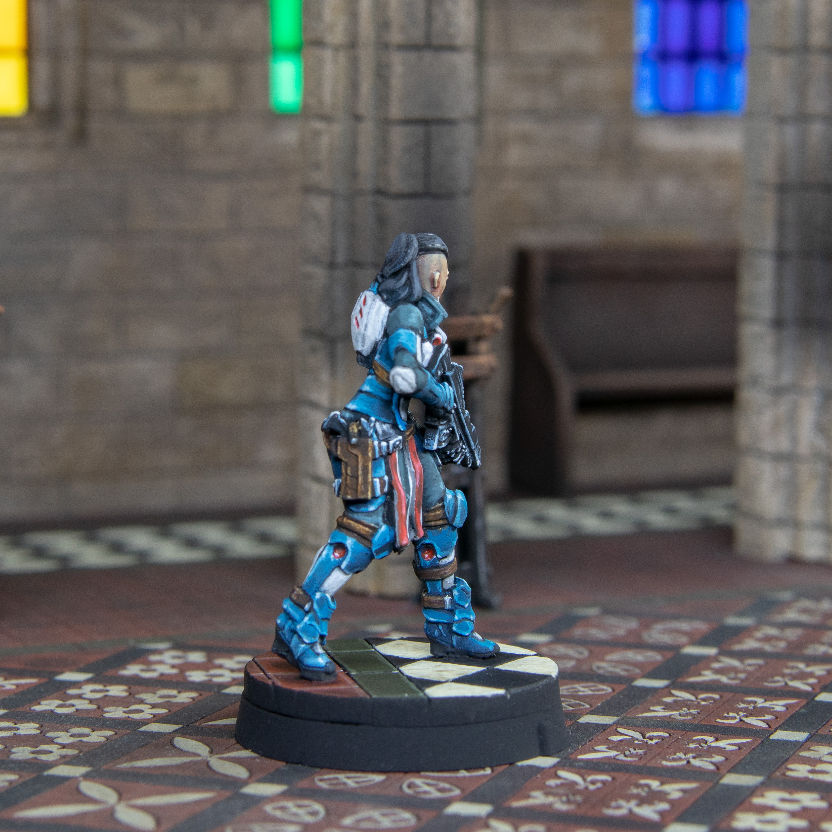
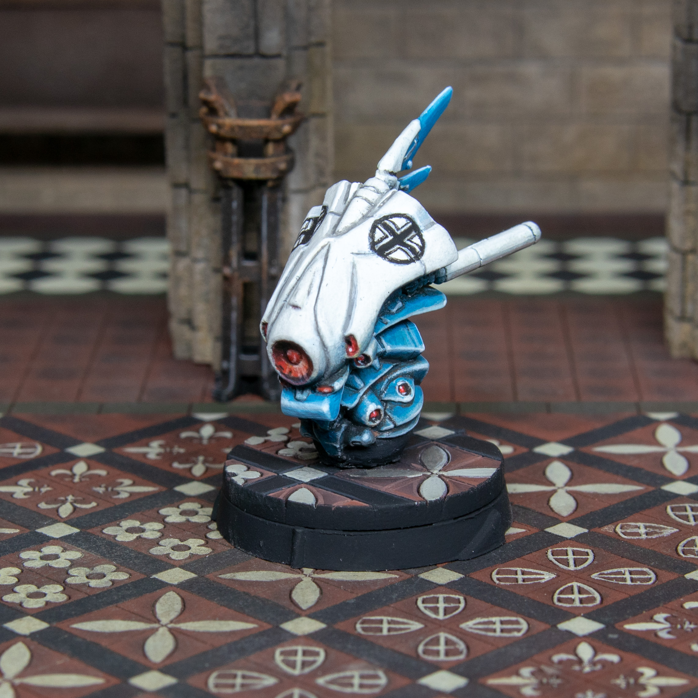 viewing the model for the most part. Here you can see the highlighting of the black at it’s best. This model was a pain to do. The volumes are very alien, it’s white on top, it has black freehand on it, the freehand is over a highly shaped section and it’s geometric shapes in a 4mm circumference. All in hard. This again was a tart up the same as the other. The same things apply. In terms f how I feel about it.
 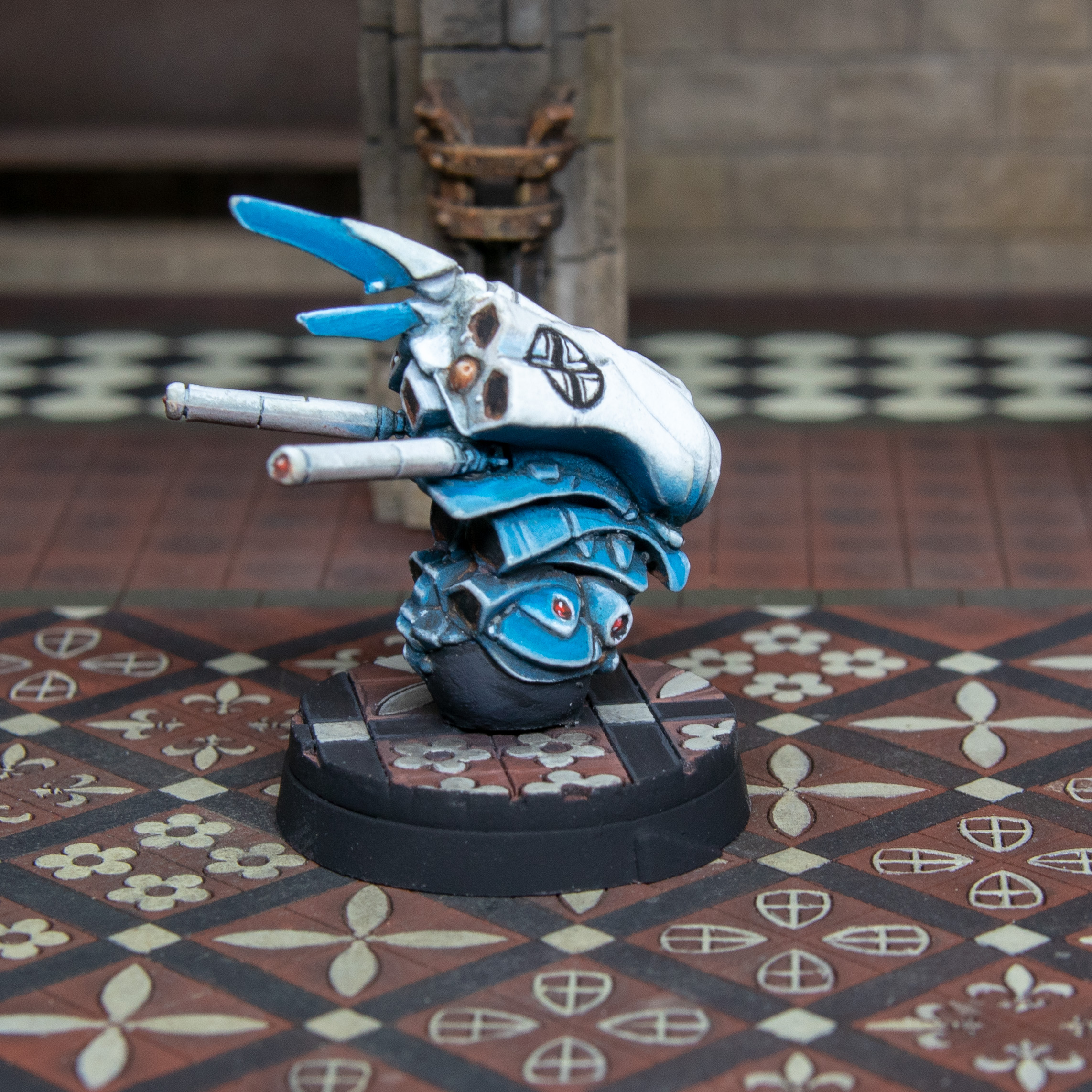 The only things I didn’t paint over was the rusty bits on those black panels. Still no idea what they are supposed to be. Also I think this may have been hand sculpted the model looks symmetrical but it’s not. This fooled me into making painting mistakes along the way.
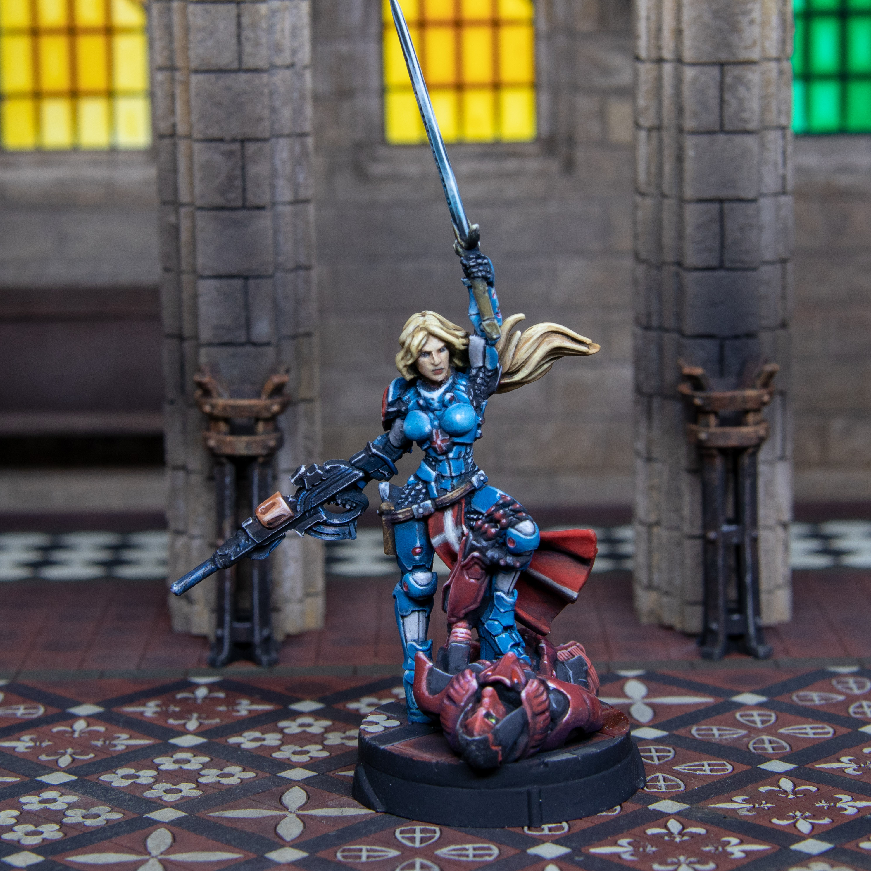 This will be the final image of Joan still much happier with this model than the other 2.
  Again, you can see from this more armoured section they should fit in well with this much better than before.
So that’s it done for this week. There has been some fun like doing the black cable armour sections. Mostly just questioning my decisions. The result is what I wanted, to play with the models but I had hoped just working on the models would make them greater. This didn’t happen and that was a surprise.
Learning is never a wasted endeavour. If I had a time machine and an infinite lifespan, would I go back and strip them… Yes.
More to come next week where hopefully the new models will arrive and I can get building, painting, and enjoying things more. They do look extra pretty.
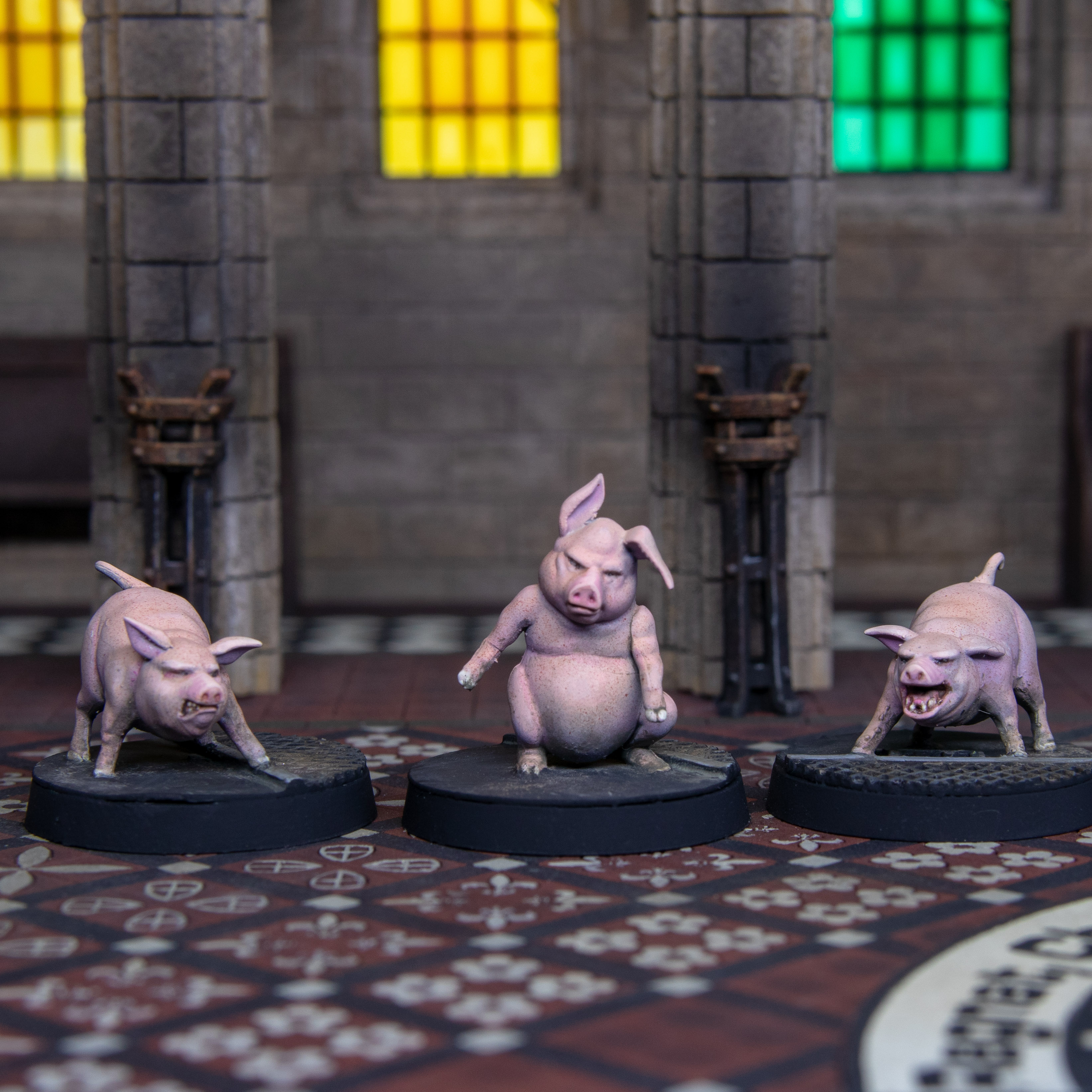
This little piggy waited for some models.
Took Monday Tuesday off. I am waiting for the rest of my military orders being delivered to flesh this force out.
I was watching the UHH last night and thinking about my own project. originally this was going to be what you had seen thus far I then expanded this before I even put up my first post. Originally I was going to clear my wish list and what I had on my table. which only consisted of three pigs.
I will want to play the fat Yuan Yuan scenarios on the Corvus Belli site. I needed to print off pig markers. This wasn’t good enough so about a year ago I asked Gerry about a set of three pigs I seen on the XLBS and he advised that they were Wyrd. So I got some. I got new dry brushes and they ended up as a failed project as they were not magic brushes and you shouldn’t try to paint an entire model with dry brushing (in my opinion).
Joan didn’t get the Dettol but these did. And since they were originally supposed to be part of the project it only feels right I include them here.
I find Dettol stinks much worse than any other chemical known to man. Nitromors is more palatable to me. Due to this I get a small food bag, stick the models in and then stick that bag in my ultrasonic cleaner which has only water in it as I cant wait to put everything away. 2 – 3 cycles at 4 minutes and they were clean.
After this I done lots of research on pigs. Don’t try and paint pigs if you are vegan. You will be shocked at what comes up when you google “pigs head”, “pigs trotter” and even “pigs tongue”… Me, I just ordered some Bacon in my next shop. Was like at the end of Supersize me, I went out and got a McDonalds. Not proud but It did happen.
Anyway I am getting side tracked. I will save you the above work. The classic pig breed to my mind is the wee pink ones. If you are painting those they are Scottish human white skin coloured when the sun has been out for no longer than 2 days, the trotters are like your nails. Their eyes are like yours but smaller and pig like. Their noses and tongues are like the colour of your tongue.
So I got out the flesh tones and just painted this like this. Pigs also have small white hair but in piglets this is less apparent. They also have skin freckles. Really every day is a green day not just Tuesday’s anymore.
Anyway enough of what I learned about pigs
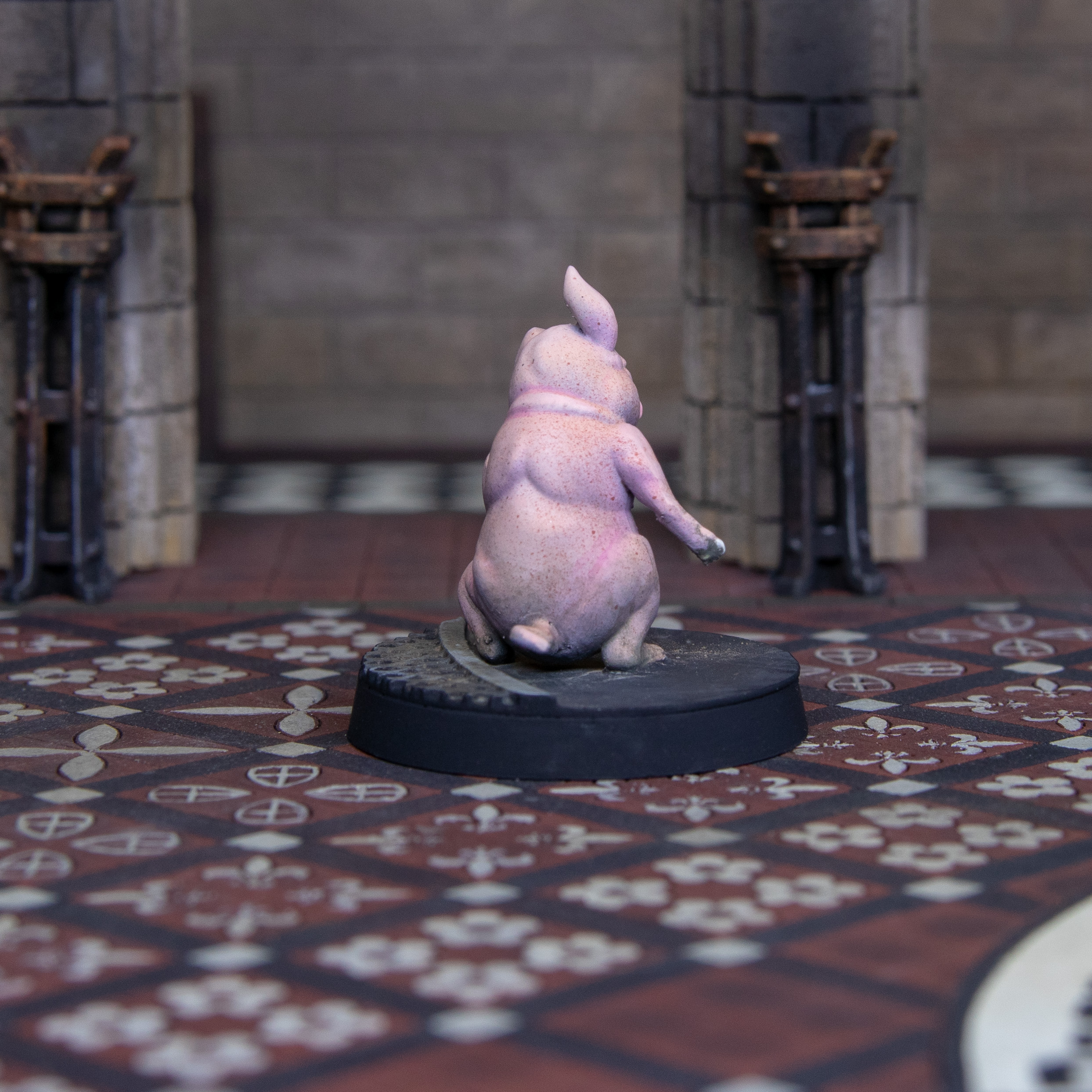
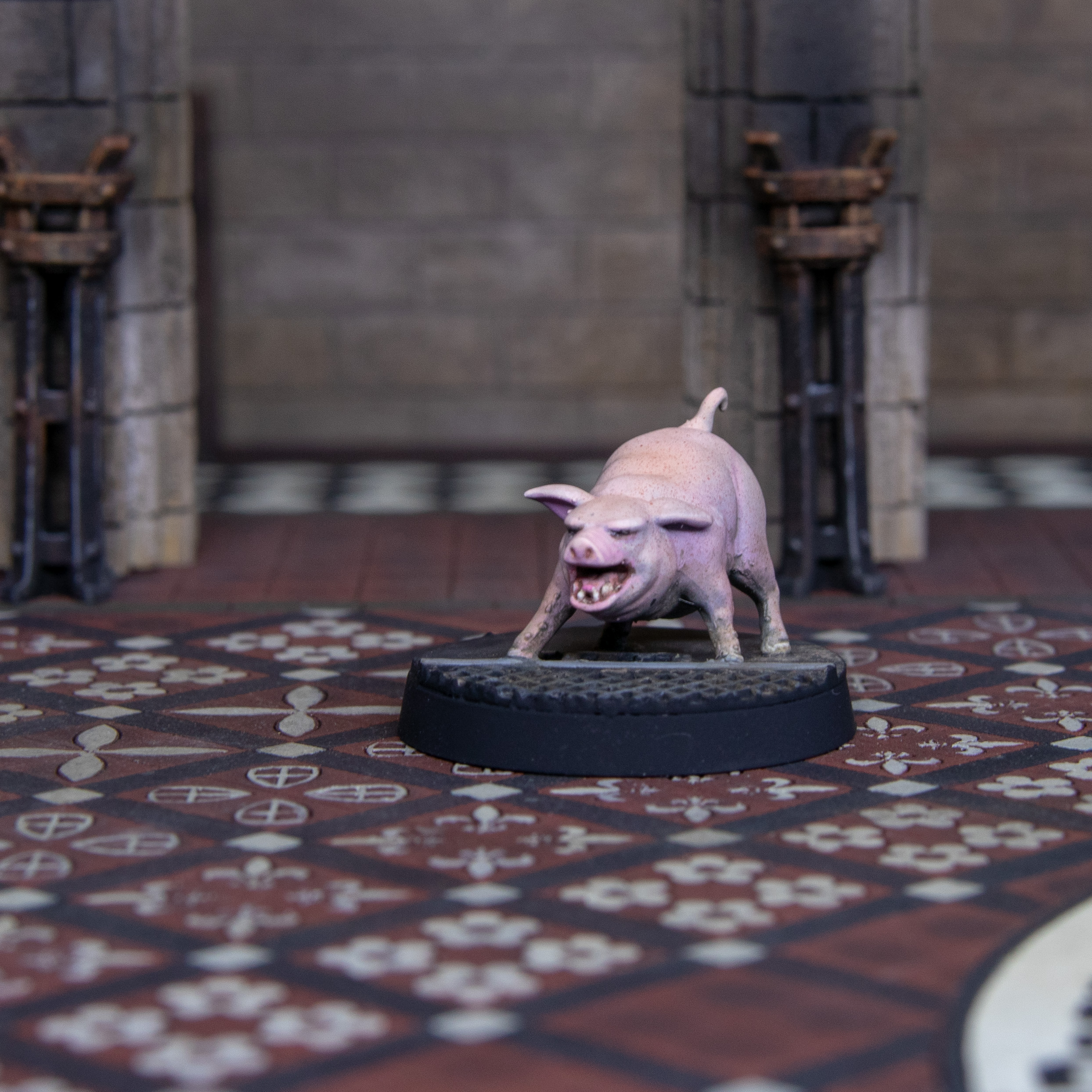
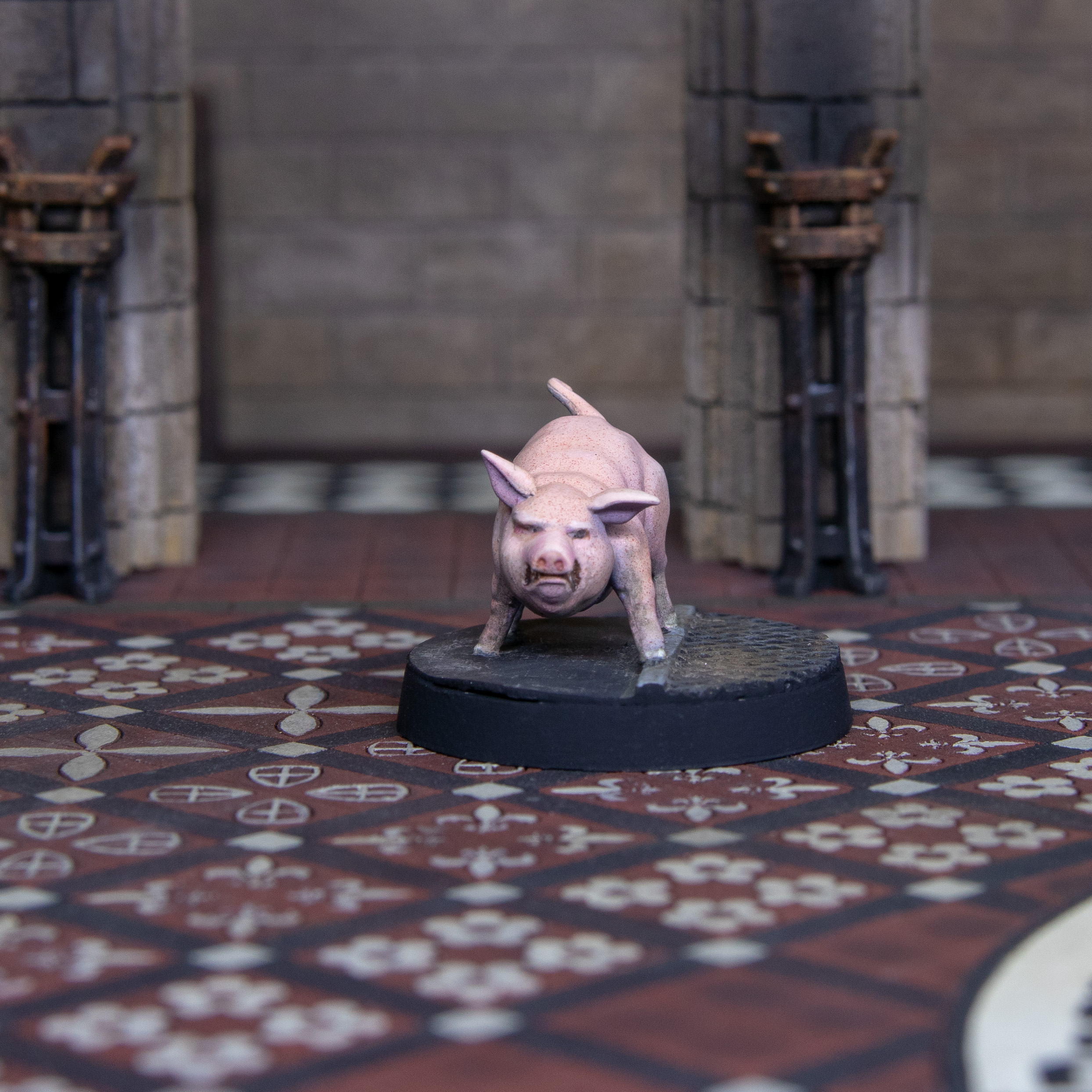
 Gotta love these Pig models.


So now spending today updating this project rather than painting. My models were dispatched today so hope they will be here in the next couple of days.
I am going to be picking up more Wyrd models. Not to play I don’t think, just to paint. I painted the puppet wars set but only played the game twice. I love the themes of the models and need a release away from Infinity. Though that’s mostly what I share, I do paint other random models from time to time even when I am not fitting them into infinity.
Anyway more to come. When they arrive. Off to watch time team.
Coadjutor Crosiers (start of the action pack
So it’s been a few days. My Action pack arrives on Thursday I was busy Friday but actually started this proper on Saturday.
These models are mostly beautiful with one exception that I will come to at a later point. There is a lot to look forward to.
So if this was a normal project the past models would have been test pieces (pigs not included) now it’s time to get stuff done!
Odd thing is I did have a mind blank and ended up using my own step by step at points. So these are painted in the exact the same way. The only difference is that these include some dark sea green areas.
I also disliked some elements of the studio scheme (still amazingly painted) I didn’t like the additional striped on the tabard or the way the swords were painted. This was personal preference.
In my mind this set had lots of heads and I was going to try and focus on painting faces. Oddly I have two left. Also I think I done a better job in painting the female faces than the male which is a shock but you can make your own judgement.
The thing I love about infinity is you don’t have 9 guys that are pretty much the same in different poses. They each feel like a unique character. Coadjutor Crosiers are effectively the line infantry of military orders. This translates to assistant staff (staff being like a fancy gold quarter staff)
I did find a detail I found hard on the lady’s. That was tiny sunken lights on their calves. I still have problems with sunken lights in general but being so small this didn’t help.
Anyway enough of me typing lets look at some pictures.
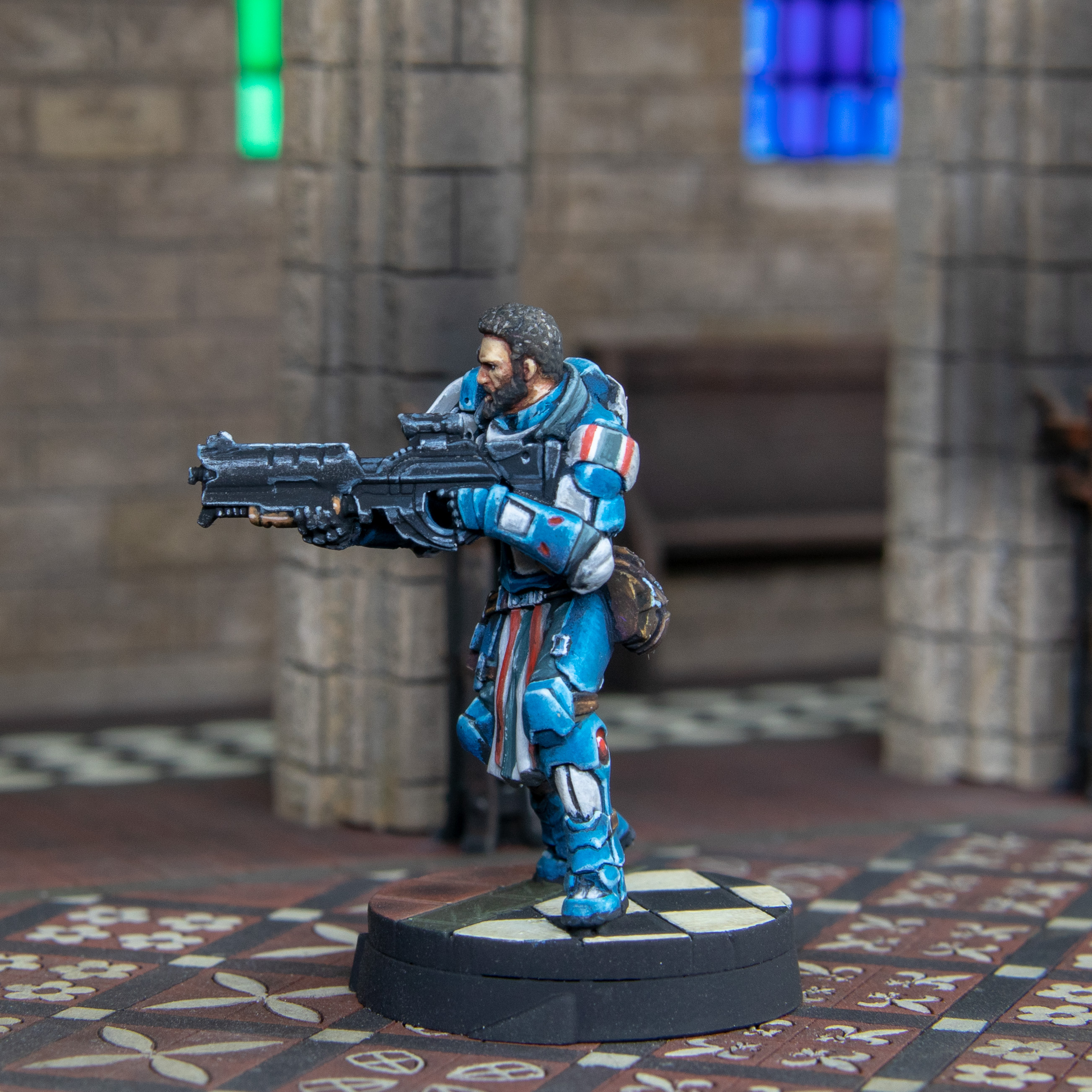
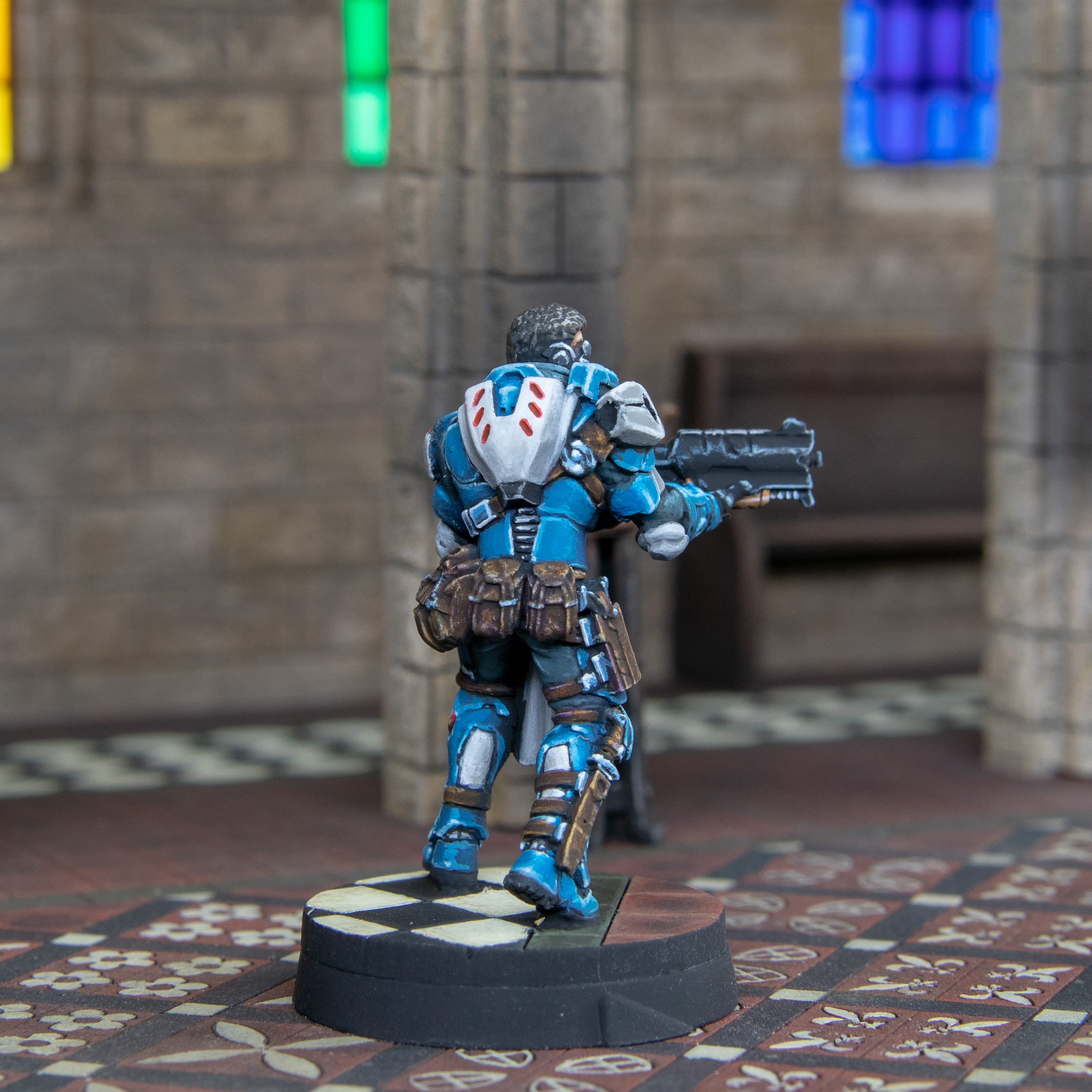
 Coadjutor Crosiers with Combi Rifle 1
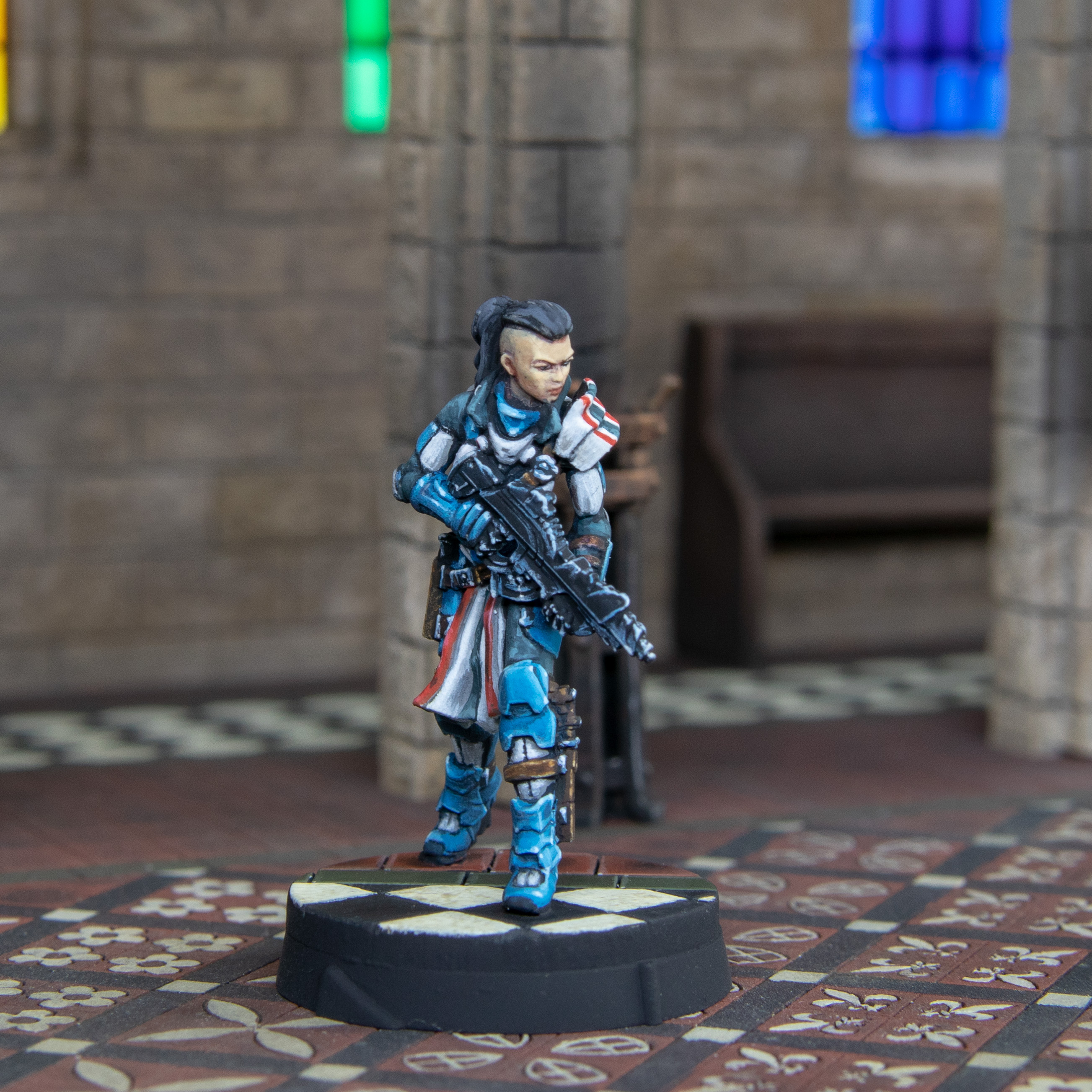 Coadjutor Crosiers with Combi Rifle 2
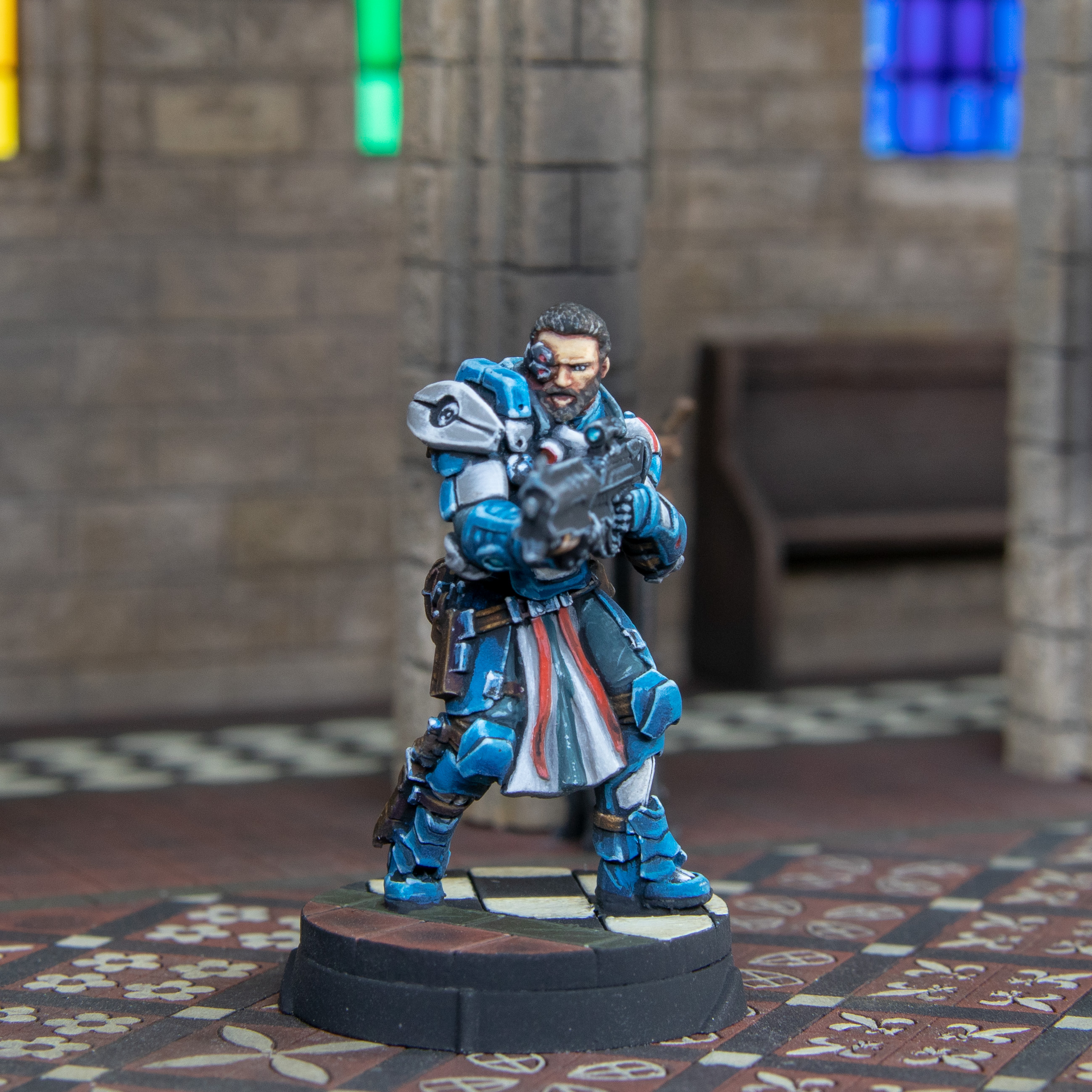 Coadjutor Crosiers with Spitfire
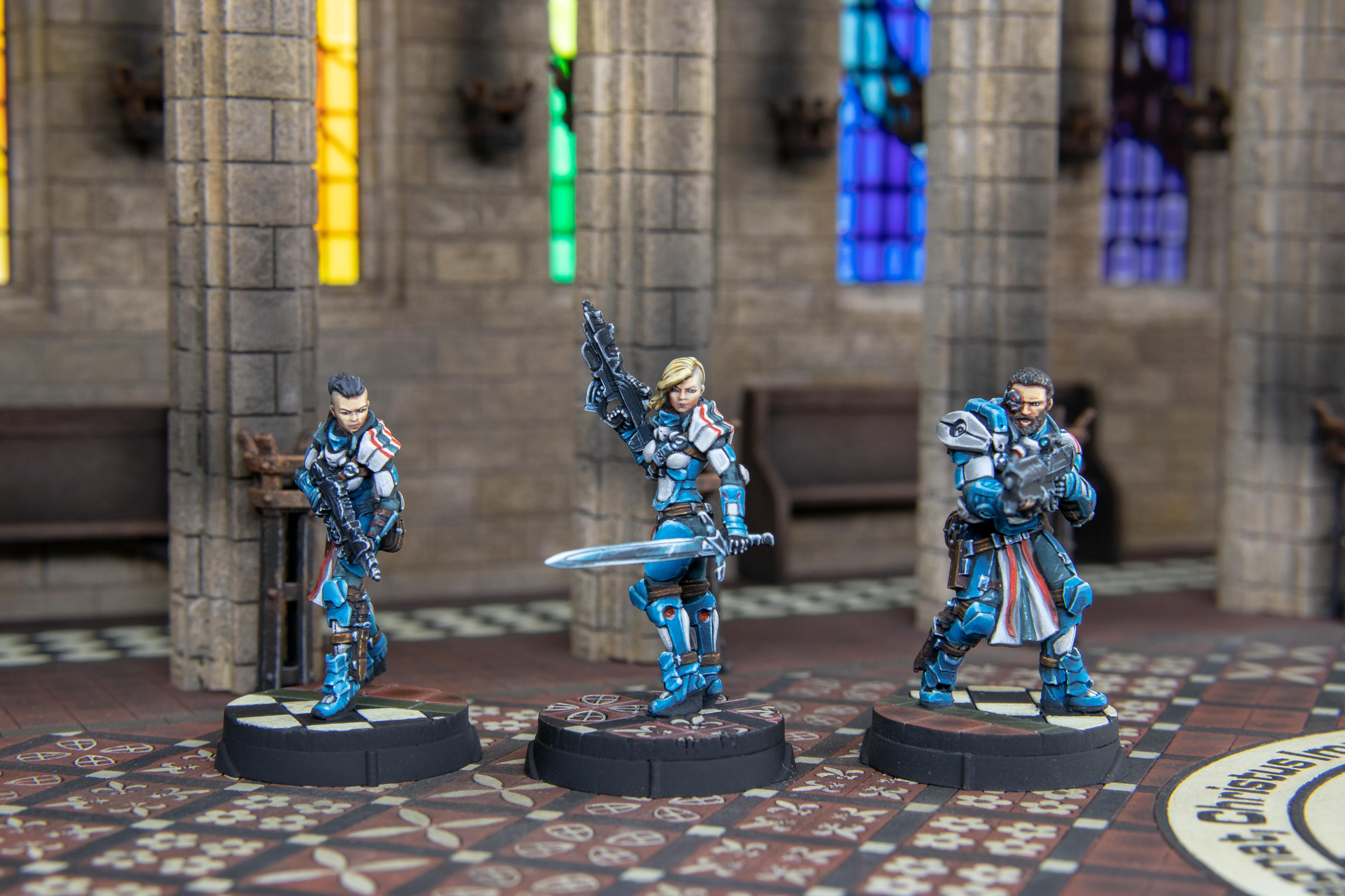 Coadjutor Crosiers
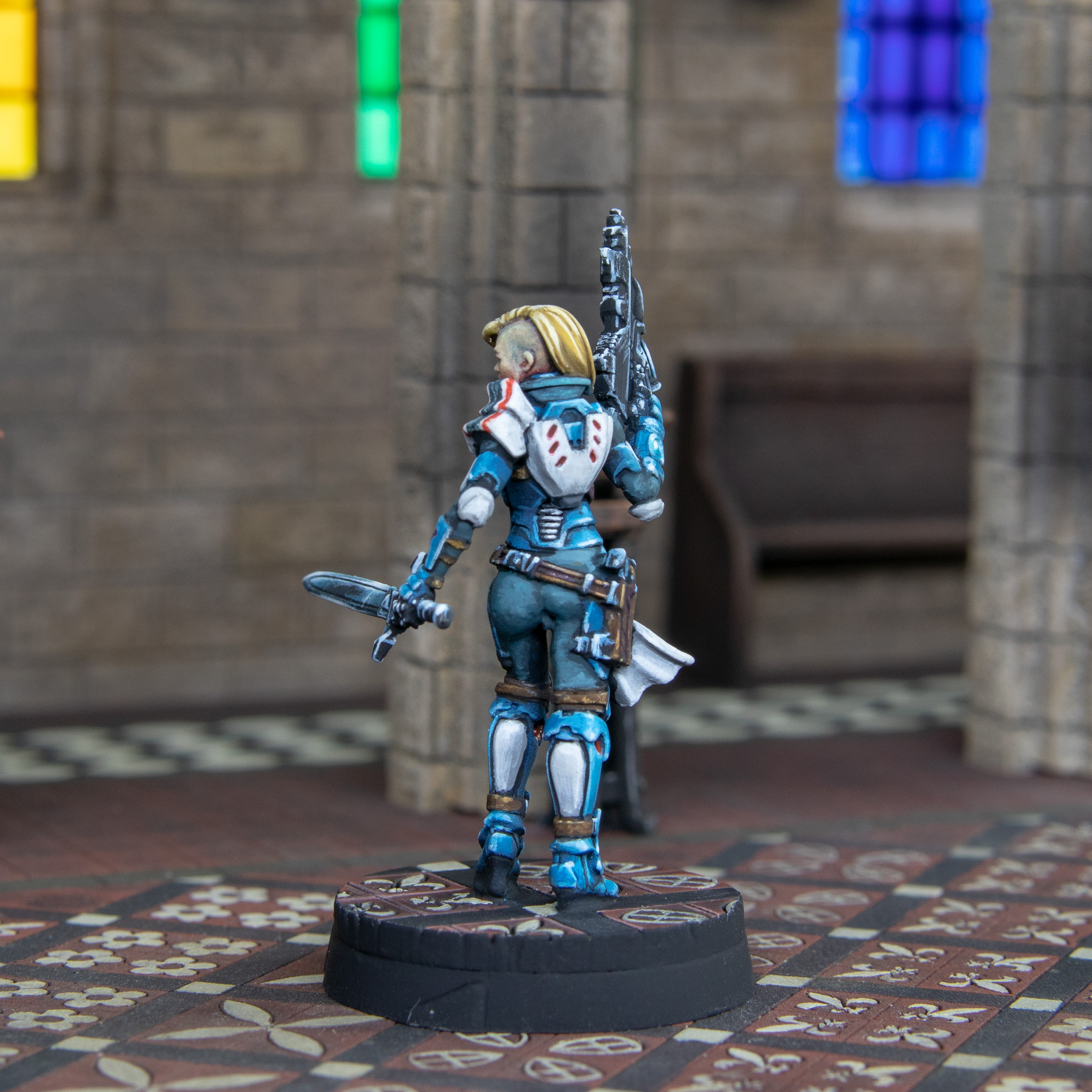
So this took some time.
I did batch paint some sections usually up to the armour section then treated them as individuals and changes points of light and altered some highlights.
This was less conscious painting than Joan so I was less focused and critical overall, but still using some of the same thoughts when painting.
Each of the female faces took about an hour each, this is mental as it’s such a small section but I am so bad it it (compared to where I want to be) I needed to take my time and the colour changes need to be so soft so they don’t look masculine.
Talking of time I would say each model is about 6 – 8 hours painting which is about 4 – 5 hours less than it was when I painted Joan. this is probably the same amount of painting time but I lost the thinking time which no one factors in.
Again it was great having a set right away to take pictures. takes the thought out of it. Still think it’s doing it’s job.
I have 9 more models to paint for this project with unique difficulties. I actually cant wait, I just wish there was more hours in the day.
At least that’s the equivalent of the tactical marine done.
Without a doubt more to come.
Pushing Forward.
Quick update here. Sadly nothing new in terms of techniques to update on. I did however do more freehand. I need to do much more preferably not on gradients or folds. I have grown to hate space marines and what they stand for but I would kill for a shoulder pad even if it had to to have a copy of the Mona Lisa. Anything flat would be great.
Those of you who are great at freehand may see this and think “that’s barely counts as freehand” but I went the great lengths to avoid this in the past including sculpting shoulder pads, buying components, brass etching. The only way I know to honestly get better is to force yourself to do it.
I don’t hate the process, just find it frustrating. However I am refusing to find it disappointing. Just got to keep working on it until it’s passible.
Well Now that I am posting it you can be the judge.
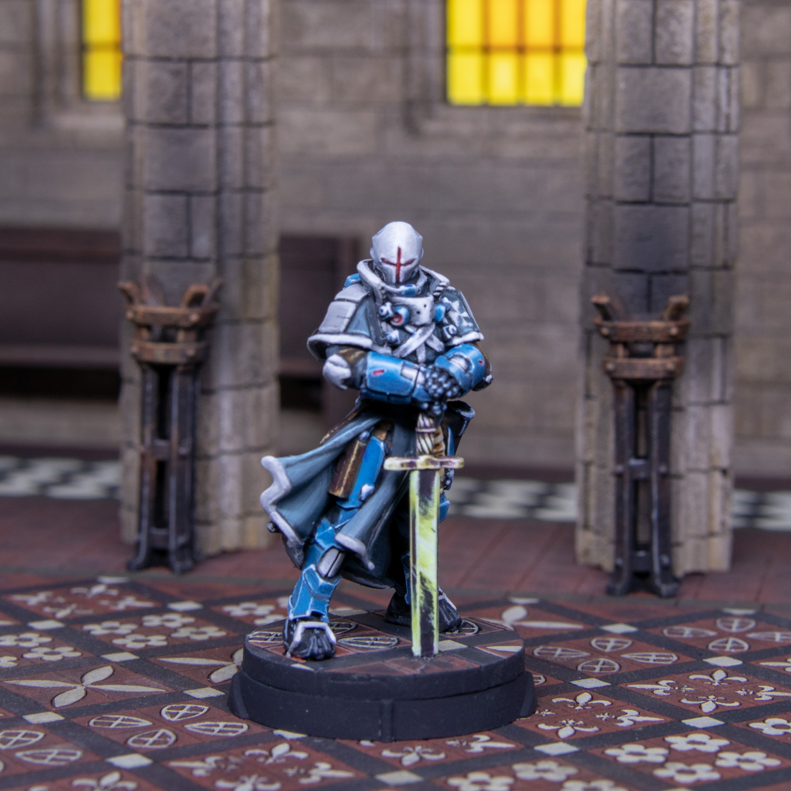 Knight Commander, I hated this model, now I have painted it I just dislike it. I love the "oldhammer" feel of the model. Reminds me of that Dark Angels Captain. What I still hate is the sword. Why cut it off on the ground. WHY!!! Hate that. Also as I hated this so much anyway I decided to try and do yellow NMN, not gold but yellow. I dislike it but not utterly hate it. I also chose not to have a wrestler gimp look on the model compared to the studio version. So yeah very mixed emotions around this.
 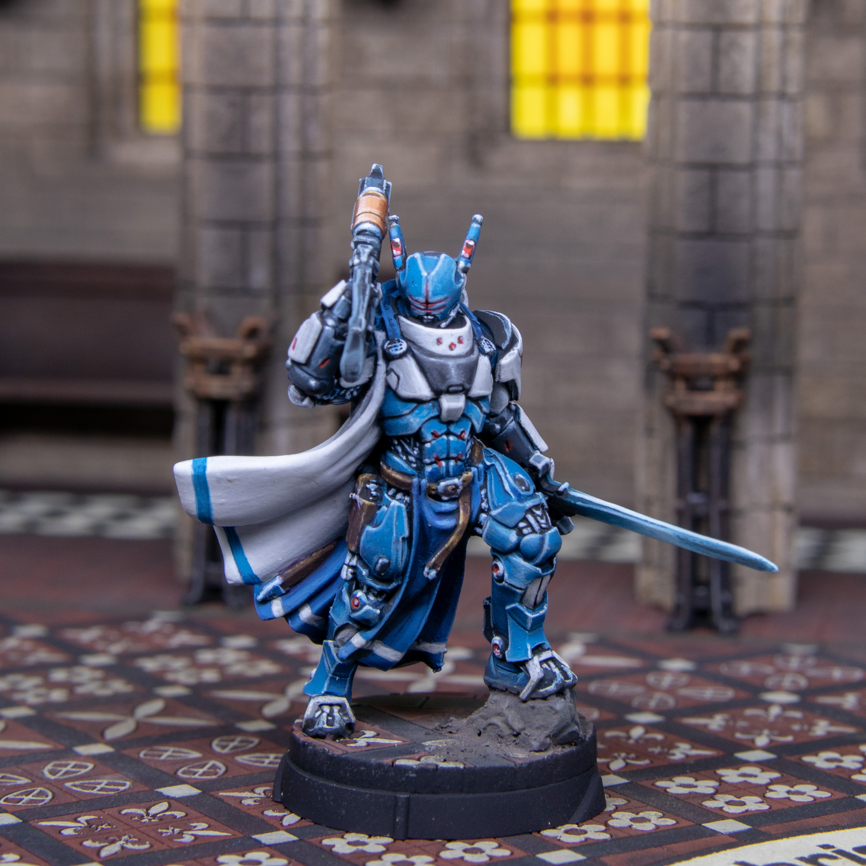 Knights of Justice, Started this model thinking I liked it more than I do now. there is so much white on this I should have airbrushed the white and painted the armour. But I do want to get better at painting white. Think I am improving on small sections but this cape is massive. Still need work but think I have another 3 white capes to do. The freehand was harsh, red and blue on white. I think I would prefer a grey on white to paint. I was going to do the red cross only, but after I had finished it reminded me of another group of people who ware white capes and have red crosses. So had to add the trim. Not pleased but had to just finish.
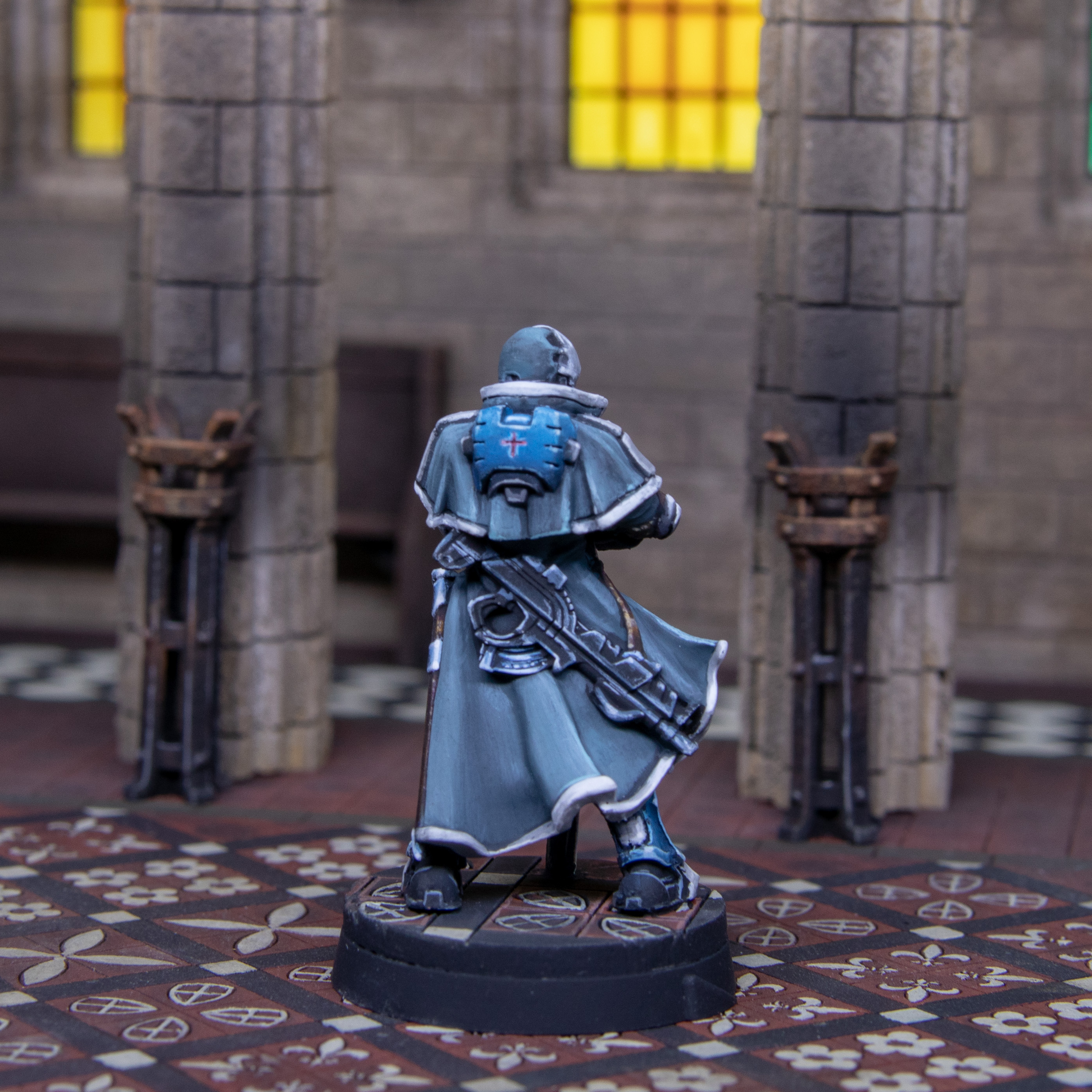
 Friends together.
So this week has been a bit tough in terms of being pleased what what has been done . I think I can do better and there are points on each model I am happy with. I have also learned a little when doing things.
One of the best tips I have for painting white (with acrylics) is use fresh paint and mix it well. Use what you have on your pallet for that session. Soak it up then replace on the next session. You move things out of your paint without knowing it or break then down by mixing with a brush. In white paint at least me, I cant see it and then it ends up on the model and I can only see it when dry. Mixing and new paint prevents any dried up paint being transferred to the model.
Thing I need to develop more is having the confidence to use darker greys when painting white. I am so focused on the small scale and not looking at the big picture. What I have done doesn’t look incorrect but it could use more contrast.
Have not decided what’s next but there are 7 models left.
So definitely more to come.

![StarCraft Tabletop Miniatures Game Pre-Orders Live Now [Updated]](https://images.beastsofwar.com/2026/03/starcraft-tmg-news-cover-600-338.jpg)
![Mounted US Cavalry On Kickstarter For Dead Man’s Hand! [Updated]](https://images.beastsofwar.com/2026/03/us-cavalry-main-600-338.jpg)
![Play WW2 Commando Operations With Butcher & Bolt [Updated]](https://images.beastsofwar.com/2026/03/relaunch-600-338.jpg)