


Of Displays and Disappointment


Recommendations: 68
About the Project
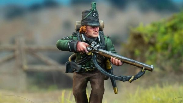
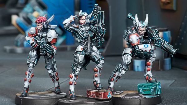
I wanted a display case for some of my assorted miniatures, a small collection. Wicked Brick wanted £25.80 extra to send me a very overpriced, officially licensed 40K display case that cost £59.99, all the way from England to Northern Ireland, when they next produce a batch that is. Delivery was supposedly considered as “Domestic – Channel Islands at £25.80”. Driven mad by the idea of paying this exorbitant fee, I emailed Support, hoping for a quick reassurance and an explanation other than that they could “confirm this is the correct pricing as per our shipping provider’s policy”. Annoyed, I looked through the usual suspects for a replacement display option and found some very cheap but just as good as, dust and cat hair-preventing, ‘clear’ acrylic boxes from Temu (Two Portrait) and its competitor AliExpress(One Landscape). In total for the 3 I have, I can’t have paid more than £15 total, I’m almost certain, they are from several continents away, and although their composition was flimsy at best, they were at least despairingly cheaper and freely delivered with speed from a vast distance away. I could not resist. I intend to make up for their lack of lustre, slightly yellow hint (just the Temu), and structural weakness by adding some 3D printed backdrop and terrain to better display my motley crew of plastic, mostly my sons of the Lion. A chance to get some more experience on a newly acquired vintage FDM printer and some action painting some display terrain. (On TEMU and AliExpress. I don't support either platform; I'm sure the low prices have dubious consequences as well as upsides. I would be sure to avoid both of their apps and definitely don't give them your main email address, as it's going to be spam city.)
Related Game: Warhammer 40,000
Related Genre: Science Fiction
This Project is Active
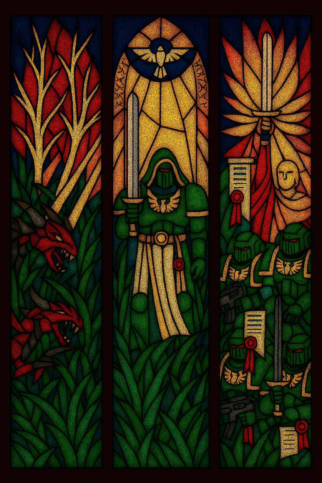
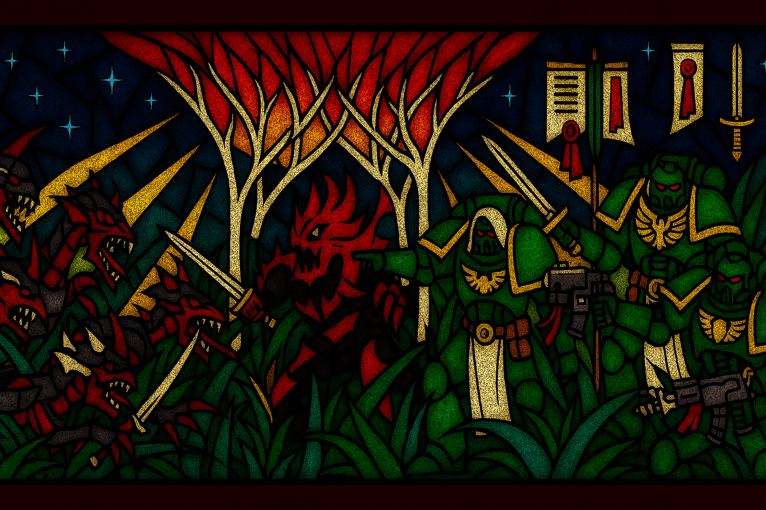
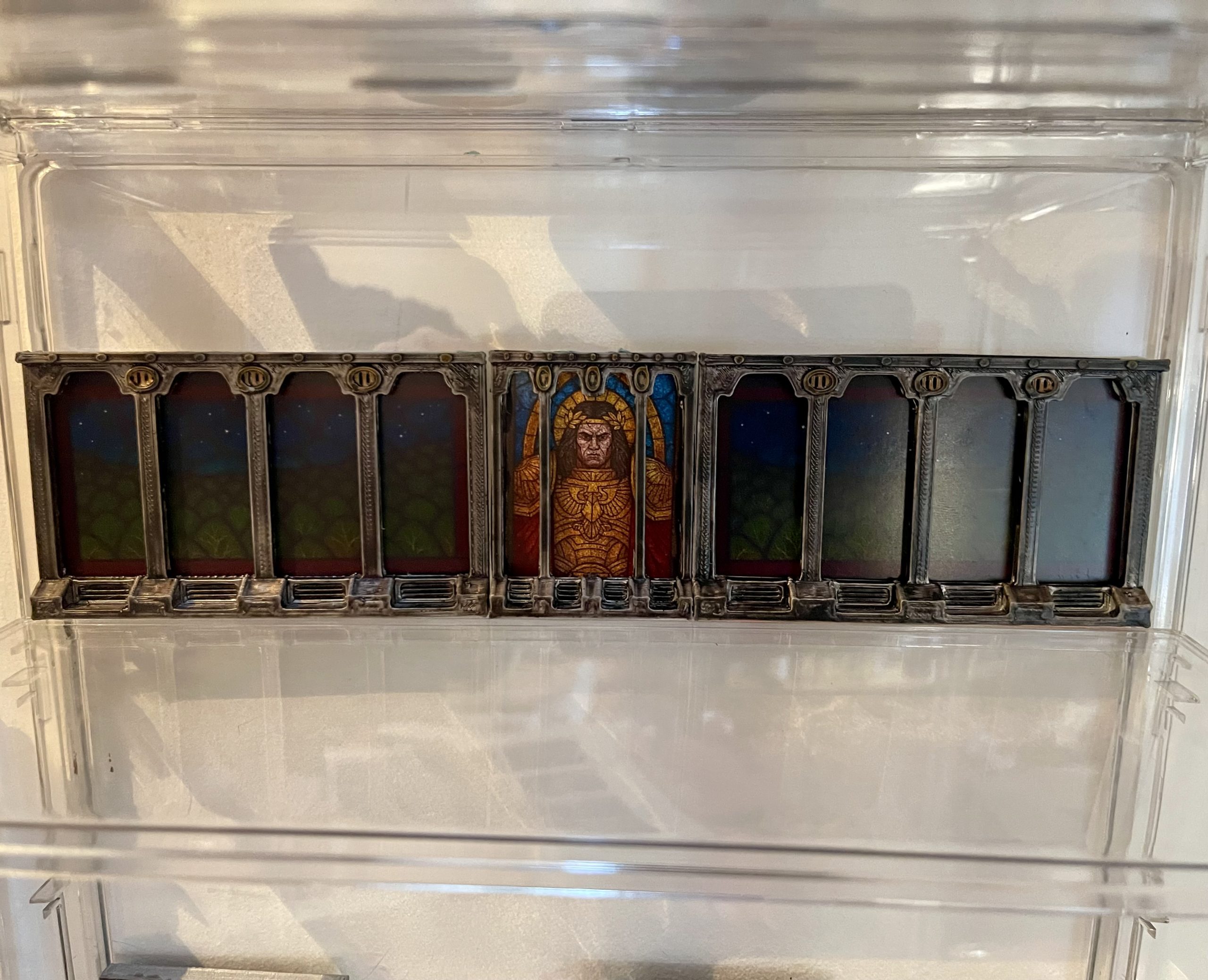
Stained Glass Windows
So many windows to fill, such little skill.
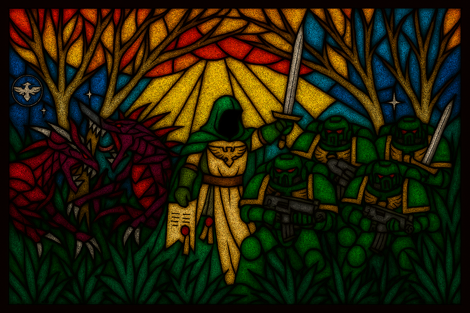
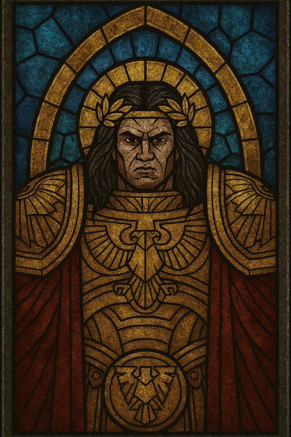
Inspired by a past project on here with some stunning stained glass, I wanted to attempt something similar but simpler. Lacking the skills to have forged my own art, I leaned on the heretical AI to help design some stained-glass effect designs.
My first attempt was to print out the images onto regular paper, glossing over the top to create a transparent but frosted window look. However, this didn’t end well; the paper absorbed all the spray, and the ink seemed to cause uneven pooling of the varnish. I gave it another go, but eventually I just ended up printing them on glossy photo paper. This proved to be much better as the gloss spray finish over normal paper had caused quite a lot of colour obfuscation and made the windows seem overly dark. On the photo papers, the greens and brighter colours showed through a good deal better. I’m not sure how the backlighting will be affected by the watermarking on the photo paper, but I think with the brighter colours, it will be less necessary.
Now for the rest.
 Test Batch
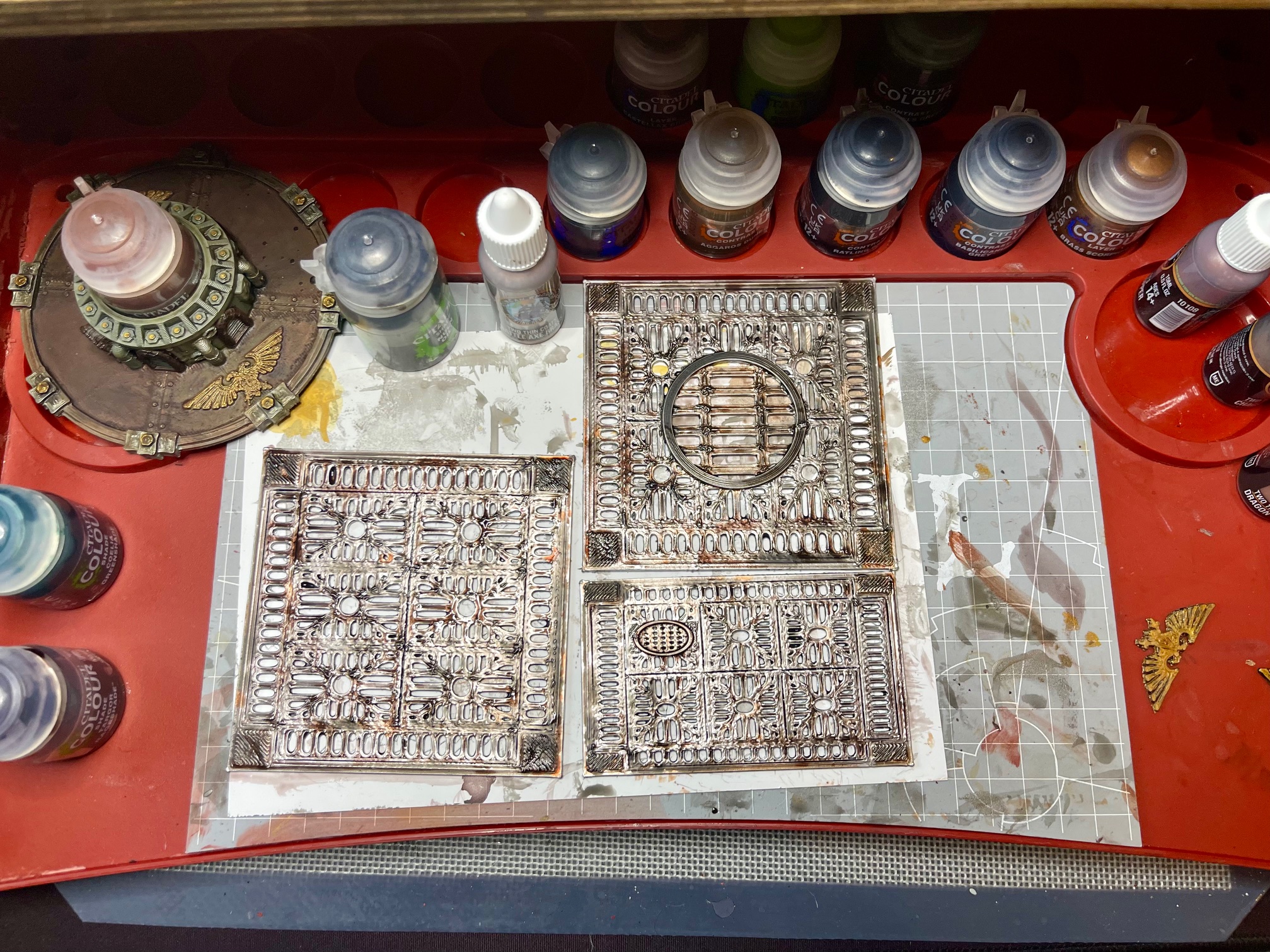
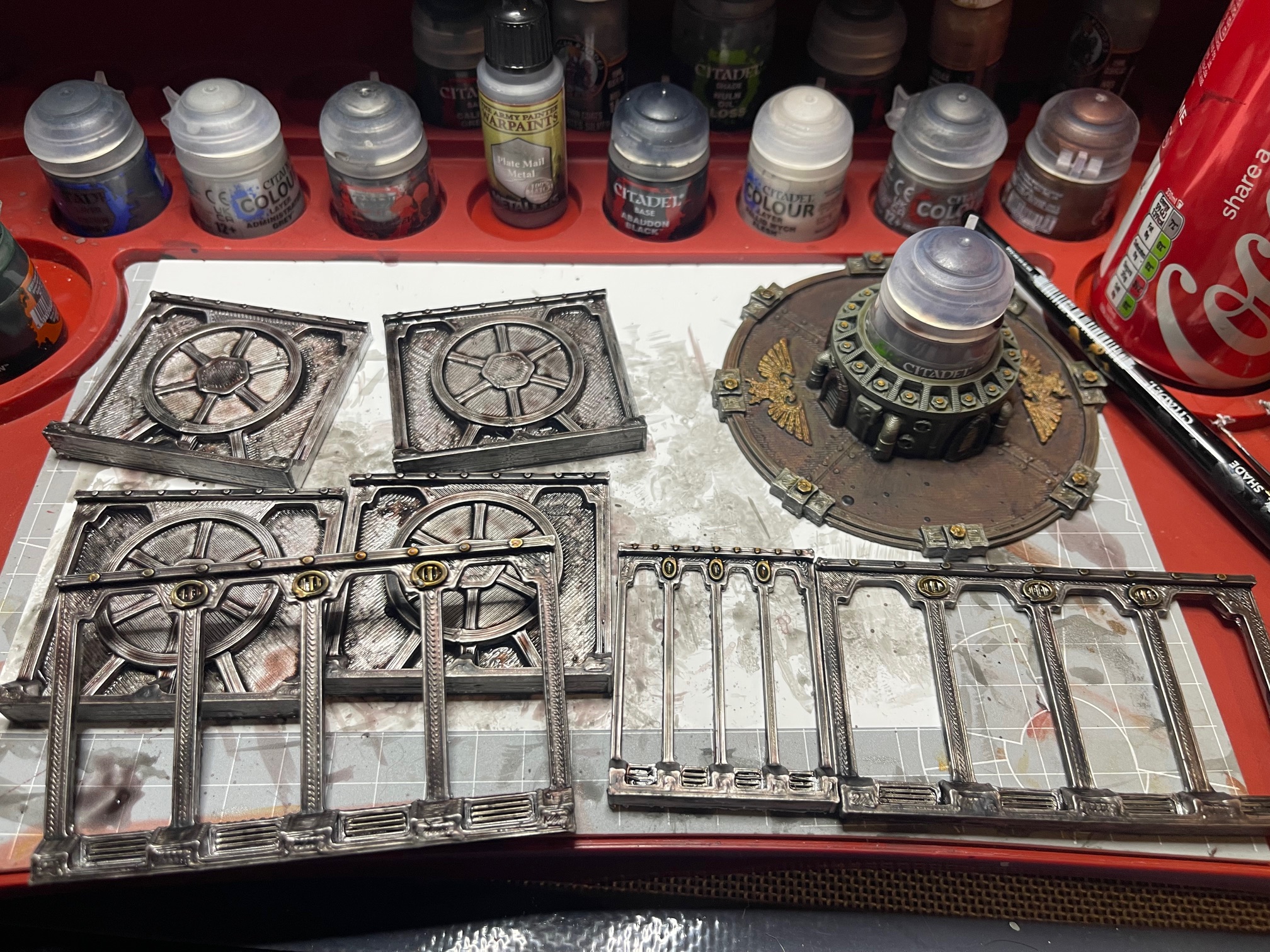
Floor Tiles
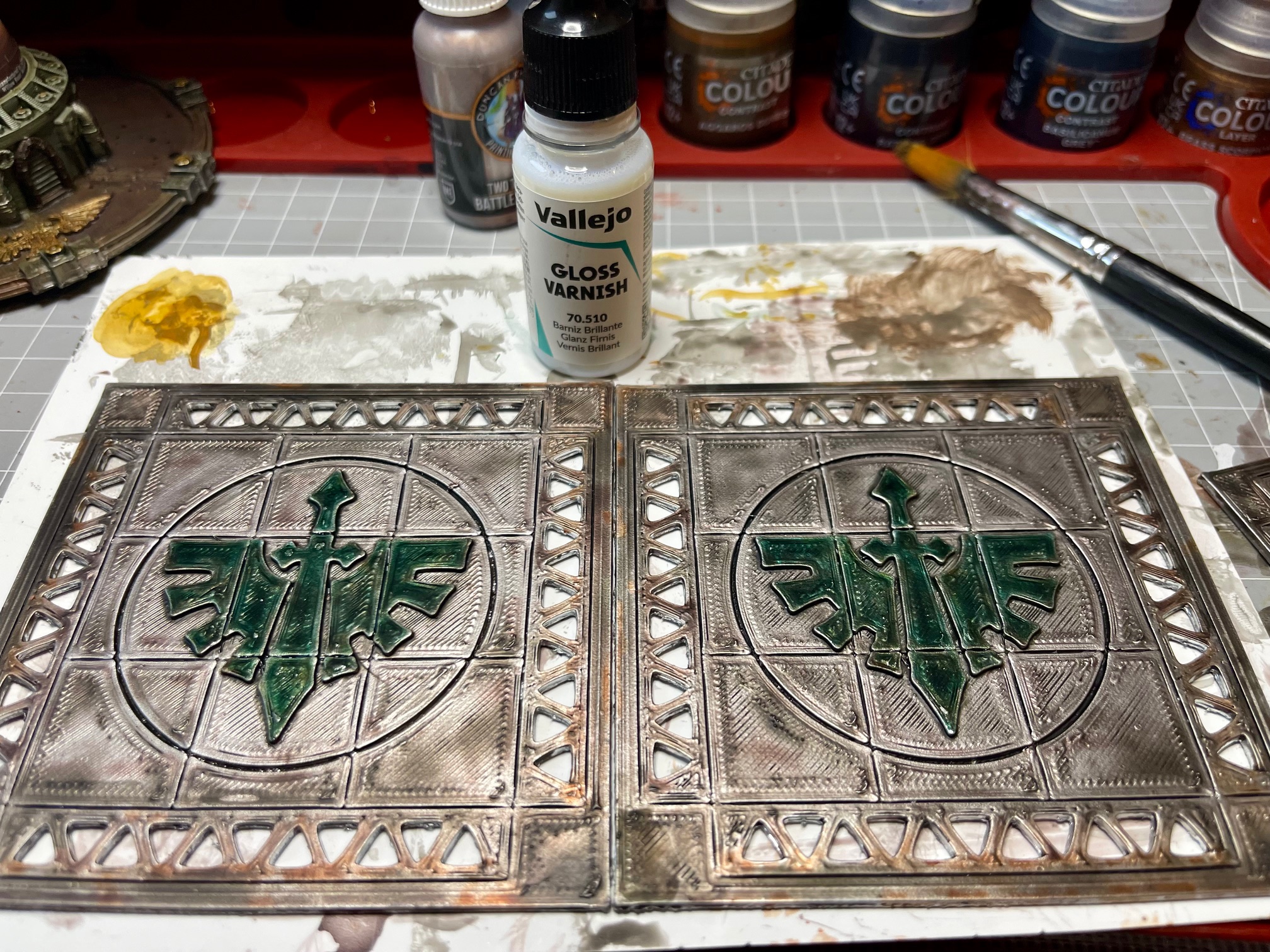
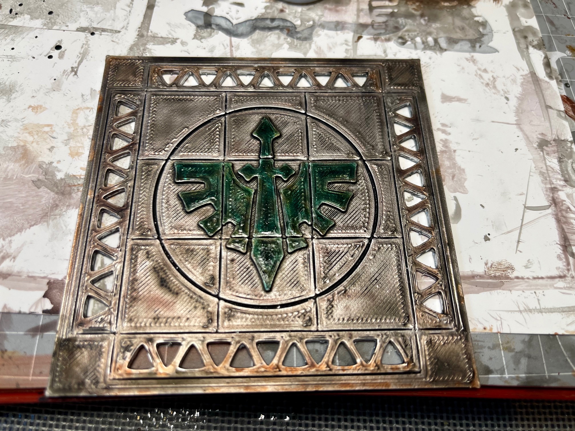
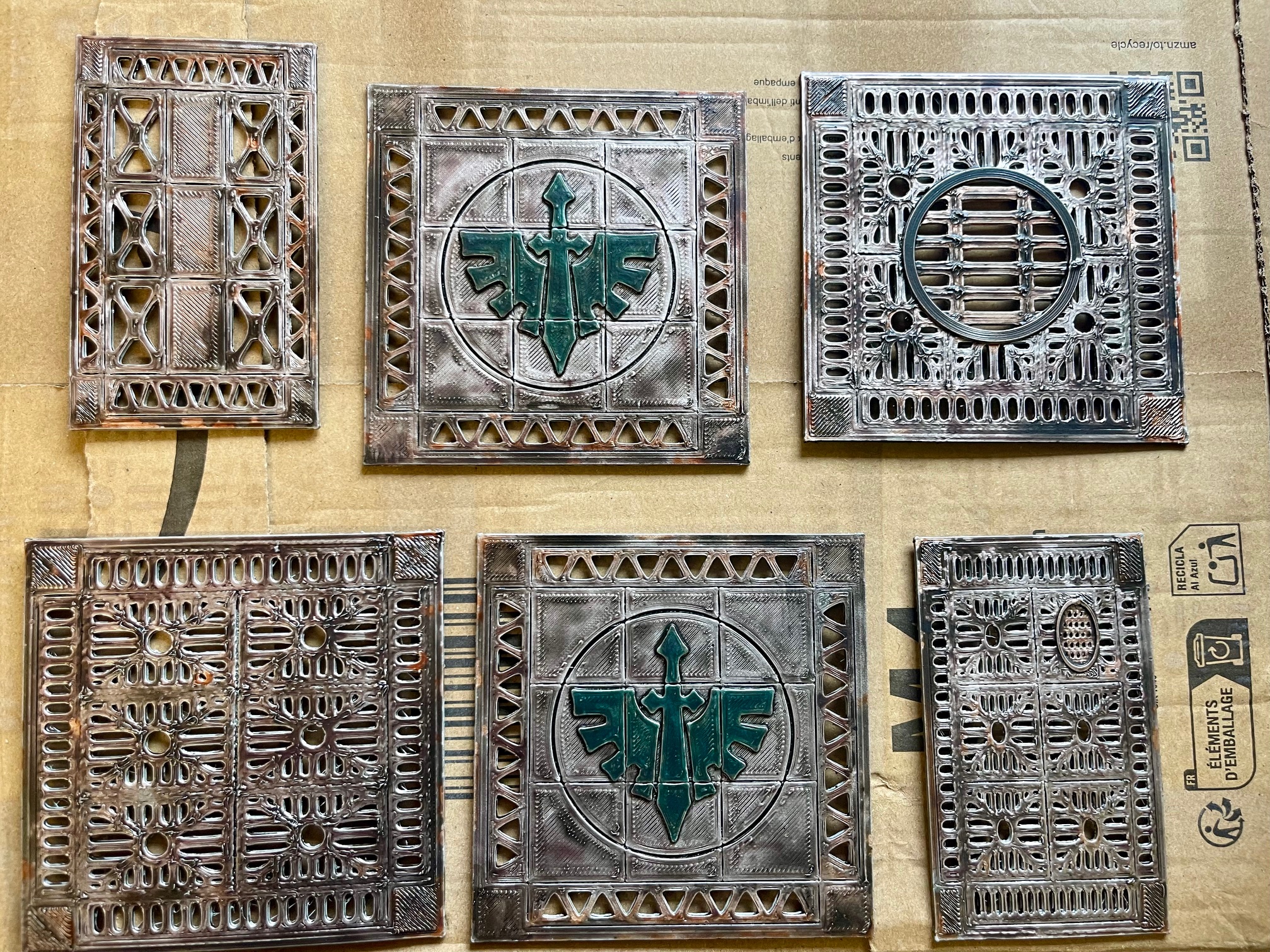 Post Varnish Floor Tiles
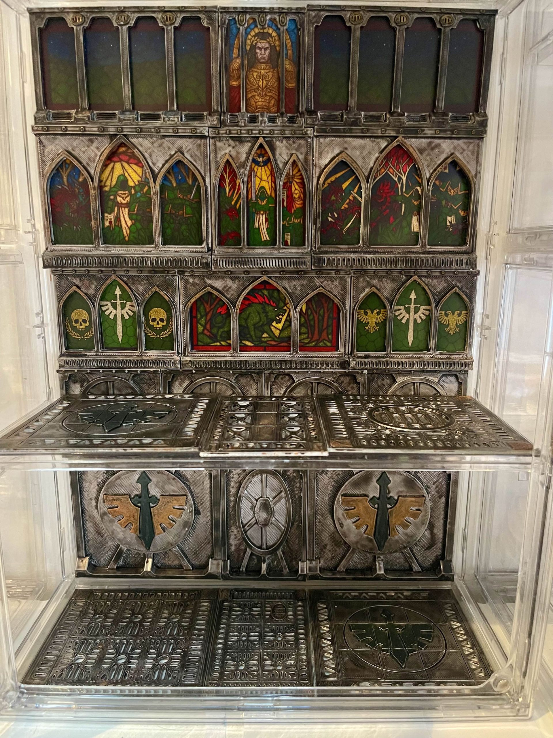
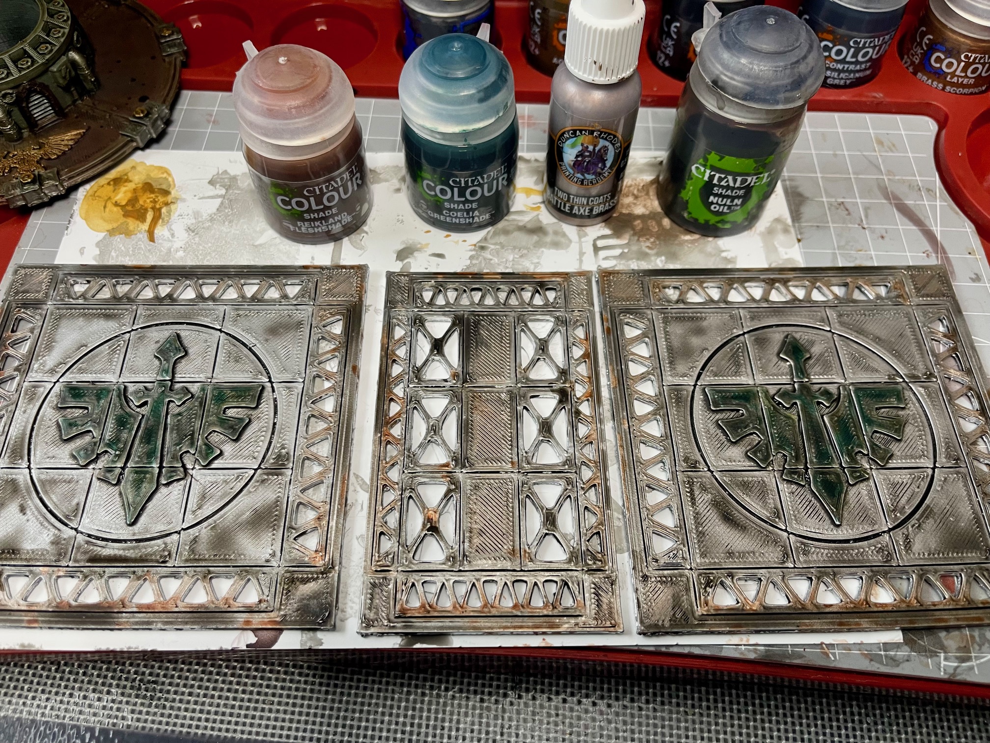
I moved onto the floor tiles, similar to the back walls in method, just with some additional grime and rust. Tried for more of an enamelled green DA emblem on the floors. Although I am tempted to gloss varnish the wall emblems as well to give them a similar pop. They all got a coat of Matt Varnish. I am still undecided about using tiles for the top floor or leaving it clear acrylic for lighting purposes. Once I have it all back together, I will try it out and see how things look.
The Paintening - Back Wall Paint
In a flurry of activity the back wall came together nicely, just floor tiles and windows to work on now Hurrah!
 The Wall
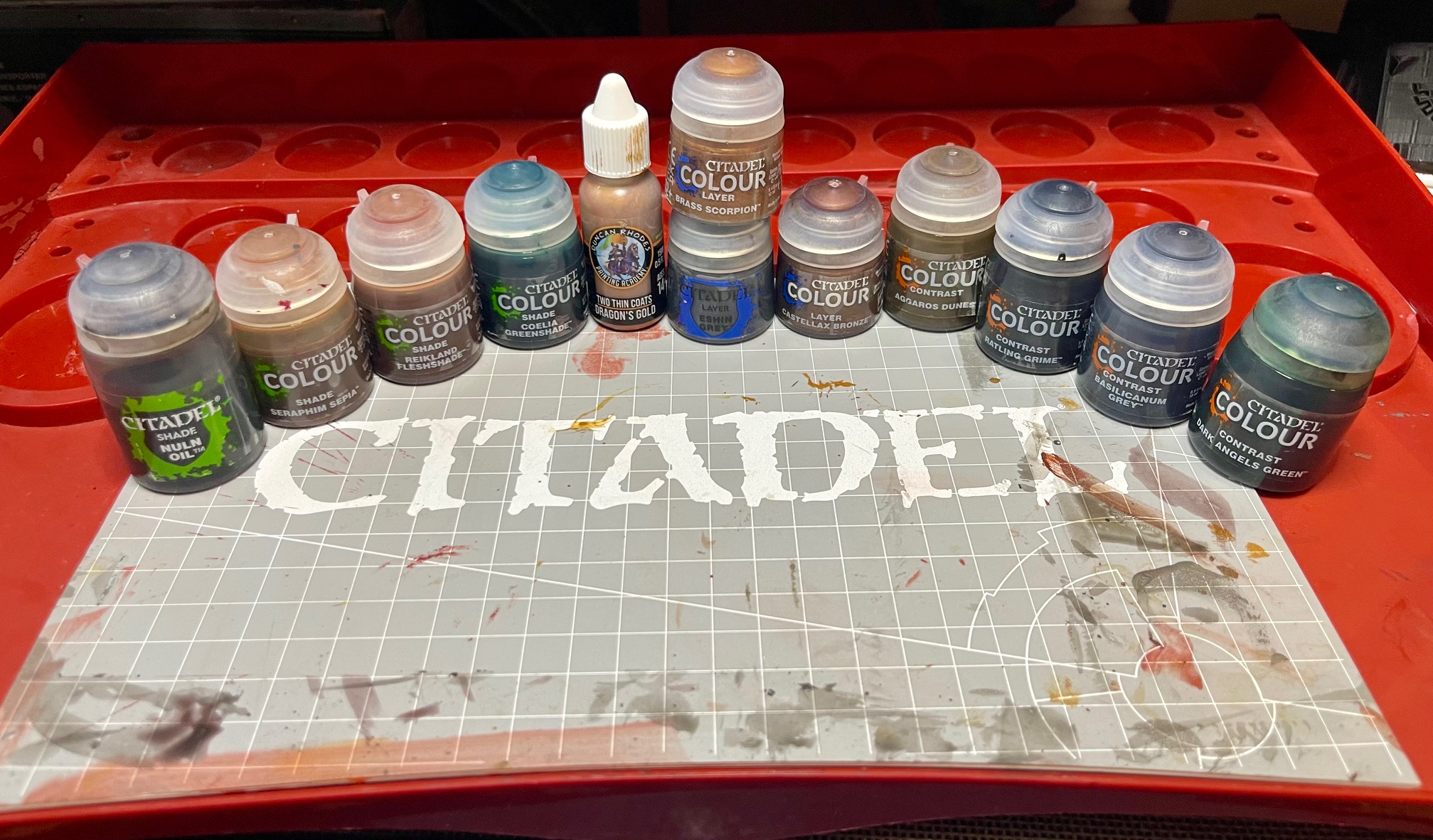
What I Did – Gothic Wall Backdrop – Dark Angels Ship Interior Style
MATERIALS
Primer
- Chrome Gloss Spray Paint (budget brand)
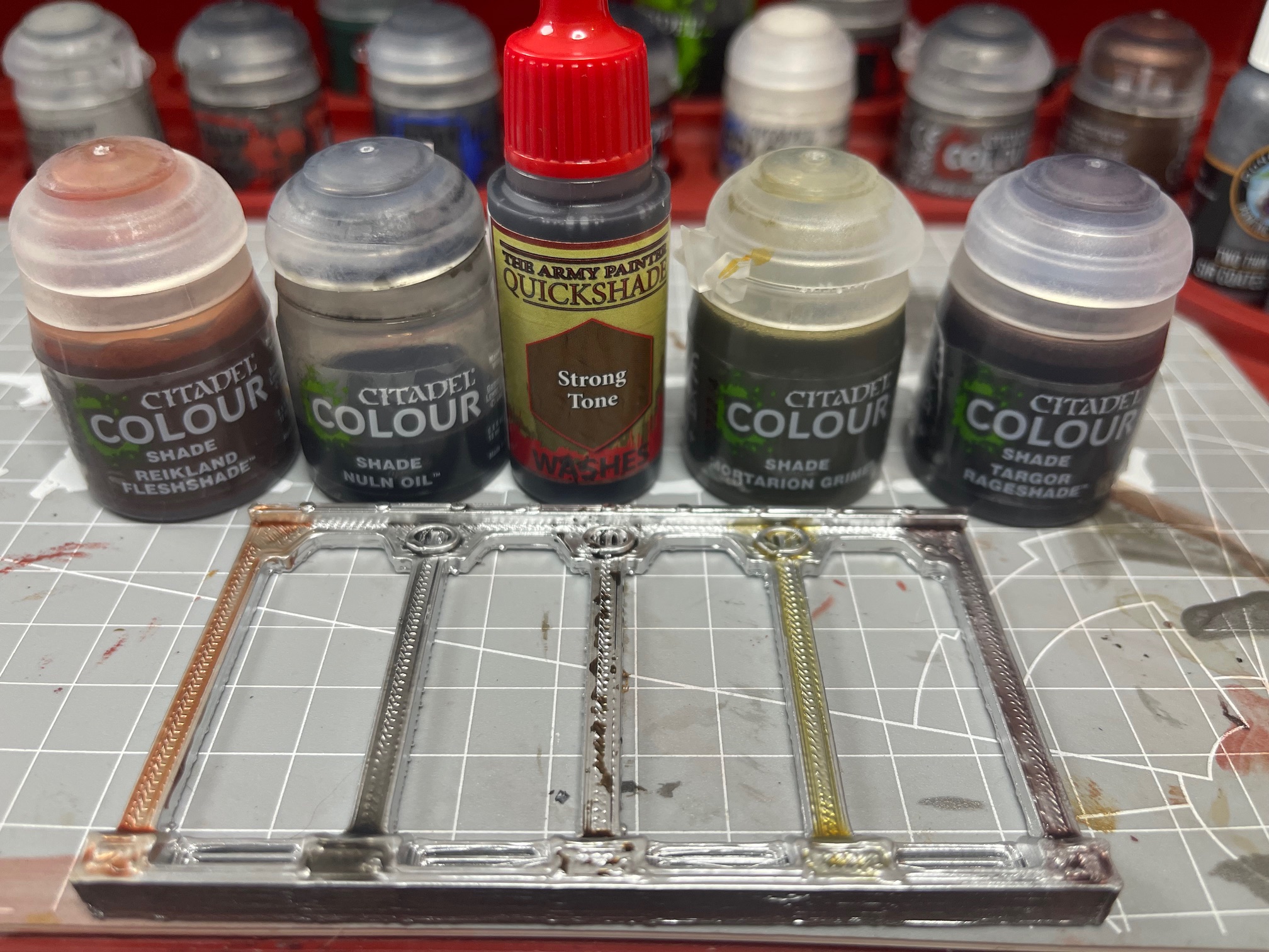
Shade Paints
- Citadel Nuln Oil
- Citadel Tagor Rage Shade
- Citadel Coelia Greenshade
- Citadel Seraphim Sepia
Contrast Paints
- Citadel Dark Angel Green
- Citadel Basilicanum Grey
- Citadel Rattling Grime
- Citadel Aggaros Dunes
Layer & Metallics
- Citadel Eshin Grey
- Citadel Brass Scorpion
- Citadel Castellax Bronze
- Citadel Moot Green
- Dragons Gold (One Thin Coat)
Tools
- Large Shade Brush
- Medium Shade Brush
- Small Layer Brush
- Medium Dry Brush
- Sponge Small
- Matt Varnish Spray
PAINTING PROCESS
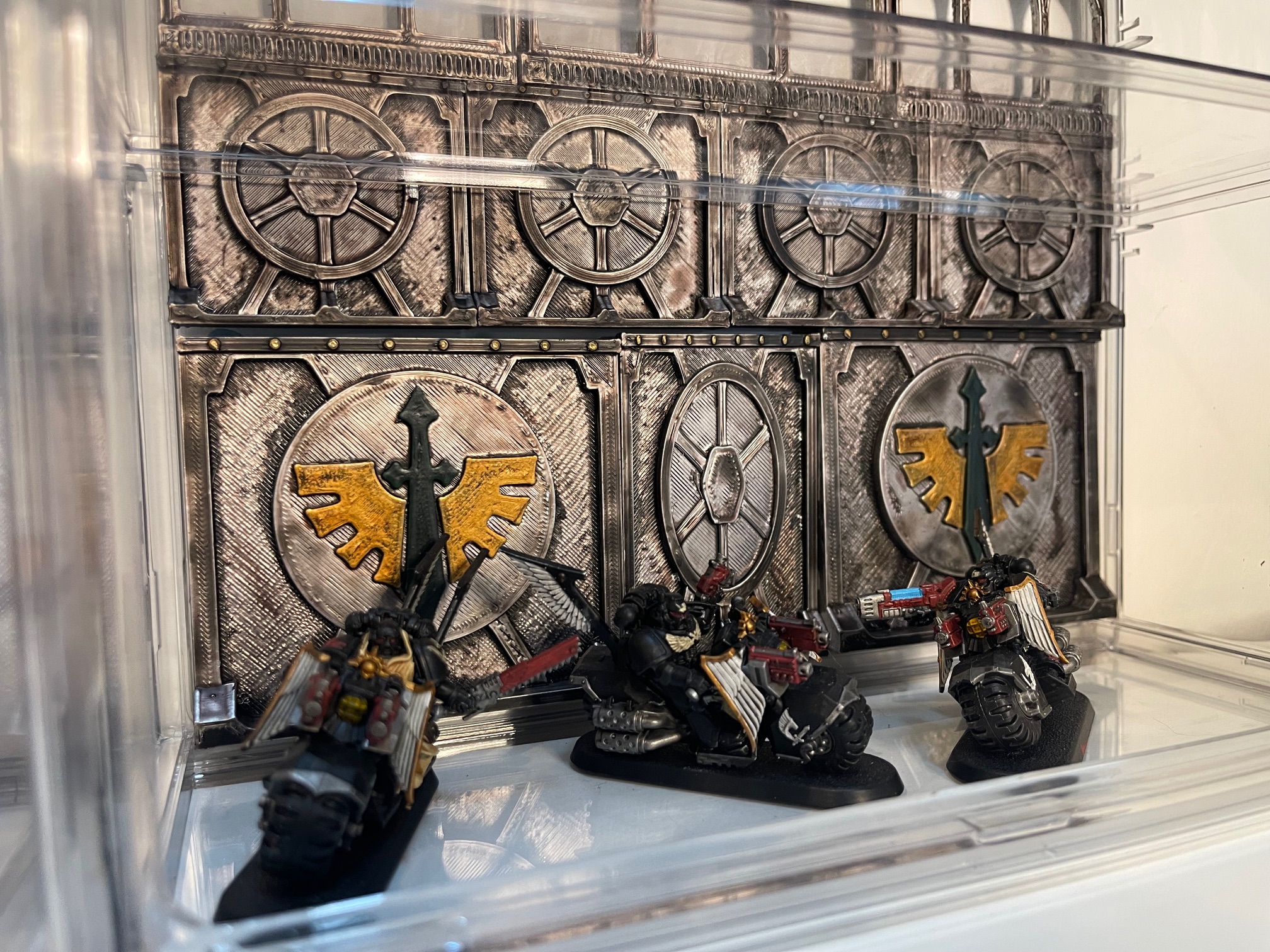
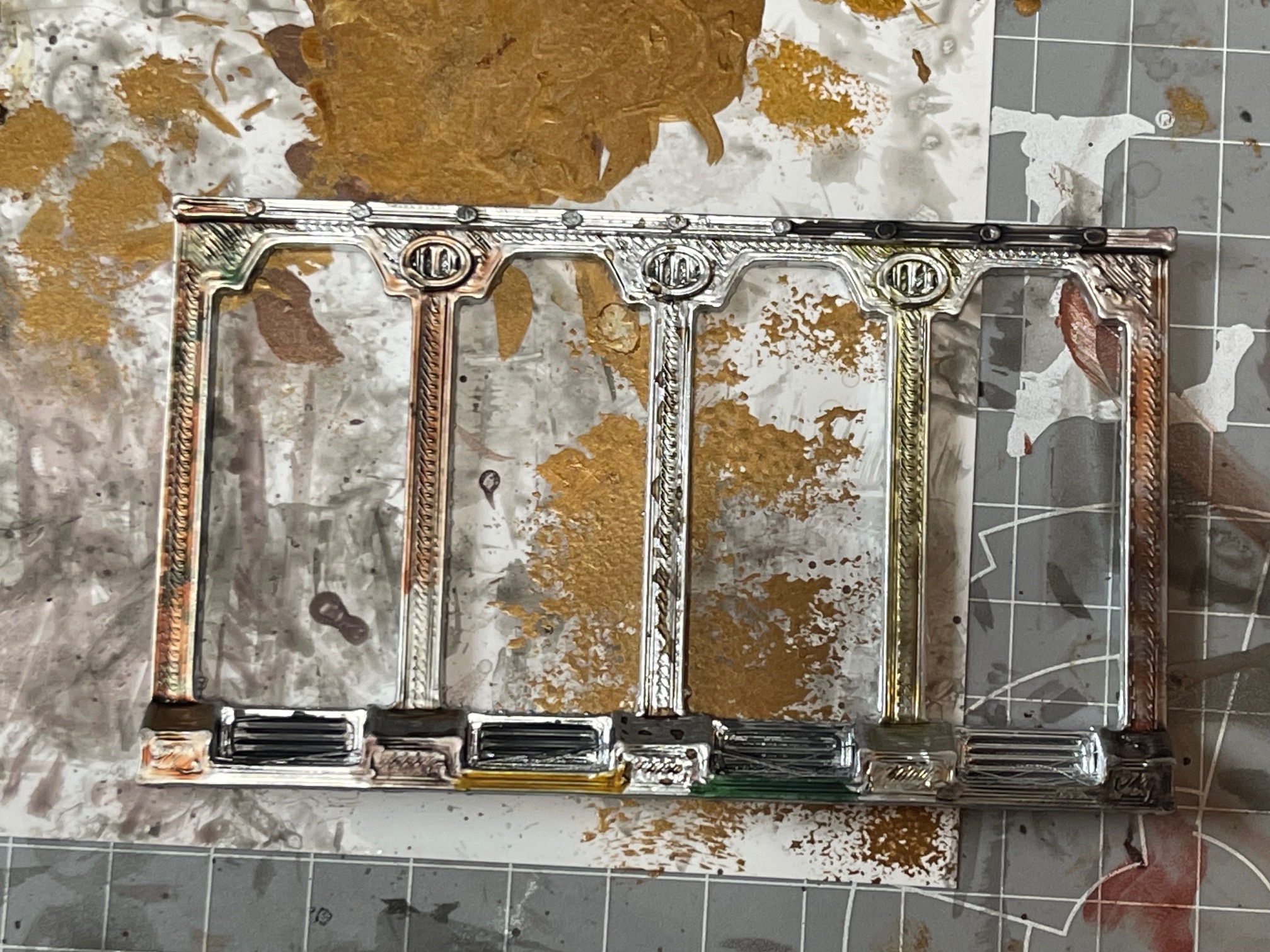
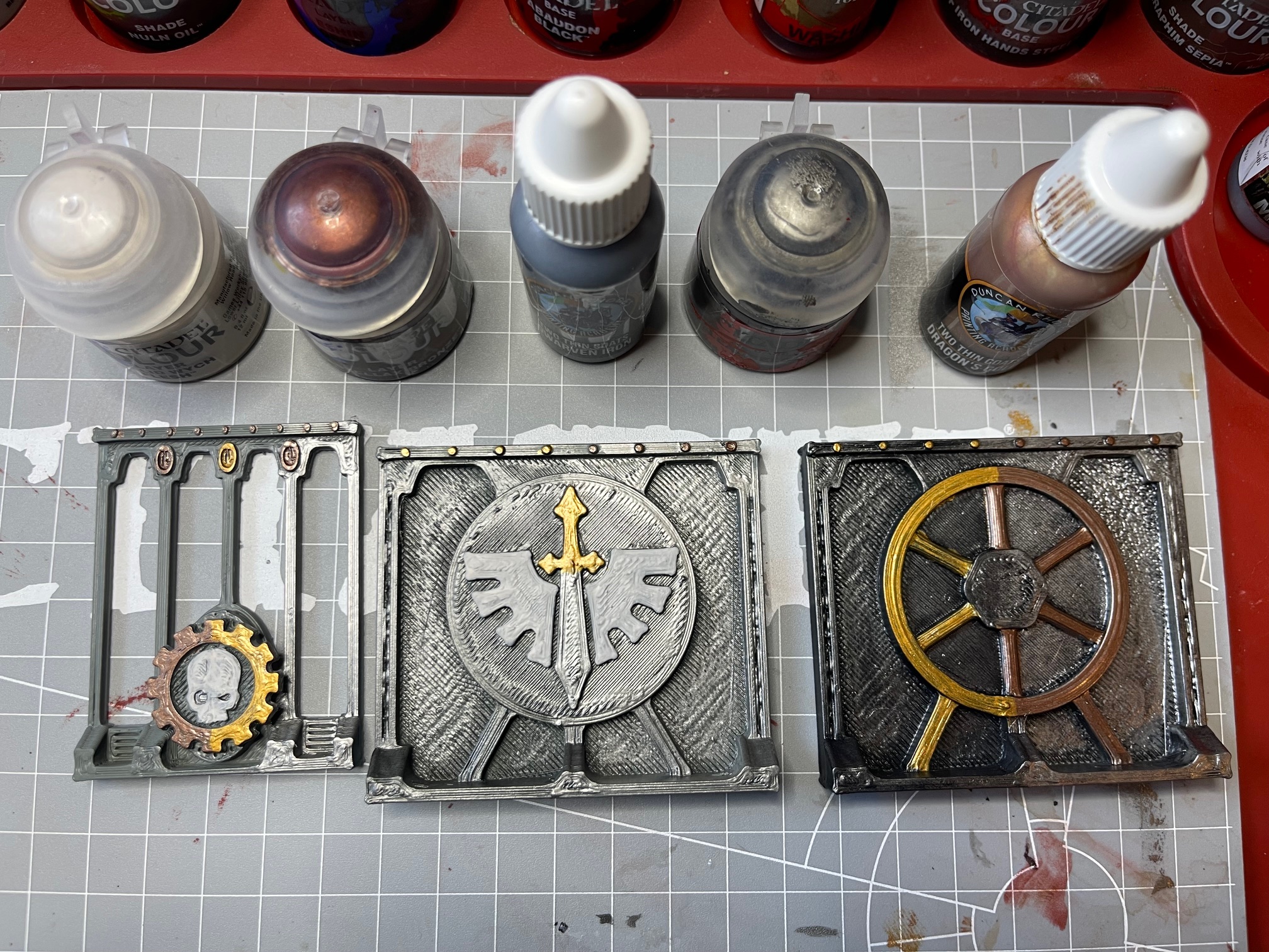
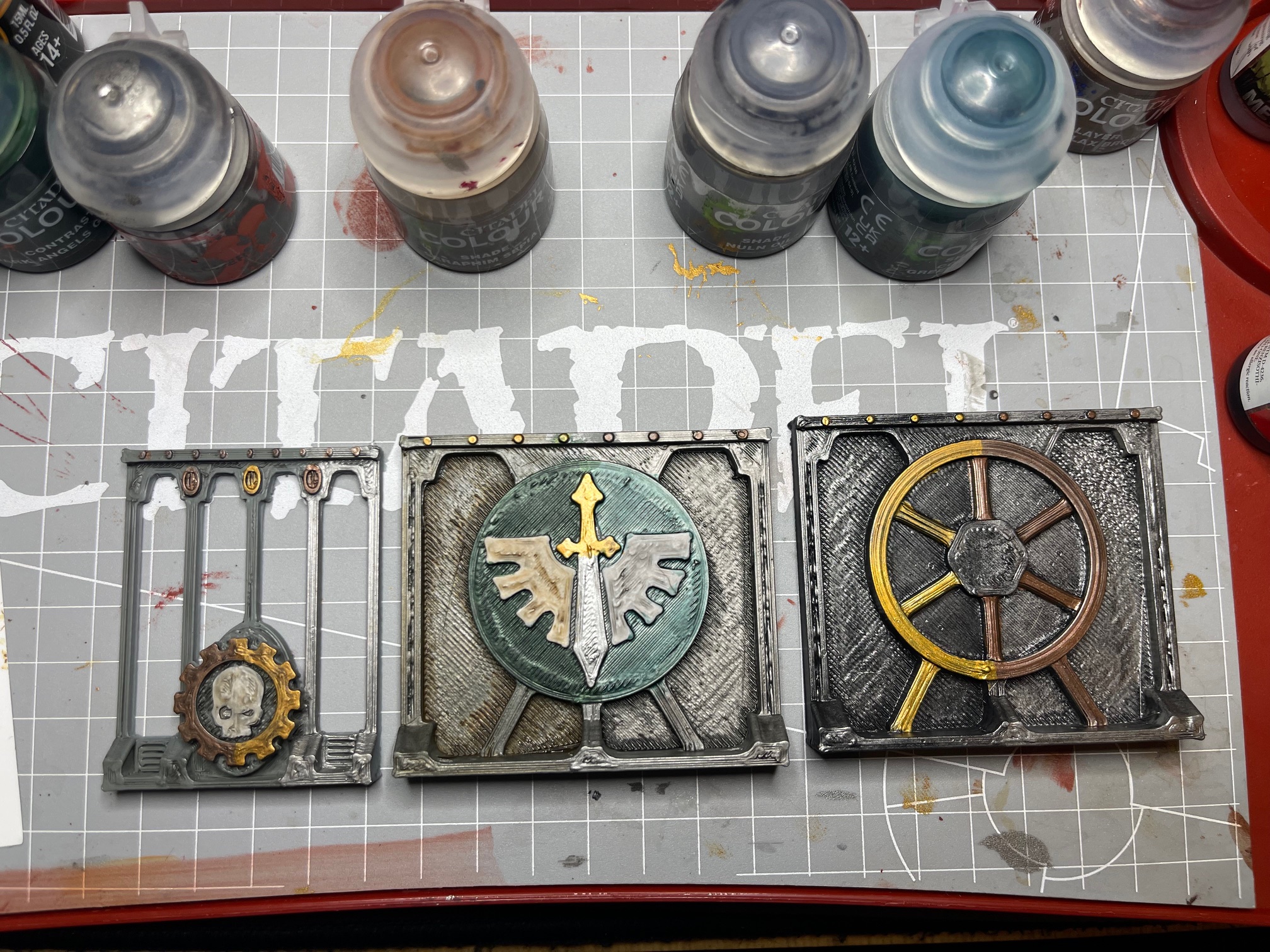
- Primer: All wall sections primed (again over the initial grey primer) with Chrome Gloss Spray Paint, creating a very reflective metallic base.
- Shading: Two coats of Nuln Oil were heavily applied across each piece to deepen recesses, cover shine and establish definition. One coat of Tagor Rage Shade layered over to give the chrome an oily, purplish metallic sheen, shifting the tone toward heat‑stained steel.
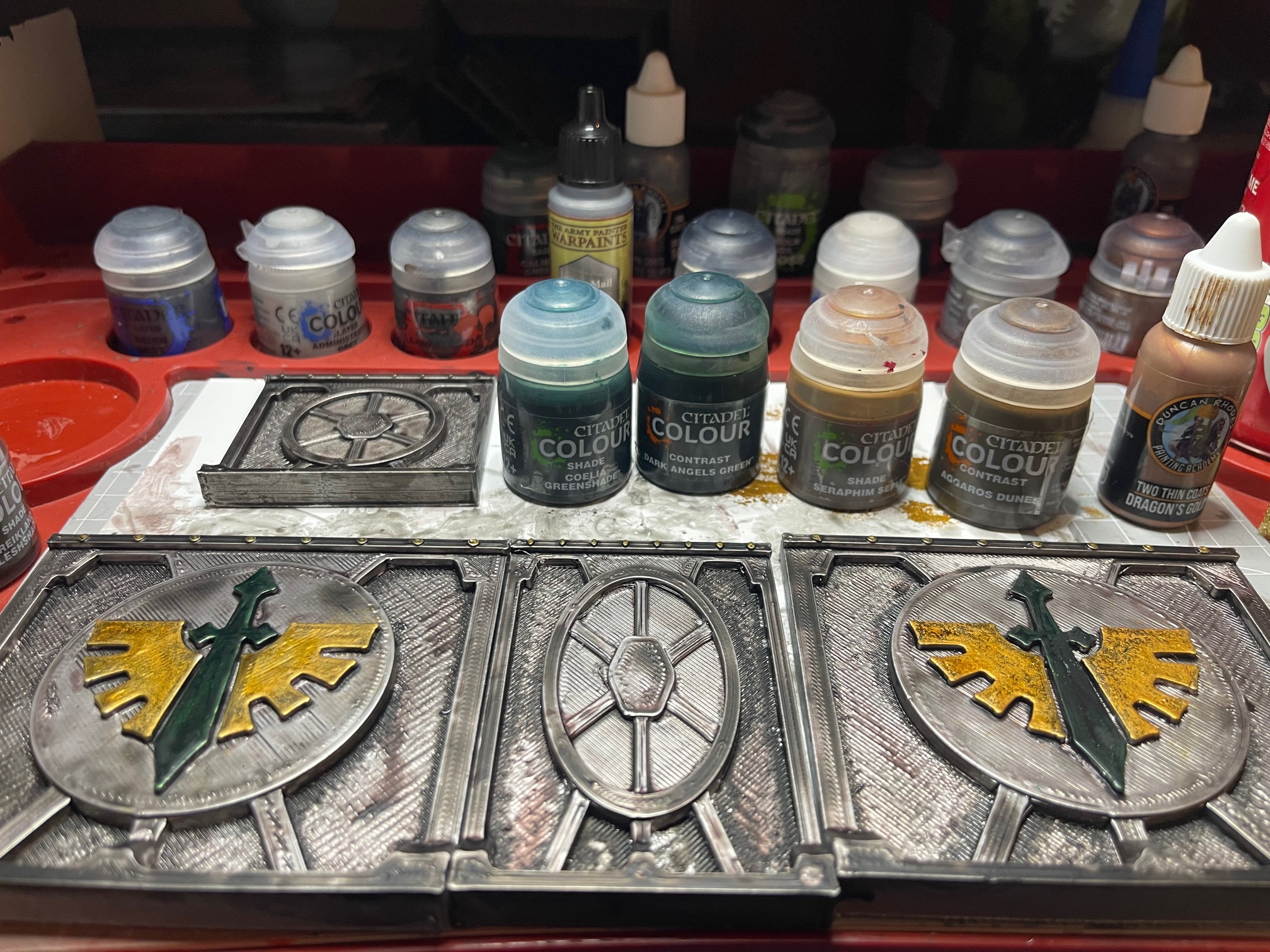
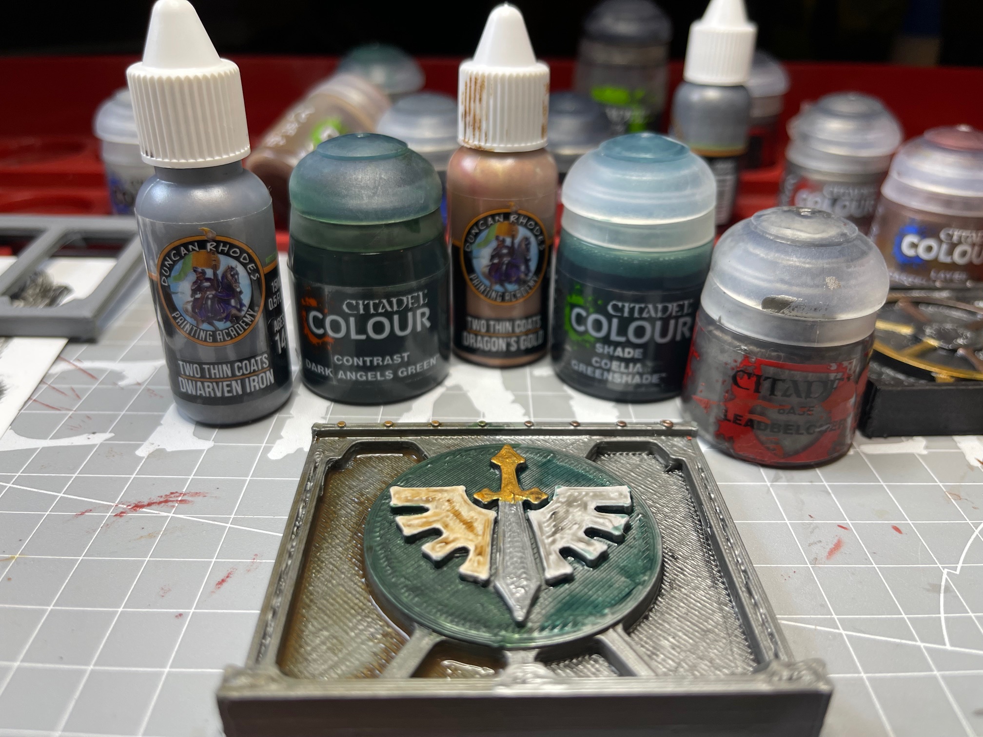
- Contrast Layers Basilicanum Grey applied to stonework and gothic arches for a muted, monastic tone. Rattling Grime was carefully applied in recesses, focusing on air vents and ground‑level areas of the walls to simulate built‑up shipboard grime. On the two panels with Dark Angels badges:
- Sword: Dark Angel Green base, highlighted with a mix of Dark Angel Green Contrast + Moot Green Layer, then glazed with Coelia Greenshade for depth.
- Wings: Aggaros Dunes base, sponge‑applied Dragons Gold for a flecked metallic effect, then glazed with Seraphim Sepia for richness.
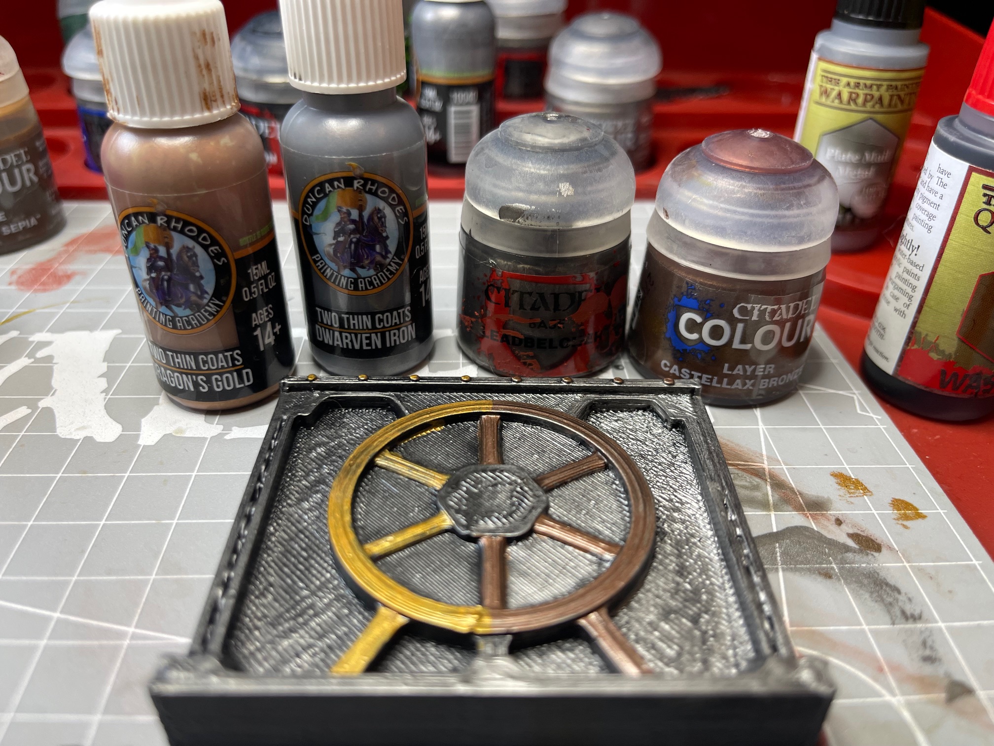
- Rivets: Aggaros Dunes applied to rivets along the tops of panels, then highlighted with Dragons Gold for a sanctified metallic finish.
- Gothic Windows: On some pieces, the tops of the Gothic windows were sponge‑applied with Dragons Gold, then drybrushed over in the same gold to catch the raised detail and create a radiant highlight.
- Metallics & Accents Eshin Grey drybrushed across the edges for definition. Brass Scorpion and Castellax Bronze are layered on mechanical details and iconography. Dragons’ Gold is used sparingly on trim and sacred symbols.
- Final Finish Matte varnish to protect, with gloss left on metallic recesses for a subtle oily sheen. Panels are mounted to the back of an acrylic display case to form the completed backdrop.
QUICK REFERENCE RECIPE
- Prime Chrome Gloss
- Shade: Nuln Oil (x2) → Tagor Rage Shade (oily purple effect)
- Contrast: Basilicanum Grey, Rattling Grime (vents + ground level)
- Badge details: Sword = Dark Angel Green → highlight mix (Dark Angel Green + Moot Green) → Coelia Greenshade glaze Wings = Aggaros Dunes → Sponge Dragons Gold → Seraphim Sepia glaze
- Rivets = Aggaros Dunes → Dragons Gold highlight
- Gothic Windows = Sponge Dragons Gold → Drybrush Dragons Gold
- Accents: Eshin Grey, Brass Scorpion, Castellax Bronze
- Finish: Matte varnish, selective gloss
- Brushes: Large & Medium Shade, Small Layer, Medium Dry
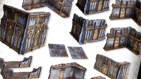
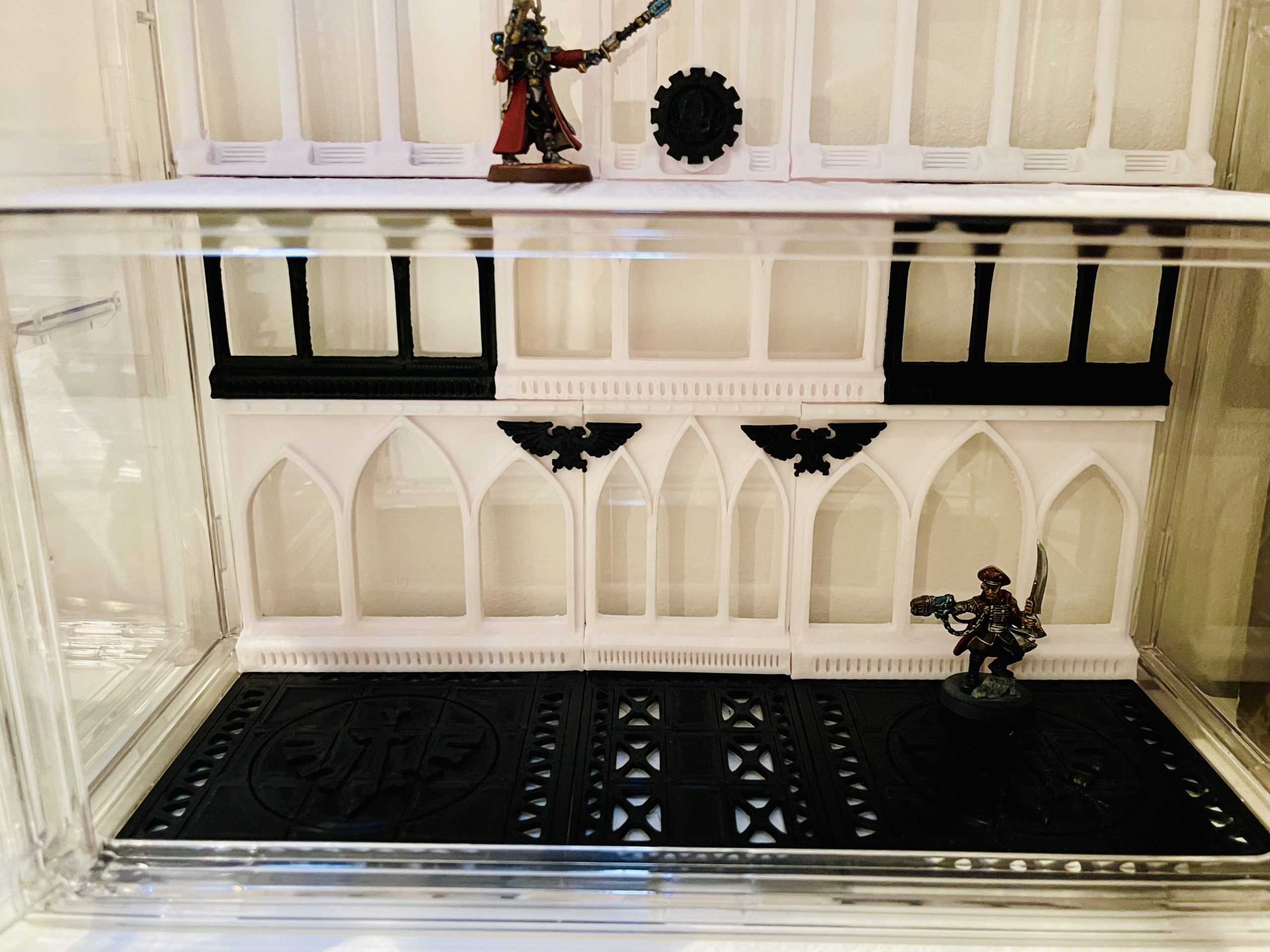
Credit & Acknowledgement Models: All the Panels Designed by AlmostPainted on Cults3D (https://cults3d.com/en/users/AlmostPainted/3d-models).
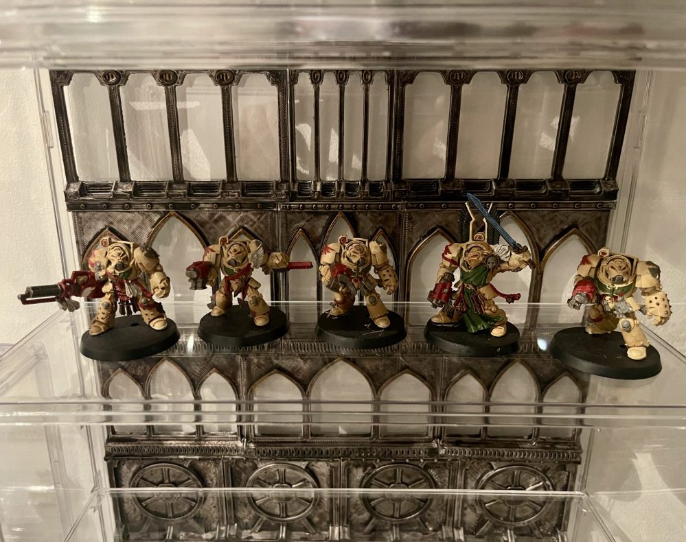
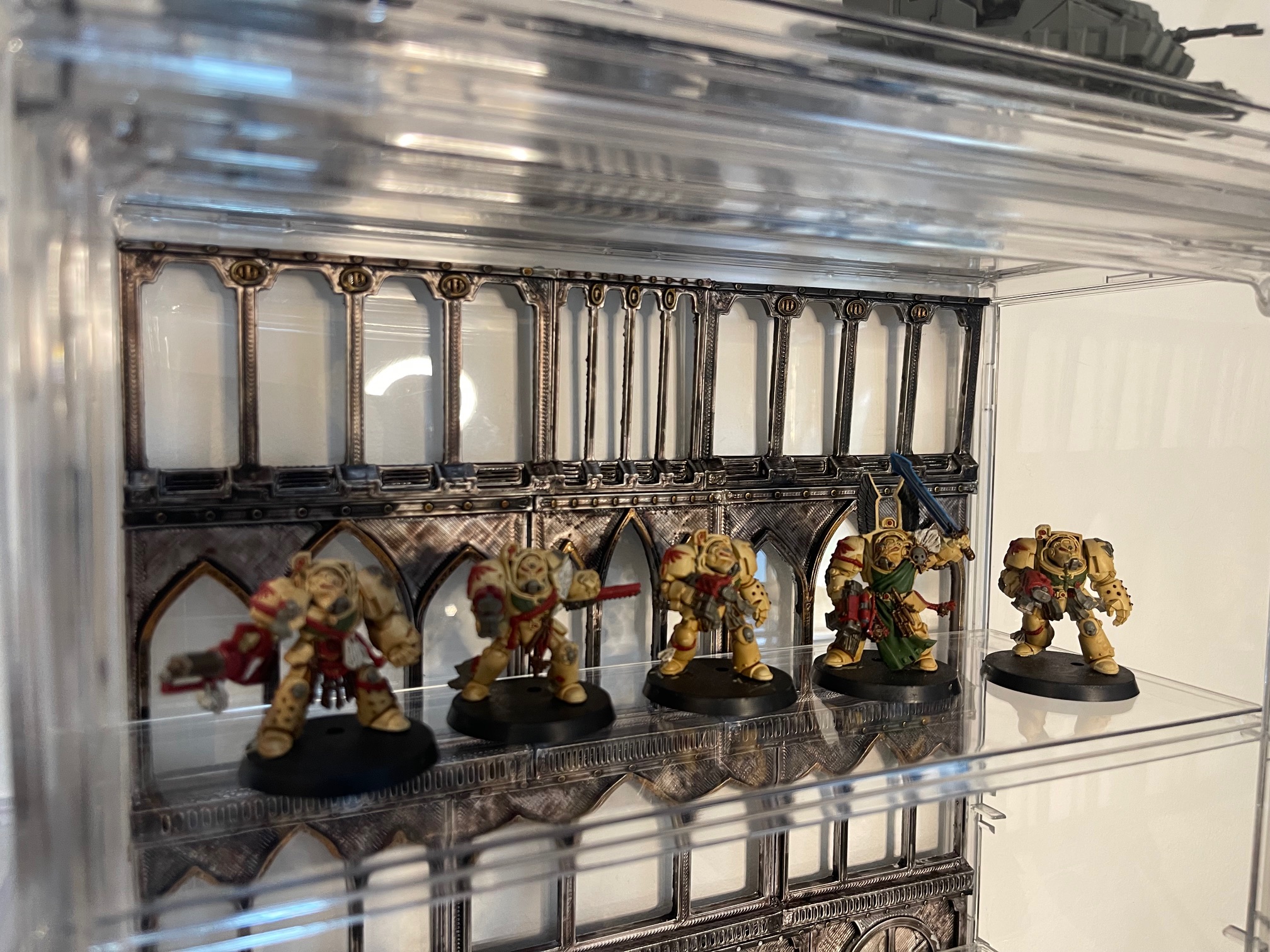
 With some DA for scale
A different approach
I didnt like much of the colour testing on my previous storm-induced work. Had a can of Chrome that I picked up a while ago, just hanging around, and decided to trial some colours of that on another spare misprint.
It was a gloss spray, so I was concerned about how or if the stains and contrast paints would work out. Surprisingly well for the Citadel and not at all for the Army Painter. I was quite taken with the oily purple metal effect on the right.
 So it all got the Mad Max treatment and was verily chromed.
 I started to piece together some of the base shade set to dull the very shiny chrome. Nuln oil two coats, with Tagor Rageshade over that. Some Contrast tests with Dark Angels Green and Aggaros Dunes proved promising. Onwards to the main paint!
Some storm induced progress
As the storm moved over i made some progress, trialing some colours and approaches for the main paint.
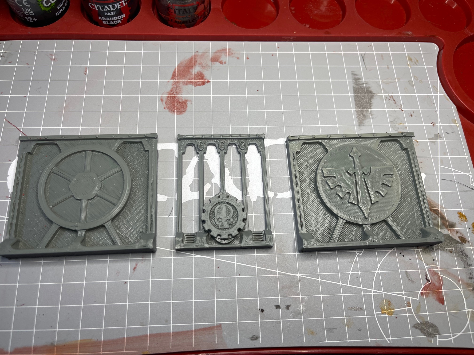
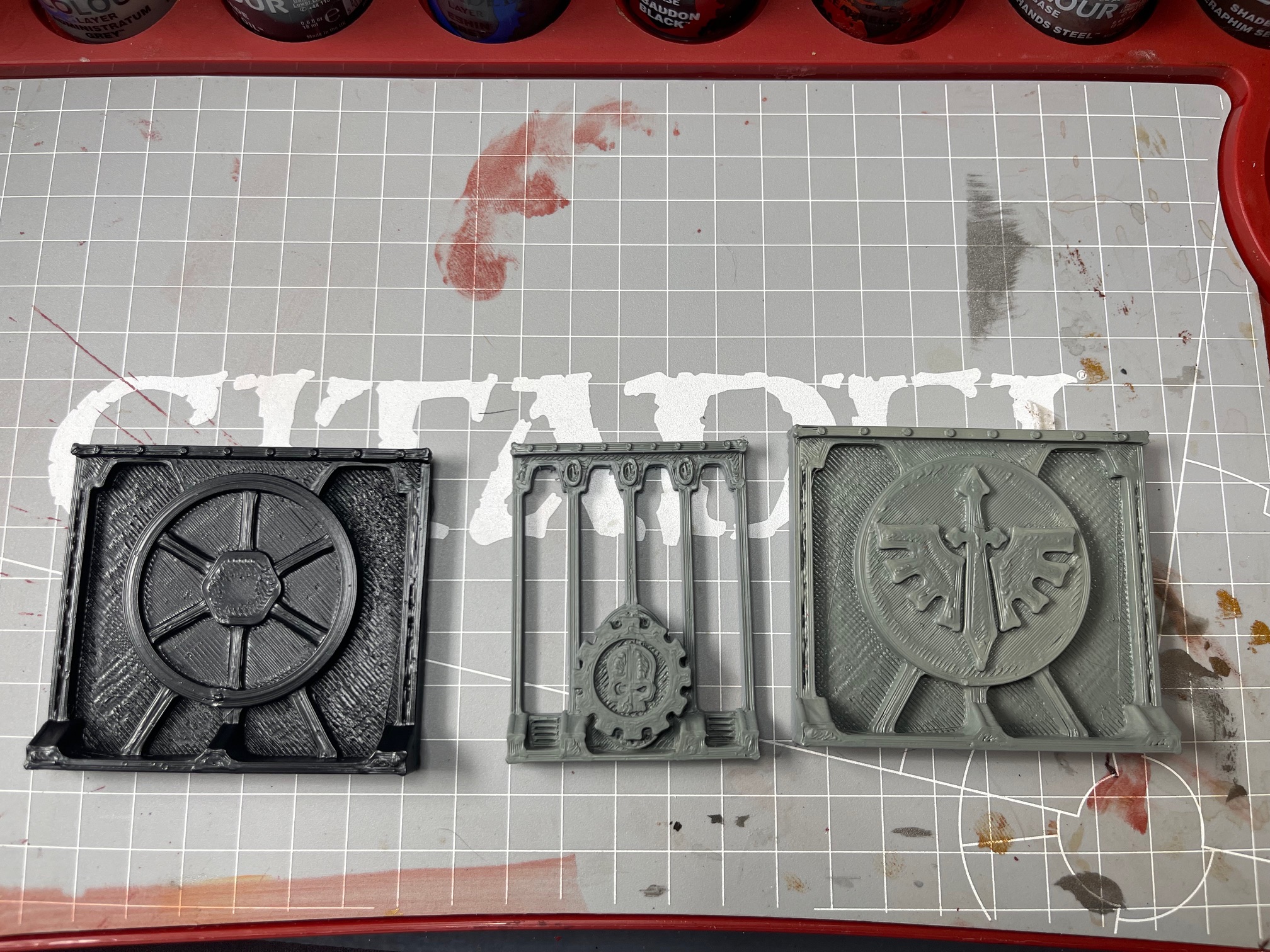
I had some misprints that I thought I would attempt to correct and add some colours to for the backdrop pieces. Tried a black undercoat, thought it might be better, but it wasn’t. Unsurprisingly, to some perhaps, but it ended up being a real pain with the surfaces of these FDM prints having a very rough and uneven texture. It was definitely evident, especially with these two metallic bases, that the grey was substantially more forgiving than the dark shadows left by the black primer.
Nothing neat, just wanted to slap some paint on so I get an idea of what these look like with a bit of colour from behind the acrylic. I think I’ll have to keep it fairly bright to avoid it becoming a bit gloomy, after a nice display for the models; after all, Dark Angels are gloomy enough already. Possibly, some LEDs will be needed to stop the floor panels from blocking out all the light or maybe a floor rework of some kind.
Progress made, Project continues
It reached the top, and turned grey.
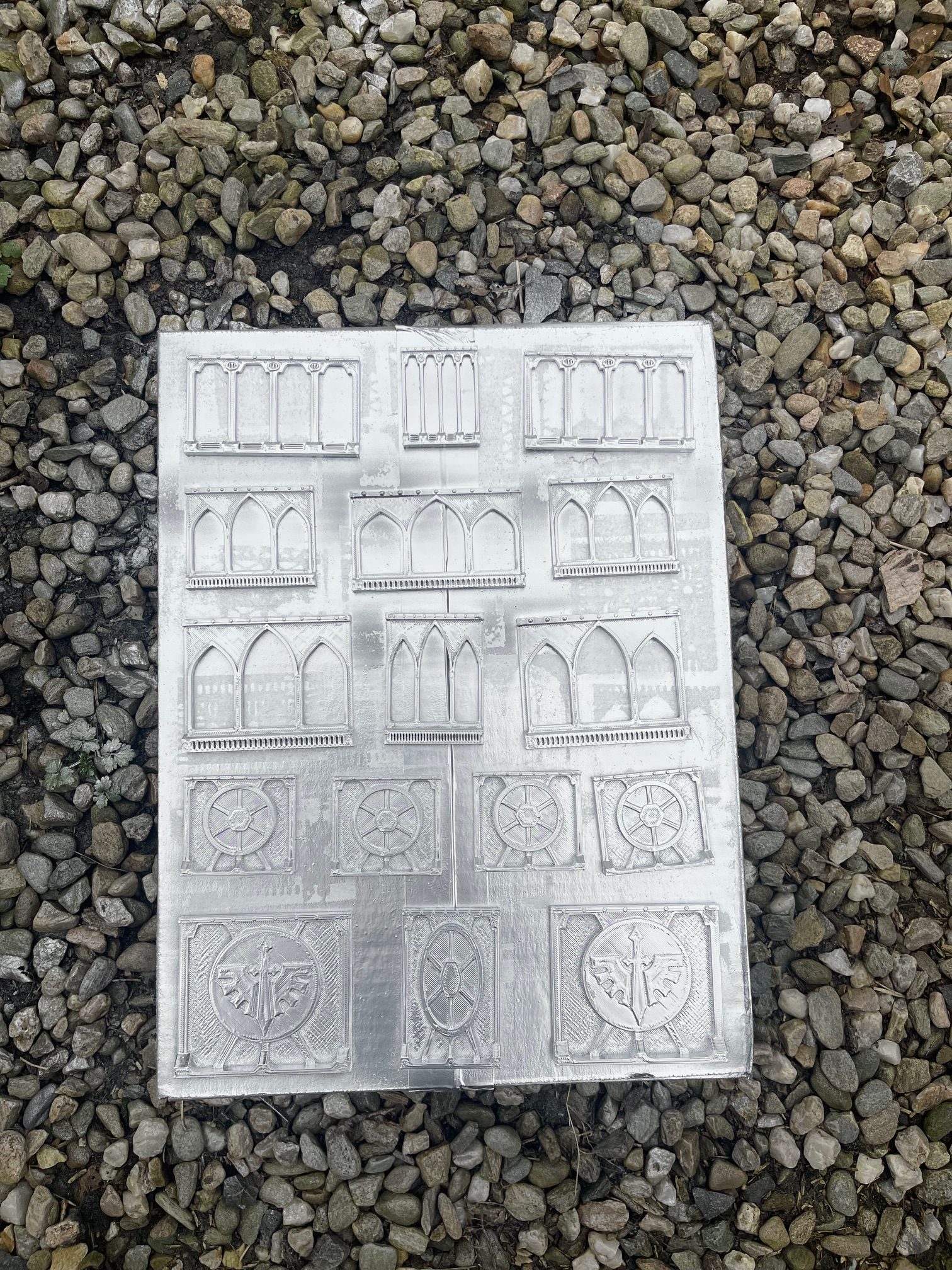
Finished printing ,messing around with the layout and priming the pieces.
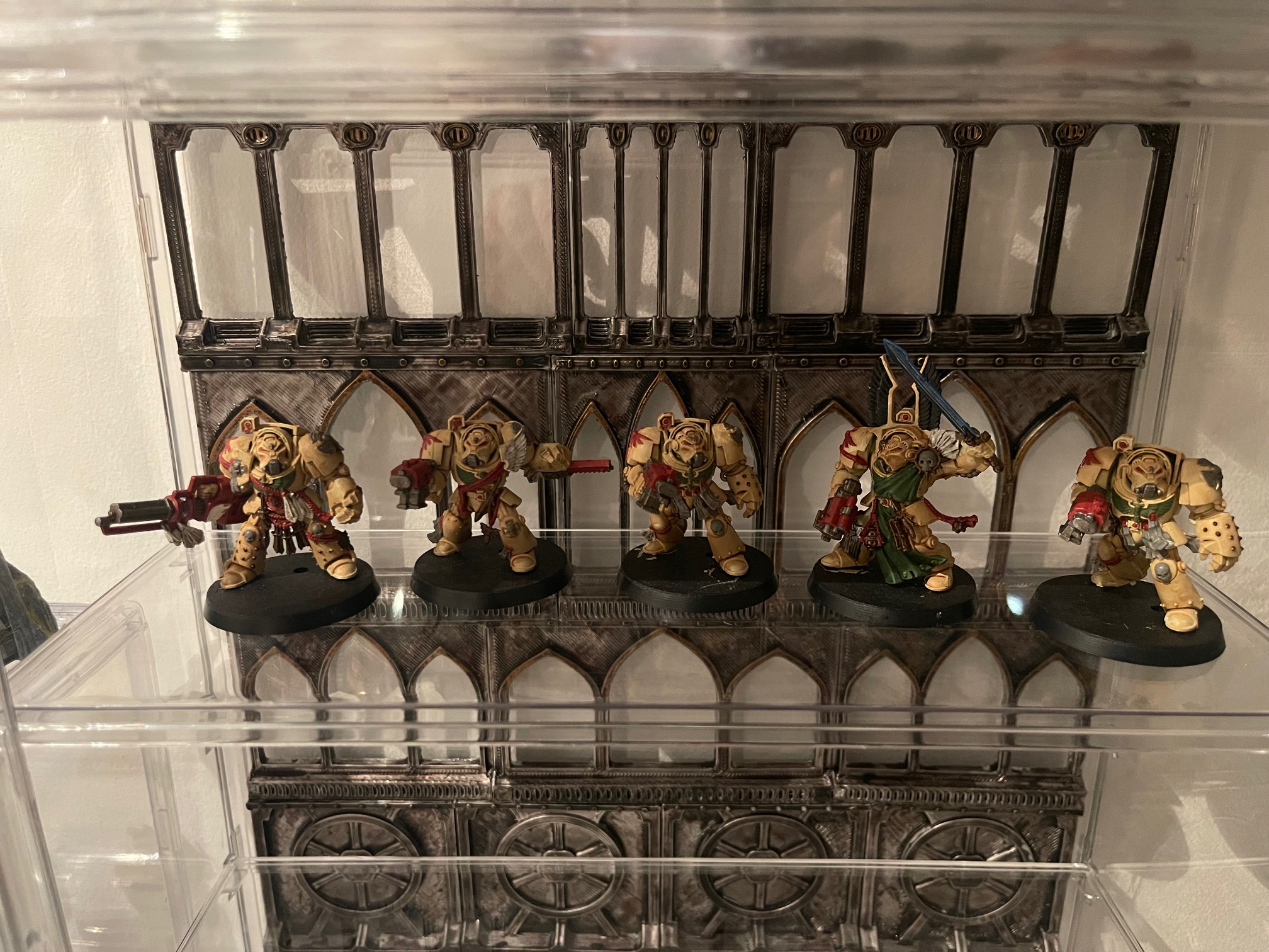
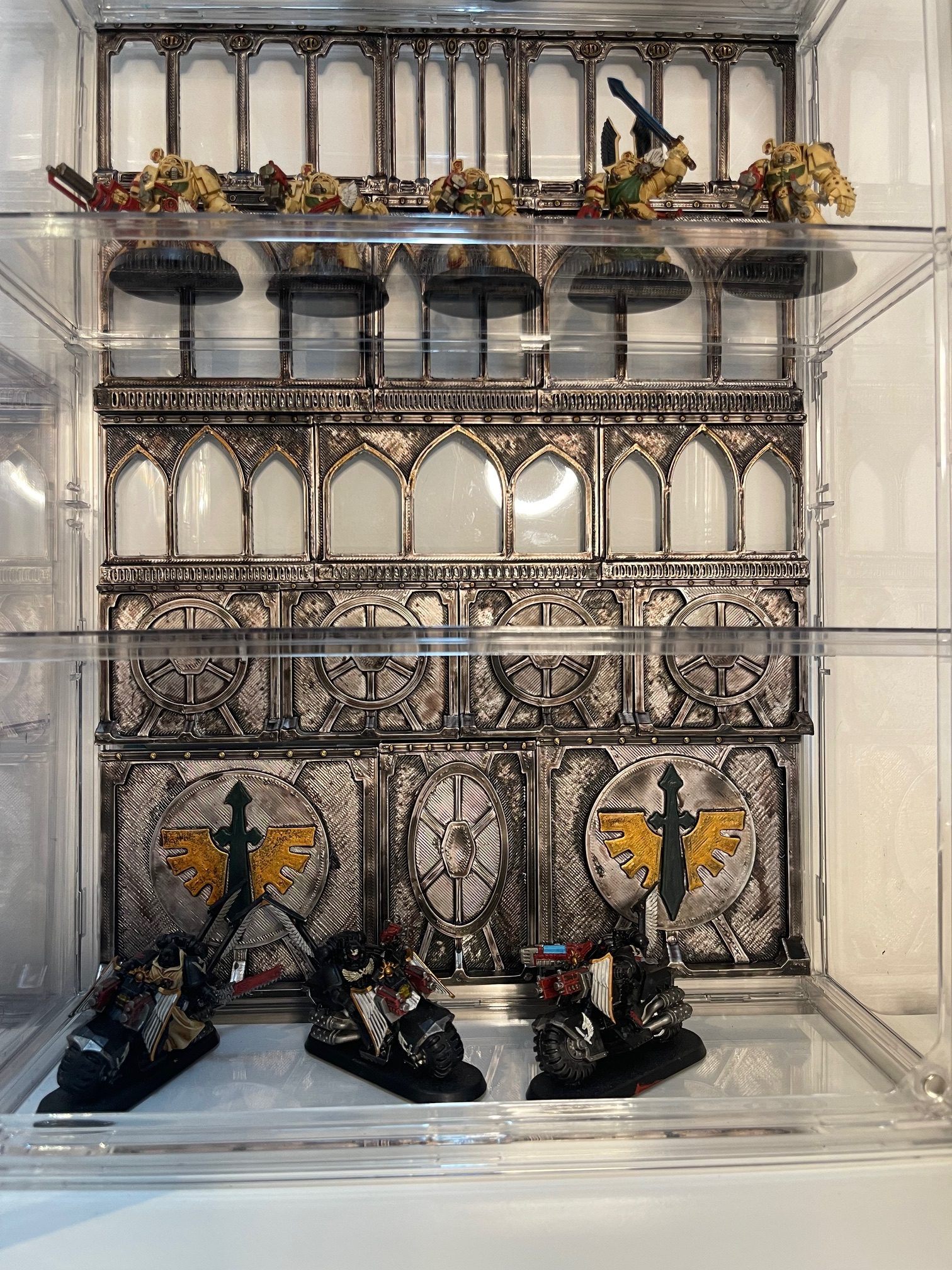
Just one layer was needed; it turned out to get to the top with some switching around and a new design for the lowest level. I was thinking about my ravenguard bikes (painted and unpainted) that might look a bit out of place in a gothic window-lit ship level, so I made somewhere a bit more brutalist looking down there. The same artist designed these as well, I think it adds a nice new dimension to the piece. All of it has had its primer (just cheap grey primer), and now the job is painting it up and getting it to fit altogether a little more seamlessly than it is currently all bluetack and hope.
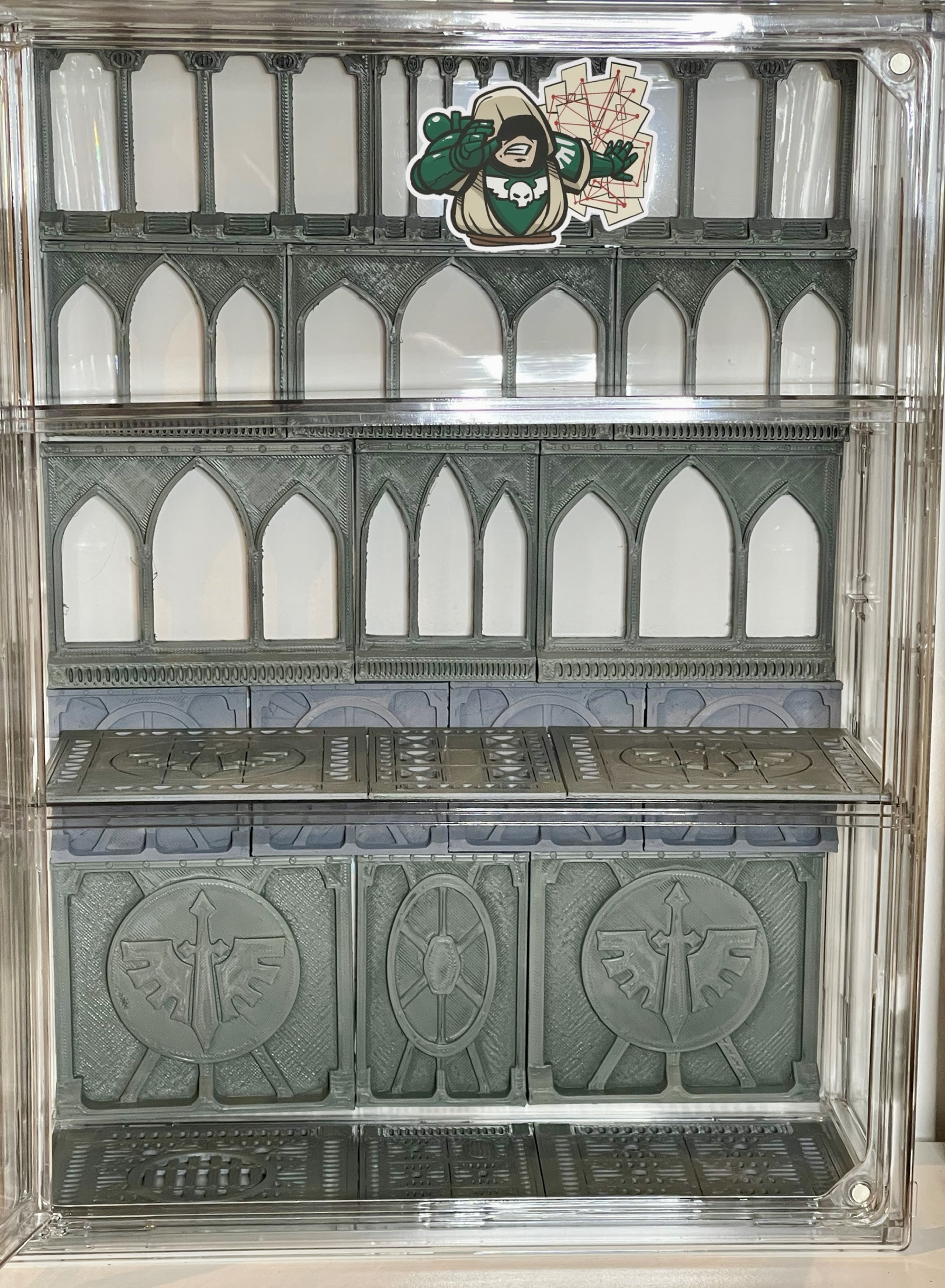 It fit, just a little blue tack here and there
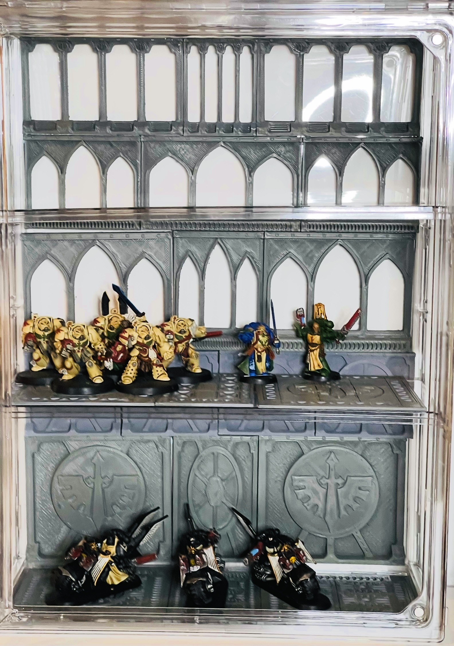 Some DA's for scale
Onwards and Upwards
 Magos Approved
A little printing progress, some extras, and some slight tweaks to the layout.
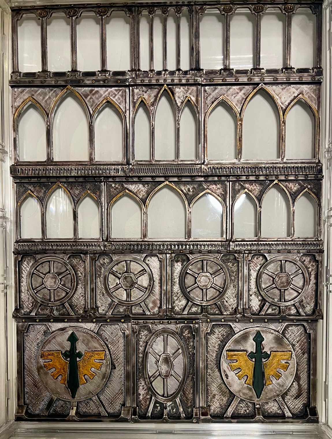
I continued with the printing and added some more wall pieces/tile variants to the collection. The addition of a few leftover printed icons from previous runs gives some distraction from some of the less-than-ideal prints. Still deciding if I should make it a purely DA display aesthetic for this case or continue with the variations up the wall (I have some Ad Mech to display as well, and the idea may be sidetracking me.) The Artist has some DA-style Engine Room Walls that I am going to try out next and see if they might make a better lower level.
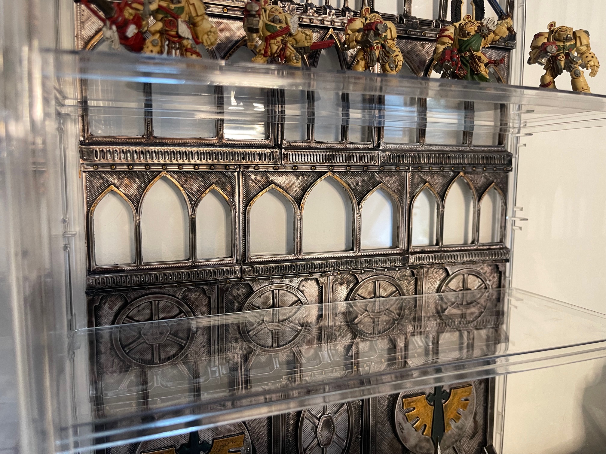
 The Evergrowing Wall