


The Dogs - Spring Clean Challenge 2026

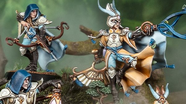
Painting Lothern City Guard
The original description of the Lothern City Guard tells us this about their uniform:
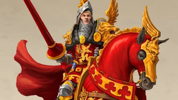
The uniform comprises a close fitting helmet, which is gilded. The tunic is padded and white, the belts and other decorative items are red. Spear shafts are blue, whilst most metal is either steel or silver. Haisplinn himself wears the arms of his family, including the tall, red crested helmet, purple embroidered tunic and equipment in gilded metal. He also has a metal breastplate.
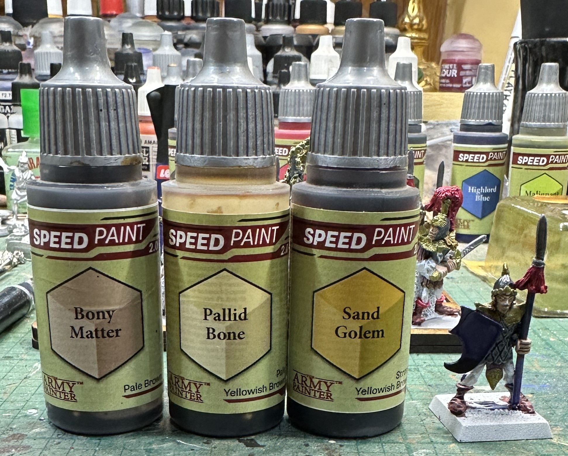
I’m going to go with most of this. So white clothing, steel armour except for officers which will be gilded. Red tone leather and red crests. Spear shafts are going to be blue. Now shields are not going to be standard as my regiment isn’t from Lothern but instead the lost city of Lindheis in the far east. I’ve looked at the options and there is a tower/lighthouse on the etched design plate I have for shield designs. We’ll use a white one of those which will show up best on a darker background so I’ll go with blue on the shields.
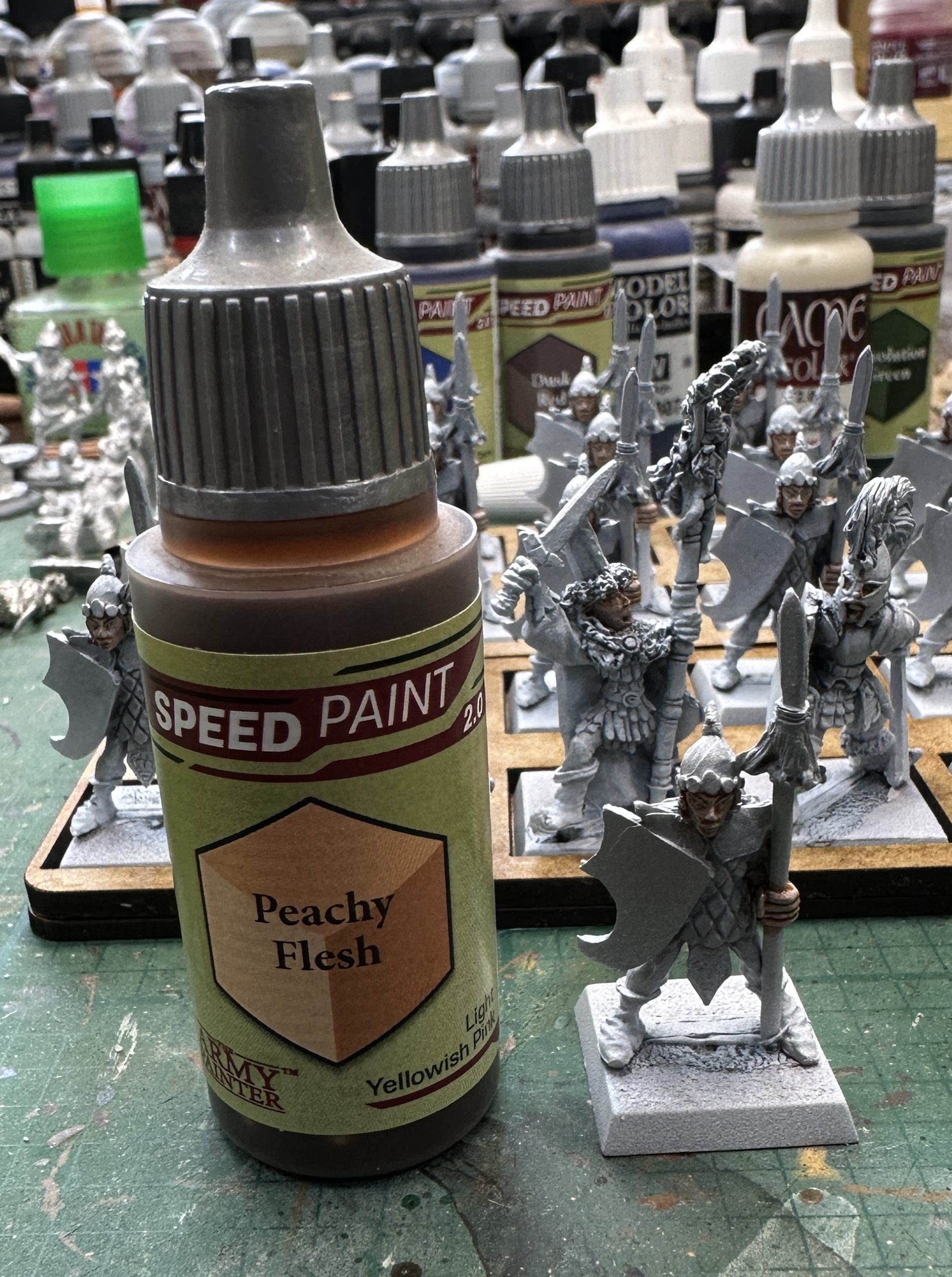
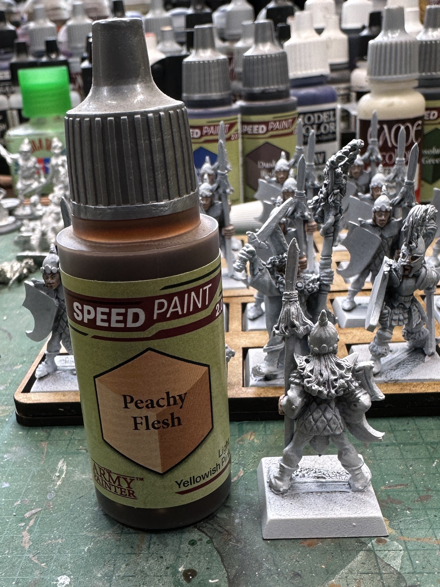
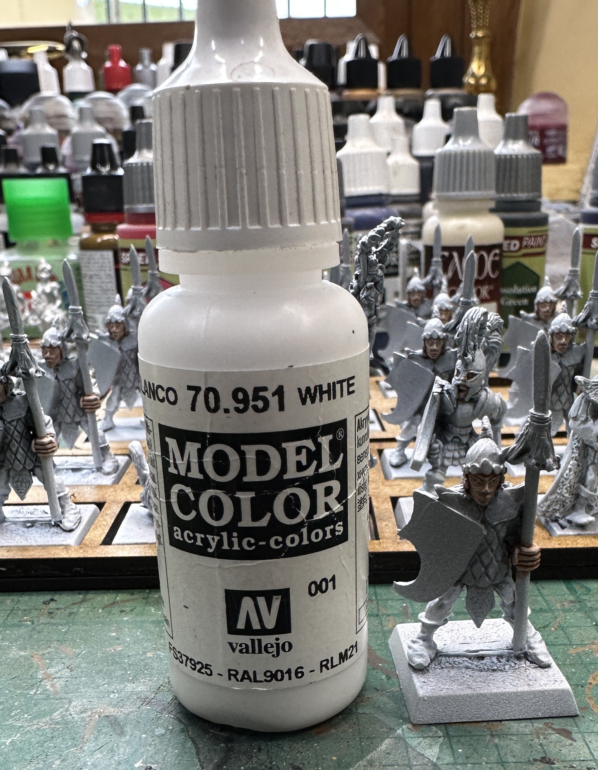
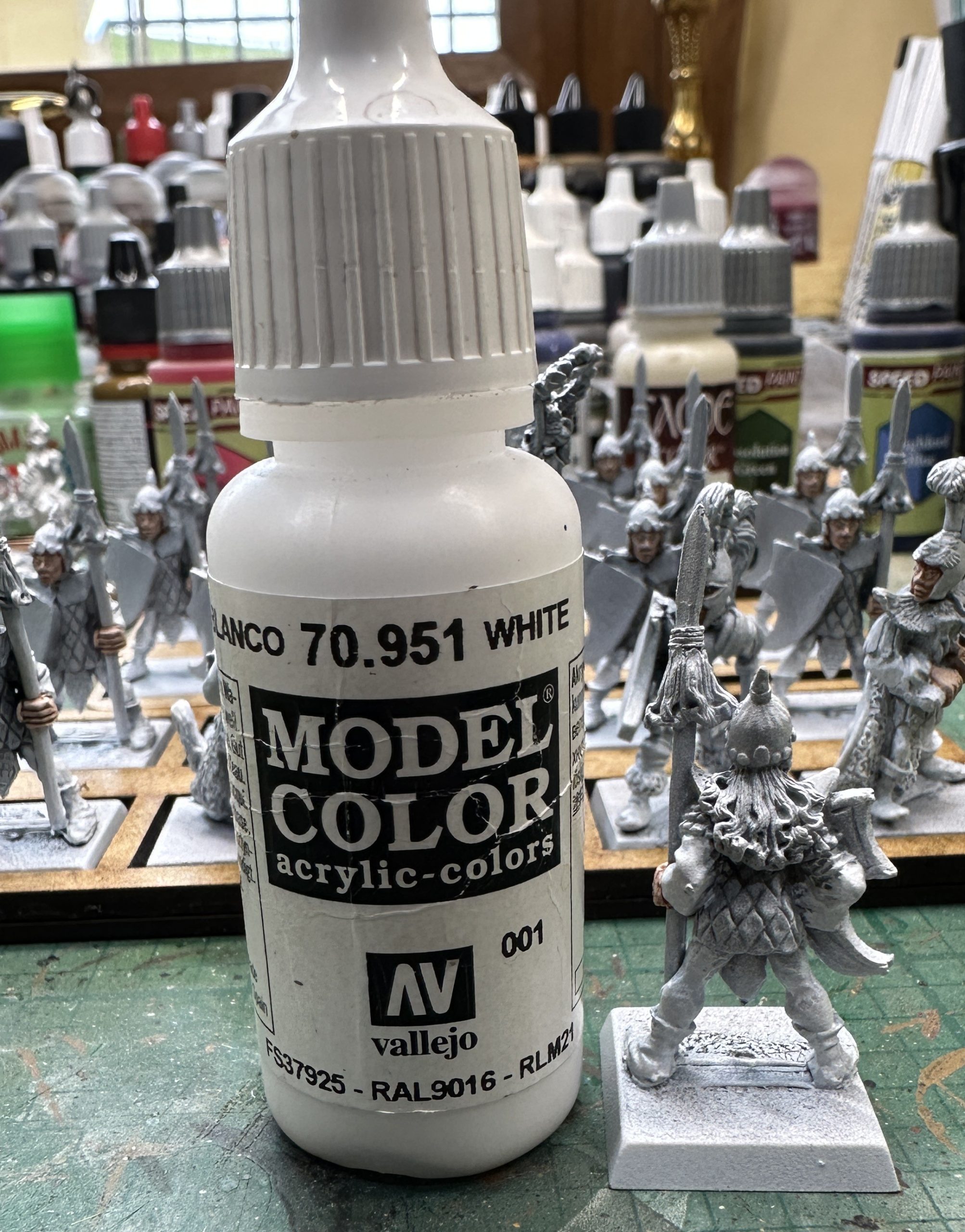
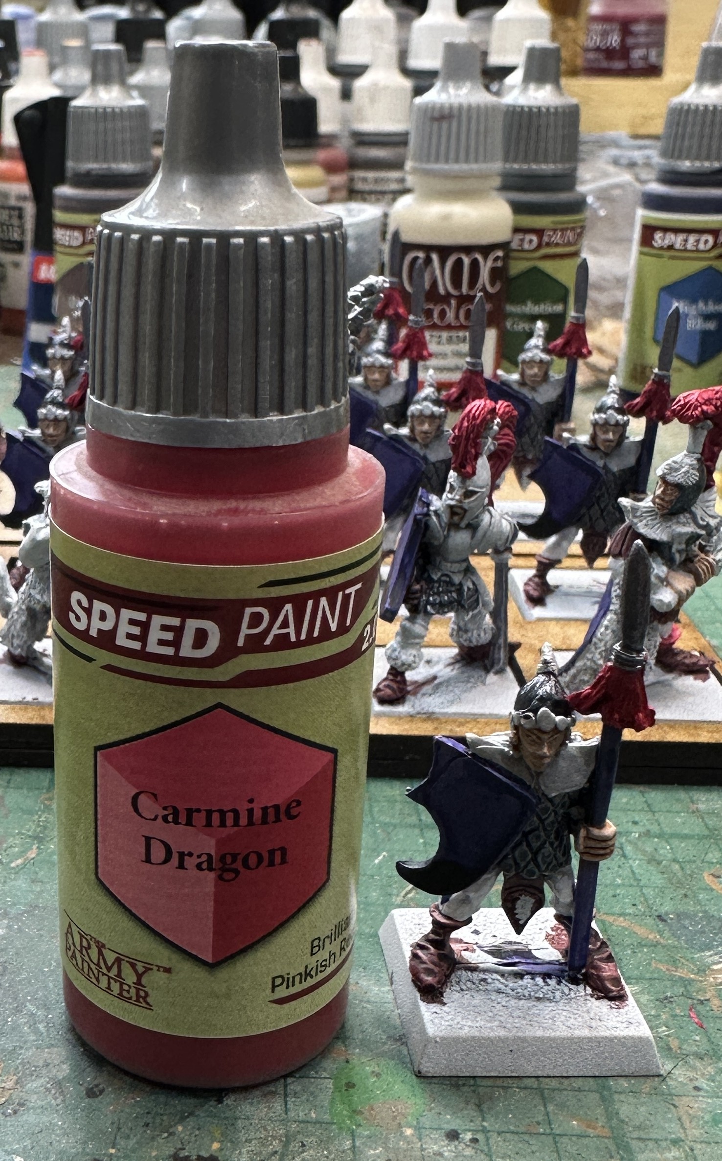
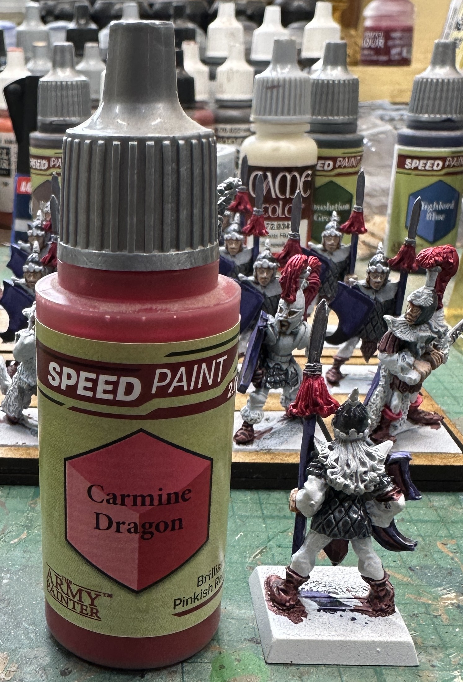
After a quick check with some potential colours on a white bit of card I settle on the two main ones, a purple shade of blue and a bright pinkish red. And so to work. First Fleshtone on hands and face. Then the white clothing was brightened from the zenithed white with an over-brush, i.e. a wet dry-brush to loosely pick up the higher parts of the tunics and hose.
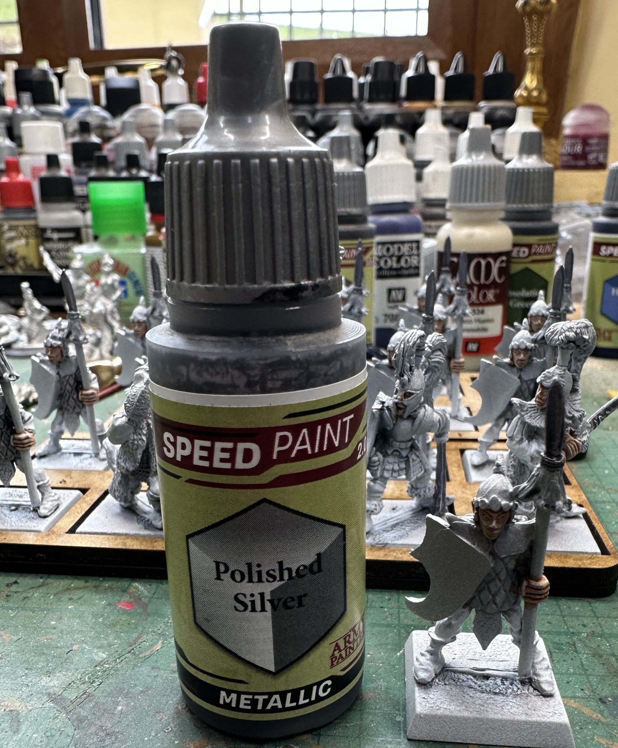
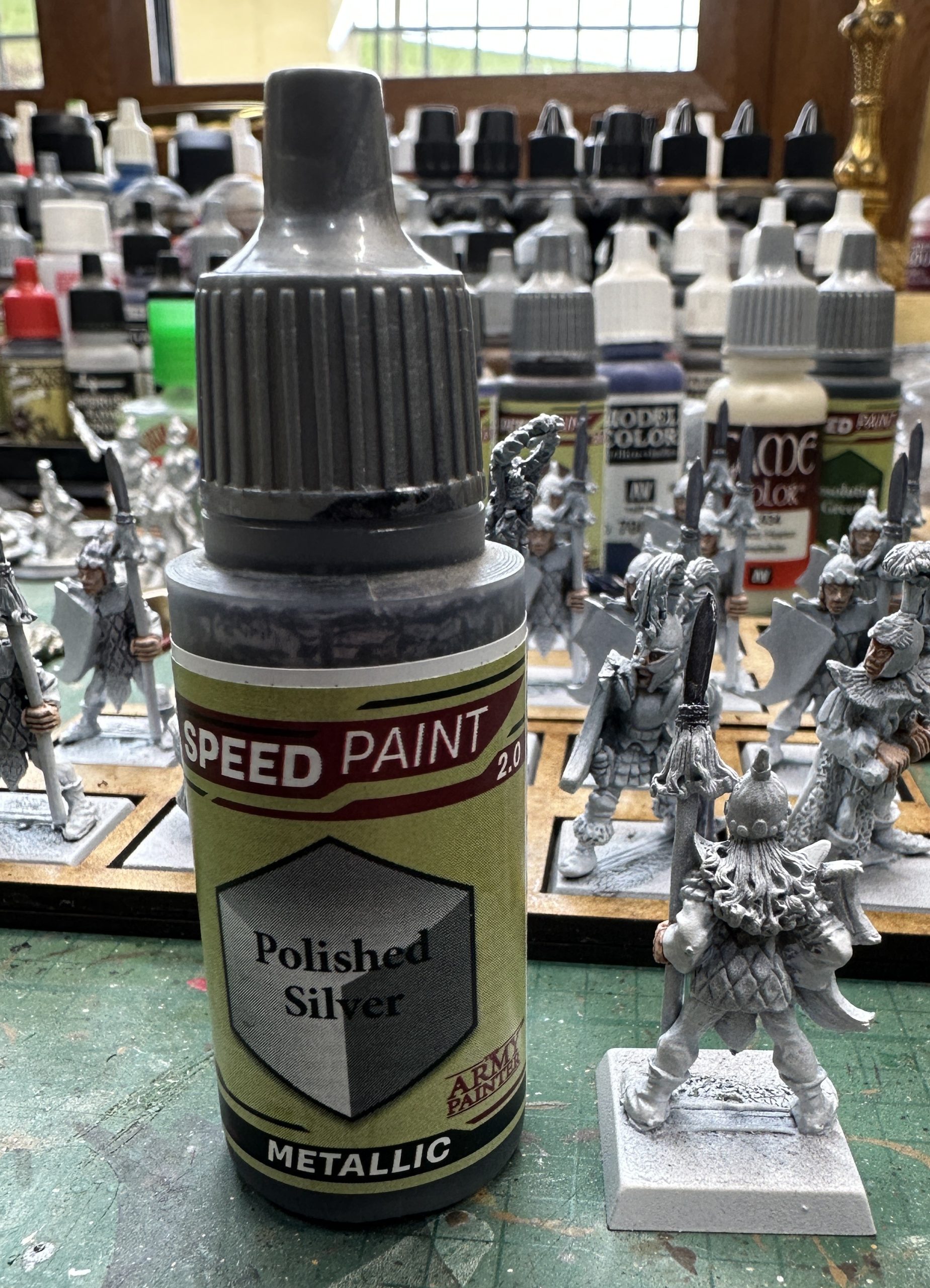
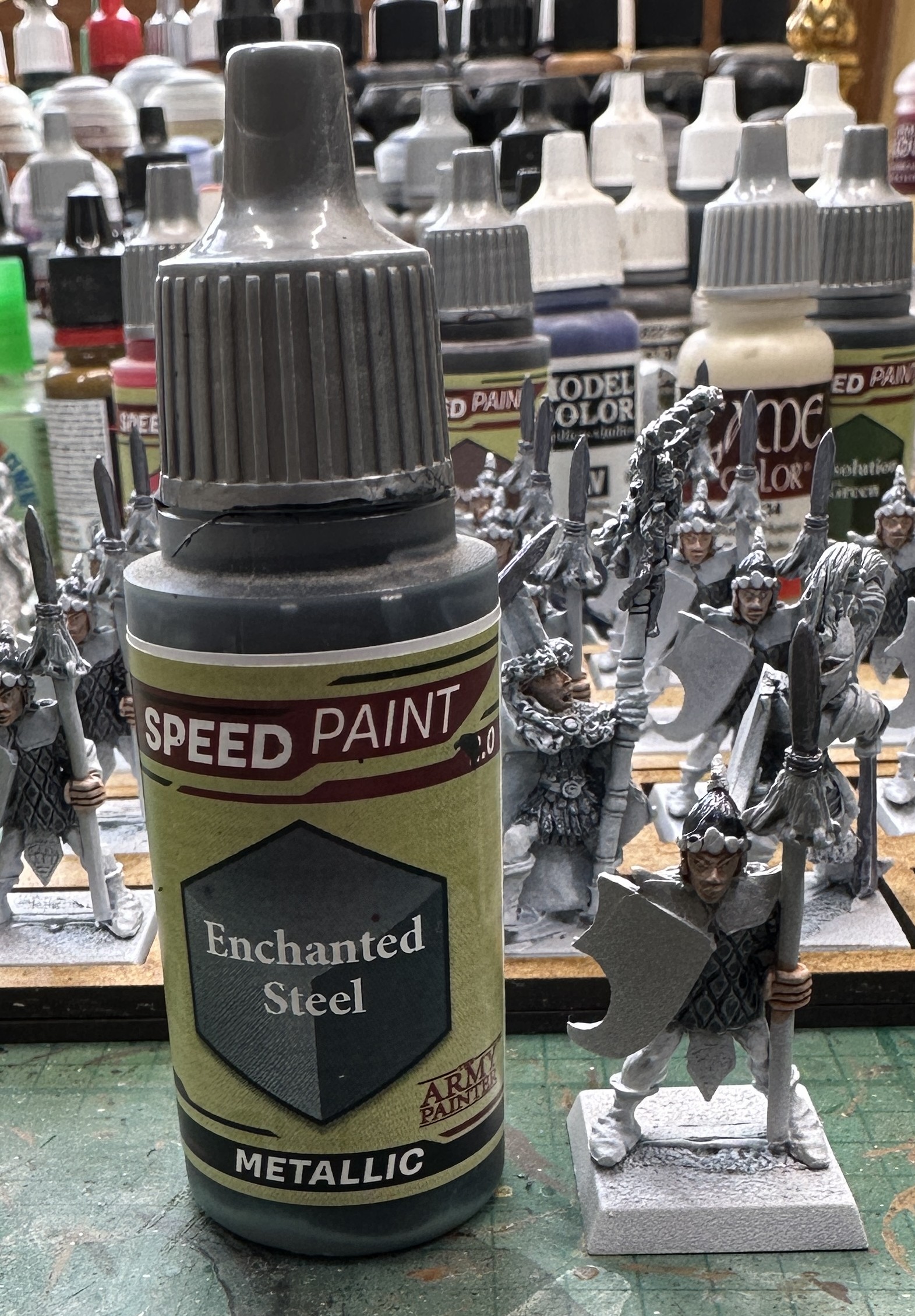
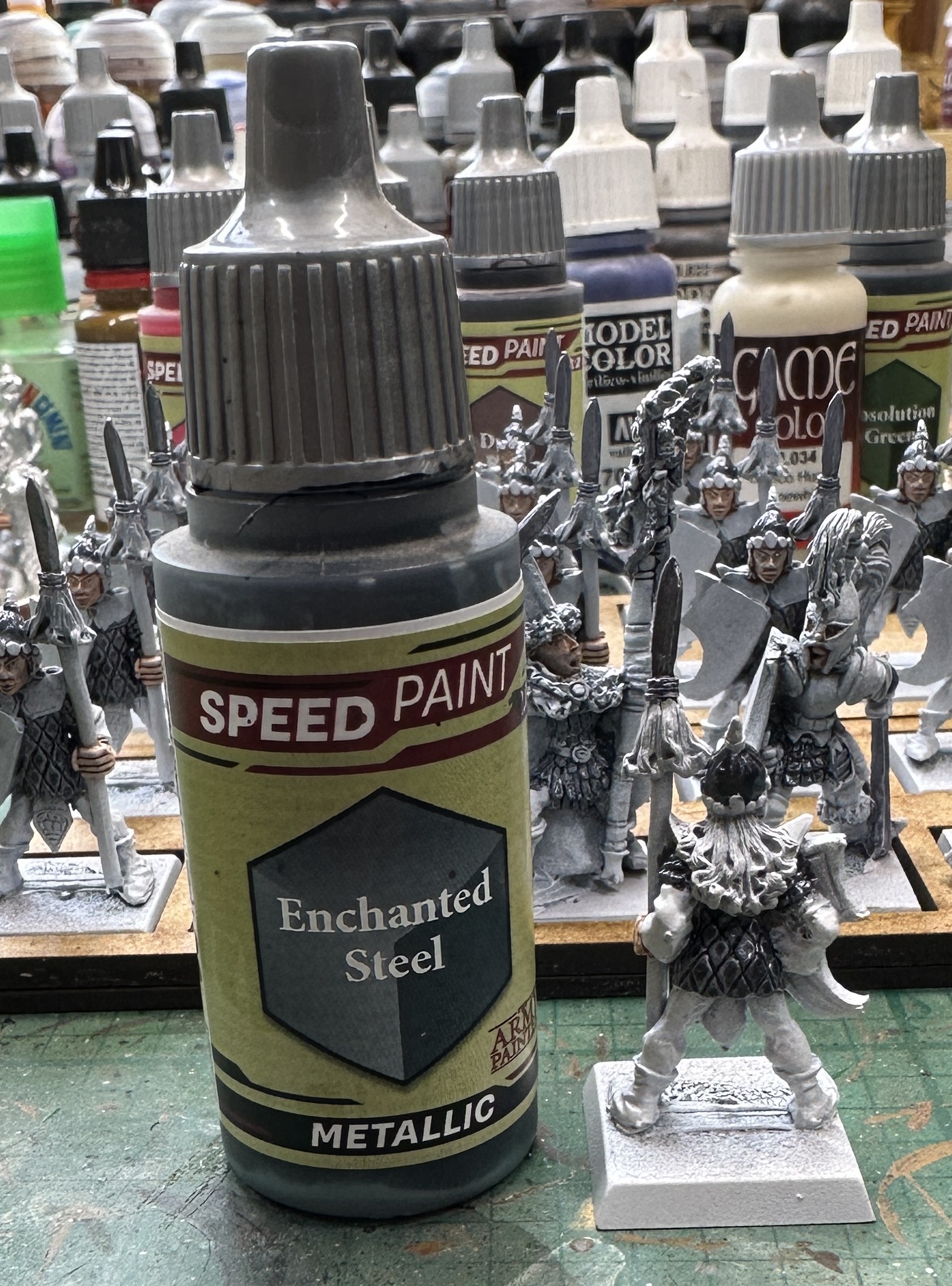
Next I did the steel metallics. A silver undertone on the spear heads and then my more usual choice for Elven steel, Enchanted Steel on the scale hauberks and helmets.
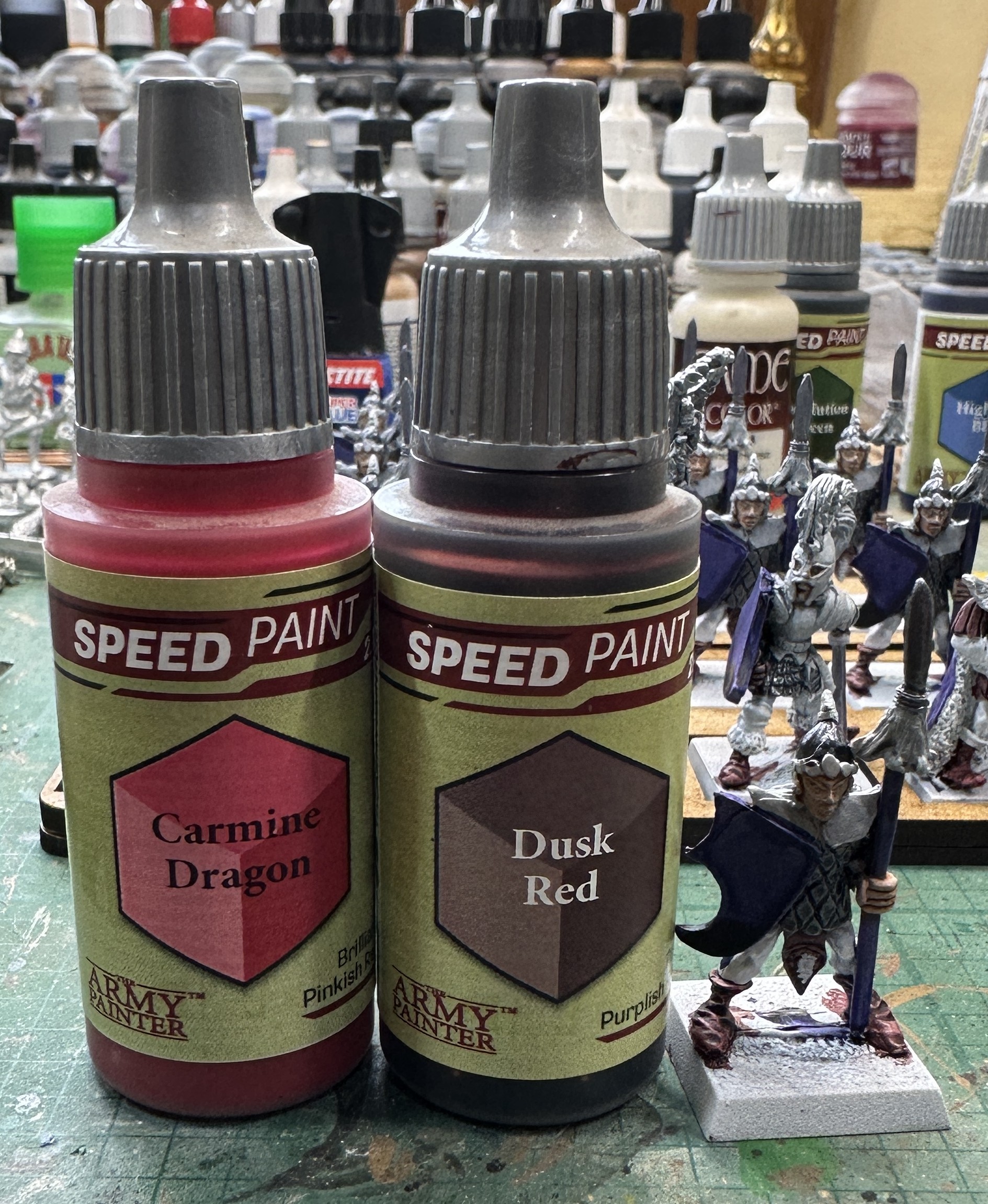
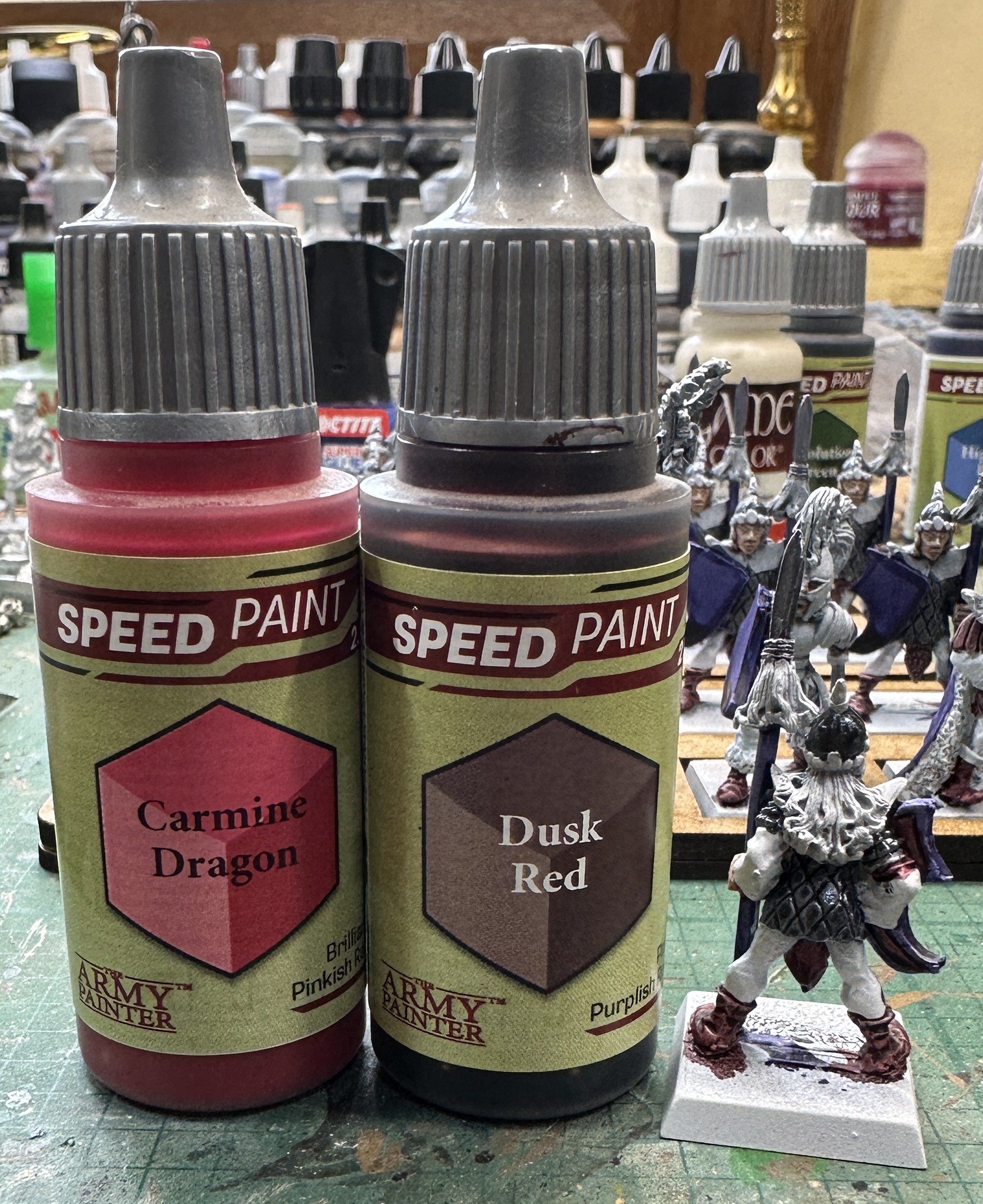
Now for some colour. Blue to start off with on shield faces and rims and then the spear shaft. After that I blended a couple of drops of red into 10 of the leather colour to just up the reddish tint a bit. That went onto shoes and some leather details on the characters.
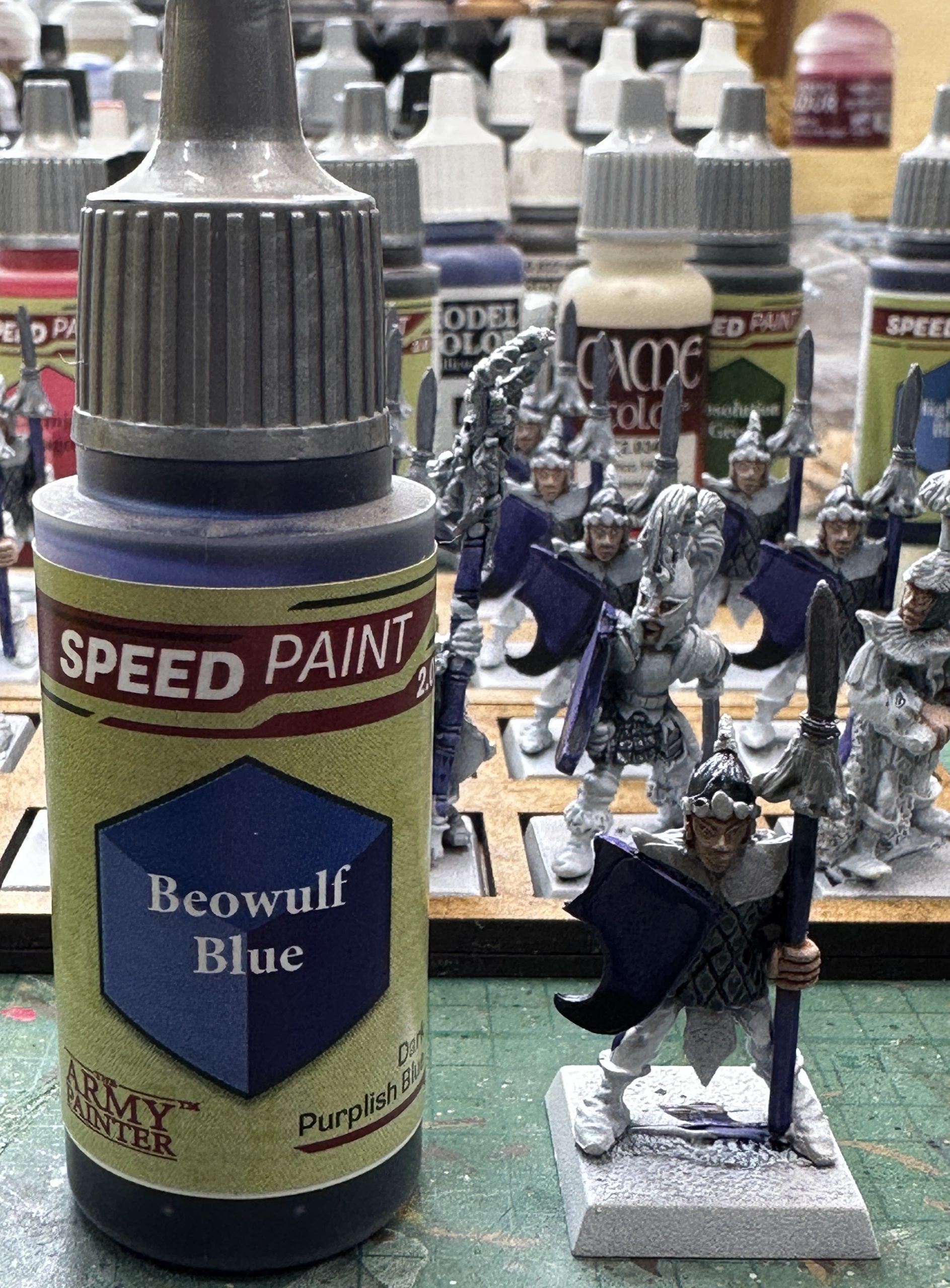
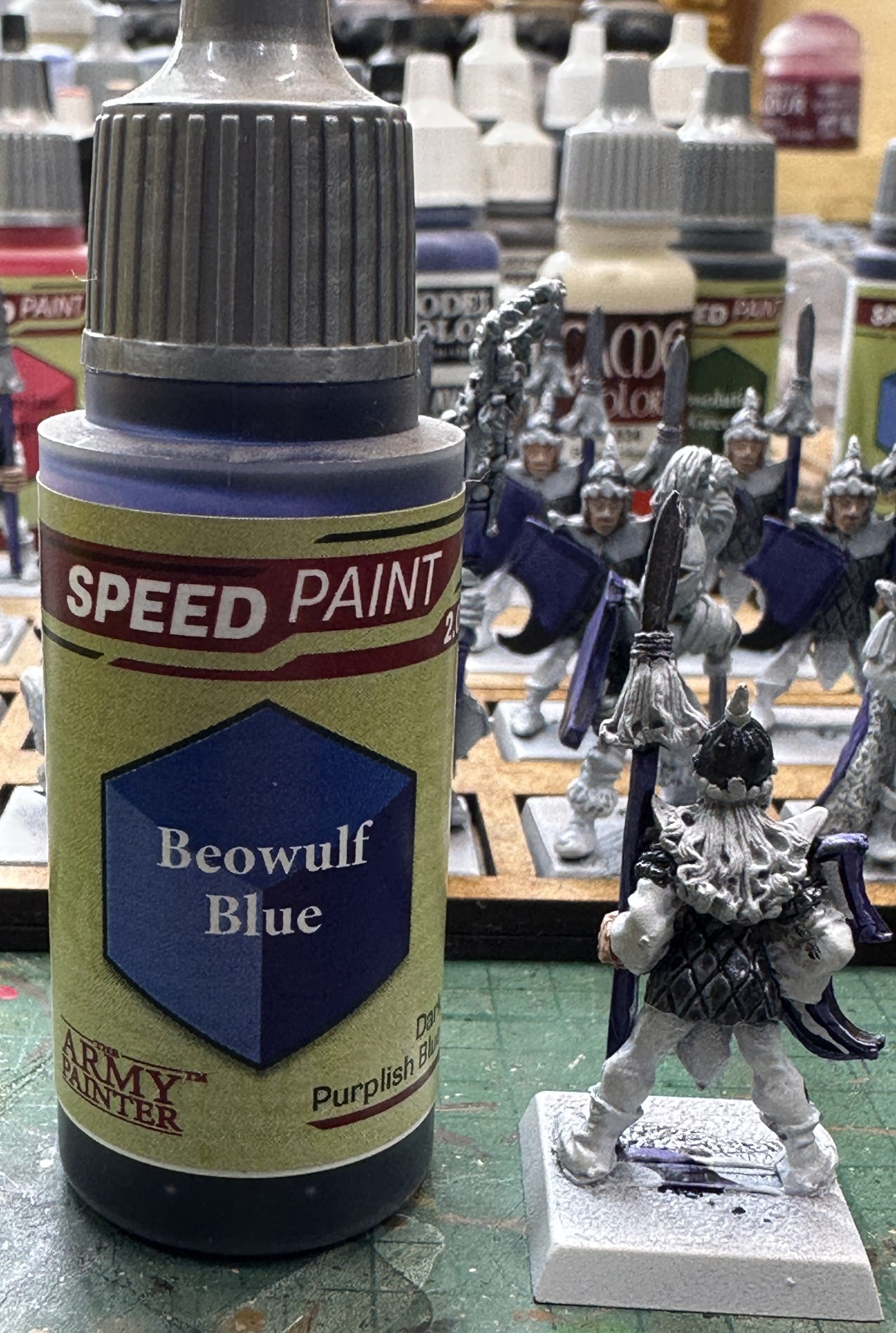
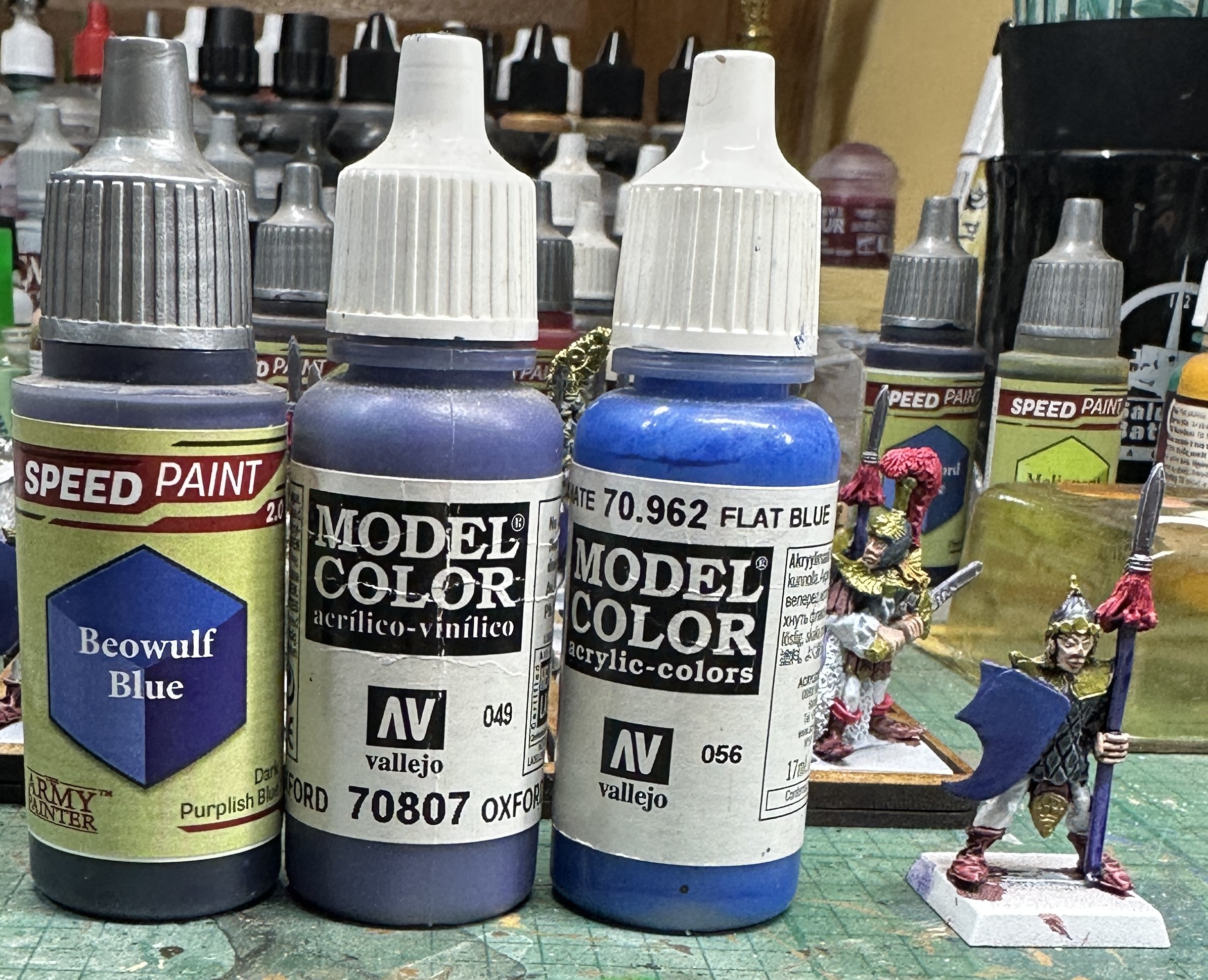
I’m not happy with the coverage of the blue on the shields. I wanted it darker at the bottom but having had to go around the rims after painting the face, there is a darker line around the top edge now. I’ll correct this later, once they are dry, with a wet blend. That way I can get a brighter tone in the upper third which should set the emblem design off nicely.
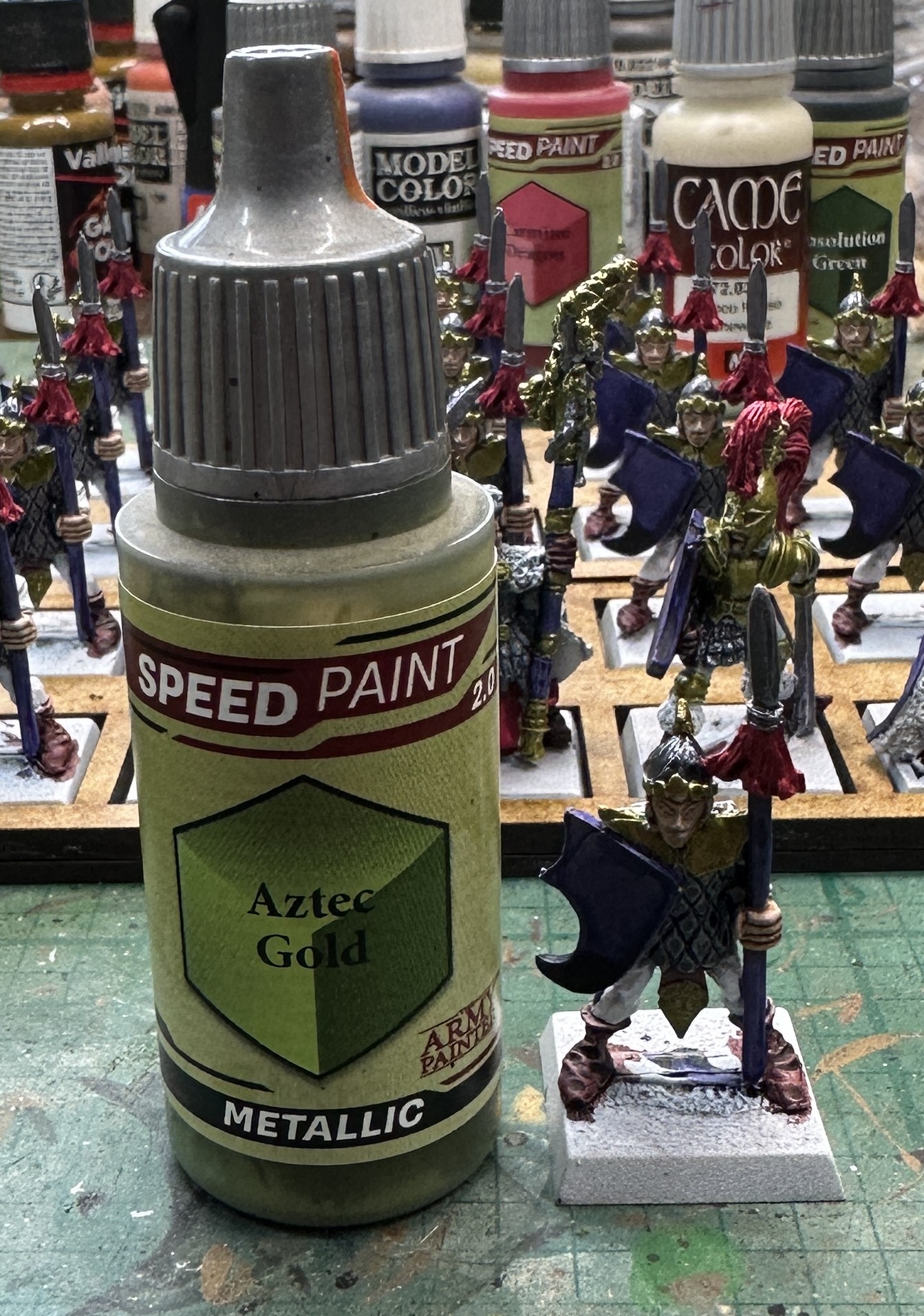
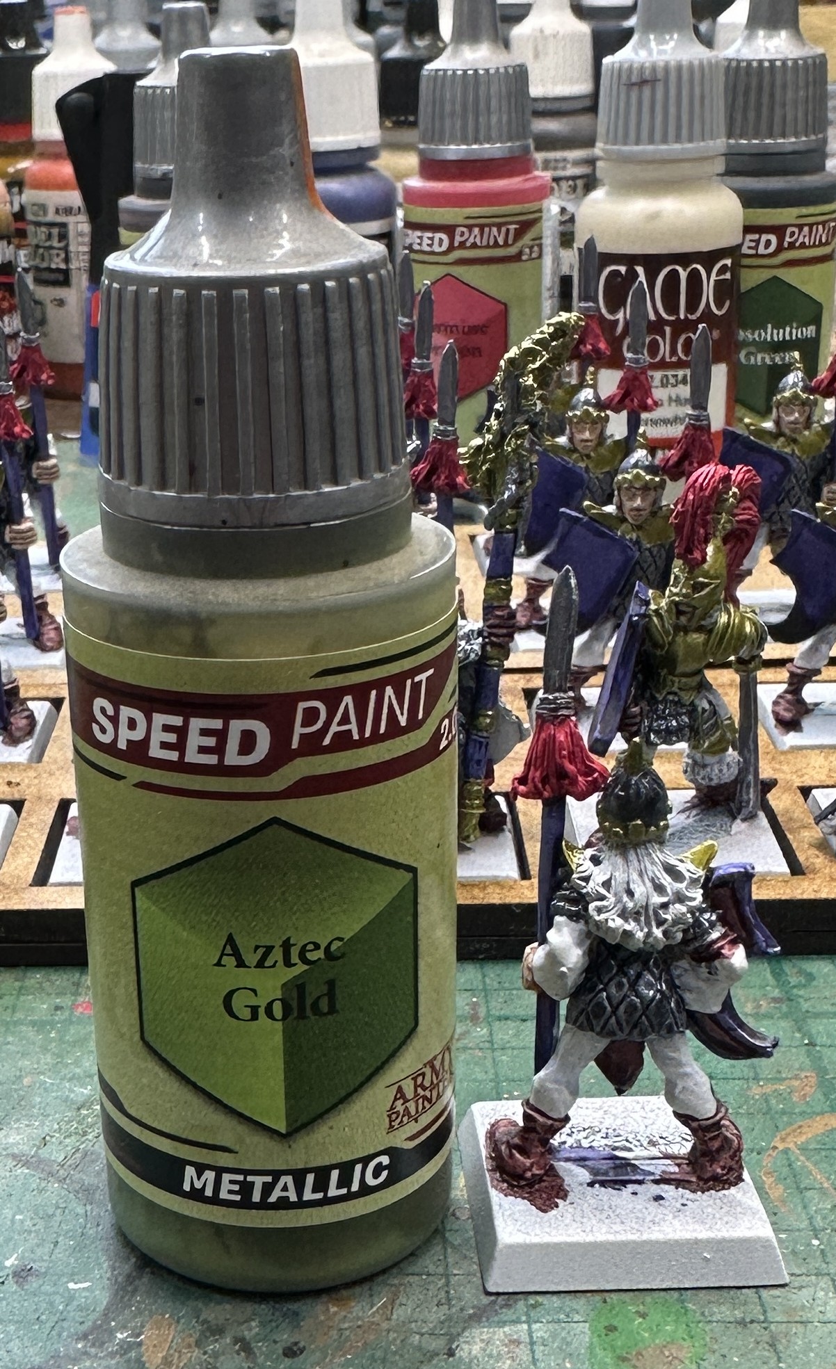
The contrast colours now. Red for the spear fringe and my usual Elven choice of a greenish shade of gold for their shoulder guards.
Final main colour was the hair. This was either the neat versions of one of these colours or a two or three part blend. As I was running out I dropped the next colour on top of what was on the palette and kept working. This should provide some variety but everyone will still be blonde.
Now we are on to highlights but before that a bit of repair work.
First the wet blend on the shield faces to sort out the patchy colour. I put these three onto a palette. I then mixed the Oxford blue with some Speedpaint for the mid tone and added some Flat Blue to that to get the top tone. They are applied in three stripes, Speedpaint at the bottom, Oxford Blue blend across the middle and then the brighter blue across the top. Layers are gently blended together with a wet brush if they look a bit jarring on the mini.
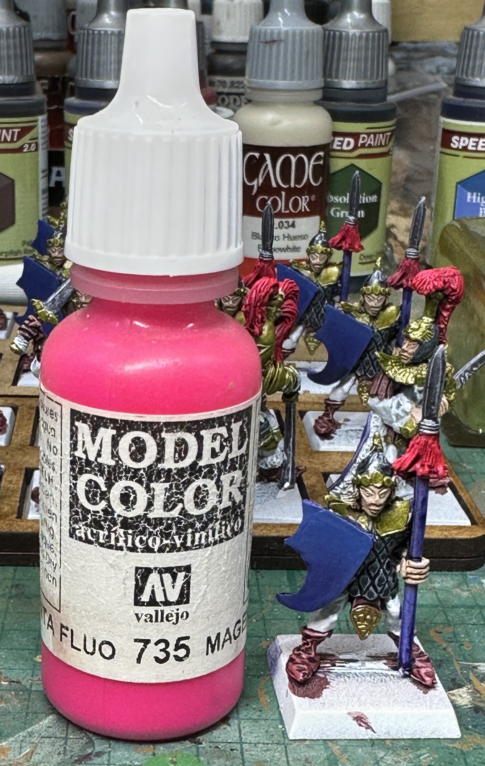
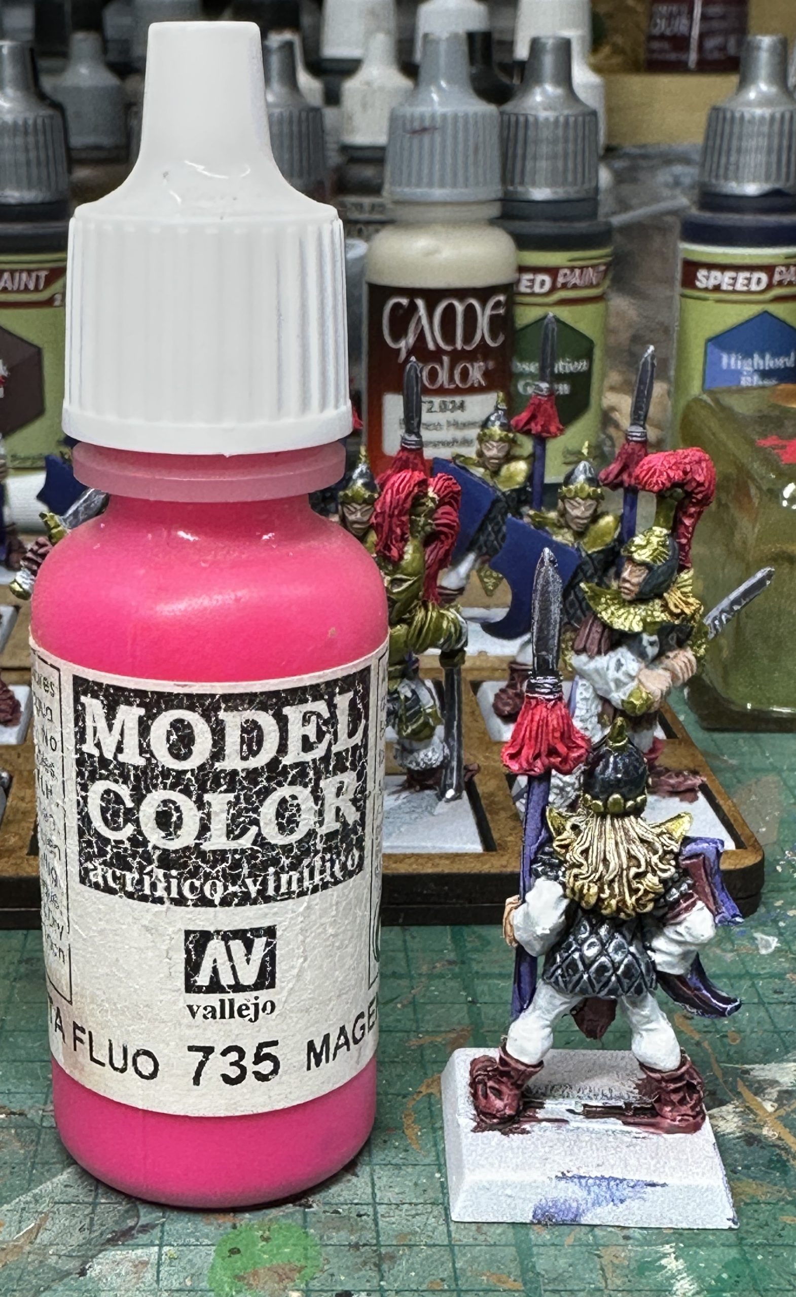
Highlights for the red were done with Magenta Fluro. This will look a bit redder on the model and give a bright but still tonally correct highlight colour. Never let it be said that elves are afraid of bright colours 😀
Just one day’s painting to get these done to this stage. A run over with some matt varnish in the morning and then I can get final highlights and tidying done before finishing the metallic layering for maximum bright and shiny.