


![Perfect Historical Wargame Objectives! Victrix Treasures & More Reviewed [7 Days Early Access]](https://images.beastsofwar.com/2026/02/unboxing-victrix-treasures_-chests-_-market-stalls-coverimage-225-127.jpg)


Crazyredcoat’s Crazy Compendium of Collected Creativity

Recommendations: 1479
About the Project
Come one, come all! See the most vaguely inconsistent extravaganza that no one really thinks about but if they did they'd be mildly misanthropic about it! Slow off the heels of my last adventure comes a tale so confusing that it's not even remotely tail-like. Here I will avail you all of the many experiments and miniatures I manage to paint over the coming times, or at least some of them. Time is funny like that... Either way, stay tuned for various projects that don't fit into any one larger project like my last foray into this sort of thing. Oh, and watch out for Spiny Norman.
Related Game: Warhammer Age of Sigmar
Related Genre: General
Related Contest: Spring Clean Hobby Challenge (Old)
This Project is Completed
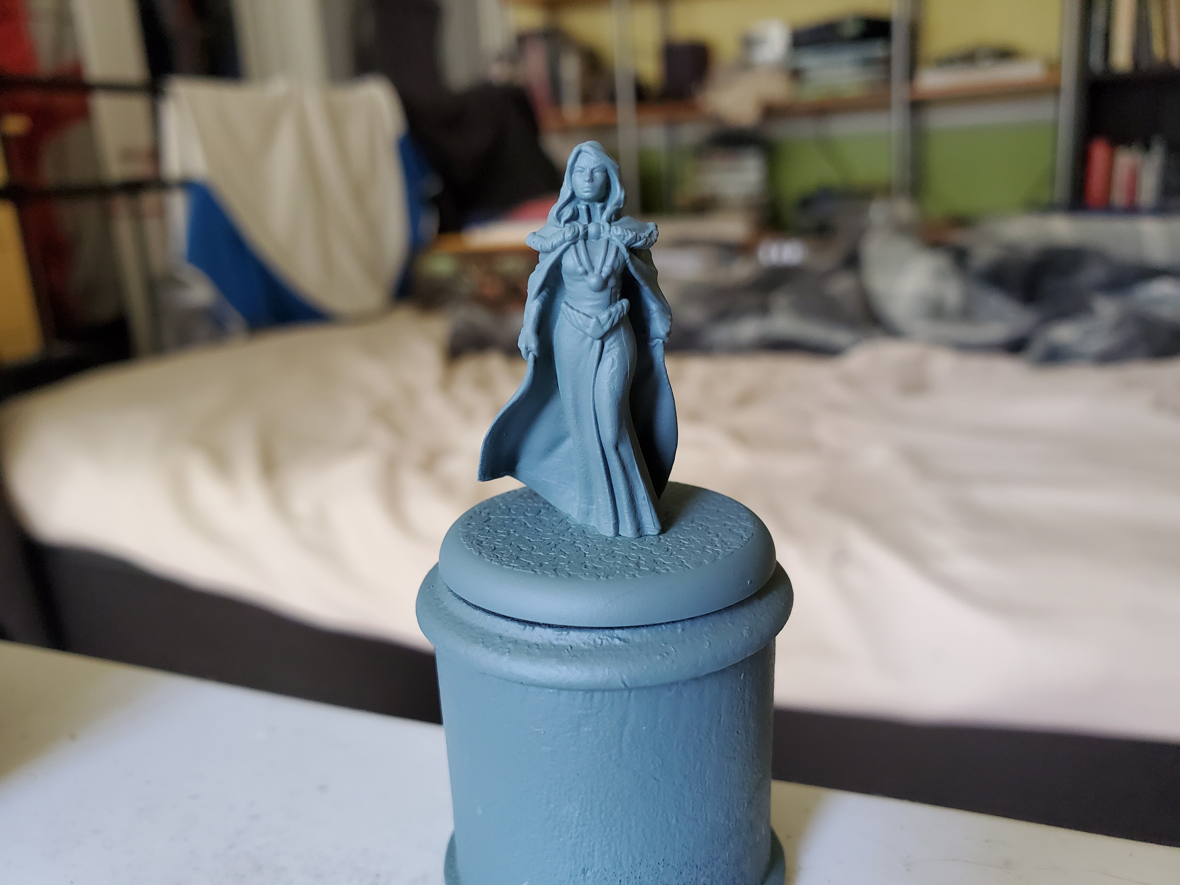
"I was born a Tully and wed to a Stark. I do not frighten easily."
Next up is Catelyn Stark, and with it a real chance to play around with some colours diving into the lore around weddings in Westeros.
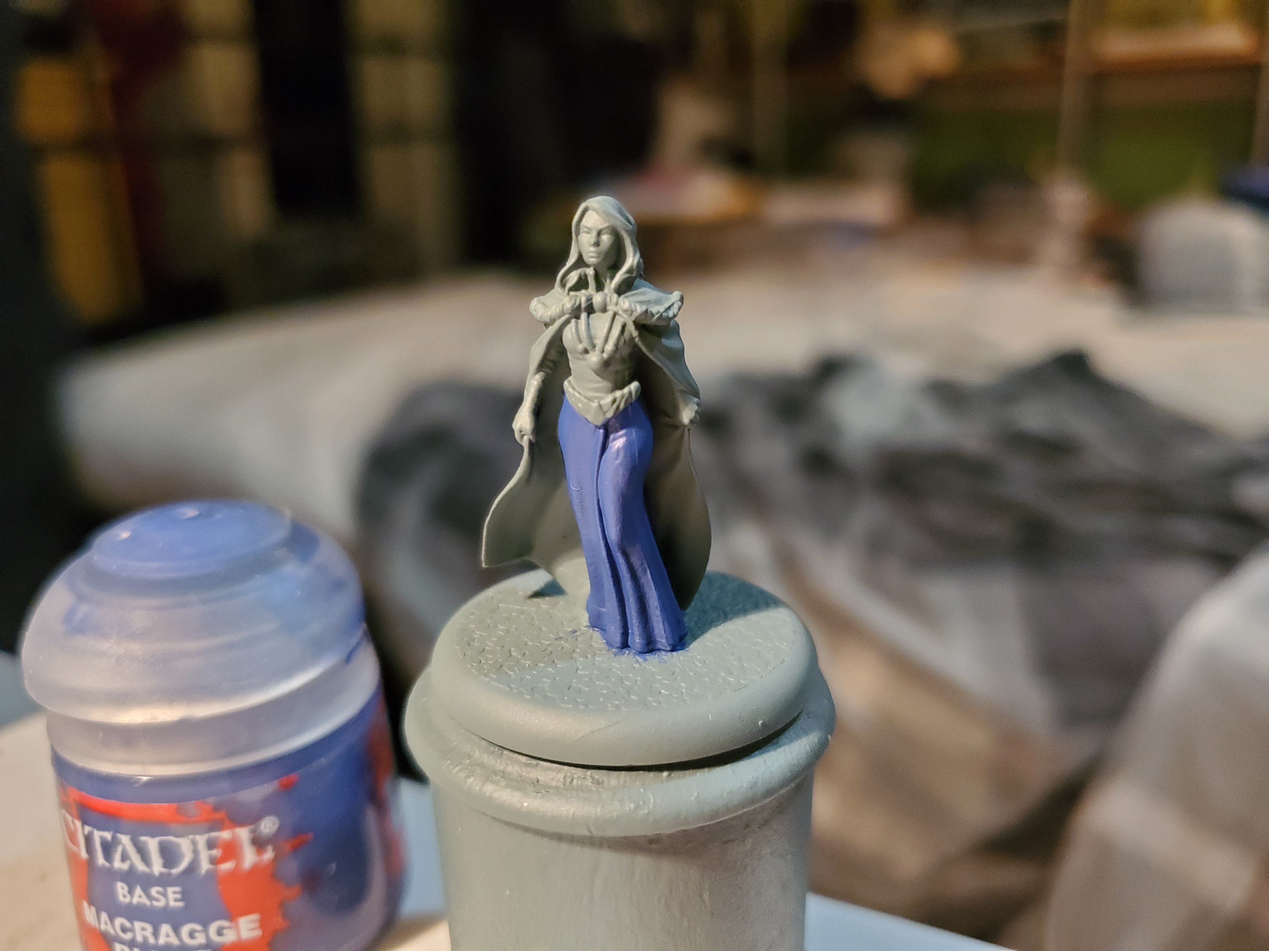
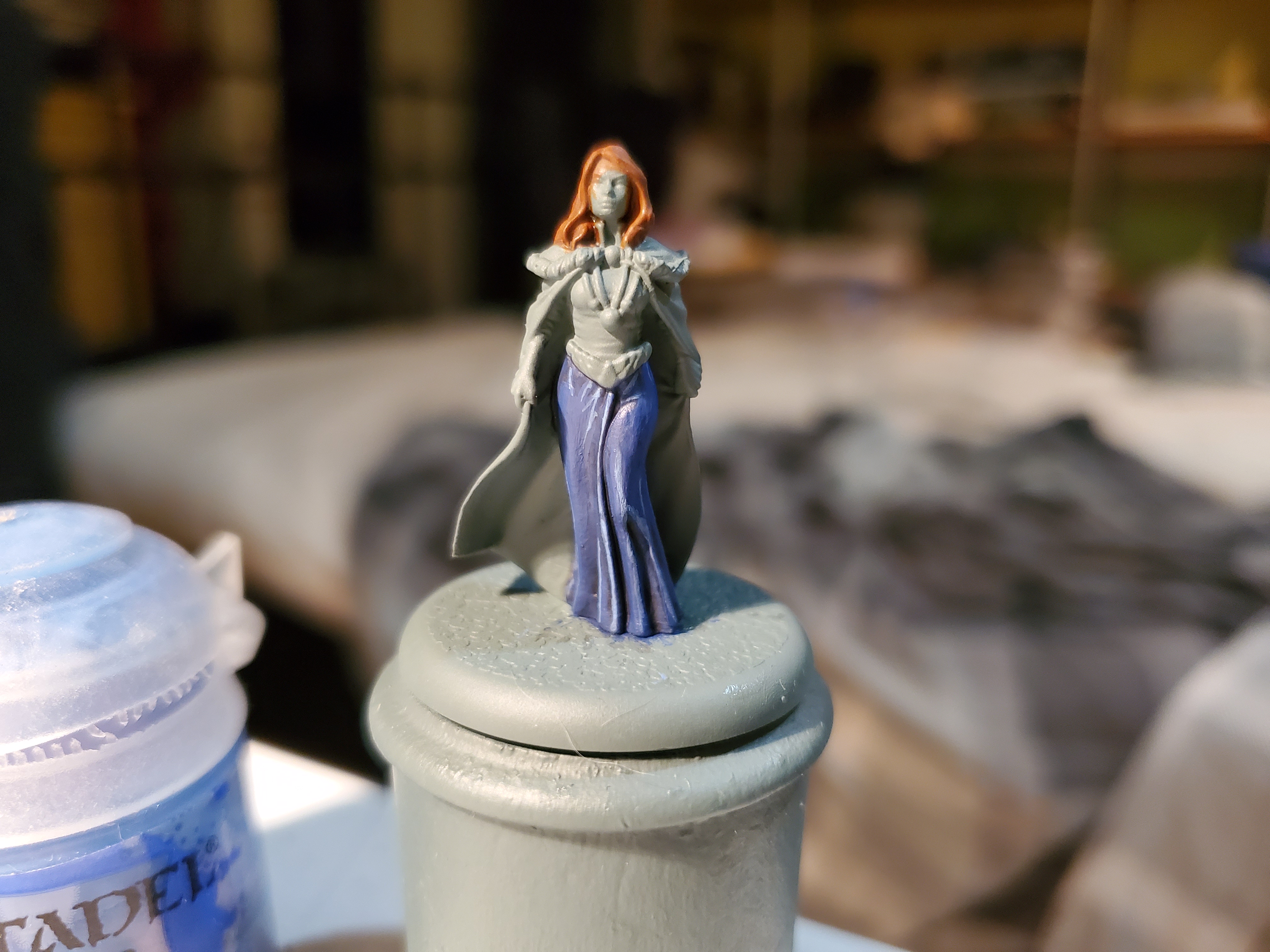
 Primed here in Citadel's Mechanicus Standard Grey spray primer...my favourite, if you hadn't noticed, yet...
So to elaborate on that last point, weddings in Westeros (between noble families, at least) involve the removal of the lady’s family cloak and the placement of the husbands family cloak. I THINK this showed up once in the series, but seeing as they only vaguely followed marriage practices (cough…Sansa’s polygamy…cough) I don’t 100% recall. Either way it gives us a very handy opportunity with Catelyn thanks to the Tully colours.
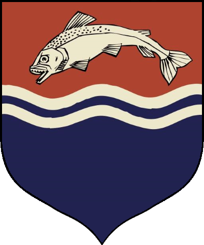
 In this case, the heraldry is second to the colours themselves, but the blue and red of the Tullys makes a nice contrast to the white of the Starks I used on Robb.
This is also very useful if I ever get any of the Tully units at a later date because there will be a nice tie-in through Catelyn. Following the wedding tradition, the cloak will be in the Stark colours (with a possible dark fur colour on the edge) where the gown will be split between red and blue. My plan is to have the lower part blue and the upper part red with the belt forming a nice split line. The auburn hair will make a return as well and, as a courtly lady, I will give a clean look to her skin like I did with Cersei. This should give some nice bright colours to an otherwise dour Northern force that should look rather striking.
 Imagine something like this but with the red and blue split through the middle of her dress. Also Arya looks like an elf in this picture...
"Catelyn Stark might take a man prisoner, but she'd never stoop to rob him. That wouldn't be honorable."
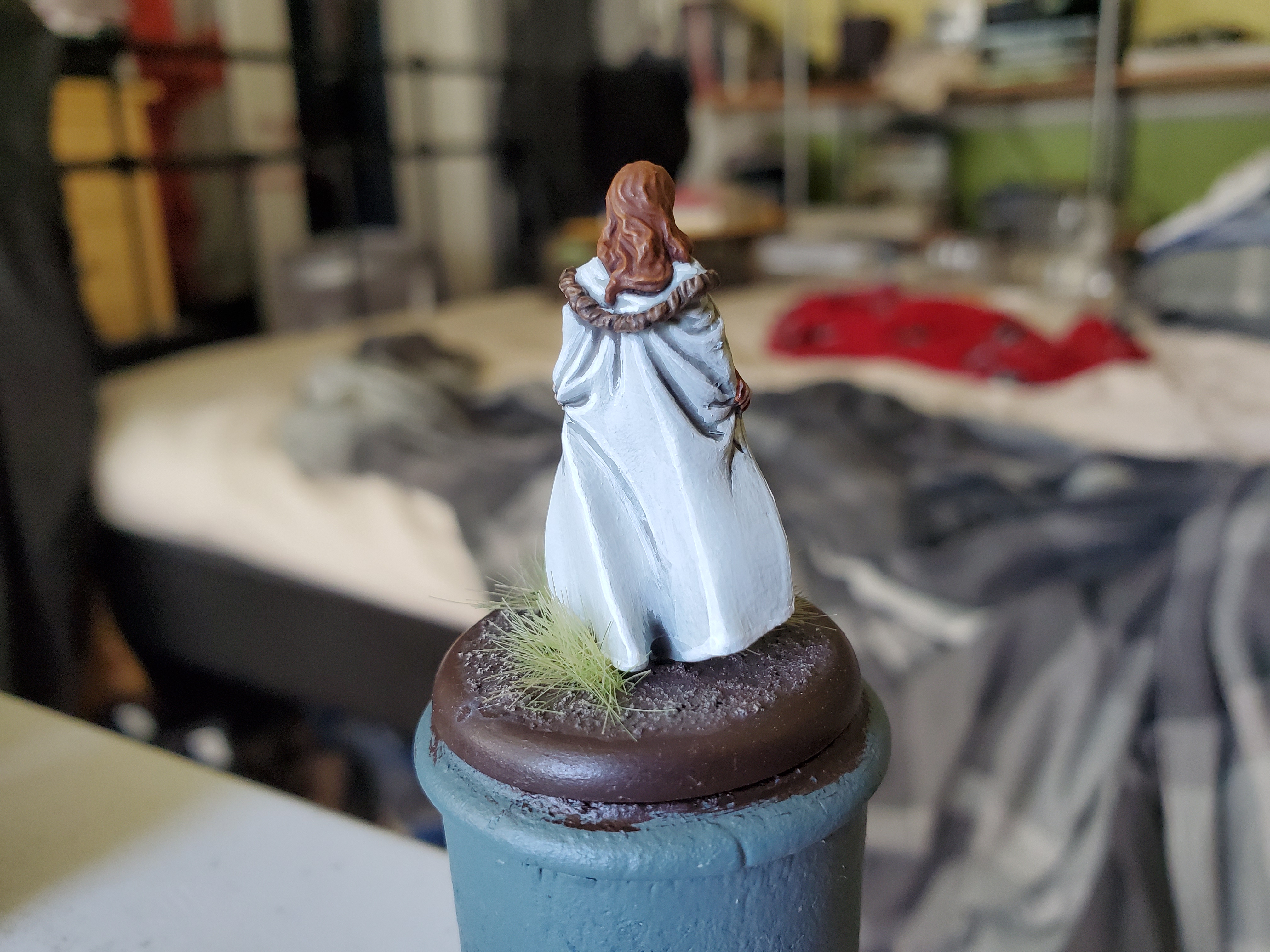
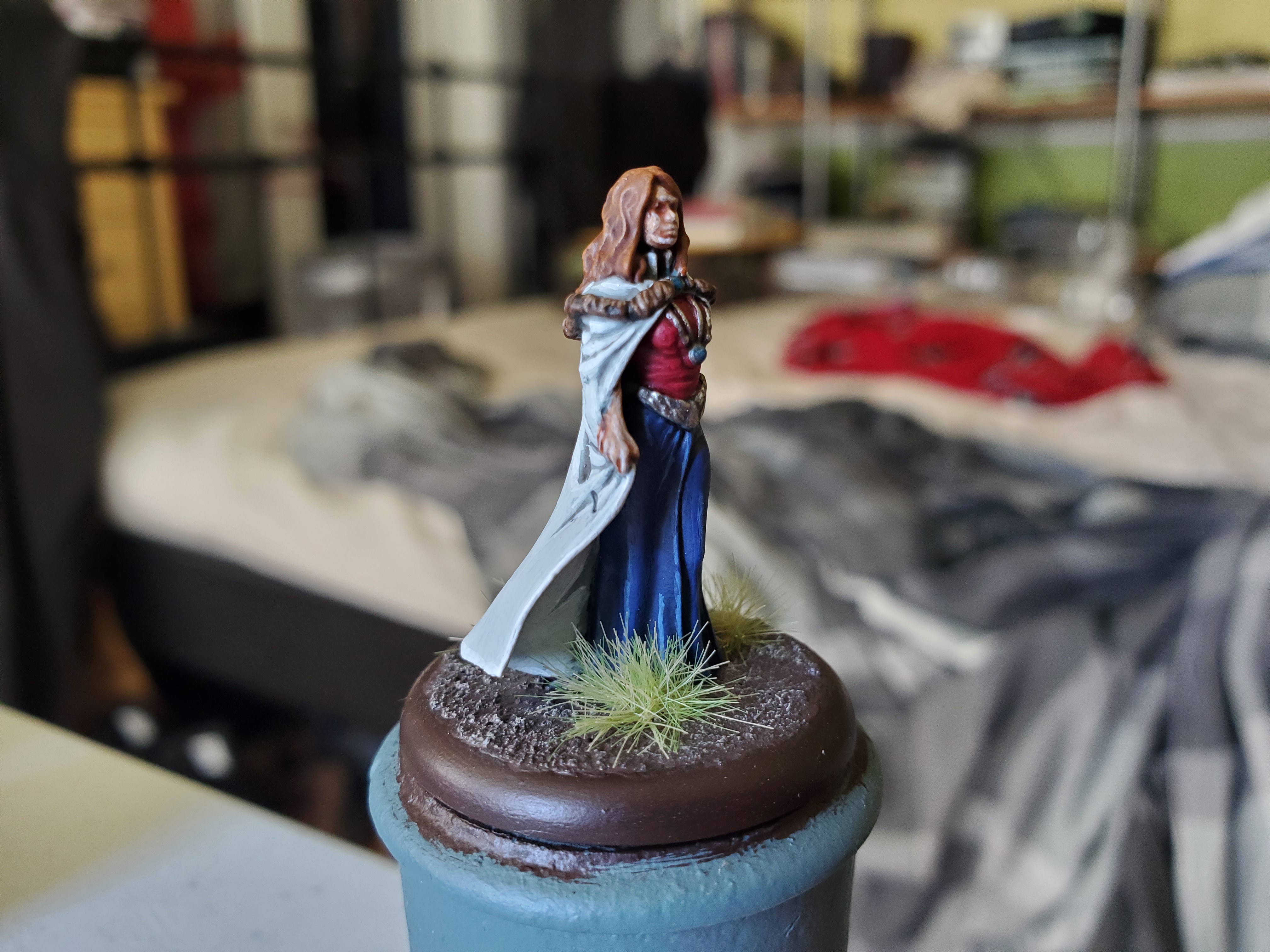
The Matriarch of the Starks is now done. There’s only one of them left from the starter box now, but more on that in the future. Again, many of the colours used here have been repeated, so I’m going to cover some of the details that are fairly unique to this mini.
As I mentioned before, I wanted to show both the Stark and Tully colours on Catelyn and I must say I find the results striking and, more importantly for me, colourful! The main goal was to imitate the Tully colours shown in the TV series (which do sort of appear on the shields of some of the Tully Sworn Shield) as the mini just seemed to be perfect for that.
 So keep this in mind for when we get to the final product...
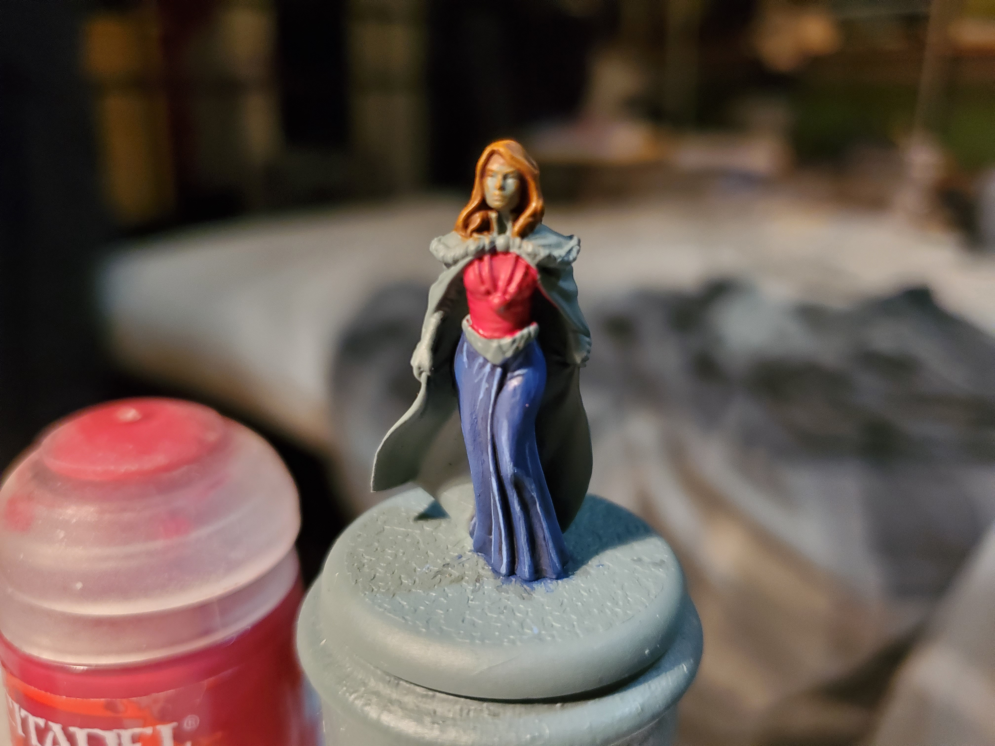
Staring with the blue on the lower part of the dress, I started with a base of Macragge Blue. I did think of going with Kantor, but I really wanted to try and have a brighter colour to compare with the white of the cloak. After that I all over shaded with Nuln Oil then reapplied Macragge Blue to the upper areas. You could recess shade and skip the second coat, but I find it simpler this way. After that there was just an edge highlight of Calgar Blue. You could go further with some highlights of Fenrisian Grey on top, but I liked how it was already and didn’t want to risk messing it up. Also, ignore other random parts of the mini getting bits of colour on it; I painted other bits while paint dried. 😛

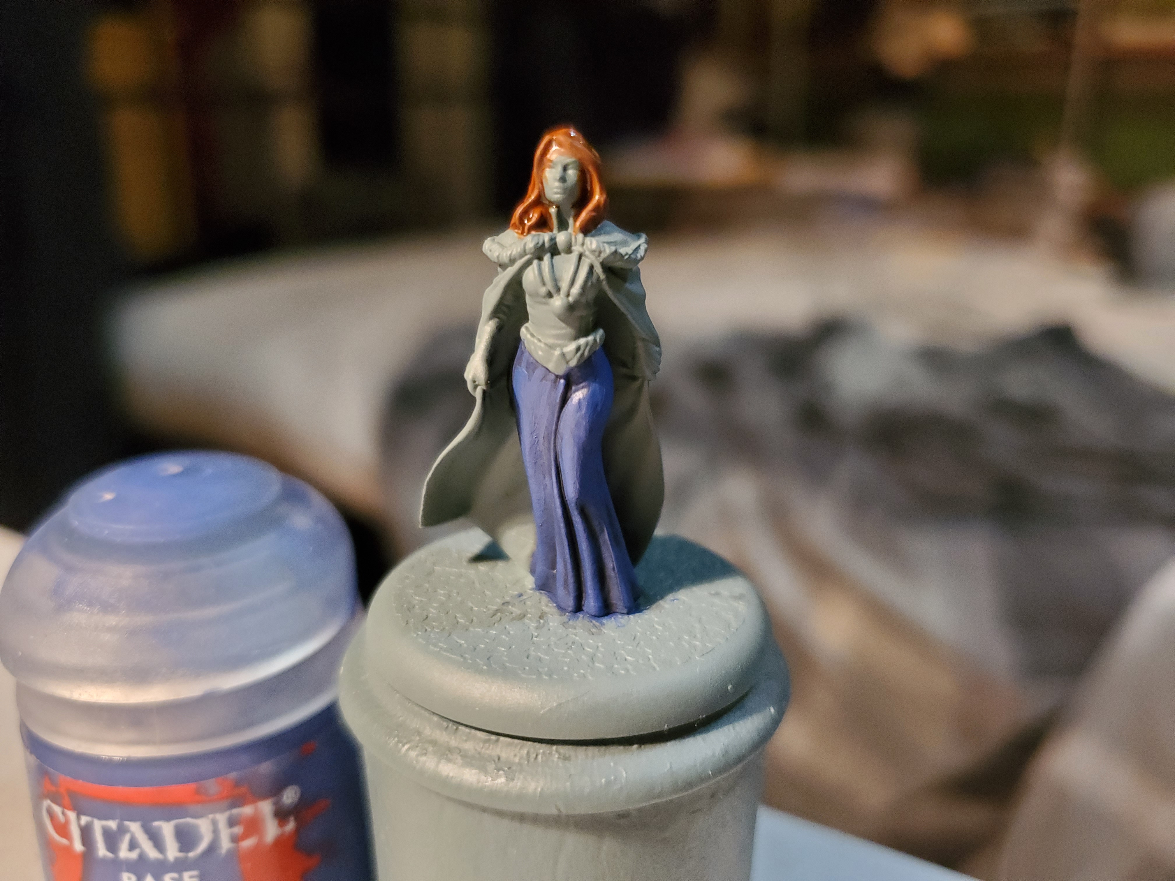
The red is my, now standard, red that was described in the Tyrion post, but I just love the tone so much that I decided to show it off here as it is part of the Tully colours. In all honesty, this is a better suited colour for the ‘mud red’ of the Tullys are that the brighter red of the Lannisters…but I like the colour…so there! Just a simple Khorne Red/Agrax Earthshade/Wazdakka Red sequence in the same vein as Tyrion. I do plan on trying to add this colour as a spot colour somewhere on Sansa to tie her into the Lannisters; she is married to Tyrion, after all.
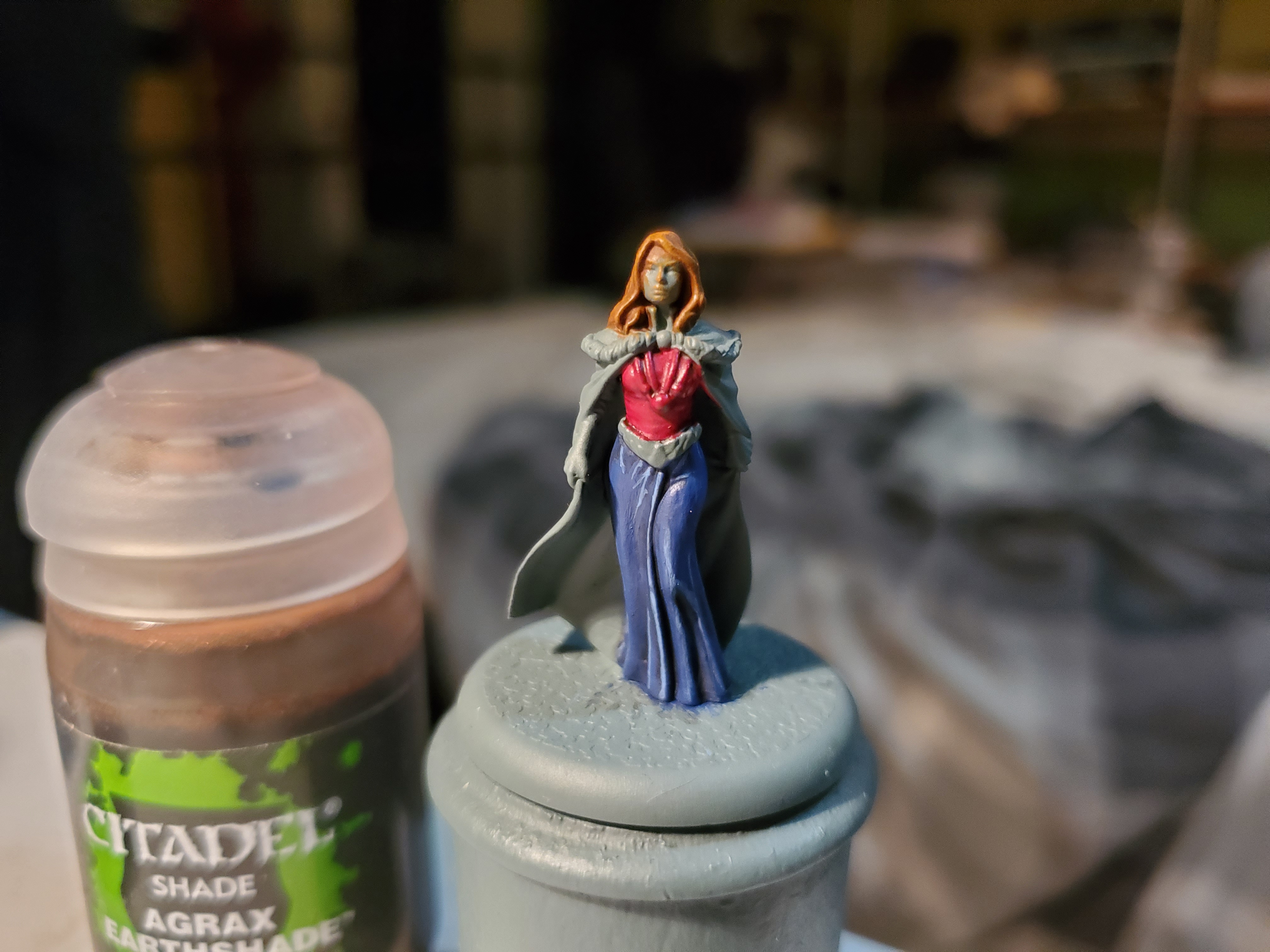
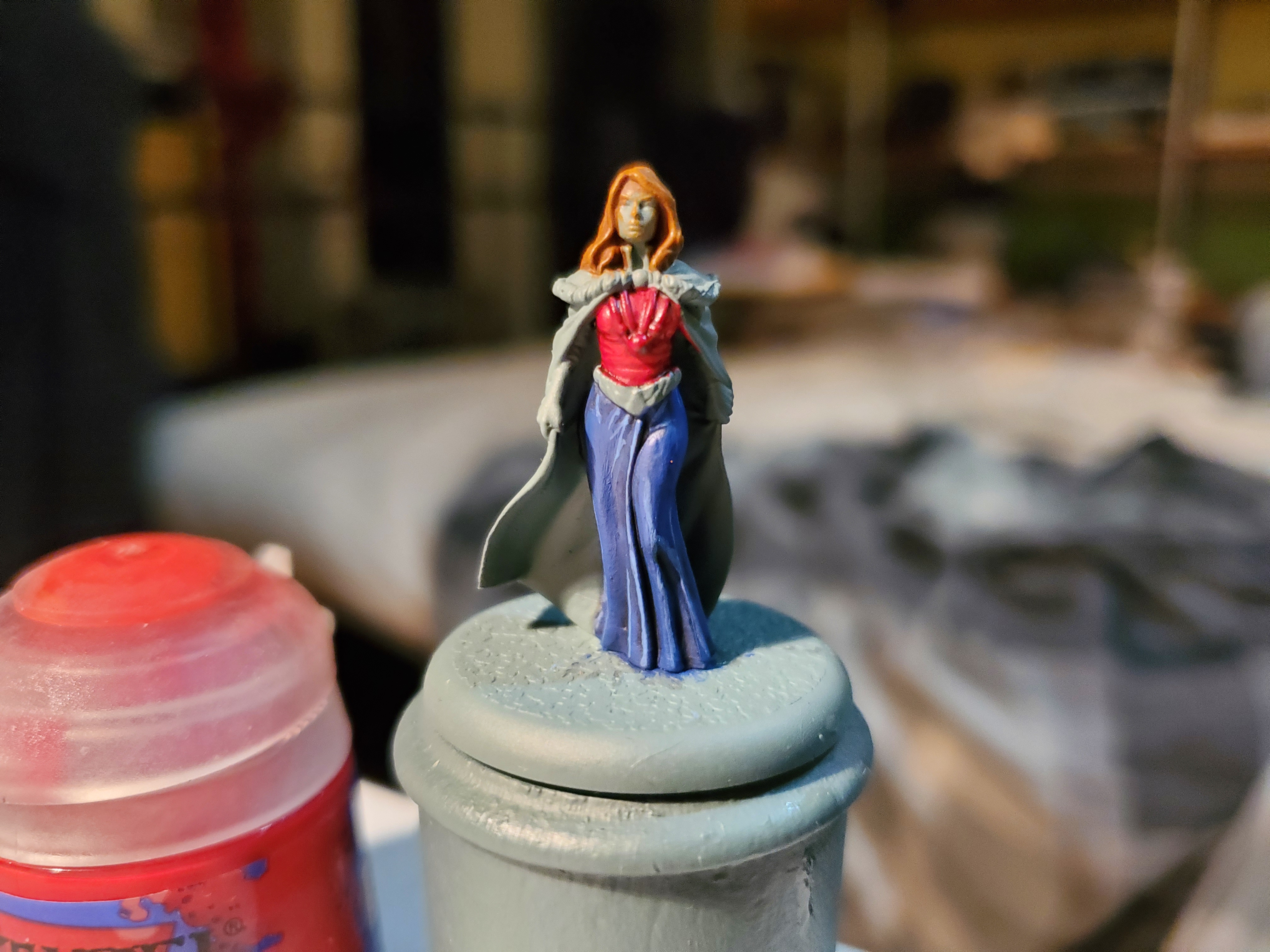
After that the other details could be added. The hair and white cloak were done the same way as Robb’s hair and tabbard, respectably, and the silver was a very simple Leadbelcher base, Nuln Oil shade and Stormhost Silver highlight. I chose silver very deliberately to add to the image of the Tully shield above, and I think it actually works quite well, I think. I went for a dark fur trim to help add some contrast to the white cloak, and that was that. Catelyn Stark was ready!
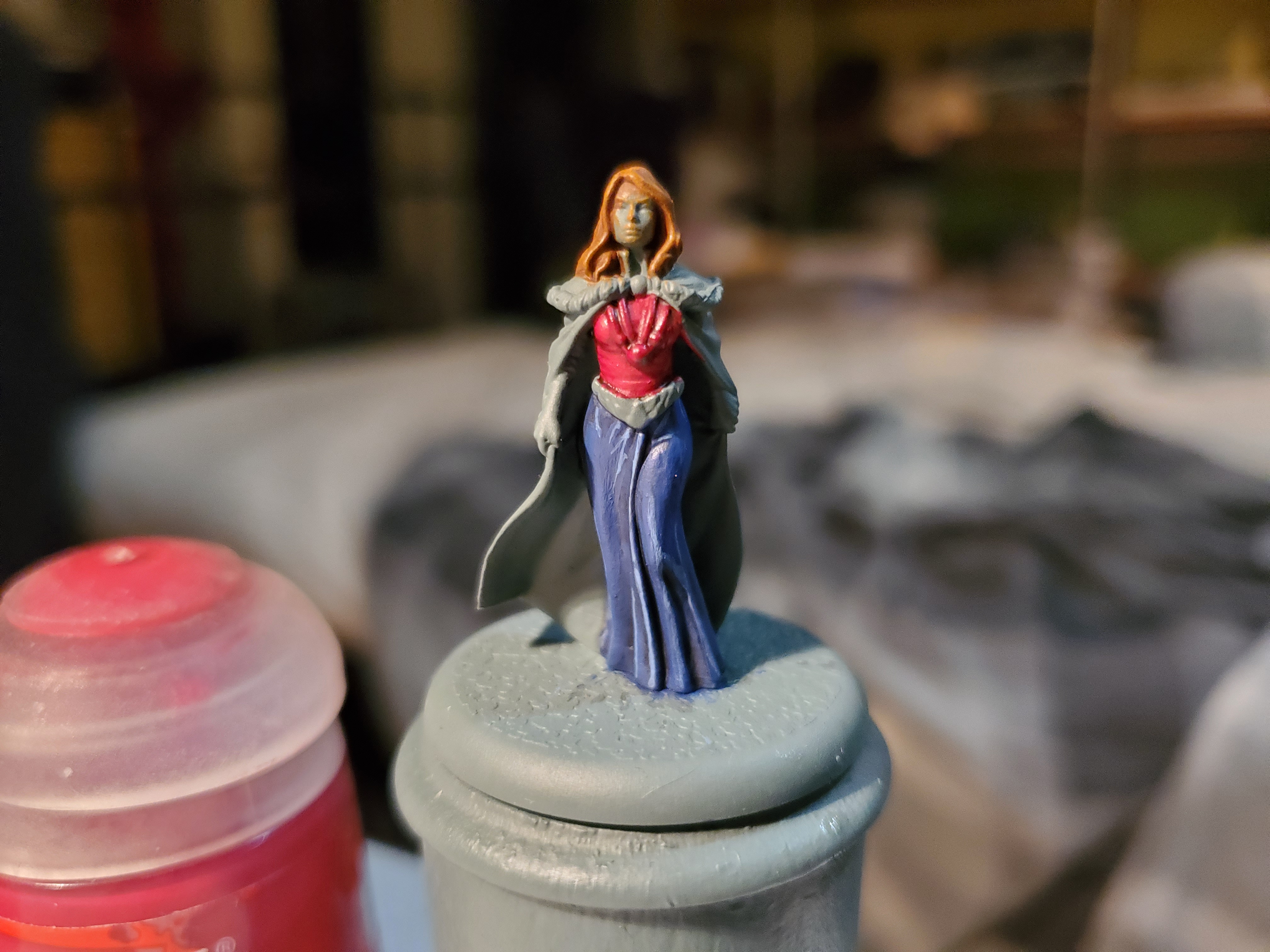
 This is the best angle to see the loose resemblance to the heraldry.
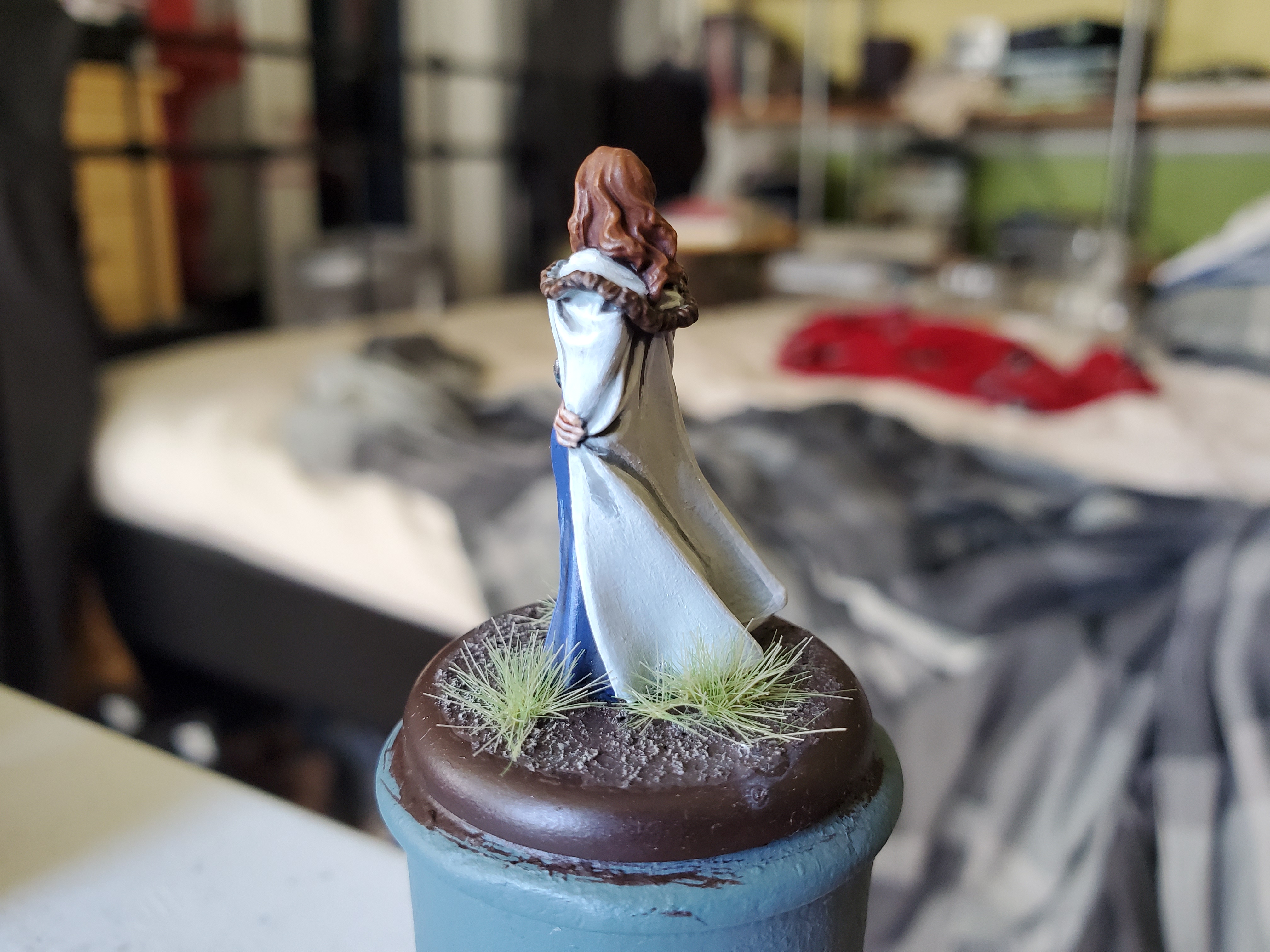
And that’s all she wrote. I’m hoping that my next project will be something a little different, but we’ll have to see if the postman brings me what I need for the project. Fingers crossed, though!
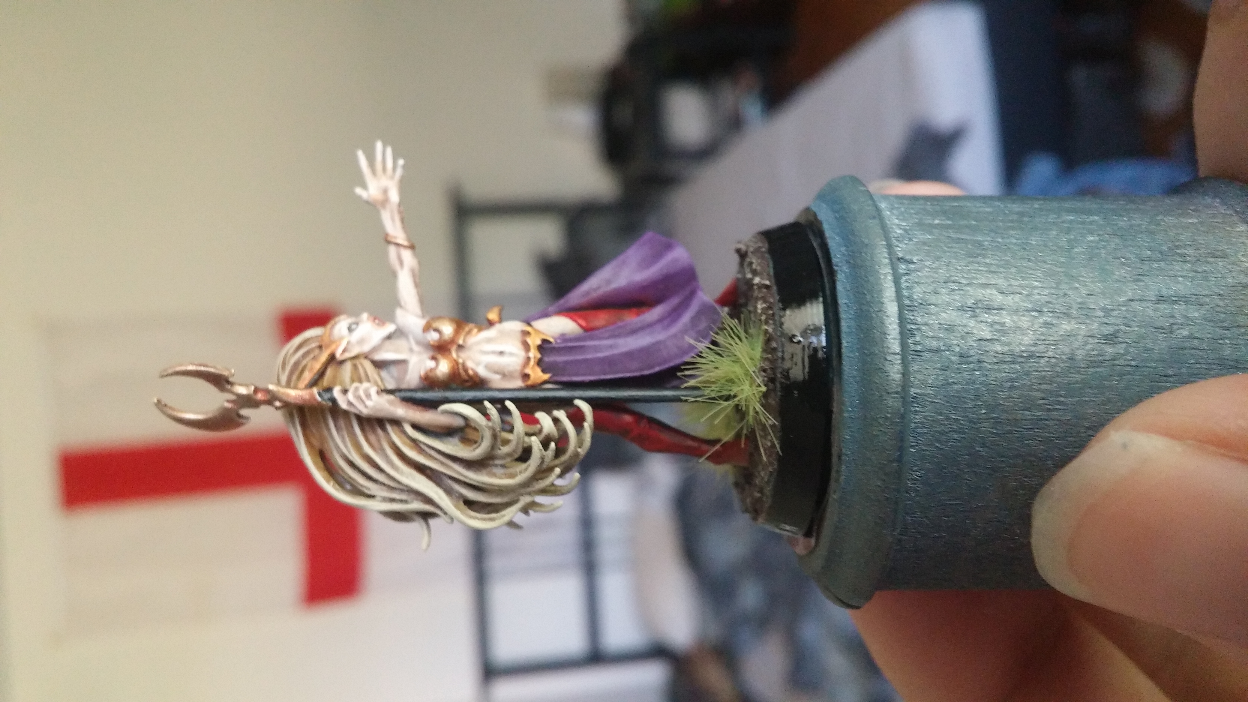
You can't get the sacrificial blood on your clothes if you don't wear much...
So a bit of a deviation for the moment. I was hoping a delivery would have arrived by now, but alas, no. In the meantime, I got a hold of the new Daughters of Khaine Shadespire team…or Warhammer Underworlds…I don’t remember which is the right name, anymore.
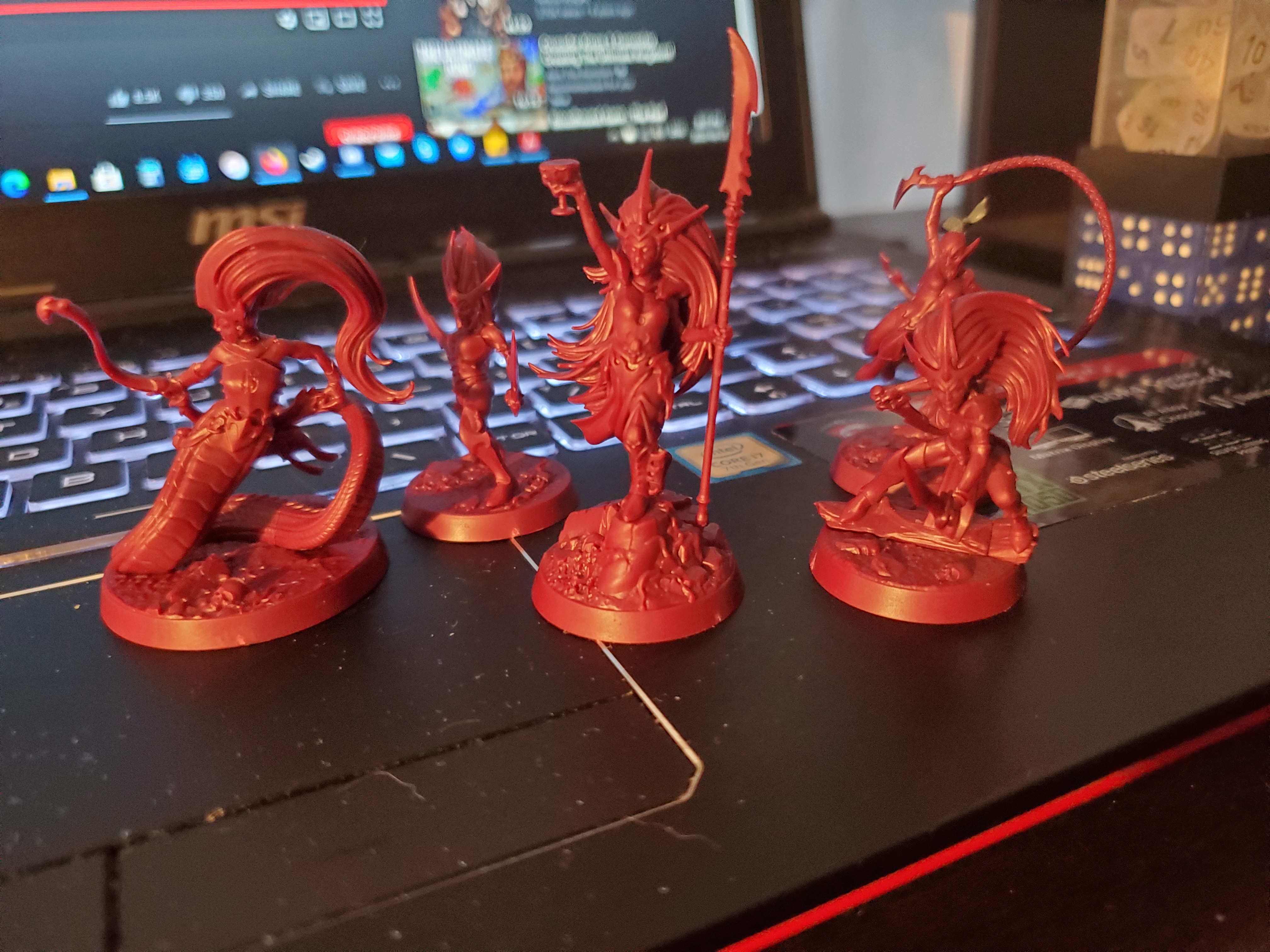 And yes, my laptop is no more tidy than my constant bed background...
It’s a bit difficult to see in that picture, but I have made a single modification to one of the minis. Long story short, I really am not a fan of the Sisters of Slaughter masks so I don’t plan on using them when I get more of the army…eventually… So I added hair. Nothing too difficult, if you have the parts lying around, but luckily I had several Escher sprues that have braids of hair flowing about in the wind. I found one of the hair pieces that had something I liked and carefully trimmed away until I had just the braid, then glue it to the head. A fairly simple conversion, but it improves the mini drastically, for me, and random top knots on bare heads is a thing with GW…so who would notice? Here’s a few better pictures.
Not much in the way of ‘research’ here, as these ladies will be using normal techniques and are going to be painted to match a test model I painted YEARS ago (you can tell because the bedroom backdrop is different). As a general rule, these ladies will be a background job unless I find myself planning something a little special that I’d want to share, such as with the Snek Lady, or Boobie Snek, or whatever boring name GW came up with for her…probably Karen… Digressions aside, this will be an on and off again appearance here, but once they are all done I will try and take a nice group shot of them. If my parcel comes inbetween any of these girls, then I will switch to that one first. In the meantime, here’s the colour scheme I plan to match.
 Perhaps with the make up, too...we'll see...
“For all those people who are finding it difficult at the moment: the sun will shine on you again and the clouds will go away."
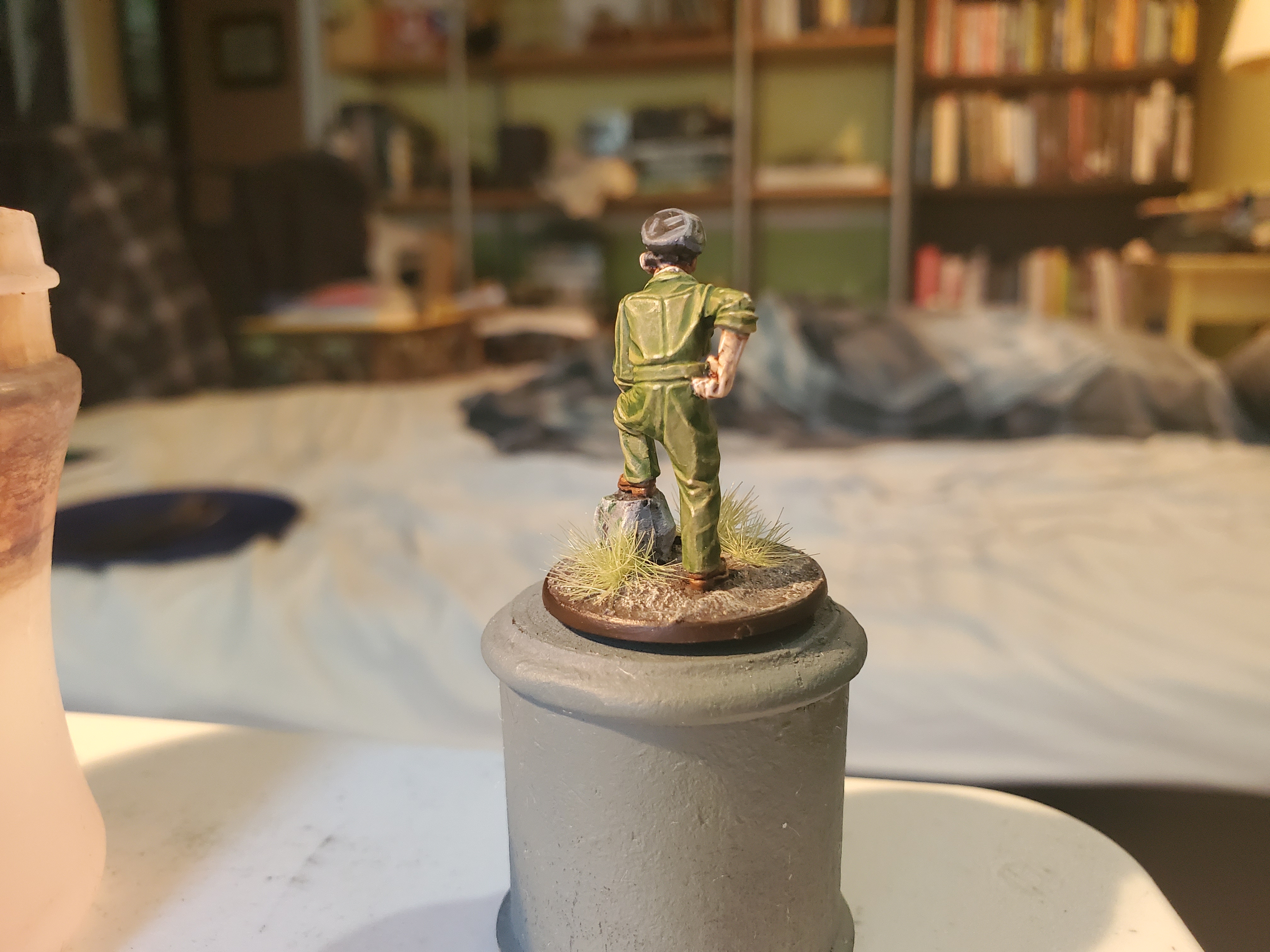
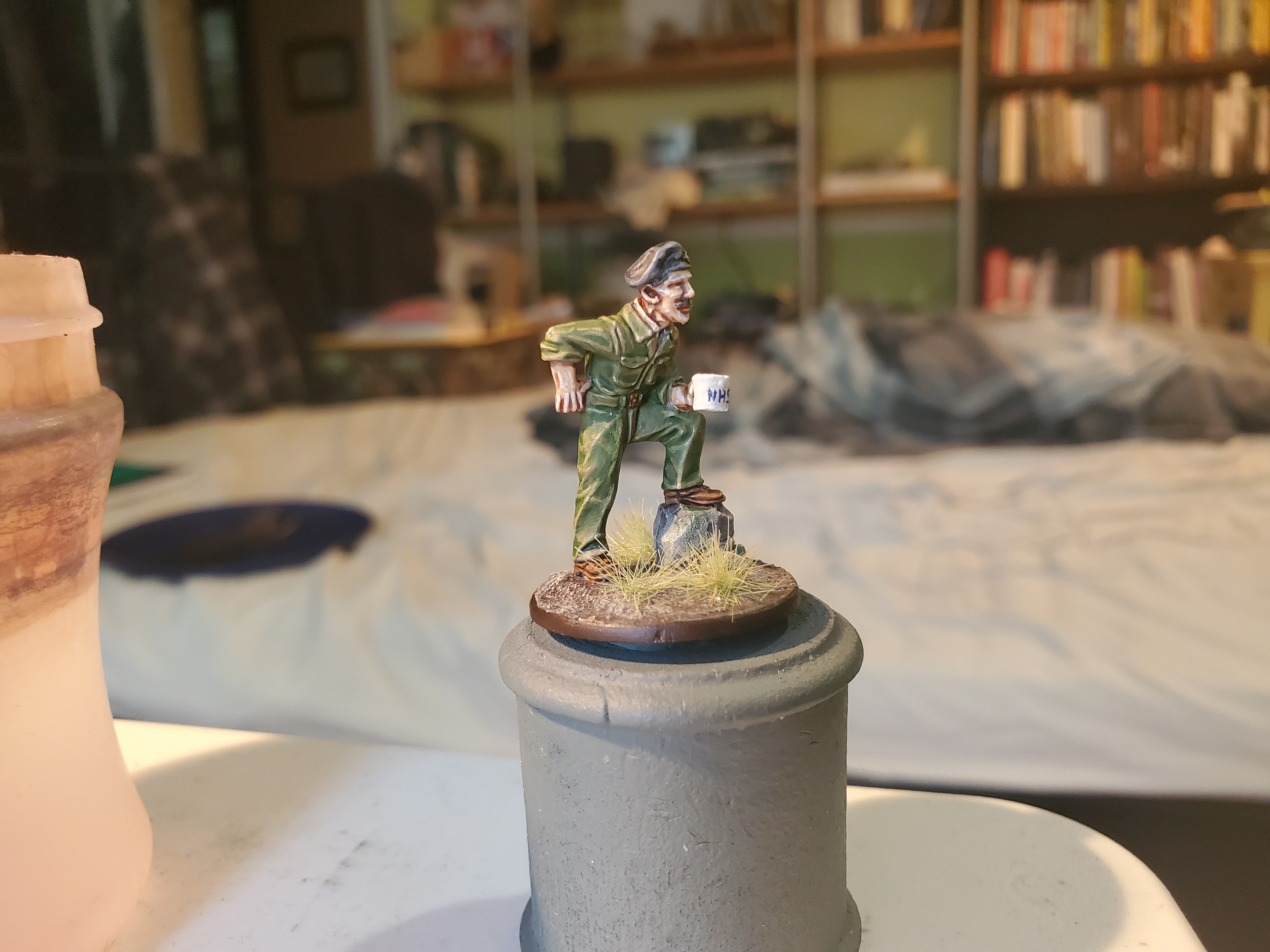
As is typical, the moment I decide I have time for a project before a delivery, it arrives the next day. So, for now, we leave the Khanite lunatics aside and we dive into a new project; Captain Tom!
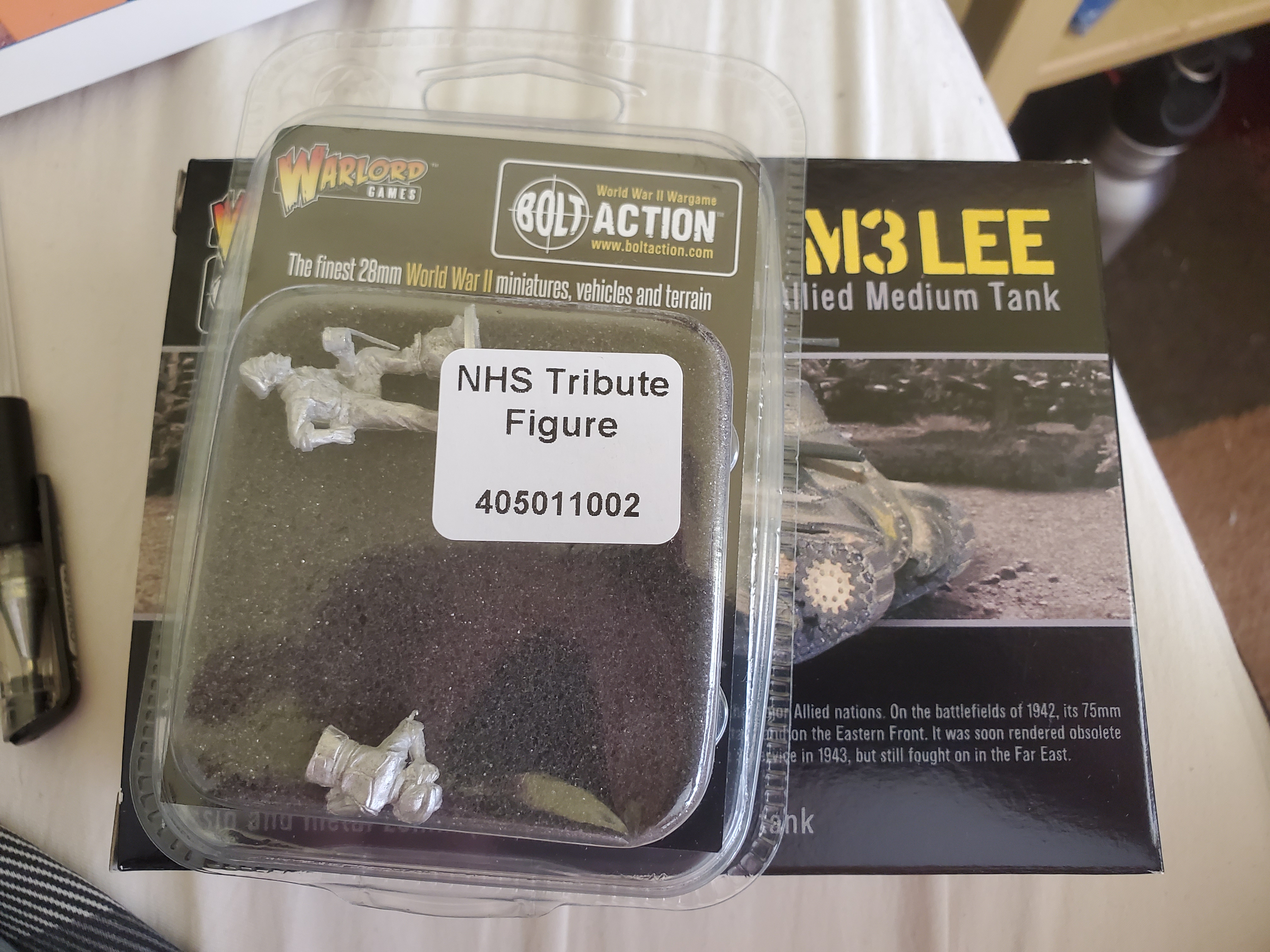 I got the whole sheband with the M3, too, but that will be a project for the future.
Usually I do reference images and such like, but as this represents Captain Tom during the Burma Campaign, I have already covered the jungle uniforms of the British Army during that time. The goal here is do paint a model damn well as very much a display piece, primarily, but also my own sort of tribute to the man himself. With that in mind I will be spending lots of time making sure all mould lines are gone, and bending is straightened out and such like. The only thing I plan to do that may be a little ‘different’ is to paint the mug of tea white and try to freehand an NHS symbol onto it…but we’ll have to see how well I can manage that… I’m really glad that Warlord took the time to do something like this to help raise money as, personally, being so far from home even the tiny amount I can help feels good.

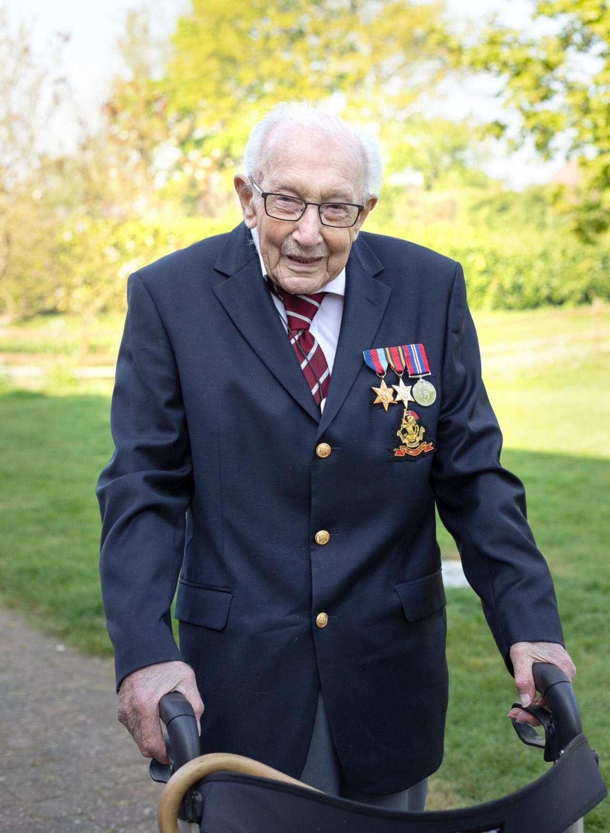
Just a couple of then and now pics of the man himself. If anyone HASN’T heard about him yet, look him up.
On another note, seeing as this just seems to be a tad more sentimental than most of my posts, I also got a parcel from the OTT team with a very kind thank you letter from the team included. It’s a kind gesture from the team…plus the sweets are very much appreciated! I might have to order more stuff just to get some good old British sweets…
Jungle fashion; you can make a killing from it.
While I would barely even consider it a pun…that title is just a terrible joke; I apologise…
So before slapping the paint onto Captain Tom, I wanted to make sure of a few things, the primary one being uniform colours. Thanks to the marvel of modern technology, being able to colourise black and white photos has created a wealth of pictographic references that any google search can give you. Something I noticed though was some serious variations, even within the same photographs, and so I looked and eventually asked the discord server if anyone knew anything that would help. Thanks to @portcullis (and by extension his grandfather) some colours, and explanations for variations, were suggested and so off we go to some experimentation!
For this colour experiment, I’m going to be using an reference I used in a previous post and my trusty Escher ganger who I practiced the purple hair on! A few more experiments and she may even get finished… 😛
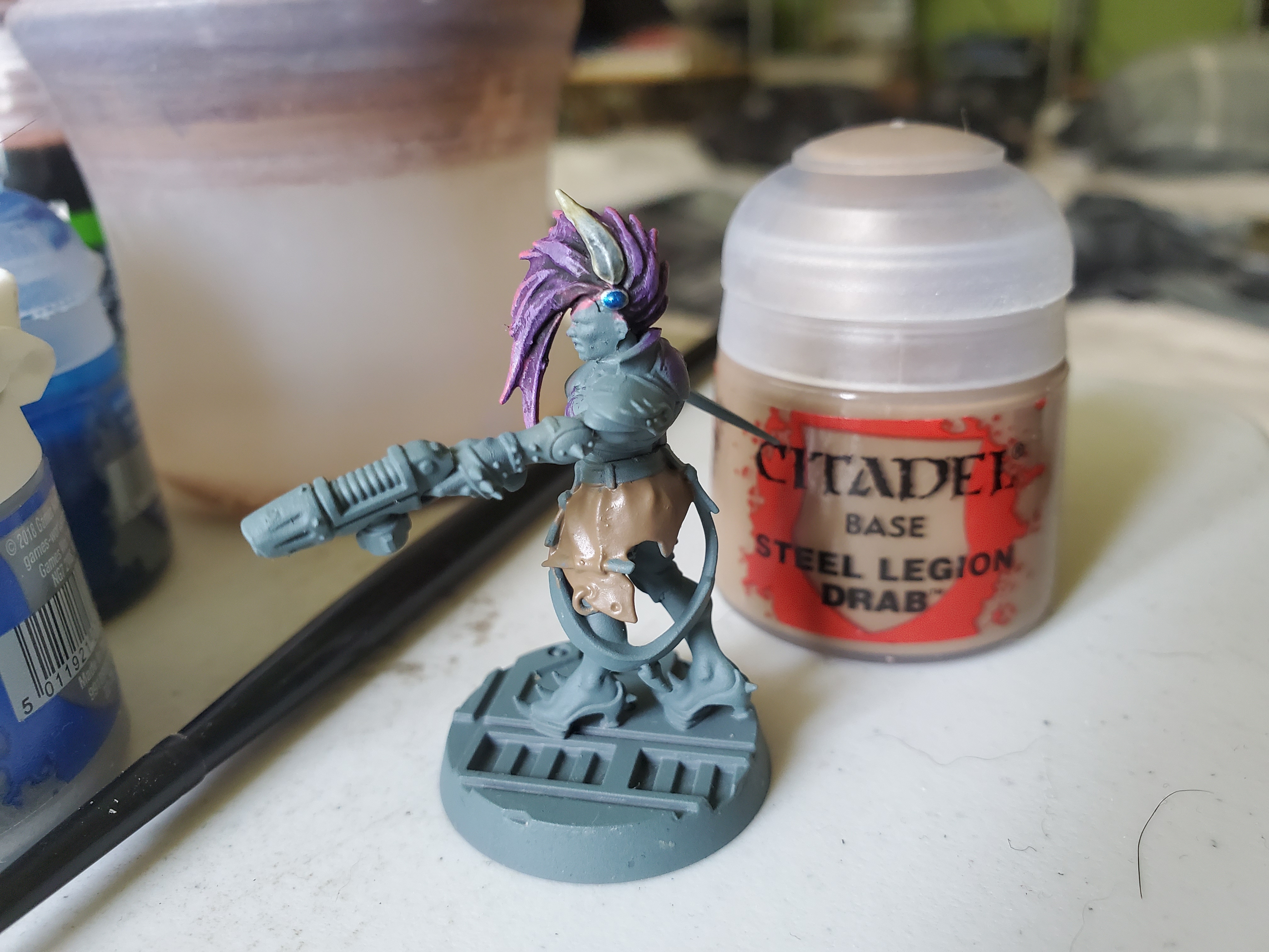 As @portcullis said, the uniforms tended to be a drab khaki that was dyed green for the jungle, so I started with Steel Legion Drab.
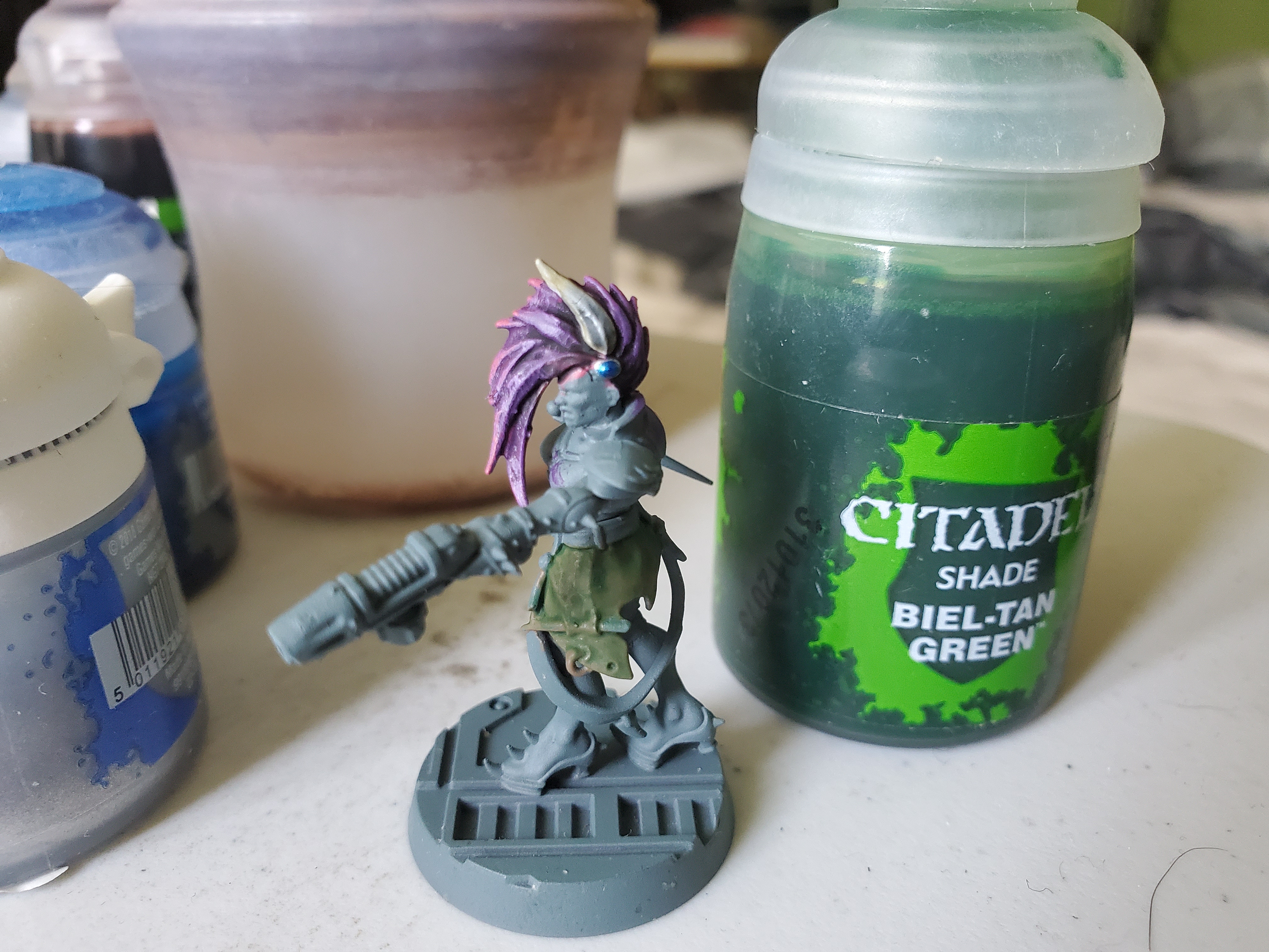 Whereas with my NW Europe uniforms (where I would shade with Agrax Earthshade), I went with a nice deep green shade of Beil Tan Green. I also did two coats, or about 1.5...ish. I made it green, that's the important bit.
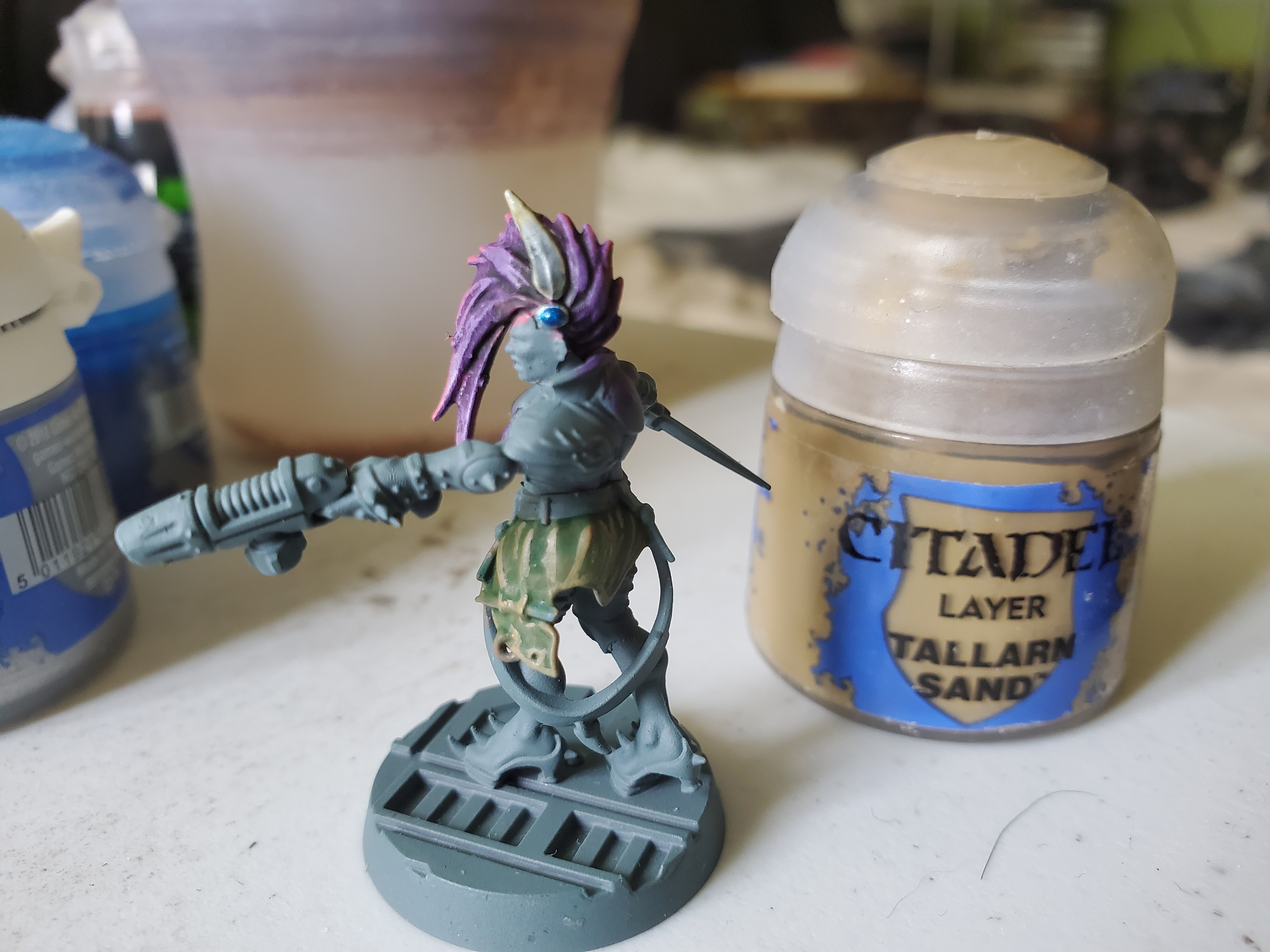 Next I highlighted with Tallarn Sand, keeping with the drab focus here to give the appearance of wartime emergency dye.
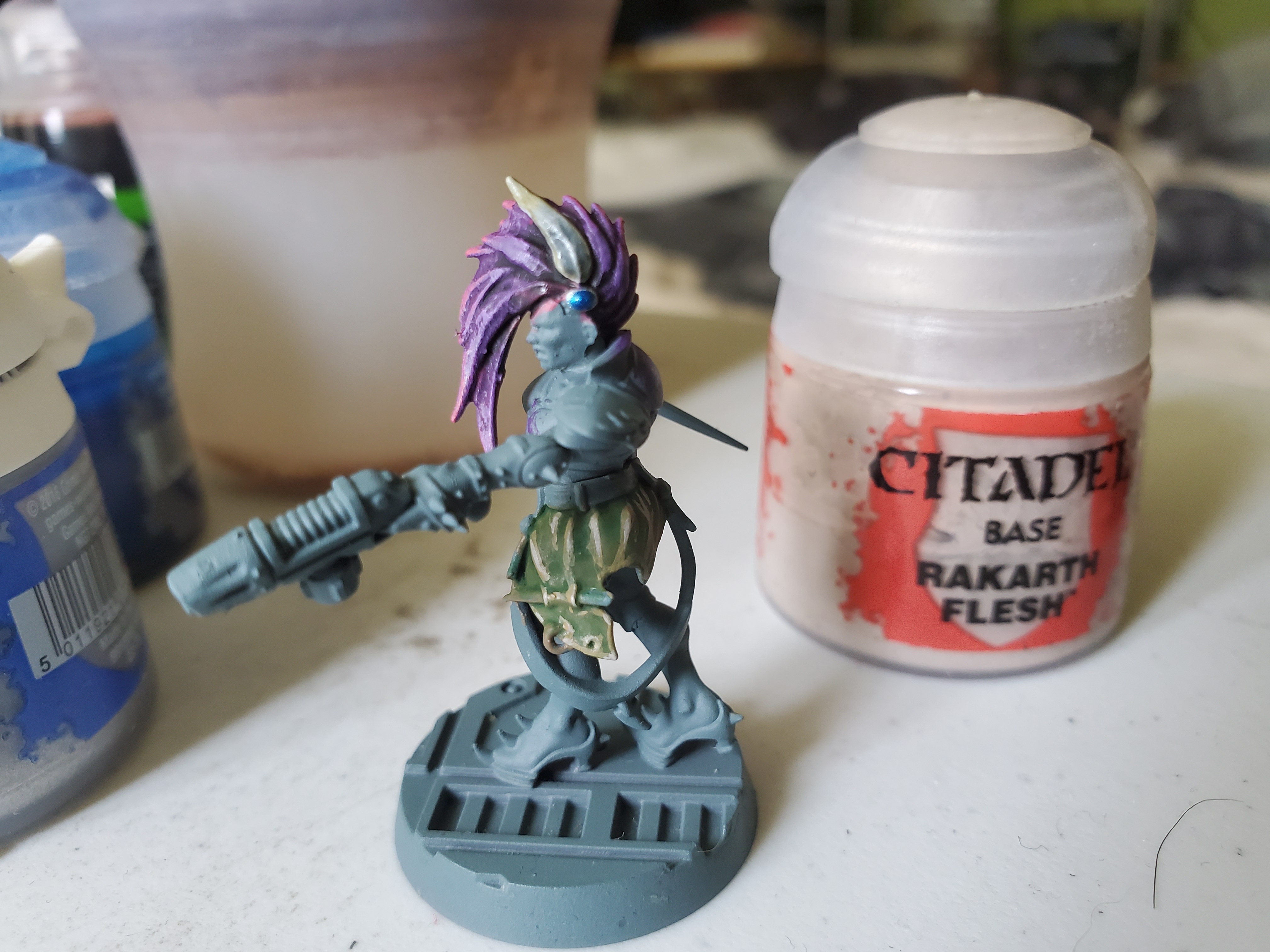 Then added an extra highlight of Rakarth Flesh. This was mainly to maintain a level of brightness with the next step, but might not be necessary.
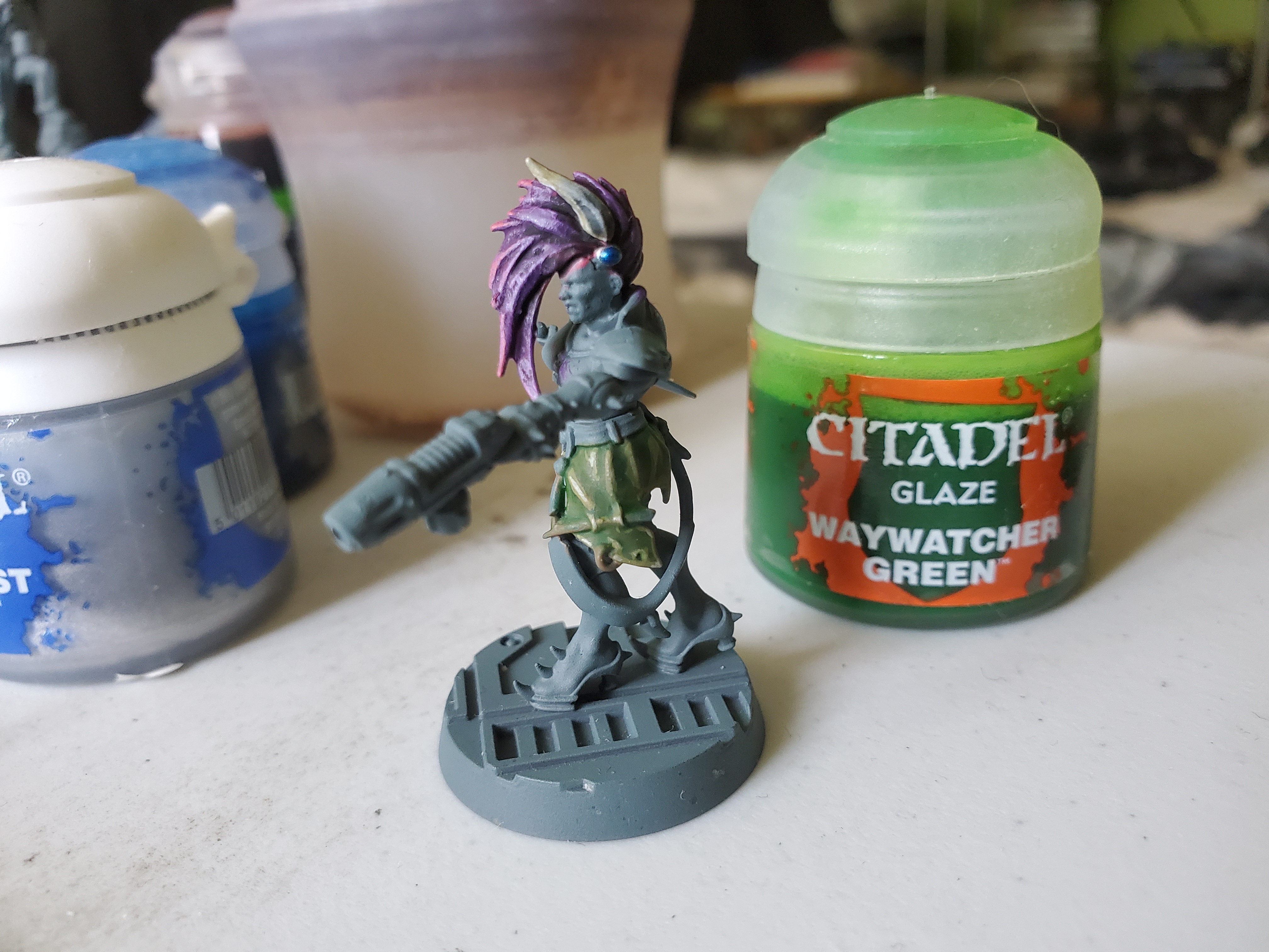 Then a coat of Waywatcher Green to bring the highlights back to a green tint. To be honest, I think this scheme may work better by doing the basecoat and highlights first, then applying the shade over top. If I were to do this, then I'd skip this step, but definitely keep the previous step of adding those extra highlights of Rakarth Flesh.
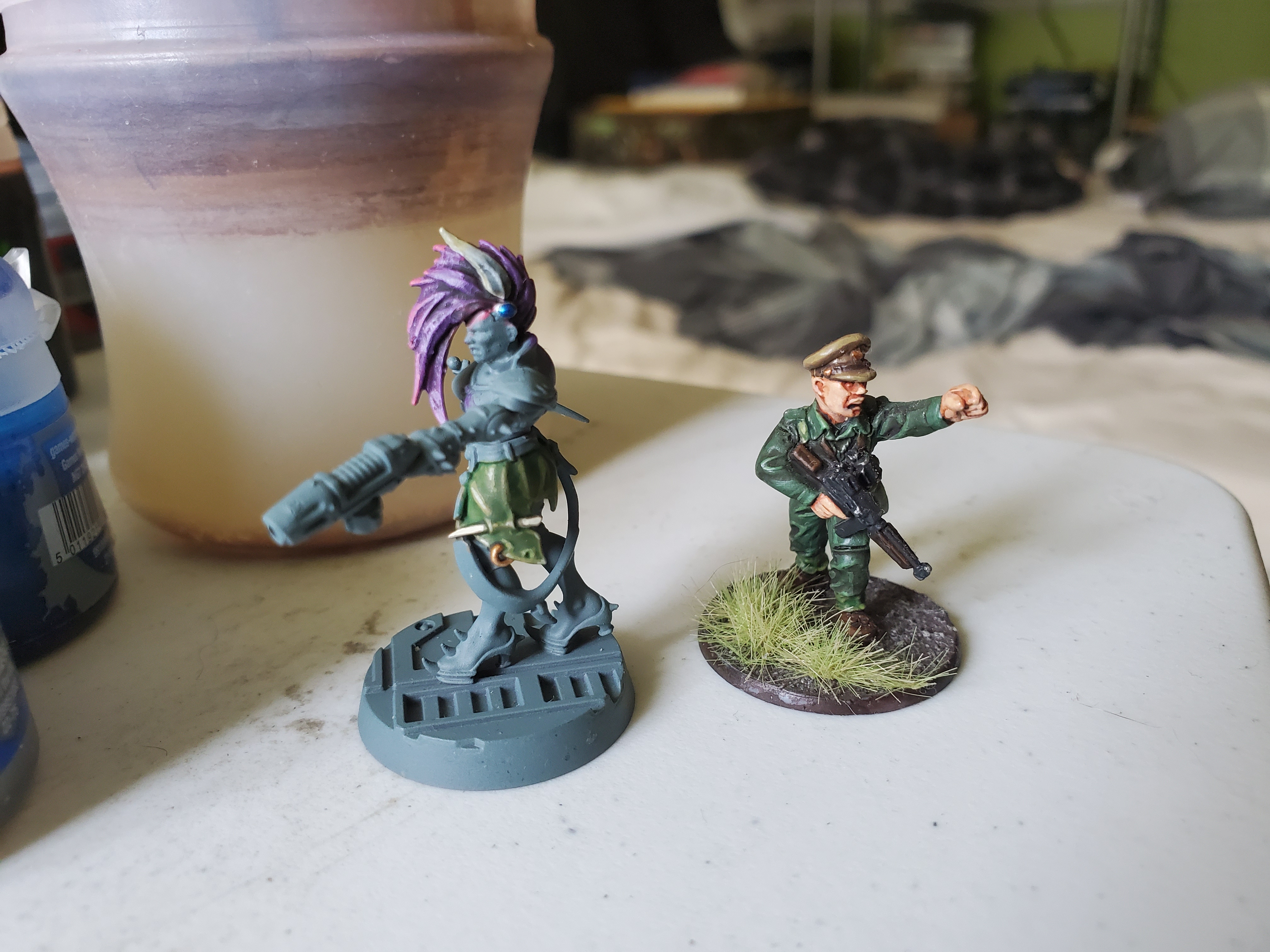 Compared to my old colours of, basically, Orc skin, I think this colour is much more appropriate to the reference materials. I liked it enough to finish off this bit of cloth with the few extra details, so I think I'll stick with this, or some form of this, in future.
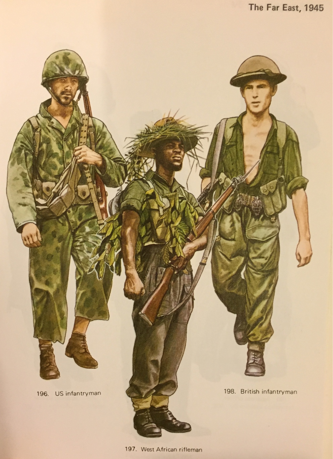 I think the new colour is definitely a better match to these Osprey images. As an aside, it's fairly close to the Yank, too, so you could use this for Korean War or, probably, Vietnam War Yanks!
"...an absolute legend [from] an exceptional generation that are still an inspiration for our Yorkshire soldiers today."
Captain Tom is now finished, and I must say I’m rather pleased with how he turned out. Only two things are not ‘correct’, I think. First off, I THINK the cap badge in the field would not be that shiny, for obvious reasons, but I may be wrong. Second, I simply wrote NHS in blue on the mug and didn’t do the whole symbol. Simple reason is this; the sysmbol is a registered trademark owned by the British government, so I thought it was more prudent to borrow the colours, but do my own thing, just in case. Other than that, he looks good. So good, in fact, that I think I need to re-paint Maj. Rutherford-Lumley…
 Also, this doesn't count as 'foot on rock' because he's having a cuppa, not waving a sword... :P
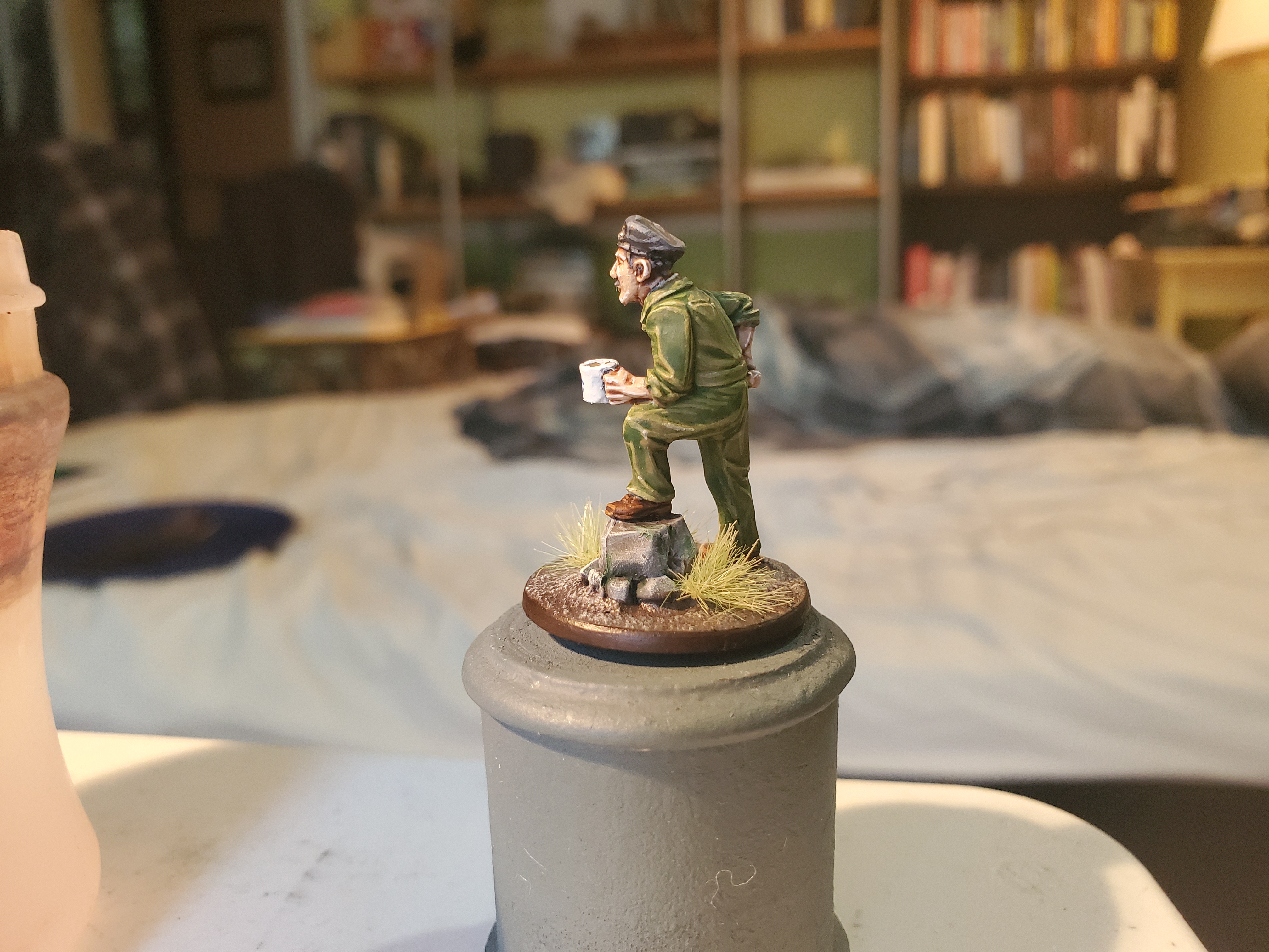
Contrast as a tool.
GW’s Contrast range has been around for quite some time now and it is something of a shift in painting. Regardless of people idolising or lambasting it, I find it very useful in my painting for a variety of reasons and thought I’d make a post about how I use it while going through the painting of skin on a Sister of Slaughter from GW’s new Underworlds team.
I find the first thing that is important it understanding the paint itself. It can be used for all sorts of things, but it is definitely a type of paint I recommend experimenting with and trying out before you decide how you want to use it for painting. One of the best videos I have seen, recently, is actually this one by Duncan Rhodes:
It’s a good introduction and, in my opinion, more useful than the official GW videos as they tend to just go over what paints they use more than how they are used. As you can see from many projects on the site, Contrast, when used properly, really can speed up army painting and for many that is all they are looking for; fast ways to get armies down for playing. Perfectly reasonable way of doing things. GW seemed to focus on this element of the paints, but as Duncan shows in his video there’s more to it than that.
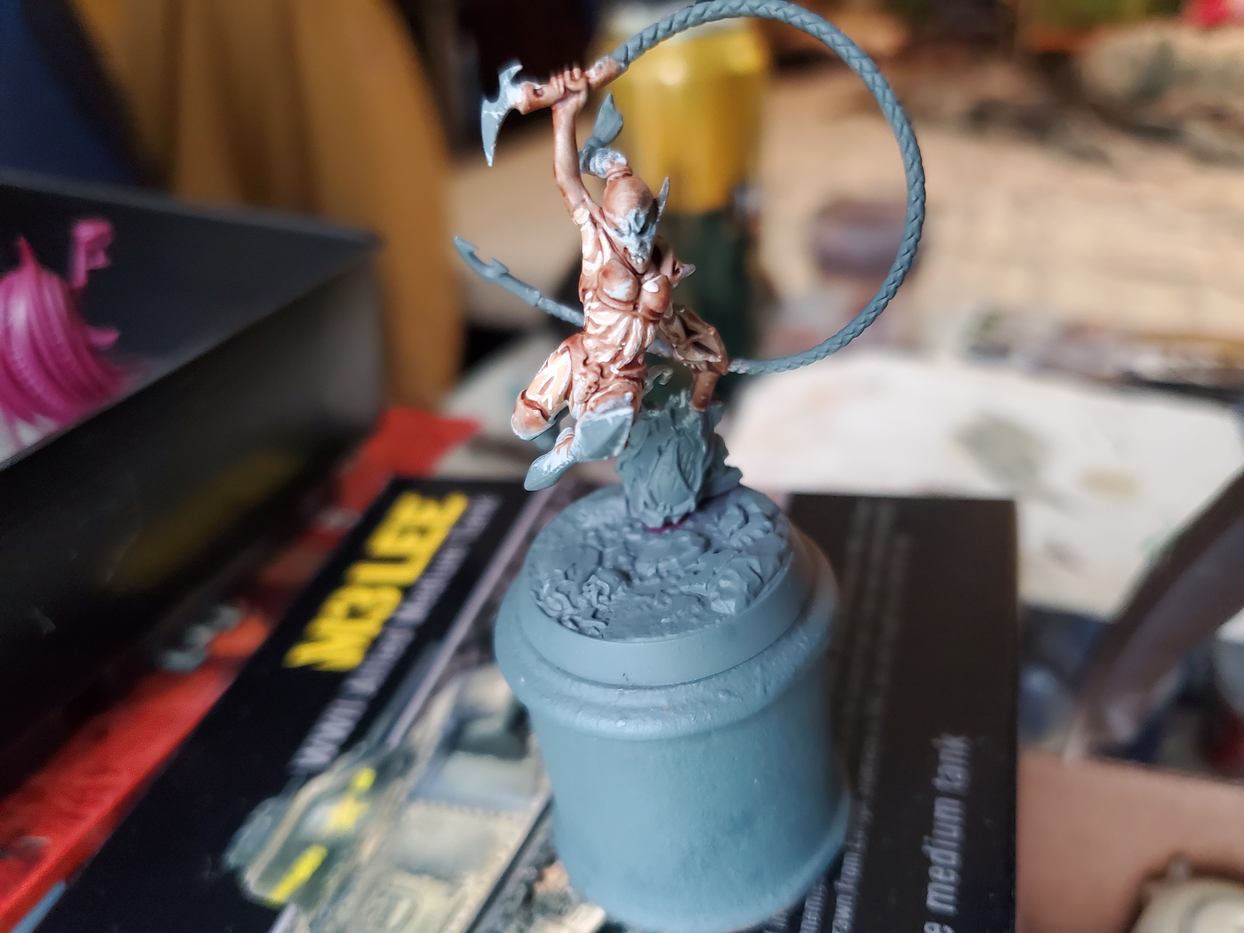
 Contrast can be used over any colour, and I like to experiemtn from time to time with what I can achieve, but for the 'standard' use you want nice solid, bright basecoats. I've used Grey Seer here, but Wraithbone works just as well.
I tend to use Contrast for skin for a variety of reasons. Primarily because it works quite well, and turns out nicely and, in the case of fighters, the little bit of ‘ruggedness’ that can come from it can work quite well to show people stuck in a warzone. If you look at my earlier posts, you will notice that the Contrast alone is what I used for my Umbers, but for Cersei and more courtly people I go for a little bit more. But before we get to that, let’s look at just the Contrast. (For anyone wondering, I used Darkoath Flesh here as it is the ‘brightest’ colour they have in the range…I think.)
 This is with a single coat, but any patches I missed I just went back over that area once it was dry and it looks fine. This is a perfectly reasonable look for the tabletop and really did take no time at all to do. I even find that the Contrast dries quite quickly, too.
The angles on the pictures aren’t the best; I took them from a bad angle, to be honest… One of the really great things about this, though, is just how much of a base it creates to work up from. In this way, you could get a whole army done quickly for that tournament you want to attend, but there is more you can add afterwards, and fairly easily. This is basically what I do with certain minis, particularly with skin tones. You really can add just a little touch of brightness to a character’s face, or a flowing cloak, or anything else you may have painted with the Contrast. Particularly with newer painters, you can get really nice bases down easily and quickly and then take your time working and practicing on details.
 Simply adding in a 'frist' highlight with Kislev Flash already helps build on the definition created by the Contrast.
With just one more step you’ve improved the look. You could try doing this on a whole bunch of minis, get used to the motions and steadiness and in no time at all your highlighting skills are much improved. Remember that no one is a master painter when they take up a brush for the first time and with Contrast being so quick and simple, it’s really not too time consuming to patch up any mistakes here and there. Once you get the hang of it, you could always go the the next stage and try some more focused highlights.
 Here I used Pallid Wych Flesh in thinner, more controlled lines.
This takes a little more practice, again, to get used to. Just remember, though, that I have (a) been painting miniatures for close to 14 years, and (b) still make mistakes all the time. In fact, I found here that my highlights seemed to ‘jump’ to quickly for my liking, so in order to help blend that in, I used a different technique of glazing the skin. While there are lots of glazes out there, I actually chose to make a glaze from my Pallid Wych Flesh so as to make sure that I was not going any brighter than my highest highlight. To make a glaze is quite simple; Put a bit of your chosen colour on a palette and then add three or four brushfulls of the medium of which ever brand you are using (Lahmian Medium for the GW paints, for example). The important thing here is that having the paint too thin is better than too thick. Once you’ve done this, just cover the whole area with a thin coat of the glaze and leave to dry. It gently blends the colours together and slightly shifts all of the colours to the colour of the glaze that was used.
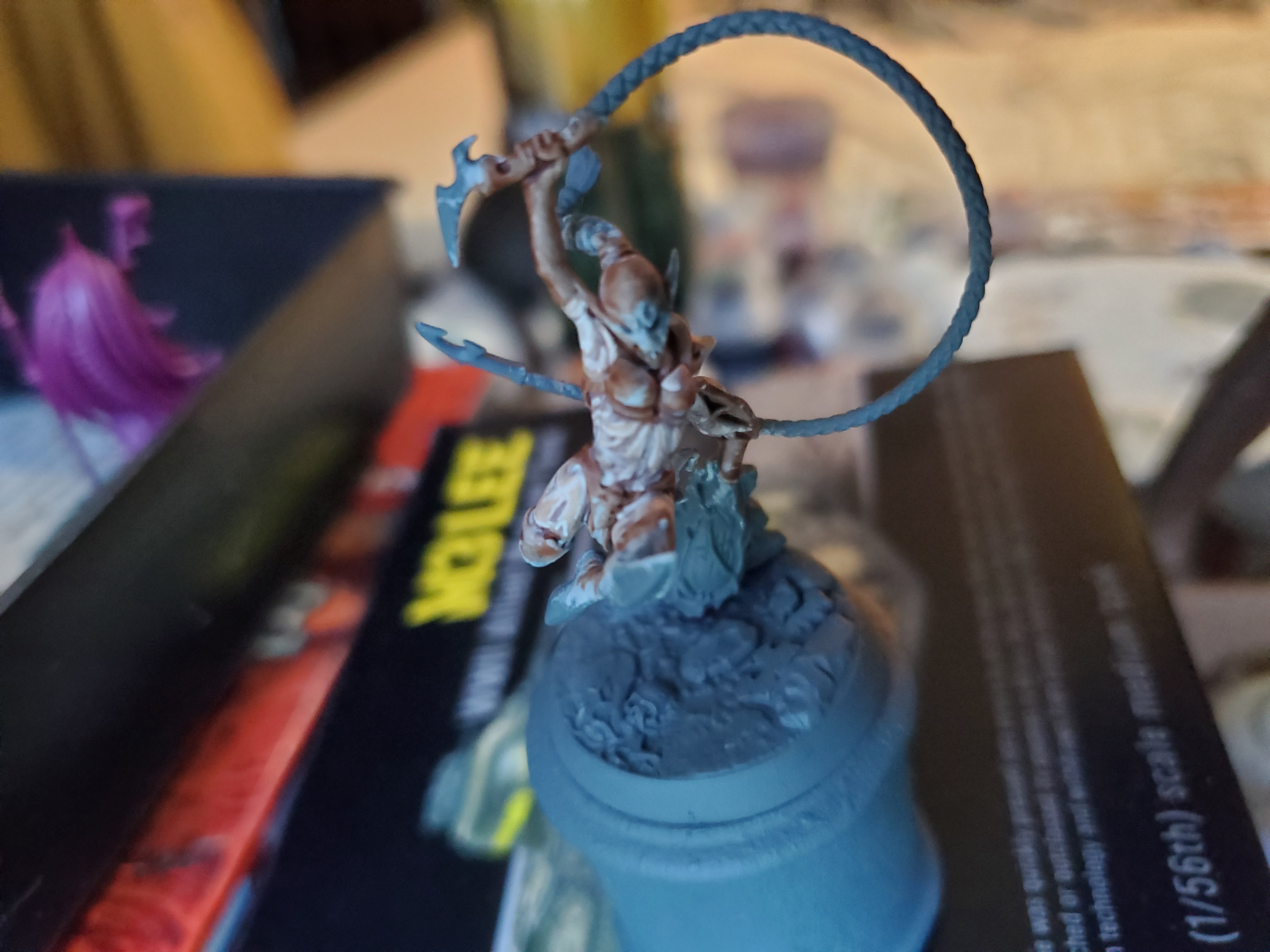 And thus the skin is a little brighter and a little smoother looking.
You may also notice that the one arm was never highlighted and that was because it’s actually a glove and I didn’t notice, but it does show the difference quite nicely. So remember that Contrast is a useful tool, but just how useful and where it sits in your repetoire is really down to personal taste. Experiment a bit with it, see where you like it and where you don’t and, most importantly, remember that;

The red means the blood won't show!
Ok, so that’s absolutely not true, but we all know the jokes that inevitably end with brown trousers…
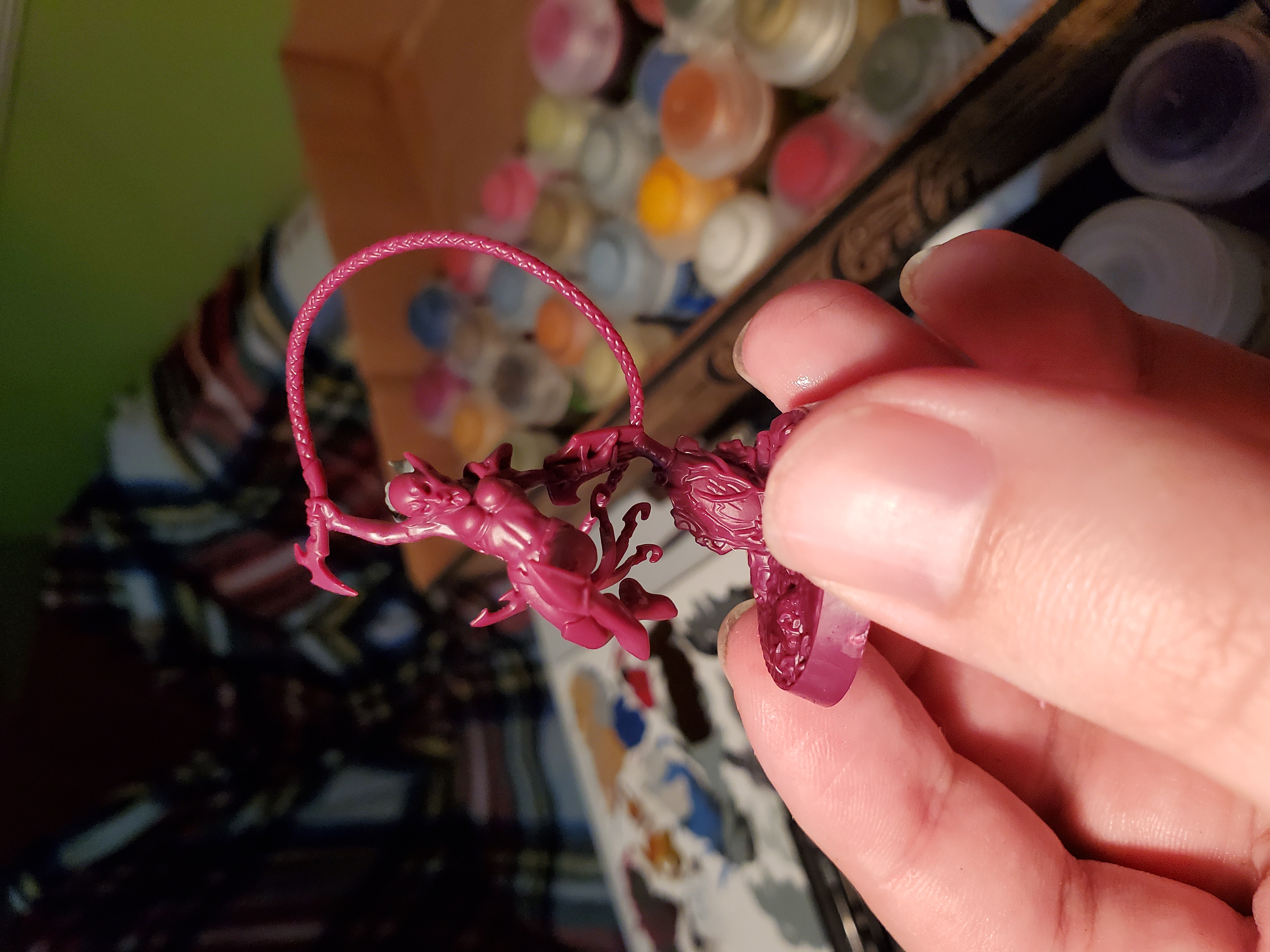
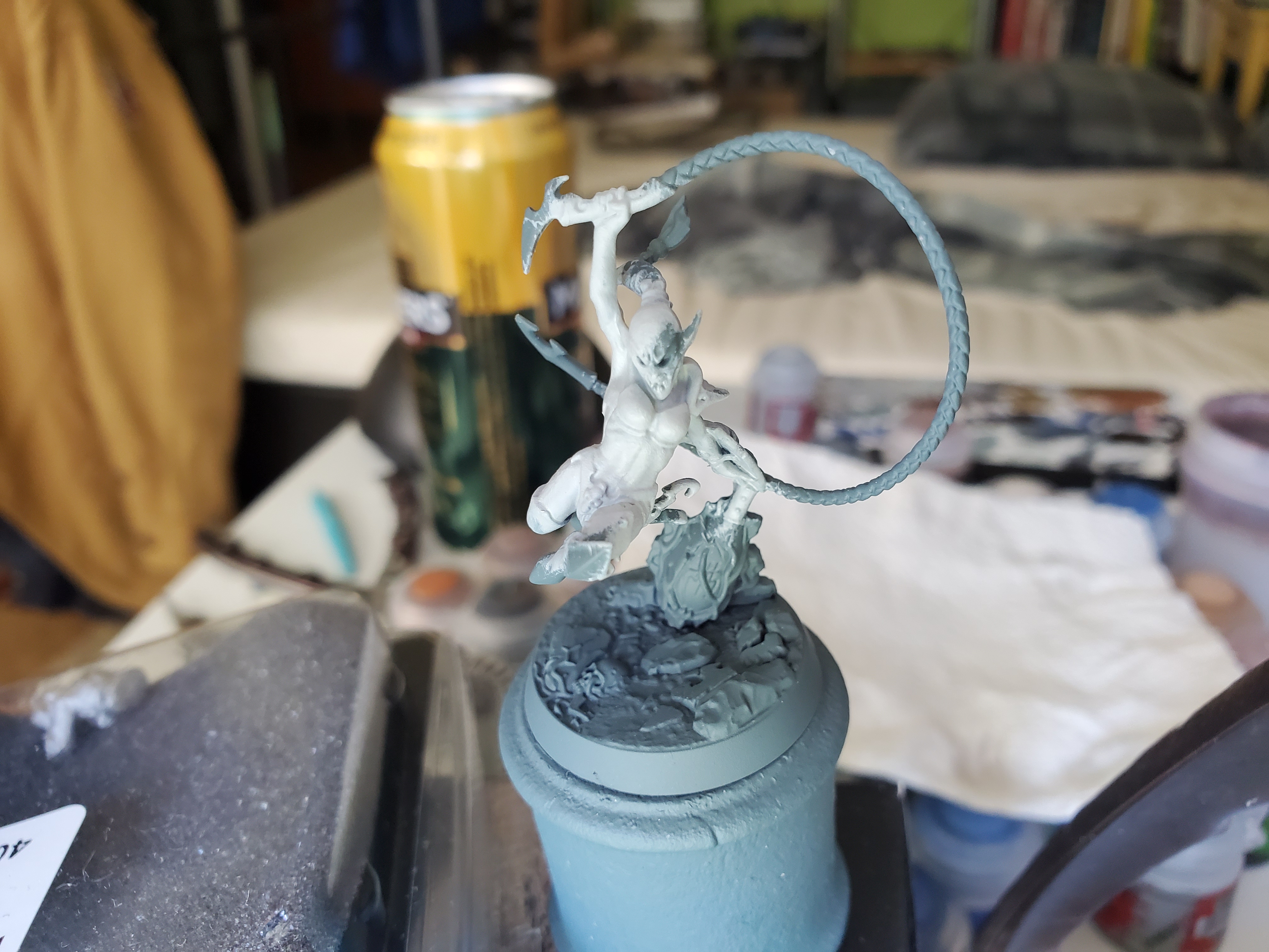
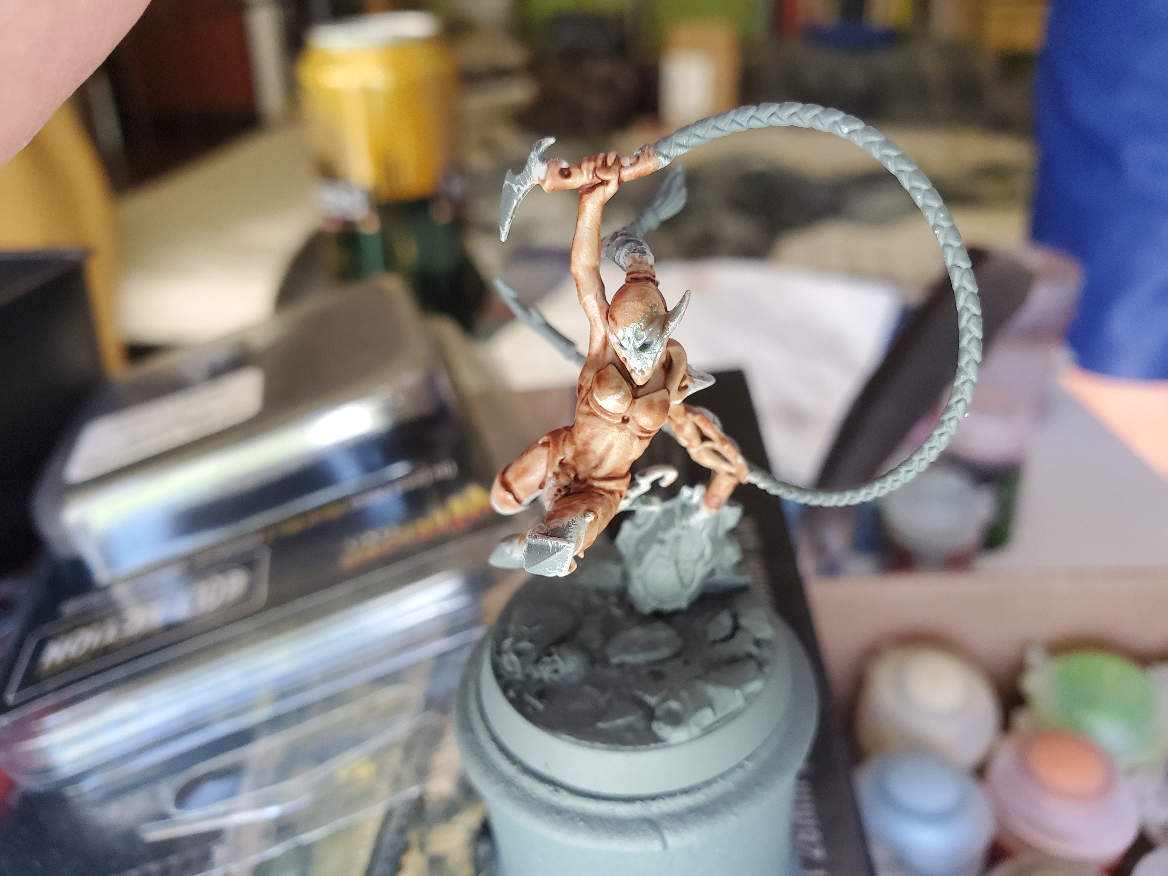
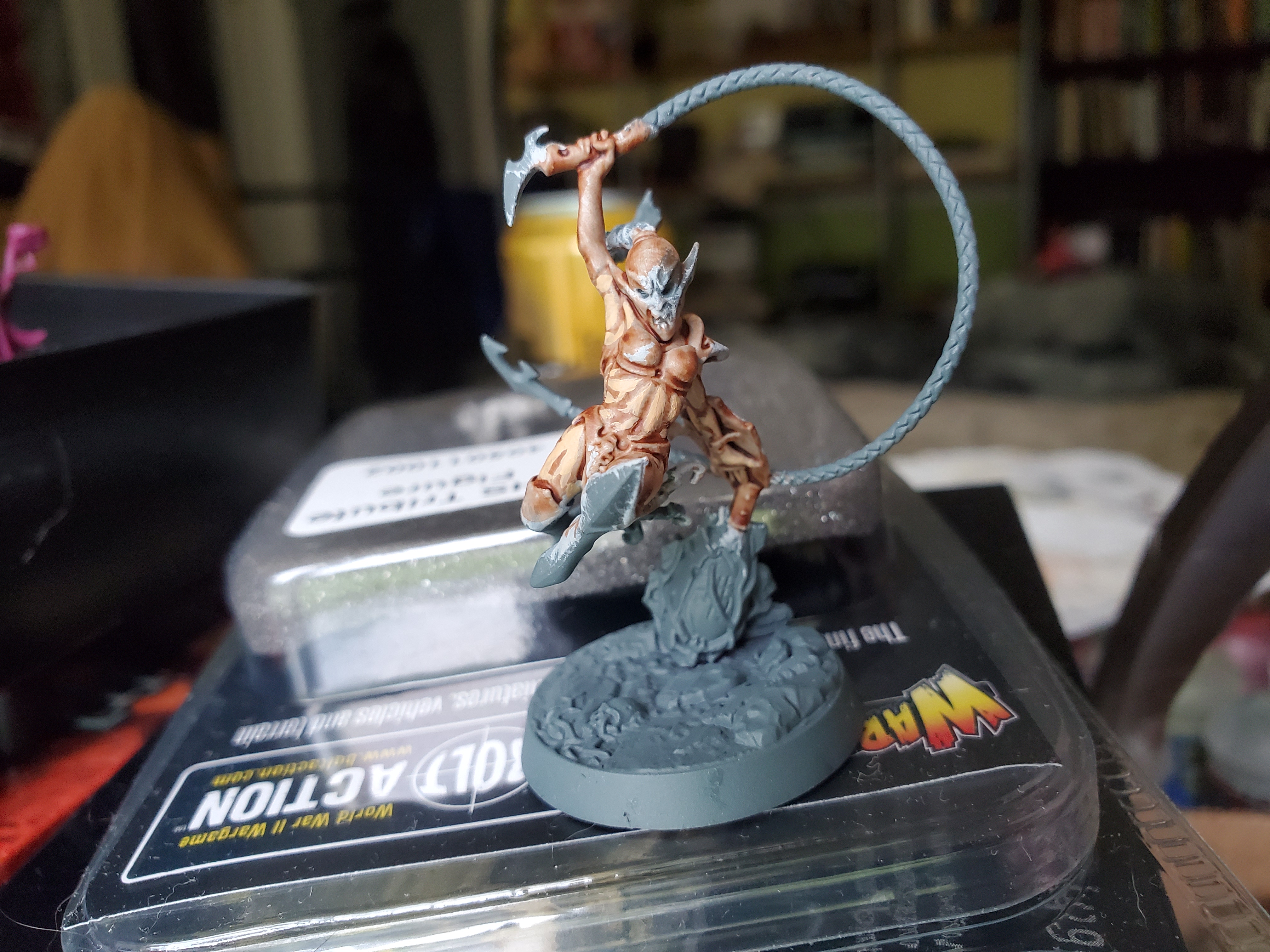
The Sister of Slaughter (who does have a name but I need to look it up) from the new Underworlds team (Morgwaeth’s Blade-coven) is now done. She was more of a busy project for me, so beyond the Contrast post earlier, I just sat down and painted when I had time. I’m rather pleased with how she turned out, though!
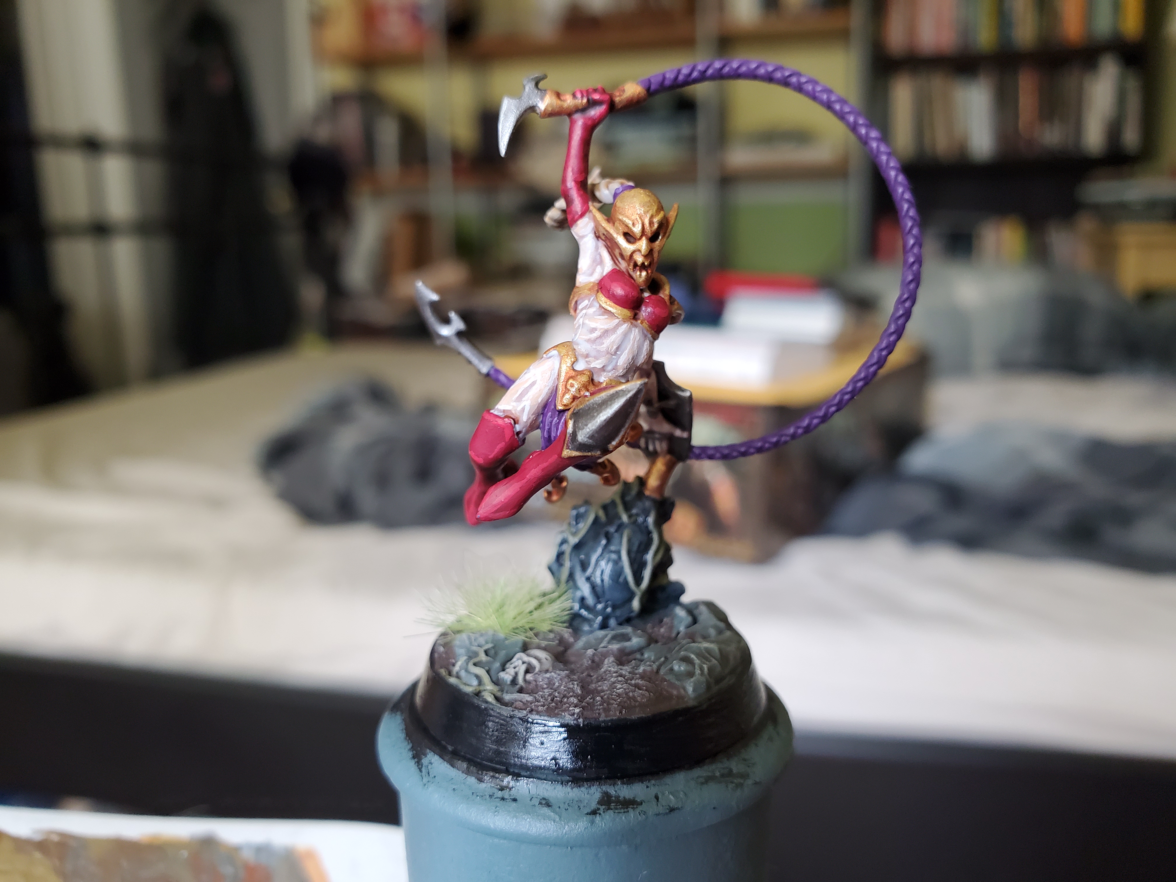 I chose my own colours, based upon a previous mini that I painted many years ago, going with red and purple. The purple isn't as obvious here, as Khamyss (I looked up her name) seems content to wear only three strands of cloth from her knickers rather than the usual loin cloth...
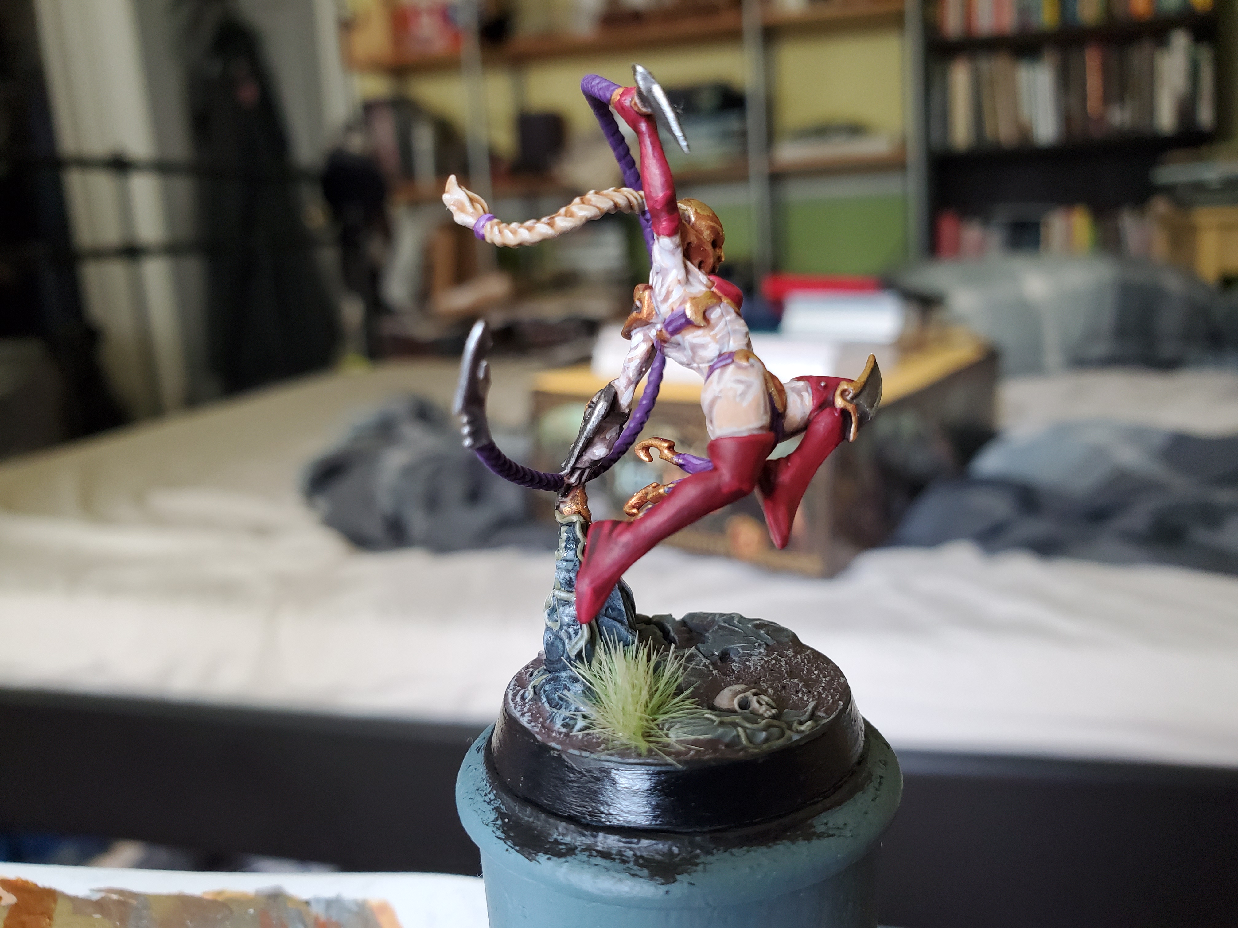 To comensate for the lack of clothing, I painted the whip in the same purple which is actually a colour I rather like. Doesn't show up as bright on darker basecoats, though, because I use a layer paint (Xerus Purple) from GW as a base.
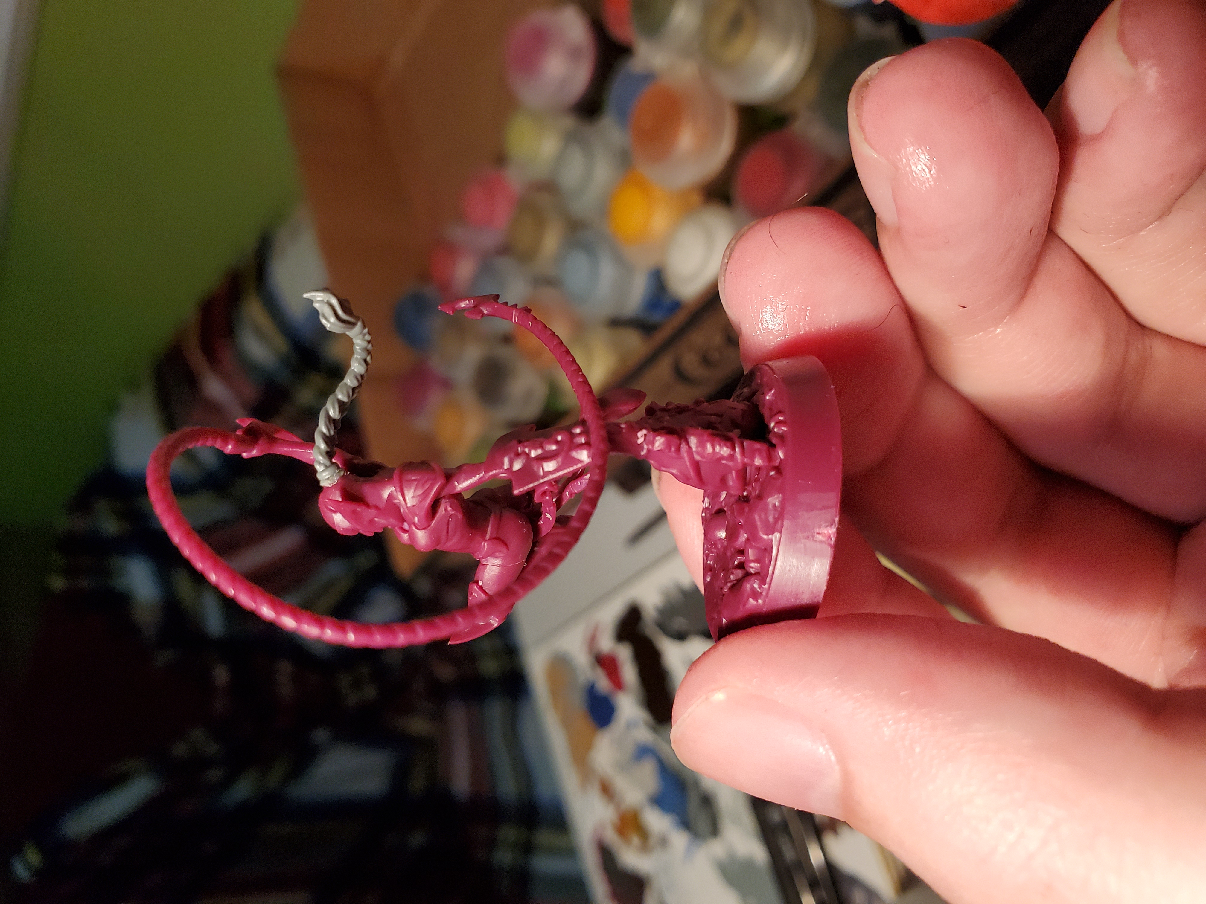
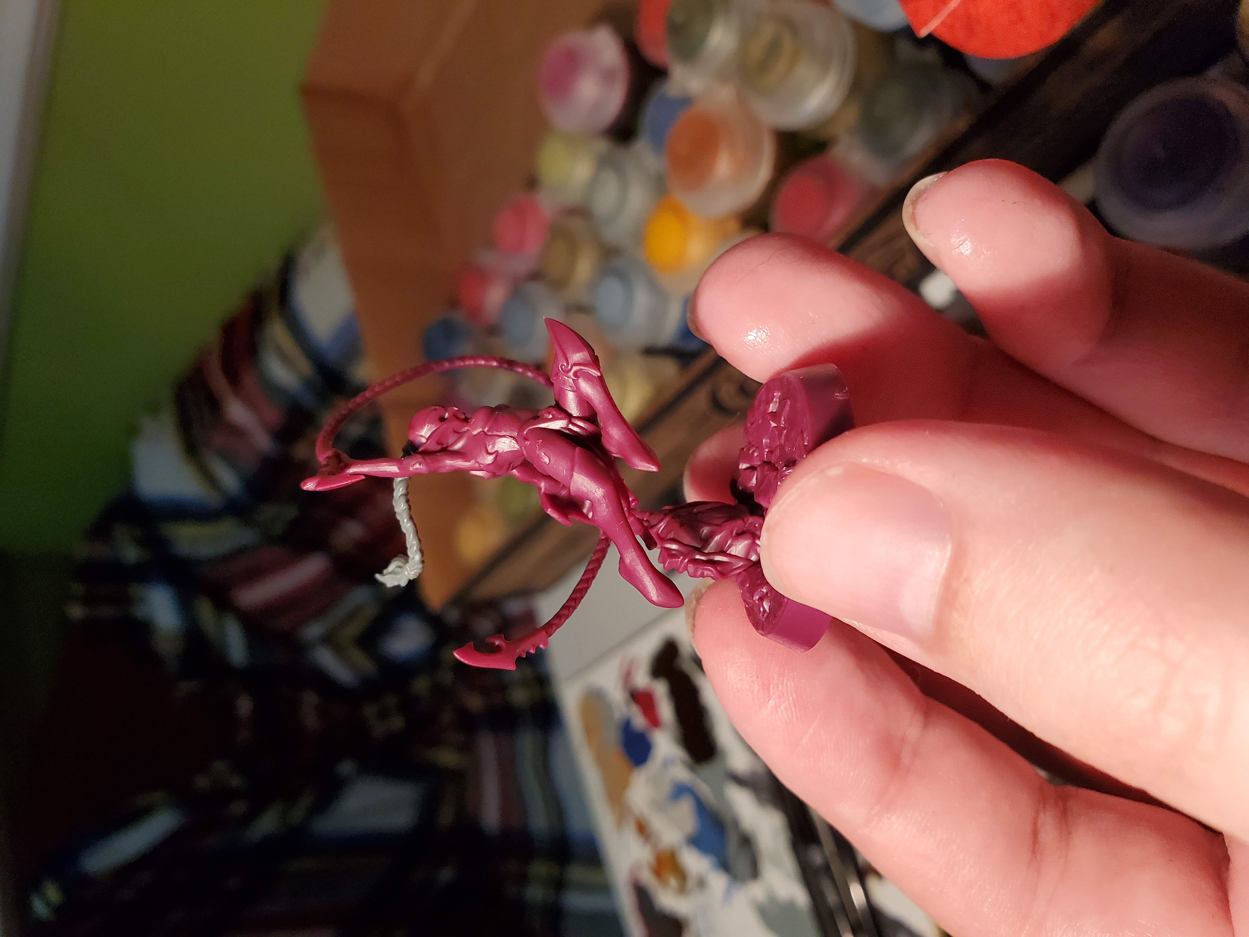
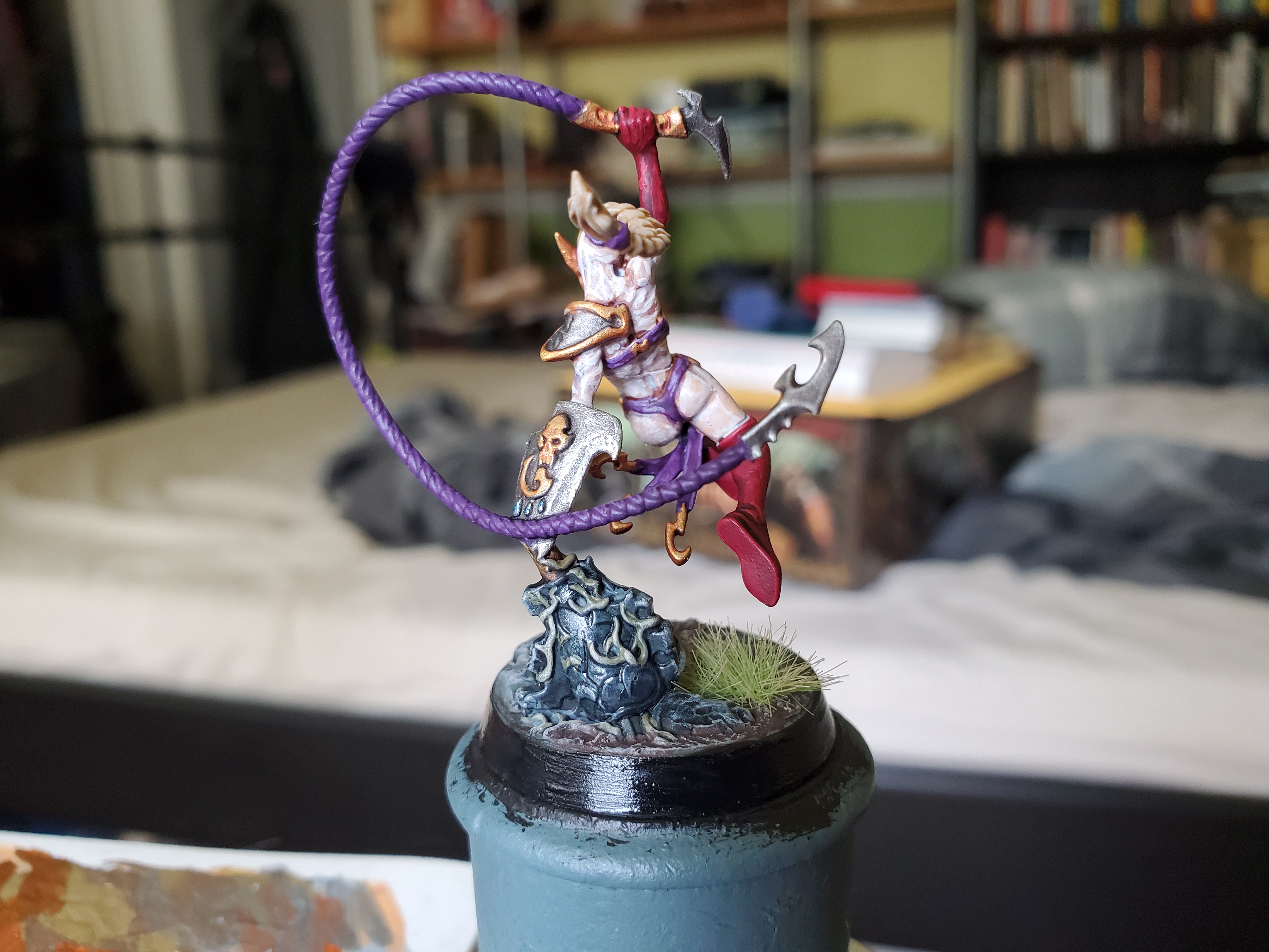 The traditional Lloyd shot.
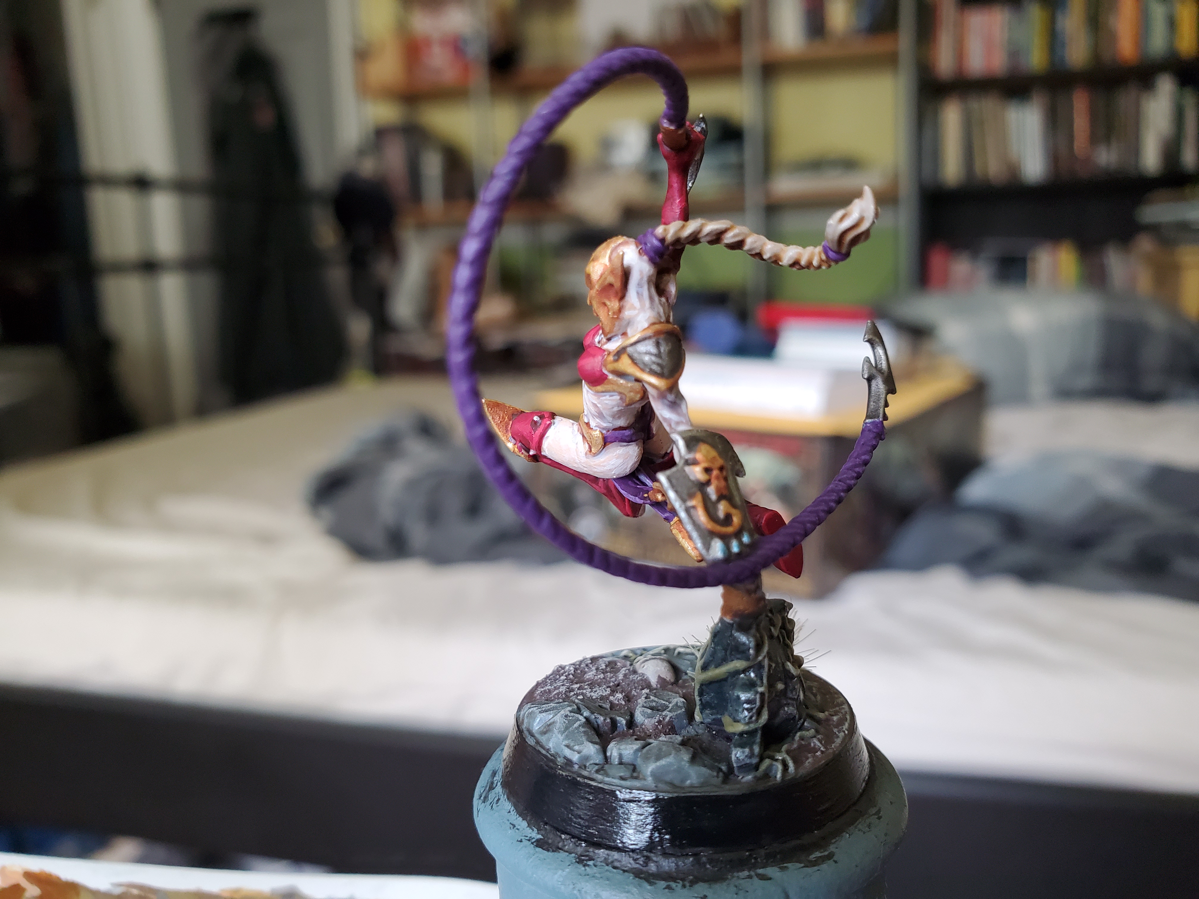 The sculpted base was a bit of a problem, as I wanted to make sure that these ladies would fit in with my Daughter's of Khaine army (whenever they come into existence) and they would have regular bases. I picked out the fallen statue in black (using Contrast) before glossing over it to give it a bit of a glassy, polished, sheen. Then I did the usualy paints before adding some of the texture paint to flatter areas to help them match the future additions.
All in all, I’m rather pleased with how she turned out and, in particular, how well my one addition (the ponytail) actually fits onto the mini almost seamlessly.
With school mere days away, I probably won’t be posting as often for a while, but I may move back to my Game of Thrans stuff just so I have them finished for when I eventually get the chance to play the game, but we’ll have to see. I may also cut down on the tutorial side of things, too, as that takes more time to prepare and photograph, but that’s a problem for future me; I don’t envy that guy!

![Zenit Miniatures’ Samurai Warlords Now Live On Kickstarter [Updated]](https://images.beastsofwar.com/2026/02/samurai-warlords-launch-main-600-338.jpg)