


Colour Theory… Part 4
December 26, 2011 by dignity


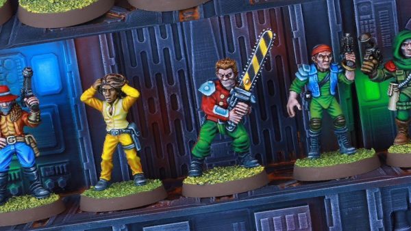
Video Sponsors: Infinity - Wayland Games
Romain continues his epic tutorial on colour theory.

See the whole series...
Supported by (Turn Off)

Supported by (Turn Off)
Supported by (Turn Off)


Romain, just wanted to say thanks very much for this excellent series so far. It’s really making me think about what I am painting, rather than just slapping down the basic colours from the painting guide. How many parts can we expect?
Also as an aside, I know you have already revieved paint makers in the past, but is it possible for you to let us know what you think the closest matched paint to the primaries are for the major ranges? I imagine that Vallejo will probably have close matches given the size of their range?
Thank you ever so much ! I do my best…
You can expect six parts, I believe.
The best bet to get affordable primary colors in acrylics is to buy them in tubes in a department store or an artists’ supplies store… They’re clearly labeled “Cyan”, “Magenta” and “Primary Yellow”.
In no particular order :
In Vallejo, it’s “Bald Moon Yellow”, “Magenta” and “Magic Blue” or “Intense Sky Blue”, I think.
For GW, it’s “Warlock Purple”, “Sunburst Yellow” and “Enchanted Blue”.
In the P3 range, it’s “Murderous Magenta”, “Cygnar Blue Highlight”, and “Sulphuric Yellow” (although “Cygnus Yellow” is an acceptable substitute).
In the Reaper range, it’s labeled “Clear Yellow”, “Clear Magenta” and “Clear blue”.
For the Foundry System it’s (approximately, alas) “Yellow 2B”, “Wine Stain Red 17B” and “Vivid Blue 22B”.
I don’t know yet about the Army Painter range, but no doubt they have the primary colors, especially since they recently expanded it.
That said, you DO NOT need the primary colors to mix things and paint properly… The color circle is merely a device to help you understand color, not an instrument to help you mix new ones. There are extremely wide ranges of tones for you to choose from when painting… and they’re often very complicated to get with the three primary colors !
Happy mixing,
BoW Romain
Romain, first, thanks for these series. I love them. Second, can you cover de-saturating metals? I would assume its just adding gray to darken it, and white to make it brighter?
Thank you, you are kind…
Desaturating metals can be tricky… I’ll cover it in a tutorial as yet unfilmed ! However, here is some short advice :
For metallic silver and iron, it’s impossible to desaturate it, because it’s already grey (albeit metallic).
Metallic gold is desaturated in the same fashion as yellow, or warm yellow… That is to say you may add grey, or ochre, or black in the shadows, and white (or better yet, silver, to keep that metallic sheen) in the highlights.
In the same fashion, you can desaturate copper as if it were a red/orange, and bronze as if it were orange/ochre.
You can also play with oxydation effects…
For non-metallic metal, the question is moot, as you simply use non metallic colors such as browns and yellows, and you can desaturate that very easily.
I hope I answered your question…
BoW Romain
Thanks! You sure did answer it!
I’d imagine the next video would be more appropriate to metals. If you think about your more common metals of silver/steel/iron they’re basically grey i.e. they already lack any hue to desaturate. If your painting a coloured metal like gold then you’re essentially painting yellow and you’d work it the same.
What makes it ‘metal’ is either grainy flecks of reflective metal in true metallics or extremes of contrast in NMM but colour wise the theory would be the same I’d imagine. If the next video is on brightness then that’ll probably be more relevant to metal.
Indeed, metallics are worked just like their regular color equivalent !
It is brightness that makes a metal shiny…
However, it is important to know about saturation or desaturation of metals, to obtain (for example) rich vivid golds, or very subdued, white golds…
BoW Romain
The desaturating with the complimentary is quite interesting. I had some Tamiya Gold Leaf on my pallet and mixed in a dab of VMC violet and the colour (or hue I suppose) had almost vanished to a near gunmetal but with the slightest hint of the golden colour still remaining.
Even though you’ve not put paint to mini yet I’m finding this series great! Can’t wait to the next one =D
I can see now how the eye will go the the saturated colour before the desaturated. Also I found it hard to choose or where the eye should go with the 2 saturated beside each other. This saturation method can be used to guide focus on many things. I think this will help me a lot in the future.
romain, i love these videos so much. it has helped me a lot on colour harmony and colour theory. keep up the great work man, ur the best 🙂
Your definitions / terminology confuses me just a bit. This is how I think of it…
A completely saturated color is a “pure” color. Perfectly saturated colors are also referred to as Hue’s. It is the purest expression of a color: absent any influence of the gray scale, either as value or as saturation. There are no neutral pigments of any kind in the color.
One of the most confusing elements of color theory and saturation seems to be the problem of describing hue without using terms like bright or dark (which are values of light). For example, you can have what would be considered a ‘bright’ green, but what you really have is a perfectly saturated hue of mostly green and some yellow which makes it appear ‘bright’, but has actually nothing to do with the amount of light striking the surface.
I like to think of desaturation as a sort of leeching process. In theory you’re not changing value (making the color brighter or darker) but rather are diminishing the purity of the color, in effect draining the saturation so that the color becomes neutral (absent of color regardless of the amount of light) which is, as you point out, gray.
I think its important to point out that normal desaturation of a hue moves to gray, but this is not the same gray for all hue’s. A deep hue (say deep purple) desaturates to a deep grey / black, where a more brilliant hue (say a pure yellow) desatureates to a brighter grey. Perfect desaturation should not change the value (the color should not get ‘brighter’ or ‘darker’, but move to a shade of grey that is of the same value / brightness.)
It’s really challenging to match the terminology to concept. One of the things that makes this hard is that saturation is best understood – in theory- as separate from light, yet in reality we can’t comprehend color without light. Its what makes theory so challenging.
This page does a good job visually demonstrating Hue, Saturation, and Value. (It helps me anyway!)
http://www.devx.com/projectcool/article/19954/0/page/6
Based on a quick study of the wheel, it appears that using complimentary colors does effect value to some extent? I find that desaturation using gray scale is really challenging as you almost always inadvertently change value, so I prefer using complimentary colors. But this does not always seem to be the case? I recall in a recent tutorial you desaturated yellow with purple (complimentary blending) and got a brown color rather than a gray color? Do secondary colors, when using contrasting colors for desaturation, tend to go muddy / brown rather than gray?
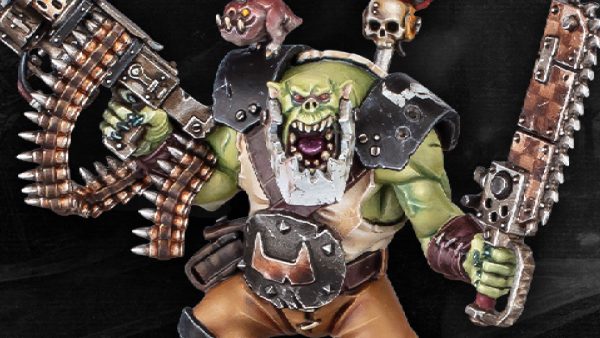
I appreciated the review of the instinctual tendency of focus. I think a good example of contrast of quality and hue in application is the GW paint scheme for the Goth Orks. The desaturated browns, and the black against the vibrant green skin naturally draws the eye to the ork skin rather than the clothing / armor.
Monochromatic painting uses one hue at various stages of saturation and value? Is this contrast of quality in its most extreme?
Keen as ever, @ubiquanon !
Yes, if you manage to find the complementary color (exactly) to the one you’re using, and at the same pigment concentration, shading with it tends towards grey, then black… In practice, it’s almost never possibel to find it exactly.
And you don’t always want it anyway.
As you pointed out, I used a purple to shade yellow into brown… But I used a purple that had more red than blue in it, not the exact complimentary color. Thus, it pulled the color more towards the orange (red + yellow) while darkening it… And dark orange is brown, usually.
As I said, in practice, you almost always get a muddy brown or a slimy green instead of a nice neutral grey… Which can be good.
If you want grey shadows, the surest way is… To add grey or black.
As for monochromatic paint, yes… it’s all value, and/or saturation. Jennifer Haley famously painted a whole ranger in sepia, with three paints : brown, black and white. The result is striking ! It is usually reserved for atmospheric and artful pieces… But it can be used to great effects for a certain chapter of space marines in pure white armors, or for ghosts, and that sort of thing.
It seems you have a good grasp of all these subjects, and are ready to dig deeper with each video…
My advice to you is… Digging is good, experimenting is better ! You can’t know how paint reacts until you’ve seen it react first hand. Keep painting !
BoW Romain