


![How To Paint Moonstone’s Nanny | Goblin King Games [7 Days Early Access]](https://images.beastsofwar.com/2024/12/3CU-Gobin-King-Games-Moonstone-Shades-Nanny-coverimage-225-127.jpg)


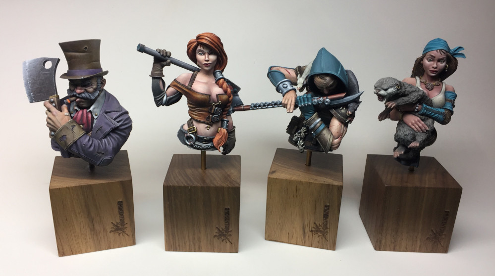
Avicenna Paints Guild Ball Busts


Next up, Brisket
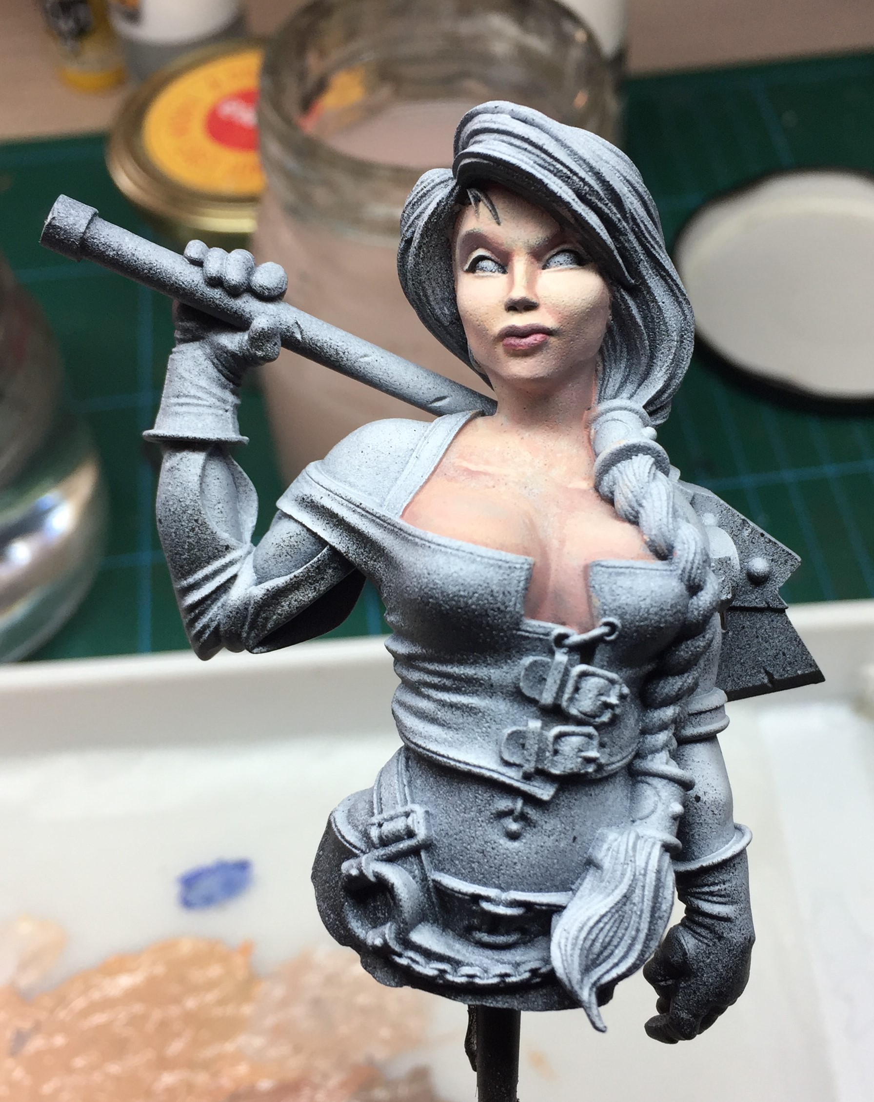
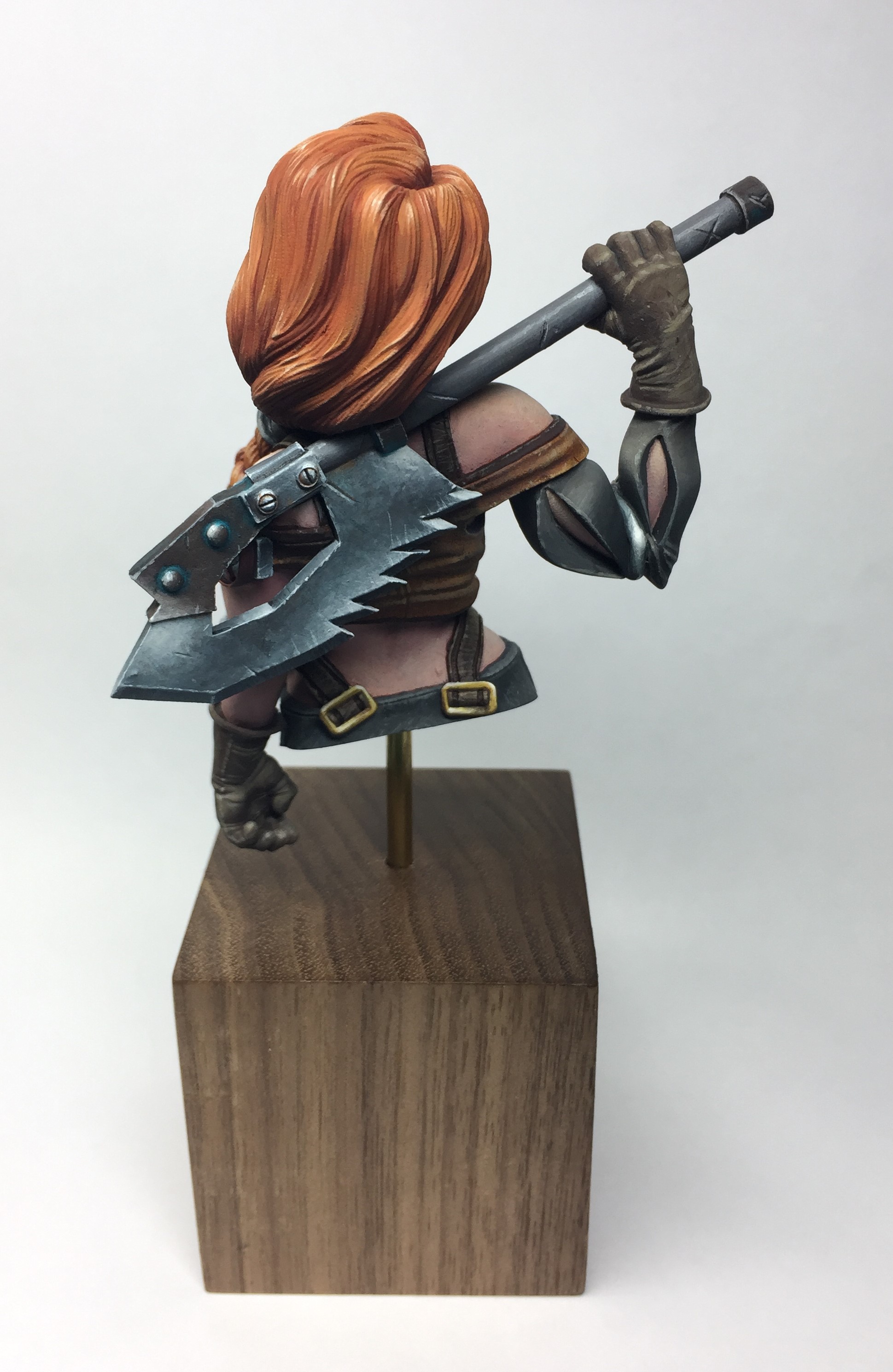
Before I finished painting up Rage, a fourth bust turned up in the post and this one was another beaut. It was Brisket from the Butcher’s Guild and she jumped straight to the head of the queue!
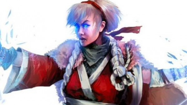
First things first, what does Brisket look like? A quick google search brought up this artwork from the guildball game itself.
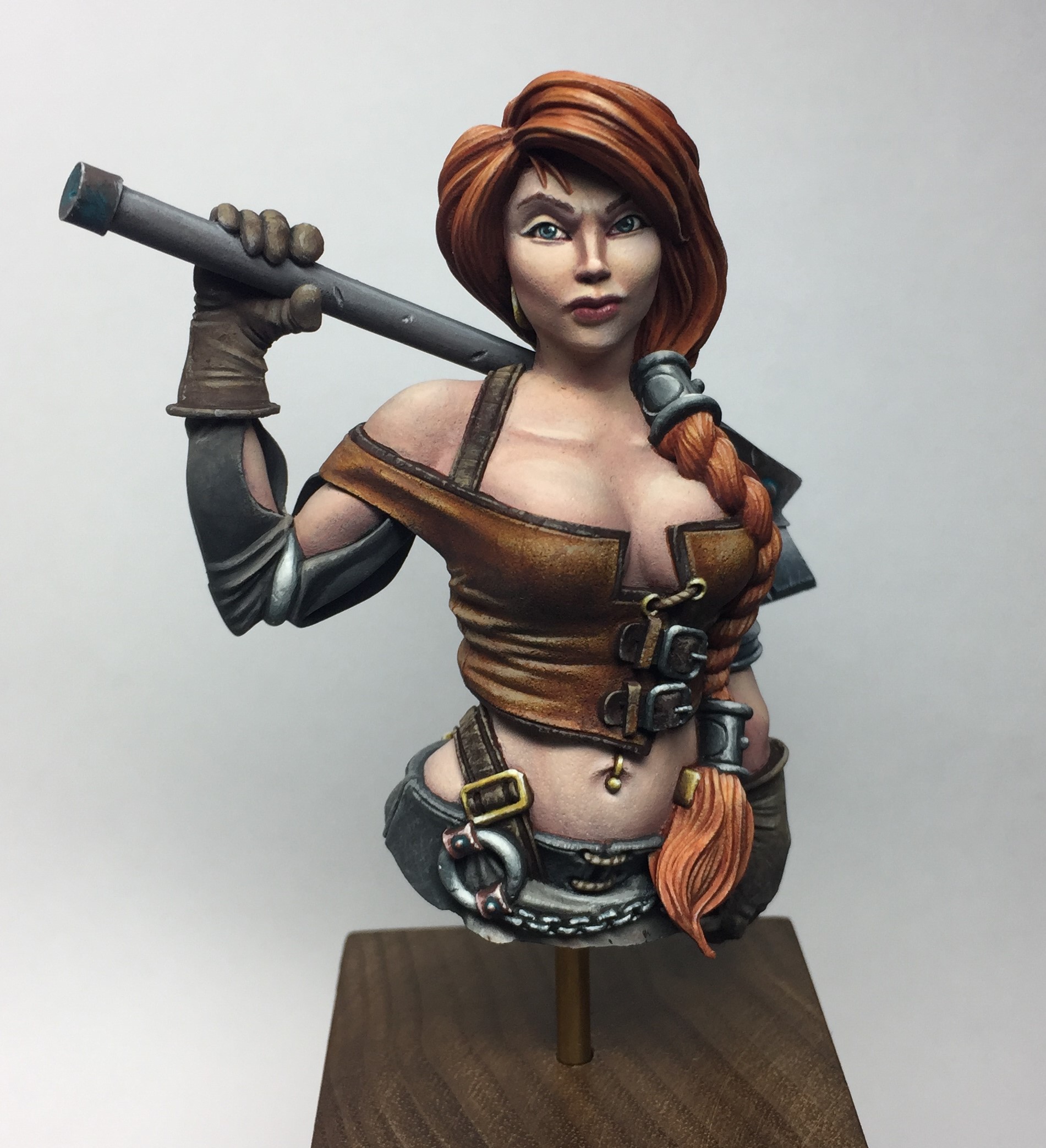
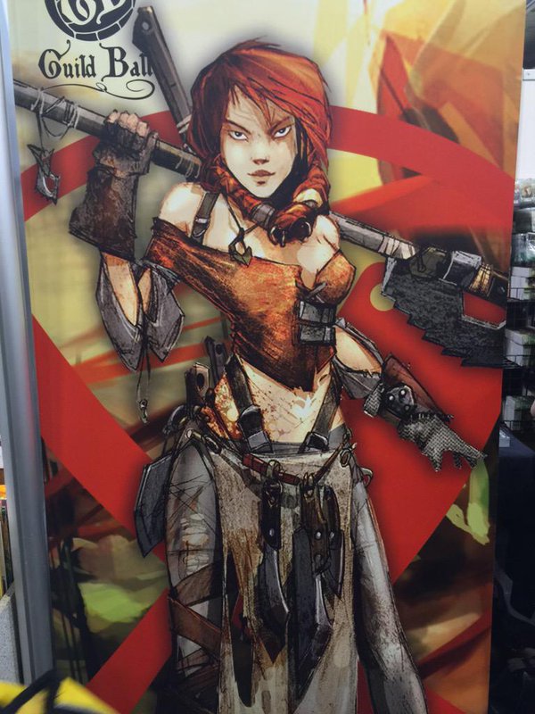 So a sassy looking red head - should be fin to paint!
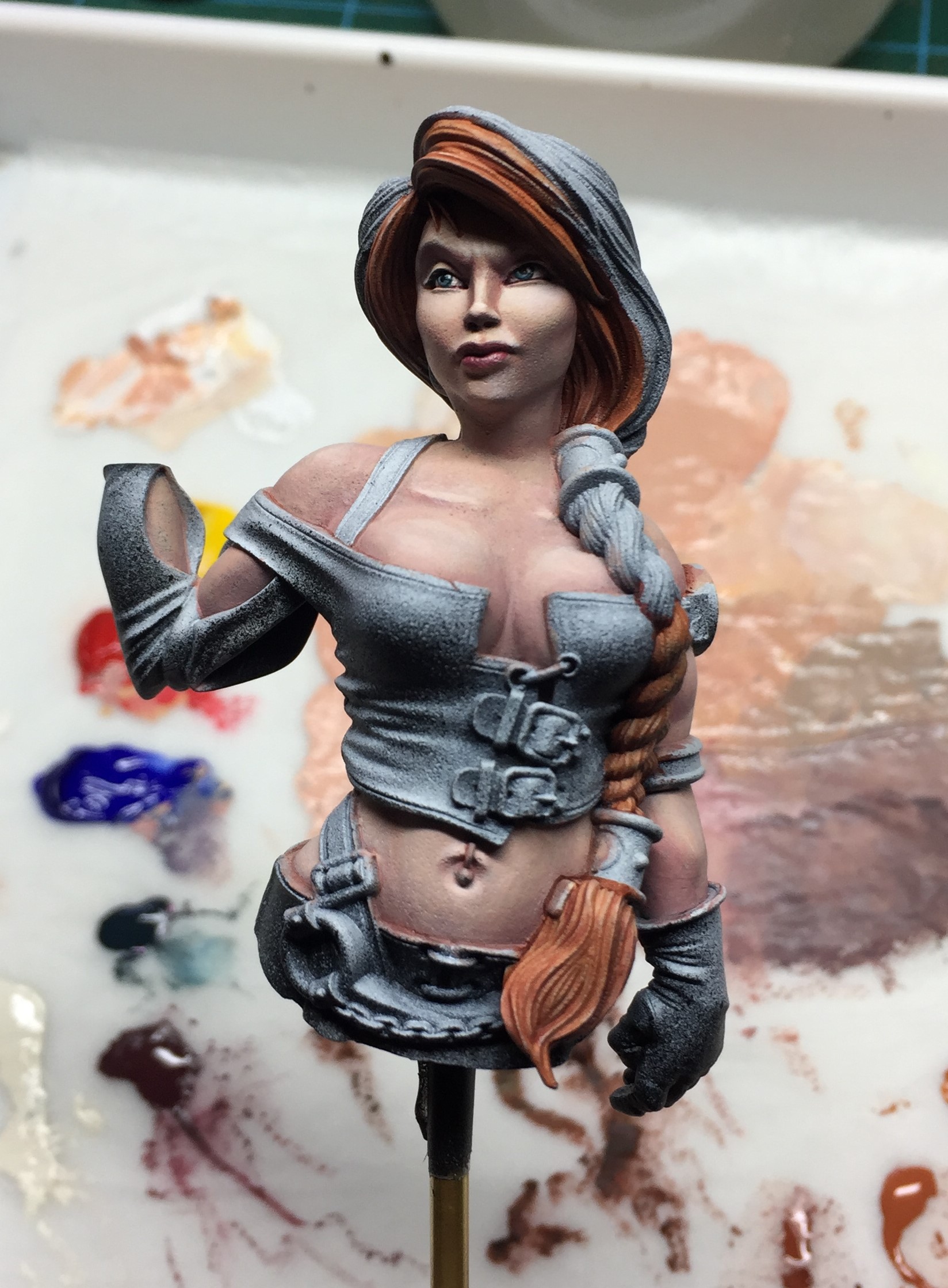
As I mentioned in the previous segment, I wasn’t really able to get many work in progress photos of painting Rage’s skin as I tend to paint ‘wet on wet’ or ‘wet blend’ those sorts of nuanced colours. This makes it difficult to stop and take a photo, but I thought I’d give that a try on Brisket.
So this post is going to mainly look at the way I painted her skin tones.
Lets start with my palette set-up
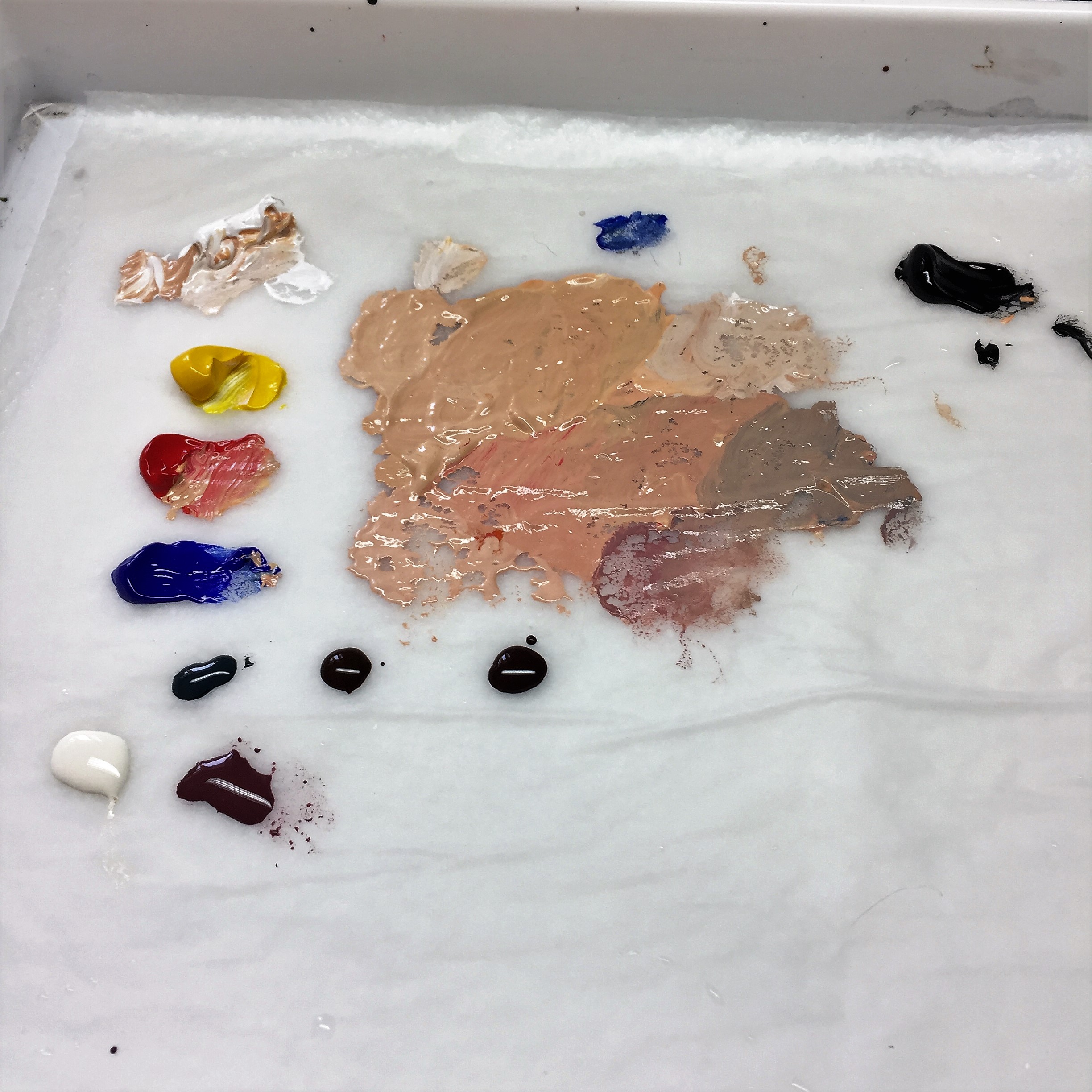
You can see my main mix in the middle of the palette which is mixed in pretty much the exact way as I showed in the video on the Rage part of the project – primary colours + black + white. I have also mixed various tones and shades that I can use throughout the painting process.
Below this large area of paint is three blobs that look almost black in this photo. I can assure you they aren’t quite that dark in the flesh and are three of my staple colours
- P3 Coal Black – this is a very dark, desaturated turquoise and a paint I frequently use in my darkest shadows, even if it is just a tiny dot of it in another colour.
- Vallejo Armour Brown – a redy brown that I use a lot as a glaze to add warmth and shift the colour of flesh tones.
- Vallejo German Camouflage Black Brown – this is a dark, desaturated brown. I use this as a dark liner where I don’t want to use black, or as another way to get some darker shadows into the flesh.
Below these three paints is 2 more pools. These two are also two of my “go to’s”
- Vallejo Ivory – this is like my standard highlight colour. Not as stark as white but still gives a good amount of contrast
- P3 Sanguine Base – I use this a lot for fleshy areas of many kinds. Inside of orcs mouths, edges of old wounds, and in this case Brisket’s lips. I also used it as a shade colour for her flesh tones.
Let’s look at how I applied the paint.

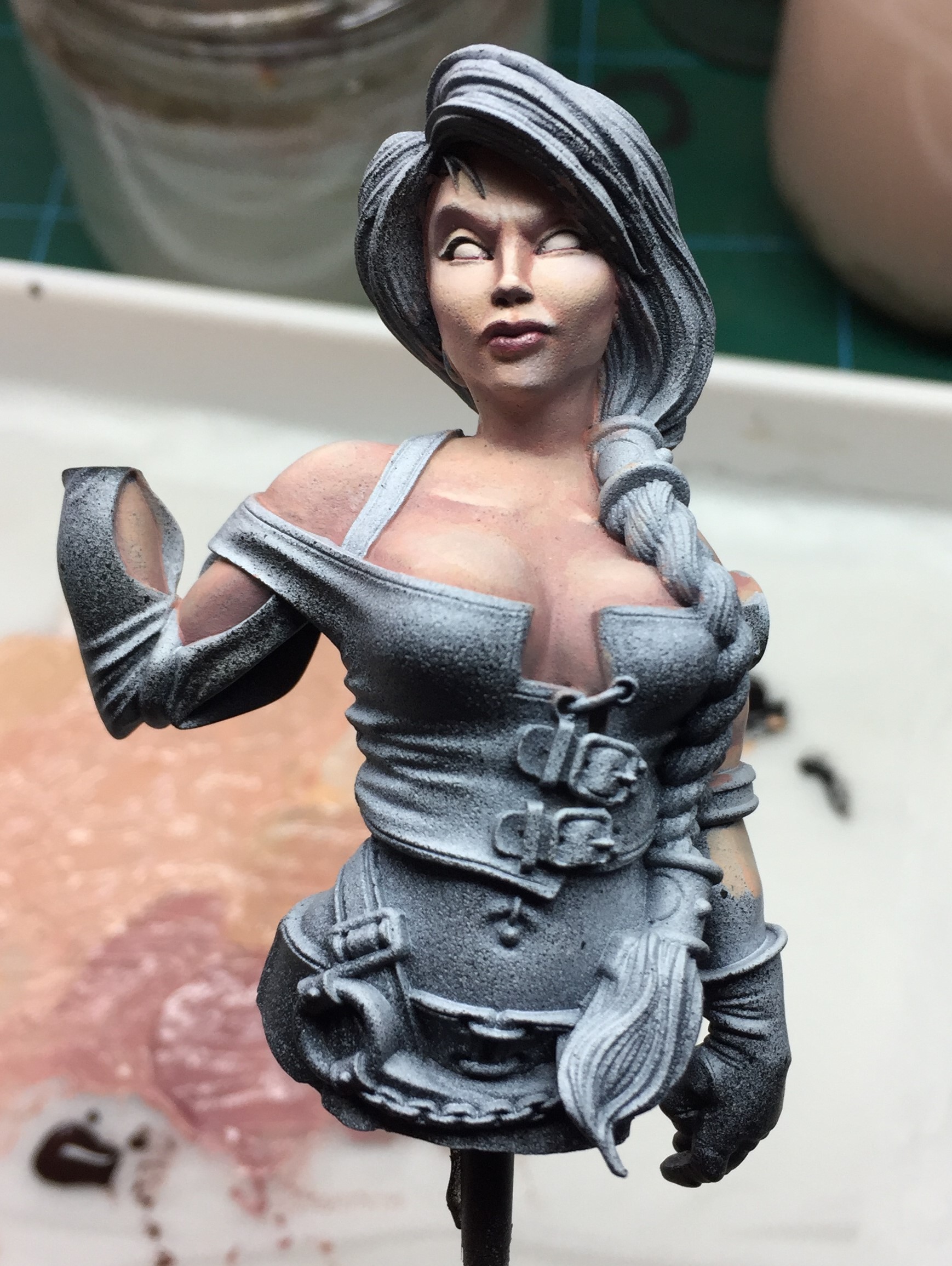

You can see that I tackled each section of flesh individually at first. This was for 2 main reasons:
- I was creating the initial gradients of colour and shade with wet paint and if I tried to do this on too many areas at once the paint would be drying before I worked my way round.
- It allowed me to be mindful of the zenithal priming and it meant that I could use this as a reference as I painted each area. If I painted it all a flat flesh tone from the start, I’d have lost all of this information.
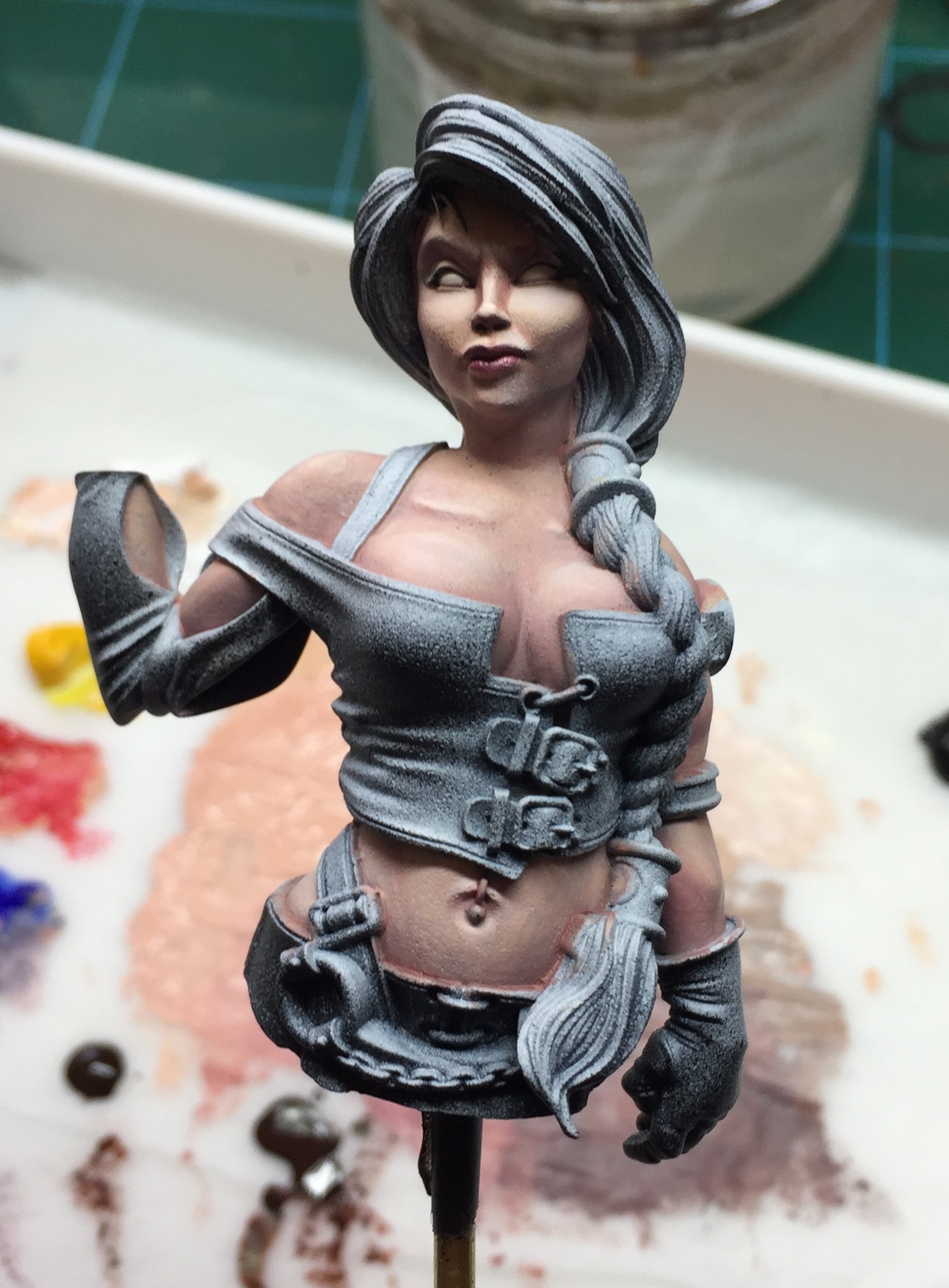
What may not appear too obvious in these photos is that I also refined all of the areas of flesh as I added paint to new areas. This meant that it could be quite rough to start with and may also still have some of the primer showing through, but by the time I got to the last image it was a lot smoother, and the shadows were much darker. I used a real mix of the darker colours depending on where the shadow was – for example, under the arms and in the recesses of her sleeve, I used more desaturated, cooler tones and round her face I used more saturated and warmer tones.
You can also see that part way through this transition, I painted the eyes in – for this I used the ivory on my palette. I also painted her lips and gave her some subtle rouge on her cheeks. Both of these details were in the P3 Sanguine Base mentioned earlier.
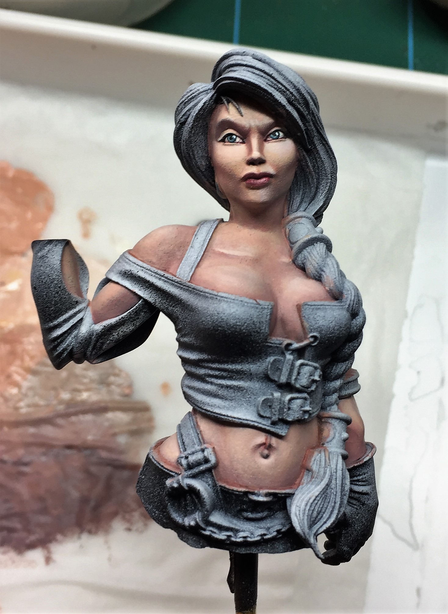
I refined these flesh tones further, pushing the highlights a bit more and sorting out any patchiness of colour, and painted in her eyes.
 The eyes have it!
The next steps were painting in the rest of the details.
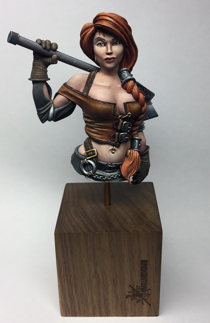
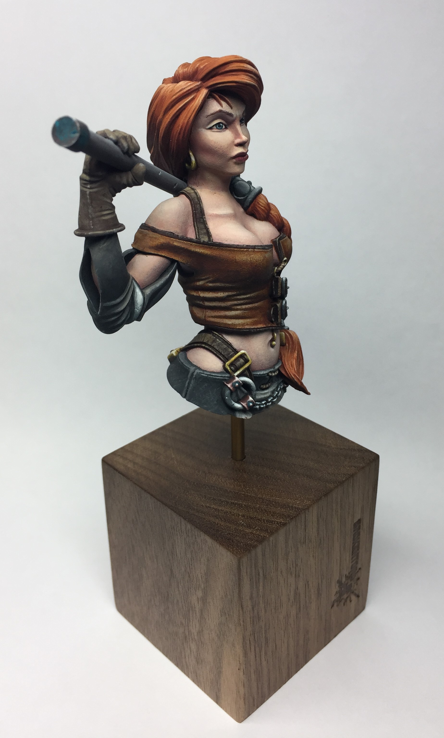
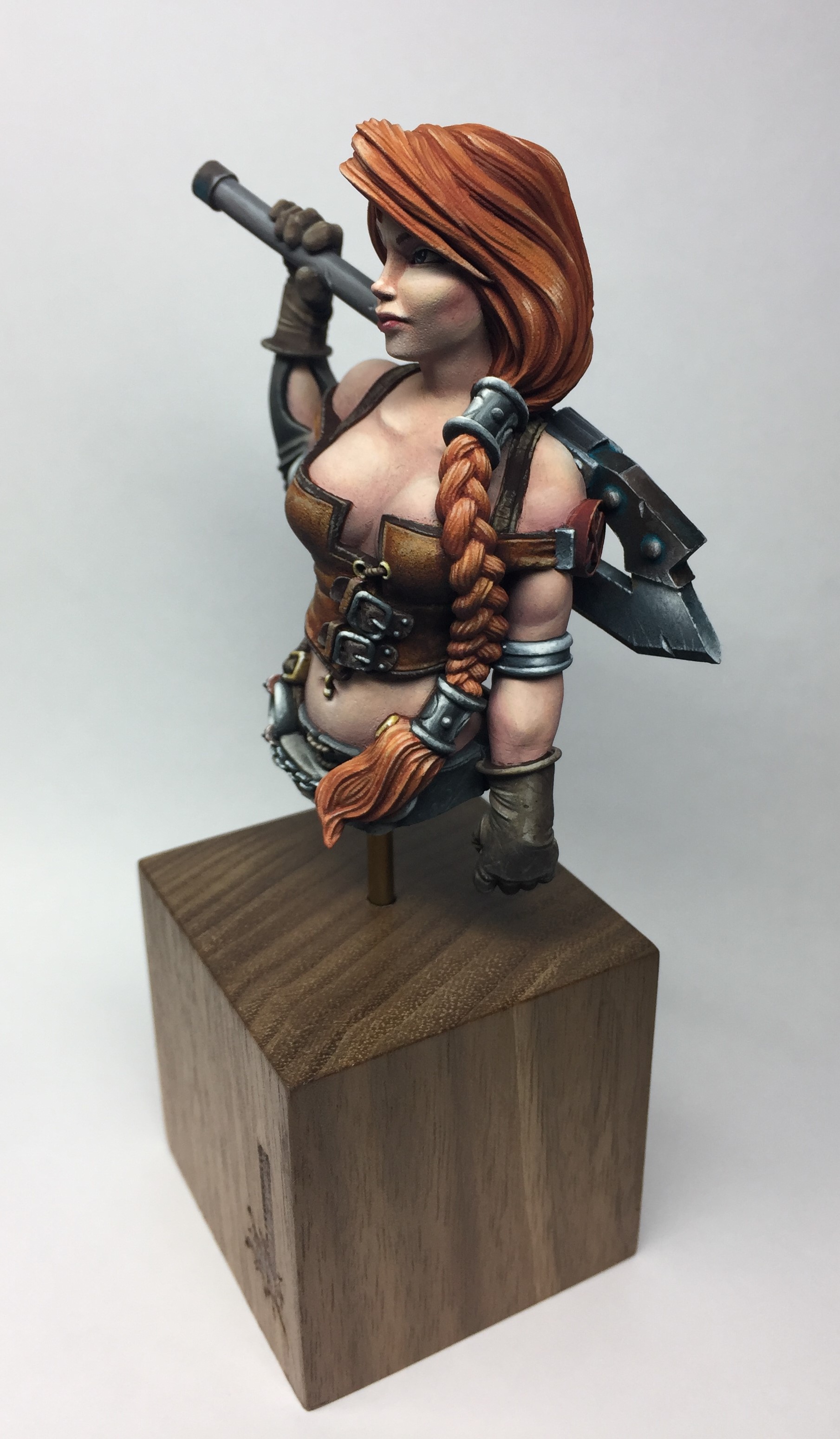
In a bust like this, where it is larger than a typical wargaming miniature, I always feel that it is worth trying to incorporate as much variation in texture into the piece as possible, taking advantage of the different materials present to try and represent them in the paint.
With this in mind I focussed on her leather top letting the spatter of the zenithal priming come through to give some of the texture, but kept areas like her sleeve as smooth as possible to try and simulate a smoother fabric and then enhanced contrast on the metal areas to make them appear reflective.


This all culminated an a fun piece that I really enjoyed working on.
If you have any questions please ask!


Leave a Reply