


![How To Paint Moonstone’s Nanny | Goblin King Games [7 Days Early Access]](https://images.beastsofwar.com/2024/12/3CU-Gobin-King-Games-Moonstone-Shades-Nanny-coverimage-225-127.jpg)


Odds, Sods n ......Stuffs. A Medley of Mayhem


Darth Progress!
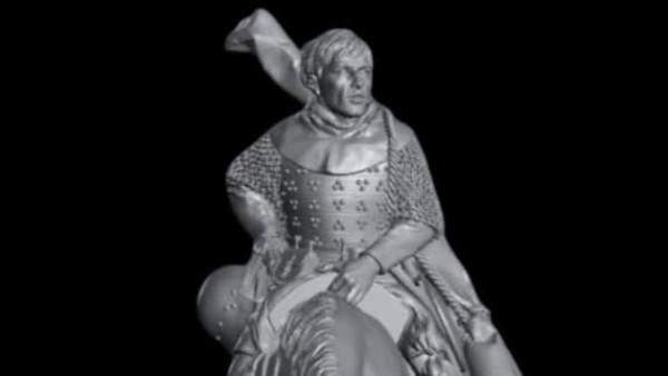
With Darth’s plinth base finished (see below) twas time to get stuck into Darth himself.
Painting black……….. I generally enjoy painting black. It does come with some caveats usually though. Most noteably you need to balance the deeper black spaces and the highlights very carefully otherwise your mini who is supposed to be clad in black looks like he is wearing grey.
Secondly – temperature. Even though black (grey & white as well) is not a colour but a shade, temperature still can and does play apart. With all the heat and warmth coming off the base, I wanted to ensure that Darth’s blacks would be cold to contrast against the warmth of the base. This meant using blues in the mixes for his garb.
Thirdly – not all materials react and reflect light in the same way. Darth has several different types of materials in his dress – softer leathers of his gloves and boots, the weird ass trousers he wears with their….. quilting, the rogher thicker material of his cloak and finally the super reflective shiny material used for his armour; greaves, helmet and cowl.
All of these differnt materials will react in a differnt way and therefore need to be treated appropriately. So the highlights on the cloak will be of a different and less reflective nature to the highlights used on his helmet for example.
I decided to work up all the softer materials first – bringing up the softer midtones and highlights to a certain point. The cloaks’ highlights stopped shorter than those for his gloves and trousers as they have softer lines and flow to the slightly sharper apices of the weird trousers fabric. I also needed to note and make allowances for where the OSL glow from his lightsaber would later fall on the materials as well.
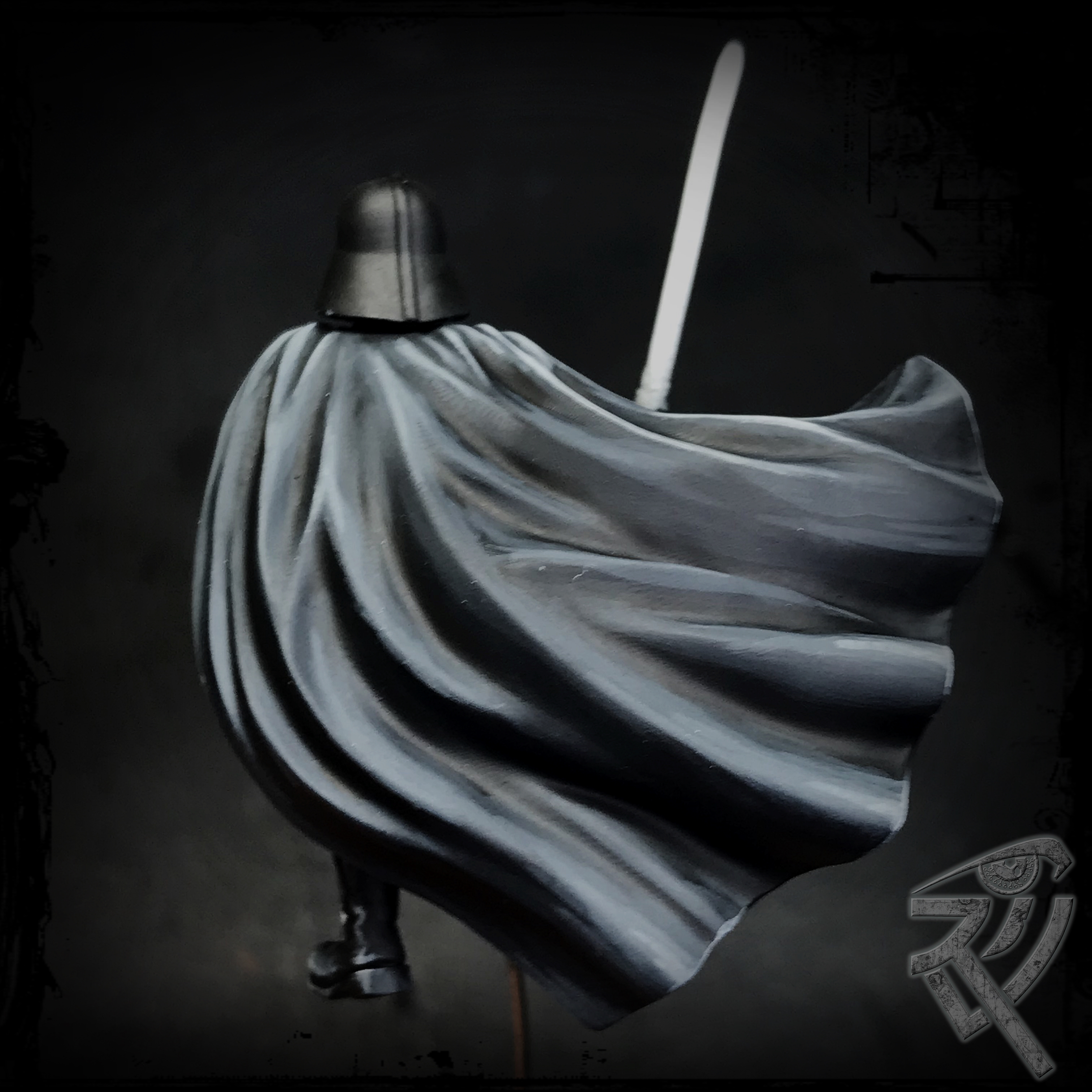 The progression and height of the highlights on the cloak are much softer and more extended than those of the soft but sharper apexed material used in teh trousers, which in turn will be softer than those used on the hard shiney armour pieces
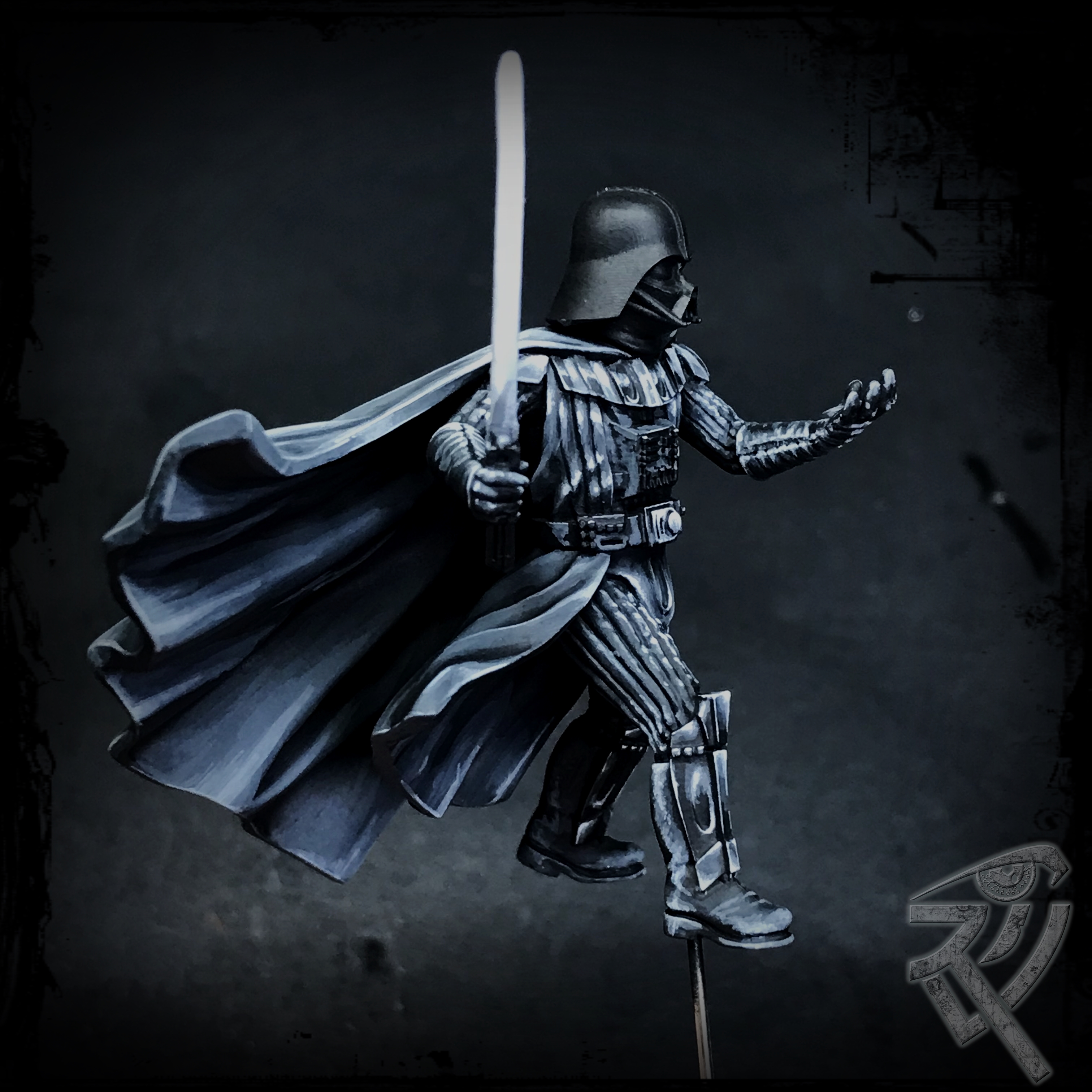
The cloak in this limited version of Darth Vader is pretty lovely in its flowing and billowing but a bit of a shit to paint!! So with the volumes (usually shown by the contrasts b/t shadows, midtones and highlights) of the cloaks in place I brought the highlights on the righthand side up a little further as they will be lit and tinted by the glare fo the lightsaber.
I did the same for his trousers and gloves but as they are leather which is more reflective usually than the wool (or whatever Vader’s cloak is spun off) of a heavy cloak, I brought some of the apex highlights here up further.
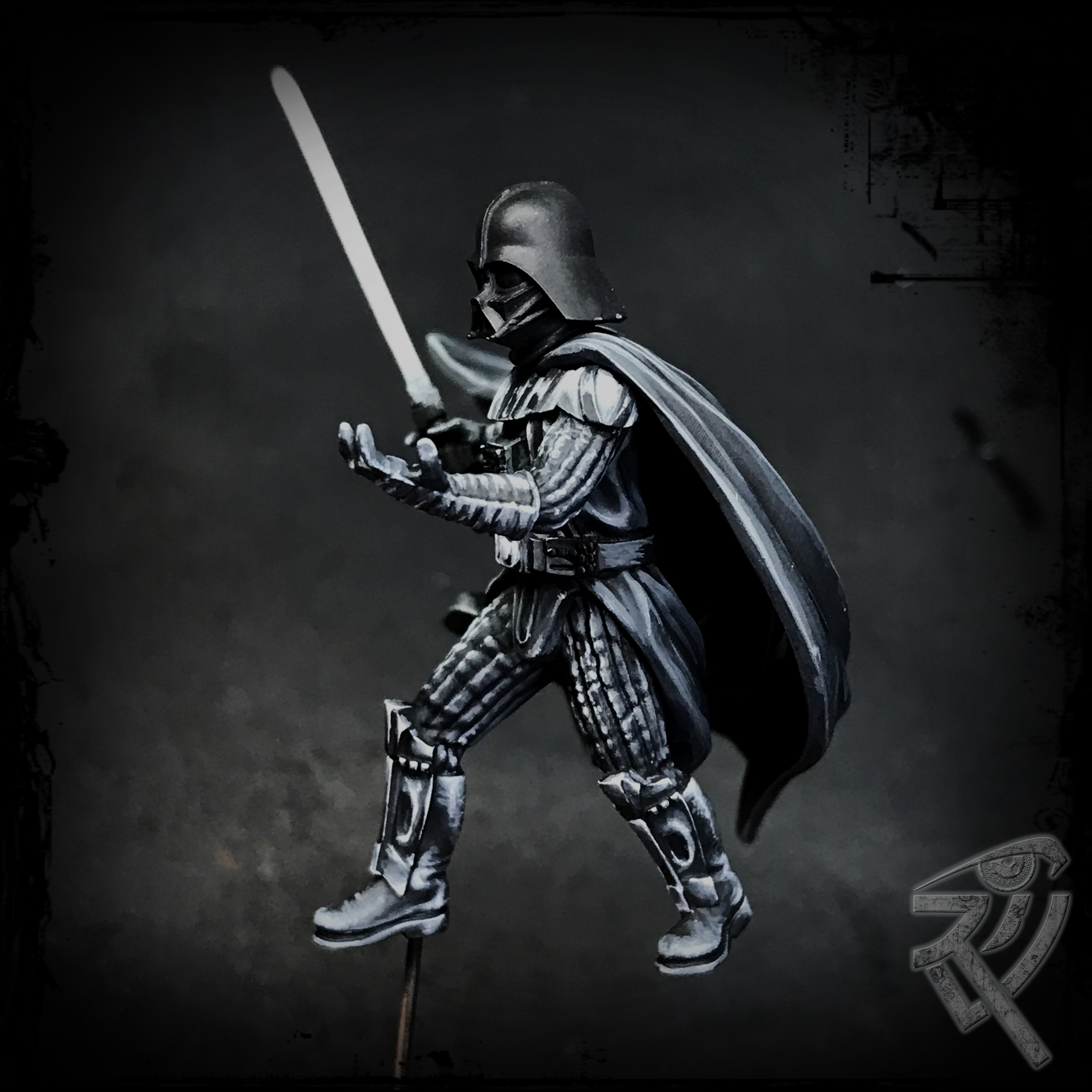
When it came to the armour pieces – I needed to firstly make the highlights and midtones much more compact and secondly to bring them up to almost pure white due to their highly reflective surfaces.
In these workups i was more concerned with getting the correct reflections and highlights in place than with ensuring the black shadows were deep and broad enough to stave off the possibility of everything reading more as grey than black. This problem will be taken on and solved later in the glazing phase.
Here the goal was made sure the armour’s shiny reflective nature was tackled and read as such.
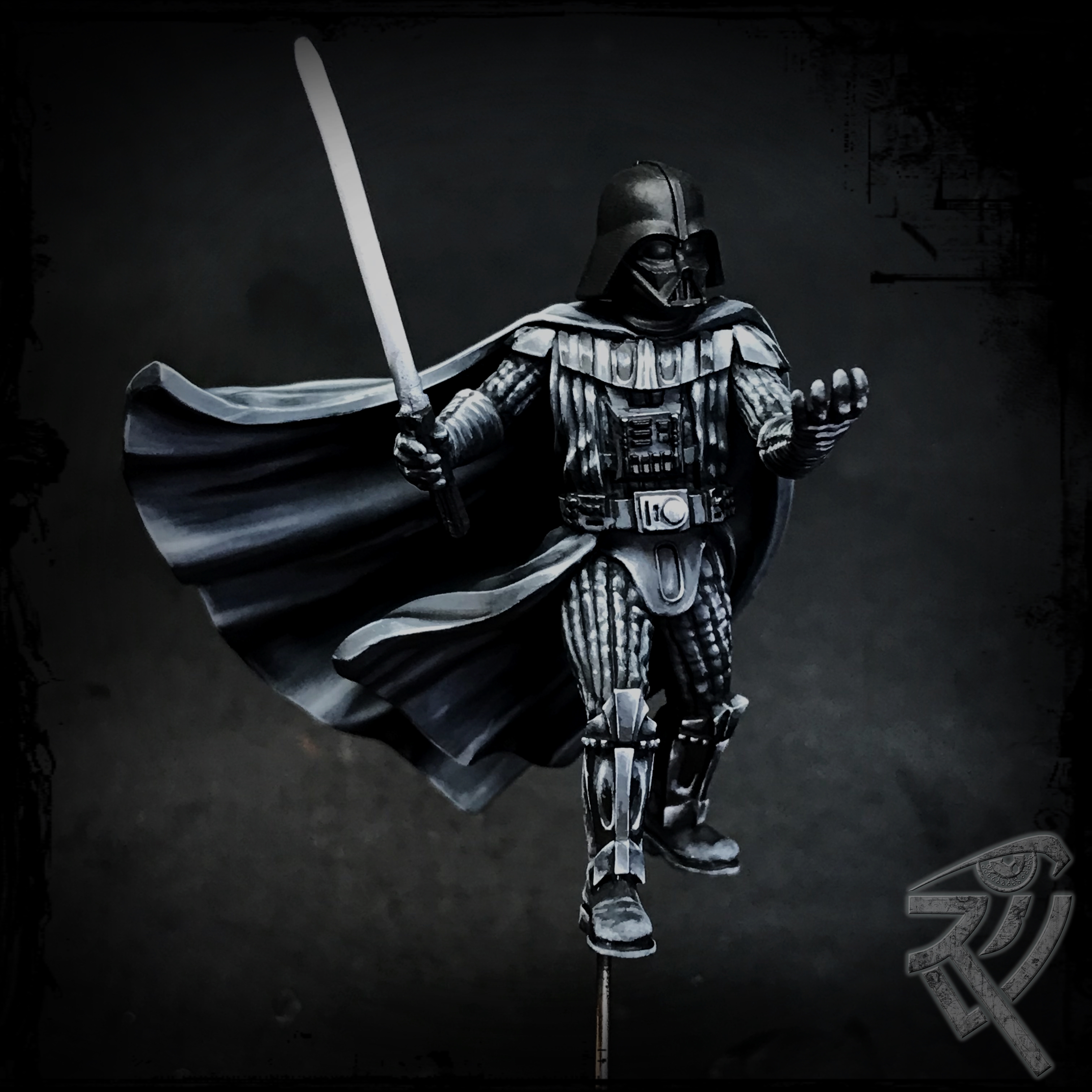
And that is where we are. There is still the question of depth and reducing back the amount of real estate that is grey rather than black to be tackled and that will be addressed and refined once all the highlights are in place.
I left the helmet till last as it has the trickiest of shapes involved – spheres. Spheres are a pain in the arse at times esp when it comes to reflective workups – nmm for example as the reflections act very differently and more complicated than flat edged items.
Once the helmet has been highlighted and of course also in relation to the lightsaber and its glare, then come the glazes.
A quick note on paints. All this was done with 4 paints. VMC black & dark sea blue ( as I said earlier, I wanted to ensure a cooler nature to the blacks used on Darth in contrast to the warmer base) and ScaleColour graphite grey and white. The initial base mix was a mix of black and dark sea blue and then the highlights came from adding increasing amounts of graphite grey and then white into this base mix.


I take great relief in the fact that the light sabre is crocked! 😉
Barely. that thing was a freaking nightmare to straighten. At first it looked like a dodgy dildo. With hot water treatment, i got it as straight as I could but that little kink 2/3s of the way up just refused to play ball.