

![Pure Sci-Fi Nostalgia! War Rocket Review | Hydra Miniatures [7 Days Early Access]](https://images.beastsofwar.com/2026/02/unboxing-hydra-miniatures-war-rocket-coverimage-225-127.jpg)


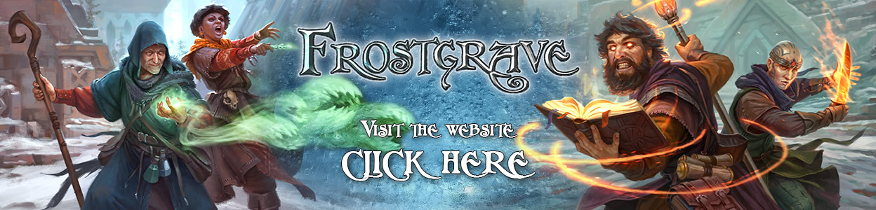
Frostgrave Miniature Painting Tutorial | Frostgrave Wizard #FrostgraveWeekOTT
December 24, 2020 by johnlyons
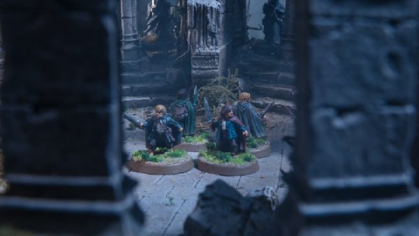
John gets stuck into a miniature painting tutorial where he explores painting up a Frostgrave Wizard to lead your warband in the 2nd Edition of the game!

Frostgrave Books - Frostgrave Miniatures - Frostgrave Terrain
We go through all the stages of painting up this excellent miniature which can be made using one of the plastic kits from the team at North Star Military Figures.
Comment To Win A Frostgrave Bundle
We will be picking winners from three of our communities: YouTube, OnTableTop & from our Cult Of Games Members.

- Frostgrave 2nd Edition Rulebook + The Red King Expansion + Cultist Plastic Box (Cult Of Games)
- Frostgrave 2nd Edition Rulebook + The Red King Expansion + Barbarian Plastic Box (YouTube)
- Frostgrave 2nd Edition Rulebook + The Red King Expansion + Soldiers I Plastic Box (OnTableTop)
How would you approach painting your Wizard?

![Zenit Miniatures’ Samurai Warlords Now Live On Kickstarter [Updated]](https://images.beastsofwar.com/2026/02/samurai-warlords-launch-main-600-338.jpg)

I would be tempted to paint that hat to look like a traffic cone 🙂
I like the look John has gone for but I’d go for a more ragged browns and worn look I think, I like the idea of the enchanter down on his luck looking to strike a big haul…I just wouldn’t be able to make it look as good as John does ?
Hes not in my hands so I can’t say for certain, but I can’t help but fear that from more than a foot away he looks like hes been given a light zenithal highlight and no actual painting. Its too muted and dark. Mind you, he’s perfect camo for the grey stone and snow of Frostgrave
You do have a good point. But it’s an easy fix by changing out the base colour for the robes. I think the lack of contrast (no pun intended…kinda..) is what may trick your eye here.
Quite possibly. The pic above is a lot clearer than in the video, so perhaps it just needed better lighting, or someone has tweaked the contrast for that image?
Always enjoy watching the painting tutorials
a Classic Wizzaaard with pointy hat.
Definitely feels like a wizard whose seen some battles.
Choosing a color scheme is always the hardest part of painting for me. I don’t come from a art background so complimenting and contrasting colors are always hard to determine. I usually go for a piece of artwork to inspire my choices, and then adjust to either things I like or limitations of the model. Looking at the game of Frostgrave and the sculpt of the model, this wizard does not look flashy to me so I would also choose a darker color for the robe and leather. He does look a bit beat up so a little weathering would work nicely. Great job John.
All I would do persoanlly if I went back to him now would be to add a brown wash to the lower parts of his ribes, and maybe highlight up the leather a bit more carefully to get that weathered look to him 🙂 Thank you.
Passes the three feet test easily. I like the grey blue end product, but you could probably have given a heavier highlight of the blue because it’s a great colour.
Nice job, he came out looking great.
I’m also all for the “see where the mini takes you” idea of having a basic concept to start and then trying things as you go.
I also think the darker look fits really well with the feel of the game. I might have gone a bit brighter on the skin to help to differentiate it from the leather but all in all looks like a solid, weather wizard adventurer 🙂
I wish I had given the skin a brighter base coat. That would have helped a lot more 🙂
Love that your covering Frostgrave from all angles.
Another great tutorial. You guys spoil us all!
Would just paint a “red Wizard” of some sort…to keep in the holiday season! 🙂
Merry Christmas, my friends!
I feel I missed a trick there, as I had red in my hand and totally forgot christmas was so close 😛
?
It was the night before Xmas and all was quiet. ….except the mini painter oooh and argh. …..
A bit too drab for me, but excellent technique, and should be easy to adapt for gadflys who want a bit more of a splash (like me 😉 )
I really like how the wizard turned out.
Looks class as ever, definitely wouldn’t be affronted to play with or against a model looking like that.
Is it just m or does that wizard look a little like Gerry?
a little but my true calling is in Wargames Atlantics Dark Age Irish ?v=1587152113
ABOO!
If that thumbnail wizzard isn’t Gerry I don’t know who that is…
Simple but effective paint scheme, well done John!
I like the wizard robe and pointy hat look. Has a Gandalf feel to it
Always enjoy John’s tutorials no matter the subject matter. Very real and informative
Nice like the paint job
‘Tabletop quality?’ .. dude I’d stick that in a cabinet … so good. I suck at painting, so I would be very proud of this. Great job John! my favorite part… the book … it looks like a proper worn read book … simply done to great effect.
Be inspired my friend! Contrast paints and washes are your friend 😀
a fabulous looking wizard John just the figure for Gerry?
I think it was a wee bit too muted. You can always try the Duncan Rhodes method of applying Contrast. If it’s too bright for you, you can always mute it back again. I do the same for my quick and dirty paintjobs, using mainly inks.
Very nice.
Nice quick paintjob! Maybe a little glowing effect on the grimoire would add interest to the figure.
I would wonder if a lighter undercoat would allow for more colour in the final product
Absolutely it would! I think I mention that in the end? I can’t recall
Classic wizard
I used the same body and book for one of my apprentices, but he’s holding a wand in the other hand and is much more fresh-faced.
Clean, quick paint job on that fellow. You could have an entire war band done in no time. Well done, John.
Looks great these are solid kits
I would do the disc world all the way personally Rincewind wizzzard
you will appreciate my warband in the Let’s Play later then
Very very well done Sir!
Spot on as always .
Yeah, I find, that with contrast paints the zenithal has to be very bright and you must hit the model from ~45° angle, so that only very deep recesses stay black. otherwise the colors are too muted
I sort of like the colors on the first pic of the wizard on the video. The hardest part is picking a paint scheme for a model, so I always get ideas from the interwebs for overall look. This model may fit better in Frostgrave , that has brighter snow background and he’ll stand out anyway. It depends if you want to use this wizard purely for Frostgrave or for a generic all purpose wizard. I like getting multiple uses out of my minis. 🙂
I think I’m going to use my old orcs for Frostgrave.
These are the first ones I ever got about 30 years ago.
It has a nice orc wizard in it.
That one of the things I like best about Frostgrave. Bringing the old minis off the shelf and back on the table snatching glory and cash from the claws of death itself.
that is a great looking mini.
love the hats
Bright colours to chase away the gloom and cold (and to invite attacks distracting the enemy from my sneaky band sneaking off with all the chests
I think a brighter bssecoat woukdnt have given you the dirty murkey look you were after . At least not without more washes etc
I’d probably go with the bright colors you mentioned initially and go out of your comfort zone. That said, your end result is great and looks like a wizard ready to throw his henchmen at problems.
Maybe try giving the Morghast Bone a stir with something; it could be that the pigment is clumping which would leave the remaining medium very thinly mixed .
I missed the plastic kit, having a metal wizard and apprentice. Still tempted to grab one though, they’re cracking minis.
I used to prime everything black and then work up from there. But I have to say that I really have become a fan of using base colors for priming and spray can zenithals (I don’t have an airbrush). It establishes shadows just like the black priming did but it makes the highlighting brightness so much easier to achieve! 😀
I would always teach a new painter zenithal. Be it spray can or airbrush, it’s just so handy to know right off the bat.
Nice show on how to use contrast paints and how to use them with other paints. Personally though it looked a little muddy and not defined, but thats a personally opinion.
And I won’t argue that opinion at all! It really depends on what you want to achieve, and there’s no harm in looking at a finished piece and thinking “Ok next time I will etc..” 🙂
@johnlyons no there really isnt and actually I am pleased that you have used contrast and showed that it is another tool to use. Personally I think the idea of the pre-shade was tight for contrast but it was a little to dark. Maybe next time stray Grey Seer and then use a wash to get the shade colour and then use the contrast.
This was interesting to watch. I did always wonder how would a “zenithal” drybrush work with contrast paints.
I like your choice of color palette @johnlyons
Couple of techniques there I’m keen to give a try. I did like the look of him from the tabletop veiw.
Its Gerry in a hat! Lovely paint job. I’ve got about 11 3d printed wizards from titan forge that I need to paint up. Just need to decide on an actual wizard class first, too much choice. My warband is good to go though.
Those wizard kits have so many bits on them.
He could have been a pink wizard…… Or even better, he could have been a pink wizard riding a pink tank. Just imagine. ?
I did want to paint him as Kirin-Tor from Warcraft. Bright purples and pinks. I sadly “Lost” my pinks. 😉
I love me some painting tutorials. Great job.
John always goes the distance (to lookat his minis) – just like hercules ^^
Thanks for the tips John!
Always nice to have another point of view
Nice painting tutorial.
To Dark for me, but I like the technique great video.
Switch up the colour choice and you’re good to go 😀
Hmm, never really looked much into this game before, but it sure is tempting me now that I see more of it!
I really like the end effect. Nice work
Nice easy painting method to use for many things with a gritty darker feel I think..
Thanks for showcasing different painting styles 🙂
Great work. I’ve become a contrast convert of late and would stick to the cooler tones for a thematic wizard.
I have trouble restricting my colour palette sometimes. This is nice and effective with a very restrained scheme.
Traffic cone mage would be funny
I have decided to go with clear acrylic bases for Frostgrave. Snow bases are cool but limiting when you want to use the minies for different setting – or even Frostgravve dungeon skirmish 😮 ?ver=3
And here comes John making things look so easy. This just is phenomenal.
I can hardly imagine it on the battlefield (a bit too dark for my taste). Nevertheless, it would totally fit into a dungeon crawler.
Nice one, and nice tutorial.
I am really inspired by the different frostgrave boxes to mix and match and create new characters.
Lovely quick and effective techniques John. Shows tohe potnetial for super speedy painting to get playing Frostgrave quickly.
John makes that look effortless tbf.
Very effective, i always fall into the perfectionist trap when painting but could really do with my pile of shame being at tabletop standard.
Cool tutorial.
Looking so long at that bearded dude I wonder why wizardry seem to be career or well matured men and pretty young girls. Ageism and sexism in one?
The minis line for this has really grown out from when it was basically the Warhammer Mordheim adventurers in winter clothes