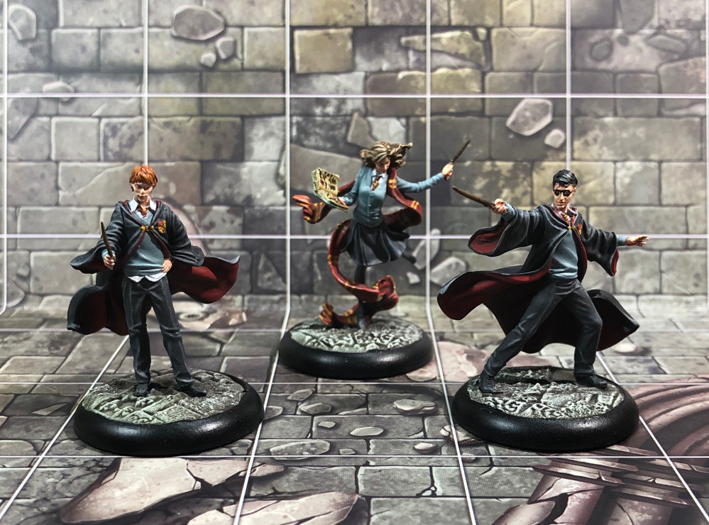
Harry Potter miniature adventure game
Highlights and shades part 2 - redo
Back to layers
Trying a different approach, I started with a new paint pallet this time thinned down with glaze medium. I wanted to be able to work with thin layers but keep the pigment coherency. Otherwise everything was the same, pre-blending my paints on the pallet for easy use. I also added a dark grey and a bit of black to darken the cloaks and some vermillion to brighten up the red on the linings and Hermoines scarf. Things were looking up.
Eyes and details
I never paint a models eyes. Mostly because I’m concerned I’ll do a botch job and end up with a goofy looking face. Because these models are so realistic and it would add life, this would be the perfect time to overcome that concern, which I’m glad I did. I even bothered to chose three different eye colours. They’re hard to see but I know they’re there and that’s all that counts. 🙂 But I’ll let you be the judge.
With the yellow stripes, the book and a brown hair dye for Hermoine, I called them done. This was the point of diminishing returns and spending more time could improve them but would take a disproportionate amount. The one thing I’m not happy with is Harry’s glasses, which look more like a superhero mask. Some time in the future maybe, this might be corrected. (Probably not.)
Next up:
Back to where it all began; basing.






















![How To Paint Moonstone’s Nanny | Goblin King Games [7 Days Early Access]](https://images.beastsofwar.com/2024/12/3CU-Gobin-King-Games-Moonstone-Shades-Nanny-coverimage-225-127.jpg)














Leave a Reply