
![NO Weekender Or Cult Of Games XLBS This Weekend [Updated]](https://images.beastsofwar.com/2026/03/No_Weekender_and_XLBS_this_Weekend-225-127.jpg)


Crazyredcoat’s Crazy Compendium of Collected Creativity

Recommendations: 1479
About the Project
Come one, come all! See the most vaguely inconsistent extravaganza that no one really thinks about but if they did they'd be mildly misanthropic about it! Slow off the heels of my last adventure comes a tale so confusing that it's not even remotely tail-like. Here I will avail you all of the many experiments and miniatures I manage to paint over the coming times, or at least some of them. Time is funny like that... Either way, stay tuned for various projects that don't fit into any one larger project like my last foray into this sort of thing. Oh, and watch out for Spiny Norman.
Related Game: Warhammer Age of Sigmar
Related Genre: General
Related Contest: Spring Clean Hobby Challenge (Old)
This Project is Completed
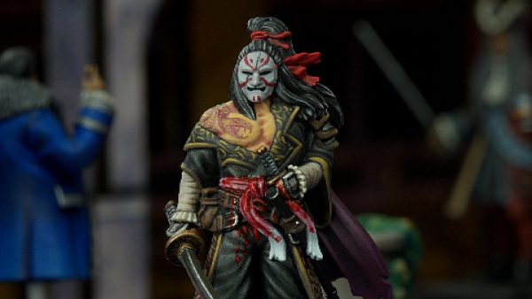
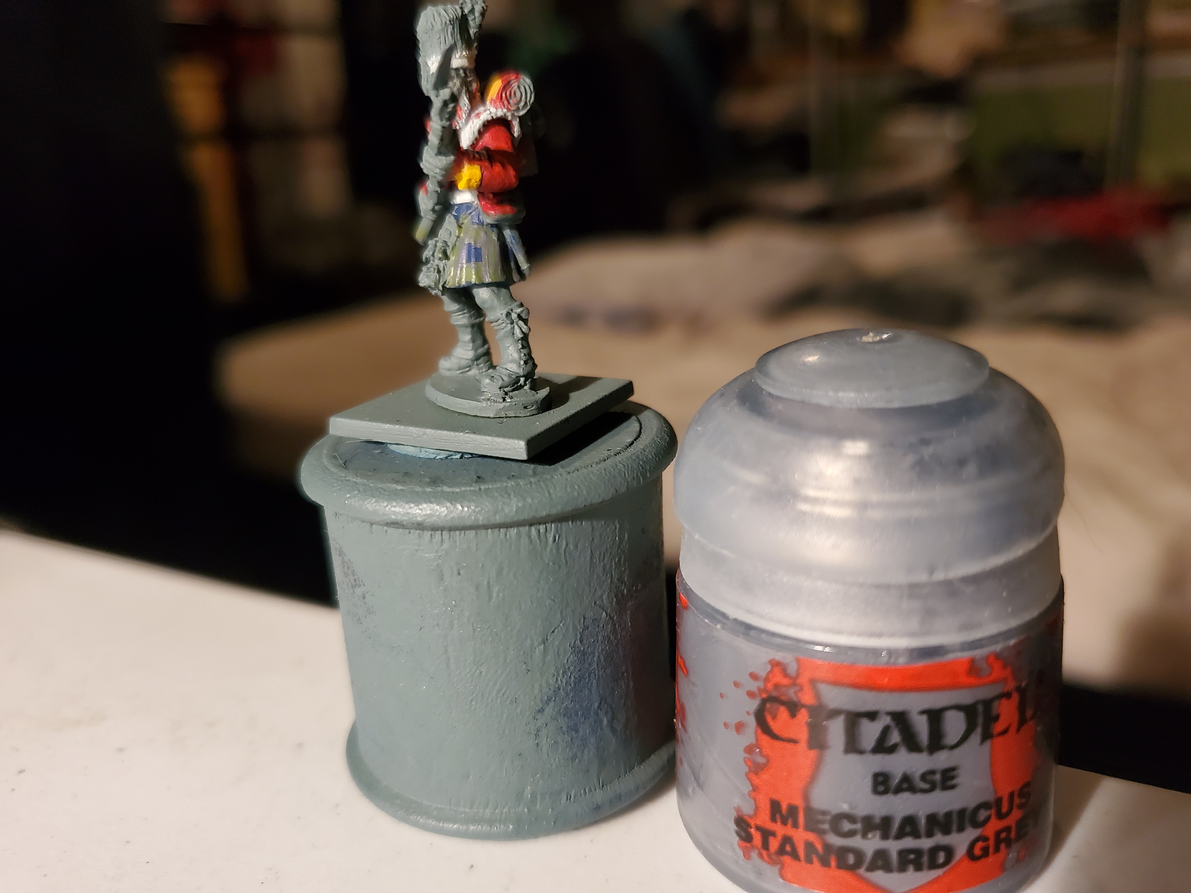
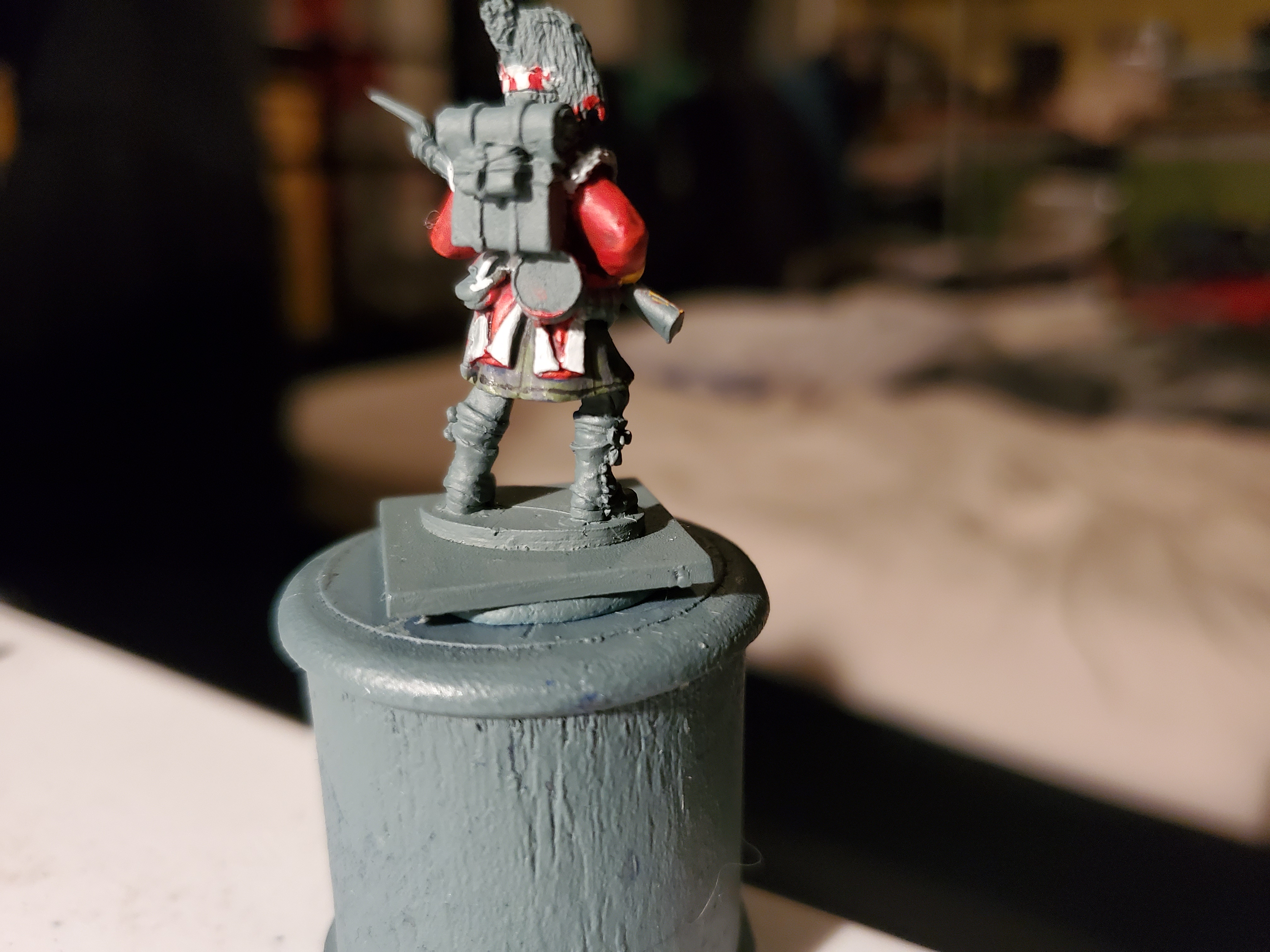
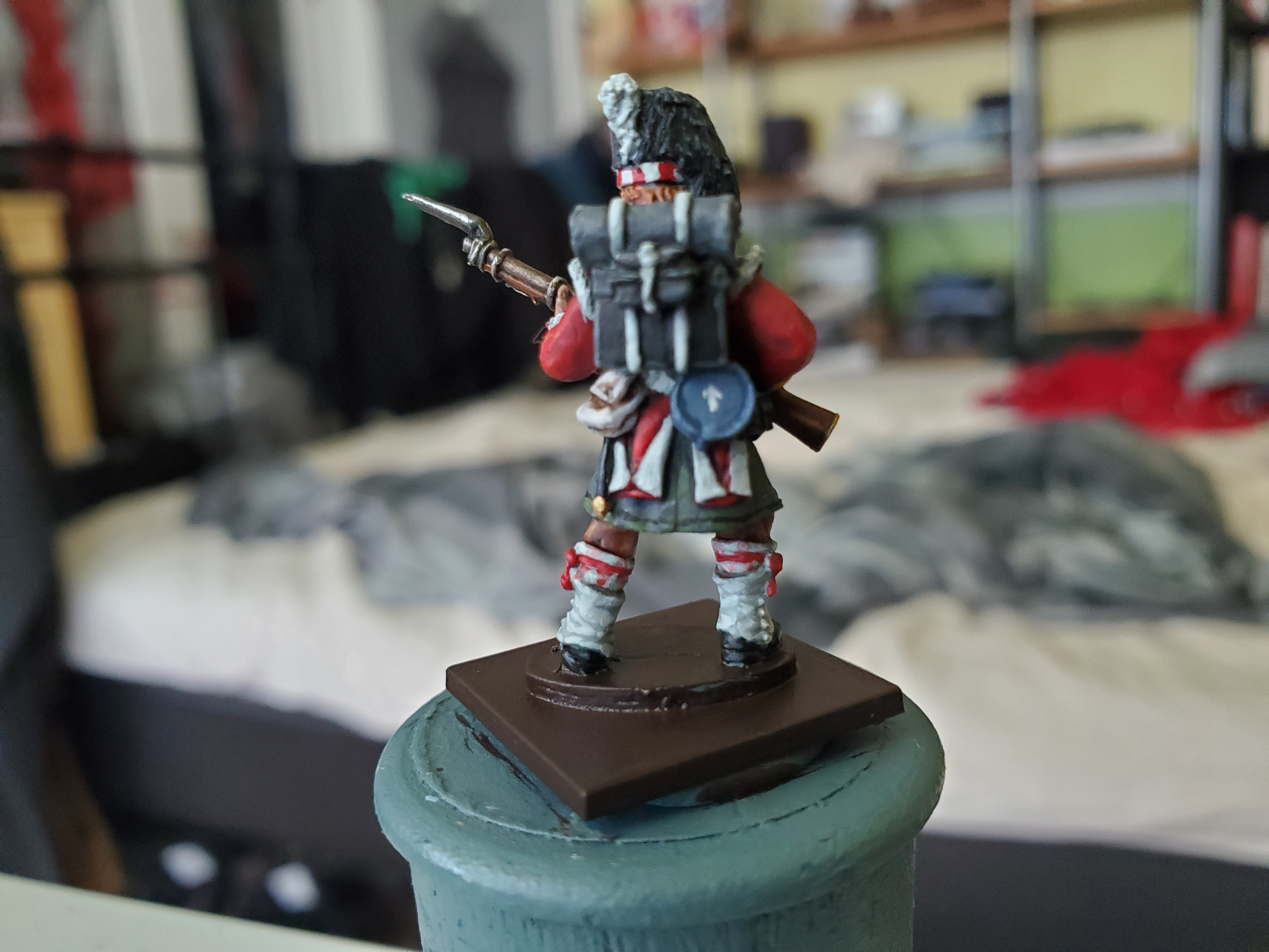
They've gone to plaid!
Hopefully most of you get that reference. If not, watch Spaceballs. Herein lies the tale of the tartan. So if you look back to the research post, there were several examples of the tartan used by the Sutherlands and it actually looks more green than blue, so I naturally started with a blue basecoat. There is a very good reason the this; painting a grid is a lot easier than painting a square. That may sound strange, but it is true. So let’s get started with the blue!
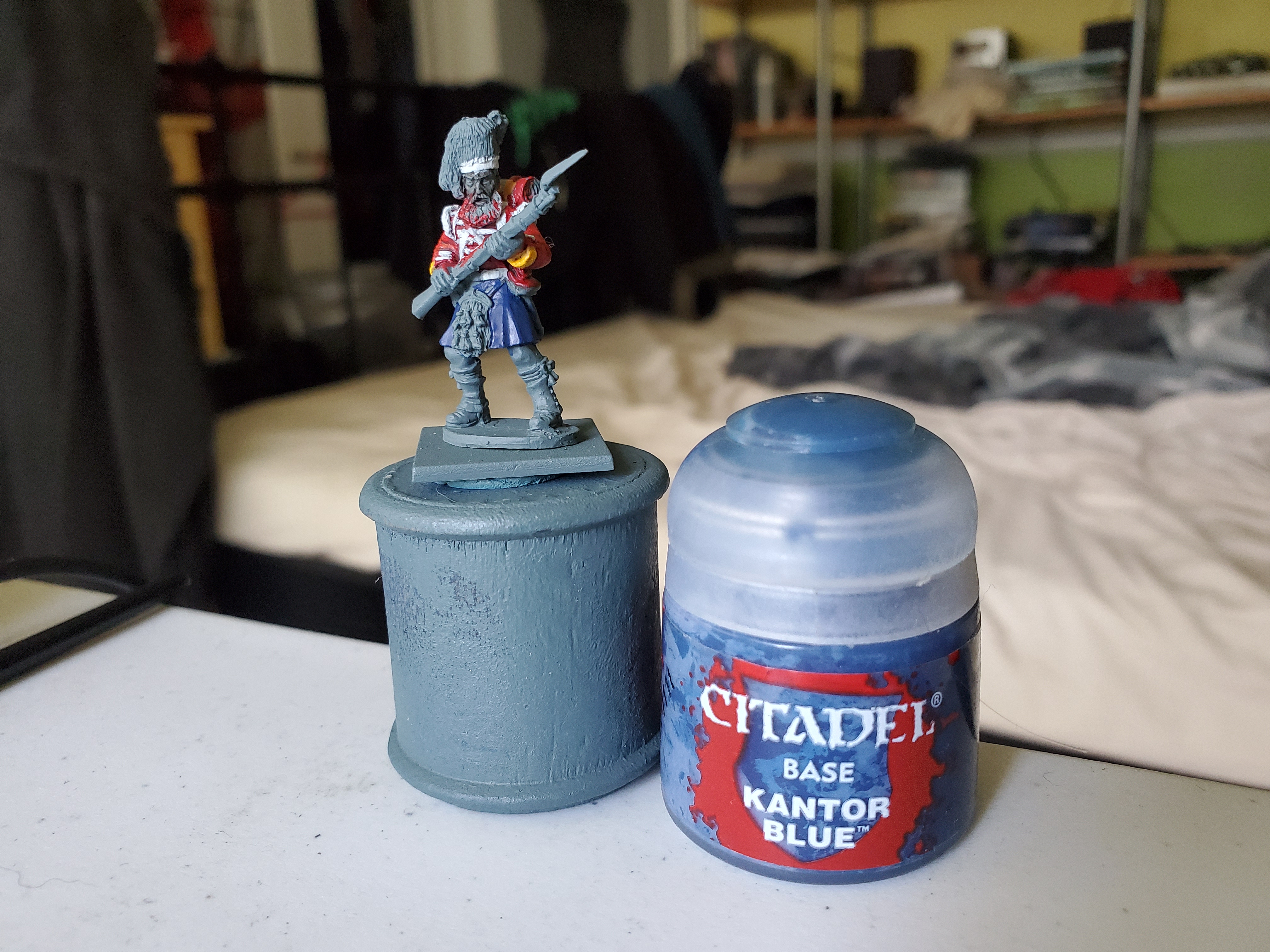 A nice solid basecoat of Kantor Blue is the starting point. Make sure it is nice and solid and be careful of any jacket tails or bits and bobs that you already painted. This is actually why I left the backpack and many of the accoutrements until after the kilt.
And at this scale you can’t see anything else so we’re done here with the kilt!
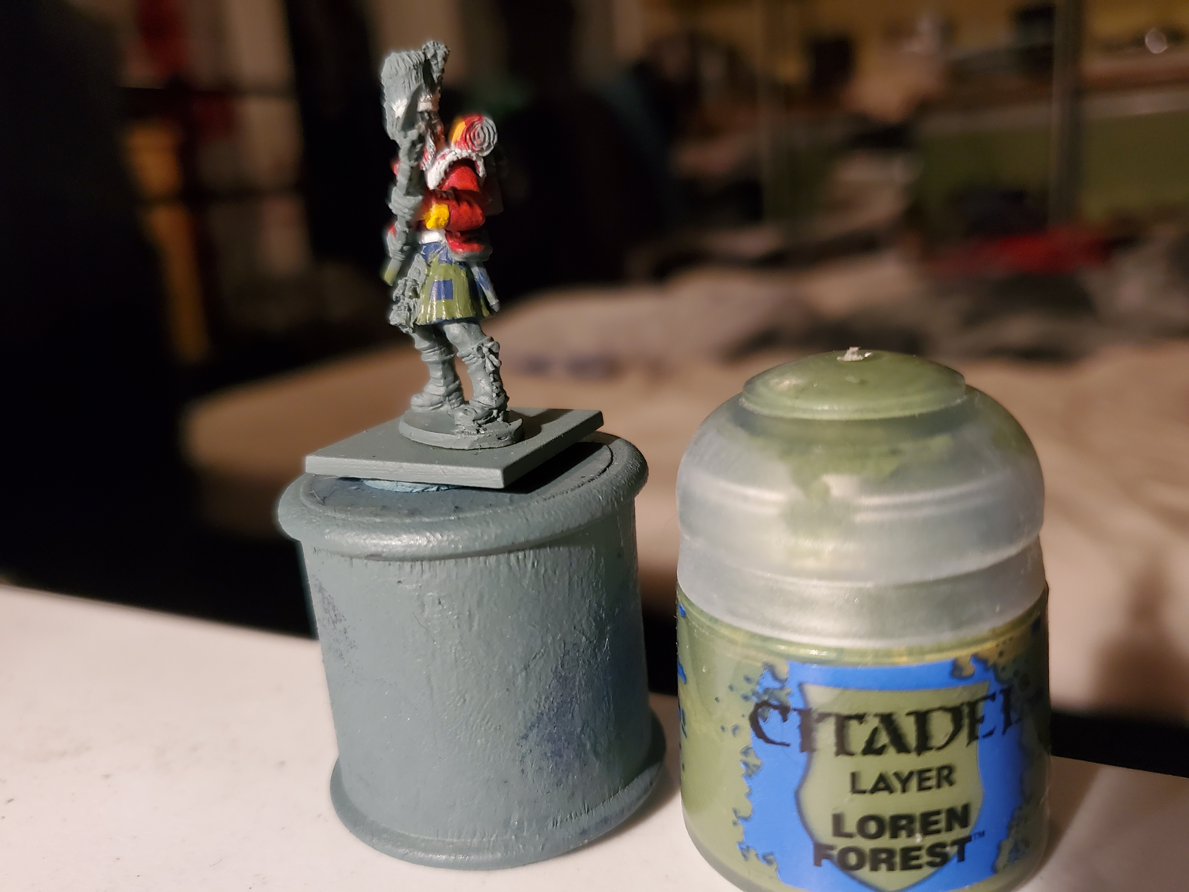
Okay, so that’s bollocks. Next we’re going to add the green. Basically, we’re going to be drawing a grid. You can do this in one go, but here I chose to do the up and down stripes first to set the distances before adding in the lateral ones. We’re I being smart, I would have actually have let the paint stay a little transparent to have a nice easy buildup of colour where the lateral and vertical bands meet. I was not smart. Loren Green was the colour I chose here, but something with a touch more yellow in it may have been a closer match.

Now we need the detail work, and this is the tricky part. It takes a steady hand…something mine quite often isn’t. First thing to do is to outline the squares with the grey that is shown in the previous visual references. If I’m honest, I was not totally happy with the contrast here and it may be difficult to see in this light. I’m hoping it looks better in the morning with natural light. I followed the same policy of vertical lines first, but this time we only wanted to outline, but a fairly thick one. Hopefully you guys can see it in this image…
 Not the contrast I was hoping for, but if I had gone for that touch more yellow in the green it may have showed more. Adeptus Mechanicus Grey here.
Then the final fine black lines. I actually did alright with these. Again going one way than the other worked very well here.
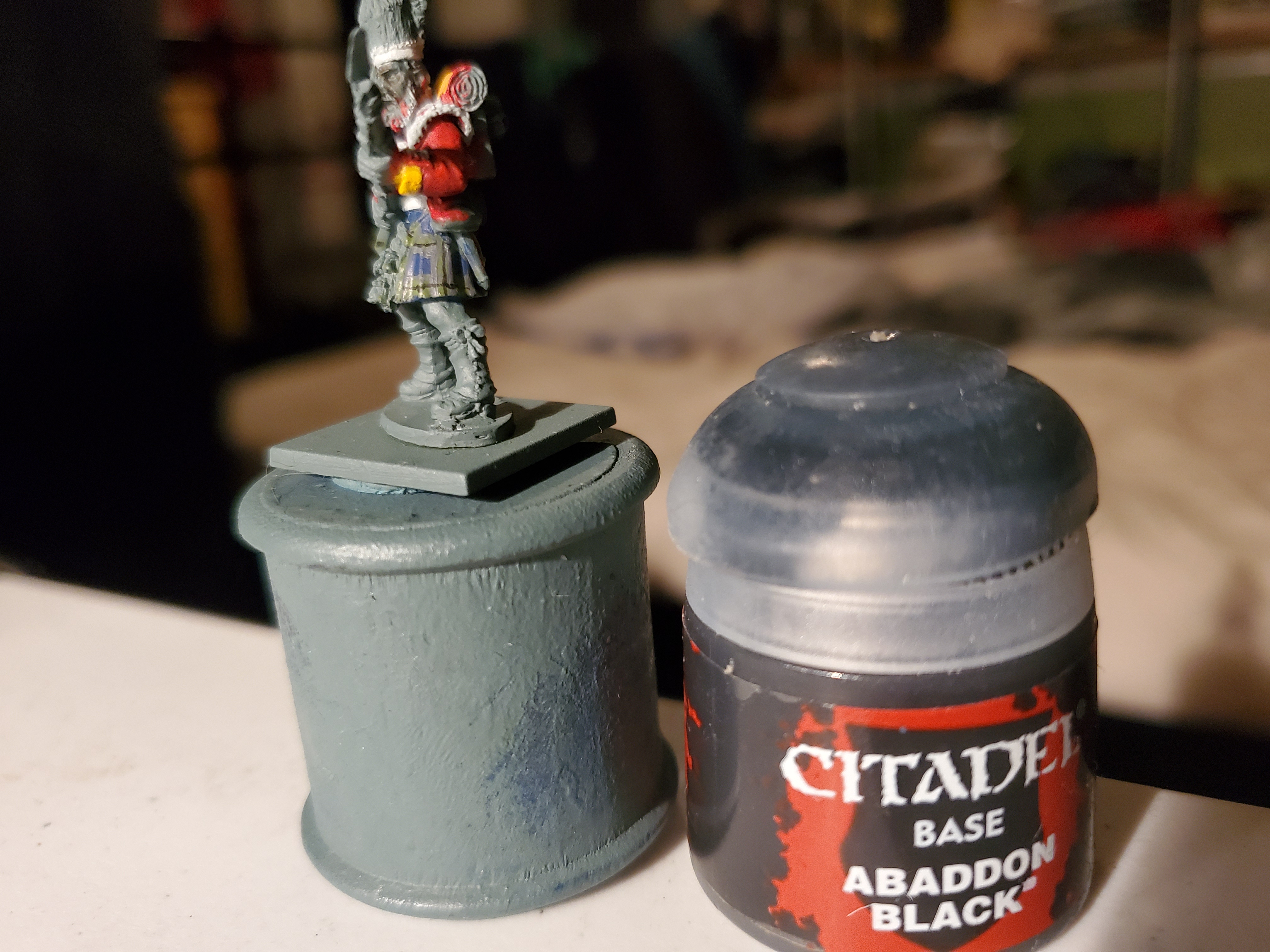
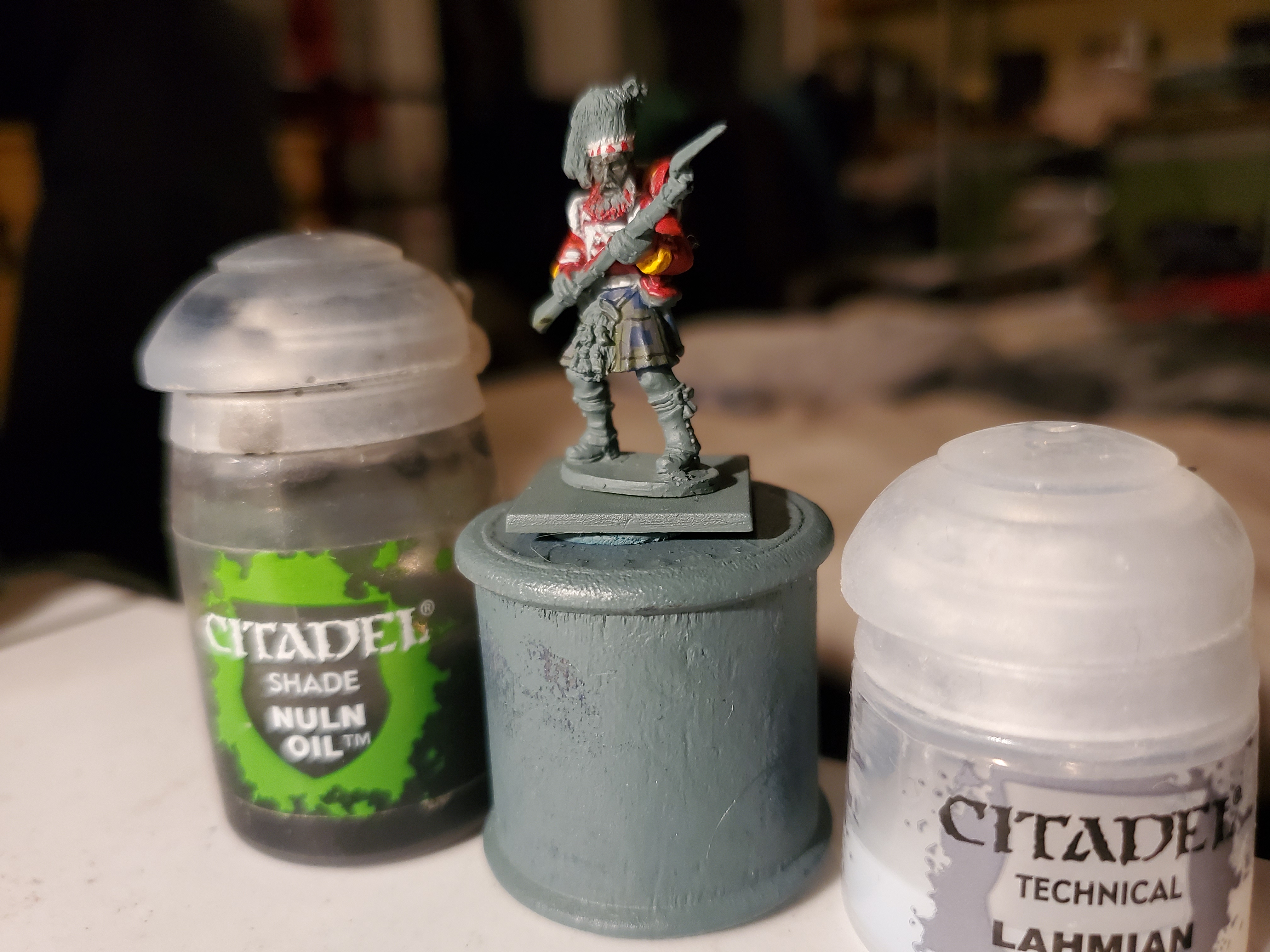
Next was time for some shade paints…but a from-the-pot nuln oil would have overpowered the pattern, I thought, so I made a 2:1 mix of Lahmian Medium to Nuln Oil. It’s subtle, but added enough that I chose not to attempt highlights. My hands are just not that stable most days. Forgive me.
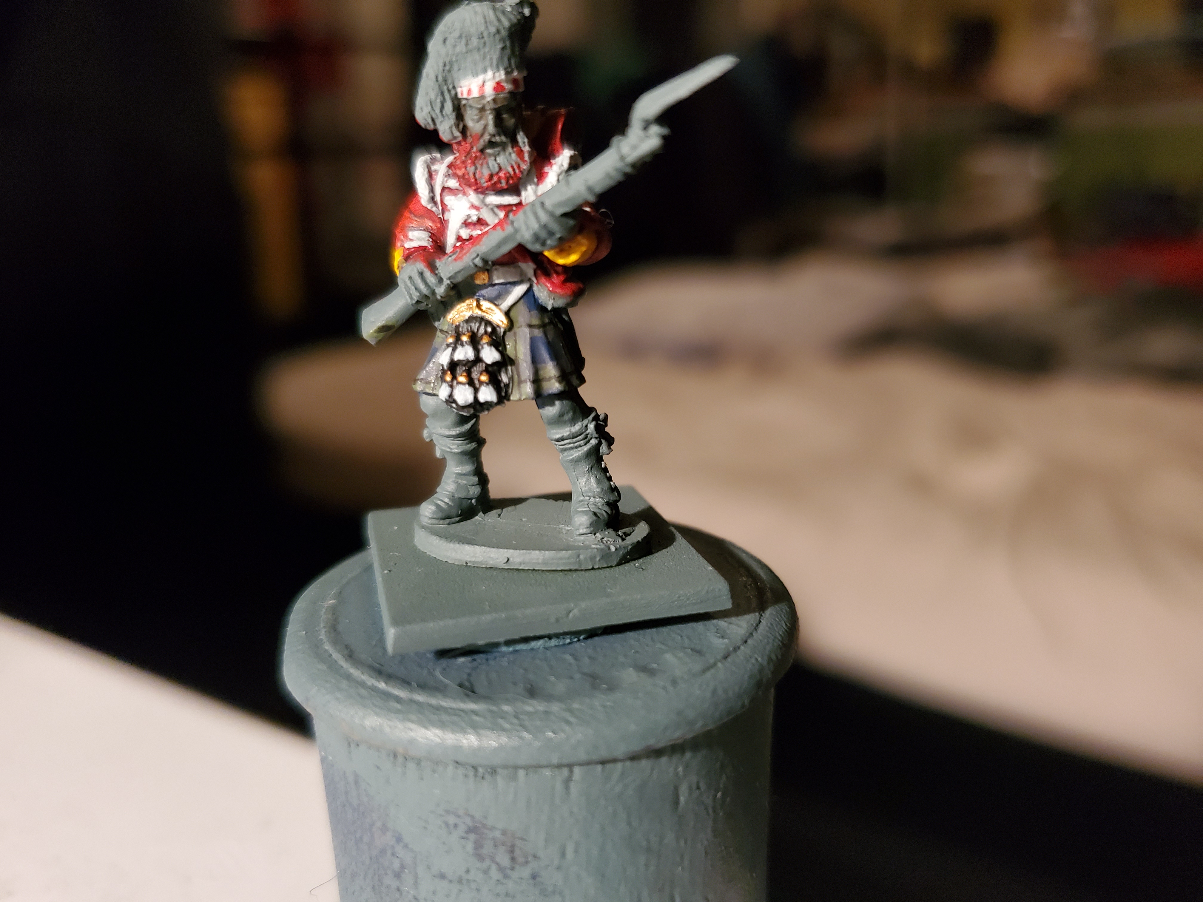
All that was left was the sporran, which was mainly Black Templar Contrast with gold and white details picked out. I’m rather happy with the final product and I think I can now safely move on to the accoutrements with all the other parts out of the way.
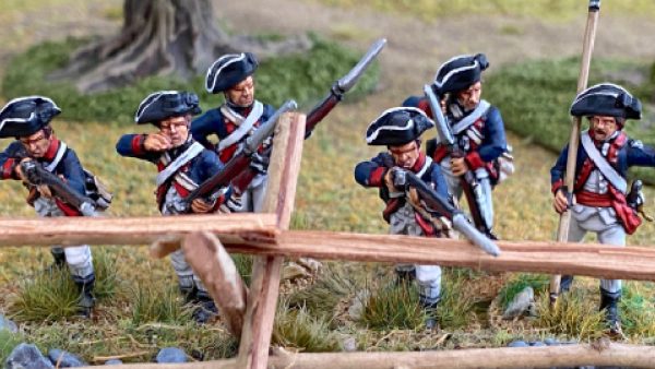
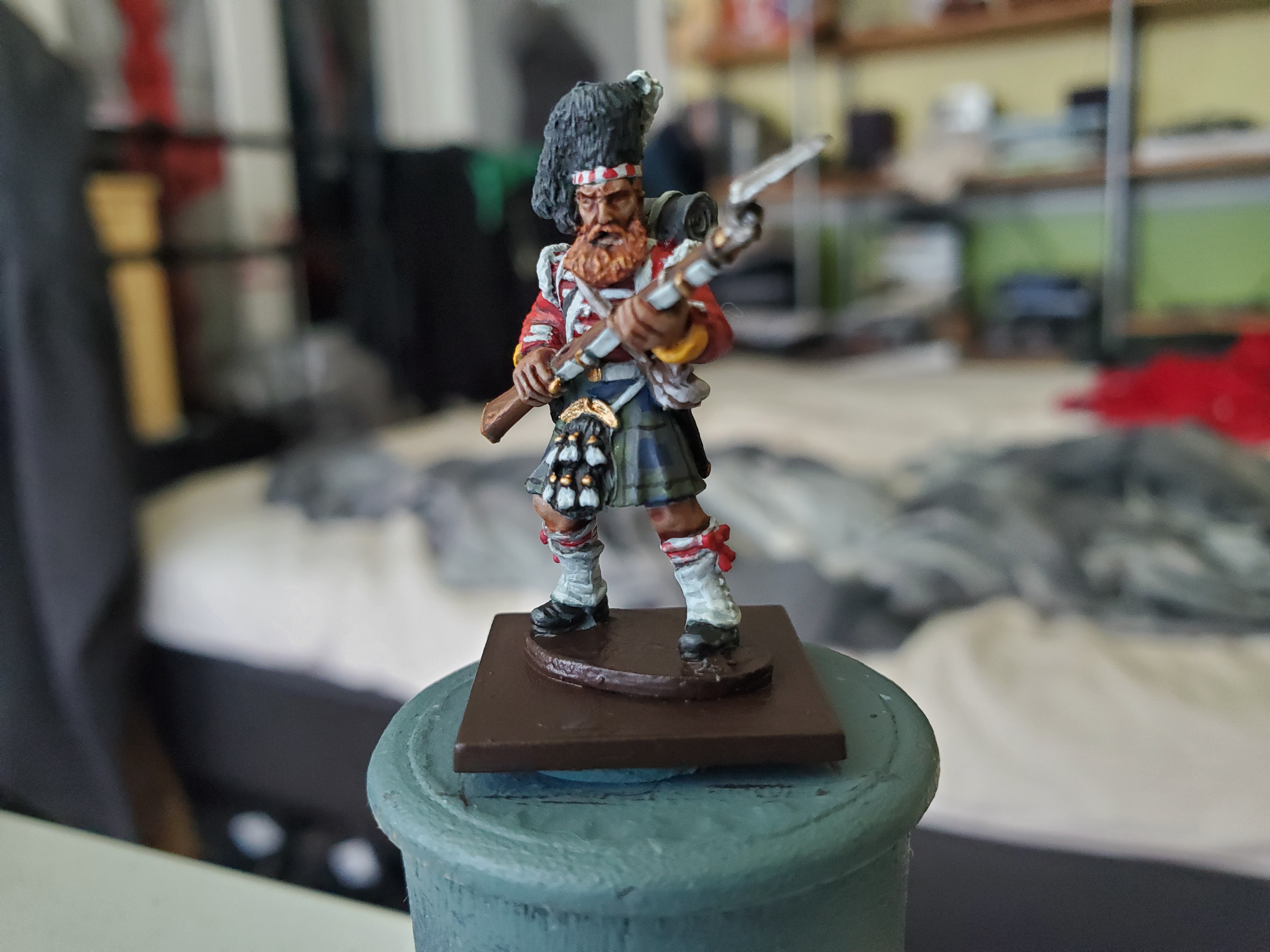
Highland Laddie
Stranglely enough, that describes the chap and is the name of one of the marches of the 93rd! When we last saw our intrepid hero, he didn’t look like this.
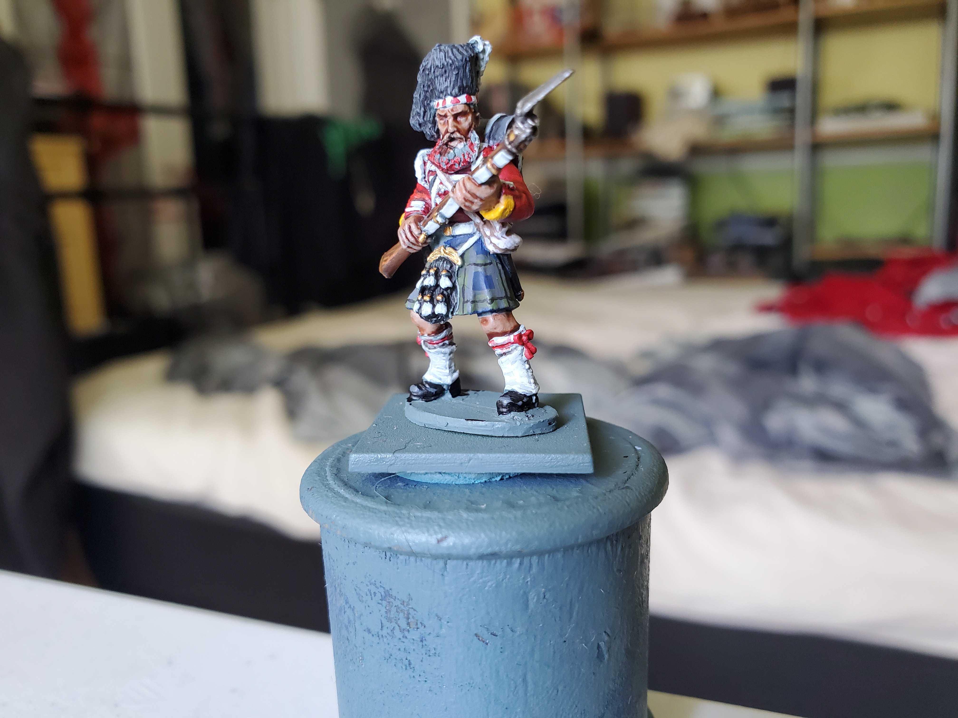

So most of the in-between stuff was fairly simple base/shade/highlight with various colours and that is why I chose not to show and not because I got carried away and forgot to take progress pictures. Not at all. It’s not that I’m an idiot. I meant to do it… Help?
So the interesting parts would be the rifle, which I decided to ‘brown’ slightly with Agrax Earthshade simply because the colourised image shows a wearing away of a finish where the socket bayonet was taken on and off the muzzle, but the colours were simple enough. Another part was the socks. They have an interesting almost faded red pattern that I was originally not going to attempt, but then I accidentally thinned some red too thin and thought ‘let’s just try it’. Just some simple lines were painted in in the same pattern as the references. It’s not perfect, but it gets the idea across. The small white symbol on the water canteen in a broadhead arrow that I attempted to draw as this was the mark of the Board of Ordinance and showed government ownership over things; this would also be stamped into the bayonet, rifle, and various other things in the soldier kit.
While some of the black material was painted the traditional way, I did paint the hat using a Contrast method, and the skin was done in Contrast as well. All that’s left is the magnificent beard!
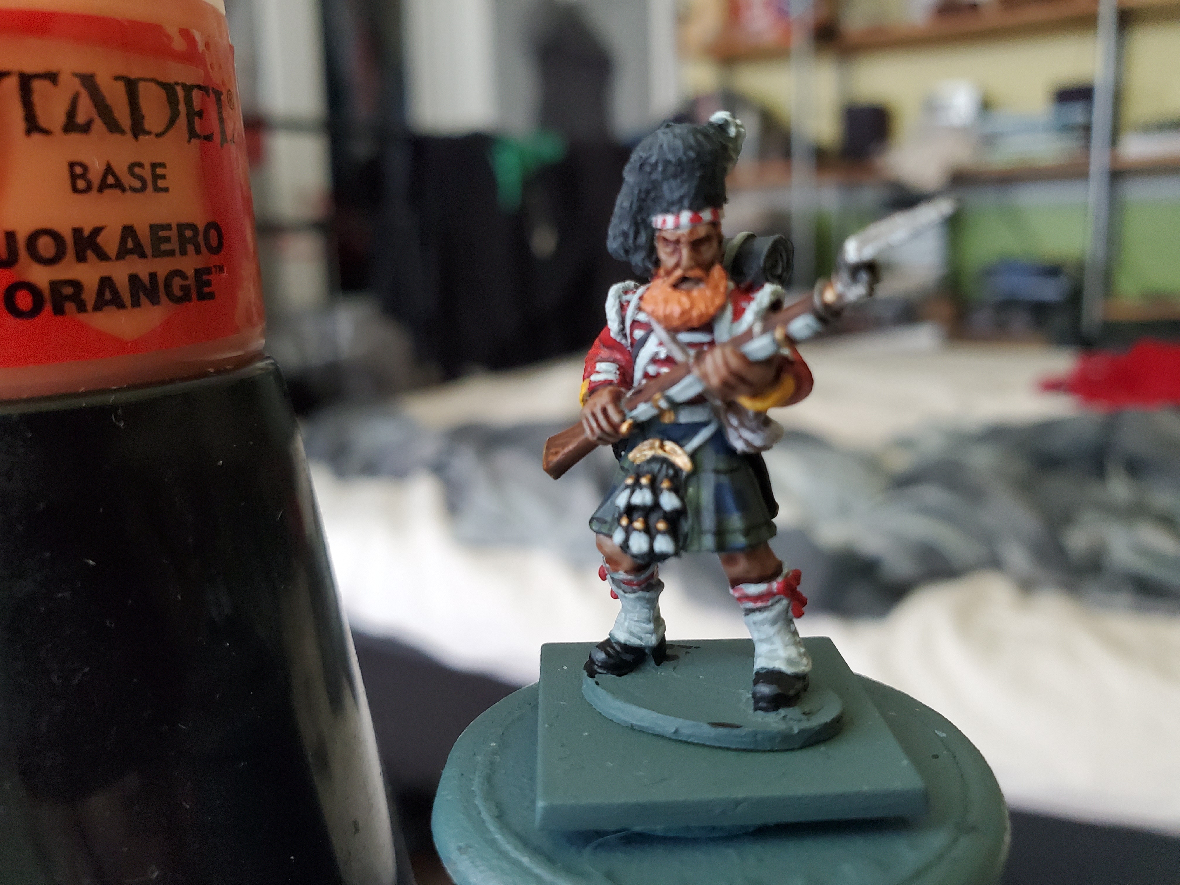


The most important thing here was colour choice. I had to stay clear of braight oranges because that would just make our man look like some sort of anime character with a fake beard. I went for slightly muted colours and make sure that I used Agrax Earthshade to add in the browner base tone to the hair. After that a very gentle overbrush of the Tau Light Ochre was used to just hit the lower beard a hint of brightness. I’m rather please with how it came out and just added that perfect final touch to the burly Scotsman.
Finally I painted the base in a flat brown just to tidy up paint spillage. As it stands, this chap it not planned to be part of any army, but that may change in the far future so I wanted to leave the base neat, but not based…just in case. And here is the man of the hour!
And to think, I managed all these posts and never once made a Crimea river joke! DAMMIT!
"He's a direwolf, not a dog, and dangerous to men he does not trust."
That title will almost certainly give the game away as to what is up next. And if you don’t recognise that line then read the books. The TV show is all well and good, but the books contain so much more intrigue and characters that it’s well worth your time. I don’t have a picture of the primed mini…yet…because he’s not due to arrive until tomorrow, but I’m getting antsy about wait for my new toys that I just had to start this ‘research’ post before I burst…
With that in mind, my next project will be Grey Wind from CMON’s A Song of Ice and Fire Miniatures Game.* Been a while since I attempted this much fur on a mini and I’m really looking forward to it. As the basis of CMON’s game is the books rather than the TV series I will be focusing heavily on those descriptions and imagery. Luckily, Grey Wind in the series isn’t too far off how he is described in the book. In fact, shall we compare?
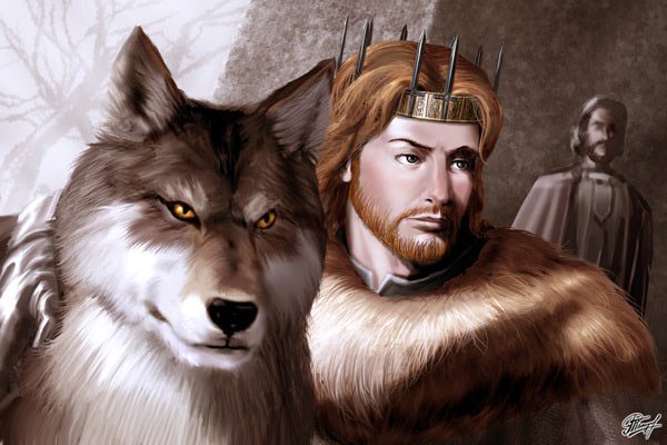
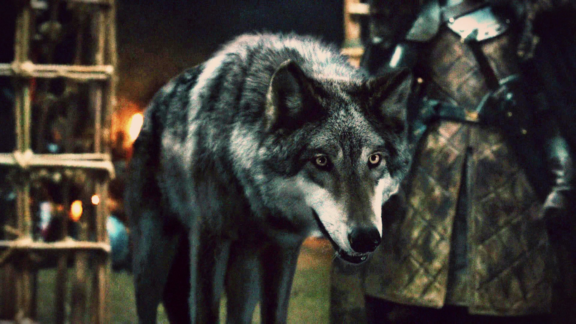
Robb looks very different, though, eh? More on that later. The artwork here was taken from the Wiki of Ice and Fire article for Grey Wind that I am including a link for in the spirit of openness and intellectual property. The other was a basic google search, so I think you could all find that easily enough. The depictions here are very similar to the colourations of Grey Wolves (Canis lupus if we’re being technical) which I am taking as my ‘real life’ influence and because of some interesting colours found in the fur. Here’s a photo from a quick google image search for Eurasian grey wolves that should show what I mean.

The brown tones in the fur are something that I do want to try, but as Grey Wind is described as having ‘smoke grey’ fur, I think I will have some darker greys along the top fur, and maybe a little less of the brown, but he should be a very interesting project and I’m looking forward to it. I really hope the parcel comes tomorrow…
"I wasn't there to see, but it's said the beast killed four men and ripped apart a dozen horses."
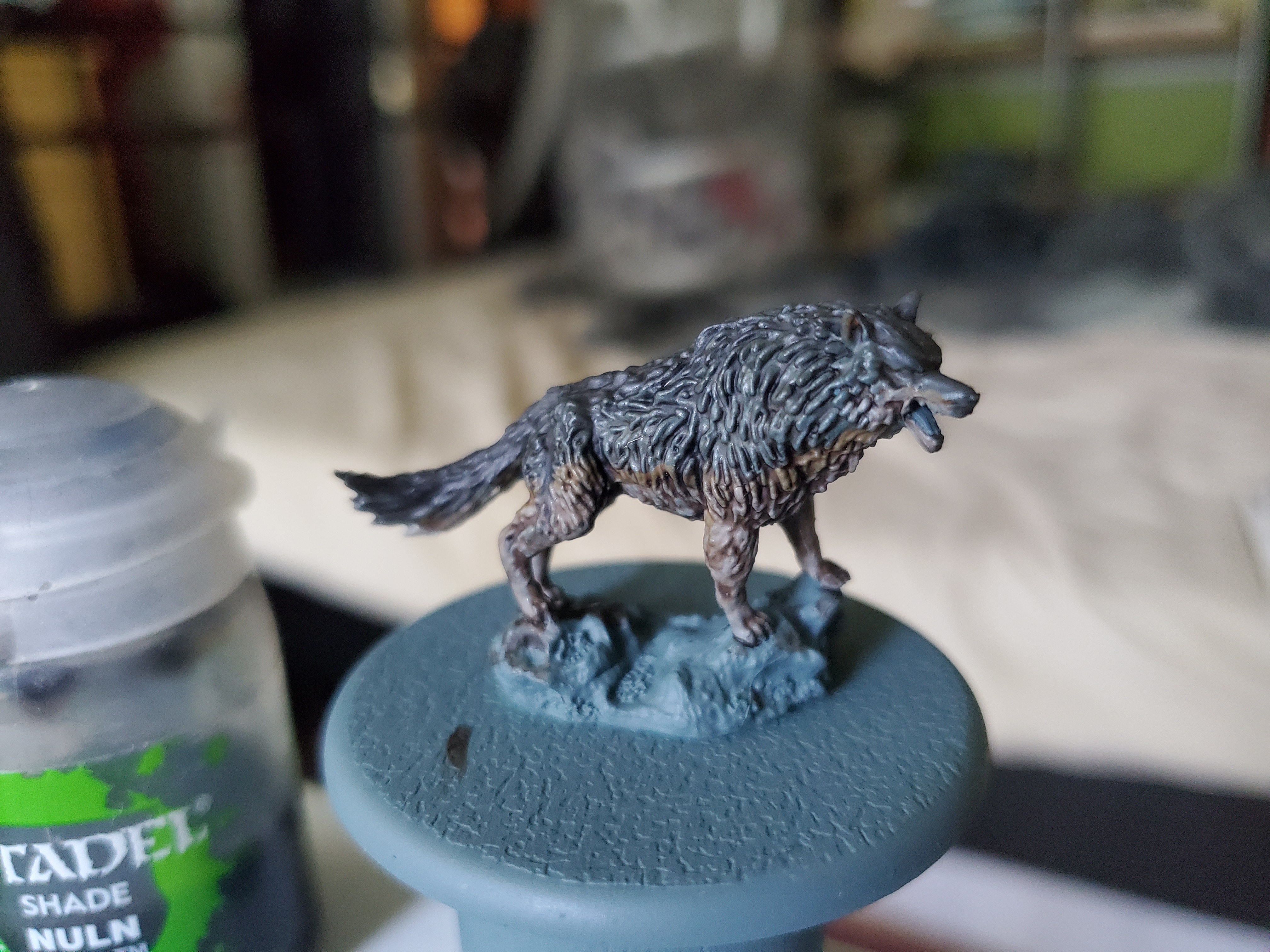
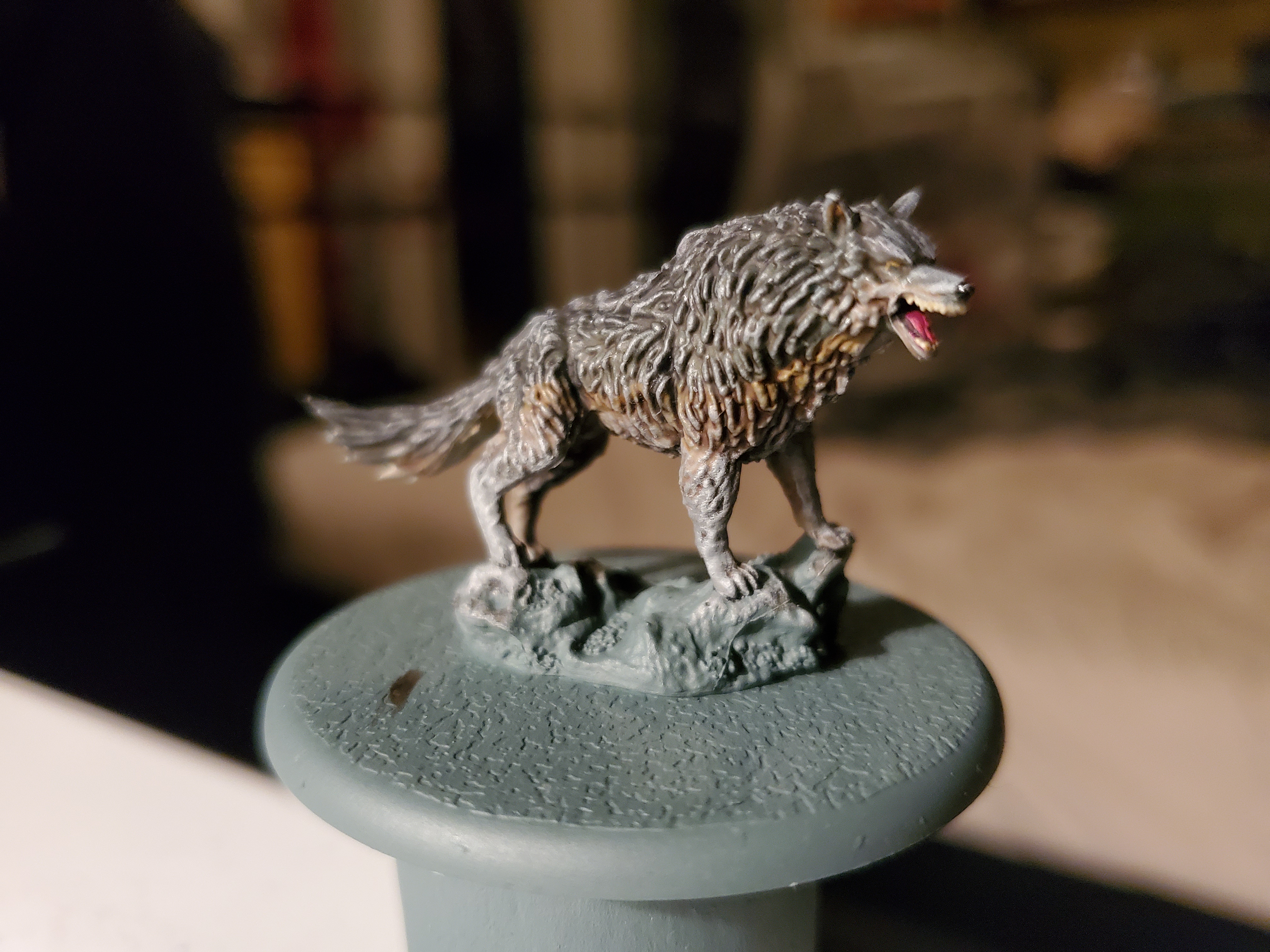
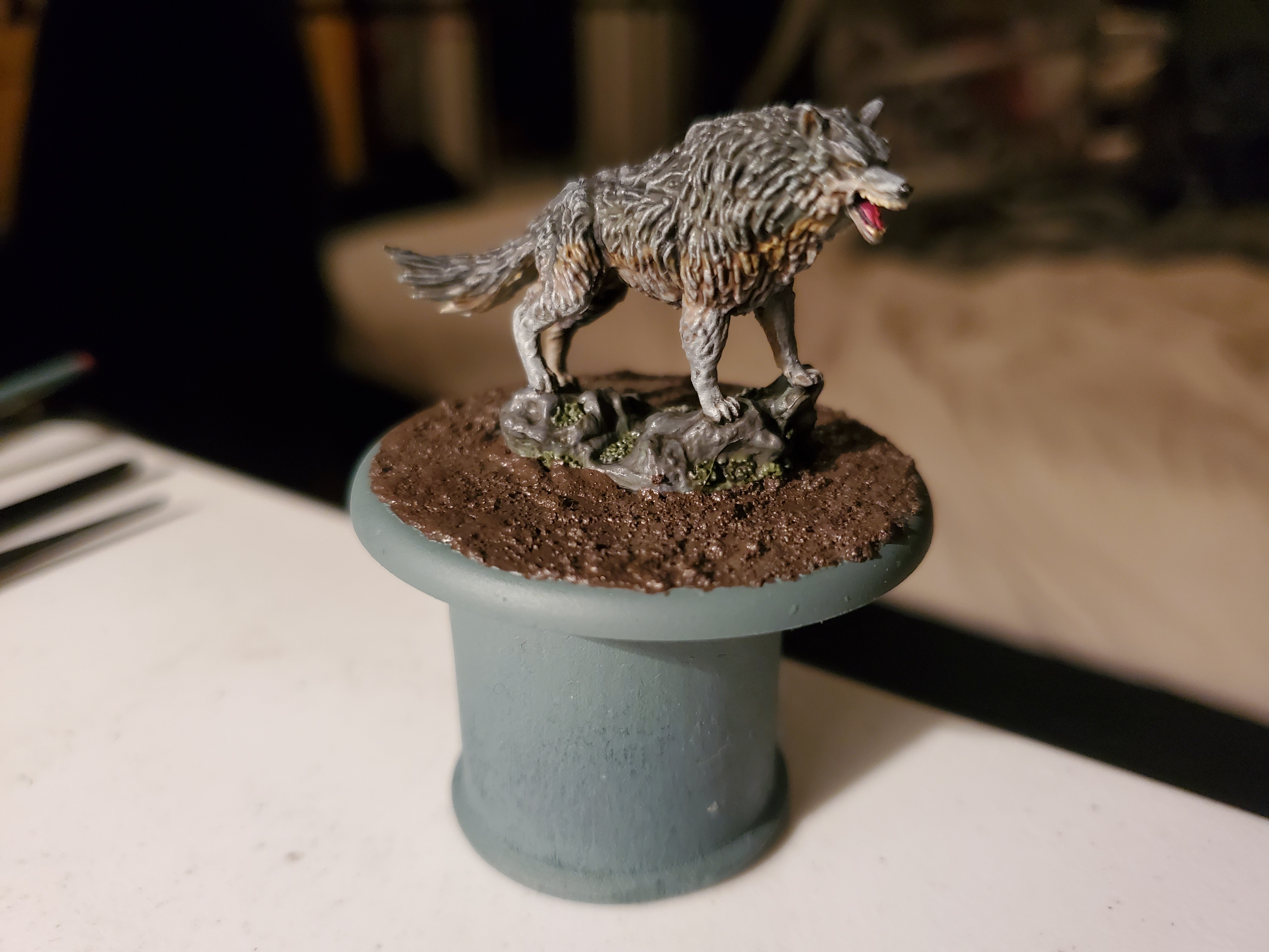
So after a week-long delay due to postage issues, progress on Grey Wind can start/finish! I was so excited to finally get him done that I finished him in one night. Almost finished his movement tray, too! More on that later.
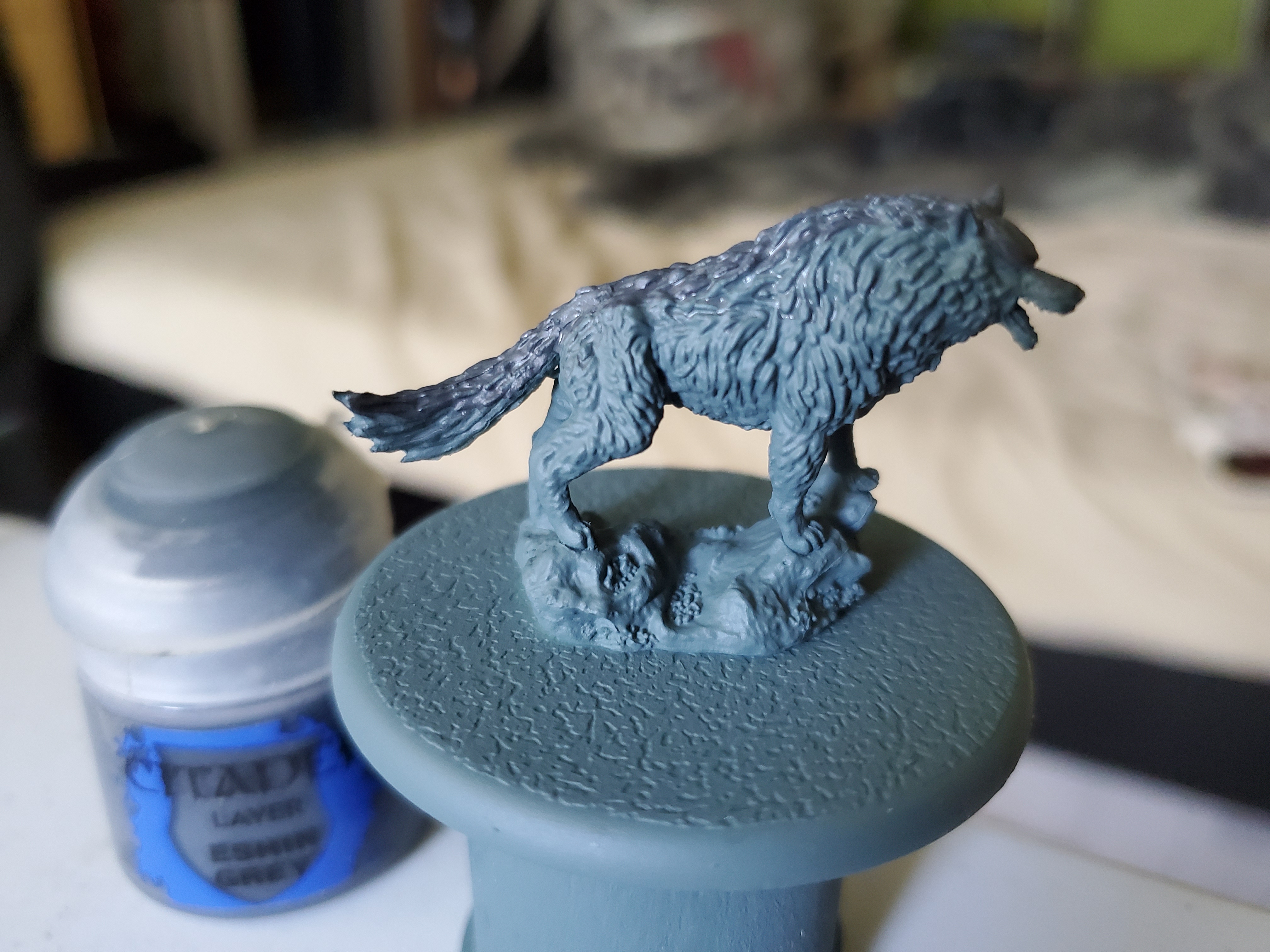
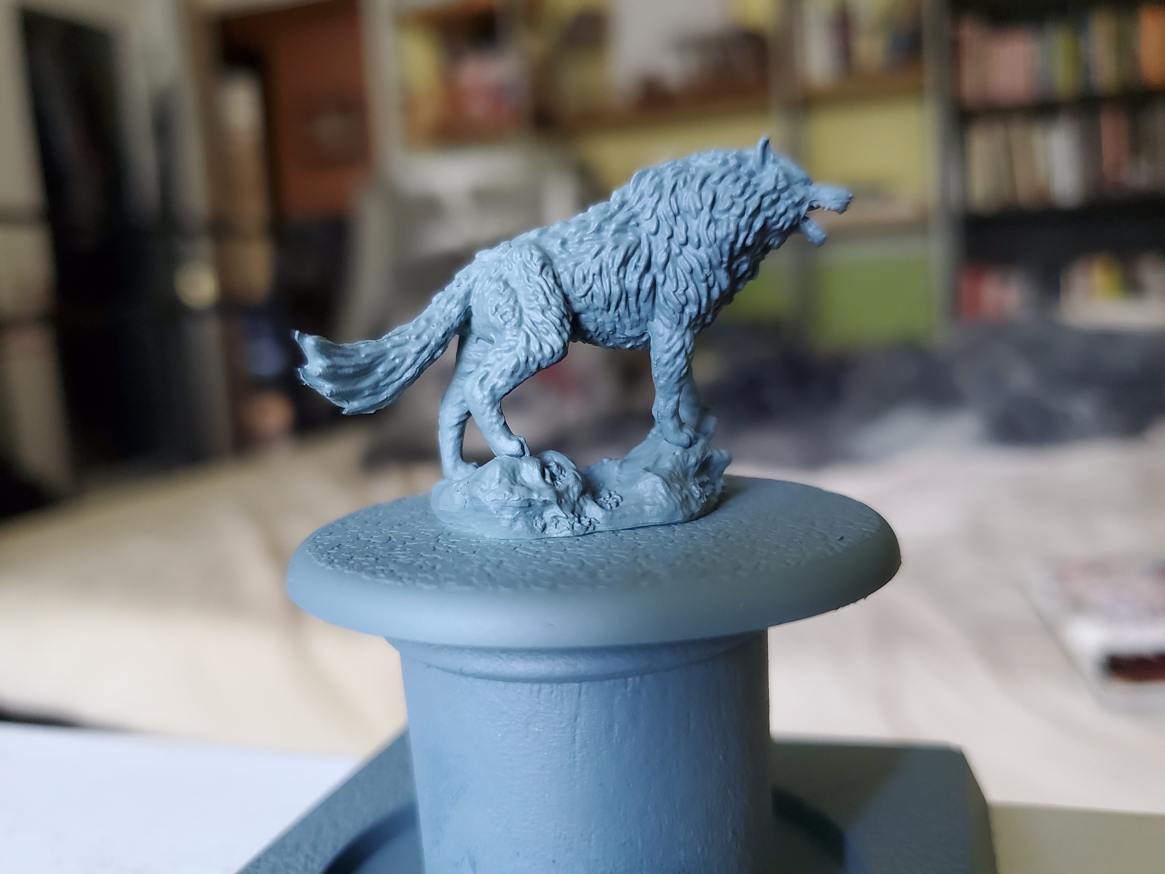 As is typical for most of my paintjobs; I started with a spray prime of GW's Mechanicus Standard Grey. Seemed to make sense for a direwolf called Grey Wind...
Next process was to block in certain colours. I was going for a slightly darker grey on top than is maybe usual in ‘real life’, so I began with a strip of Eshin Grey along the upper portions of the wolf, including the head and tail. After that I was going to use the primer colour for the next ‘band’ so I painted a brown band using Tallarn Sand. After that I needed the brighter undercarriage of the wolf so I switched to Adminstratum Grey for that part. With both the Tallarn Sand and the Administratum Grey I used a single coat of paint to allow some grey to show through. I also use and older brush and applied the paint with a stabbing motion to give the patches a more random look.
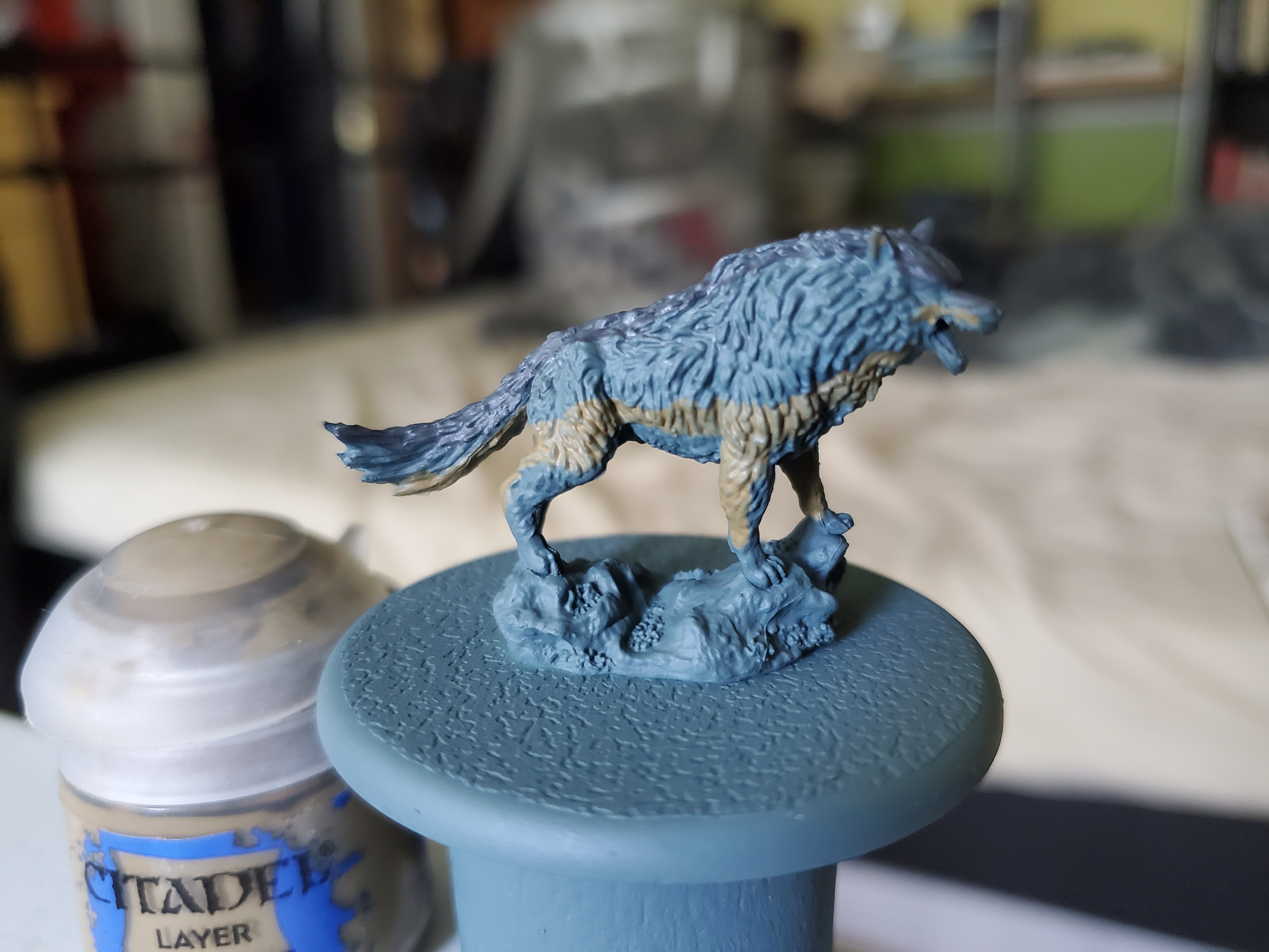
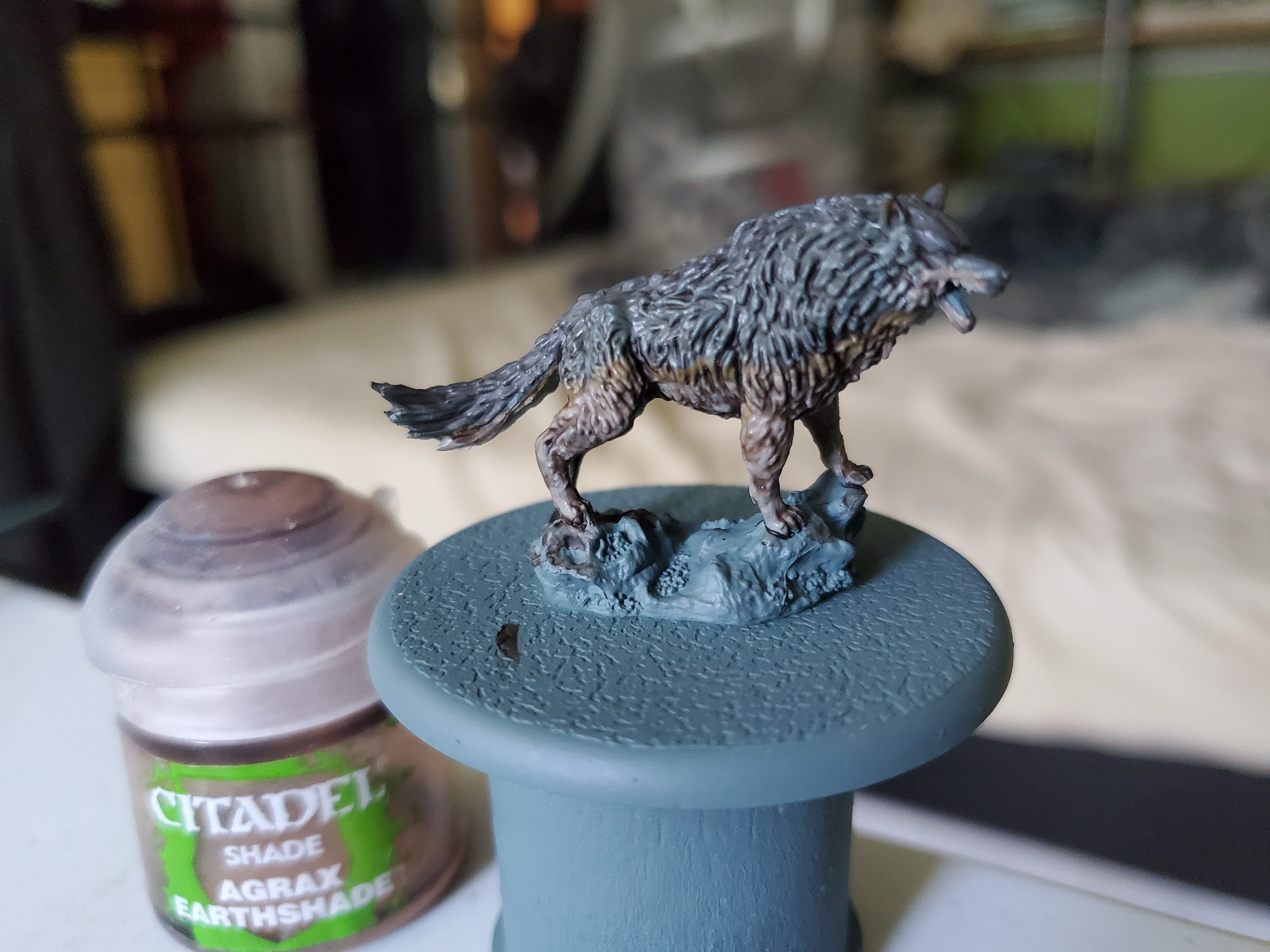
Next I needed to tie the colours together and the fastest way to get that started is with shade paints. Normally for greys you would use a black shade, but I first used Agrax Earthshade as the slight brown hues in the recesses looks a little more like natural fur, though once this first coat was dried I did apply some Nuln Oil along the top to darken it down further and into some deeper recesses to emphasise them.
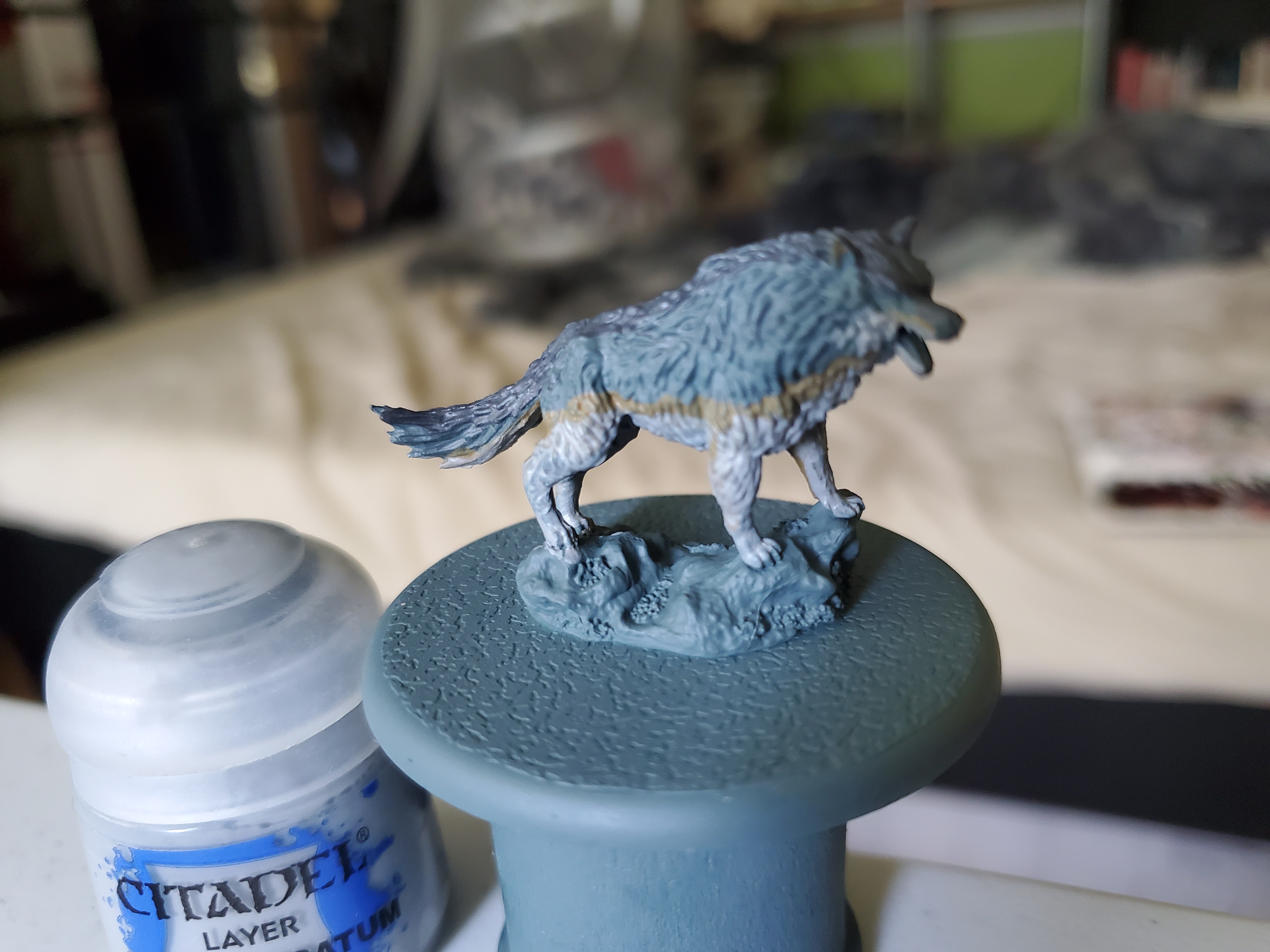
Now onto some highlights! I chose drybrushing for this part due to the ease and randomness that it gives the finish. It also helps that the sculpting on the fur of the mini is very welcoming to the technique. Starting with Mechanicus Standard Grey, again, I focused it on to the darker grey fur on the top but allowed it to slip onto the brown ‘line’ to give it an even more random and natural feel to it. I added no drybrush to the brown so that it sat more in the recesses than bright to make it look like less of a line. After that the lower portions were dryburshed with Dawnstone (with a touch of this going up into the darker greys) and then a lighter highlight of Administratum Grey on the lower portions and a touch on some sharper upper edges, though just a touch.
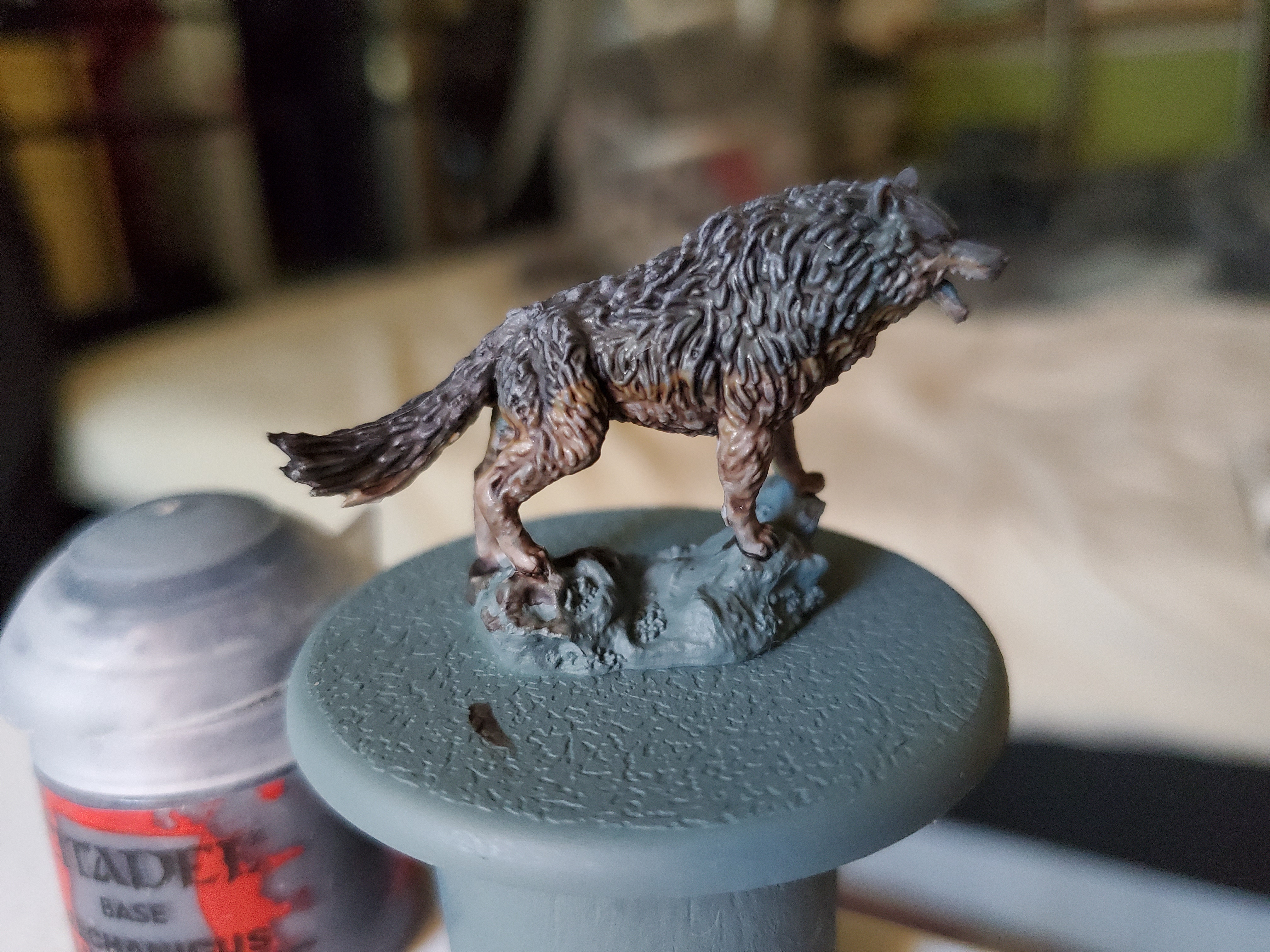
After the fur, a few minor details were done such as the tongue, teeth, eyes and nose were done. The eyes were filled with yellow with a black dot added. Originally it looked very off, so I added a shade of Nuln Oil to tidy up the whole thing; it worked ok, I think. The tongue was painted with Screamer Pink, shaded with Nuln Oil and then highlighted with some Pink Horror while the teeth were picked out in Tallarn Sand and highlighted with Screaming Skull. Finally the nose was picked out in black, highlighted with Eshin Grey, then given a coat of ‘Ardcoat Gloss Varnish to give it a little shine. After all that, he looked like this.
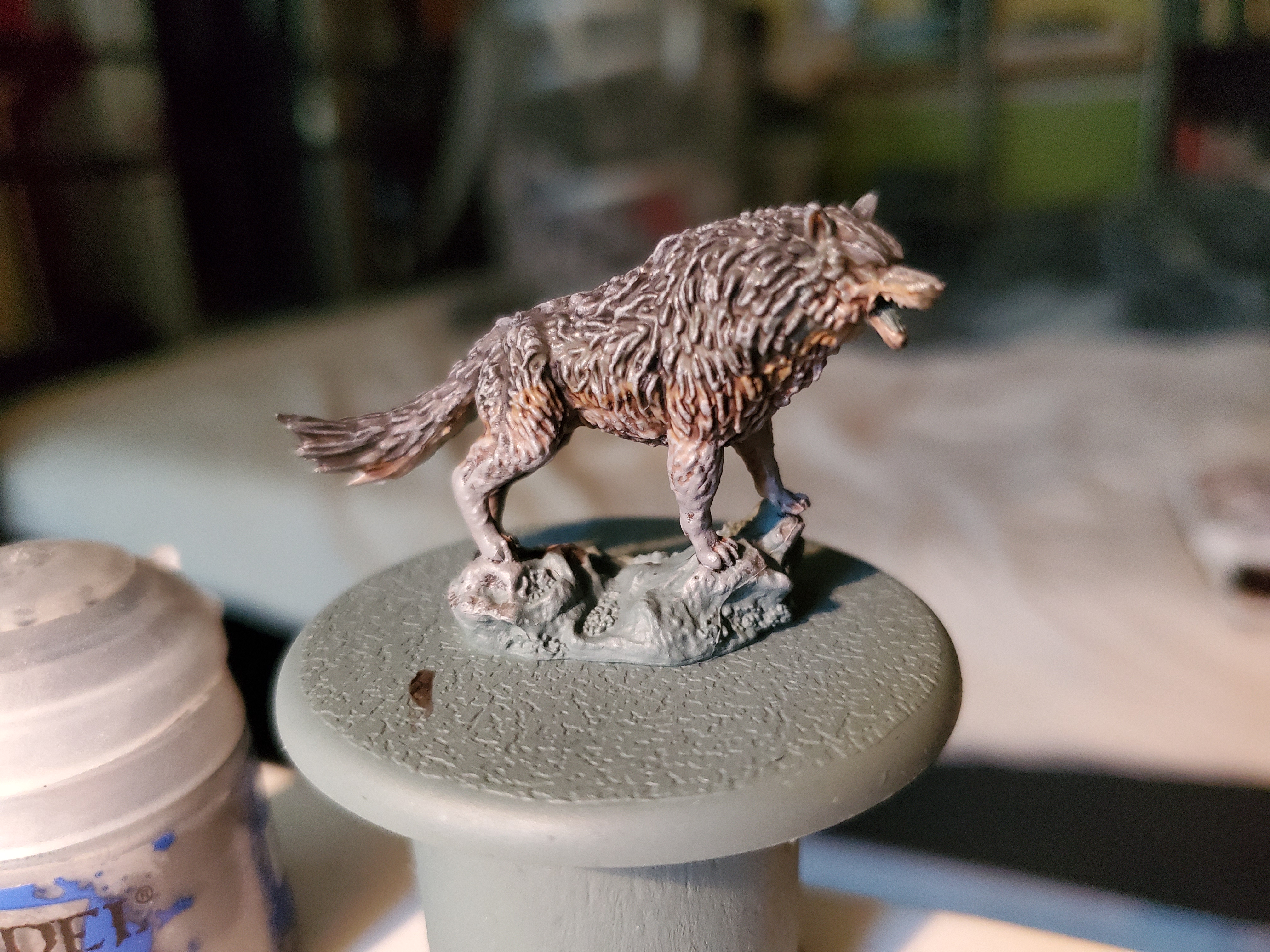
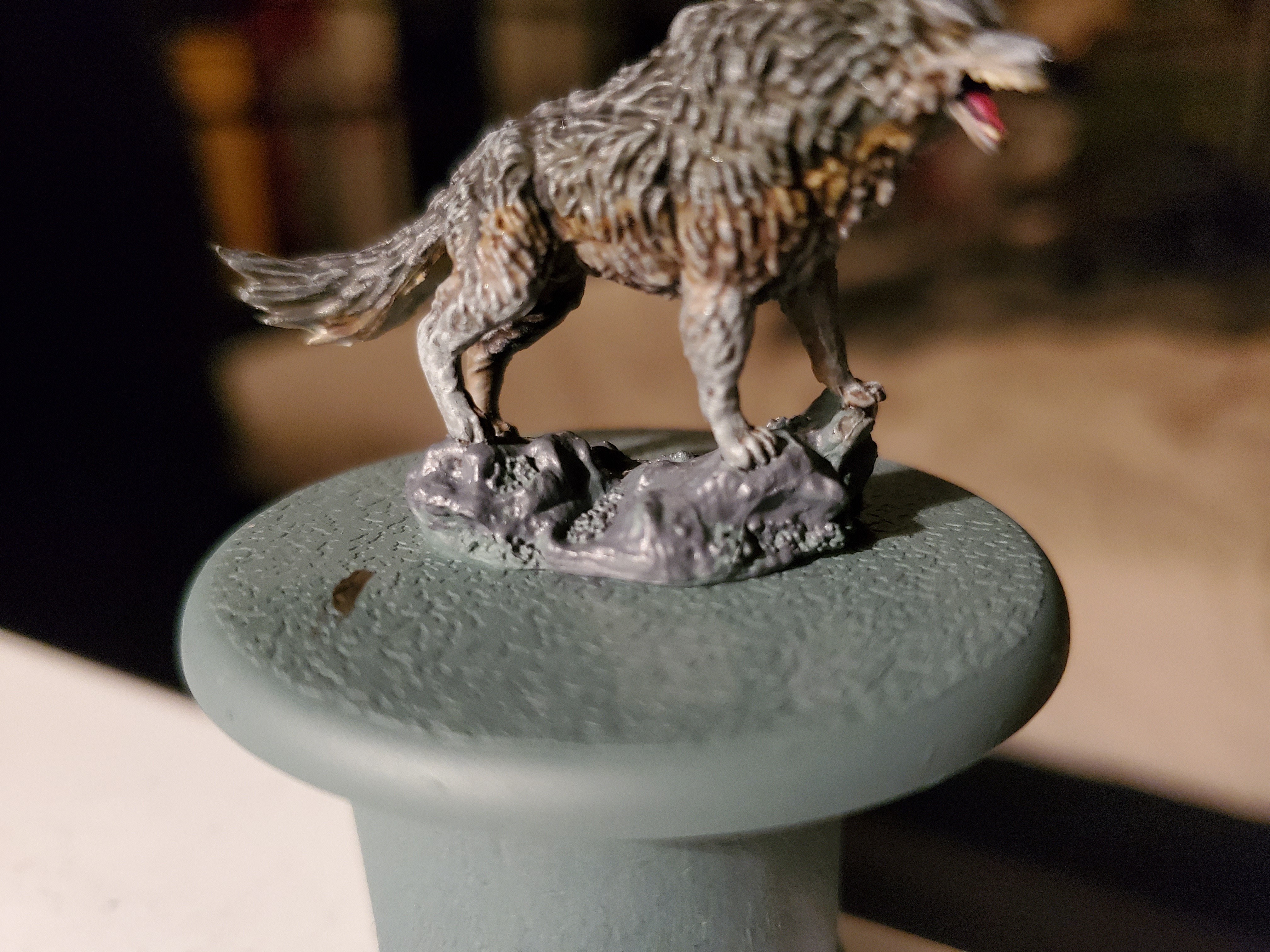
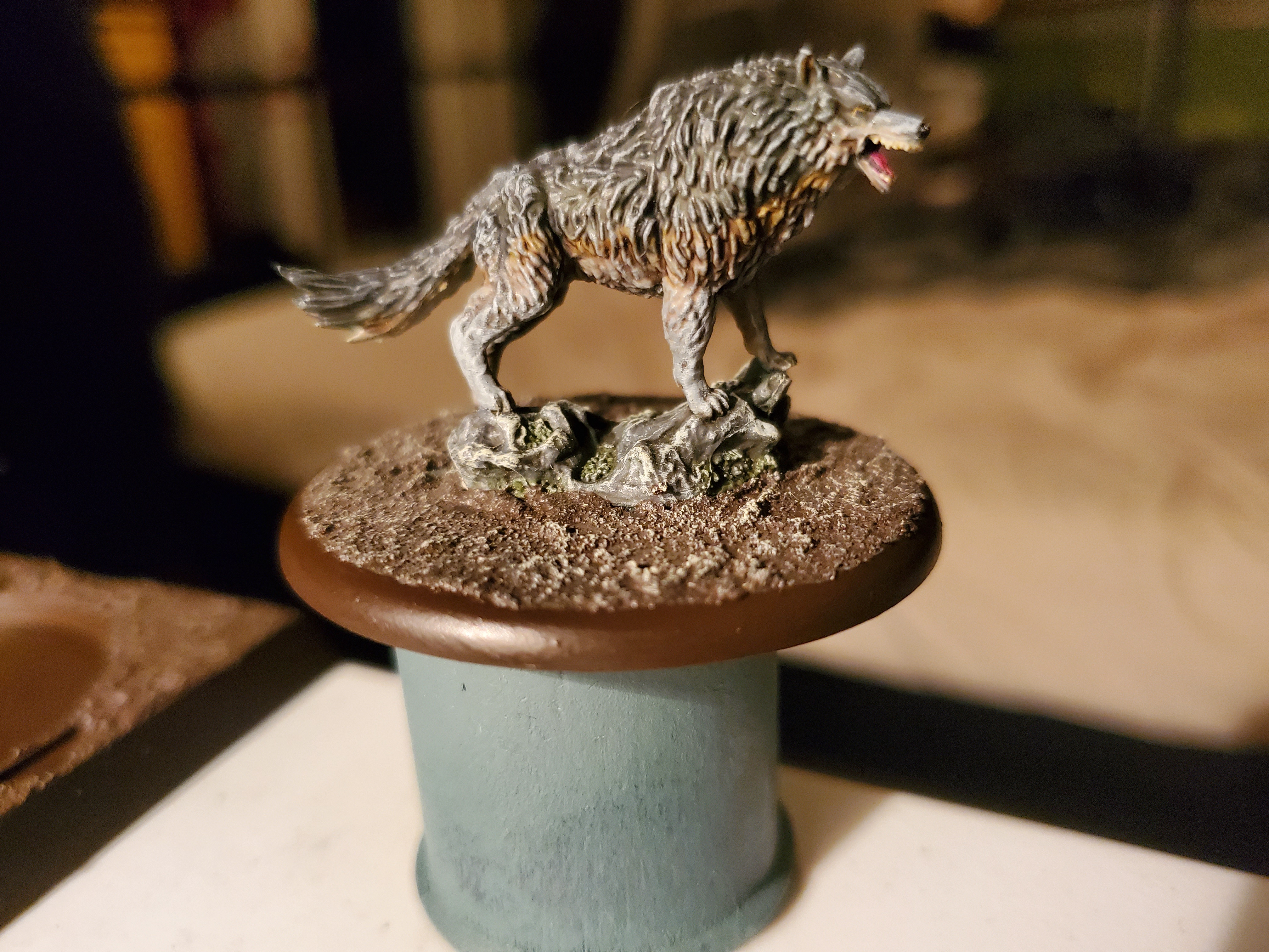
 The next thing to do would be the stone at his feet.
First thing would be to ‘clean up’ the rock with Mechanicus Standard Grey. It was a bit patchy, but that worked fine. As a Geology student, I know that rocks are not always uniform in colour. After that we needed to pick out the moss. Any green would do here, I chose Loren Forest. Next the rock was shaded with Agrax Earthshade, Athonian Camoshade, and Nuln Oil in patches that were allowed to mix freely. This helped give a natural feel, though the Nuln Oil may have been too strong and overpowering in places. After that, the texture paint was added (Stirland Battlemire in this case) as the drybrush highlight for it and the rock were the same. That drybrush Screaming Skull and the edge of the base was trimmed in Rhinox Hide to finish it off.
There's not been a direwolf sighted south of the Wall in two hundred years.
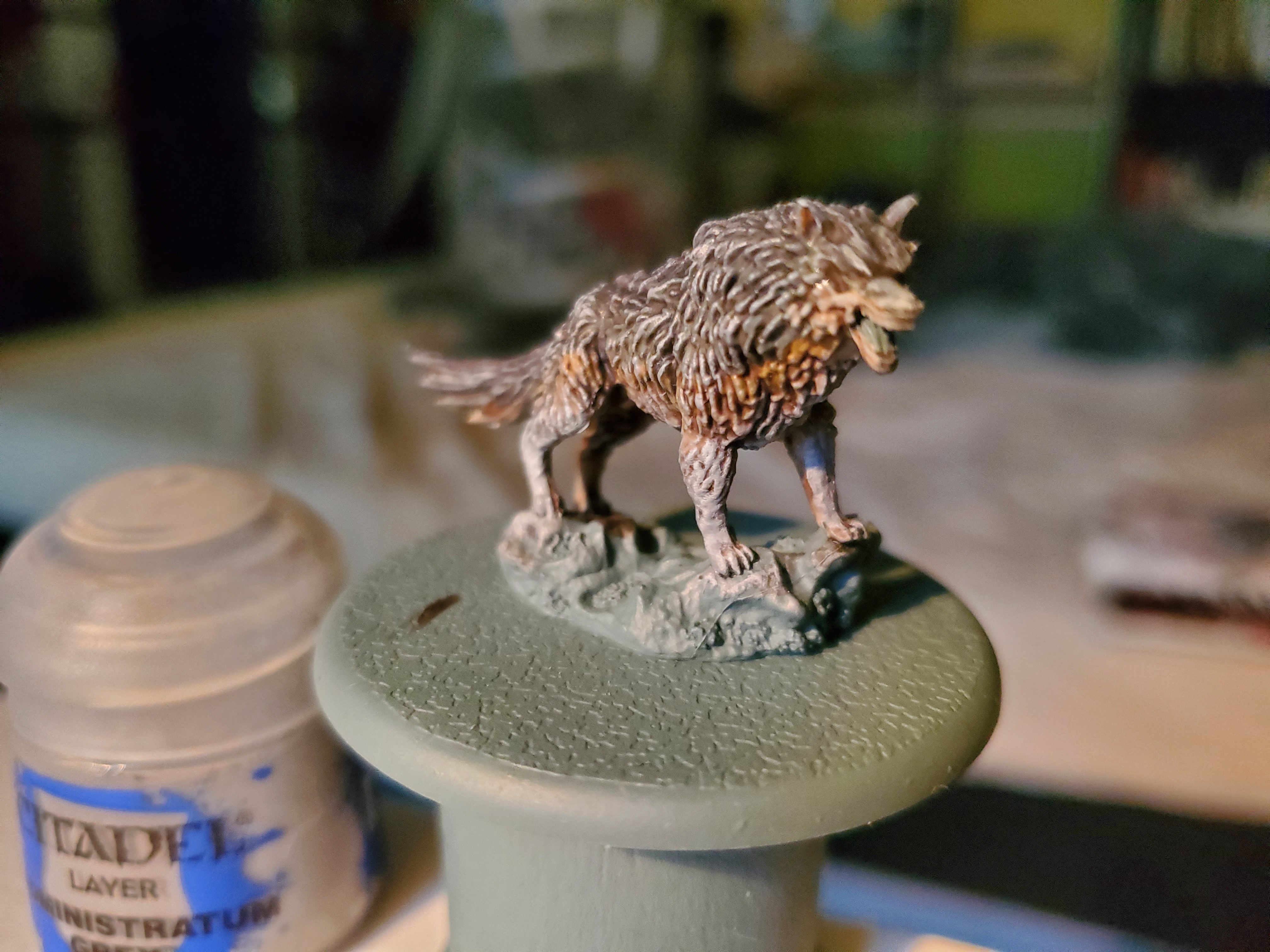
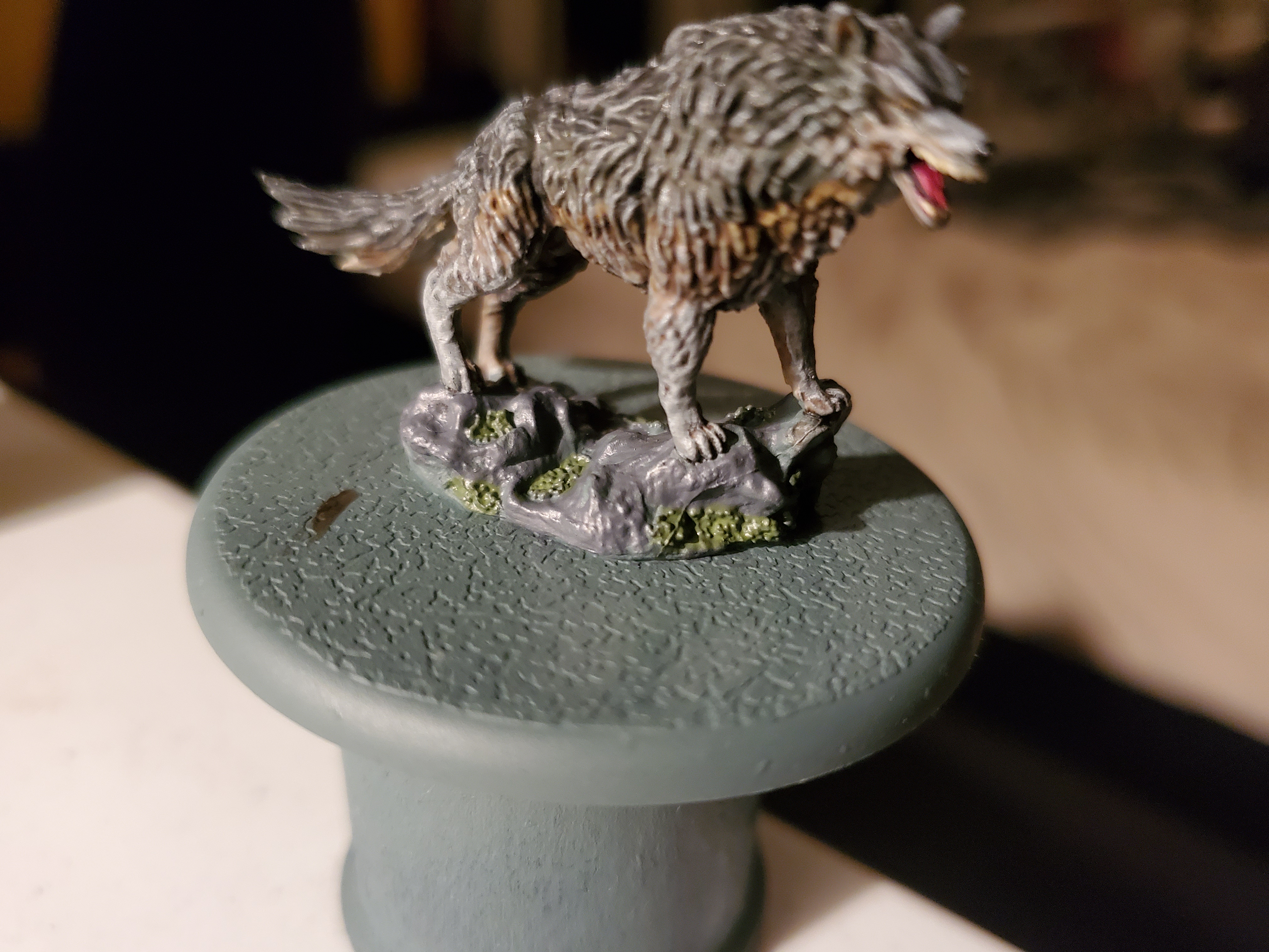
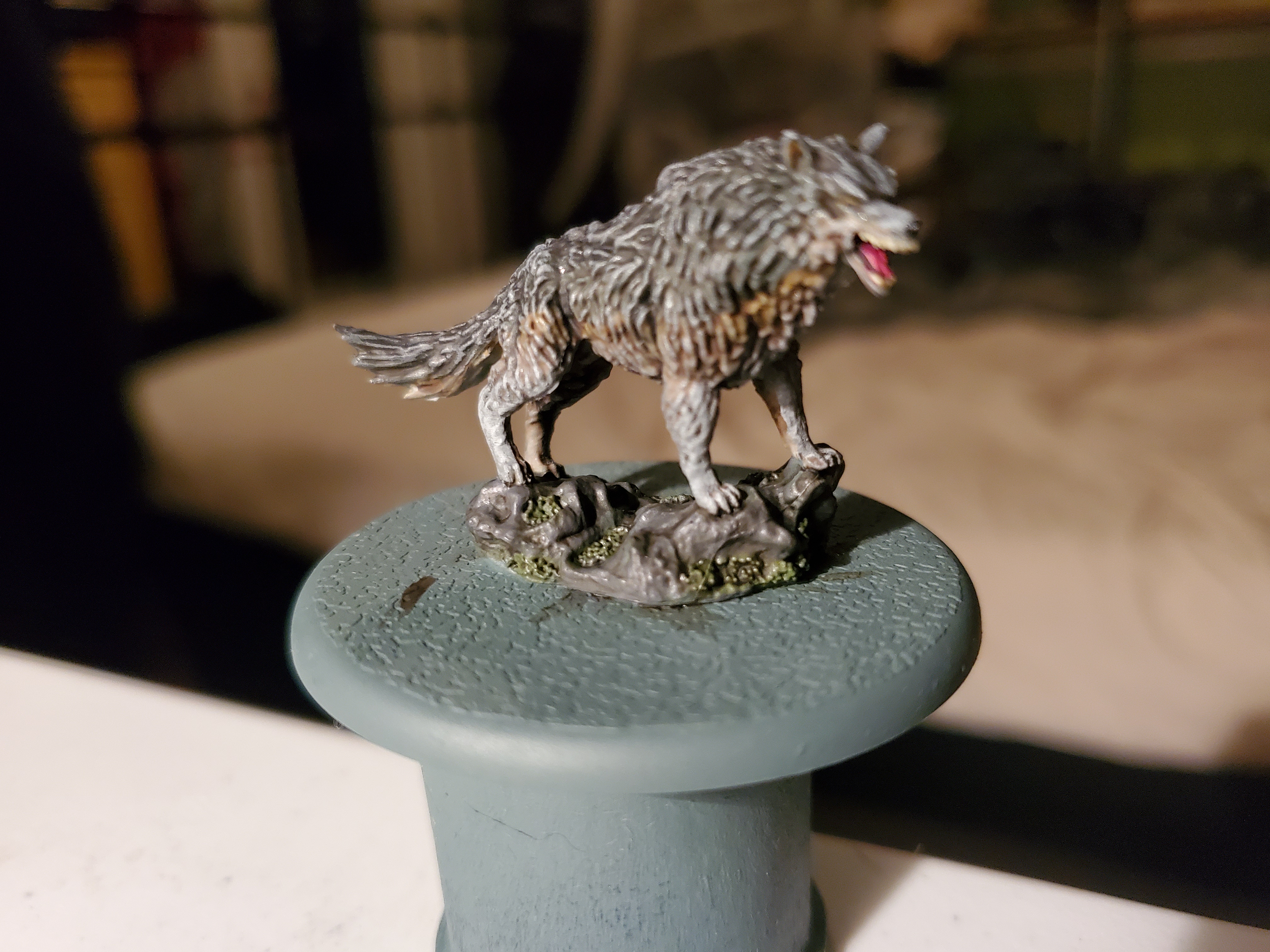
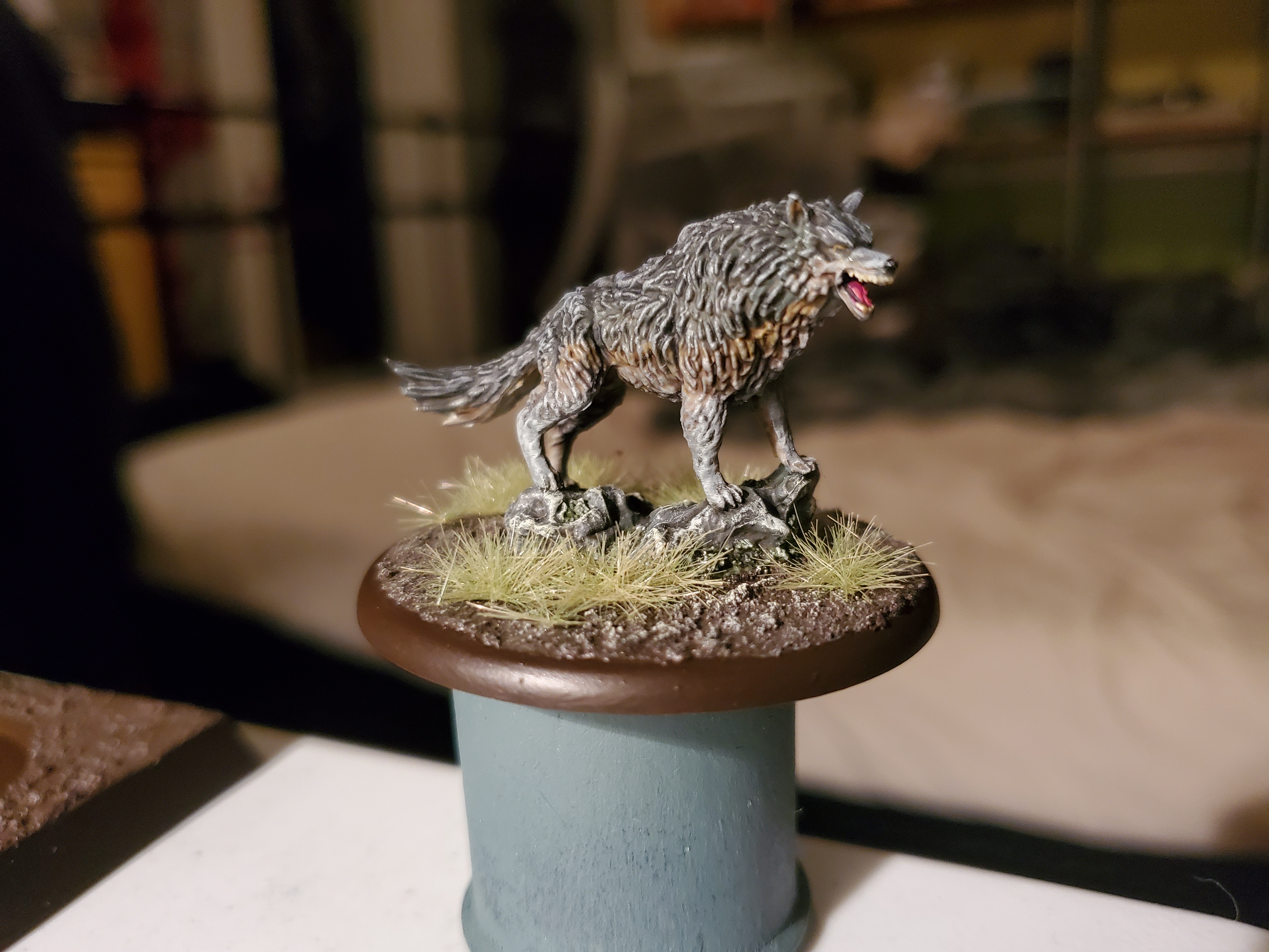 Grey Wind all ready to fight for The North! I may change this picture for one taken in better light tomorrow, and when that happens this post may merge into a post about painting the movement trays for the A Song of Ice and Fire Miniatures Game...we shall see.
Squares AND Circles? Is this peace, or madness?
Couldn’t find a fitting quote from the books, so I went with this. Thought I’d take the chance to do a small post on the movement trays as they are fun and have some small quirks about them.
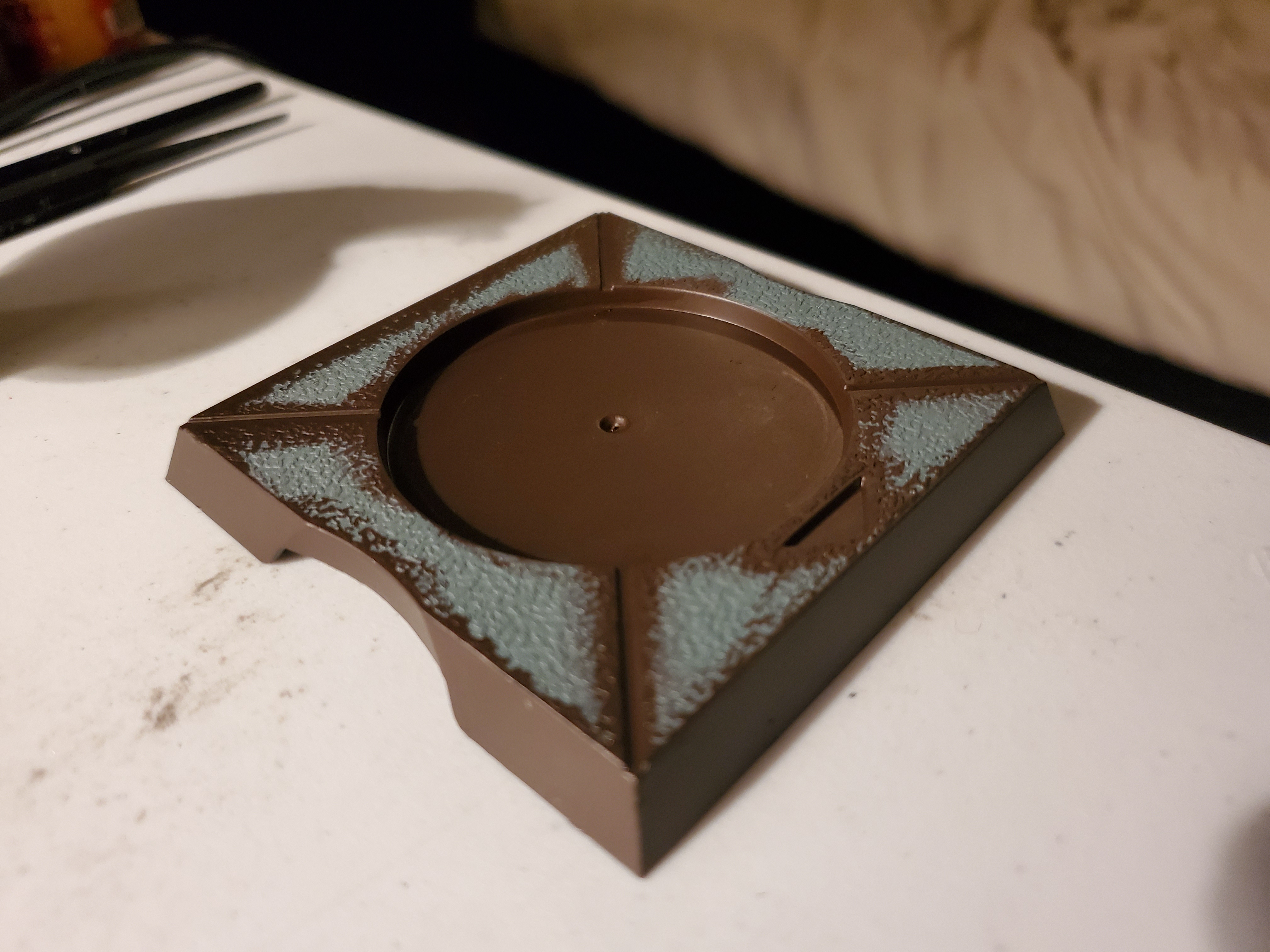 First task (after priming) is to give the none textured areas a coat of paint. I used Rhinox Hide, as it closely matched the basing colour I had chosen, but you could paint the lines in a brighter colour to stand out, though, if you'd rather. A pure white would work well for that. I also edges the tray in the same colour because I liked the look, but you could do whatever colour you like. I would recommend painting the slot where the mini sits in a similar colour to your basing, though. While it doesn't matter with a single mini like Grey Wind, here, for the larger units when a model is removed it probably looks better for the tray to not have large white circle appearing in the ground.
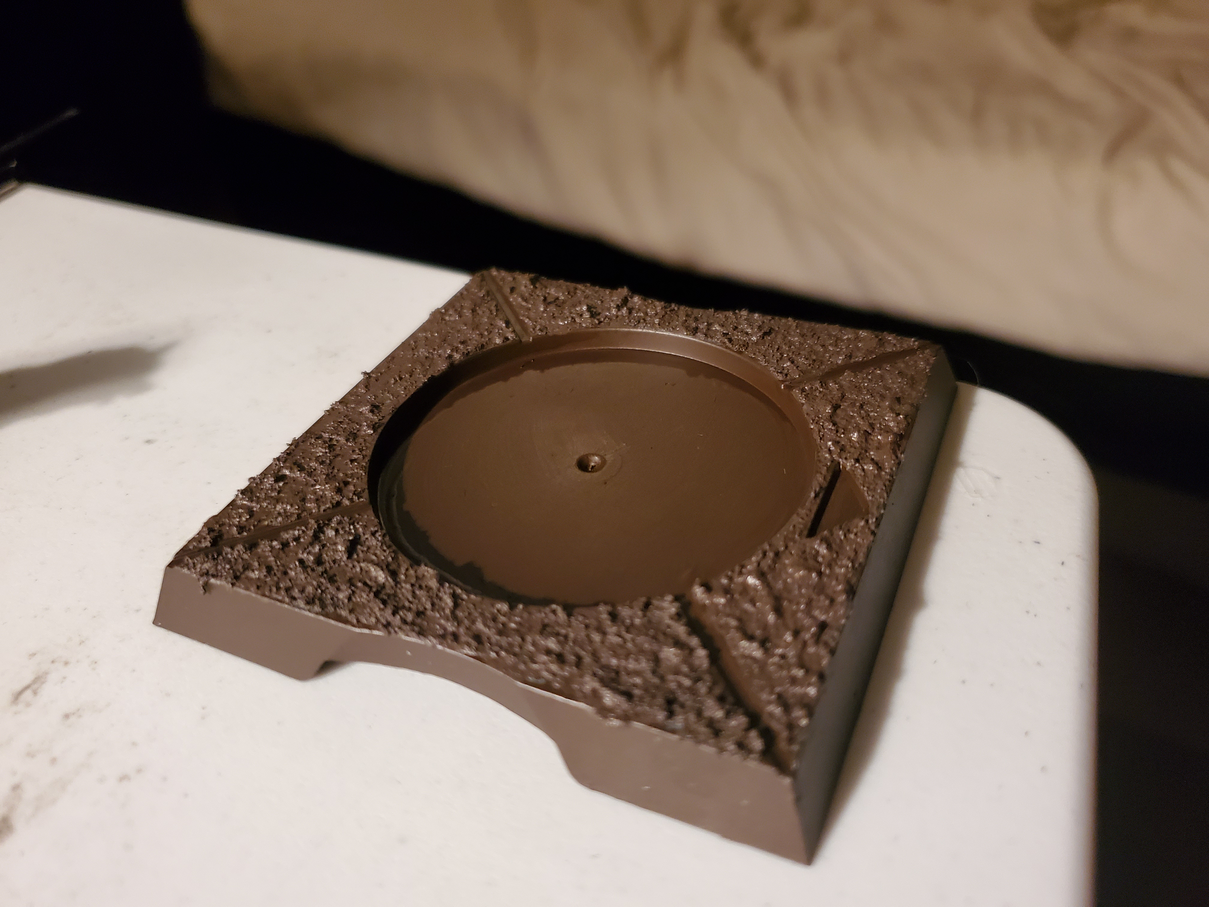 Next was an application of a texture paint. If you want to use sand or other basing materials then you could do this step first then paint over the whole base, you just have to be careful not to obscure the lines and the triangle for gaming purposes. Also, if you used a lighter colour and wanted to shade it down a bit, do so after this step.
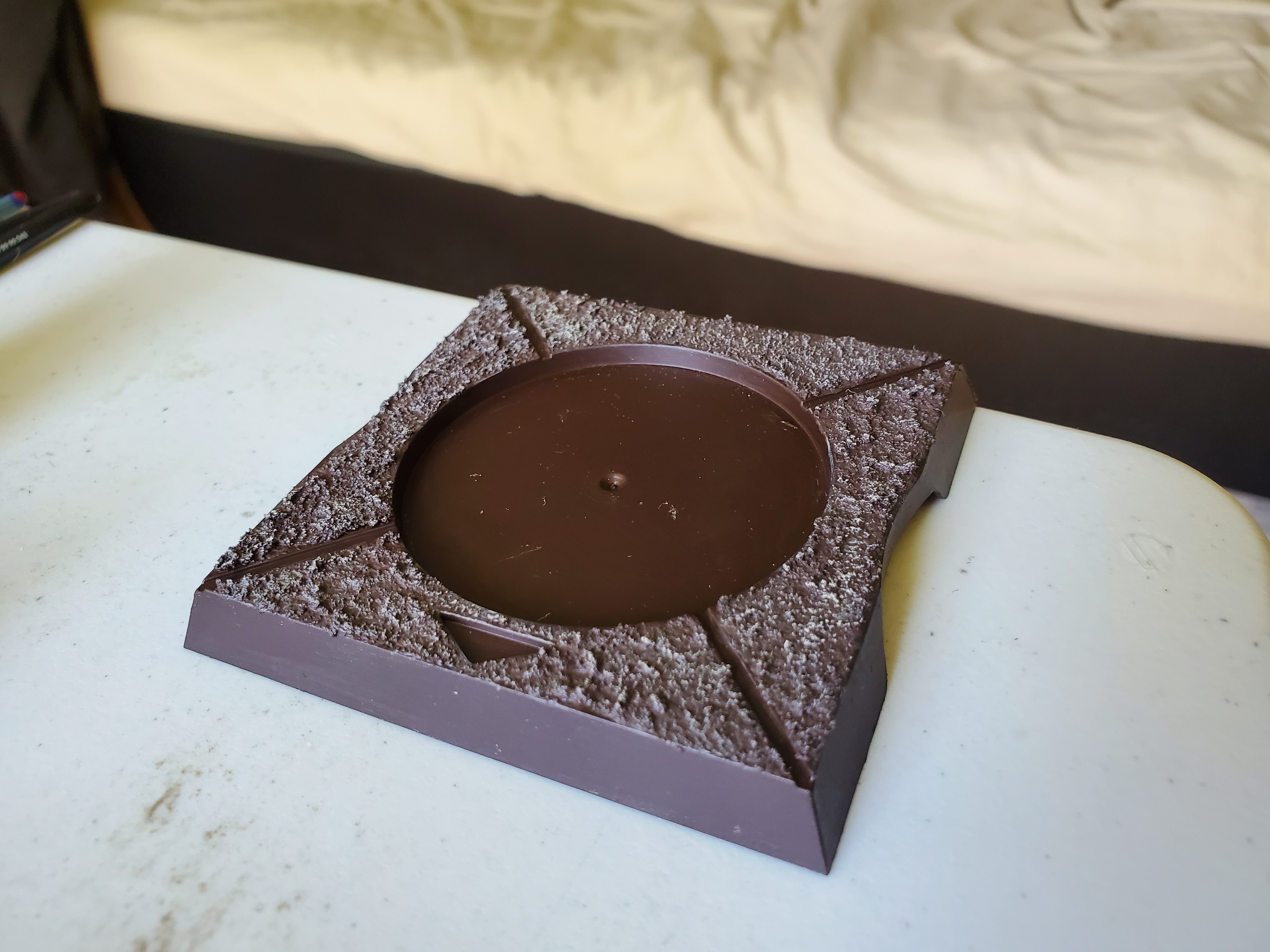 Next up a simple drybursh. I was rather careful here to not overspill, but if you do get some on the corners of the tray just touch it up with the colour you used to paint it. I tried to stear clear of the edges of the lines, too, to help them blend in a bit more, because that's a style I personally like more, but if you want more contrast, the drybrush can be used to add some bright edges here and there.
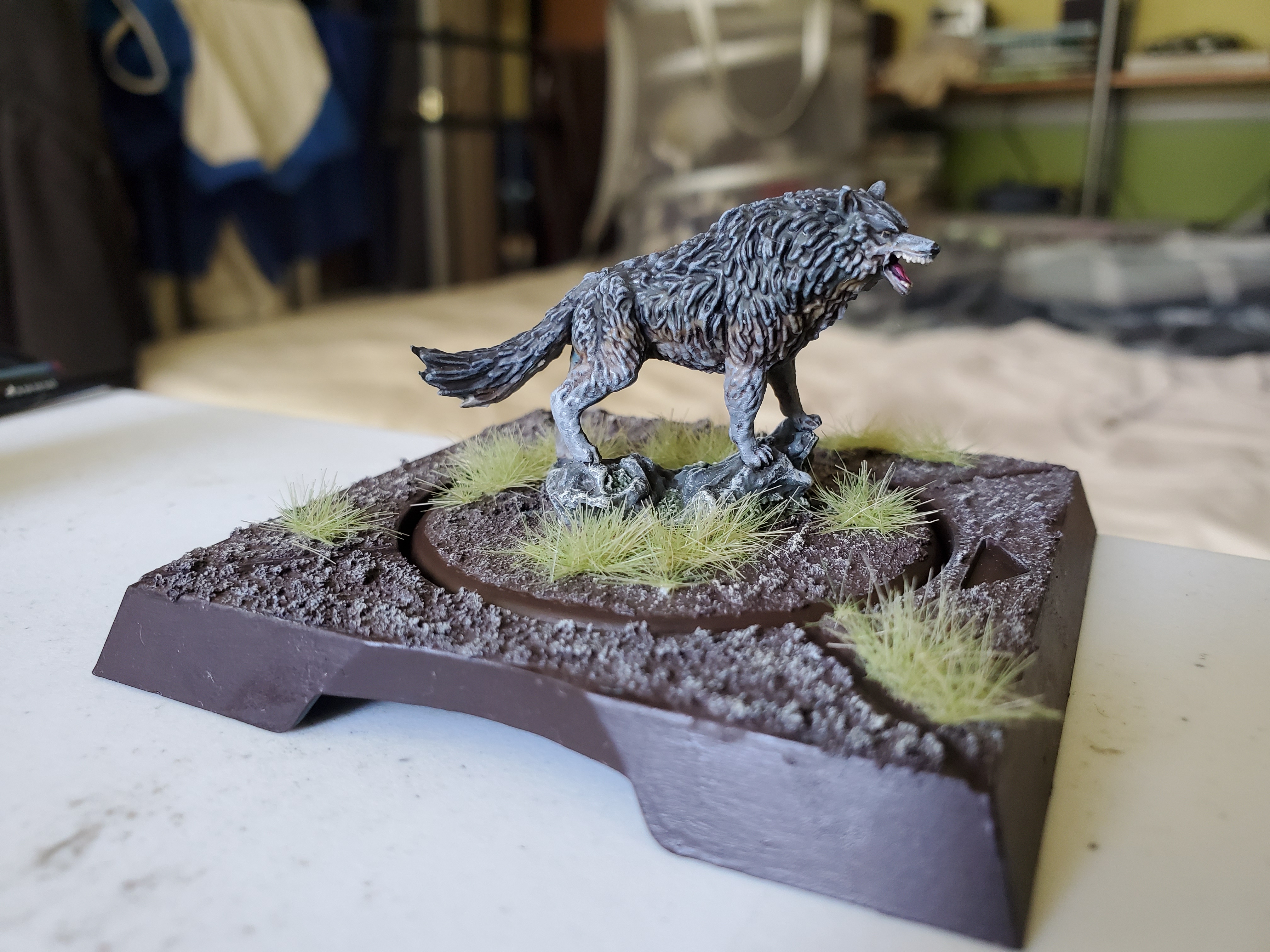 Then add your finishing touches, just some grass here and there for me, and it's ready for the table. You could add a shine to the edge with some gloss varnish, and I may do that at a later date, but getting Grey Wind from delivery to finished in under 24 hours is a new record for me. I'd never be able to manage a whole army in 24 hours...I'll leave that to the experts.
"Their father had been as relentless and implacable as a glacier, where Cersei was all wildfire, especially when thwarted."
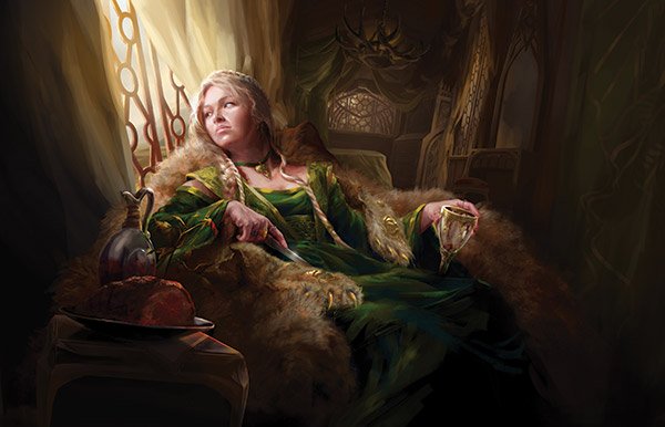
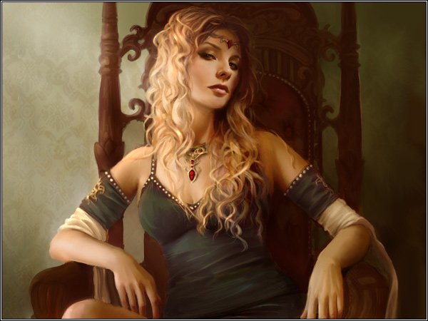
Next project is Cersei Lannister from A Song of Ice and Fire. The flowing gown will be something of a challenge, but something I’m looking forward to. I also plan on spending much more time on the skin here as she is a Lady at Court and not a warrior on the field of battle or a worker toiling away. Hopefully with a bit of work I could show that off. Due to the scale of the sculpt I don’t think make-up is within my abilities, but we’ll see how I feel when I get to that point.
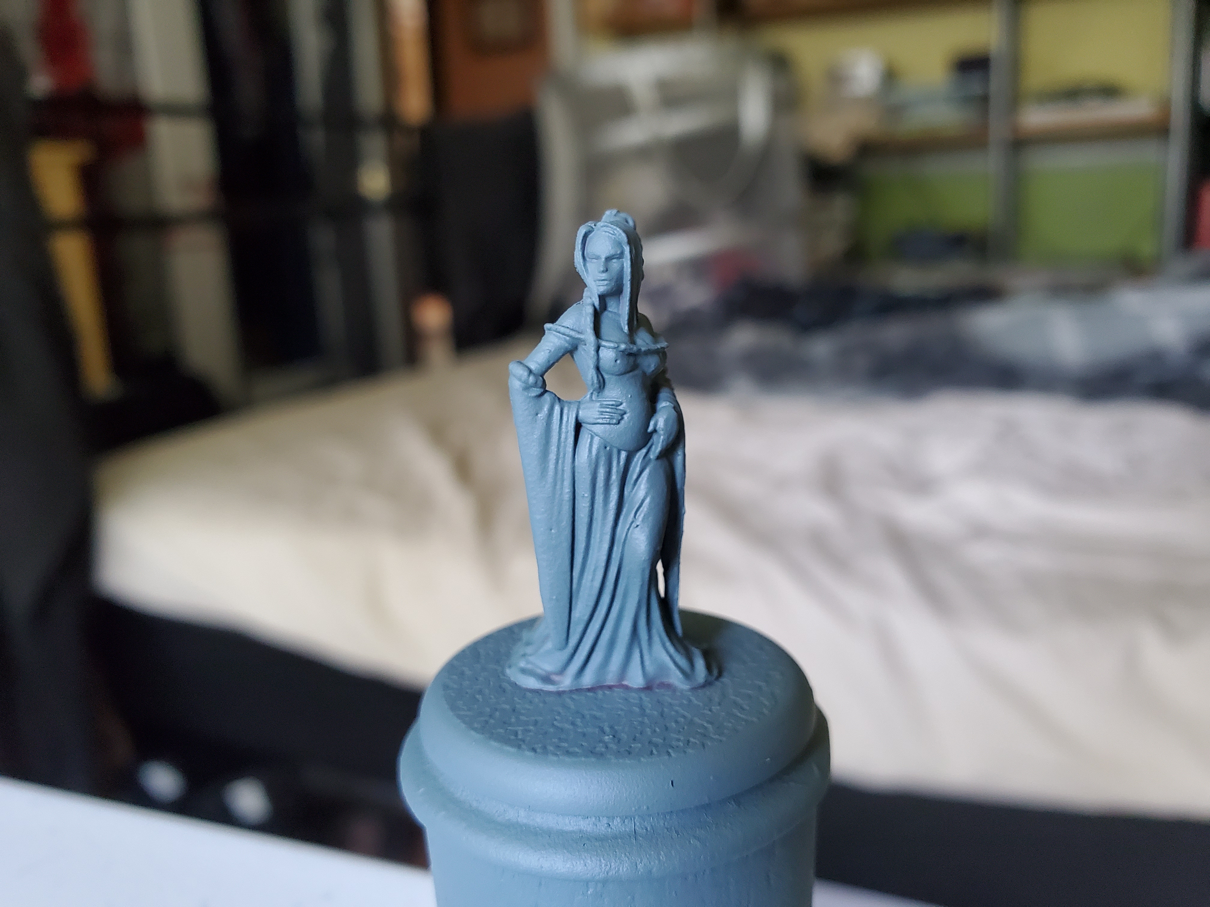
Mainly as a way of making her distinct from the soldiers, I plan to paint her wearing a gown she is described as wearing in the books as a low-cut deep green in colour. Hopefully I can find enough greens in my collection that are not ‘camo’ greens… The model has some differences, but the following pictures found on the Wiki of Ice and Fire should give a good indicator as to what I’m planning for. I will add some gold here and there to show opulence, but Cersei is supposed to fight in the halls of power and not the muds of the Riverlands.
I really do like these sculpts and the Non Combat Units add a certain layer to the painting side of things that is a nice break; not everything is a war-weary hero constantly fighting. On that note, there is a speech from the books given by Septon Meribald that, for some reason, they left out of the TV series…probably not enough sex appeal…
"I am a lioness. I will not cringe for them."
Not sure why I’m being so productive at the moment, but Cersei’s gown is finished. This is a large part of the mini so she looks almost done, but I do plan to spend some time on the skin for her. As described earlier, I went for a green colour, but as the gown is so much of the mini, I made the colours a bit varied on the bodice and sleeves while still have them work together.
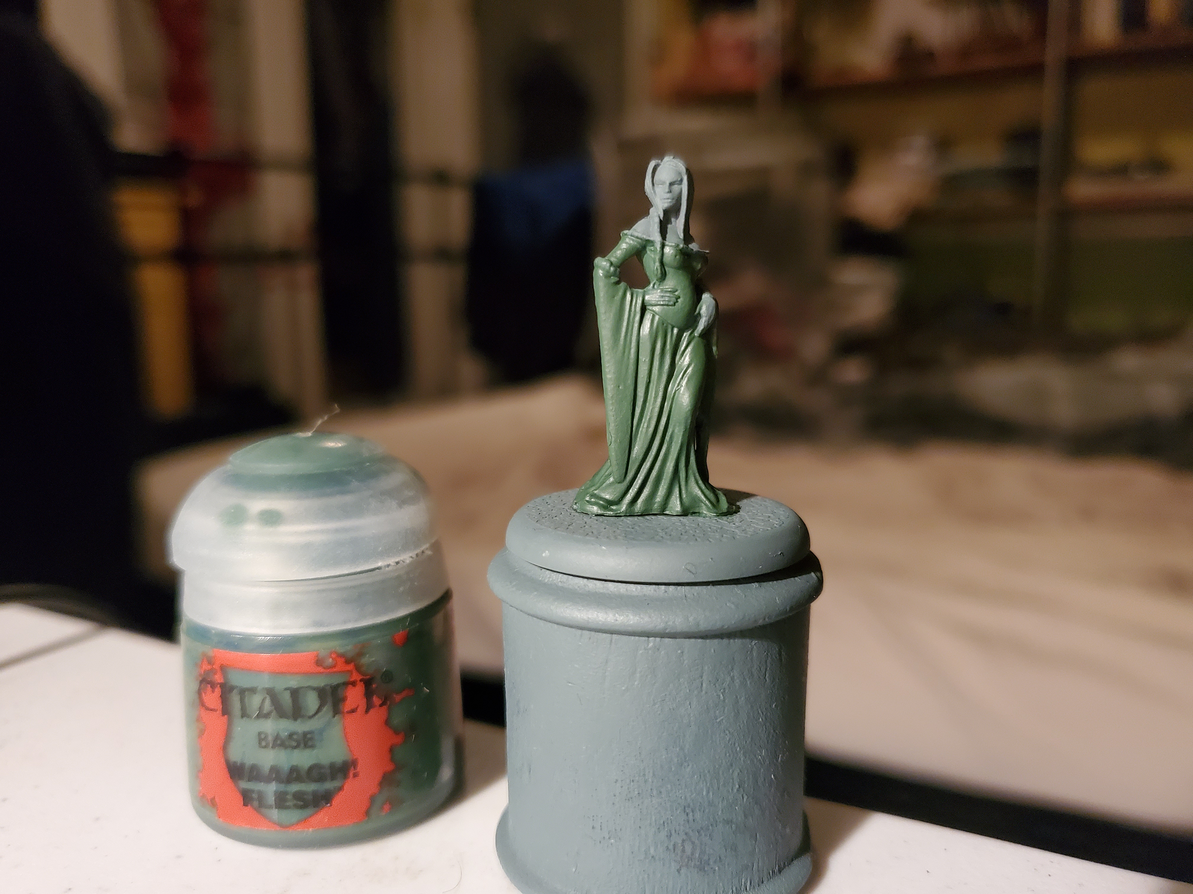 Starting with a basecoat of WAAAGH! Flesh (I did check how many A's were there before typing) over everything, this sets some nice recesses in the folds of the fabric. Having a unified basecoat colour also helps the slight variations to still work well together.
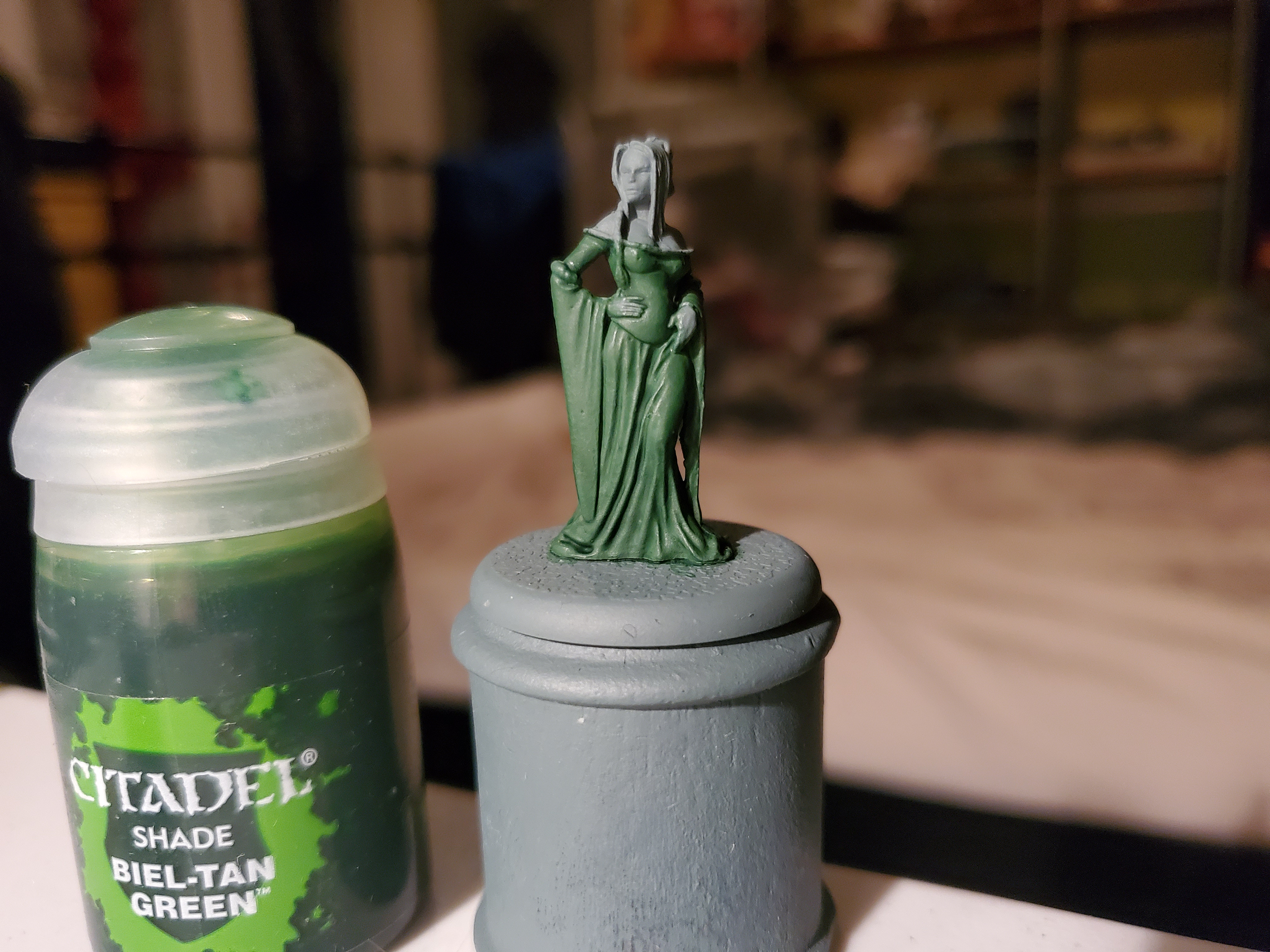 Next an all over shade of Biel-Tan Green over the gown. This helped keep the greenness of the gown while still adding shade, though it is more subtle than a black shade would have been.
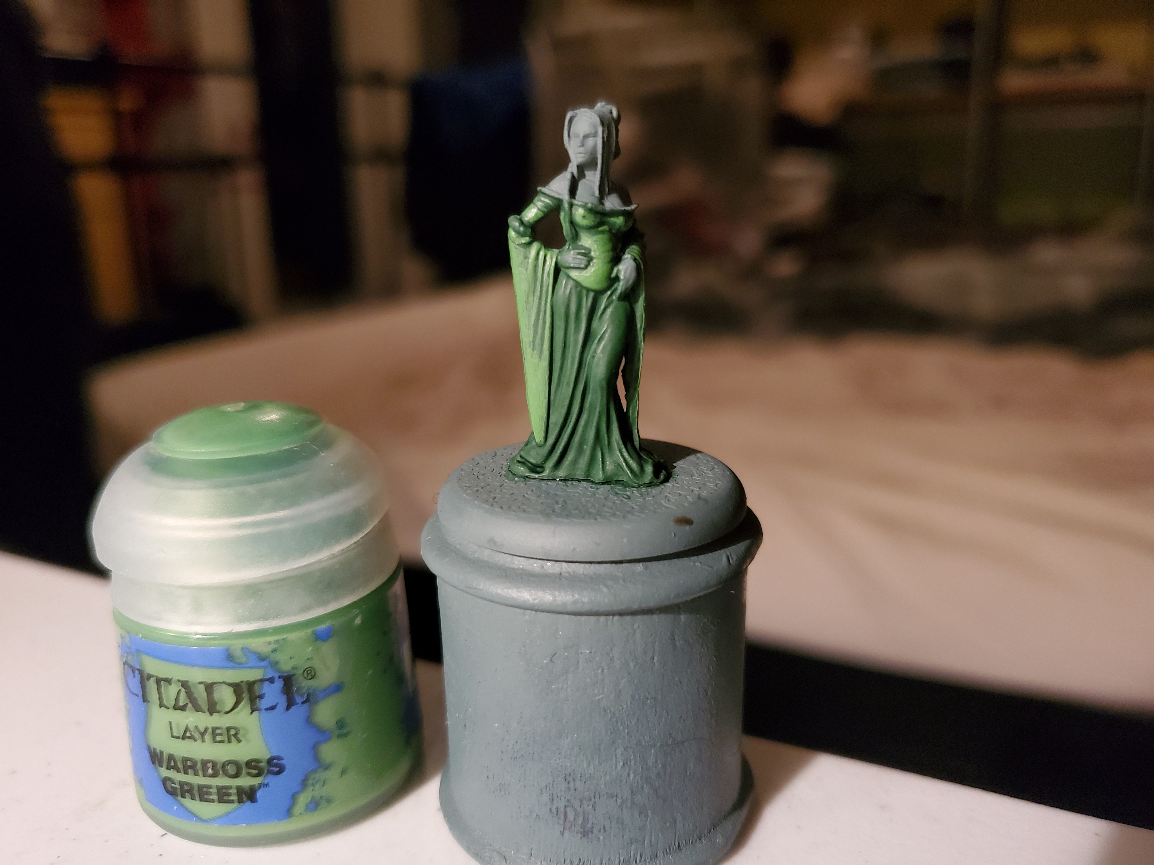 Next I started with the first deviation of tones. I layered Warboss Green over the bodice and sleeves, ignoring the darker recesses, brightening these areas up a touch.
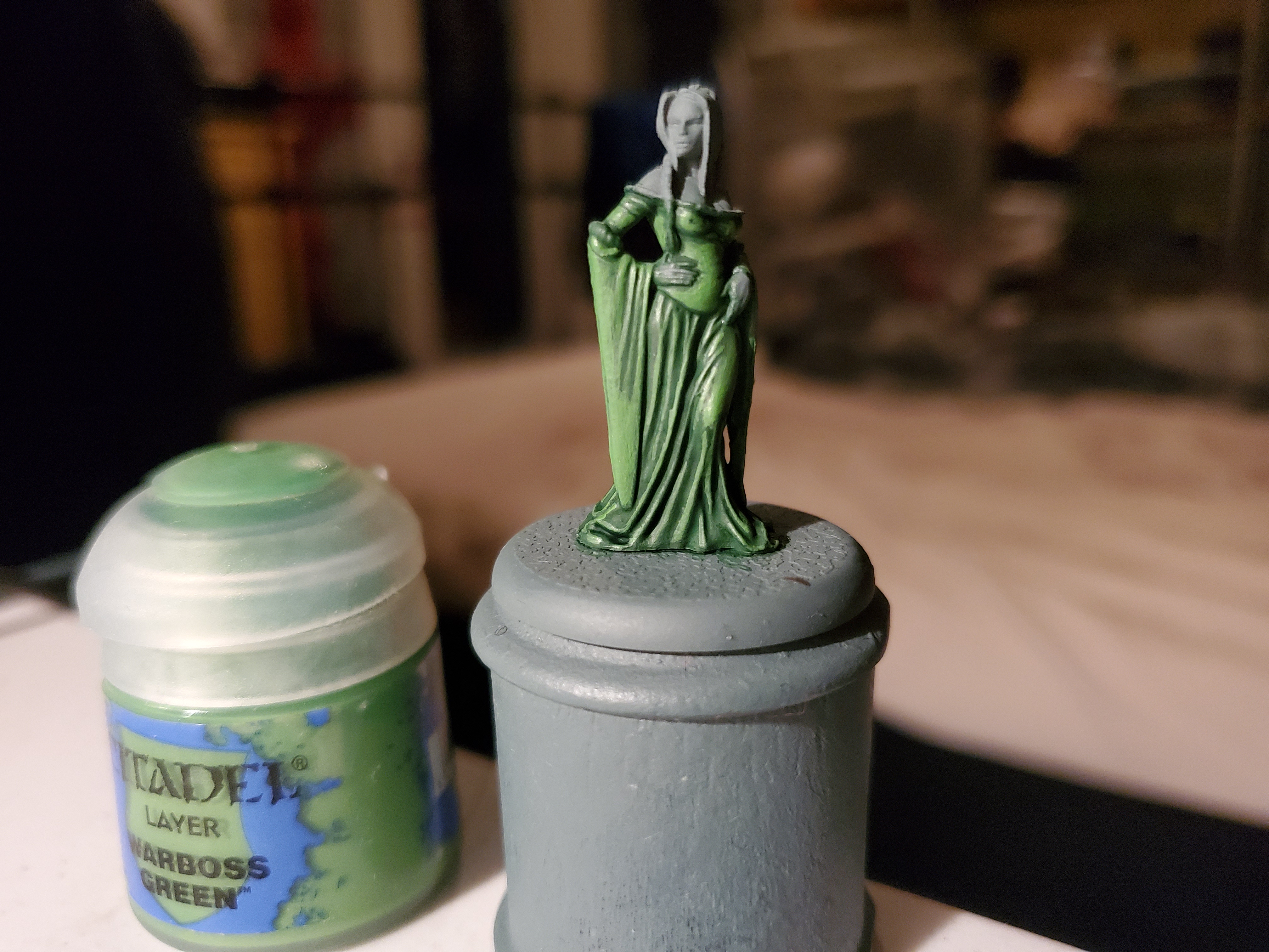 Then, still with Warboss Green, the lower part of the gown was edge highlighted. If you were using a different colour, you may want to layer the base colour first, but when I did that on some of the few flatter areas there wasn't a big enough difference in colour. The Biel-Tan shade is very subtle here.
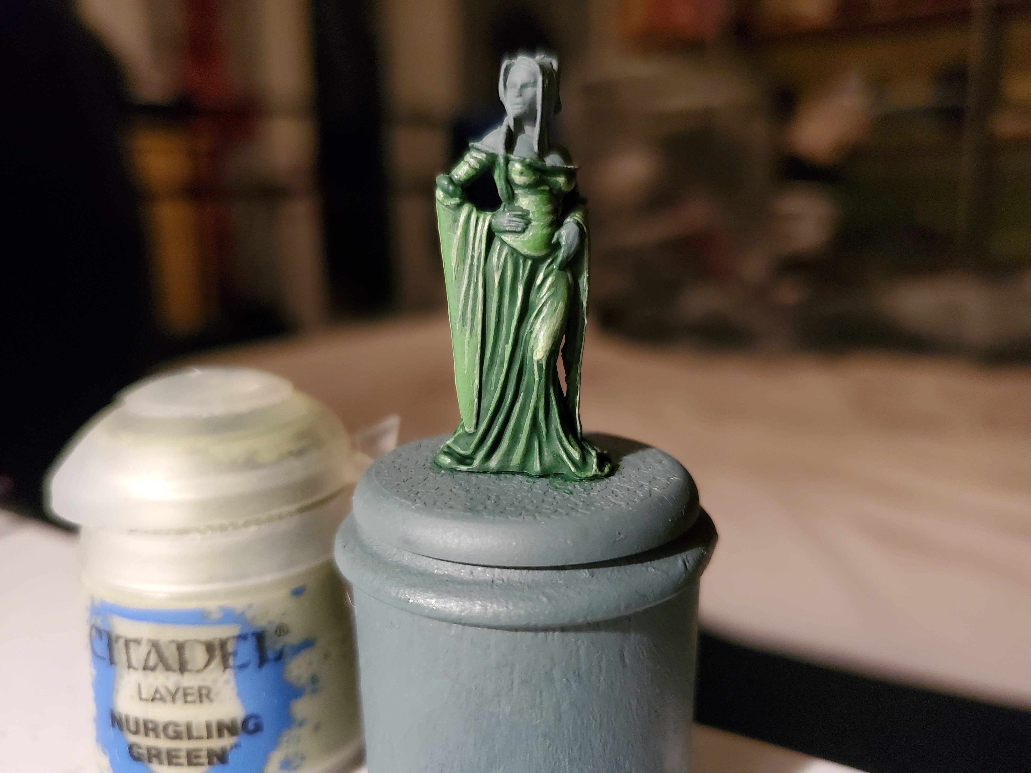 Next with Nurgling Green (very thin in my case) I edge highlighted the sleeves and bodice while extreme highlighting the lower gown with this colour (just dotting the paint more than painting it). This continued the darker tone on the lower gown and, with the exception of one spot on the knee area, finished it.
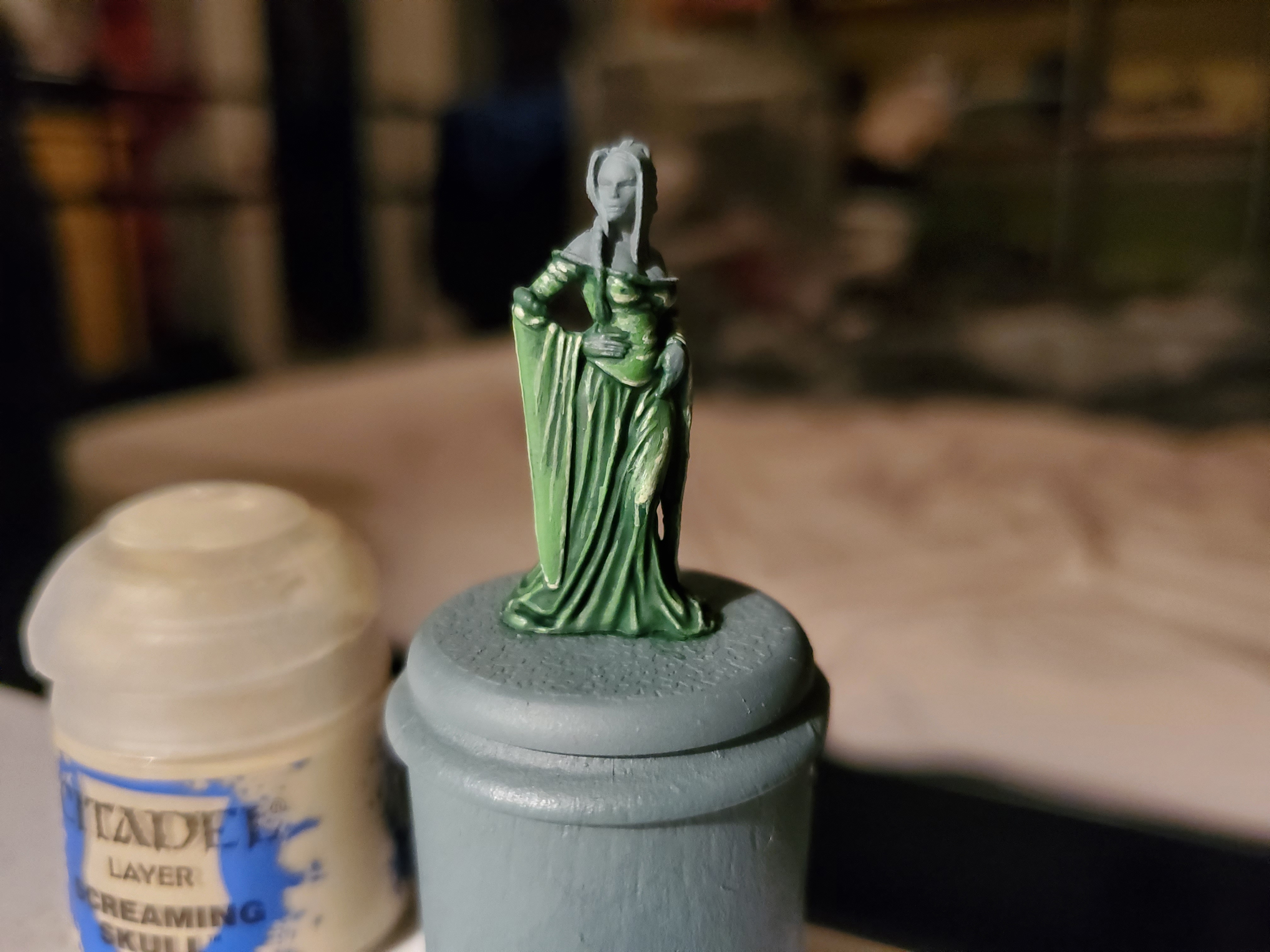 Then I did some extreme highlights on the lighter areas with Screaming Skull. Very small touches of this otherwise the colour can quickly turn beige. I also added a touch of this to the knee to help show off that area where she is slightly pulling up her gown along the knee... Floozie!
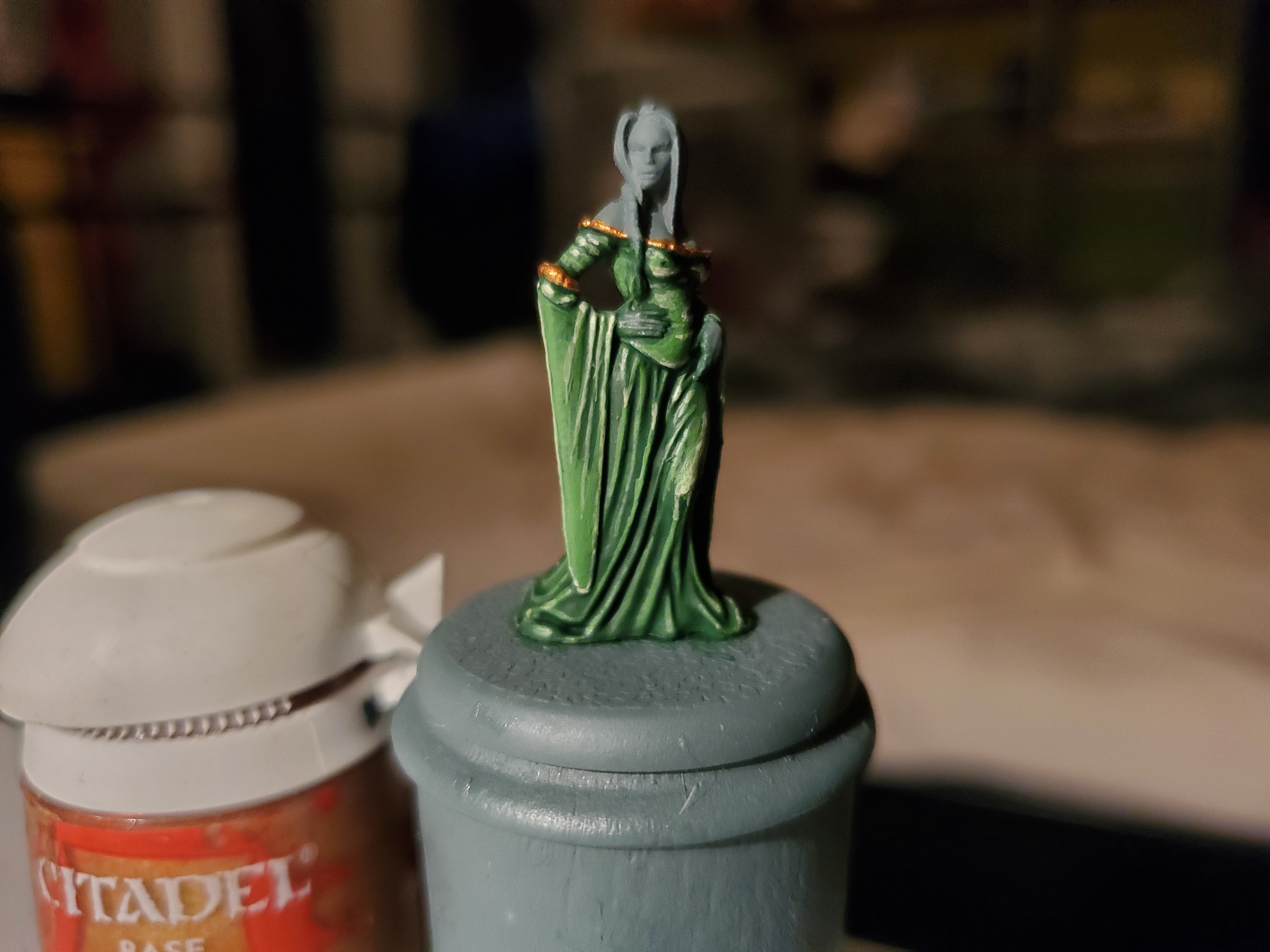 Finally the trim was basecoated in Retributor Armour...
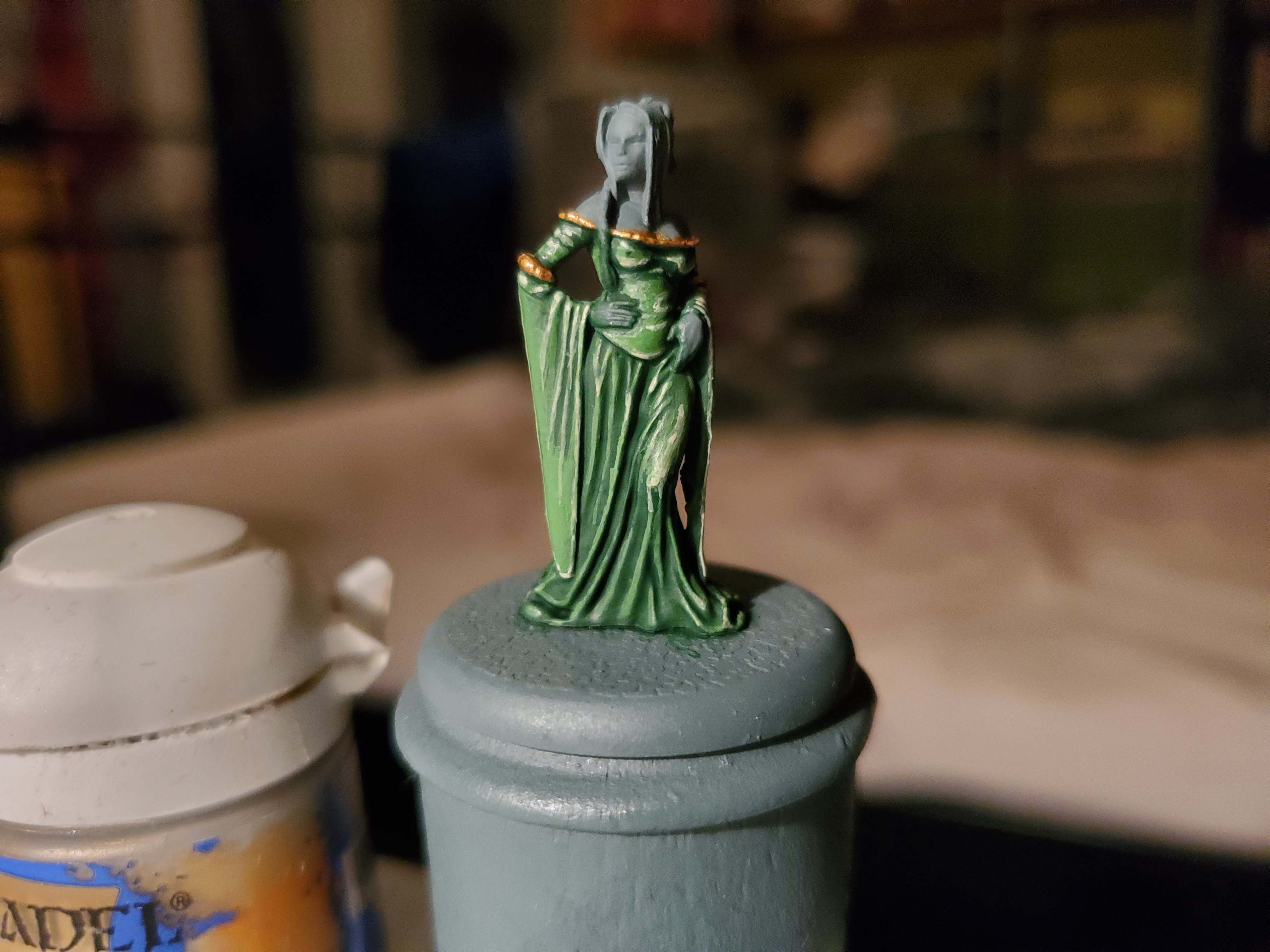 ...and highlighted with Liberator Gold. I think that simple touch of shine really makes the whole thing stand out. Next up is the skin and hair, so stay tuned...or whatever.
![StarCraft Tabletop Miniatures Game Pre-Orders Live Now [Updated]](https://images.beastsofwar.com/2026/03/starcraft-tmg-news-cover-600-338.jpg)