Master Class: Painting the D&D Eye Tyrant Part 1
September 9, 2013 by elromanozo
Video Sponsors: Mercs - Warmachine
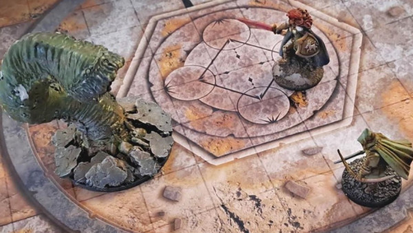
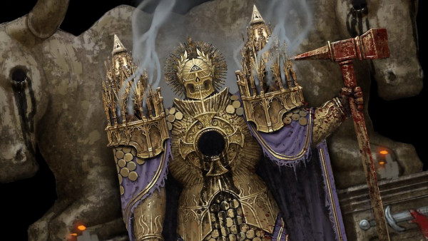
Romain has taken out another of the fantastic D&D collectors series minis for a painting tutorial, and will be showing off another round of his wet painting techniques.
For more info. on the D&D Collector's Series form Gale Force Nine visit: www.gf9-dnd.com
Supported by (Turn Off)


























another great wet blending tutorial. i found citadel paints ok recently i have been letting them down with lamian medium from citadel that works better with citadel paints than valejjo flow aid i find not sure why.
Thanks !
I don’t know why either. I assume the formulas are getting more and more brand-specific, and that GW, as per usual, wants very specific products that are less miscible with other brands and more specific to the GW painting style. They sure are implementing sculpts that are made for the “eavy metal” style already.
No backstage needed for this tutorial? Let’s hope this will continue -)
The contributions from backstage are what enables us to do tutorials like the above, so if you like them, it would be great if you considerd contributing 🙂
Generally, the lovely big full ones are meant to be on display for all to see, but you get to experience the tips (and so much more) in the back area…
Sorry, couldn’t resist. 🙂
that and it would be totally remiss of us not to let @elromanozo ‘s one eyed monster out of the back area … 😉
Sure. Right after the purple worm, here’s the big balled red guy with the eye…
Hi Romain. I purchased the Purple Worm and some War Paint after watching that tutorial. Can you give a rough idea about what the open working time for the paint is when using this wet on wet technique? Thanks.
Good for you !
You’ve got plenty of time as long as you don’t leave it alone. If you keep painting it, it lasts longer (obviously). Depending on your dilution, it lasts… oh, about an hour, tops. But you will never need that long a time. Even if you’re extra-slow, use medium if you need to (I didn’t).
You may have to pour more paint on your palette as you go (as I did), but don’t worry about time : at least just do the whole basecoat in one sitting, you’ll be all right.
You’ll see, it’s very quick anyway. Don’t be afraid to overstep ! With that technique, you simply can’t.
Awesome Tutorial as alaways Romain, looking forward to the other parts.
Some quick questions, if you don’t mind:
1-What’s the brush you use to paint the eye? It seems like a small flat brush…
2 – I have recently noticed that some friends of mine have a thing for the “ivory” colour (they use it in extreme highlights wheter its white, bone or some other colours, as well as mixing it to achieve lighter versions of the base colour).
In this tutorial you also use it instead of just white, (in this case to blend the creature’s eye) What’s with the Ivory colour that aparently is so good?
Cheers and keep up the great work!
Thanks for the compliments !
1) It was indeed a small flat brush. Specifically a Royal and Langnickel filbert brush, about the equivalent of a number 4 flat brush or filbert brush in other brands.
2) Sadly, I may be credited for this “bad” habit, if they’re fans of my tutorials… That or a certain line of historical figure painters magazine, and some Internet articles for the aficionado.
I often use Ivory for reasons explained below. However, I try never to systematically use a certain paint for all highlights or all shadows on every miniature. Still, some tones come back often, like Hull Red for example, because I like the look.
Ivory is a “go to” colour for highlights because it’s always less chalky than white (even though white is used readily when looking for something crisp and cold). In this case, it’s used to work on an eye and teeth to make them more natural, more jaundiced, less cartoony.
Ivory is also a warm colour, and it’s used as a highlight because of colour temperature : having cold (blue/green) shadows and warm (yellow/red) highlights increases the sense of depth and feels more natural than black shadows and white highlights (too desaturated, something that almost never happens in nature).
Finally, by nature, Ivory is slightly yellow and slightly red, which means it can be used more efficiently to highlight reds : when you mix white and red, you obtain pink. When you mix Ivory and red, you obtain pink only after a while, and always something slightly orange first, which makes it more appropriate for some types of red.
In that respect, Ice Yellow (Vallejo) is also a very good “warm” highlight, and such is skeleton bone (warpaints) and all light fleshtones. Deck Tan (Vallejo) sometimes does the trick if you don’t want your highlights too bright and want to keep things desaturated.
If you need cold highlights, colours such as Frostbite (P3) or Underbelly Blue (P3) or Thrall Flesh (P3) are interesting…
This last advice should enable you and your friends to “force” yourselves to use alternatives to Ivory, in order to achieve the effects you want, and not always the same effect…
For more information on colour temperature, depth, desaturation and the whole “not using white or black” thing, you could do worse than refer to my six-video series about colour theory… Just saying. 🙂
I hope this answers your queries… Happy painting !
R.
Thanks for the reply Romain!
When I mentioned the Ivory thing, i didn’t mean it as a “bad thing”: i’m actually starting to enjoy the colour very much. It was only to understand the rational behind it being awesome 🙂
As for your coulour theory series I’ve watched it quite some times and actually return to it from time to time 🙂
Regarding the brush question, I find it quite interesting that you use brushes other than the usual standard miniature brushes or the classic W&N series 7. You seem to use standard artist brushes, or am I completly wrong on this ?
Cheers
I always tell you (pretty much) what brush I use… Prince August (french miniature brand), Raphael (the very very best) and Isabey are my favorites. W&N series 7 are too expensive for what they are, IMHO, but it’s all a matter of taste and availability.
The W&N series 7 is indeed an “artist’s brush”, and you should always endeavor to use proper brushes, at any rate. I’ve done an article about brushes that’s still on BoW somewhere…
There are great brushes out there, even the synthetic nylon/taklon ones, and very affordable…
Comparatively, the brushes from many specialized brands, such as the Citadel brushes, or some german brands I’ve tried, are (pardon me for using the appropriate term) arse gravy of the worst kind. Even the sable ones.
I’ve forked and crooked “sable” citadel brushes in less than a month, whereas my trusty Raphael brushes (even the synthetic ones) have lasted me years and are still in good shape… I think it’s worth the investment ! 🙂
Agreed 100%
The Citadel brushes have been a disapointment and I’ve stopped using them altogether. I have come to use the Valejo ones and find them excelent in the money/value ratio.
Oh yes, those aren’t bad at all, if you can get them.
Hey Romain, if you’d be so kind as to give me a little bit of advise. Been a gamer for a long time but have only recently been trying to really improve my painting skills.
1 – When it comes to shades and highlights, I do a pretty good job with the former but often struggle with the latter. Usually if I attempt to blend shadows I either make them too stark or too subtle. I can’t seem to achieve that nice “sweet spot” where they give the model depth without looking out of place.
As a result I’ve been thinking about giving Foundry paints a shot due to their triad system. I understand that it could be a pitfall to get into the habit of adhering to a paint system but I’m thinking they may be a good way to help train my eyes in terms of color. Thoughts on this?
2 – Would love some tips on how to paint faster. I’m such a slow painter…even when I use pre-made washes like Quickshades it seems to take me much longer than most other people to finish a model. I’m not sure what I’m doing to make it go so slow…normally I only apply two to three layers for the basecoat. I use a Raphael #2 which is a pretty good sized brush for that sort of work. I do try to get a pretty opaque basecoat so maybe I should worry less about that?
Any help you could give would be appreciated.
Hi ! 🙂
1) If you want to go for my usual technique of washes and glazes (which is by no means the only one to achieve blending), it seems to me that, from what you tell me, you need to dilute your paint more (or control the dilution better). Put less paint on your brush, perhaps. Only by seeing some of your work would I be able to advise you properly on this one…
The gist of the technique is getting only a little dilute paint on your brush, and paint a “veil” of pigment over the surface you need to highlight or shade. By painting more and more “veils” over a smaller and smaller surface, you increase the opacity, and manage blending.
Now, about the Foundry system… It’s not just the “three tone” thing, it’s a whole painting method, with a guidebook and everything.
While Foundry paints aren’t bad (and their range is indeed impressive… I believe I’ve done a review article on them), you will probably have noticed that NONE of the miniatures painted with the Foundry system is blended, properly or otherwise. They simply don’t try : that’s not their thing. So don’t try this system “as is” if you want to achieve blending.
While indeed very easy, I believe this “system” is a gateway to buy more paints than you need (although that’s never a problem), and won’t ultimately teach you anything about painting.
It won’t teach you about colour : even if you don’t use the method and start blending, you’ll get used to shading yellow with a darker yellow and highlighting it with a lighter yellow, and you won’t consider highlighting yellow with, for example, a fleshtone or a light blue… or shading it with brown, or purple. You would have considered it if you had known about colours or if you had observed real yellow objects : purple is the complementary colour to yellow, it’s quite logical to use it to shade yellow.
It won’t teach you about realism : in nature, shadows DO NOT work that way. Ever.
It won’t teach you about colour temperature, value, or saturation : All tones are at one saturation/value/quality for what they represent, and do not vary. Shades and highlights are never warmer or colder than the base tone.
It won’t teach you about mixing : if you follow the system to the letter, you’ll never have to blend again, and mixing paints is discouraged because you simply buy the proper “triad” for the colour you want.
It won’t teach you about dilution : you’re encouraged to use as opaque a paint as possible for the thing to work. The paints are fluid enough that you can paint from the pot… which is a bad habit, and which you should never do if you want your brushes to survive more than a week.
It won’t teach you about light : the direction of the light is barely treated, and the colour of the light is irrelevant to the system : you get the colour triad to paint such and such object, this type of object will always be painted with that triad, shaded and highlighted the same way… never mind if the scene represented is at night, at noon, at dusk, underwater, or with weird source-lighting glows.
What can I say ? This system is a grid that one adopts to basically stop wondering about what colour to use. Just like anything “systematic” or “automatic”, it’s mostly good when you break from it.
It’s facile.
I do believe it’s never a good idea (both in painting and life in general) to stop thinking or stop experimenting.
Following it, you would never even think of painting a black cape, say, by basecoating it in a dark purple, shading with olive green and black, enriching the tones with prussian blue, and highlighting it with elf skintone, then putting on the final highlights with ice yellow (Which is one of the common ways to do realistic black capes on larger scale miniatures).
That said, the Foundry system will give you quick and easy results for tabeltop quality models, by merely reducing painting to a step-by-step paint-by-numbers here-are-your-ingredients-follow-the-recipe kind of activity… There’s nothing wrong with that, especially if you’re chain painting and don’t care about light and blending, or if you can’t be bothered with all that Renaissance painting and fluffy art stuff.
Who knows ? It could happen. I prefer to think most of my viewers don’t belong in that category, but I may well be deluding myself.
Whatever the Foundry system is, and whatever it’s undeniable redeeming merits are, it is at the antipodes of what I have been trying to teach here.
I certainly would be bored to death, painting like that… but I’m always for whatever works : if it’s what you need, if it’s your style, go for it !
If you’re precise enough and if you dare to “break” the triads every now and then, it yields interesting results. I have one or two friends who use it to some extent, quite successfully so.
2) I don’t know exactly how fast you’re painting, you haven’t told me. Speed comes with experience, I’m afraid… But you’ll indubitably get there. “Longer than most” is very relative… I’ve known master painters who spent weeks on a single piece, but on the other hand the superhuman Angel Giraldez manages studio quality in one afternoon. Thomas David invented and perfected airbrush pre-shading techniques in order to turn out studio-level work in record time… (I’ve done a tutorial on pre-shading and a few on spraying and chain-painting ; not as in depth as what he does, but the lessons serve their purpose).
With my technique (which is by no means the only one, as I’ve told you) opacity comes with many layers, and you should perhaps let your basecoat be more translucent, as long as it’s sufficiently homogenous. It does seem to me that dilution is one of your problems, but I can’t tell without seeing your work proper. See what I did for the Britanan : most, if not all of the basecoating was semi-transparent.
In any case, one can’t go wrong with Raphael, and the number 2 is a pretty standard brush… if you require more precision and control for delineating basecoats, you could use a number 1 or number 0, as Raphael brushes are slightly bigger than most (yet they keep a sharp point, even at bigger sizes). Technically, you can paint anything (even small details) with a number 2 Raphael brush, but you and I know that it’s much more comfortable to use different brush sizes.
Right… I think that’s about it…
Sorry about the Foundry system rant; the range has its merits and the method is made to be an easy way to paint in steps, but it does give you bad habits as an artist, and doesn’t help you understanding colours.
About that, I’ll refer you to my series of videos on colour theory… Or any good book on painting and art that covers those basics.
I hope this has helped you. Don’t hesitate to ask again if you need more information ! 🙂
Wow…that was a little longer than expected. Not that I’m complaining. 🙂
Given the price and how hard it is to get here in the US I’ll probably stay away from Foundry for the time being. I’ll stick to my Vallejo, Warpaints, and P3.
I would give you pictures, except my only camera is on my phone and I don’t think it could properly show you how the minis look. I’m thinking maybe I’m just too obsessed with getting an opaque basecoat before I start blending. Generally my first basecoat still shows the primer but is enough to have color on the model. Could be why I feel like it takes so long to finish a model as well…most of the time I’m painting the basecoat.
When it is translucent like that however it does, at times, come out a little patchy. (I tend to have this issue more with Warpaints and P3 than Vallejo). So maybe dilute it a little bit more? I’ve watched your series on color (or colour if you prefer) theory and loved it. May have to go back and watch it again.
Either way I’d love to see two things from you; some examples of doing non-caucasian fleshtones (although that may be hidden somewhere in your backlog) and a painting tutorial on a 1650 model. Those models scream for an excellent paint job!
Vallejo, Warpaints and P3 are what I use… Can’t be faulted for that ! 🙂
I think that, if it helps, don’t consider the basecoat as a basecoat. Consider it simply teh first of a series of washes and glazes… As for dilution, you should feel like it’s watercolour, not oil or gouache. I don’t know if you get my meaning…
Patchiness is usually about paint drying in places where you don’t want it to dry (with higher pigment concentration). The solution is… cheating. Paint surfaces one at a time, always end your brush strokes in a crease (so the pigments are “pushed” in teh crease, so it’s darker) or on an edge (so pigments are pushed on teh edge and don’t leave a mark or a “halo” in the middle of a surface).
Don’t forget : more water in your paint means it’ll evaporate/dry faster, contrary to what you may think. More medium in your paint means it’ll dry much, much slower (too slow for some).
Adding water is good for the “successive glazes” technique, as it allows the paint to be more transparent (less pigments) and it allows every coat (glaze) to dry faster. However, if you put too much on your brush, you end up leaving little drops of too-much-paint on some surfaces, and that makes spots and halos. For this technique, you need to elarn to “push” the paint where you want the pigment to be concentrated, like I do in most videos…
Adding medium (or not adding a lot of water, more often than not) is good for techniques where your paint is fresh for a long time on your miniature (like the one I used for the eye-tyrant), because it lets you keep the paint fresh on your miniature, and mix directly on your miniature. Teh danger is that you’ll end up mixing too much and have a murky miniature that’s just one big splodge of colour… it’s especially a danger if your miniature is small. teh other danger is, if you’re using “pure” paint that’s not fluid enough, you might drown some details. So it’s more subtle than it looks.
I really should do a series of basic videos presenting the usual techniques and their underpinnings… One day perhaps.
As for non caucasian skintones, I’ve done a black guy (which is a 1650 miniature, incidentally) as a tip in backstage, a while ago. I should do more about different skintones… I’ve done one or two recently, but the tutorials aren’t out there yet. I’ve also done a series of tips on NMM (non metallic metal) on a guard from the 1650 range, also in the backstage section.
Thank you for your viewership and your very good questions (I think any question that makes me rethink the way I’m teaching the basics is an excellent one) !