Mantic Get Creative With New Warpath Logo
August 20, 2015 by brennon
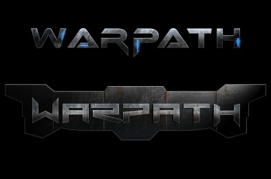
A logo for a tabletop game is always important because it will usually be one of the most recognisable parts of the box when it sits on the shelf. With that in mind Mantic would love to know which one you like the best for Warpath. You can see more over on their Facebook page too...
As mentioned above these are just some of the designs that might make the cut. I do like all the metallic texturing to the logo, it has something of the Transformer about it.
The light blue is something I'd like to see carried over into the final design too as it conveys less of a grim dark feel and something in-between the likes of Warhammer 40,000 at one end of the spectrum and Infinity at the other in terms of tone.
Which do you like best?
"The light blue is something I'd like to see carried over into the final design..."
Supported by (Turn Off)
Supported by (Turn Off)
Supported by (Turn Off)

















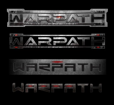
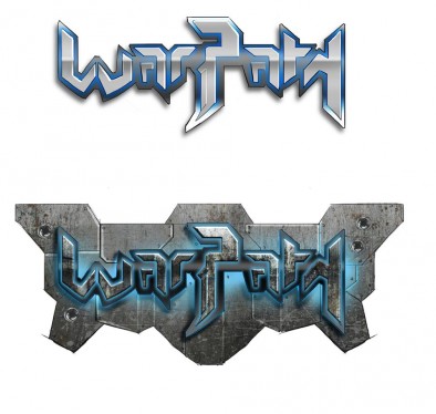

They all look fine to me – though the rebrand is a good sign. Interesting times ahead!
number 7 please bob
Yeah, number 7 is the one i like too.
I keep reading Prodos games when i look at the logos ..
well the first 4 anyway, did that insult anyone? 😛
Seems it did, I’ll bump ya back up again 🙂
4 is very Prodos btw
I mean 1
Some look like “Warfath” to me. I’m good with any that don’t.
Looks like Mantic is getting serious about making Warpath a viable competitor in the scifi genre. Should put them in good position for when the industry leader gets rebranded and reruled…
I’m thinking 2, 4 or 7 are my favourites, though admittedly I think I’d prefer 2 and 4 with blue lighting rather than red.
It may be my old eyes, but I imagine a few of those logos would look like “ARPA” on the shelf. And 5 and 6 look like they’re written in Klingon. So #1?
i think 6 or 8 are the best.
Number 4, cos’ it looks Cylon.
But number 7 if they want to avoid that…
~8 for me. Has a very “Transformers” vibe. The first four are giving me worrying flashbacks to Terminator Salvation…
#7 is my favourite for sure.
5 an 6 are a bit hard to read but the rest is brilliant
#7
Aw, you didn’t include the best one….
Number 1. I think it has to be a logo with more things on it (1,2,3,6,8) but I don’t like 5 + 6 (too infinity) I like 7 but I shall prefer it with some lines up and down like 1.
Like the cylonness of #4, and #7 is good but maybe red instead of blue?
a logo should be perfectly legible from a certain distance, and it should bring connotations to what it is all about.
#5 and 6 look like some late 80s metal band logos
I personally like #4, with a bit of Cylon to it, but #7 is the clearest one, IMO.
I like the Cylon feel of #1. But a combination of #7 and #8 would work great as well, though a little more lighting, to make it easier to see the brand/name.
I like #7 the best. Its something about the blue lights I like. #1 is my second favorite, I like its ruggedness.
#7 Rocks1 Its looks clean, hi tech and menacing all at once. Its says future war like no other. Its the combination of clean typeface, metallic texture with the hi-tech blue high light but the fade in and out shadow all at once.
2, 4 need a lens flare behind to make them pop, 5 is too cartoon’ie, 6 is very nice, just wants some of the blue removed from the concrete behind, 7 looks goo but again needs a lens flare.