


![How To Paint Moonstone’s Nanny | Goblin King Games [7 Days Early Access]](https://images.beastsofwar.com/2024/12/3CU-Gobin-King-Games-Moonstone-Shades-Nanny-coverimage-225-127.jpg)


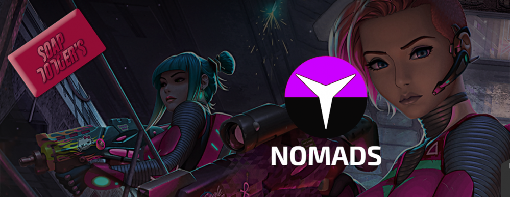
Soap Dodger's Nomands


Painting and a section of why this doesn't contain a step by step.
Time to fess up, In this section was supposed to be a video painting tutorial / walkthrough. However I did record this and although this is comparable with some video content you see on YouTube it was not to my standards or taste so it didn’t make the cut at this time. I would have tried again but it was the last model of the set.
To give you an idea of the issues I was facing, (may want to skip this section if you don’t care about it and want to get the the mini content) my camera mounting options are pretty much my hands, tripod and a tiny dolly. This is fine for setup shots taking stills and even a short burst Video. I thought this was ok, I used a 55-200mm lens and went in at about 100mm to fill the frame with some wiggle room in post. I positioned the same over my shoulder and blasted as much light as I could from good angles. Sorted? No the colour was way off, my idea to keep the settings on auto and just point and film were naïve. Autofocus though great on people is bad on miniatures. I seen the problems and thought, I will try and correct in post. So stopped after the prep stage. Changed to manual focus but stopped short of going full manual for camera settings (as I don’t really know what I’m doing for Video). I was capturing the video in OBS and using my DSLR as a webcam. (also creates quality issues but lets leave that one) I took the first long clip into DaVinci and while I could correct the colour (mostly) it looked odd, unnatural and “enhanced”. The focus was an issue but I could edit around that. I thought my corrections would have been enough. They were not. Now if you know about all this stuff you may be screaming my errors out. Sadly I learn by doing things multiple different ways until something works or I give up. looking at other painting setups the camera seems to be way closer to the subject. No one seems to be using larger lenses to get up close and if they are they tend to be for a close up shot not moving the camera further back. I feel this is probably to do with the quality of light and getting more correct colour. I found filming in my make shift setup very uncomfortable as well. High powered lights on for hours at a time on a subject while it’s hot outside, does not make a happy painter and causes more than a few unhappy accidents that don’t happen in other situations. So I think I need the camera closer and more flexible and my lights further away for comfort. That’s my next step. So enough of my filming woes lets talk about the painting here anyway.
Now you see why a picture is worth a thousand words.
The “Pink”
So I wanted to reclaim magenta. It’s a misunderstood colour. “Pink” is mixture of Magenta, Yellow (to make red) and white. Magenta is just Magenta. If you add White to Magenta it’s a light Magenta if you add black it’s a dark magenta it doesn’t change the colour only the value. If you add white and black or grey it becomes a desaturated magenta again not changing the colour.
Magenta gets it’s odd place in the male dominated world of wargaming and miniature painting from Barbie, The logo is more Magenta than pink. That’s why “Barbie Pink” in most cases (sure they have messed this up with multiple people doing it over the years) is Magenta and not Pink. This has lead to a number (not all) of frankly “joke” forces being put together painted Pink (or Magenta).
This has driven some to say the act of finding these forces funny or mocking them is misogynistic if you consider the “pink” as feminine and thus weak and underserving of being a colour choice of a force which is strong and masculine. While I myself will stop short getting (further) into gender politics of colour choices in wargaming (great dissertation title) it has created a gap in army or force colours across the hobby. I do not personally like pastel colours which is what I consider pink to be, red pastel. I however love magenta.
I took the box art and put it into photoshop and changed the hue until the reds were Magenta and pumped up the greys blues until they showed their true colour. The Intruder caught my eye here with his gun. I think I have my paint scheme.
I have only really ever painted the box art scheme for infinity minus a few exceptions or one off’s for people. This did make me nervous, however I really like the balance the colour choice has and this is a good way to find a half way house from something truly original and the box art.
 Box art, changed hue in photo editing software.
Then there is this “rule” in painting not only miniatures that you should introduce more colour into a painting by changing the colour and not just the lightness and darkness of colour to change the value to make your volumes. While I agree with this rule in principal in practice everyone breaks it at points but rarely does anyone stick two fingers at it, even by accident and produces a good result.
I wanted gradients to be the main way of showing volume as there are a lot of bots in the nomads force. I have a habit of always making straps leather unless it clashes then I move to black. That was a no brainer. I also replaced the jade like colour with flow green as the jade was to similar to the turquoise I wished to use. These are small accents. I should have kept to theme and used back and white to shade the yellow. While this is possible as I have done it, it’s super sensitive to mix quantities due to the opacity of the yellow when you add the tiniest dot of black. So switched this up to a dark red/brown. Sadly this choice made the yellows much warmer than I wanted but I didn’t get as frustrated with the yellows. Oddly this closer matched by box art remix.
You will also notice this is very close to Cyan Magenta and Yellow. This isn’t by accident but I do feel the proportions are different.
I also use desaturated Turquoise and desaturated Magenta by adding white and black this gives great contrast without changing the colour.
 Colour Scheme
These are all the paints I used for everything.
The yellow’s reds magenta and oranges gave me options for skin tones and browns as well as my yellow.
White black and magenta gave me my magentas.
Turquoise white and blacks gave me the turquoise (almost Cyan).
I have florescent green green ink for the greens.
Varnish for varnish and glaze medium to support my blending.
Quite limited which is what I wanted the only addition was in basing and I used rust pigments and a black.
The variety in colour I think was very good considering and I don’t feel the colours and dull and lifeless as people imagine when mostly just adding white black and grey to colours. Though in saying that could I have got a better magenta and cyan style by mixing it up with reds and blues for lights and darks? Yes. Would it have been more difficult? No. So why didn’t you do it? to prove (to myself) it’s not always a bad thing to do even taking it to the excess. This has removed my guilt for sometimes being lazy and not reaching for another colour when I have black and white on my pallet.
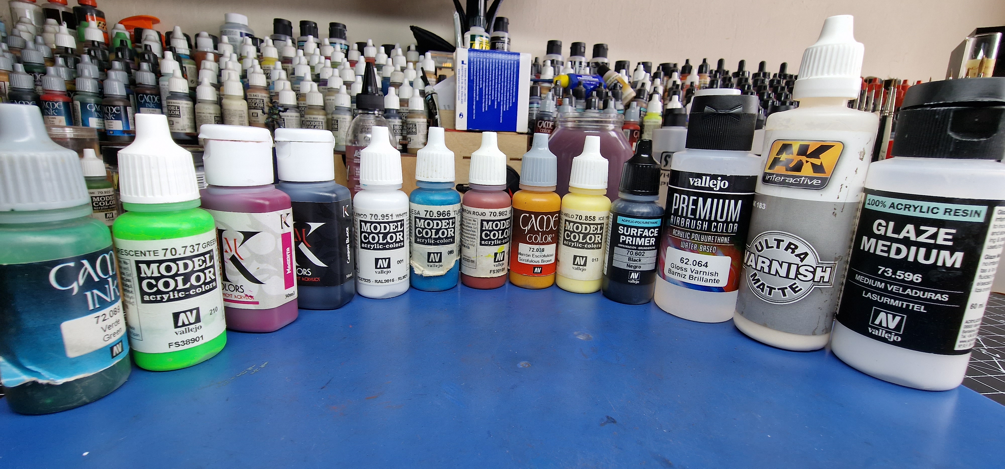 Paints used
As ever art is subjective. I am not asking or forcing you to like what I have done, approve of my colour choices and rationalisation. If your reading this (which I think about 2 people will, I hope that it makes you think about your choices. Are they choices or is convivence choosing for you? because it does for me. If you like it or not, I think I have loads of room for improvement in painting. Putting limitations and boundary’s on things you take for granted helps me think deeper about what and how I paint. For most it’s how to get mini’s done better, quicker and with less effort. For my it’s about getting my monies worth.
So that’s it, instead of a video probably focusing on the action painting rather than the colour selection and reasoning.


I can’t wait to see your video in some other project. I hope you’ll keep trying!
By accident I just changed inks in my printer – CMYK Nomads they are.
I will get a mount next month which will hopefully help. No point in putting something out that’s more digital than what I am actually doing. CMYK is the way forward 😀
I honestly admire your devotion to good photography, personally I had to just accept my own problematic photos. I use same camera, same settings, same black/white sampler and receive effects which are nowhere near consistent, which you surely noticed in my projects…
Anyway, waiting impatiently for the videos.
On different note, have you seen Vince Venturella new video just today?
Just watched it, that’s how to “properly” use magenta. It’s a much better way to use the colour rather than just using white and black. This starts a problem especially for new painters. I painted my Equipe Mirage-5 yesterday and I just counted the paints on my desk and it was 43. 43 paints to paint one model is excessive for a new starter, I still think you can get quite far depending on the colour with black and white 😀
43? Mate, I want to see it in detail!
As for shading, recently I have good effects with chromatic black, especially for primary colours.
If you’ve not seen it Angelina Curka painted a Masterglass winning pink Nomads scheme. If you check Riotgrrl Painting on Facebook you can see it on her backdrop.
That’s an extensive pink nomads force but it’s 100% in the pink and not the magenta category. Still ace though. is nice to compare the colours to make sure I didn’t drift over to pink. Thanks for pointing it out.